
Judith Curry’s recent critical assessment of “L4”, as I’ll call Shaun Lovejoy’s October 20 EOS article, raised the following points:
- About 40% of the warming since 1880 occurred prior to 1950, and is
not attributed to human greenhouse gas emissions. - There are centennial and even millennial scale internal variations in
ocean circulation - Dismissing the existence of multidecadal to century scale variations
in solar radiation is completely unjustified. - Major volcanic eruptions do not occur uniformly in time, e.g. early
19th century. - (my numbering). It is unscientific to ignore the contributions of
ocean oscillations and solar variability to 20th and 21st century
climate variability.
The purpose of this post is to focus attention on the 70-year period 1880-1950 addressed by JC in her first point, which is also where her other four points seem particularly applicable.
The importance of this period is that it contains by far the best data we have about natural variability in the absence of significant variation in CO2. Before that period we have nice regional data such as Central England Temperature going back to the 17th century, but no satisfactory global data. After that period the onset of rapidly rising CO2 makes it the devil’s own job to separate the contribution of CO2 from other climate impacts, opening the door to bitter debate as to the proper separation.
At one extreme of the debate, some of the denizens here flatly deny CO2 has any effect and that the recent rise is simply further natural variation. That extreme gets annoyed at Judy, who to them appears to be on the other side from them.
At the other extreme are those who, when confronted with JC’s point 1 above, would reply “The science shows that most of the warming since 1880 is attributable to GHG.” They too get annoyed at Judy, whom they lump together with what one might call the absolute denialists, those claiming that CO2 has no effect whatsoever on climate. Since Judy’s earlier research involved radiative forcing, it would be fair to say that putting her in that camp is unscientifically dismissive.
Yet this reply about “most of the warming” was in fact SL’s exact response to that point when he joined the discussion of JC’s post.
Which glosses over the point that CO2 increased by only about 7% during the 70 years from 1880 to 1950, but increased during the next 65 years by a further 30% of the 1880 level.
SL cited as his source for “the science” his own Figure 1 from L4:

One need be neither a scientist nor a statistician to see that the unexplained variance represented by the residuals in Figure 1(b) prior to 1944 consists of a huge 0.4 °C decline during the 33 years 1878-1911 followed by an equally huge rise during the 33 years 1911-1944, seemingly completing one cycle of a 66-year oscillation. Note that this is not the temperature itself but the presumed natural
fluctuation after taking into account the expected contribution of CO2, i.e. the explained variance represented by the black line in Figure 1(a).
If it were truly an oscillation one would expect an equal decline during
1944-1977. And indeed there it is, quite clearly, in Figure 1(b). Labeled “Post war cooling”, but what’s in a name?
But after that, the putative “oscillation” seems to die down. The 14
year period 1998-2012 labeled “pause” in 1(b) is much too short to be
part of a 66-year oscillation. And if the pause is attributed to the
22-year-period polarity reversal of the heliomagnetosphere, based on its
relevance to climate as has been suggested from time to time starting
with Edward Ney in 1959, then it would be more appropriate to take it to be even
shorter, namely the 11 years 2001-2012, with the freak peak of 1998
taken to be an unrelated outlier, consistent with the following choice
of trend lines
plotted by WoodForTrees.
But that, along with the papers by Santer et al 2008 and more recently
Karl et al 2015 purporting to prove that the pause is statistically
indistinguishable from no pause based on a questionable assumption that
all else is noise, is a digression better dealt with elsewhere.
So who’s correct here? JC with her “40% of the warming since 1880 occurred prior to 1950”? Or SL with his “most of the warming since 1880 is attributable to GHG” based on his Figure 1?
Well, based on Figure 1(b) there was a clear natural increase during 1911-1944 of 0.4 °C, no statistics needed for that. Given that the entire increase was somewhere between 0.7 and 1.0 °C depending on where you start, it would be very reasonable to say “over 40% of the warming since 1911 occurred prior to 1944.”
On the other hand Figure 1(b) shows an overall decrease from 1880 to 1950. So a more all-round-acceptable version of JC’s first point might be “natural fluctuations prior to 1977 have a peak-to-peak amplitude on the order of 40% of the total increase since 1880.” It would then be conceivable that, whatever the source of those natural fluctuations, they may have simply increased in amplitude since then.
Now what about SL’s “most of the warming since 1880 is attributable to
GHG.” Can this be defended against point 1 thus restated?
I believe something like that is possible, but it will require the opposite of SL’s high-pass filter designed to take out 125-year and slower periods. Instead I’ll use a low-pass filter designed to take out short-term fluctuations.
Arguably these short-term fluctuations have little bearing on either climate in earlier centuries or on multidecadal climate in 2100. Here’s my argument for that.
- (a) Can anyone tell what the fluctuations in medieval global climate were to a resolution of better than about half a century?
- (b) Can a forecast of average temperature over the 60-year period 2070-2130 be improved significantly by narrowing the period to the 20 years 2090-2110?
I don’t know about other people, but my impression of (a) is “no”. Furthermore I have great difficulty believing “yes” to (b), at least with current modeling technology.
So on that basis there should be little loss in either insights into past climate or long-term predictive power resulting from applying a 60-year moving average (running mean, boxcar) filter to recent climate data.
In order to get good data as far back as 1880 I’ll use HadCRUT4, which has data from 1850. For CO2 I’ll use the Australian Law Dome data up to 1960 and the Mauna Loa Keeling curve for 1960 to 2015. Smoothing these lops off 59 years (a running mean of 1 year lops off nothing), leaving smooth data for the 106 years 1881-1986 inclusive (more precisely 1880.5-1985.5).
Combining this with SL’s very neat technique of plotting CO2 linearly with forcing rather than with quantity of CO2 yields the following MATLAB plot.
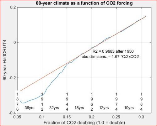
What shocked me when I first saw this was not so much the very linear
plot on the right, which I’d been kind of expecting, but the sharpness
of the transition into linearity during 1944-1950. If you take the
goodness of fit to Arrhenius’s logarithmic law after 1950 as a measure
of the goodness to expect in general, with its astonishing R2 of 99.83%,
then climate before 1950 very badly fails that law!
Based on this plot I would judge Judy’s first point as borne out by that
failure to fit. And that’s even after removing 60-year-period “AMO”
and faster oscillations with the 60-year boxcar filter.
Apparently there is more to the period before 1950 than meets the eye.
Solar variability during the first half of the 20th century is even
slower than the AMO and therefore could well be a contributor. With CO2
rising so slowly in that period, there could also be other slow-moving
contributors able to overwhelm CO2’s contribution before it kicked into
high gear. This surely bears further investigation!
But it would also appear that SL’s claim is just as strongly borne out,
provided he limits it to past 1950.
And this is to be expected based on the HITRAN table of CO2 absorption line. Lines above any given level of strength increase in number by about 60-80 with each halving of strength. Hence each doubling of CO2 brings roughly the same number of absorption lines into the role of fresh absorbers of OLR, with the stronger lines being retired to the tropopause where they lose most of their influence. Although Arrhenius did not know this, it provides further support for his empirically determined logarithmic law of dependence of radiative forcing on
atmospheric CO2 level.
I submit this as support for JC’s fifth point, that SL has been a tad unscientific in simply claiming that “The science shows that most of the warming since 1880 is attributable to GHG.” Most of the warming since 1950, certainly, but to ignore that Judy limited her first point to the period prior to 1950 is to be unscientifically dismissive. (I would have said even “snarky” but that’s not a scientific judgment.)
Note that I’ve labeled the slope of the line, 1.67 °C/2xCO2, as “observed climate sensitivity”. This is considerably lower than Equilibrium Climate Sensitivity, ECS, due to the thermal inertia of the Oceanic Mixed Layer, OML. It is also different from Transient Climate Response, TCR, which as the response to a steady rise in CO2 of 1%/yr over 70 years, is more like what the rise between now and 2095 will look like. SL’s unqualified casual reference to “climate sensitivity”
completely overlooks these hugely significant distinctions.
Ironically the left of this plot should appeal more to the political right, and vice versa. As they move to their correct sides, perhaps they could pause for a beer and a chat as they pass by.
All relevant MATLAB code and .csv data are freely downloadable from this folder. Offers to translate it to any of Excel, R, Python, Java, C, etc. gratefully accepted. I’d be happy to help with any unclear points, though not to do the whole thing alone. Feel free to ask about the technical details in the comments section below.
JC comment: As with all guest posts, please keep comments civil and relevant. I will tweet this and flag Shaun Lovejoy, hopefully he will stop by to discuss.

Pingback: Natural climate variability during 1880-1950: A response to Shaun Lovejoy | Enjeux énergies et environnement
It might be possible to come up with a proxy based on ENSO from sea-bottom cores. One perhaps good enough for a scientific speculation, or even hypothesis.
Not good enough for policy, of course.
Why rely on proxies given the instrumental temperature record of the last century, and contemporary northern plant ranges extending far beyond classical and medieval limits ?
AK
Not good enough for policy, of course.
I’m a little curious what you might be suggesting by this comment. Any policy-making should be deferred until the science is better know? Or at this time that particular approach is not likely to provide much addition clarity to policy-makers and they are left with proceeding with whatever policy with things as they are? Or something else?
mwg
I’m saying that speculative hypotheses based on using ENSO records as a proxy for “global average temperature” couldn’t be (properly) used in support of policy positions, except as responses to some sort of claim that evidence shows no variation. At most, it could be an answer to a something like “there’s no evidence of any changes till the Industrial Revolution.”
Thanks for clarification.
Thank you, Professor Curry, for your continuing efforts to restore logic and observation to the AGW scare.
One official source of climate dogma may have been revealed in a recent ResearchGate discussion. The Smithsonian Institution is controlled by a Board of Regents that is: “the Chief Justice, the Vice President, three members of the Senate, three members of the House of Representatives, and nine citizen members appointed by Joint Resolution of Congress.”
Prof Pratt:
Thank you for a very interesting post.
I continue to hold that the AMO is a powerful negative feedback to solar plasma variability and its effects on the NAO/AO.
http://snag.gy/HxdKY.jpg
Vaughan, Lovejoy’s whole point is that early in the warming you could not distinguish it from natural variability with a standard deviation near 0.2 C. The left of your graph has CO2 trends low enough to be heavily influenced by that background especially since the CO2 trend in real terms (degrees/decade) is very low compared to the typical natural variability trends. However, moving to the right the CO2 trend goes through more than two doublings since 1880, finally drowning out the natural variability trend that does not change. The second figure of Lovejoy shows that natural variations continue through to the present with their 0.2 C amplitude, but it is the highly distrorted time scale of your x-axis that means that the recent trend is really very high and can only be dominated by CO2 at that level. That is, even though the gradient on your graph is constant, it represents an accelerating trend in real terms of degrees per decade as you go left to right, and natural variability can compete with the slow trends on the left, but not with the much faster trends on the right.
For example that line represents a trend near 0.02 C per decade on the left and 0.15 C per decade on the right. Natural variability is probably in the 0.05-0.1 C per decade range, so it dominates the left, but CO2 dominates the right.
Thanks for your quantification of natural variability, Jim. However nature has many phenomena and I feel it’s worth trying to separate them.
How about focusing on the 66-year “AMO”? In the spirit of better visuaIization I reproduced (the HadCRUT4 counterpart of) Shaun’s Figure 1(b) and fitted 33-year trend lines at 1878-1910, 1911-43, 1944-1976, and 1978-2010 as follows.
http://clim.stanford.edu/L4Fig1bTL.jpg
Their slopes are given in degrees per century. The first two are essentially one degree per century, the third drops by 10% to −0.89 °C/cy, and the last by considerably more, to 0.63 °/cy.
The last was steeper than I’d estimated by eyeballing L4’s Figure 1(b), but it’s definitely not as strong as its three predecessors. Perhaps the AMO is weakening for the time being, or Figure 1(a) has overestimated the contribution of CO2, or something else again.
On further reflection, there is a quite strong 21-year oscillation visible not only in contemporary climate data including HadSST3 and the ESRL AMO index, as well as in CET where it is particularly visible in the preindustrial portion before aerosols added noise to the signal. Its peaks coincide with the peaks of the odd-numbered solar cycles, which is when the heliomagnetosphere flips to South and couples to Earth’s magnetic field.
A more reliable estimate of the AMO would therefore benefit by subtracting that oscillation before fitting these 33-year trend lines.
Jim D: Natural variability is probably in the 0.05-0.1 C per decade range,
Really?
On what evidence do you conclude that? I know there is lots of all kinds or evidence; my question is what evidence you in particular use in that assessment?
Did the natural variability end, or reverse sign as in an oscillation?
MM, natural variability of the quasi-60-year oscillation type is 0.05-0.1 C/decade. This appears to be the only one we have once you take out the expected CO2 acceleration. And, its magnitude never deviates more than 0.2 C from the forcing.
Vaughan, the sun is now as it was around 1910, so I think we are in a downward part of the long-term natural trend that arguably started around 2000, but that is only half the current CO2 trend, so we will hardly see it at all against the background trend this time, while it was very visible in 1910.
@Jim D: Vaughan, the sun is now as it was around 1910, so I think we are in a downward part of the long-term natural trend that arguably started around 2000,
You talk like a shareholder focused on next quarter’s earnings, Jim. You’d never get a job at Berkshire-Hathaway. :)
Those who want information about 2100 aren’t going to get much out of 10-year samples. Here’s what Earth has been receiving from the Sun during 1850-2014, smoothed to a moving average of 60 years.
http://clim.stanford.edu/TSI60.jpg
Be very sure of your projections when selling short.
The peak of solar cosmic rays for each cycle alternates from sharp to peaked with two of one type and one of the other in the first half of the 60-66 year cycle, and with two of the other type and one of the one type in the other. This provides a clock like mechanism. Whether it is in fact the mechanism, I don’t know.
Leif Svalgaard considers it a second order effect, and he’s probably right.
There’s the ticking and the tocking,
Sun and Earth, embraced, and locking.
======================
Not insisting on a causal mechanism; both phenomena may be responding to a prior unguessed cause.
===========
@kim: The peak of solar cosmic rays for each cycle alternates from sharp to peaked with two of one type and one of the other in the first half of the 60-66 year cycle, and with two of the other type and one of the one type in the other.
Kim, the heliomagnetosphere flips polarity at each solar max, giving rise to the alternation N S N S N S N S N S … where N means the heliomagnetosphere points north and S means it points south.
That’s a pretty simple pattern, wouldn’t you say? First N, then S, then back to N, and so on.
Now what you’ve just said is that if you (kim) group them as
(N S N) (S N S) (N S N) (S N S) …
then you get “each cycle alternates from sharp to peaked with two of one type and one of the other in the first half of the 60-66 year cycle, and with two of the other type and one of the one type in the other”.
Well, duh.
What planet did you say you were from?
One half of the cycle is in the PDO El Nino dominant phase and the other is in the La Nina dominant phase. Hmmmm.
You just saw a bomb, not a clock.
=======================
Heh, Leif understood what I was getting at; perhaps I was more eloquent, then. He just didn’t think it was very important.
Or maybe Leif is simply kinder than you are.
=====================
And thanks for very nicely and correctly rendering my words into arithmetic symbols.
================
@kim: One half of the cycle is in the PDO El Nino dominant phase and the other is in the La Nina dominant phase.
That’s only when Saturn is in the 7th house. When Jupiter is in Virgo Mars gets jealous.
Vaughan, I think the sun is the main component of that 60-year variation. It is no coincidence that 1910 was inactive like now while about 1940-1950 was about the most active period of the century. So, the smart betting is on a downturn in that component, but this time somewhat masked by the rising CO2 component that is even easier to forecast.
Well, Gaia anyway, notes that one half of the cycle cools the atmosphere and the other half warms it.
================
I agree, Jim D. I am very closely following the slope of this latest phase. It does not seem to be warped very much upward by increased and increasing CO2.
We shall see; it’s too early to tell.
==============
Jim D: MM, natural variability of the quasi-60-year oscillation type is 0.05-0.1 C/decade.
That clarifies.
It’s hard to leave this one alone because conjecturing how the reversing polarity and alternating shapes of cosmic ray peaks meshes with the ENSO cycles provokes rich imaginings. There has been time enough for the radiant and magnetic solar phenomena to become synchronized with the oceans currents. Whether they have been or not, whether by these mechanisms or not, I dunno, but also dunno why not.
=====================
And yet the fishes move.
=============
Well…
This is mostly true. Lets look at that chart…
https://curryja.files.wordpress.com/2015/11/clim60.jpg?w=500&h=402
Using pineapple people numbers and this chart the CO2 level started to correlate with CO2 in 1967 AD. The CO2 numbers before then just sort of flopped around like a dying fish.
The interesting thing is the chart stops at 369 PPM or 1999 AD. Perhaps if the chart were completed to 2014 AD or 2015 AD it would have some value. As it is the chart only shows correlation for about 22 years. That is 1/6th of the instrumented climate history and the chart ignores the 17 years of greatest interest.
PA: Using pineapple people numbers and this chart the CO2 level started to correlate with CO2 in 1967 AD.
CO2 always correlates with CO2. Maybe you meant temperature started to correlate with CO2. But what’s your basis for 1967?
PA: As it is the chart only shows correlation for about 22 years. That is 1/6th of the instrumented climate history and the chart ignores the 17 years of greatest interest.
If we’re talking about the same chart,
https://curryja.files.wordpress.com/2015/11/clim60.jpg
then the blue curve (60-year smoothed climate) looks pretty straight to me for the 43 years from 1944 to 1986 inclusive. Furthermore for the 106 years from 1880 to 1986 the blue curve is always within 0.1 °C of the expected contribution of CO2. While I agree that 22 years isn’t much to go on, 106 years is a lot better.
But perhaps you had a different chart in mind?
Also if the question is global temperature in 2100, 17-year periods of data should only be of interest to people more interested in the average temperature from 2092-2108 than for 2070-2130. I’d find a projection for the latter more plausible than one for the former.
The full 1882 to 2015 chart (if drawn) would look like an inverted shallow tilted parabola and an intersecting tangential line (with the parabola crudely drawn).
The 1944 “0.15” point is somewhat arbitrarily picked. The real point (given the 1959 0.9 PPM increase in the Mauna Loa data) was after 1950 and possibly 1955.
Well, based on Figure 1(b) there was a clear natural increase during 1911-1944 of 0.4 °C, no statistics needed for that. Given that the entire increase was somewhere between 0.7 and 1.0 °C depending on where you start, it would be very reasonable to say “over 40% of the warming since 1911 occurred prior to 1944.”
Well, early warming presumably continued to 2000. Some part of the post 1982 warming was due to this. The rate of increase after 1982 isn’t that much greater than the pre 1944 increase. But it is greater.
The February 2015 22 PPM = 0.2 W/m2 study informs us that the 20th century warming due to CO2 was around 0.2°C
0.2°C is a good fit with the historic temperature data assuming “natural warming” (all causes other than GHG) for the whole century at the first 1/2 century rate. If the natural “40% of the warming since 1911” in the first half century continued in the second half, with the GHG forcing at 0.2°C (20%), 40%+40%+20%=100%. Problem solved.
More effort should be expended identifying and attributing the “natural warming” causes, some of which are cyclic or unnatural.
Funds for studying GHG should be terminated. The IPCC has “high confidence” they understand GHG. Further funding is wasted money.
We should only be studying areas where the IPCC has “low confidence” “no confidence” or “simple confusion” IE all non-GHG causes and forcings.
You can add to it the words of wisdom from Popper:
“Believers in inductive logic assume that we arrive at natural laws by generalization from particular observations. If we think of the various results in a series of observations as points plotted in a co-ordinate system, then the graphic representation of the law will be a curve passing through all these points. But through a finite number of points we can always draw an unlimited number of curves of the most diverse form. Since therefore the law is not uniquely determined by the observations, inductive logic is confronted with the problem of deciding which curve, among all these possible curves, is to be chosen.”
– Karl Popper
Science or Fiction | November 3, 2015 at 6:04 pm |
You can add to it the words of wisdom from Popper:
“Believers in inductive logic assume that we arrive at natural laws by generalization from particular observations.
We burn down half the rainforest, pave over 3% of the land and clear off or alter about 30%, change the hydrology so much we are changing weather patterns, emit so much particulate the air is black (US), then let it clear, then turn it black again (China). on top of natural oscillation and natural forcing that are badly understood.
About the only thing for sure – we have plenty of time to sort it out. There is some CO2 warming. Beyond that nothing has been proved. Attribution of warming between the various causes is sort of a joke. Until we can properly attribute forcing among the various causes, prediction will not be a valuable exercise.
If you consider the Roman and Medieval Warm periods to be natural climate cycles then you must consider the current Warm period to be another natural climate cycle. All warm cycles occur because it does not snow as much in all cold cycles and ice always retreats and diminishes and causes warming. Now, we are warm, as we are supposed to be and the snowfall has started,
Antarctic and Greenland are now gaining ice volume and thickness and dumping ice and ice water faster from the edges. Albedo of Earth has stopped decreasing. These are the reasons for the pause. After a few hundred warm years, similar to Roman and Medieval Warm Times, the ice volume will have increased enough that the ice will Advance and increase albedo and the ice release at the edges of Antarctic and Greenland will increase and Earth will move into another cold period.
This is what the ice core data tells us. The ice thickens faster in warm times and slower in cold times. Warm times always follow cold times and cold times always follow warm times. This has always happened without manmade CO2. The extra manmade CO2 has not made this warming any faster or any different or any more.
The difference this time is that we have thermometers that were invented during a natural warming and computers that were invented during a natural warming and climate theory that was invented during a natural warming.
Go back and understand the natural cycles of the past and get the computers to match those cycles. That does not work, the computer output for the past ten thousand years is just a hockey stick. Real data had warm and cold cycles.
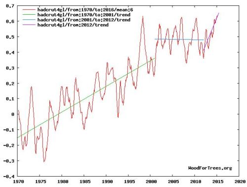
Impressing pause after 2001.
http://www.woodfortrees.org/graph/hadcrut4gl/from:1970/to:2016/mean:6/plot/hadcrut4gl/from:1970/to:2001/trend/plot/hadcrut4gl/from:1970/trend
Even with missing the months after May 2015.
It’s impressing, really. So impressing I have the same difficulty as in understanding the high R value of Vaughan’s graph. Why, why is the correlation between ln CO2 and LOTI strictly linear after 1950? ‘I struggle to understand.’
Who ordered the straight line? It would be interesting to see comparisons with different indices, like RSS, BEST and GISS old revisions. Of course, smoothing may produce random correlations.
Hugh,
I thought the article was based on Lovejoy’s work and whichever data set Lovejoy used.
@Hugh: Who ordered the straight line?
By Arrhenius’s logarithmic law for dependence of surface temperature on CO2, a straight line is what you’d expect if CO2 were the only remaining contributor to global surface temperature after removing (a) contributors with periods of 60 years or less and (b) TSI.
The straightness shows that any other long term contributors must either be pretty minor or act about the same way on temperature as CO2.
Note that this only establishes correlation, not causation. Causation would be established by measuring the strengths of CO2 absorption lines in the laboratory, which are tabulated in the HITRAN tables, and noting that CO2 is estimated to be about 80% of the total radiative forcing of all well-mixed greenhouse gases, which have also been rising.
It would be interesting to see comparisons with different indices, like RSS, BEST and GISS old revisions
As explained in the post I used HadCRUT4 rather than Lovejoy’s choice of GISS because 60-year GISS is only 76 years long while 60-year HadCRUT4 is 106 years. 60-year RSS will get its first data point in 2044 (the first year in which CO2 in RCP8.5, aka “business as usual”, has a CAGR of 1%).
I hadn’t tried BEST because I thought it had no ocean data. However when I went to http://www.berkeleyearth.org just now I was very pleasantly surprised to find annual land+ocean for 1850 to 2014! So it was a very simple matter to just replace HadCRUT4 with it, with the following result.
http://clim.stanford.edu/Best60.jpg
To get TSI to straighten out 60-year BEST before 1944 I had to raise the TSI scaling factor from 1/5 to 1/4. When I used the latter on 60-year HadCRUT4 the result was this.
http://clim.stanford.edu/Hadcrut60.jpg
Since that got the period 1900-1944 straighter, maybe 1/4 is better anyway—evidently HadCRUT4 overestimates the 19th century relative to BEST, no idea which is more accurate.
Nice post. The rise from ~1910 to 1945 would also have an associated water vapor increase which should have an ECS impact similar to CO2 as far as radiant forcing goes “all things remaining equal”. Since most of the antropogenic changes during that period would be land based I am a bit surprised that land Tmax and Tmin as well as Tave aren’t compared to ocean on global and regional scales to sort out some potential causes.
After all, anthropgenic atmospheric forcing should be more “global” and natural variability should be more regional.
Also from a heat balance perspective, ocean coral and Mg/Ca reconstructions combined indicate a longer term warming trend with a pseudo-cyclic signal starting in roughly 1700AD of about 1C in the tropical oceans which represent close to 50% of the oceans. The same “polar” and higher latitude land amplification of that 1C with associated water vapor feedback should be expected if it is “real”. Being “real” might require an assumption that something other than CO2 could be a significant climate factor though.
I suspect that greening, increased water efficiency, and increased water transport from ocean to land (and decreased land to ocean sans increased aquifer extraction). I think that very near surface water vapor is increased by reduced demand from more efficient plants. The greening climate traps more water near the surface and water moves more slowly across land (more frequent moderate rains) and plants and moist soil keep greenhouse gasses near the surface (prevent mixing) and respiration increases GHG concentrations at night.
Thanks, cd.
@cd: Since most of the antropogenic changes during that period would be land based I am a bit surprised that land Tmax and Tmin as well as Tave aren’t compared to ocean on global and regional scales to sort out some potential causes.
Actually I did compare land and sea in the first part of my AGU 2013 talk in the SWIRL session GC53C “Understanding 400 ppm Climate: Past, Present and Future”. Here’s the relevant slide.
http://clim.stanford.edu/LandSeaDiff.jpg
The blue curve is HadCRUT4, which is basically land plus sea weighted 0.7 and 0.3 respectively. The red curve is their difference. The trend lines are put wherever the blue curve shows a strong upward trend. The trends for the corresponding periods in the red curve then tell you whether the sea or the land is driving those trends.
For the first two the sea is the driver, though the land is starting to get some traction in the second trend. At the third however the land totally dominates, consistent with strongly increasing atmospheric forcing such as from rising CO2.
@cd: After all, anthropgenic atmospheric forcing should be more “global” and natural variability should be more regional.
This is more true for faster fluctuations. However very slow ones like the AMO have more time for their influence to spread globally, otherwise the aerosol theory of the AMO would be the only viable theory. The above graph supports an internal variability account of the AMO. My poster at the 2014 AGU fall meeting went into this in more detail.
vp, “This is more true for faster fluctuations. However very slow ones like the AMO have more time for their influence to spread globally, otherwise the aerosol theory of the AMO would be the only viable theory.”
Actually, Toggwieler’s ocean modeling based on paleo indicates longer term hemispheric shifts like his “Shifting Westerlies and variations in the “Thermal Equator”. Since the North Atlantic is about half the size of the North Pacific basin, shifts in the Thermal Equator most likely “cause” both the AMO and Pacific pseudo-oscillations. Like now for example the northern ITCZ and warmest ocean water band is around 10N and that shift could take 90 years or more. Think of it as a smaller version of the hemispheric seesaw.
In any case, there is some young blood rediscovering pre-CO2 dominate climate.
https://lh3.googleusercontent.com/-hVnd1uOfaiQ/VKcIuuh2W_I/AAAAAAAAMD0/XcDFLCjBlQA/s912-Ic42/lamb%252520with%252520oppo.png
How can the sea surface temperature of the North Atlantic spread globally? The surface area is simply too small-sized for it to have this sort of large-sized impact. More likely, something that actually can spread globally spread to the North Atlantic, and sometimes the AMO spread to Central England.
JCH, “How can the sea surface temperature of the North Atlantic spread globally? ”
It doesn’t very much which is the point. The north Atlantic basin is small, about half the size of the north Pacific because of the land mass configuration. It would have a small impact on “global” ocean temperature but a fairly large impact on land temperature and precipitation transfer to land. It has a slower time constant because it cannot mix well with the rest of the oceans. The north Pacific has more efficient mixing because of size and has a different time constant because of that. The AMO is just a better indication of larger variations driving climate and not that large a driver own its own.
btw JCH, there are some other interesting things. The North Pacific Sea level is about 8 inches higher than the North Atlantic. When you have an eastward shift of “weather” in the Pacific you would change the rate of flow across the Arctic and over the eastern Indian ocean which would impact Arctic sea ice stability and the Gulfstream flow. Because to the Antarctic Circumpolar current you don’t have that in the southern hemisphere. There is basically no way you cannot have fairly significant longer term pseudo-oscillations with a somewhat consistent frequency.
These are good points.
But there’s another way for INTernal variability to be global: variability in Length Of Day (LOD). Whatever its influence, it is not confined to one hemisphere.
vp, “But there’s another way for INTernal variability to be global: variability in Length Of Day (LOD). Whatever its influence, it is not confined to one hemisphere.”
I haven’t seen LOD compared with regions to see what it correlates with most consistently. It should correlated with mainly tropical oceans I would think which would be “global”.
Internal variability isn’t all that well defined if there are 100 plus year events that are just not considered “possible”. That would be misunderstood climate which should be one of the first things on the list.
Interesting post,
I have two questions: Can we really trust the observed temperatures before 1950, or more specifically, can we trust the “bucket correction”? The period between 1910 and 1940 is a little bit strange because SST increased almost faster than air temps, which doesnt seem likely due to the larger thermal inertia of the oceans. See:
http://woodfortrees.org/plot/crutem4vgl/mean:120/plot/hadsst3gl/mean:120
What If the real global temperature in 1910 actually were 0.1 C higher, how would that affect the analysis?
I also wonder about the derived climate sensitivity in the last figure. How would that number change if Hadcrut4 was switched to a fully global index, e g Cowtan&Way or BEST land/ocean. The trends of those (1850-now) are 0.49, 0.53, and 0.58 C/century respectively. Is it reasonable to assume that the climate sensitivity would be ~18% larger with BEST?
Let’s leave Cowton & Way out of this. I thought we were looking at serious science.
Totally uncalled-for. Just because many scientists disagree with their methods doesn’t mean their work isn’t “serious science.”
C&W use the same approach as McIntyre and JeffId did in doing Antartica… You had no issue with that.
Bottom line YOU HAVE TO INTERPOLATE.
THIS year if you dont interpolate you can Miss the coldest year every in certain parts of the world
jbenton2013…I am curious just what specifically is it about C&W that in your mind prevents it from being serious science. (But it would be nice to start that with a new comment so as not to deflect the intent of Olof’s comment.)
Mosh:
you write:
“Bottom line YOU HAVE TO INTERPOLATE.”
uh….no you dont.
David. Yes you do.
See my blog at Berkeley earth that demonstrates how a failure to interpolate leads to an over estimated warming.
But go ahead and argue that we need thermometers for every molecule
Steven Mosher
No one is saying it is improper to interpolate, but not in the way Way does it. They take interpolation Way too far across land sea boundaries. Not serious science in my opinion, more like wild guesses, but if you don’t agree then we will agree to disagree.
“No one is saying it is improper to interpolate, but not in the way Way does it. They take interpolation Way too far across land sea boundaries. Not serious science in my opinion, more like wild guesses, but if you don’t agree then we will agree to disagree.”
the only problem with your ideas, is that they are wrong.
the interpolation was validated out of sample.
When it comes to the arctic you have these choices.
1. Dont interpolate. That is demonstrably inferrior.
2. Simply extend the last known land data.. this will be better
3. Use Other data sources (satellites) to reconstruct.
You will note that if you adopt #1 as NCDC does at the South Pole
it leads to a much warmer estimate.
Regarding Cowtan and Way I think it is more correct to use the word
extrapolation:
(2) Extrapolation by kriging and a hybrid method guided by the satellite data have been examined. Both provide good temperature reconstructions at short ranges. Over longer ranges the hybrid method performs well over land and kriging performs well for SSTs.
(3) Extrapolation over land/ocean boundaries is problematic; however, observations and reanalyses confirm that air temperatures over ice are better reconstructed from land- based air temperature readings. Since the highest latitude observations are land-based, reconstruction from the blended land/ocean data is realistic.
I’d ‘cringe’ at extrapolating* with any interpolation methods…along with dubious kriging of locations beyond the range of the variogram or correlation. In ordinary kriging you’ll just get a ‘mean’ of the points within the neighborhood; with regression kriging [one form of universal kriging] I would be particularly concerned about errors in the underlying trend surface when extrapolating; and with universal kriging with coordinates as covariates** I would again be wary of the locally extrapolated surface contribution.
————
* If one considers the we at talking about the Arctic it is a matter of point of view–extrapolation or interpolation into a sparsely(?) sample interior region.
** Kriging weights simultaneously determined along with (local) low order regression coefficients.
Also kriging across boundaries, e.g., land/sea boundaries, to me is a not a definite no-no–at least initially. Why? Because the medium whose temperatures are being estimated is air and it freely moves across the boundaries. I wonder if flow there gets more messy when one considers coastal boundary layers and effects on vertical mixing.
Also it is telling to me that no-one** has gotten into the realm of artifacts arising in the interior regions of the sampled space–all interpolation methods can have such problems.*** This not saying some form of kriging is inappropriate or should be neglected, but instead is saying one needs to recognize and contend with the possibilities. As for the hybrid approaches–anyone guess. If you are serious about judging/evaluating them you are much better off to take a lot of time to work through them. Seems fair and that’s what works. Besides there are lots of interesting little sidebar problems to keep one entertained.
Things are moving along. The science takes time but this has implications. Interesting. BEST and C&W have finite shelf-lives. This is natural.
—————
**In the few blogs I look at.
***Well known stuff to folks who have spent some time engaged with interpolating spatial environmental data.
@mwg: BEST and C&W have finite shelf-lives.
At WoodForTrees BEST ended in 2010. Steve M., if BEST has anything more recent please wake up Paul Clark.
BEST differs from HadCRUT4 in a very interesting way: the “pause” does not exist in BEST.
vp,
BEST differs from HadCRUT4 in a very interesting way: the “pause” does not exist in BEST.
For me this sort of ‘problem’ gets to the primary value of such exercises. In the long run the value comes from the experience of processing the data, exercising the techniques, and developing familiarity with both the data and the greater problem of devising a suitable metric or index. Hence the finite shelf-life is a natural thing. Perception of data often changes as one works with it. That is why we have to do and enjoy doing the work.
BTW nicely written post…clear. Thanks.
Steven Mosher, “When it comes to the arctic you have these choices.
1. Dont interpolate. That is demonstrably inferrior.
2. Simply extend the last known land data.. this will be better
3. Use Other data sources (satellites) to reconstruct.”
If you are using a method to tease out cyclic signals that depends on variance in the data, interpolation changes the signal you are looking for. Then you have competing error estimation methods. While kriging might be superior for finding a “global” number, if it changes the variance over time, for example adding the Antarctic increased the variance, you aren’t comparing apples to apples for the pre 1950s.
There isn’t any “right” way or “superior” way for all ways of analyzing data there are just ways.
Now what is interesting is what makes people think what is the “right” way. Karl et al and Cowtan and Way both “improved” the data because they obviously thought it needing improvement.
http://climexp.knmi.nl/data/ihad4_krig_v2_0-360E_-60–90N_n_10p.png
Eureka! Prior to 1950 Antarctic climate was stable!
Would it not be more superior to say something like, the temperature has not been measured there so we cannot say what the temperature was like there and recommend a way to start measuring temperature there so that is the future we will know what the temperature is doing there?
@Olof R: The period between 1910 and 1940 is a little bit strange because SST increased almost faster than air temps, which doesnt seem likely due to the larger thermal inertia of the oceans.
SST is only the temperature of the oceanic mixed layer, OML. The thermocline acts like a good (but not perfect) insulator. Monterey and Levitus’s 1997 tables for mixed layer depth (MLD) indicate an average MLD of about 50 m. The specific gravity of seawater is 1.028 tonnes/m3 so each m2 of OML would therefore have a mass of about 50 tonnes on average. To heat this column by 0.3 °C would require 0.3*4 = 1.2 kJ/kg, totaling about 60 MJ. Over a period of 30 years or 1E9 seconds this is a heating rate of 0.06 W/m2 (60 mW/m2).
Lava has a specific heat of 1.6 kJ/kg/K. If this 60 mW of heat were somehow supplied by molten lava at 1000 °C, 1 kg of lava when cooled by seawater would supply 1.6 MJ. So a flow of 60/1.6 = 37 nanograms/sec of lava averaged over each m2 of ocean floor.would supply the requisite 60 mW of power.
This of course would be concentrated in only very small portions of the floor and create thermals large enough to rise to the surface without losing too much heat on the way up. Observing them would need to be done when the Earth was accelerating (LOD decreasing).
Fluctuations in Earth’s rotation would translate into fluctuations in pressure of magma in magma chambers causing fluctuations in lava flow rates, maintained until the pressure dies down, which might take several years. Pressure is relieved in two main ways: (a) leakage upwards of magma from chambers (thereby becoming lava, by definition), and (b) magma chambers (harder than magma but softer than cold rock) slowly expanding.
Observation of variability of such flows would need to be done at different rates of Earth’s rotation (different LODs), a very long term project.
VP, very nice write up.
VP, how would your analysis determine the amount of warming from the second half of the 20th century that was due to feedbacks from the first half and how would it eliminate the possibility that the forcings from the first half of the century were still positive?
SRI, I wish I knew more about teedbacks from 1900-1950 influencing 1950-2000. Regrettably that’s yet another of the many things currently above my pay grade. If ever I learn anything about that you’ll be among the first to know.
+10
In my opinion the best answer any scientist could give at this point in time with the knowledge currently available.
” each doubling of CO2 brings roughly the same number of absorption lines into the role of fresh absorbers of OLR, with the stronger lines being retired to the tropopause where they lose most of their influence”
The strong “saturated” lines are not retired to the tropopause. They continue to function. No light even reaches the tropopause in these bands because the existing level of GHG has exhausted the light. Adding more GHG lowers the altitude of light exhaustion, leaving the radiation unchanged from the “saturated” lines. Adding more GHG engages additional lines in the “wings”, but over a narrower spectral range and at lower intensity.
What changed in 1950? A transition from linear to exponential growth in human respiration? Perhaps the linear correspondence since then results from the happenstance of a neat cancellation of exponents.
gymnosperm:
I don’t think you meant “light”.
I did mean light. All EM radiation is light.
opluso,
I’m with him. If it’s good enough for Feynman (and others of his ilk), it’s good enough for me. Even Einstein used it. The speed of light applies to EMR generally, not just the visible frequencies.
No disrespect intended.
Cheers.
Gymnosperm:
“Light” is typically (even in my old physics classes) used in reference to “visible light” but I can accept it with your modifying clause “in these bands”.
I also see you have added a more detailed explanation below that is quite nice except when it uses the shorthand “light” for “light within this narrow wavelength band”.
What nonsense.
You’re a twit.
Pot:Kettle:black.
gymnosperm says “The strong “saturated” lines are not retired to the tropopause. They continue to function. No light even reaches the tropopause in these bands because the existing level of GHG has exhausted the light. Adding more GHG lowers the altitude of light exhaustion, leaving the radiation unchanged from the “saturated” lines. Adding more GHG engages additional lines in the “wings”, but over a narrower spectral range and at lower intensity.”
Total nonsense. CO2 ABSORBS and EMITS within a fraction of a second at the FIXED very-low-energy ~15um band and does not “exhaust the light.” With all the bouncing around at the speed of light, CO2 only delays the ultimate passage of photons from surface to space by a few seconds, easily reversed and erased during each 12 hour night, thus no net “heat trapping.”
Furthermore, CO2 is ONE BILLION times more likely to transfer quanta of energy in the atmosphere via collisions instead of emitting a photon, which ACCELERATES convection to cool the troposphere. Climate models fail to consider this, and convection is merely fudge-factor-parameterized in models.
Perhaps you can explain why this HITRAN graphic shows zero transmittance to the troposphere.
https://geosciencebigpicture.files.wordpress.com/2015/10/280-560-transmittance-annotated.png
Mind you, water is also involved, but no light reaches the tropopause in the 15 micron/667 band as measured by aircraft.
The 15 micron band is not “low energy”. It is by far the highest intensity (read energy) and it is “saturated” read no light in these bands makes it to the tropopause.
These are the electron states of CO2.
https://geosciencebigpicture.files.wordpress.com/2015/08/co2levs.jpg
The central branch of excitation states is called the Q branch. It contains about half of the radiative potential of CO2. Go back to the Hitran graphic and check what is saturated=zero transmittance to the tropopause.
Dude, the only reason light does not make it to the tropopause (or space) is because it has been exhausted. Maybe it is exhausted kinetically by being transformed to enthalpy in collisions as you say. I have never heard that CO2 had a billion x collisional mojo. Compared to what? Water? Doubtful.
Maybe it’s Rayleigh “scattering”.
The bottom line which perhaps I didn’t make clear is that adding more gas produces no more radiation in saturated bands because all the light is already exhausted. What adding more gas does do is lower the altitude of light exhaustion and bring all that radiation and kinetic energy closer to the louvered boxes where we store our surface thermometers.
@hs: Furthermore, CO2 is ONE BILLION times more likely to transfer quanta of energy in the atmosphere via collisions instead of emitting a photon, which ACCELERATES convection to cool the troposphere. Climate models fail to consider this, and convection is merely fudge-factor-parameterized in models.
Apparently you have a better climate model. Why have you been hiding it under a bushel?
” I have never heard that CO2 had a billion x collisional mojo. Compared to what?”
Compared to re-emitting an absorbed photon, CO2 is one billion times more likely to transfer quanta of energy in the troposphere via collisions. Here’s a quote from William Happer in response to a question from Dave Burton:
Dave: So, after a CO2 (or H2O) molecule absorbs a 15 micron IR photon, about 99.9999999% of the time it will give up its energy by collision with another gas molecule, not by re-emission of another photon. Is that true (assuming that I counted the right number of nines)?
Will: [YES, ABSOLUTELY.]
http://hockeyschtick.blogspot.com/2015/09/why-greenhouse-gases-dont-trap-heat-in.html
And here’s why that accelerates convection:
http://hockeyschtick.blogspot.com/2015/08/why-greenhouse-gases-accelerate.html
“Mind you, water is also involved, but no light reaches the tropopause in the 15 micron/667 band as measured by aircraft.”
Of course it does: Here is the ~15um band of OUTGOING longwave IR as measured by the Nimbus satellite (circled in red) and corresponding to a Planck blackbody curve of ~218K. The “partial” blackbodies of CO2 + H2O overlap in the ~15um band absorb and emit at the FIXED “partial” blackbody emitting temperature of ~218K as may be calculated using Wien’s Law.
http://1.bp.blogspot.com/-vvN1VZjxhu4/Vc0gRW-aXeI/AAAAAAAAHUI/dlx0Wlsaeco/s640/OLR%2BNimbus_energy_out%2B2.jpg
“The 15 micron band is not “low energy”. It is by far the highest intensity (read energy) and it is “saturated” read no light in these bands makes it to the tropopause.”
Already falsified re tropopause above. Sure, the ~15um CO2 band is the only band of CO2 relevant to Earth’s thermal radiation spectrum, but the higher the wavelength, the lower the frequency and energy E=hv, and WV absorbs the higher frequency/E bands in the IR, not CO2.
VP says “Apparently you have a better climate model. Why have you been hiding it under a bushel?”
I haven’t been hiding it. The HS greenhouse equation, easily mathematically derived from the first principles of the 1st Lot, Ideal Gas Law, Poisson Equation, Newton’s 2nd Law, and Stefan-Bolztmann law for SOLAR radiative forcing only (no GHG radiative forcing) PERFECTLY reproduces the 1976 US Standard Atmosphere 1D model of the atmosphere:
http://3.bp.blogspot.com/-xXJOurldG_E/VHjjbD6XinI/AAAAAAAAGx8/8yXlYh8Lcr4/s1600/The%2BGreenhouse%2BEquation%2B-%2BSymbolic%2Bsolution%2BP.png
http://hockeyschtick.blogspot.com/search?q=greenhouse+equation
@gymnosperm: Perhaps you can explain why this HITRAN graphic shows zero transmittance to the troposphere.
The simplest explanation would be that the curiously named “gymnosperm” thinks “tropopause” is a synonym for “troposphere”.
Those unable to draw such basic distinctions have no business engaging in the climate debate.
True.
OTOH, for those interested in more detailed distinctions, it’s worth pointing out that even the Tropopause isn’t a thin boundary, especially in the tropics. In fact, it’s often over a quarter of the height of the troposphere. For instance, from an older review[Gettelman and Forster (2002)]:
There’s been a wealth of recent research involving the radiative balance, and the distribution of ice particles (which among other things act as black bodies for thermal IR), e.g., Jensen et al. (2013).
Ref’s
Gettelman and Forster (2002) A Climatology of the Tropical Tropopause Layer by A. Gettelman and P.M. de F. Forster Journal of the Meteorological Society of Japan, Vol. 80, No. 4B, pp. 911–924, 2002
Jensen et al. (2013) Ice nucleation and dehydration in the Tropical Tropopause Layer by Eric J. Jensen, Glenn Diskin, R. Paul Lawson, Sara Lance, T. Paul Bui, Dennis Hlavka, Matthew McGill, Leonhard Pfister, Owen B. Toon, and Rushan Gao PNAS February 5, 2013 vol. 110 no. 6 2041-2046
http://www.acom.ucar.edu/utls/schematic.jpg
From here.
What HS won’t tell you about that formula is that log(P/2) means that the atmosphere is emitting at a temperature different from the surface making it like an IR active greenhouse atmosphere rather than an infrared inactive one.
Jim D: “What HS won’t tell you about that formula is that log(P/2) means that the atmosphere is emitting at a temperature different from the surface making it like an IR active greenhouse atmosphere rather than an infrared inactive one.”
False. First of all, log(P/2) is for purposes of calculating the center of mass of the atmosphere for purposes of applying Newton’s 2nd Law F=mg as the average gravitational forcing. This has NOTHING to do with and IR-active atmosphere or not and is necessary to compute for BOTH a pure N2 atmosphere without GHGs as it is for our atmosphere, despite the differences in location of the “ERL.”
Secondly, as I’ve already proven mathematically and shown you several times, a Maxwell-Boltzmann Distribution of a pure N2 atmosphere would be slightly warmer than our current atmosphere:
http://hockeyschtick.blogspot.com/2014/11/why-greenhouse-gases-dont-affect.html
Thus, your false claims completely fail on all accounts.
https://curryja.files.wordpress.com/2015/11/clim60.jpg
1. 0.05 is 294 PPM of CO2.
2. In 1900 AD the CO2 level was 295 PPM.
3. The chart assumes 280 PPM is the peak of perfection.
Using the Mauna Loa data this chart doesn’t look right.
4. 0.15 is 322 PPM or 1967 AD NOT 1944 AD
5. 0.20 is 338 PPM or 1980 AD NOT 1962 AD
6. 0.25 is 350 PPM or 1987 AD NOT 1974 AD
7. 0.30 is 364 PPM or 1997 AD NOT 1984 AD
8. The entire 21st century to 0.43 (today) is missing.
Chart seems wrong – looks like what we used to call dry labbing. The curves were plotted then the labelling was added.
In addition:
0.15 to 0.20 is 13 years
0.20 to 0.25 is 7 years
0.25 to 0.30 is 10 years
The chart is pretty messed up – I’m not sure it proves what it was supposed to prove. A correct plot of the chart would look ugly and have much lower correlation.
“8. The entire 21st century to 0.43 (today) is missing.”
60 year filter.
1984… is 30 years ago…
making sense yet?
Steven Mosher | November 3, 2015 at 10:47 am | Reply
“8. The entire 21st century to 0.43 (today) is missing.”
60 year filter.
1984… is 30 years ago…
making sense yet?
I don’t believe he is 60 year filtering the CO2 data. That doesn’t make a lot of sense. Why would he do that? Please enlighten me.
The problem is his chart needs a geometrically decreasing time between points on the y-axis to show close correlation and that is only partially true from about 1966 to 1984 (he had to use artistic license to even get it halfway close)..
The correlation after 1984 (the white space to the right of the chart) is lousy as indicated by the time duration between future (post 1984) Y data points..
20 years from now when the rest of the graph is plotted – the trend will take a sharp bend at 2000 and go almost flat until 0.5 (2013)..
20 years from now when the rest of the graph is plotted – the trend will take a sharp bend at 2000 and go almost flat until 0.5 (2013)..
Since I’m using data up to 2014, this only makes sense if you can predict the next 20 years of data. On what do you base your prediction?
Vaughan Pratt: ” Since I’m using data up to 2014, this only makes sense if you can predict the next 20 years of data. On what do you base your prediction?”
Climastrology of course.
“Vaughan Pratt | November 3, 2015 at 10:55 pm |
20 years from now when the rest of the graph is plotted – the trend will take a sharp bend at 2000 and go almost flat until 0.5 (2013)..
Since I’m using data up to 2014, this only makes sense if you can predict the next 20 years of data. On what do you base your prediction?
1. According to the Law Dome data 0.15 (310.6) occurred in 1950.
The Y-axis points represent the years 1876,1912,1950,1966,1977,1984,1993,2000,2006,2013 (0.50)
The interval between your Y-axis points (in years) is: 36,38,16,11,7,9,7,6,7
The time interval between Y-axis points is neither geometric or really progressing all that much.
2. Does your method account for population/temporally increasing forcings that contaminate the data or Heller claimed adjustments?
If the answer is no… 1.56 would be an upper bound that would drop as these other effects are accounted for. Land clearing, UHI, CGAGW, etc. should survive the 60 year smoothing.
http://clivebest.com/blog/?p=5767
http://judithcurry.com/2015/03/19/implications-of-lower-aerosol-forcing-for-climate-sensitivity/
3. The 1.3-1.6ish TCR range is pretty popular so you are right in the pack.
4. The human influences are increasing at about the same rate (or at least the same direction) as GHG.
The TSI adjusted graph looks good. It naturally results in about 0.39°C from 1900 to 1984 and if the trend continues would be 0.54°C from 1900 to 2000.
It looks reasonable but is a composite of GHG + other human/computer influence. It is however useful as a solid upper bound on GHG forcing.
PA, you’re misreading the x-axis. It’s labelled “fraction of CO2 doubling” and is intended to be logarithmic; that is, proportional to forcing. E.g., 0.1 corresponds to pCO2 of (2^0.1)*280 ppmv = 300.1 ppmv; 0.3 corresponds to pCO2 = (2^0.3)*280 ppmv = 344.7 ppmv.
Now convert those back to years…
Corrections… Assuming he is using logs (I didn’t realize/notice)
Using the Mauna Loa data this chart doesn’t look right.
4. 0.15 is 311 PPM or pre Mauna loa
5. 0.20 is 321.6 PPM or 1966 AD NOT 1962 AD
6. 0.25 is 333 (half the mark of the devil) PPM or 1977 AD NOT 1974 AD
7. 0.30 is 344.7 PPM or 1984 AD which is 1984 AD
8. The entire 21st century to 0.52 (today) is missing.
In addition:
0.20 to 0.25 is 11 years
0.25 to 0.30 is 7 years
0.30 to 0.35 is 11 years (357/1993 not shown on chart)
0.35 to 0.40 is 7 years (369/2000 not shown on chart)
0.40 to 0.45 is 6 years (382.5/2006 not shown on chart)
0.45 to 0.50 is 7 years (396.5/2013 not shown on chart)
It sort of is what it is. There is a 20 year period that somewhat correlates – then after 2000 things go back off the rails again. He didn’t plot after 2000 because it would undermine his thesis.
“At one extreme of the debate, some of the denizens here flatly deny CO2 has any effect and that the recent rise is simply further natural variation.”
That is a gross mischaracterization. That it’s effect is already baked-in; that a network of countervailing effects are a part of natural stability: the network hypothesis is pretty much summed up by the belief that increasing the amount in ppm of atmospheric CO2 has about as much effect on global warming as barbequing hot dogs in the backyard has on a thermostat in the house and what effect it arguably does have is counteracted by nature turning on the a/c.
what effect it arguably does have is counteracted by nature turning on the a/c.
Just like Earth. Anything that adds more energy, warms and thaws oceans and turns on more cooling, meaning more snowfall.
The thermostats for earth is the ice covering polar oceans and the temperature that it freezes and thaws.
When earth warms the snowfall increases and when earth cools the snowfall decreases.
Wagathon: That is a gross mischaracterization
Personally, I thought that he wrote a fair characterization of the extremes.
It’s an inaccurate characterization. A ‘fair’ characterization of the extreme is captured by Singer and Avery (Unstoppable Global Warming: Every 1,500 Years) –i.e., there is no power source that the Greens will accept. Global warming is a wedge issue that Western academia facilitates for ideological not scientific purposes.
wagathon: there is no power source that the Greens will accept.
Maybe, but Vaughan Pratt wrote about the opinions on climate expressed by denizens here.
I don’t say CO2 has no effect. I say that it does not matter if CO2 has any effect. The thermostat set point is when polar sea ice thaws and turns on snowfall. Ice piles up and advances on land and into the oceans. It takes care of any amount of heating with snowfall that does not stop until the oceans cool. The climate cycle is robust enough to adjust when 40 watts per meter squared moved from the North to the South over the past ten thousand years. It has kept the ice core temperature in Greenland in the same bounds as the ice core temperature in Antarctic. The change from the physics of Greenhouse Gas is tiny by comparison.
So, you think it is reasonable to ‘flatly deny’ that rising atmospheric greenhouse gas concentration has anything more than a ‘tiny’ effect on a rise of global temperatures because the ‘climate cycle’ is ‘robust’ within certain ‘bounds’ and that an example of an extreme position would be that rising CO2 levels have no effect on the rise of global warming because the most effect CO2 can have has already been had?
For example, I believe it is a mischaracterization to label Dr. Tim Ball’s view as extreme –e.g.,
I have no experience in climatology but I did spend 35 years on rotating equipment design and analysis. I am very familiar with signal processing and making extensive use of FFTs in solving problems. I have applied that knowledge base in looking at various temperature anomaly records. In particular I made extensive use of Dr. Evans Optimized Fourier Transform (OFT) that is available through a spreadsheet on his website.
I would input the raw data into his spreadsheet, select the number of cycles I wanted output, and then further use the outputs from the OFT in a multiple sinusoid fit program that would further endeavor to come up with the sinusoids that best fit the raw data by minimizing the Sum Squares Error (SSE).
I applied this technique to Hadcrut4, RSS, Christensen and Ljungqvist, CET, NINO 3.0, and NINO 3.4 data. I am getting good correlation with these measured data. Further, I have also added a contribution from CO2 via ECS. I will try to furnish a brief taste of what I have determined.
Only recently I analyzed the Hadcrut4 data since a new data point was added. The analysis includes 89 sinusoids to describe the raw data.
There are three figures in the link. The redlines are my fit to the data. The OFT are the results of the OFT analysis and the CO2 lines show the contribution of CO2 that is already in the data fit. The last is a table that gives the flavor of the sinusoids that fit the data. It also furnishes the ECS value.
https://onedrive.live.com/redir?resid=A14244340288E543!12169&authkey=!AA2Fn81uy1ySd5E&ithint=folder%2c
The correlation coefficient is above 0.92.
Just to provide an added flavor I analyzed the NINO 3.0 region yesterday with new daily data values. Only recently I started supplementing the monthly data with the daily data. It does cause a disjoint but I don’t think it invalidates the analysis. 80 sinusoids were used to fit the data. Some of the figures come from the program that I used and others from a spreadsheet.
https://onedrive.live.com/redir?resid=A14244340288E543!12174&authkey=!AG_J-qbtianWelQ&ithint=folder%2c
I understand that predicting El Niño’s has not been all that successful. I projected the analysis out a short period of time and this is what might be expected.
https://onedrive.live.com/redir?resid=A14244340288E543!12175&authkey=!AJjQlhNVAEsPyKg&v=3&ithint=photo%2cjpg
I have analyzed NINO 3.4 in the same manner and it is also showing a twin peak. We shall see.
I hope my efforts have been worthwhile. I try to make a contribution where I think my experience might help.
Like your work. Interesting approach.
I have a different view on the future of the current El Nino. I don’t believe the second peak will happen.
However we can revisit this next June.
You should go into GCM modeling – you reproduce past temps better than the people paid to do it.
In terms of ENSO and the ONI, we’re basically post ~1932. Back-to-back la Nina events faked future cooling, and then the globe warmed rapidly as natural variation rode the gentle upward trend of anthropogenic factors, culminating in a prolonged El Nino during WW2. And then the PDO flipped negative, and things looked normal until ~1952, when ACO2 plowed natural variation’s clock with a haymaker from hades, and up we went.
The PDO has again flipped positive, and we’re about to get a lot of El Nino and the anthropogenic factors are no longer gentle. ACO2 is the beastly control knob of our climate… see October 2015.
I started this more than a year ago. I started with just a few cycles. In the link you will see a more recent version of this early work which now includes a contribution from CO2. I analyzed the Hadcrut4 annual data instead of the monthly data.
I got into it because I had heard many, including Joe Bastardi, talking about a 60 year cycle. I originally input it as 60 but the program changed it to 66. You will notice a 350-year cycle and an 85-year cycle. They come from the McCracken paper. I included that figure in the link. I was picking solar cycles.
https://onedrive.live.com/redir?resid=A14244340288E543!12180&authkey=!AKUIdVhOWw5GlwI&ithint=folder%2c
Thanks for your interest
Your welcome.
https://i.imgur.com/FJDLSHn.png
I did have something interesting happen. Microsoft has managed to infect the internet with problems that originally could only be enjoyed on a desktop.
With a desktop you can power cycle Microsoft software to fix the problem.
I tried power cycling the internet and no joy.
I call this image “OneDrivesYouCrazy”
I went to the reply I posted and the one drive came up. I can’t show you the pictures but I can show you what I got in the table from fitting the annual Hadcrut4 data.
Amp Freq Period Phase Parameter Value
.40351 .0028515 350.69 5.464 DC offset .27874
.1172 .015148 66.015-7.5728
-.043611 .011765 85 76.287
-.037425 .11164 8.9577 -.68797 ‘SSE 1.2213
.041964 .047181 21.195 -8.1977
-.017963 .17008 5.8794 1.9669 ‘Correlatio.95296
-.013436 .22029 4.5394 -30.965 ‘Iterations “17 iterations
‘ECS .17126
The correlation was 0.95. It was a good fit with only 7 cycles.
The 350-year cycle and the 85 year cycle come from McCracken. The 66 year cycle was my attempt at the MDO which I input at 60 but came out at 66. It is a good fit to the annual data. Sorry you can’t see it.
It was worked.
Then it hiccuped.
I rechecked after your last post and things are ok.
Again your work looks interesting.
If the El Nino is indeed a double humper you will get the laurel wreath and appropriate accolades.
Even I have my doubts about the twin peak El Nino. However, I don’t think current models have done a very good job either. Perhaps, projecting the cyclic analysis out a few years will do a better job. We shall see.
I am glad you were able to get to the onedrive.
I mentioned before that I am applying the cyclic analysis to several datasets. Yesterday there was a new point added to the RSS dataset. I have analyzed it already and I though you might be interested.
Since this dataset starts after 1958 I decided to model the CO2 measurements in Mauna Loa and use those results in the cyclic analysis of RSS and CO2. The model equation is shown on the first chart. The resulting correlation coefficient was 0.999. The graphs reveal how well it worked.
CO2 measurements.
https://onedrive.live.com/redir?resid=A14244340288E543!12189&authkey=!AOTsw0-3fZ9lbTM&ithint=folder%2c
The RSS evaluation with the new point is given in the following:
https://onedrive.live.com/redir?resid=A14244340288E543!12190&authkey=!AMz9mWAQudHUb7c&ithint=folder%2c
With only 35 years worth of data I remain uncertain about the computation of ECS but it is quite clear a very good fit to the data has been achieved.
I appreciate your interest. I am off the couch on climate change. I have communicated regularly with my congressional representative on this.
We are obligated to get involved in this. It can be argued that the motivations is self-preservation or self-defense.
We shall see on the EL Nino next year.
I put your last email with a comment back to me in my saved emails. I thought that next years if I see evidence of the twin peak in one of the NINO regions you might like an update and I would post a comment.
This morning I thought it necessary not to wait that long.
I don’t know if you are aware that Dr. Evans is proposing a change in the climate model. It may only be my opinion, but I think I am crushing them.
In one of the earlier posts with the analysis of the Hadcrut4 data I enabled CO2 to influence the result along with natural variability through my various sine waves and preserve correlation with the measurements of 0.92.
The contribution of CO2 was part of my red line construction.
When finished the ECS was determined to be 0.33.
This morning I went to JoNova and Dr. Evans included his latest installment. In that installment he concluded the following:
– Conclusions
There is no strong basis in the data for favoring any scenario in particular, but the A4, A5, A6, and B4 scenarios are the ones that best reflect the input data over longer periods. Hence we conclude that:
• The ECS might be almost zero, is likely less than 0.25 °C, and most likely less than 0.5 °C.
• μ is likely less than 20%.
• λC is likely less than 0.15 °C W−1 m2.
Given a descending WVEL, it is difficult to construct a scenario consistent with the observed data in which the influence of CO2 is greater than this.
I have been communicating with Dr. Evans for over a year now. I think my numerical analysis of the measured data supports what he is saying.
charplum:
It was not clear to me from your posting what, exactly, you feel needs preserving or defending? The global climate or the global economy?
The economics of green energy are terrible. I have seen that Germany and Denmark have the highest utility rates because of their renewable energy. Being retired I don’t want to see my utility rates double or triple. I live in a state that mines coal. I don’t see one good reason for a miner to lose his job. What about West Virginia? What happens to them? It will be devastating.
That is where the self-defense comes in. I can’t afford green energy.
I read a while ago that Stihl moved chainsaw production to the US because of our low energy costs. We do have an advantage here and I don’t want to lose it.
charplum | November 4, 2015 at 9:37 am |
Even I have my doubts about the twin peak El Nino. However, I don’t think current models have done a very good job either.
You are giving them undeserved high praise.
It would very difficult to be worse than the NOAA model based predictions. Simple guessing would be better. The same is true for the GCM climate predictions.
I expect you will have a better track record. We’ll see.
charplum | November 5, 2015 at 8:00 am |
I put your last email with a comment back to me in my saved emails. I thought that next years if I see evidence of the twin peak in one of the NINO regions you might like an update and I would post a comment.
I look forward to hearing from you.
The AMO bags another one. She is a wonderfully seductive ocean cycle, and equally deceitful. I don’t know how VP will ever get his groove back, but all I can do is harken his youth and send him in the right direction:
JCH
Sometimes I don’t understand your point. Sometimes you have no point. But if something brings back memories of my mother singing the popular songs of the day around the house in her beautiful voice, none of that matters. Thanks.
The AMO does almost nothing. Hangs around and gets in the family pictures a lot. There is no 60-year cycle. It’s a mirage. There is a dynamic Pacific, and the GMST would follow it like a slave if not for ACO2.
JCH is quite certain about the AMO. He even made a prediction at http://judithcurry.com/2015/10/23/climate-closure/#comment-739187:
This impressed me by the fact that we will soon know whether his prediction is accurate. Most folks prefer to predict far into the future.
http://www.woodfortrees.org/graph/esrl-amo/from:1850/to:2015
even the satellites agree with me!
6 months do not a “very very very long time” make. Perhaps your prediction was not quite as bold as I presumed.
That was just a treat for all the folks who said last year that the AMO was going to go negative this year.
Trenberth made an argument very similar to mine… the PDO staircase to tomorrow.
Opluso – the PDO is affecting all of the GMST; the AMO is affecting almost none of the GMST
And this is why:
http://www.ospo.noaa.gov/data/sst/anomaly/2015/anomnight.11.2.2015.gif
the GMST follows the PDO like a slave when the PDO is trending upward; it may not yet have reached its peak; vigorous warming is likely all we’re going to get for quite awhile – 8 to 15 years
JCH, I think you have a paradigm problem. I think your thinking of AMO as a driver via sea surface temp is likely wrong. The AMO is probably more like a clock, indicating changes in global dynamics and changing weather patterns affecting both radiative forcings and responses.
JCH:
Not sure I would disagree since I was most interested in your bold prophecy regarding the AMO.
As Prof Curry commented a while back, in response to published papers on the AMO :
So perhaps 3(“very”) = 2020?
The cool phase is based upon the dynamic behavior of a complex nonlinear system when a major component was at ppm in the 300 range. It’s now 400 and growing. They’re delusional. It’s a political prayer. Just like the water chef praying for abrupt climate change to prove the supremacy of libertarianism over climate models. In the nick of time, gawd saves the earth from liberals. Lol.
The AMO is not going negative, in a global sense, for at least several more decades. If the AMOC shuts down, well, that’s not the same thing.
Please read at least the jacket cover about the solar eruption of Sept 1859 and realize how terribly vulnerable modern civilization would be to such an eruption today:
http://press.princeton.edu/titles/8370.html
Oliver K. Manuel
Vaugh Pratt,
“based on Figure 1(b) there was a clear natural increase during 1911-1944 of 0.4 °C, no statistics needed for that”
That is an ignorant, innumerate statement. You have a noisy, autocorrelated time series. There is pretty much NOTHING that you can say about such a series without using statistics. Just picking two extreme points and taking the difference is flat out incompetent. I doubt that 0.4 C is a large change; you certainly can not claim that it is without a careful analysis of the statistics.
Mike M:
I’m going to go out on a limb here and suggest that “ignorant” and “innumerate” are two words that do not apply to Vaughan Pratt.
Indeed.
One thing you are really not allowed to do is smooth data and then work out a correlation.
See this famous (well, it should be) post by Matt Briggs,
http://wmbriggs.com/post/195/
“Do not smooth times series, you hockey puck!”
He writes:
“you absolutely on pain of death do NOT use the smoothed series as input for other analyses!”
“If, in a moment of insanity, you do smooth time series data and you do use it as input to other analyses, you dramatically increase the probability of fooling yourself!”
It seems that both Vaughan and Shaun did this, so you can interpret it as a criticism of either, as you wish.
MB’s dogma should not be taken too seriously.
It depends on what you want from the data. If you have 10 year’s worth of hourly temperature data from your home weather station and want to predict the difference in temperature between noon and midnight a week hence, smoothing the data to a running mean of 24 hours will seriously underestimate that difference.
But if you want a clear visual of the difference between summer and winter, a running mean of 24 hours will remove a lot of the irrelevant variance that is obscuring that difference, while 2 weeks will remove even more.
In the case at hand, if you are satisfied with a forecast for climate averaged over 2070-2130 then you don’t care whether the AMO is strong or weak then, nor about the solar cycle, nor ENSO, nor summer vs. winter. Removing it with a suitable filter leaves you with data that is no less relevant to that 60-year period but much easier to interpret without all that irrelevant clutter.
Vaughan Pratt: MB’s dogma should not be taken too seriously.
I was about to write something similar.
“If, in a moment of insanity, you do smooth time series data and you do use it as input to other analyses, you dramatically increase the probability of fooling yourself!”
If you smooth time series data carefully and thoughtfully, you can obtain a more reliable estimate of a signal that is hard to detect and otherwise unusable. As in all statistics, you use all information at hand to balance the risks.
Take MB seriously, but not too seriously.
The point is why smooth and then produce meaningless statistics when you can do it properly by fitting a model that explicitly includes the 60-year cycle?
The simple linear fit of log2 (co2) to temp is ill behaved as the residue plot clearly shows, so why place any credence on straight or wiggly lines that result from that?
For once I agree with HAS, albeit for reasons beyond the scope of this thread.
In this case, we see a correlation between two smoothed series. The key thing to remember is that the r^2 which is obtained thereby, must be interpreted much differently than an r^2 obtained by correlating unfiltered data.
Harold, yes, the amazing 99.83 r2 is just a consequence of the heavy smoothing.
Vaughan Pratt, that is a good essay.
I have three points that don’t affect the quality of your essay much. (1) the evidence for an change in temperature trend over the last few years is pretty skimpy. (2) because of the thermal inertia of the ocean (as it is called, though not technically “inertia”), the time from 95% of the transient response to 100% of the equilibrium response (assuming such to exist) may be a long time, but the time from 95% of the transient response to 95% of the equilibrium response, measured at the surface, is probably about 4 years or less (that came from a study presented and discussed here some time ago, but I do not remember which — also, if the surface responded slowly then we would not experience night-time cooling.) (3) Evidence for long period oscillation has been found where it has been looked for, but the search has not been very extensive yet, and adequate proxies do not seem to exist everywhere.
I repeat: that is a good essay.
Thanks, Matthew.
PA also made your point (1). The last three paragraphs of my response to him addresses it. My main point is that there are natural fluctuations of various periodicities, 20 and even 60, that are strong enough to temporarily mask even a strong CO2 signal. Basing a prediction 85 years into the future on 17 years of data could be way off because you are risk of extrapolating some strong but short-lived (relative to 85 years) fluctuation.
The blue curve in my smoothed version of Figure 1(a) is 106 years of temperature within 0.1 °C of the expected contribution of CO2. This is surely a more reliable basis for an 85-year forecast that what happens in a 17-year period.
(2) I’d be interested in a link to that study.
(3) My general impression is that the AMO is a somewhat damped or quasi-periodic ringing caused by sporadic events at the CMB (core-mantle boundary). I expect the moment of inertia and Young’s modulus of the lower mantle to play a role in setting the 33-year figure.
Vaughn Pratt,
Just thanks. very interesting.
Lots of work but seems useful.
Scott
The first figure is the best example of end point picking Eli has seen in a while. The entire argument disappears if individual endpoints are shifted a year or two in any direction.
Eli Rabett: The first figure is the best example of end point picking Eli has seen in a while. The entire argument disappears if individual endpoints are shifted a year or two in any direction.
The first figure is from Shaun Lovejoy. Which argument is it that you claim disappears if the endpoints are shifted a year or two in any direction?
Don’t care whom it is from, it is cherry picking end points, the equivalent of differentiating noisy data w/o smoothing,.
Eli Rabett: Don’t care whom it is from, it is cherry picking end points,
OK, which argument is it that you claim disappears
The entire argument disappears if individual endpoints are shifted a year or two in any direction.
What does that even mean, Josh? There are no “individual endpoints” that can be shifted.
The graph is a plot of HadCRUT4 against “forcing” defined as log2(CO2/280) (both CO2 and HadCRUT4 are smoothed). As customary when drawing graphs, gridlines are plotted at regular intervals, in this case every 0.05 forcing units. The label on each gridline is simply the year in which the forcing went past that gridline. Leaving the labels off would make no difference to the graph.
Forcing in 1880 was 0.05534 which is why the blue curve does not extend to the left edge. Forcing in 1876 was 0.0506 (the Law Dome data I’m using goes back to 1832). Those were the years in which forcing first exceeded respectively 0.055 and 0.05.
The little rabetticus halpernicus has retreated to his hole. Or, he is in class putting his hapless students to sleep.
I was a bit surprised. Usually his comments make more sense.
It is a good exercise to determine the amount of natural variability.
But to go further and specify what periods are warming and which are cooling is an exercise in futility, but now we have the prepause in the lexicon, which can only be described as progress.
Nonono. It’s the surge.
This post, in addition to the milky water analogy for GHE, are the best recent contributions to CE that I have read for some time, both from V Pratt. Well done.
Agreed. VP is always worth reading (even when IMO he may be wrong) and he is one of the few contributers here who actually engages with what is written, most of the time anyway!
A question I still have about SL’s EOS op-ed is how does he distinguish between TCR and ECS?
Referring to his own figure 1(a) he says:
That is, SL refers to observed temp increases (projected forward to a doubling of CO2 equivalent) as “effective climate sensitivity” rather than transient climate response.
In contrast, VP points out:
IPCC definitions may be found here: https://www.ipcc.ch/ipccreports/tar/wg1/345.htm
One thing I noticed in the residuals, it seems that the recent trends are steeper and shorter in duration than the pre-1950s. I think there are implications for attribution.
Recent trends look different with different trend lines. The lines fitted in
http://clim.stanford.edu/L4Fig1bTL.jpg
are to 33-year periods end to end using linear regression. As such I would judge them more objective than lines drawn with a ruler with a more subjective choice of points.
the recent trends are steeper and shorter in duration than the pre-1950s
One can find short steep trends, specifically 10-year ones, way back into the 19th century:
http://clim.stanford.edu/Decades1.jpg
A similar pattern occurs throughout Central England Temperature, even as far back as the 17th century, and even another century further back if you use Tony Brown’s extrapolation.
Another way to show the internal variability is to calculate the residuals from forcing ( without volcanos from AR5) to the HadCRUT4 as shown here: http://notrickszone.com/2015/10/13/scientists-no-need-for-economic-kamikaze-program-in-paris-2c-warming-wont-be-reached-even-with-ipcc-numbers/#sthash.44C6Vuhr.dpbs .
The pattern is very simililar to the hemispheric difference of the 0-700m OHC.
Vaughan
Nice article well done.
I make no secret of my liking for CET as its longevity enables us to see a lot of natural variation. As yu know, many consider it to be a useful, if not perfect proxy for global temperatures or at the least the Northern hemisphere. These include the UK and Dutch met offices, Hubert lamb and mike Hulme amongst others
Hence my interest in extending it , so far to 1538, as it seems unlikely the natural variations we can observe in the instrumental record from 1660 would just have disappeared in the medieval period.
As regards the 50 year centring that novel proxies are restricted to, it is evident that the processes involved completely remove the great natural variability we can observe as it does not pick up decadal let alone annual variation
I illustrated this by placing CET over a selection of ‘spaghetti’ proxies
https://wattsupwiththat.files.wordpress.com/2013/08/clip_image0041.jpg
It would appear that in the Extended CET record the period around1540 and 1740 are respectively the warmest and coldest years respectively, thereby putting parameters round natural variability.
We need to definitively exceed these for some time time before enhanced levels of Co2 can be considered the most likely culprit for the warming we can observe from the start of the extended record in 1660 . The medieval period may or may not be warmer than this, as yet I have not collated the research in the period often said to be the height of the MWP, around 900 to 1150 AD.
Tonyb
tonyb
I’ve always thought clearstorys in early medieval buildings strange
weren’t they completely open?
aren’t they prevalent in that 900 to 1150 period?
seems problematic in the dead of winter
winters easy maybe?
Had me confused there, clerestory, no a.
rebelronin
The castle design of that period is also interesting due to the structural openess of the design. Might be partially to do with limited availability of glass as well as a milder climate.
tonyb
CET is virtually meaningless before ~1770.
1992 Parker, Legg and Folland paper:
———————–
“Manley1953) published a time series of monthly mean temperatures representative of central England for 1698-1952, followed (Manley 1974) by an extended and revised series for 1659-1973. Up to 1814 his data are based mainly on overlapping sequences of observations from a variety of carefully chosen and documented locations. Up to 1722, available instrumental records fail to overlap and Manley needs to use non-instrumental series for Utrecht compiled by Labrijn (1945), in order to mate the monthly central England temperature (CET) series complete. Between 1723 and the 1760s there are no gaps in the composite instrumental record, but the observations generally were taken in unheated rooms rather than with a truly outdoor exposure….”
———————
Which means that the Manley reconstruction is only continuous from 1722 on, but the information upon which it relies from 1723-28 has further difficulties, essentially absolute values were not reliable, and the series was constructed by taking the difference between measurements made by those thermometers and ones thought to be more reliable after 1727, and then repeatedly differenced to get values before 1727.
In the light of this, it is perfectly reasonable to truncate the CET series at 1730 although Parker chose to start in 1772 when reliable thermometer records are available from Hoy in London, not trusting the data before 1770.
http://rabett.blogspot.com/2010/07/this-is-where-eli-came-in.html
Eli
You always seem to forget the follow up paper ‘Uncertainties in early Central England temperatures’ by David Parker from 2009.
I discussed this paper with David at the Met office a year or so ago.
Putting natural variability into their context is assisted by looking at the paper from Phil Jones in 2006.
Unusual Climate in Northwest Europe During the Period 1730 to 1745 Based on Instrumental and Documentary Data
P. D. Jones , K. R. Briffa
“This study focuses on one of the most interesting times of the early instrumental period in northwest Europe (from 1730–1745) attempting to place the extremely cold year of 1740 and the unusual warmth of the 1730s decade in a longer context. The similarity of the features in the few long (and independent) instrumental records together with extensive documentary evidence clearly indicates that remarkable climatic changes occurred rapidly in this period
….Apart from evidence of a reduction in the number of explosive volcanic eruptions following the 1690s, it is difficult to explain the changes in terms of our knowledge of the possible factors that have influenced this region during the 19th and 20th centuries. The study, therefore, highlights how estimates of natural climatic variability in this region based on more recent data may not fully encompass the possible known range.”
Natural variability is considerable and well documented in early CET and other studies, including the Paris series. However I always bear in mind the comment from Hubert Lamb that ‘we can understand the (temperature tendency but not the precision..’
Good advice, even for well documented and much examined CET. Even better advice when considering Historic global average data sets
tonyb
L4 takes CO2 as a proxy, for all things humans did to the earth that increased the temperature. So It is NOT the contribution of CO2 tot the temperature (that is ~log(co2)) and what is called the Natural variation is not “the” unexplainde natural variation.
I’m not saying L4 is wrong – it serves to make a point, but what is wrong is to expand this model with other conclusions. If you want to see how much CO2 contributed over time, at least calculate:
T ~log(co2) + tsi + volcanoes + enso + … (amo,, lod, etc)
The slope of the line is around 2.3, That is true for a period from 1880-1950 (with a low confidence[*] because of uncertainties in the data) as well as for the whole period with a confidence of over 80%. See my applet https://mrooijer.shinyapps.io/graphic/ that is about a year old.
[*] confidence measured by a OOB cross validation measure.
The effective climate sensitivity (TCR in the applet) is pretty constant over the whole period. It does not support this statement “About 40% of the warming since 1880 occurred prior to 1950, and is not attributed to human greenhouse gas emissions.”
Arrhenius-believer VP repeats the silly notion that greenhouse gases act as thermal insulators or “trap heat.”
While SOLIDS can act as thermal insulators by preventing CONVECTION, GASES free to convect, & adiabatically rise, expand, and cool in our atmosphere act as cooling agents, not solid thermal insulators which limit convection. The warmer the surface and/or atmosphere, the more convection ACCELERATES to increase convective cooling of the surface.
Furthermore, CO2 is ONE BILLION times more likely to transfer quanta of energy in the troposphere via collisions (vs. emitting a photon) with the other 99.96% of the atmosphere, which also ACCELERATES convective cooling, adiabatic expansion, rising, and cooling of air parcels.
Furthermore, the wimpy “partial blackbody” CO2 absorbs and emits at a fixed very-low-energy ~15 micron band, equivalent to a TRUE blackbody at 193K by Wien’s Law. The entire atmosphere surface to 100km edge of space is already much much warmer than 193K, and a true or “partial” blackbody at 193K cannot warm a much warmer blackbody at 255K or 288K. For that to occur would require a continuous, dominating heat transfer from cold to hot, and an IMPOSSIBLE continuous DECREASE of entropy, forbidden by the 2nd LoT.
The kinetic theory of gases fully explains the 33C Poisson, Maxwell, Clausius, Carnot, Boltzmann, Feynman, US Std Atmosphere, HS greenhouse eqn. gravito-thermal mass/gravity/pressure greenhouse effect, and falsifies the cold-heats-hot Arrhenius GHE.
http://hockeyschtick.blogspot.com/2015/10/the-kinetic-theory-of-gases-explains.html
The 33C gravito-thermal GHE is the cause, and IR absorption & emission from GHGs is the effect, not the other way around, & mathematically proven using 19th century physics:
http://hockeyschtick.blogspot.com/2015/09/why-effective-radiating-level-erl-is.html
IR-active gases merely delay the passage of photons from the surface to space by a few seconds, easily reversed and erased during each 12 hour night. The convection-accelerating effect of GHGs also overwhelms radiative-convective equilibrium in the troposphere by a factor of 8 times.
spam
Spammer-in-chief Donnie boy, presents his best fizzikxs counter-argument: “spam.” Pathetic.
Donnie boy clearly doesn’t even understand 3rd grade elementary school science, & implies the works of Poisson, Helmholtz, Maxwell, Clausius, Carnot, Boyle, Clapeyron, Boltzmann, Feynman, US Standard Atmosphere, International Standard Atmosphere, etc. are “spam.” LOL
OK hockeyputz, please show us actual quotations from the works of Poisson, Helmholtz, Maxwell, Clausius, Carnot, Boyle, Clapeyron, Boltzmann, Feynman, US Standard Atmosphere, International Standard Atmosphere, etc. that actually state the following:
“IR-active gases merely delay the passage of photons from the surface to space by a few seconds, easily reversed and erased during each 12 hour night. The convection-accelerating effect of GHGs also overwhelms radiative-convective equilibrium in the troposphere by a factor of 8 times.”
We have long ago grown tired of your goofy misrepresentations of the work of real scientists. Stop the spamming.
Stop the clueless spamming Donnie boy.
40+ links to posts and papers/books of these giants of physics and others are listed in this post:
http://hockeyschtick.blogspot.com/2015/08/new-paper-confirms-gravito-thermal.html
For example, the greatest physicist in history on the topics of HEAT and RADIATION, J. Clerk Maxwell stated in his 1888 classic book Theory of Heat,
“In the convective equilibrium of temperature [of our atmosphere], the absolute temperature is proportional to the pressure raised to the power (γ-1)/γ, or 0,29.”
http://hockeyschtick.blogspot.com/2014/05/maxwell-established-that-gravity.html
which is a restatement of the 1834 Poisson Relation, confirmed and expanded upon a couple years later by Helmholtz, and later by Maxwell.
For more references and quote from these giants corroborating the gravito-thermal GHE, simply replace their name instead of “maxwell” in the search link below:
http://hockeyschtick.blogspot.com/search?q=maxwell
You have spammed us with all of your crap misinterpretations of dead scientists’ work many times, hockeyputz. Is that the same Maxwell, who along with Boltzman , poo-pooed the nonsensical Lochsmidt “gravito-thermal effect”?. That quote does not support what you are claiming, you disingenuous clown.
Instead of misrepresenting the writings of a bunch of famous but dead scientists who are not in a position to refute your lies, name a half-dozen current big names in science who agree with that gravito-thermal BS. We’ll wait.
Donnie boy doesn’t even understand the quote from Maxwell’s 1888 book:
”This result [of a theoretical isothermal column] is by no means applicable to the case of our atmosphere. Setting aside the enormous direct effect of the sun’s radiation in disturbing thermal equilibrium, the effect of winds in carrying large masses of air from one height to another tends to produce a distribution of temperature of a quite different kind, the temperature at any height being such that a mass of air, brought from one height to another without gaining or losing heat, would always find itself at the temperature of the surrounding air. In this condition of what Sir William Thomson has called the convective equilibrium of heat, it is not the temperature which is constant, but the quantity ϕ [entropy], which determines the adiabatic curves.”
“In the convective equilibrium of temperature, the absolute temperature is proportional to the pressure raised to the power (γ-1)/γ, or 0,29. [A restatement of the Poisson Equation].The extreme slowness of the conduction of heat in air, compared with the rapidity with which large masses of air are carried from one height to another by the winds, causes the temperature of the different strata of the atmosphere to depend far more on this condition of convective equilibrium than on true thermal equilibrium.” thus, the atmosphere is NOT isothermal due to mass/gravity/pressure/convection, i.e. the gravito-thermal effect.
The claim that Lochsmidt and Maxwell/Boltzmann disagreed on the gravito-thermal effect as of 1888 is thereby falsified. Lochsmidt was also “nearly correct” in discovering the adiabatic lapse rate equation
dT/dh = -g/Cp
although used Cv instead of Cp, but nonetheless the lapse rate equation forms the basis of calculating the 33C gravito(g)-thermal GHE.
Maxwell-Boltzmann Distribution/kinetic theory of gases proves the gravito-thermal GHE:
http://hockeyschtick.blogspot.com/2015/10/the-kinetic-theory-of-gases-explains.html
Maxwell-Boltzmann Distribution calculated for Earth’s atmosphere and a theoretical pure N2 atmosphere:
http://hockeyschtick.blogspot.com/2014/11/why-greenhouse-gases-dont-affect.html
I’ve already given you the links to 40 papers, many of which are by currently living physicists. Your “dead physicists” argument is pathetic, perhaps that’s why you don’t even understand the elementary 19th or 20th century statistical mechanics & kinetic theory of gases worked out by these “famous dead” giants.
You just keep repeating the same old misrepresentations/lies. You will only fool other fools. Carry on, spamboy.
Donnie boy, you are by far the biggest fool & spamboy on this site, who is obviously clueless about elementary school physics, thinks cold heats hot, all photons are created equal, CO2 causes an impossible DECREASE of entropy, photons behave as steel balls, static & closed gas cylinders in equilibrium are analogous to the 100km atmosphere NOT in vertical equilibrium, temperature isn’t a function of pressure, gravity doesn’t cause the lapse rate (even though the gravitational acceleration constant is IN the lapse rate equation), etc., etc. ad nauseum…
And Donnie spamboy thinks it’s just an unbelievable, amazing, incredible, huge “coincidence” that the HS greenhouse eqn perfectly reproduces the 1976 US Standard Atmosphere, the only atmospheric model ever verified with millions of observations.
http://3.bp.blogspot.com/-xXJOurldG_E/VHjjbD6XinI/AAAAAAAAGx8/8yXlYh8Lcr4/s1600/The%2BGreenhouse%2BEquation%2B-%2BSymbolic%2Bsolution%2BP.png
@DM: Let’s see if we can weasel our way into the well-funded alarmist camp.
If that works, Don, send me a couple percent. ;)
hockeyschtick,
Feynman wrote no such thing.
Cheers.
Oh yes he did MF:
Feynman: “the pressure is not constant, it must increase as the altitude is reduced, because it has to hold, so to speak, the weight of all the gas above it. That is the clue by which we may determine how the pressure changes with height. If we take a unit area at height h, then the vertical force from below, on this unit area, is the pressure P. The vertical force per unit area pushing down at a height h+dh would be the same, in the absence of gravity, but here it is not, because the force from below must exceed the force from above by the weight of gas in the section between h and h+dh. Now mg is the force of gravity on each molecule, where gis the acceleration due to gravity, and ndh is the total number of molecules in the unit section. So this gives us the differential equation Ph+dh−Ph= dP= −mgndh. Since P=nkT, and T is constant, we can eliminate either P or n, say P, and get
dndh=−mgkTn
for the differential equation, which tells us how the density goes down as we go up in energy.
We thus have an equation for the particle density n, which varies with height, but which has a derivative which is proportional to itself. Now a function which has a derivative proportional to itself is an exponential, and the solution of this differential equation is
n=n0e−mgh/kT.(40.1)
Here the constant of integration, n0, is obviously the density at h=0 (which can be chosen anywhere), and the density goes down exponentially with height.
Note that if we have different kinds of molecules with different masses, they go down with different exponentials. The ones which were heavier would decrease with altitude faster than the light ones. Therefore we would expect that because oxygen is heavier than nitrogen, as we go higher and higher in an atmosphere with nitrogen and oxygen the proportion of nitrogen would increase. This does not really happen in our own atmosphere, at least at reasonable heights, because there is so much agitation which mixes the gases back together again. It is not an isothermal atmosphere.,/b. Nevertheless, there is a tendency for lighter materials, like hydrogen, to dominate at very great heights in the atmosphere, because the lowest masses continue to exist, while the other exponentials have all died out (Fig. 40–2).”
http://hockeyschtick.blogspot.com/2015/07/feynman-explains-how-gravitational.html
Feynman quotes Maxwell extensively in the same chapter, and calculates a Maxwell-Boltzmann distribution exactly as I have for a PURE N2 atmosphere:
http://hockeyschtick.blogspot.com/2014/11/why-greenhouse-gases-dont-affect.html
Oh no he didn’t. He points out that under the influence of gravity, the atmosphere is denser closer to the Earth, and less dense further away.
He further points out that the atmosphere is not, in fact, isothermal, which is trivially obvious given its location between a heat source at a temperature in excess of 3000 K (the Earth’s core), and the 3 K or so of outer space.
Now all matter, whether subject to gravity or not, radiates energy in accordance with its absolute temperature.
Gravity has no effect on this – neither increasing, nor decreasing.
Maybe you are not taking into account the reason for the atmosphere not being isothermal. Remove all heat input, it will cool to 0 K in spite of the force of gravity.
Cheers.
We are waiting for the hockeyputz to show us quotes from the scientists who maintain that it is the so-called gravito-thermal effect that is responsible for the earth’s climate being considerably warmer than it would be without an atmosphere. Actually, we are not waiting. We ain’t that foolish.
There is little solar input into Jupiter’s atmosphere, but even after some 4.5 billion years, it has not cooled to 3K (the approximate background temperature of space).
MF sez “He points out that under the influence of gravity, the atmosphere is denser closer to the Earth, and less dense further away.”
Of course it is, and as shown below, density, pressure, and temperature in the troposphere are closely related via the kinetic theory of gases:
http://1.bp.blogspot.com/-btxyYJrcWYM/UAA_f0uLmaI/AAAAAAAAAVM/xc-5G913jho/s1600/1000px-Comparison_US_standard_atmosphere_1962.svg.png
and that’s why the HS greenhouse equation has a density correction for the pressure at the center of mass of the atmosphere:
http://3.bp.blogspot.com/-tL9Rn1JavZ0/VHrS9zarKrI/AAAAAAAAG18/5C1X4NifzoQ/s1600/quick%2Band%2Bdirty.jpg
“He further points out that the atmosphere is not, in fact, isothermal, which is trivially obvious given its location between a heat source at a temperature in excess of 3000 K (the Earth’s core), and the 3 K or so of outer space.”
The gravito-thermal effect has NOTHING to do with the Earth’s core temperature, and everything to do with the atmospheric Maxwell-Boltzmann Distribution that Feynman calculates.
“Gravity has no effect on this – neither increasing, nor decreasing.”
Oh yeah? explain why the top of the atmosphere on Uranus reaches temperatures hot enough to melt STEEL.
http://hockeyschtick.blogspot.com/2015/10/jupiter-emits-67-more-radiation-than-it.html
And explain why the lapse rate change in temperature (dT) with height (h) is a function of GRAVITATIONAL ACCELERATION and heat capacity only:
dT/dh = -g/Cp
http://hockeyschtick.blogspot.com/2015/10/jupiter-emits-67-more-radiation-than-it.html
“Maybe you are not taking into account the reason for the atmosphere not being isothermal. Remove all heat input, it will cool to 0 K in spite of the force of gravity.”
I’ve already explained this to you 6 times now. There would be no atmosphere without the energy from the Sun necessary to inflate the atmosphere. That’s why the solar insolation radiative forcing is in the HS greenhouse equation above TWICE.
——————————————————————-
Donnie spamboy, once again, I’ve provided 40+ links in this post to other scientist’s work corroborating the gravito-thermal GHE:
http://hockeyschtick.blogspot.com/2015/08/new-paper-confirms-gravito-thermal.html
——————————————————————
richard verney | November 3, 2015 at 8:58 pm | says
“There is little solar input into Jupiter’s atmosphere, but even after some 4.5 billion years, it has not cooled to 3K (the approximate background temperature of space).”
And Jupiter, which consists of almost 100% non-GHGs hydrogen & helium, radiates 67% more radiation than it receives from the Sun, more proof of the gravito-thermal GHE. (see 1st link above)
All of that crackpot foolishness that you have compiled on your silly website has been debunked in your face many, many times. Here have a look at Glen Tamblyn destroy the crap from one of your “papers”:
http://hockeyschtick.blogspot.com/2015/07/new-paper-finds-increased-co2-or.html
Enough of your crap spamming.
More Donnie-spamboy lies. In fact, I demolished every single one of Glen Tamblyn’s false claims in the comments:
http://hockeyschtick.blogspot.com/2015/07/new-paper-finds-increased-co2-or.html
Mathematical proof the HS greenhouse equation perfectly reproduces the 1976 US Standard Atmosphere, and for which donnie-spamboy has a complete inability to refute mathematically or physically:
http://hockeyschtick.blogspot.com/search?q=1976+US+Standard+Atmosphere
Keep the spam coming, hockeyputz. Show us where the U.S. Standard Atmosphere scientists and engineers say the following:
“IR-active gases merely delay the passage of photons from the surface to space by a few seconds, easily reversed and erased during each 12 hour night. The convection-accelerating effect of GHGs also overwhelms radiative-convective equilibrium in the troposphere by a factor of 8 times.”
Show us where they discuss the gravito-thermal effect and how it adds 33C to earth’s temperature. Show us where they debunk the GHE. What page is it on? I read through a fairly detailed description of the U.S. Standard Atmosphere and didn’t see gravito-thermal effect mentioned. Maybe I missed it. What page, spamboy? You are a tiresome little bitty mosquito-sized skydragoon.
Donnie-spamboy: Read the US Standard Atmosphere document. They don’t use my term of “gravito-thermal greenhouse effect” but nonetheless calculate the 68K temperature gradient of the troposphere using mass/pressure as a function of geopotential height (i.e. GRAVITY), AND NEVER ONCE use ANY radiative calculations from any IR-active gases whatsoever in doing so. In fact, they calculated the effect of CO2, and determined it to be so negligible that they completely REMOVED CO2 entirely from their mathematical model. Why didn’t these 100’s of scientists NOT use GHG radiative forcing at all Donnie-spamboy??
The dominance of convection by ~8X over radiative-convective equilibrium in the troposphere is demonstrated by several papers on my site, including these:
http://hockeyschtick.blogspot.com/2015/07/new-paper-finds-increased-co2-or.html
http://hockeyschtick.blogspot.com/2015/08/why-greenhouse-gases-accelerate.html
http://hockeyschtick.blogspot.com/search?q=circuit+analogy
OK hockeyputz, I got a memo from skydragoon HQ that we can drop the act now. Nobody is paying any attention to this phony crap. We are wasting our time here.
Are there any other climate blogs that you haven’t been banned from that we could spam with this skydragoon foolishness? Actually, I think I’ll quit this gig and try to sign on with the warmist goons, for a while. They have the big bucks.
Didn’t you see the memo from HQ, hockeyputz? They said to drop the embarrassing foolishness and move on. They will take away your little plastic skydragoon wings and your tinfoil hat.
Donnie boy, you are by far the biggest fool & spamboy on this site, who is obviously clueless about elementary school physics, thinks cold heats hot, all photons are created equal, CO2 causes an impossible DECREASE of entropy, photons behave as steel balls, static & closed gas cylinders in equilibrium are analogous to the 100km atmosphere NOT in vertical equilibrium, temperature isn’t a function of pressure, gravity doesn’t cause the lapse rate (even though the gravitational acceleration constant is IN the lapse rate equation), etc., etc. ad nauseum…
And Donnie-spamboy thinks it’s just an unbelievable, amazing, incredible, huge “coincidence” that the HS greenhouse eqn perfectly reproduces the 1976 US Standard Atmosphere, the only atmospheric model ever verified with millions of observations, including reproducing the 33C GHE due to mass/gravity/pressure alone.
http://3.bp.blogspot.com/-xXJOurldG_E/VHjjbD6XinI/AAAAAAAAGx8/8yXlYh8Lcr4/s1600/The%2BGreenhouse%2BEquation%2B-%2BSymbolic%2Bsolution%2BP.png
Why you acting all mad, hockeyputz? Still ain’t got the memo? HQ told us to fold our act and move on. Nobody here is going to fall for this lame skydragoon crap. Let’s see if we can weasel our way into the well-funded alarmist camp. I’m tired of eating pork&beans and ramen. I was supposed to get a replacement for my broken left flip-flop six weeks ago and I am still having to alternate. I just ain’t as dedicated as you are.
“The 14 year period 1998-2012 labeled “pause” in 1(b) is much too short to be part of a 66-year oscillation.”
So the pause would then continue until the next cold AMO mode through the 2030’s and 2040’s.
“So who’s correct here? JC with her “40% of the warming since 1880 occurred prior to 1950”? Or SL with his “most of the warming since 1880 is attributable to GHG” based on his Figure 1?”
You cannot even say whether since 1950 is mostly due to GHG’s while certain solar metrics are neglected.
“Arguably these short-term fluctuations have little bearing on either climate in earlier centuries or on multidecadal climate in 2100. Here’s my argument for that.”
The AMO signal and solar minima every ~108 years on average are the fundamentals of climatic variability through the Holocene, and is exactly what is needed to answer your two questions:
“(a) Can anyone tell what the fluctuations in medieval global climate were to a resolution of better than about half a century?”
I hindcast the heliocentric ordering of the solar forcing of the NAO/AO at the noise level in any epoch.Through CET, and previous written weather record compilations as from Tony Brown and others. From that a modeled AMO response could be easily extrapolated.
(b) Can a forecast of average temperature over the 60-year period 2070-2130 be improved significantly by narrowing the period to the 20 years 2090-2110?”
Yes as there will be a solar minima starting in the 2090’s, and unlike Dalton, Gleissberg and the current one, it will much longer like Maunder.
will much *last* longer
third time lucky… will *last* much longer..
Vaughan Pratt,
This is the part I don’t understand:
“But it would also appear that SL’s claim is just as strongly borne out,
provided he limits it to past 1950.”
I can easily (and believably) see that your plot shows this to be true but how can one dismiss the strength of solar cycles during that same period?
Secondly, If natural variability had something to do with temperature rise before 1950 why would it suddenly disappear after? It’s not logical.
Your second point is a good one against both SL and VP. The 60 smooth removes the last 30 from the VP chart above. If the smooth were, say 5 years, the correlation would not be as good and it would be apparent the thing ‘went off the rails’ again about 2000. From which would be concluded that natural variation has not ceased. Which would shoot down SL in a time period when better (satellite) temperature records are availble.
See my reply below..
Oh and GISTemp has .131 per decade with less uncertainty.
@ordvic: I can easily (and believably) see that your plot shows this to be true but how can one dismiss the strength of solar cycles during that same period? Secondly, If natural variability had something to do with temperature rise before 1950 why would it suddenly disappear after? It’s not logical.
Nature is only scrutable when it suits her.
However during this afternoon’s faculty meeting on hiring I got to thinking (strange how the mind wanders during faculty meetings) that it was interesting that the strongest rise in recent TSI (Total Solar Irradiance) was for the period 1900-1950, after which it flattened out except for the 20-year solar cycles.
It rather resembled the discrepancy up to 1950.
So I thought, when I get home, let’s see what happens if I subtract TSI (or at least the anomaly relative to mean TSI since 1950). So I subtracted it directly from HadCRUT4, suitably scaled, with both then smoothed as one signal, and obtained the following plot.
http://clim.stanford.edu/ClimLessTSI60.jpg
It greatly reduced the gap before 1950!
This should also answer ristvan’s comment just below yours.
In the immortal words of Mug Wump, who was by far the most prolific contributor to the Amazon blog “Global warming is nothing but a hoax and a scare tactic”, which ran for years even before Climate Etc was a gleam in Judy’s eye, “It’s the Sun, stupid.”
1.56C / doubling? Lukewarming.
VP, it matches too close. Where is the accumulation of long term feedbacks that should drive the temperature to increase faster than the increase in new forcing? The only way you should get a linear temperature increase along with a linear forcing increase is when the forcings have reached a point where as much forcing is reaching equilibrium as is being added.
I drew SL’s attention to David J Thomson from Bell Labs’ “Dependence of global temperatures on atmospheric CO2 and solar irradiance”.Proc. Natl. Acad. Sci. USA Vol. 94, pp. 8370–8377, August 1997 Colloquium Paper, noting he made a better fist of the model fitting and stats than SL did. You’ll see he reports results with Temp (t-1), Log2(CO2) and solar irradiation as the predictors.
That is very interesting ND ANSWERS MY QUESTION
VP, That is very interesting and answers my question, Thanks.
stevenreincarnated raises the same concern I have over this curve-fitting process. A near-perfect fit of “all forcing” to temperature response suggests nothing is left over to produce higher equilibrium warming in the future.
As I understand it, Lovejoy’s approach implies that TCR = ECS and wipes out high-end temperature risks. If so, perhaps skeptics should embrace his bold stand against the IPCC.
SL In an earlier comment you state:
OPLUSO:
stevenreincarnated raises the same concern I have over this curve-fitting process. A near-perfect fit of “all forcing” to temperature response suggests nothing is left over to produce higher equilibrium warming in the future.
As I understand it, Lovejoy’s approach implies that TCR = ECS and wipes out high-end temperature risks. If so, perhaps skeptics should embrace his bold stand against the IPCC.
SL: I don’t imply TCR=ECS, I simply use something that’s (probably) in between the two: the effective climate sensitivity, and this is done with zero lag. Using a twenty year lag gives almost the same residual statistics but a much higher effective climate sensitivity. Other (Green’s functions, transfer functions) are even more likely to be realistic, but it is very tough to estimate them and it makes very little difference to the conclusions.
Prof. Lovejoy:
Thank you for the reply.
However, I still feel as though your approach is dangerously close to that of “denialists” (aka, lukewarmers) who argue against the likelihood of fat-tail warming scenarios (that is, high-end equilibrium scenarios).
The IPCC TAR discussed effective sensitivity:
Given that your forcing curve with zero lag tracks temperature for many years, and accepting your interpretation of internal variability, it suggests to me that your feedbacks are balancing at net zero. Is there a physical mechanism that you anticipate will shift feedbacks into net positive territory (and hence a higher equilibrium sensitivity)?
Kent
@SB: 1.56C / doubling? Lukewarming.
Well spotted. :)
But also note that the number of years between each 0.05 increment in forcing is decreasing. If the gap in years continues to shrink like that, by the time the steadily rising straight line hits 2100 in the x-axis, it’s not immediately obvious that the temperature won’t have risen 4 or 6 °C by then!
Incidentally the warming is not evenly distributed by latitude: low latitudes are expected to warm less than high. So while moving to higher latitudes as a way of evading global warming might seem like a sound move, the effect might not be as strong as you expected.
A further point is that the ocean is like a CPU with a heatsink but no fan. Initially the CPU is kept cold by the heatsink, but as it continues to dump heat into the heatsink that cooling effect can’t keep up forever.
If you model insolation and radiation to space as respectively a constant-current source and constant-current sink, with the oceanic mixed layer, OML, as a capacitor to ground (or any other fixed voltage) and the CO2 as a resistor, this provides an electrical counterpart of the fanless heatsink that can be easily simulated: SPICE would be overkill but could do the job.
You can then use your favorite circuit simulator to experiment, e.g. by fiddling with different Representative Concentration Pathwaysto explore the respective likely impacts of increasing GHGs (by varying the CO2 resistor).
More elaborate circuits could model more details of the geophysics such as leakage from the OML into the deep ocean (which would be like a more or less feeble CPU fan), separation of land and sea as two nodes connected by a resistor, ditto for high vs. low latitudes, etc.
In this way you could develop quite sophisticated models that were still thousands of times simpler than any of the thirty or more CMIP5 global coupled ocean-atmosphere general circulation models.
Whether increasing the complexity of such a circuit model by a factor of a thousand would improve its forecasting skill for climate in 2100 by that much is a great question. If you just want to distinguish between rises of 2 and 4 degrees I’d be inclined to guess not.
@SL: I don’t imply TCR=ECS, I simply use something that’s (probably) in between the two: the effective climate sensitivity, and this is done with zero lag.
Ah, I remember now, this is where I saw SL’s obs.clim.sens > TCR.
Since global surface temperature amounts to 70% sea and 30% land temperature, and since the ocean mixed layer (OML) mixes pretty quickly relative to 70 years, this is a tough one to analyze. It depends primarily on the net insolation IS (a constant-flux source), thermal coupling Rs of land to sea, thermal capacities Co and Cl of respectively the OML and land (modeling the thermocline as an open circuit for now), thermal insulation Rc of atmospheric CO2, and radiation Is (a constant-flux sink) from the Effective Radiation Level of the atmosphere to space.
Let’s simplify this to two cases: CO2 doubled in 70 years (TCR) or 140 years (observed CS today, very roughly). For each case we need to figure the rises of land and sea separately, then add them weighted by respectively 0.3 and 0.7.
Ok, this suddenly got above my pay grade. If I figure it out I’ll come back for my pay raise. Sorry.
(I hate it when sun, sea, and space all start with the same letter. One could use h for helios, o for ocean, and c for cosmos, but then c is taken by co2 so s for sea it is.)
I meant s for space of course.
Vaughan Pratt:
but as it continues to dump heat into the heatsink that cooling effect can’t keep up forever.
You seem to imply that there will be some sort of discontinuous behavior. But for the simplest linear system that you have described, it is not. For a constant current-source pulse train striking an RC filter, average voltage on the capacitor rises with an increase in the resistance so that the average current out = average current in. Voltage here is an analog for the surface temperature.
For a constant current-source pulse train striking an RC filter, average voltage on the capacitor rises with an increase in the resistance so that the average current out = average current in.
Agreed. Where are you going with this?
VP:
Seems to me you could have stopped there. Changing cloud cover by a small amount short circuits your electrical model.
Hi Vaughan,
I just wanted to say that the ‘cooling still keeps up’ except that analogously, the surface temperature has to continuously rise. The idea of using a circuit simulator is interesting, given the various analogs between heat conduction and Kirchhoff’s circuit laws. But I think the usefulness of circuit analogs may lie more in insight development since it should be possible to construct equivalently simple climate models. A question worth considering is whether climate models can be constructed equivalent to the fast circuit simulators which trade off speed for accuracy.
@RB: I think the usefulness of circuit analogs may lie more in insight development since it should be possible to construct equivalently simple climate models.
The circuit analogs are simple climate models.
What they don’t model is all the things that make thermodynamics different from electrical circuits, such as the laws of thermodynamics, notions like enthalpy, entropy, and Gibbs free energy, and formulas like dS = dQ/T.
But to the extent that the climate is not a terribly efficient heat engine, hurricanes notwithstanding, one should be able to get a decent approximation with these simple models.
Vaughan Pratt | November 5, 2015 at 5:22 pm | :
“@RB: I think the usefulness of circuit analogs may lie more in insight development since it should be possible to construct equivalently simple climate models.
The circuit analogs are simple climate models.”
Indeed and at least 2 published papers using circuit analogs demonstrate convection dominates radiative-convective equilibrium in the troposphere, thus any increase of alleged GHG radiative forcing is erased by increased convection.
http://hockeyschtick.blogspot.com/2014/11/modeling-of-earths-planetary-heat.html
http://www.lpl.arizona.edu/~rlorenz/convection.pdf
HS, I was unable to find anything in the second paper you cited that contradicted the steady rise in Earth’s surface temperature with increasing CO2. Everything in that paper seemed entirely consistent with the correlation between CO2 and surface temperature.
I can’t comment on the first paper because it left out too many steps in the reasoning. Perhaps you can fill them in? I couldn’t.
Little hockeyputz will eat up a lot of your time, doc. He got a different perspective on the physics. Don’t get him started on Venus.
In the meantime I noticed something interesting about my version of L4 Figure 1(b) (the residuals on a linear-time x-axis, plus four 33-year trend lines). I had remarked that the fourth line was weaker than the preceding three, being only 2/3 the slope of the steepest, which I took as a sign of possible AMO weakening.
Here’s what it became after subtracting TSI/4. (The factor of 4 is because every m2 of intercepted insolation is distributed to 4 m2 of Earth’s surface and λ = 1 K/(W/m2) is a rough approximation to climate sensitivity, but see (*) at the bottom.)
http://clim.stanford.edu/L4Fig1bnoTSITL.jpg
Here it’s the reverse: it’s the strongest trend, namely 1.2 °C per century!
As someone pointed out earlier, TSI has been weakening lately. Until now I’d been dismissing that decline as insignificant compared to the rise between 1900 and 1950. What I hadn’t taken into account was the rate of decline. Here’s the contribution of TSI/4 to 21-year climate since 1860.
http://clim.stanford.edu/TSI21.jpg
In particular from 1998 to 2003 the contribution as smoothed to global cooling was about 40 mK. That’s a decline of 0.8 °C per century!
If the coupling of the heliomagnetospheric field (HMF) to Earth’s magnetic field is also a contributor to the decline during 201-2012, that would make two independent ways in which the Sun can be expected to cool the Earth: a direct reduction in solar forcing, and an indirect reduction due to increasing albedo.
Although the HMF impact should by now be on its way back up, the TSI could conceivably return to its 1900 level by mid-century. But that would only offset the expected global warming by 0.15 °C or so, not enough to make an important difference.
—————-
(*) TSI/4 takes albedo A = 0 and climate sensitivity λ = 1 K/(W/m2), both of which overestimate the contribution of TSI fluctuations. However TSI/4 also ignores feedbacks which may therefore underestimate that contribution. Not knowing the extent to which the latter offsets the former, I assumed exact cancellation, which seemed to work very well with HadCRUT4 after 1900, although TSI/3.5 would have worked better with BEST (but best with BETTER if someone creates that).
vp, the ~0.8 C per century appears to be a limit of sorts set by the ocean heat exchange characteristics. Solar is going to be a fun puzzle which would probably be best approached from an ocean mainly perspective. The oceans do have a different time constant due to penetration of the long wave lengths and much larger heat capacity.
VP says, “HS, I was unable to find anything in the second paper you cited that contradicted the steady rise in Earth’s surface temperature with increasing CO2. Everything in that paper seemed entirely consistent with the correlation between CO2 and surface temperature.”
As stated in the second paper:
Resistance Rc corresponds to convection ‘shorting out’ the tropospheric radiative resistance Rt .”
The fact that convection dominates or “shorts out” tropospheric radiative resistance proves that the gravito-thermal effect of mass/pressure/gravity/convection controls the tropospheric lapse rate, temperature profile, and surface temperature, just as calculated by the HS greenhouse equation.
Further, …”In the conventional approach of convective
adjustment, Rc is replaced by a diode, with a fixed voltage
drop—supply of additional current or increasing Rt simply
forces more current through that element, such that the convective
heat flux always maintains a constant lapse rate or
temperature difference.”
Correct, as calculated by the HS greenhouse equation, which calculates the 33C GHE as well as the even larger -35C anti-greenhouse effect from the center of mass of the atmosphere to the top of the troposphere.
Continuing from the 2nd paper, “Another approach may be to select the convective ‘resistance’
to maximise the electrical power dissipated in
that element—i.e., the product of voltage difference and
current flow. There is some evidence (Lorenz, 2003; Paltridge,
1975) that horizontal heat transport on the Earth
may adjust itself to maximize dissipation (or entropy production),
apparently also the case with Titan and Mars
(Lorenz et al., 2001). Ozawa and Ohmura (1997) present
a 1D radiative–convection model (with shortwave absorption)
with the vertical convective flux selected to maximize
entropy production—without regard to any critical
lapse rate—and find that the observed terrestrial atmosphere
seems consistent with this idea.
The CO2 “partial blackbody” radiating in the ~15um band is “equivalent” to a true blackbody a an emitting temperature of 193K by Wien’s Law. A 193K BB cannot transfer heat to the much much warmer blackbodies the atmosphere at 255K or surface at 288K. To do so would require a continuous DECREASE of entropy, forbidden by the 2nd law and Principle of Maximum Entropy Production.
“I can’t comment on the first paper because it left out too many steps in the reasoning. Perhaps you can fill them in? I couldn’t.”
Specifically what?
The result is not very stable with respect to the chosen time intervals and the plot a bit suggestive because the last two thirds of the graph represent
only 42 years of 106.
If you take the first 35 years one gets a co2 sensitivity of 0.58, the next 35 yield 2,46 and the whole first seventy, “drumroll”, 0.077. The last 35 years yield 1,64. All years 1.56.
The same with yearly data gives for the whole period 1,88, first 35: -1.06, second 35: 6.43, first 70: 1.77 and last 35: 2.22.
Pick your favorite.
I’ve been sloppy.
The last period of the first set has 36 years.
The second set is about the unsmoothed data. The periods have 55 years each.
I would have thought that the only valid measure of long term average surface temperature rise would be sea surface temperatures. Because of our effects on soil moisture content with agriculture, land clearance and drainage.
The HADSST3 trend from cold to cold AMO 1911 and 1976 is almost as fast as from warm to warm AMO 1945 and 2010.
http://www.woodfortrees.org/plot/hadsst3gl/from:1900/plot/hadsst3gl/from:1911/to:1976/trend/plot/hadsst3gl/from:1945/to:2010/trend
When I go to the Skeptical Science trend calculator I find UAH has a trend of .122 C +- +- .189 per decade from 2000 to the present. A lot of uncertainty but I wouldn’t call that evidence of no warming.
https://www.skepticalscience.com/trend.php
J, SkS might, but I do not trust them to do anything right. Ross McKitricks 2014 paper arduously correcting for autocorrelation says SkS is wrong. Heck, forget error bounds, use ordinary OLS, and SkS is still wrong–but less certainly wrong. Do you know any basic statistics? Cause it sure looks like you do not, nd are relying on the pronouncements of a notoriously bad warmunist site. The GIss, NCEI (formerly NCDC), HadCru, RSS, RSS, and even BEST is downlodable, so can be personally examined using your favorite stats package. Actually, Excel suffices for these imprecise purposes. You are just wrong about the pause (unless using Karl’s newly readjusted SST), mouthing other’s claims that can be easily and rigorously shown erroneous.
UAH?
from 2000 to present? warming.
Nick Stokes has the nicest trend calculator
A trend is a trend is a trend. It’s not magic.. What are they doing wrong in their calculator?
Joseph, the problem with trend calculators like that is that it is sensitive to your start and end points. I like Moncktons approach which is to take the most recent temperature measurement you have and work BACKWARDS until you get a trend with statistical significance. That way you can’t be accused of cherry picking – your start and end points are fixed by the calculation.
If you start your trend calculation at 2000, which was a La Niña period you will of course get increasing trend because the temps during that period were unusually low. Likewise if you start your trend on 1998, hugely unusually high year, you will get a cooling trend, which is equally spurious.
It’s interesting to note that Moncktons approach means that the length of no trend will vary depending on new data that comes in. The current El Niño is likely going to shorten the period of no trend…probably quite significantly. However, La Ninas often follow El Ninos and if that were to occur it would extend out again.
It’s a fair way to look at it and since industrial activity and CO2 emissions during the last 20 years are the highest in human history a valid way to gauge how much effect they are having on climate.
I even went back to 1997 got .127 per decade for UAH. I say the evidence for no warming is just not apparent to me..
oops that should .107 per decade
Well that most definitely not 0.3 C per decade is it? The whole basis for alarm is based on positive feedbacks to CO2 forcing which 0.1 C per decade would represent per doubling of CO2. At this rate, and presuming natural variability remains unchanged for the next 100 years, we will only have a 1 degree C increase in global temps, not thought to be net detrimental….in fact it is likely to be net beneficial.
It’s certainly not fast enough to be alarming and progression from fossil fuels can occur without the needless and wasteful pathway through renewables.
SkepSci is using the older version of UAH temps. The new v6 is much closer to the RSS results.
VP
Thanks for good exploration of issues.
Re JC #1 “About 40% of the warming since 1880 occurred prior to 1950, and is not attributed to human greenhouse gas emissions.”
What about the null hypothesis that natural trends and variations will continue?
If we do not know what caused the 40% of warming from 1880-1950, why should we expect anything different since 1950?
e.g. what if we extrapolate 1880-1950 and infer that 37% of the warming since 1950 is also natural? (40% * 65 years/70 years).
That would infer 23% might be anthroprogenic by the difference.
Is that distinguishable from the noise? e.g. the pause since 1997.
This natural vs anthropogenic issue is similarly explored in the following:
Linear increase with multi-decadal oscillation
On the Present Halting of Global Warming Syun-Ichi Akasofu, Climate 2013, 1, 4-11; doi:10.3390/cli1010004
That stirred things up with the editors justifying publication: Invitation for Discussion of a Paper Published in Climate: Akasofu, S.-I. On the Present Halting of Global Warming. Climate 2013, 1, 4–11
Nuccitelli et al. submitted: Comment on: Akasofu, S.-I. On the Present Halting of Global Warming.
Seeing none of the models predicted the current 18 year 8 month “pause”, what validity is there to the arguments by Nuccitelli et al?
@DLH: If we do not know what caused the 40% of warming from 1880-1950, why should we expect anything different since 1950?
You’re quoting Judy’s first point, which as per my post needs to be restated in order to be correct.
Apropos of either of the two restatements that I proposed, fluctuations with periods of 60 years or less cannot influence climate averaged over 2070-2130. Therefore those interested in likely temperature in 2100 would have to be interested in its average over less than a 60-year period in order for any ignorance about 1880-1950 to entail ignorance of temperature in 2100.
Prof. Pratt:
Given that the 66-year temperature cycles you identified are composed of 33 years of relatively steady increase followed by 33 years of relatively steady decrease are you suggesting that the 30 year mean monthly climatology standard is inadequate for policy purposes?
@opluso: are you suggesting that the 30 year mean monthly climatology standard is inadequate for policy purposes?
That would be a great question except for its premise. In the Glossary on page 1450 of AR5 WG1, the entry for climate reads as follows.
Climate Climate in a narrow sense is usually defined as the average weather, or more rigorously, as the statistical description in terms of the mean and variability of relevant quantities over a period of time ranging from months to thousands or millions of years. The classical period for averaging these variables is 30 years, as defined by the World Meteorological Organization. The relevant quantities are most often surface variables such as temperature, precipitation and wind. Climate in a wider sense is the state, including a statistical description, of the climate system.
I don’t know when the WMO ever said that, but if they say it today they probably use the IPCC statement above as their (circular) source! (The IPCC was founded by the WMO.)
For the purpose of estimating 60-year climate 85 years into the future, I would say 60-year climate based on 165 years of data (HadCRUT4 is for 1850-2015) should be sufficient for many policy purposes concerning 2100, assuming CO2 continues to track RCP8.5 (“business as usual”). If it doesn’t then a decent projection would need a more complex model.
However many policy makers may need nearer-term forecasts, say for 2030. They might well prefer to know the average over 2020-2040.
That too can be arranged but it takes a slightly more complex model than just rising GHGs. While I could write about that too here it’s really beyond the scope of this post since SL did not propose any model more complex than the naive one of just rising CO2. For 20-year climate one needs more than just CO2, which I view as reliable mainly for 60-year climate within a few decades of 2100.
For say 2030 one would prefer to know the increase between 2015 and 2030, which 60-year climate obviously isn’t going to give since it tells nothing about 15-year trends.
And for 2200 recent 60-year climate may well be insufficient because (as an imprecise rule of thumb) 160 years is insufficient for forecasting 185 years hence, quite apart from the uncertainties about future CO2.
Incidentally there is one modern climatology concept that does take 20-year climate as a standard. This is Transient Climate Response, TCR, which is defined as the rise in 20-year climate over 70 years of a sustained CO2 CAGR of 1%. Assuming RCP8.5, 20-year climate from 2010 to 2080 is a fair approximation to this because RPC8.5 CO2 is 508.43 ppmv in 2044 (my 100th birthday!) and 513.45 ppmv in 2045, a rise of 1%.
Observed CS this century should be less than TCR because the lower rate of rising CO2 (CAGR of about 0.25% in 1960 and 0.5% today) gives the ocean more time to absorb the Planck feedback resulting from the increasing thermal insulation of CO2. (I forget: did SL compare 20th century observed CS with TCR?)
Vaughan Pratt,
In case you missed it, I’ll repeat (from the WMO site) –
“Climate, sometimes understood as the “average weather,” is defined as the measurement of the mean and variability of relevant quantities of certain variables (such as temperature, precipitation or wind) over a period of time, ranging from months to thousands or millions of years.
The classical period is 30 years, as defined by the World Meteorological Organization (WMO). Climate in a wider sense is the state, including a statistical description, of the climate system.”
They also say –
‘Climate “normals” are reference points used by climatologists to compare current climatological trends to that of the past or what is considered “normal”. A Normal is defined as the arithmetic average of a climate element (e.g. temperature) over a 30-year period. A 30 year period is used, as it is long enough to filter out any interannual variation or anomalies, but also short enough to be able to show longer climatic trends. The current climate normal period is calculated from 1 January 1961 to 31 December 1990.”
Whether you believe they say it or not, I’ll believe what they wrote.
If you believe they are as clueless as the average self proclaimed “climatologist” seems to be, maybe you could give the WMO the benefit of your vast knowledge, and set them straight. They may not be aware of the difference between climate and weather. What do you think?
Cheers.
Many thanks, Mike. Now I know where the WMO said that.
However that wasn’t my question, which was “I don’t know when the WMO ever said that”. Do you? It looks like at least 30 years out of date.
Vaughan Pratt,
“The World Meteorological Organization (WMO) and its predecessor, the International Meteoro- logical Organization (IMO), have been coordinat- ing the publication of global climate normals at the monthly scale for about 75 years.”
Does this help? They would appear to go back to at least 1940, if not before. The relevant US Act of Congress was passed in 1890.
I’m not sure if any of this helps.
The following quote refers to the opinion of presumably real scientists –
“Typical was the situation at the U.S. Weather Bureau, where an advisory group reported in 1953 that climatology was “exclusively a data collection and tabulation business.”
Collectors and tabulators. Nothing seems to have changed.
Cheers.
Thanks, Mike. I’m fine with either 1890 or 1940.
Two premises jump out regarding the treatment of “natural variability” here:
1. The presumption that the HADCRUT4 index represents a natural variable rather than a manufactured series of skimpy, biased, hybrid data.
2. The notion that stochastic geophysical time-series can be usefully parsed into piecemeal “trends” and strictly periodic cycles.
I fear the entire exercise is not physical science, but idle intellectualization.
@john321s: I fear the entire exercise is not physical science, but idle intellectualization.
You appear to be claiming that the uncertainty estimates of professional climatologists, which are incorporated into the data in case you weren’t aware, are less reliable than yours. This would be plausible if your man-hours spent on evaluating this uncertainty exceeded their combined man-hours. Is this what you’re claiming, or do you have a direct line to a superior source of this information, or something else?
Just curious.
Alas, professional climatologists are avis rara in present-day climate science, which is dominated by newcomers from other fields who lack the experience to recognize various biases in station records and SST data series. Their uncertainty estimates, which are based on unrealistic AR(1) models to begin with, thus have little value.
The amount of man-hours expended is a bureaucratic metric that reveals nothing about scientific validity or probity.
The amount of man-hours expended is a bureaucratic metric that reveals nothing about scientific validity or probity.
When an expert witness is called upon to testify in a murder trial, it is natural for the counsel for defense to try to convince the jury that this so-called “expert” is in reality a drooling ninny whose 10,000 hours of experience in his field since graduation make him no more qualified to testify in this case than a drunken soccer fan.
A jury that would buy that would be the sort of jury that would find your line of reasoning very appealing.
If it took you 10,000 hours to hone that line to perfection I’d say you were a tad slow off the mark.
Vaughan:
It seems that you are incapable of addressing the scientific issues I raise without resort to appeals to putative authority and ad hominem distractions. I never have any time for that.
Vaughan Pratt: “This would be plausible if your man-hours spent on evaluating this uncertainty exceeded their combined man-hours.”
Really…
Given that the range of “climate sensitivity” – 1.5 to 4.5°C – has not narrowed since the Charney report of 1979, it appears a vast quantity of manpower and treasure has not managed to advance the “science” by so much as an iota.
But I’m sure that the army of (publicly funded) researchers involved managed to pay their mortgages, feed their families and send their kids to university on the strength of it. Nice work if you can get it.
“If I were wrong, one would be enough.” Albert Einstein.
It seems that you are incapable of addressing the scientific issues I raise without resort to appeals to putative authority and ad hominem distractions.
Very well. Let me address the two scientific issues you raised.
1. The presumption that the HADCRUT4 index represents a natural variable rather than a manufactured series of skimpy, biased, hybrid data.
If you have a better data set for global land-sea surface temperature I’d be more than happy to evaluate its correlation with CO2 forcing. So far 60-year HadCRUT4 had demonstrated a far better correlation with CO2 forcing than 60-year S&P 500.
2. The notion that stochastic geophysical time-series can be usefully parsed into piecemeal “trends” and strictly periodic cycles.
If theory predicts a causal law and the law is observed to good accuracy in the field, how is that “useless”. That’s how science is done.
Vaughan Pratt,
Your assumption, that people who endlessly play with weather averages, hoping (in vain) to determine the future, are any more credible than a reader of entrails, is simply bizarre.
Their combined man hours have produced nothing of demonstrable value to humanity. The hypothesis that you can create warming by the magical properties of CO2 or H2O is as understandable as it is silly.
No different to phlogiston, caloric, or the ether. Seemed like a good idea at the time!
The mad, demented, idea that CO2 is “evil” – presumably just as “evil” as H2O – beggars belief!
And if you ask nicely, I might tell you what I really think!
Cheers.
You’re still here?
How do you know that you haven´t just found the same kind of adjustments which Tony Heller found?
https://stevengoddard.files.wordpress.com/2014/10/screenhunter_3233-oct-01-22-59.gif
He found that adjustments to the United States Historical Climatology Network USHCN temperature data has a near perfect linear correlation with the increase of CO2 in the atmosphere. Ref.:
https://stevengoddard.wordpress.com/2014/10/02/co2-drives-ncdc-data-tampering/
Good point!
http://www.ncdc.noaa.gov/temp-and-precip/national-temperature-index/time-series?datasets%5B%5D=cmbushcn¶meter=anom-tavg&time_scale=3mo&begyear=2005&endyear=2015&month=12
“National USHCN monthly temperature updates have been discontinued. The official CONUS temperature record is now based upon nClimDiv. USHCN data for January 1895 to August 2014 will remain available for historical comparison.”
Mr. Heller needs to repeat his work with nClimDiv.
I would most certainly like to see test by Tone Heller repeated, to be sure that it wasn´t spurious. But I think a researcher should ensure that the possible error source isn´t present in the data used in their analysis. The possible error source where there is an untenable adjustment of the temperature in the data series. An adjustment which increases with increasing levels of CO2 in the atmosphere. The close linear relationship in the curve: 60-year climate as a function of CO2 forcing (in parts of the curve) made me suspicious.
@SoF: He found that adjustments to the United States Historical Climatology Network USHCN temperature data has a near perfect linear correlation with the increase of CO2 in the atmosphere.
Yes, as I’ve pointed out in previous posts, ln(1 + x) is very close to x for x in the interval [-0.14, 0.16]. Observe that ln(1.16) = 0.1484 while ln(0.86) = -0.1508. Since 1.16/0.86 = 1.349, and 400/300 = 1.333, it follows that over the range 300 to 400 ppm we can treat ln(1 + x) as very close to linear in x, certainly to within the noise in Heller’s data.
That approximation is not so great when CO2 ranges out to 1000 ppmv.
I cannot see how this makes it reasonable that the size of the adjustments correlates with the level of CO2 in the atmosphere.
There are two questions here: what’s an adjustment, and how did Heller get away with linear instead of log? I only answered the second, I have no idea about the first.
The adjustments by Unite States – National Oceanic and Atmospheric Administration which made: “The average USHCN final data diverges massively from the measured (raw) temperatures.”
http://realclimatescience.com/2015/08/fixing-nick-stokes-fud/
I see. So where may we view the unadjusted data?
Vaughan Pratt | November 4, 2015 at 12:10 am |
There are two questions here: what’s an adjustment, and how did Heller get away with linear instead of log? I only answered the second, I have no idea about the first.
http://i.imgur.com/QhR1xbq.jpg
Couple of observations (log plot shown above):
1. He isn’t plotting a physical phenomenon.
2. What is plotted is an artificial computer adjustment
3. Since it isn’t tied to station moves, changes, or anything else it can be what they want it to be. And none of those would almost perfectly vary with CO2.
4. What they are doing is any ever increasing acceleration of their artificial warming trend (compared to a real forcing trend).
Assuming Heller plotted the data correctly.
I diffed the monthly data a year apart a while ago and got this:
http://i.imgur.com/3lRwFAO.png
That is what a years worth of adjustment of historical data looks like.
I see. So where may we view the unadjusted data?
Earlier on I said I’d rejected GISTEMP as less suitable for examining 60-year climate than HadCRUT4 because it had 30 years less data.
However the comparison with Yale economics professor Robert Shiller’s reconstruction of the S&P 500 since 1870 yielded the following plot based on 20 years less data.
http://clim.stanford.edu/Clim60/fig1.jpg
For HadCRUT4 thus truncated, the slope remained at 1.61 with R2 0.9968. (0.32%). No significant difference from the full monty but continuing to show that at least one important economic index, the S&P 500, was far less well correlated with CO2: R2 = 0.9565.
So what possible difference could one more decade make?
As it turned out, essentially nothing. Here’s what you get when ten more years of hadCRUT4 are lopped off so as to start at 1880.
http://clim.stanford.edu/HadCRUT1880+SnP500.jpg
Slope 1.62, R2 = 0.9961. But S&P down even further at R2 = 0.9625.
Thus encouraged, I looked again at GISTEMP for Land and Ocean since 1880.
What immediately caught my attention was the significant increase in slope of the blue (climate) curve.
http://clim.stanford.edu/GISTEMPsnp500.jpg
From a mere 1.62 °C/century for HadCRUT4, GISTEMP had raised that slope to 1.94 °/century!
I’d always considered GISTEMP to be merely the US take on UK’s HadCRUT4. How could there be such a huge discrepancy?
So I tried again with yet another US index, Berkeley Earth, originally called the Berkeley Earth Surface Temperature project or BEST. Like HadCRUT4 this goes back to 1850. This produced the following.
http://clim.stanford.edu/BESTsnp.jpg
Slope = 1.86, R2 = 0.9942.
Very interesting. 1.86 is between HadCRUT4’s 1.61 and GISTEMP’s 1.96, but closer to the latter.
The question I’m completely unable to answer is, why do these climate indexes, based as they are on a substantial fraction of a billion temperature data points around the planet, yield slopes of 1.61, 1.86, and 1.94 °/century for respectively HadCRUT4, BEST, and GISTEMP.
With that many data points, why don’t they give at least roughly the same slopes?
The state of Denmark cries fish. Smelly fish.
Here is an update on the issue from Tony Heller:
http://realclimatescience.com/wp-content/uploads/2015/11/2015-11-09-03-11-39.png
It smells fishy.
http://realclimatescience.com/2015/11/97-of-climate-scientists-base-their-research-on-fraudulent-data-from-nasa-and-noaa/
Some people assert that CO2 can only absorb EMR of specific wavelengths. Some people, particularly people with physics degrees, should know better.
Trying to find something simple but relatively correct, I came upon the following –
“How fast an atom (and electrons) vibrates determines the oscillation (frequency) of the EM radiation it emits.
A real object contains atoms that are oscillating at a variety of frequencies. They have various amounts of kinetic energy. The temperature of the object reflects the average kinetic energy of its atoms. That average determines the general frequency of EM radiation it emits, what colour it glows when it’s hot.
The emission spectrum of black body EM radiation reflects a whole variety of frequencies, or wavelengths, of photons, with a majority vibrating at some particular wavelength. The peak wavelength is the average energy of the atoms in the object. The overall average of thermal energies is what the thermometer reads. There are no forbidden photon wavelengths in black body radiation. Thermal radiation, and the black body spectrum of that radiation, depends only on the temperature of the object, not on its elemental make up.”
Note the final sentence –
“Thermal radiation, and the black body spectrum of that radiation, depends only on the temperature of the object, not on its elemental make up.”
Anyone that thinks that CO2 can only emit certain wavelengths at say, 20 C, and that measuring the presence of these wavelengths can establish that it is CO2, rather than O2, CO, or even C, in a pitch black remote environment, is bonkers. Probably a Warmist.
Discussions involving the well known absorption and emission spectra of gasses are irrelevant, in the context of unexcited gases.
Excited neon emits a characteristic lighted. Non excited neon is indistinguishable by emitted radiation from CO2 at, say, 20 C.
No warming at all due to CO2.
Man and his works affect many things. Weather and hence climate is probably one. Increased heat around the globe is another. Albedo changes relating in both local heating – areas of roads, buildings, cleared land – and cooling – greening of deserts, reflective particulates in atmosphere – affect the surface and atmosphere.
Try to quantify the impact, and you will assuredly fail. Try to predict the future of an unpredictable chaotic system, and you will assuredly fail.
VP’s effort is laudable, but ultimately pointless, as are all efforts based on false premises.
Cheers.
“Some people assert that CO2 can only absorb EMR of specific wavelengths. Some people, particularly people with physics degrees, should know better.”
Oh lordy MF! You really ought to take some remedial ed courses on very basic science. You’ve embarrassed yourself here as much or even more than even Donnie spamboy’s fizzikx.
In the thermal radiation spectrum of Earth from ~10-25 microns or so, the ONE AND ONLY FIXED absorption AND emission band of CO2 is at ~15 microns, due to the FIXED molecular structure of the CO2 triatomic bending transitions. That CANNOT change!
CO2 is by no means a TRUE blackbody; it is a FIXED ~15um line-emitter without a Planck curve of a TRUE blackbody. Even if CO2 was a TRUE blackbody, the 15 micron absorption/emission band would correspond to a blackbody emitting temperature of 193K, far colder than the entire atmosphere all the way from the surface to space.
A blackbody at 193K CANNOT warm a blackbody at 255K (atmosphere) or at 288K (surface), no matter what you or Donnie spamboy thinks.
CO2 also absorbs at 4.25 microns, the asymmetric stretch. This is not so much of an issue for the greenhouse effect because the relative emission of a ~300 K blackbody @ 4.25 microns (temperature of the Earth;s surface) is relatively small as compared to that at 15 microns.
hockeyschtick,
Unfortunately, you are wrong. CO2 at -50 C radiates a different spread of frequencies to CO2 at 150 C. CO2 in the flame of CO combustion, yet more different frequencies.
Solid CO2 can have different temperatures. Even liquid CO2, at various pressures and temperatures, cannot be distinguished from liquid H2O on the basis of temperature alone.
Another easily seen example of the difference between the types of EMR, is that of sodium vapour in street lamps. Until excited, the sodium emits none of its characteristic emission spectrum. You might say it does, but it doesn’t. It emits the same frequencies as the container, the light pole, the wiring and all the rest.
All at the same temperature. Thank goodness!
Still no gravito thermal effect. Not at the bottom of the atmosphere. Not at the bottom of the ocean. None, not a sausage!
Cheers.
Josh Halpern/Rabett says, “CO2 also absorbs at 4.25 microns, the asymmetric stretch. This is not so much of an issue for the greenhouse effect because the relative emission of a ~300 K blackbody @ 4.25 microns (temperature of the Earth;s surface) is relatively small as compared to that at 15 microns.”
4.25um is so “relatively small” as to be negligible for Earth’s thermal radiation spectrum:
http://www.greatians.com/globalwarming/figures/fig3-4.gif
——————————————————————–
MF sez “Unfortunately, you are wrong. CO2 at -50 C radiates a different spread of frequencies to CO2 at 150 C. CO2 in the flame of CO combustion, yet more different frequencies.”
MF, unfortunately every single time you open your mouth, the more ignorant you expose yourself to be.
With respect to the alleged Arrhenius radiative GHE, ONLY the Earth’s thermal radiation spectrum, as shown in the above graph, is relevant. The ONLY microstates of CO2 of relevance to the ~10-25um Earth thermal radiation spectrum are the molecular-orbital BENDING transitions at a very-low-energy/frequency FIXED ~15um band within the far-IR. Even if CO2 was a TRUE blackbody, by Wien’s Law, the 15um absorption/emission line corresponds to a blackbody emission temperature of 193K. This CANNOT change, due to the FIXED molecular bending transitions of the FIXED CO2 molecular structure.
Correction to apparently misleading statement. By implicitly stating that CO2 can “absorb” EMR of various wavelengths, I might have raised a few hackles. However I cannot think of a more suitable common English word.
Absorption may result in momentum being imparted to the molecule, or other effects.
Cheers.
@MF: Absorption may result in momentum being imparted to the molecule, or other effects.
This is quite right, though hardly a big deal. Momentum p = h/λ of an absorbed photon at a CO2-absorbing wavelength of 10 micrometers comes to 6.6E-29 kg.m/sec. A CO2 molecule weighs 44 daltons or about 7E-26 kg. The additional velocity acquired by a CO2 molecule absorbing such a photon would therefore be about 6.6E-29/7E-26 m/s or 1 mm/sec. CO2 molecules move at around 1000 m/sec. Hence absorbing a photon with a wavelength of 10 micrometers would increase or decrease the velocity of a CO2 molecule by about one part in a million.
Vaughan Pratt,
Changes in average momentum in a gas are reflected in changes to temperature. If one heats the CO2 in a sealed container, purely by the application of friction (quite easy), the average speed of the molecules changes by more than a little bit. It’s quite easy to provide energy by friction alone, sufficient to raise temperature and pressure to the point where a steel CO2 container ruptures explosively.
Or pick another gas with a completely different absorption spectrum if you wish. Same ultimate result.
The Maxwell-Boltzmann distribution allows you to calculate the average molecular speeds for an ideal gas at a particular temperature. Experimentally, N2 has an average speed of around 850 ms-1 at 1000 K. I’ll let you calculate the energy required to raise the temperature of CO2 to 1000 K, and its average speed. Can this energy be provided by other than EMR at wavelengths corresponding to CO2 emission or absorption spectra?
I don’t think you can be bothered answering, because you will be faced with reality.
Give it a try if you think I’m wrong. I change my mind if I get new facts. Facts, not assumptions.
Cheers.
Suggest you read up on the absorption and emission spectra of gas phase atoms and molecules, not lumps of clods.
eli rabbet,
You may know more than the chap who wrote this –
“If a gas is heated to the point where it glows, the resulting spectrum has light at discrete wavelengths . . . ”
Or maybe not. Try to measure the emission spectrum of CO2 at 20 C in a dark room at 20 C. Let me know your results. No heating of the gas, mind!
Cheers.
Please, please let me say it eli!
In addition Bunnies should learn to ‘relax’.
Thanks for the post, VP.
You’re welcome, jim2. Weigh in if you see an opportunity.
Dr Curry;
“The purpose of this post is to focus attention on the 70-year period 1880-1950”
///
How do we know precisely what happened during this period since the thermometer record covering this period uses different station data during the entirety of the 70 year period such that we are not, at any time during the time series, comparing apples with apples.
The 1950 anomaly is not that made up from a comparison with the 1880 station data!
If you wanted to do this task, one would first have to identify which stations were used in compiling the 1880 temperature set, and then use these and only these stations to construct the anomaly trend through to 1950.
The matter would be further complicated by the fact obviously some of the stations that were used in 1880 may not have continuous records throughout the entire period running through to 1950. That being the case, one would have to check which stations had extant records covering the entire period between 1880 and 1950 and use these and only these to construct a record of temperature anomalies running from 1880 through to 1950.
My understanding is that there were only about 300 to 500 stations reporting data in 1880 and these were mainly in the Northern Hemisphere. I recall reading something that suggested that there were less than a couple of dozen stations in the Southern Hemisphere.
Apart from that, I agree with the general premise that it is important to know and consider what happened prior to 1950, and use this to form a view on natural variation, and possibly natural climate cycles.
To paraphrase Dick Cheney, you go to press with the data you have, not the data you might want or wish to have at a later time.
A slam dunk.
=========
The data is out there, it is just that the producers of the data do not undertake the task properly when presenting their meaningless time series.
If all that one was interested in was an approximation of temperature to say 1 or 2 degrees, the point I raise may not matter. However, when you are seeking to look at tenths of a degree, here and there at different times, and what may or may not have caused that variation then the point I make becomes material.
We do not know whether it is warmer today than it was in the 1880s if for no other reason because the data we use today is not the data that was used to create the 1880 temperature record.
The land based thermometer record is useless for genuine scientific work. it is simply not fit for purpose and other better records are simply too short a duration, to tell us what we need to know.
Richard
Yes, the data collected at the time was never intended to be used for accuracy to tenths of a degree, as neither the consistent methodology nor the instrumentation necessary was generally available.
Hubert Lamb had it right when he remarked that as regards historic temperatures and reconstructions that ‘we can understand ‘temperature) tendencies but not the precision’. Land based instrumentation is bad enough but SST’s should not be used until the modern era.
BTW, in another thread I think you are making unfair criticism of Celtic jewellery when comparing it unfavourably to Egyptian. Both were created in often warm times and there is little between them
tonyb
Tony.
As far as I am concerned (for a number of reasons) the only important metric for measuring global warming would be sea temperature data, but prior to ARGO, it is worthless (.and I have some 35 years of looking at ship log data).
Regrettably, presently ARGO is simply too short, and of course lacks spatial coverage and has yet to be validated for bias that might arise from the free floating nature of the buoys that get swept along with currents (which currents are in themselves temperature dependent).
Further, ARGO got off too a bad start due to preconceived bias. Initially, it showed that the oceans were cooling. The data was not liked (it did not fit with satellite data that suggested that the oceans may be expanding, and did not accord with the GHG theory) and the buoys that showed the greatest trend of cooling were simply deleted. This was unscientific.
if there was reason to question the data, as perhaps there was, then a random sample of the buoys showing the greatest trend in warming and the greatest trend in cooling should have been returned to the laboratory for equipment and calibration testing/evaluation. No attempt was made to check whether there was some equipment defect which had led to the cooling trend first observed. Further, if there was genuinely some equipment problem, it may be that this worked both ways and caused some buoys to show a false warming trend.
There was no proper and scientific investigation. See generally;
http://earthobservatory.nasa.gov/Features/OceanCooling/page1.php
Tony
Further to my recent comment, I am not seeking to down play your very worthwhile endeavours with CET. it is just that the latent capacity of the oceans compared to the atmosphere is orders of magnitude difference and it is oceanic currents that act as the large heat pump of the planet, and not only redistribute heat/energy in 3D (pole wards and vertically down to depth), but they ultimately power the jet streams, clouds, storms and the water cycle.
Perhaps I should also have applauded Lamb. He was so right on a number of basic fronts, and would surely be turning in his grave if he saw how this science has become corrupted and the shoddy collection and manipulation of data, and data handling. Your work on CET is one of things that he would have appreciated.
Vaughan Pratt,
Or you might not go to press until you had good reason.
And as it is, we have little knowledge of past surface temperatures. We can’t even be sure how much of the surface was above sea level, or even where the land was.
Trying to understand the atmosphere, and predict its future, is about as easy as understanding why Australia is heading approximately NE at around 5 cm per annum, and how long it will continue to do so.
What effect will this have on global climate? Are you sure? What about the rest of the continents?
In one way, all is Natural variation. A Natural Philosopher might wonder about Nature, and hypothesise about why certain things occur.
A Warmist might ignore Nature, in his hubris. Good luck with that. Nature always wins in the end.
Cheers.
@MF: Or you might not go to press until you had good reason.
You are projecting your ignorance onto others.
Richard Verney:
You’re spot on about the crying need to use the identical set of stations in order to establish the natural variability and secular changes over any time period. Alas, there are only a few score stations around the globe that are relatively uncorrupted by UHI and have nearly intact data series throughout the 20th century. During the last few decades, I have been maintaining a geographically representative set of such records–without the arbitrary and tendentious adjustments that have been introduced by various agencies and index makers. Their aggregate average shows virtually no secular trend and stochastic variation that is dominated by multidecadal components far stronger than any “red noise” or other “power law” spectral structure can explain.
Although a blog discussion is not the venue for publishing these results, I’d be happy to answer some questions about the spectral characteristics of that unbiased, albeit necessarily modest, world-wide sampling of 20th century surface air temperatures vis a vis the question of climate change.
What is the basis for the different attributions before and after 1950 ?
… only one note:
… 66-year oscillation … – it is not enough for (or even approximate) of the total estimate of natural variability …
ordvic – he asks: “… but how can one dismiss the strength of solar cycles during that same period?”
Milankovitch cycles, semi-precession (11.7 kyr, 9.4 kyr).
Steinhilber and Beer, 2011: “… during the past six decades the Sun has been in a state of high solar activity compared to the entire period of 9300 years.”
… for age = − 255 ma: “An exceptionally strong 2.3 kyr quasi-bi-millennial oscillation (QBMO) appears to have had its own source of forcing, possibly solar, with its amplitude enhanced at Milankovitch frequencies.” (Anderson, 2011).
… however:
„…from a grand solar maximum …” “… the Sun has returned to a state that last prevailed in 1924.” (Lockwood, 2009).
… but I will quote (somewhat less known) these papers:
“… the climate feedbacks should include not only short-term (including instantaneous) responses but also longer time scale (or historical) …” “The estimated time constant of the climate is large (70-120 years) …” (Lin et al., 2009).
“The near-centennial delay in climate in responding to sunspots indicates that the Sun’s influence on climate arising from the current episode of high sunspot numbers may not yet have manifested itself fully […] in climate trends.” (Helama et al., 2010).
kim says: “Leif Svalgaard considers it a second order effect, and he’s probably right.”
Not only. e.g.:
Swingedouw et al., 2010: “We argue that this lag is due, in the model, to a northward shift of the tropical atmospheric convection in the Pacific Ocean, which is maximum more than four decades after the solar forcing increase. This shift then forces a positive NAO through an atmospheric wave connection related to the jet-stream wave guide.” “Changes in wind stress, notably due to the NAO, modify the barotropic streamfunction in the Atlantic 50 years after solar variations. This implies a wind-driven modification of the oceanic circulation in the Atlantic sector in response to changes in solar forcing …”
Varma et al., 2011 and 2012.:
“Taken together, the proxy and model results suggest that centennial-scale periods of lower (higher) solar activity caused equatorward (southward) shifts of the annual mean SWW.”
“Variations in their intensity and latitudinal position have been suggested to exert a strong influence on the CO2 budget in the Southern Ocean, thus making them a potential factor affecting the global climate.”
“The results suggest that during periods of lower solar activity, the annual-mean SWW tend to get weaker on their poleward side and shift towards the equator.”
“… response is larger than expected based on simple thermodynamic considerations, indicating that there is dynamical response … … ocean to the Sun.” (Sejrup, 2010)
I can be cite (more of conclusion) a lot of papers…
Does not, however, has (any) comprehensive (verified – even approximate) estimates the impact “described above” to existing temperature …
I reply point by point to Vaughn Pratt’s comments.
-Shaun Lovejoy
VP: One need be neither a scientist nor a statistician to see that the unexplained variance represented by the residuals in Figure 1(b) prior to 1944 consists of a huge 0.4 °C decline during the 33 years 1878-1911 followed by an equally huge rise during the 33 years 1911-1944, seemingly completing one cycle of a 66-year oscillation. Note that this is not the temperature itself but the presumed natural fluctuation after taking into account the expected contribution of CO2, i.e. the explained variance represented by the black line in Figure 1(a).
SL: Any signal can be decomposed into sinuosoids (Fourier analysis) but the signal here has no exceptional “spike” in the spectrum of the residuals that one would associate with cyclic, periodic oscillations. Rather the spectrum is closer to a power law with an exponent such that there is an increasing amount of variance as we move to lower and lower frequencies. This is what leads to the appearance of slow undulations at all scales, but most notably (under visual inspection) at the largest scales present.
VP: If it were truly an oscillation one would expect an equal decline during 1944-1977. And indeed there it is, quite clearly, in Figure 1(b). Labeled “Post war cooling”, but what’s in a name?
SL: As indicated in L2, the largest change (the post war cooling) of about 0.4 oC is perfectly “predicted” on this basis in the sense that for a 125 year long record, the largest change over expected to be – on average – 0.4 oC. In technical terms, 125 years is the return period for a 0.4oC change in temperature.
VP: But after that, the putative “oscillation” seems to die down.
SL: This indeed confirms that it is not really an oscillation at all but rather an expression of low frequency natural variability (i.e. due to internal dynamics and the response to volcanic, solar and other natural causes). Indeed, as shown in L3, these residuals can in fact be forecast (hindcast) nearly as well as theoretically possible under the assumption that the spectrum is indeed a power law. The physics behind the power laws is simply that the dynamics have no characteristic time scale over a wide range: they create fluctuations at all scales (they are fractal).
VP: The 14 year period 1998-2012 labeled “pause” in 1(b) is much too short to be part of a 66-year oscillation.
SL: Yes indeed. And the return period (20- 50 years depending on how you define the pause, L2) is not so long. And given that it immediately follows a larger pre-pause warming, it can be almost exactly predicted/hindcast (L3, to within better than 0.11oC: and 4- year averages or longer to within +-0.03oC).
VP: And if the pause is attributed to the 22-year-period polarity reversal of the heliomagnetosphere, based on its relevance to climate as has been suggested from time to time starting with Edward Ney in 1959, then it would be more appropriate to take it to be even shorter, namely the 11 years 2001-2012, with the freak peak of 1998 taken to be an unrelated outlier, consistent with the following choice of trend lines
plotted by WoodForTrees.
But that, along with the papers by Santer et al 2008 and more recently Karl et al 2015 purporting to prove that the pause is statistically indistinguishable from no pause based on a questionable assumption that all else is noise, is a digression better dealt with elsewhere.
SL: If one accepts the arbitrary choice of 10 years to define a trend, then clearly only events with return periods somewhat longer than this can be statistically detected. As mentioned in L4, in the new Karl et al 2015 series, the pause was reduced in amplitude sufficiently so that the return period was only 10 years. That explains why it was not detected.
VP: So who’s correct here? JC with her “40% of the warming since 1880 occurred prior to 1950”? Or SL with his “most of the warming since 1880 is attributable to GHG” based on his Figure 1?
Well, based on Figure 1(b) there was a clear natural increase during 1911-1944 of 0.4 °C, no statistics needed for that. Given that the entire increase was somewhere between 0.7 and 1.0 °C depending on where you start, it would be very reasonable to say “over 40% of the warming since 1911 occurred prior to 1944.”
On the other hand Figure 1(b) shows an overall decrease from 1880 to 1950. So a more all-round-acceptable version of JC’s first point might be “natural fluctuations prior to 1977 have a peak-to-peak amplitude on the order of 40% of the total increase since 1880.” It would then be conceivable that, whatever the source of those natural fluctuations, they may have simply increased in amplitude since then.
SL: First, I can accept Judith’s number of about 40%, it is indeed confirmed by the black line in fig. 1a. The question is attribution. Perhaps some of the misunderstanding of my papers is due to the fact that there two levels of analysis here. In the first (paper L1), we don’t require any attribution, we only need some estimate of the total change since 1880 (i.e. without implicating any particular cause). We then take this number (somewhere around 0.9 oC, but even if it was as low as 0.6 oC, it would still be highly significant) and then make an essentially classical statistical test that rejects the hypothesis of a change of such magnitude over 125 years.
Since for the moment there are only two hypotheses (anthropogenic and natural) one is forced to accept the remaining (anthropogenic) hypothesis for much of the remainder. This is the place where you are forced to make an anthropogenic attribution of at least a substantial part of the warming (of the order of at least 0.5 oC), the probability is simply too low that more than that was natural.
But let me underline, attribution is only possible due to the elimination of one of the two hypotheses. It doesn’t make the error of correlation= causation. If there was third hypothesis such as divine or alien intervention, then it would not be possible to make a positive conclusion by rejecting a hypothesis.
Finally, let me stress that with just two numbers: the slope in fig. 1a (the effective climate sensitivity) and the global annual averaged CO2 concentration, that the global annual temperature can be determined to an accuracy of +-0.109 oC over the period from 1880-2012. If in addition, we have data from the previous 20 years, then this can be improved to +-0.092 oC (L3). This includes the pause – which as indicated is well hindcast by this method – and it is indeed close to the theoretical maximum given only this data. It is also a bit better than initialized GCMs.
VP: Now what about SL’s “most of the warming since 1880 is attributable to GHG.” Can this be defended against point 1 thus restated?
I believe something like that is possible, but it will require the opposite of SL’s high-pass filter designed to take out 125-year and slower periods. Instead I’ll use a low-pass filter designed to take out short-term fluctuations.
Arguably these short-term fluctuations have little bearing on either climate in earlier centuries or on multidecadal climate in 2100. Here’s my argument for that.
SL: The very simple high pass filter that I use is simply the difference in temperature. This is easy to interpret yet has the effect of removing any long term variations from consideration – here multicentennial, multimillenial (and longer). That’s why I have nothing to say about the medieval warming or little ice age (they are largely irrelevant for the 125 year changes).
(a) Can anyone tell what the fluctuations in medieval global climate were to a resolution of better than about half a century?
(b) Can a forecast of average temperature over the 60-year period 2070-2130 be improved significantly by narrowing the period to the 20 years 2090-2110?
I don’t know about other people, but my impression of (a) is “no”. Furthermore I have great difficulty believing “yes” to (b), at least with current modeling technology.
SL: With my approach, the projection you refer to can be done without GCM’s by using historical data. This is work in progress.
VP: So on that basis there should be little loss in either insights into past climate or long-term predictive power resulting from applying a 60-year moving average (running mean, boxcar) filter to recent climate data.
In order to get good data as far back as 1880 I’ll use HadCRUT4, which has data from 1850. For CO2 I’ll use the Australian Law Dome data up to 1960 and the Mauna Loa Keeling curve for 1960 to 2015. Smoothing these lops off 59 years (a running mean of 1 year lops off nothing), leaving smooth data for the 106 years 1881-1986 inclusive (more precisely 1880.5-1985.5).
Combining this with SL’s very neat technique of plotting CO2 linearly with forcing rather than with quantity of CO2 yields the following MATLAB plot.
What shocked me when I first saw this was not so much the very linear plot on the right, which I’d been kind of expecting, but the sharpness of the transition into linearity during 1944-1950. If you take the goodness of fit to Arrhenius’s logarithmic law after 1950 as a measure of the goodness to expect in general, with its astonishing R2 of 99.83%, then climate before 1950 very badly fails that law!
Based on this plot I would judge Judy’s first point as borne out by that failure to fit. And that’s even after removing 60-year-period “AMO” and faster oscillations with the 60-year boxcar filter.
Apparently there is more to the period before 1950 than meets the eye. Solar variability during the first half of the 20th century is even slower than the AMO and therefore could well be a contributor. With CO2 rising so slowly in that period, there could also be other slow-moving contributors able to overwhelm CO2’s contribution before it kicked into high gear. This surely bears further investigation!
But it would also appear that SL’s claim is just as strongly borne out, provided he limits it to past 1950.
SL: I did not make an exhaustive comparison of pre 1950 and post 1950: certainly, the regression in fig. 1a or the residuals in fig. 1b show no strong difference in behaviour pre and post 1950. Also, as mentioned the hindcasts in L3 from 1900 to 2012 were just as good as later (see e.g. fig. 3 in L3).
Beyond that, the data are probably inadequate to make strong conclusions in this regard. This is partly because the data were not as good in the past (and this could affect the statistics) but also because the process is scaling and dominated by the lower frequencies. It is therefore normal that the first and second halves of such records are rather different from each other (i.e. simply due to random differences in natural variability).
VP: And this is to be expected based on the HITRAN table of CO2 absorption line. Lines above any given level of strength increase in number by about 60-80 with each halving of strength. Hence each doubling of CO2 brings roughly the same number of absorption lines into the role of fresh absorbers of OLR, with the stronger lines being retired to the tropopause where they lose most of their influence. Although Arrhenius did not know this, it provides further support for his empirically determined logarithmic law of dependence of radiative forcing on atmospheric CO2 level.
SL: If one assumes that the concentration of CO2 falls off exponentially in the vertical (which is roughly true of annual averaged CO2 concentrations), and that the temperature profile in the vertical is roughly linear at the altitude where saturation of the CO2 IR absorption bands occur, then one theoretically obtains the same logarithmic result. This is due to the fact that the effective altitude of the IR emissions increases (i.e. saturation occurs at higher and hence colder altitudes). The earth is no longer in thermal equilibrium and warms to compensate.
VP: I submit this as support for JC’s fifth point, that SL has been a tad unscientific in simply claiming that “The science shows that most of the warming since 1880 is attributable to GHG.” Most of the warming since 1950, certainly, but to ignore that Judy limited her first point to the period prior to 1950 is to be unscientifically dismissive. (I would have said even “snarky” but that’s not a scientific judgment.)
SL: The statement was based on the relatively good agreement of the 1880-1950 part of the regression in fig. 1a and the good ability to explain (statistically) and hindcast the temperatures over the entire period from 1880. The statement was perhaps strong, but it will be hard to convincingly demonstrate a difference between 1880-1950 and 1950- present.
VP: Note that I’ve labeled the slope of the line, 1.67 °C/2xCO2, as “observed climate sensitivity”. This is considerably lower than Equilibrium Climate Sensitivity, ECS, due to the thermal inertia of the Oceanic Mixed Layer, OML. It is also different from Transient Climate Response, TCR, which as the response to a steady rise in CO2 of 1%/yr over 70 years, is more like what the rise between now and 2095 will look like. SL’s unqualified casual reference to “climate sensitivity” completely overlooks these hugely significant distinctions.
SL: You are being unfair here. I repeatedly (maybe I forgot in one instance?) insisted that the slope in fig. 1a is the “effective climate sensitivity” and that this is indeed different from the equilibrium climate sensitivity and – although closer – also different from the transient climate sensitivity. It is the actual sensitivity to the actual historical change in CO2. This works because of economics – CO2 is linked to the global economy. I also discuss the issue of lagging the CO2 to take into account possible delays between forcing and response due to the heating of the oceans.
Thanks for engaging, SL. The doc should be along a little later. He’s a night owl.
Shaun, many thanks for your comments on my post, including your clarification of the referent of “climate sensitivity”, sorry I was insensitive about that! And I’d be interested in a link to a more detailed version of the argument you cited for Arrhenius’s logarithmic law—certainly the same law relates temperature to pressure in the atmosphere but I didn’t follow your derivation of the former from the latter.
As a number of your comments involve minor or no disagreements, in the interest of losing neither time nor the audience I’ll concede the minor ones and focus on just two issues, one short and one long.
The short point is that while one 10-year “pause” may hard to identify as such, a number of them at 20-year intervals are much more reliably identifiable with a 20-year mexican-hat or G2 bandpass filter. This is illustrated for the case of HadCRUT4 in slides 14-15 of my AGU Fall Meeting talk in 2013. The red curve labeled MID shows a clear 20-year oscillation that can also be found in other climate datasets including the ESRI AMO index, CET back in the 17th and 18th century, etc. Moreover its peaks coincide to within a couple of years with the peaks of the odd-numbered solar cycles, which is when the magnetic field of the solar wind couples with that of Earth.
If that coupling were to somehow increase albedo, e.g. by enhancing cloud-forming nucleation as suggested by Ney in 1959, it would explain the observed decline in climate over the next 10 years. On average this decline is on the order of 0.1 °C, hard to estimate from any individual instance but with much better accuracy possible with a combination of detrending and averaging many instances.
I believe this oscillation is sufficiently reliable on both statistical and physical grounds to be about as good an explanation of the pause as any other, and more insightful than statistical proofs of nonexistence of the pause when treated as an isolated event.
Ok, that was a bit longer than I’d intended so let me fire this off now and address the other issue in a separate response.
Continuing my response to Shaun…
The promised longer point involves your observation that spectral analysis reveals fractal dynamics. Indeed, but in that case why are you doing it with Fourier analysis? This is simply the special case of wavelet analysis in which an n-point time series is analyzed as its convolution with two orthogonal copies of each of the n harmonics of the fundamental (starting from 0 as DC and the fundamental as 1).
One problem with harmonics is that they’re distributed linearly with frequency, resulting in their being spread too far apart at the low end of the spectrum and too close together at the high end.
Another problem is that they’re undamped and therefore don’t correlate reliably with either damped or quasiperiodic signals. Sine waves are best suited to identifying relatively undamped ringing at a fixed pitch.
A more appropriate distribution of wavelet frequencies for fractal or self-similar scale invariance is logarithmic, as with a piano keyboard or the ear’s cochlea. And there are many alternatives to sine waves for wavelets, ranging from the simple and very familiar box filter, convolution products thereof such as the triangle filter and n-point binomial filters, through the gaussian and its derivatives (e.g. the Ricker or Mexican hat filter as its second derivative g_2), to very sophisticated wavelets such as the orhogonal wavelets of Ingrid Daubechies.
Standard wavelets are best suited to preliminary investigations when it’s not clear what’s going on. With increasing statistical and/or physical insight into the data, designer wavelets tuned to the situation may give better results.
Essentially this progression can be seen in my four previous AGU Fall Meeting presentations for 2011-2014, all easily accessed from the top left of my home page..
2011: I was just starting to learn about global climate. Graphs 1-4 at the end analyze HadCRUT3 for 1850-2010 as a sum of 2 analytic functions (AGW and OSC) and 9 spectral components, with frequencies distributed logarithmically, using convolution with a triangle filter rather than a box filter for slightly better side-lobe suppression in the frequency response. The pie chart at the end split the total variance of monthly HadCRUT3 into 11 parts, of which AGW constituted 74.8%. (Annual HadCRUT3 would have omitted the three highest-frequency components, which would have raised the variance of AGW to around 85% of the total variance.) This is the kind of analysis you do when you don’t yet have much of a theory of what’s going on.
2012: This extended my remark above about AGW having a bigger share of the variance with annual rather than monthly data by removing even more components, namely 8 more (all but the analytically modeled ones) using a filter I called F3 that composed three different box filters.
The difference between F3 and a Gaussian filter is quite subtle:
http://clim.stanford.edu/F3vsGaussian.jpg
F3 cuts off very hard at (normalized) frequency 1.0 whereas the Gaussian has a little leakage there.. This is an example of designing a wavelet (F3) for the specific purpose of completely filtering out the 20-year Hale and 10-year TSI solar components of my 2011 poster. This particular design occasioned much discussion between Greg Goodman and me during 2013.
Removing the solar and faster components with this filter left just AGW, OSC (which I characterized as mainly harmonics 2 and 3 of a sawtooth), and a very tiny residual. After detrending out OSC, the variance of the residual was about 0.02%. As could be expected the tiny size of the residual was greeted with great skepticism.
2013: Instead of a poster this was a talk in a session on 400 ppm of CO2. Here I used a variety of signal processing techniques. Part 1 fitted trend lines to the sum and difference of land (CRUTEM4) and sea (HadSST3) temperatures to argue that early variability was INTernal (in or under the ocean, therefore not aerosols), shading over gradually to RADiative (presumably CO2). Part 2 abandoned F3 in favor of Gaussian low-pass and Ricker band-pass filters in order to explain the pause. Part 3 derived a relation between Transient Climate Response and Equilibrium Climate Sensitivity based on the delay induced by the ocean as heat sink. No new filtering in that part, just a bit of regression analysis.
2014: Whereas my previous presentations had been largely numerical, this one started to explore physical explanations (my undergraduate degree was double honours in pure maths and physics), in this case of the AMO. This illustrates the point that increasing familiarity with a subject can lead not only to wavelets better suited to the job at hand but also to increasing insight into the physics.
I plan to continue along this path. It keeps me off the streets in my dotage. :)
SL: “(a) Can anyone tell what the fluctuations in medieval global climate were to a resolution of better than about half a century?”
That isn’t the right question IMO Dr L. I think it should be “Can anyone constrain natural variability prior to reliable records?” To which the answer is “yes” or “very likely”.
This leads to my next point which I find real flaw in your logic:
“Since for the moment there are only two hypotheses (anthropogenic and natural) one is forced to accept the remaining (anthropogenic) hypothesis for much of the remainder.”
The problem is you haven’t characterised the natural component sufficiently well to be able to determine the anthropogenic. What you CAN say is that you have found two components: Natural decadal fluctuations, and another component, possibly anthropogenic. You are assuming the remainder is anthro, when it could be an unkown unknown. And there are quite a few competing hypotheses out there for that component.
Since by your own admission you are ignoring anything prior to useful measurements – ie before 125 years, you are ignoring possible multi-cenntenial natural internal variability and possible external (solar, GCM etc) natural forcing. I would be perfectly happy if your conclusions were that as a result of your analysis, you have determined the amount of internal variability on a centennial timescale which you can subtract from the total, leaving you with a budget that other forcings (including anthro) need to account for.
For example, you have implied understanding of the possibility of medieval warming, and I have no doubt you know what “LIA” means. These are multi-decadal phenomena which you 125 year analysis quite reasonably ignore. But if as a result of this phenomena, we are looking at the 125 year period as a section of a much longer rising trend – such as from the LIA excursion – then this will not be accounted for in your 125 year analysis and will distort it.
Furthermore, as john321s points out (if I understood his point correctly), the magnitude of those multi-decadal forcings may vary. This is why the Minoan, Roman, and Medieval warming periods each may have had different magnitudes. If we could account accurately for the forcing at work in these periods, on top of decadal fluctuations such as you have analysed, then we might have a fighting chance of working out how much of the modern warming is anthropogenic.
Until then, it is jumping the gun, and in todays political climate, divisive, to conclude that you have successfully separated the natural and anthropogenic components on an analysis over no more than 125 years.
Typo: “These are multi-decadal phenomena which you 125 year analysis quite reasonably ignore.” – should read “multi-centennial”.
@agnostic2015: That isn’t the right question IMO Dr L. I think it should be “Can anyone constrain natural variability prior to reliable records?”
Many people do indeed find questions about medieval climate interesting. But how does that imply that no one should be interested in the likely 20-year or 60-year climate in 2100?
To which the answer is “yes” or “very likely”.
I don’t see what can be inferred from that answer until it is (a) quantified and (b) backed up with data and analysis.
What natural variables did you have mind? CO2, global temperature, their derivatives with respect to time, or what?
What constraints on variability: upper bounds, lower bounds, both?
What values have been demonstrated for those bounds?
Where can we download the relevant data from in order to verify all that for ourselves?
And how would you use that information to show that it is highly likely that 60-year climate will veer downwards off the straight line it’s currently on between now and 2100?
Because if it’s at all unlikely then 60-year global climate is at risk of going up far hotter than in any known 60-year period in the last several million years. And in a mere century at that.
All excellent questions Vaughan. But in my view you are thinking about it in too narrow a way:
“I don’t see what can be inferred from that answer until it is (a) quantified and (b) backed up with data and analysis.”
You won’t be able to make the sorts of anaylses that Dr L and you have done here because obviously the data doesn’t exist. Otherwise it would have been attempted by now.
What you can do is look at historical evidence and make inferences about the climate based on that. It’s detective work.
For example, there are viking graves buried within permafrost in Greenland. It’s very unlikely (probably impossible) they dug into the permafrost in order to bury their loved ones, so it follows that at that time the ground was unfrozen. That should give you an indication that the temperatures during that period were warmer than they are now. you can then constrain a lower bounds temperatures – you would pick the lowest temp long term temps could have been to allow that kind of activity. That gives you a lower bound.
In the UK, famously wine was grown during the Roman warming period. You could find the average climate temperatures as far North as possible today for similar viticulture and that would you give a rough estimate of climate conditions at that period.
There is a whole climate discipline dedicated to trying to determining past pre-thermometer record temperatures; Paleo-climatology. It’s not terribly reliable and has been subjected to an awful lot of confirmation bias, but without considering multi-centennial variability, making generalisations about what you can conclude from just 125 years of actual hard data means you are going to be mislead.
agnostic2015: “In the UK, famously wine was grown during the Roman warming period. You could find the average climate temperatures as far North as possible today for similar viticulture and that would you give a rough estimate of climate conditions at that period.
There is a whole climate discipline dedicated to trying to determining past pre-thermometer record temperatures; Paleo-climatology. It’s not terribly reliable and has been subjected to an awful lot of confirmation bias, but without considering multi-centennial variability, making generalisations about what you can conclude from just 125 years of actual hard data means you are going to be mislead.”
SL: The key probability distributions were based on series from 1500-1900, which is more than 125 years. However the problem is not the length of the series – taking differences gets rid of the longer period variations (high pass filter) – but rather that the amount of data is not so large. The key is therefore to have a convincing hypothesis about the extremes (“black swan”) type events. This is where the nonlinear geophysics comes in. Essentially, the theory says that the tails of the probability distributions should be power laws, not the usual bell curve. This has the effect of greatly enhancing large fluctuations over any fixed time interval.
The thing is that the warming since the 19th C – 125 years – is huge by any standard that we have. All the comaprisons that you make are changes that occured much more slowly, over much longer periods of time. I have nothign to say about those slow changes. My statistics are just for the actual 125 change. That the 4 -5 standard deviation event that are rare even when the black swans are taken into account.
Is this clearer??
SL: “The thing is that the warming since the 19th C – 125 years – is huge by any standard that we have. All the comaprisons that you make are changes that occured much more slowly, over much longer periods of time. I have nothign to say about those slow changes. My statistics are just for the actual 125 change. That the 4 -5 standard deviation event that are rare even when the black swans are taken into account.”
It is clear, but I always understood your argument, I just don’t see that it’s justifiable on those time scales and with present knowledge about the climate. The warming over the time period we have data might be huge by the standard we have, but we might have the wrong standard! You don’t know that it is a 4-5 standard deviation, because the climate dynamics informing the power laws or low or high frequency changes simply aren’t well enough understood.
And a probability distribution based on a period since 1500 isn’t long enough since that is most likely the depth of the LIA. In order to account for centennial variations you need to go back to at least 1000 in order include the MWP so that you can characterise the extent of the low frequency signal – which incidentally – may well vary in length!
Perhaps you could characterise a little better the geophysics informing the power laws that are determining the extent of low frequency variability in your analysis? I am worried they don’t form a complete enough picture to justify your conclusions. There are many who quite reasonably view modern warming as a return from an excursion to lower average temps, which itself is part of longer term millennial scale slow decline in temps since the younger dryas. We have a good idea all that occurred but not with any precision, so you can’t rule out that the claims variability we measured over the last 125 years is not predominantly natural.
SL:
It would be helpful for the slow student in the back of the class (me) if you could point to the mechanism that enables your closely calibrated duo (effective climate sensitivity and GHG forcing) to produce a future equilibrium climate sensitivity that is significantly warmer than immediate observations.
As I quoted from the IPCC TAR earlier:
http://judithcurry.com/2015/11/03/natural-climate-variability-during-1880-1950-a-response-to-shaun-lovejoy/#comment-740930
Since you are charting the course of effective climate sensitivity (that is, the strength of feedbacks under current forcing), I was left wondering if you could have any “hidden heat” leftover in your model.
Most point to the thermal inertia of the Oceanic Mixed Layer as the source for ECS being significantly higher than TCR (or even effective climate sensitivity). VP did so in his original post, above. But I’m left wondering what is “charging” the thermal capacity of the mixed layer if, as your work demonstrates, the atmospheric mixed layer is apparently expressing the full effect of the GHG forcing?
I note that Boris Sherstyukov has developed an index which suggests atmospheric warming of the latter 20th century was due to the lack of corresponding warming in the mixed layer. http://meetingorganizer.copernicus.org/EGU2013/EGU2013-2822.pdf
If true, or if thermal inertia acts fairly rapidly on the atmosphere, it would seem to make your approach’s effective sensitivity quite close to equilibrium sensitivity. That is why I am interested to learn whether you rely on anything other than thermal inertia of the mixed layer to support a significantly higher equilibrium estimate.
Again, I appreciate your willingness to engage with others to discuss your work.
Kent
Opluso: “Since you are charting the course of effective climate sensitivity (that is, the strength of feedbacks under current forcing), I was left wondering if you could have any “hidden heat” leftover in your model.”
SL: Yes, I’m sorry I should have specified that my “effective climate sensitivity” is a little different than the one you cite (which is not much used). I probably should have called it the “effective historical climate sensitivity”. Sorry for the confusion.
The problem is that a more appropriate sensitivity would weight the past forcings in a specific way (Green’s function of “transfer function”). There are too many choices possible, even if we restrict the function to a power law (due to the scaling). The choice I made is the simplest and empirically the others give virtually identical results.
There is much miscomprehension of stochastic oscillations evident in the cited exchange:
“VP: But after that, the putative “oscillation” seems to die down.
SL: This indeed confirms that it is not really an oscillation at all but rather an expression of low frequency natural variability (i.e. due to internal dynamics and the response to volcanic, solar and other natural causes). Indeed, as shown in L3, these residuals can in fact be forecast (hindcast) nearly as well as theoretically possible under the assumption that the spectrum is indeed a power law. The physics behind the power laws is simply that the dynamics have no characteristic time scale over a wide range: they create fluctuations at all scales (they are fractal).”
Waxing and waning of oscillations is a very common feature of geophysical signals, widely evident, e.g., in the behavior of ocean swell. Such “grouping” is simply the manifestation of bandwidth of the continuous spectrum characterizing the random.
The presumption that the spectral density of surface temperature is governed by a power law, while analytically expedient, is physically unjustified. In fact, power spectrum analysis of GISP2 Holocene data clearly shows significant spectral peaks of various bandwidths, not only at multidecadal , but also at multi-centennial and quasi-millennial time-scales. That is not fractal behavior!
The next-to-last paragraph in my comment should end with the phrase “random waves.”
John 321S: “The presumption that the spectral density of surface temperature is governed by a power law, while analytically expedient, is physically unjustified. In fact, power spectrum analysis of GISP2 Holocene data clearly shows significant spectral peaks of various bandwidths, not only at multidecadal , but also at multi-centennial and quasi-millennial time-scales. That is not fractal behavior!”
SL: First, the reason for power laws is physics. It is the consequence of dynamics that operate over wide range of scales without a characteristic time scale (and/or space scale). It is symmetry with respect to scale (scale invariance). It is obeyed by the laws of fluid mechanics from dissipation scales (submillimetrer) to the size of the planet (hence for example, the models are scale invariant essentially by construction down to their pixel scale). The main break (aside form the diurnal and annual cycles) is at 5-10 days, this is the lifetime of planetary sized structures.
Technically you are correct that the observed behaviour is not “fractal” it is rather multifractal. This explains the existence of spectral spikes that are too strong for classical Gaussian processes but that are nevertheless randomly porduced by the scale invariant dynamics.
The main break (aside form the diurnal and annual cycles) is at 5-10 days, this is the lifetime of planetary sized structures.
I’m not sure what that means. Hide et al (2000) cite geomagnetic secular variation (GSV) data since 1840 as evidence for the attribution of a 65-year quasiperiodic fluctuation in Earth’s angular momentum to an equal and opposite such fluctuation in Earth’s core. This is considerably longer than 5-10 days. (FWIW it’s been about 65 years since Hide entered Cambridge’s Ph.D. program.)
Shaun Lovejoy:
Although there are many physical processes, such as shot noise, flicker noise, diffusion etc., that indeed produce inverse power-law spectral densities over a wide frequency range, that doesn’t imply that surface temperature has such a spectral structure.
On the contrary, besides the numerous significant peaks in proxy GISP2 power spectra previously noted here, individual and regional aggregates of station records likewise manifest spectral signatures incompatible with any power-law. In fact, there is usually a fairly sharp spectral trough at quasi-decadal frequencies, followed by a very broad and relatively flat density out to Nyquist in yearly-average data. The low-frequency structure, meanwhile, varies greatly from region to region, depending upon the strength of multi-decadal and longer oscillations. In viewing many thousands actual temperature spectra, there is no example of a virtually monotonically declining one to be found.
john321s: “Although there are many physical processes, such as shot noise, flicker noise, diffusion etc., that indeed produce inverse power-law spectral densities over a wide frequency range, that doesn’t imply that surface temperature has such a spectral structure.
On the contrary, besides the numerous significant peaks in proxy GISP2 power spectra previously noted here, individual and regional aggregates of station records likewise manifest spectral signatures incompatible with any power-law. In fact, there is usually a fairly sharp spectral trough at quasi-decadal frequencies, followed by a very broad and relatively flat density out to Nyquist in yearly-average data. The low-frequency structure, meanwhile, varies greatly from region to region, depending upon the strength of multi-decadal and longer oscillations. In viewing many thousands actual temperature spectra, there is no example of a virtually monotonically declining one to be found.”
SL: This is a misunderstanding: scale invariance manifested by spectral (or other) power laws is a statistical symmetry that is only expected to hold on a statistical ensemble. Here, this means over an average over an infinite number of statistically identical planets. On the contrary, on each realization of such a process, the symmetry is broken leading to all kinds of strong spectral spikes generated by purely random dynamics. The physics is in the symmetry principle: the equations of continuum mechanics are for example scaling from the small dissipation scale (less than 1 mm in the atmosphere) on up (at planetary scales the scaling is broken, but this is due to the large scale boundary conditions). The models and the data thus respect the scaling symmetries extremely well (generally to within about +-0.5% up to 5000 km). Check out some of the references on my site if you are curious:
http://www.physics.mcgill.ca/~gang/Lovejoy.htm
Our concern is with the particular realization of Earth’s climate, not any statistical ensemble.
I’ve been trying to figure out which you know more about. It’s like trying to compare nanojoules and nanovolts.
John 321S: “The presumption that the spectral density of surface temperature is governed by a power law, while analytically expedient, is physically unjustified. In fact, power spectrum analysis of GISP2 Holocene data clearly shows significant spectral peaks of various bandwidths, not only at multidecadal , but also at multi-centennial and quasi-millennial time-scales. That is not fractal behavior!”
I agree with this. This is my understanding as well. The problem is we simply don’t know enough about long term climate dynamics.
“SL: First, the reason for power laws is physics.”
But the “physics” may be incomplete. You seem to me to think we have a complete picture of physics involved in determining the climate on long time scales relevant to your conclusions. And from that you can determine the power laws needed to complete your analysis. But from our lack of ability to understand historic climate variations should tell you that the geophysical picture is incomplete.
Much better (in my view) to say the warming component not associated with known physics must come from an unknown source and/or anthropogenic influence.
Shaun Lovejoy: “VP: But after that, the putative “oscillation” seems to die down.”
But only if you use the Mannipulated data.
1. Interesting analysis of testing methods is here: A review of Holocene solar-linked climatic variation on centennial to millennial timescales: Physical processes, interpretative frameworks and a new multiple cross-wavelet transform algorithm, Soon et al., 2014.
2. Me, in there paper, most “pleasing” this proposal: “We conclude that is premature to reject possible links between solar activity and terrestrial climate at the multiple scales that are commonly represented in paleoclimatic records. Instead, we find that strong empirical evidence supports the existence of sun – climate relationships on a number of centennial-to-millennial, suborbital timescales, and that these relationships are represented by climate proxy variations from nearly all the Earth’s major climatic zones and regimes. This broad conclusion needs clarification in terms of both the physical nature of the solar variability and of the precise mechanisms that are involved in the manifestation of solar changes …“
Just a thought….
[Well .. that’s a surprise…trying again.]
Question for Pratt ==> Do you see any “non-linear dynamics” behavior in your “60-year climate as a function of CO2 forcing” graph?
To me, it “looks like” it could be a non-linear dynamical system value being drawn back and latching on to its stable attractor after a strong perturbation. It is the very stubbornness of the right-hand side of the graph that leads me It is the very stubbornness of the right-hand side of the graph that leads me in this direction.
It is easy to forget that a major feature of “chaotic systems” is the “attraction to stability” when these systems are not pushed into bifrucations and well-bounded chaotic realms.
Just a thought….
@KH: To me, it “looks like” it could be a non-linear dynamical system value being drawn back and latching on to its stable attractor after a strong perturbation.
Maybe, Kip. However an alternative (and simpler) explanation is the increase in TSI during the first half of the 20th century, as per the plot in this comment.
[Anther surprise, but taking out the extra “It is the very stubbornness of the right-hand side of the graph that leads me” clears it up….mischievous pixies in the ether!]
This is all about analyzing a 125 year section of a thousand year cycle and determining what correlated in that time frame without analyzing the rest of the thousand year cycles over the past ten thousand years.
manmade CO2 did not cause the thousand year cycles of the past and there is no reason to believe this warm period would have not happened. Warm periods have always followed cold periods. There is more ice on earth during a Little Ice Age. Earth naturally warms as the ice diminishes and retreats. Albedo decreases as the ice retreats. The ice that is dumped into the oceans decreases as the ice on land is depleted. If you don’t consider the Little Ice Age and Roman and Medieval Warm periods and why they are different, you will never get this right.
It snows more when it is warm and then it gets cold.
It snows less when it is cold and then it gets warm.
The ice core data shows that this is true.
Forecasts 80 years into the future are more reliably based on 160 years of recent climate than on either 20 years or 2000 years. Extrapolating 20-year trends 80 years hence is unreliable, while trends much longer than 80 years in a 2000-year record are more indicative of climate much further into the future, and then preferably if there has been a repeated pattern of such trends.
equilibrium climate
There is no equilibrium climate That would cause the past ten thousand years to be a hockey stick The data shows it is not a hockey stick.
The sixty year cycle is on top of the thousand year cycle but the thousand year cycle determines the Roman to cold to Medieval to Little Ice Age to current warm period and on to the next cold period that will come in a few hundred years. .
There is a well bounded cycle that always cycles from warm to cold to warm to cold. That is accomplished by turning on snowfall in warm times and turning off snowfall in cold times.
I went to a climate lecture last night. The speaker told me that we are now a lot warmer than the Medieval and Roman Warm periods and we are warming a lot faster. He does not acknowledge the pause, he is hiding heat in the oceans. That is junk science. We must use the real data and not model output.
Who was the speaker?
pope
You always miss out the bronze age warming cycle now often referred to as the Minoan warm period. Why is that?
tonyb
I call B.S. on this Warmist unicorn:
“At one extreme of the debate, some of the denizens here flatly deny CO2 has any effect and that the recent rise is simply further natural variation. That extreme gets annoyed at Judy, who to them appears to be on the other side from them.”
How did I get 10/10 wrong?
http://metro.co.uk/2015/10/28/how-much-do-you-know-about-climate-change-quiz-5467169/
8 of your wrong answers can be attibuted to reading Watts ,Morano, and Curry .
The extra 2 are a Dunning Kruger bonus for incorrectly counting the nimber of questions.
How did I get 10/10 wrong?
Each of the 8 questions had one correct answer and two incorrect ones.
Hence for each of the 8 questions you had a 2/3 chance of being wrong.
The probability of getting all 8 wrong is therefore (2/3)^8 = .039
So the clueless would have a chance of about one in 26 of getting all 8 wrong.
Explanation 1. A reliable way of getting them all wrong is to know all the right answers and to perversely pick a wrong answer for every one. That explanation would make you the perverse one.
Explanation 2. 26 people took the test and the 25 that got at least one right didn’t bother to complain. That explanation would make you the unlucky one.
(I got three wrong. I overestimated US beliefs and US pollution and underestimated sea level rise. With any luck I’ll do better when I retake the test next year. That would make me the optimistic one.)
First time I read this I thought there were two D/K questions. Then I looked at the link. Thanks for creating a smile!
AUIP,
It could be worse.
From same issue –
“Global warming could be stopping us all from having SEX”
Get in first! Land in Antarctica available now! Beat the rush!
Cheers.
Hilarious!
I got 3/10.
What is this CO2 pollution they talks of?
Number 5 highlight how much the data has changed over the last couple of year. Makes me want a tin foil hat.
I’ve been very dismissive of the “most warming is from biased adjustments” crowd, but my gut is starting to tell something is really rotten in the adjustment industry. It doesn’t take a conspiracy for biases to have a major impact and research and results.
Years ago a read a good article about how incentives have unconscious and significant impact on results even when participants are very focused on objectivity and aware of their bias. Don’t remember where I read it.
When applicable, double blind collection of data helps avoid biasing the data. But even then the resulting data is open to interpretation: writing up the conclusions while wearing two blindfolds is a challenge.
vp,
Pretty easy to do in R. Some small differences in 0.10, 0.15,…0.30 years. I didn’t try to unravel that section of the mathlab code…just ordered and grab. Shaded area is region used from regression (adj R2=0.9992, slope=1.658). Arrays (Csm, force, etc.) compared well with results from vp’s code run in octave…but without graphics.
http://i1285.photobucket.com/albums/a593/mwgrant1/Rplot-60-year%20climate%20as%20a%20function%20of%20CO2%20forcing_zpsd5uig2t9.png
forcing not force…
telling residuals plot…should be crawled more…
http://s1285.photobucket.com/user/mwgrant1/media/Rplot-60-year%20climate–residuals%20vs%20fitted%20for%20regression_zpszihzz3g1.png.html
crawled over/examined…now my conscience is clear.
Thanks for checking that, Michael. I can add your R version to http://clim.stanford.edu/Clim60 if you’d like.
I’ll upload newer code shortly that should make it easy to run the code on climate, co2 and tsi data from other sources with other than 60-year smoothing.
My pleasure, Vaughn. Let me comment the code a little and I want to add the years (1912,…)to vertical grid lines. As I said mine are slightly different …I’ll explain in an email.
Vaughan Pratt,
You asked about a comment of mine, where I said –
“Heat induced warming, of course.”
You asked “What are you talking about? Heat from what? And how much?”
I assume you are genuinely interested in learning about heat, energy, temperature, and so on. This is a large and complicated field, plagued with multiple definitions, and even now poorly understood. This is particularly so where Warmists, such as yourself, are concerned.
Initially, I might refer you to Tyndall’s most recent publications, as you seem to be a bit out of date. Follow this by reading Feynman’s small book – “QED, the strange theory of light and matter”, from memory.
The concept of “warmth” is not easily defined, but is generally accepted to be a “temperature” comfortable to the observer, taking other environmental factors into account.
In most cases, “warmth” comes about as the result of the interaction between “light” and “matter”. This is generally termed “heat”. Many people are still locked into 19th and early 20th century concepts of “heat”, “warming”, and so on.
Even now, some Warmists believe that a reduction in the rate of “cooling”, is “warming”, which of course is complete nonsense. Redefining “cooling” at a reduced rate as “warming” is just silly.
Tyndall’s experiments demonstrate absorption of invisible energy by invisible matter. Solids, liquids, gases, are all forms of matter. Feynman explains the theoretical considerations, and as far as I am aware, his theories have been confirmed by experiment – so far.
So – heat from what? Any source of light (EMR if you wish).
And how much? This is a completely pointless question. You have defined no parameters. You are apparently still unaware of the physics involved. Steven Mosher’s clue is still missing. You obviously haven’t found one.
Cheers.
@MF: In most cases, “warmth” comes about as the result of the interaction between “light” and “matter”. This is generally termed “heat”
Truly you have a dazzling intellect, Mike.
Vaughan Pratt,
I agree.
Cheers.
It would be very interesting to repeat this beguiling computational exercise with strongly trending time-series other than the manufactured HADCRUT4 index. For example, try real estate prices in California, global urban population, fraction of surface stations at airports, etc. No doubt, in the simplistic logic of the exercise, we would discover that they are all due to the nearly monotonic rise in CO2. ;-)
Well the code is avilable. ;o) … but to me miss the point picture:
Apparently there is more to the period before 1950 than meets the eye.
…
Ironically the left of this plot should appeal more to the political right, and vice versa. As they move to their correct sides, perhaps they could pause for a beer and a chat as they pass by.
For example, try real estate prices in California, global urban population, fraction of surface stations at airports, etc. No doubt, in the simplistic logic of the exercise, we would discover that they are all due to the nearly monotonic rise in CO2. ;-)
I thought this was such a great point that I spent a day rewriting my MATLAB script from scratch so that it can compare multiple data sets side by side with CO2 forcing (or any other data whose log you think might be influencing something). If you want to dig into this more deeply yourself, everything you need is in http://clim.stanford.edu/Clim60 .
But if you just want to compare 61-year climate (less TSI/4) with some economic data, here’s a comparison with Yale economics professor Robert Shiller’s reconstruction of the Standard & Poor 500 economic index back to 1871 (done by picking large cap stocks at the time, with some hysteresis).
http://clim.stanford.edu/Clim60/fig1.jpg
More details on Shiller’s work are at http://www.econ.yale.edu/~shiller .
Although the S&P seems to have the “same” slope as climate, this is an artifact of how MATLAB picks its two vertical axes for best display of each. Any two rising economic indicators will seem to have the same slope even when they actually have very different slopes.
The more important point is that climate is much better correlated with forcing than is the S&P 500. For the former the relative variance of the residual after removing the trend line is 0.37% for climate but 4.35% for the S&P 500. (Both trend lines are fitted to the whole data now, not just the period after 1950 as I was doing before.)
Why should this big difference not be a surprise? This is addressed in the third paragraph of my comment here on Thursday, which distinguishes correlation vs. causation.
Based on laboratory experiments the warming effect of what are now called greenhouse gases was predicted by British physicist John Tyndale during the first decade of HadCRUT4 data. Subsequently Arrhenius proposed the logarithmic dependence in 1896, and Ekholm, Callendar, Plass, etc. all developed this theory further before there was any sign of rising CO2 causing rising global temperature.
None of them thought to explore a causal relation between greenhouse gases and economic indexes. Perhaps there is one, but if so it would appear to be much weaker than that with climate.
It would be very interesting to investigate whether there are other data sets going back to the 19th century whose correlation with forcing is more like that of climate than of the S&P 500. The material in the above-mentioned directory is designed to make such comparisons easy.
At least if you have MATLAB. Octave is a free almost perfectly compatible alternative. The script sort of works in octave: it gets the right answers but some items are misplaced in the figure. Mwgrant very kindly translated the old script into R, which is another free package; hopefully he or someone else will do it for the current script, or at least improve the figure under octave. Excel and/or python with numpy or scipy or matplotlib would be excellent too.
Incidentally the relative variance of the residual, namely 1 − R2, is now 0.32%, after I looked into what impact TSI fluctuations should have, including taking albedo and so on into account. This also pushed the observed climate sensitivity (blue slope) up very slightly, to 1.61 °C/2xCO2. I’ve accordingly revised the downloadable information at http://clim.stanford.edu/Clim60/ .
I tried explaining this graph to someone a few minutes ago and they had no idea what I was talking about until eventually I made the following argument.
CO2 forcing (log(CO2)) has been rising over the past century and a half. So has the climate, so has the economy, and so have a great many other indexes associated with both increasing human population and increasing per capita energy consumption.
So we would expect a positive correlation between rising CO2 forcing and all these rising variables. Any falling variable would show a negative correlation so we can rule these out.
Now if there were a precise linear relation between CO2 forcing and any one of these other variables we would expect that variable to follow a straight line with increasing forcing.
Two curves are plotted on this graph, climate (blue) and S&P500 (red). A trend line is fitted to each. The extent to which each curve follows a linear relationship with CO2 forcing is the extent to which it stays close to its fitted trend line.
That extent is measured by 1 − R2. In the case of climate it is 0.32%. For the S&P500 measure of the economy it is 4.35%. This is , more than thirteen times as much variance in departing from a straight line.
So yes there is a positive correlation between rising variables, as there should be.
But the extent to which that correlation can be judged as actual causation depends on two things.
1. How good is that correlation?
2. And is there a physics-based reason to expect such a correlation?
For climate the respective answers are, “excellent”, and “yes”.
For the S&P 500 they are, “considerably poorer”, and “no”.
As can be seen from the difficulty of arriving at this line of reasoning, the logic of global warming is far from trivial. No wonder there is so much argument about it.
Vaughan Pratt,
Tyndall was a brilliant experimenter. He also speculated on many things – the meteoric source of the Sun’s heat, the composition of the luminiferous aether, and quite a few others.
If you read what he actually wrote (most people don’t, of course), you will find you are hard pressed to use Tyndall’s work to support the “global warming due to CO2” nonsense. I will be the first to grovel in abject apology if you can show a Tyndall experiment that supports such rubbish.
If you can’t, I don’t expect you to apologise. Warmists never do. They simply come up with even more bizarre explanations for the failure of facts to fall into line with their fantasy. By the way, speculations are not experiments.
Cheers.
Mike, thanks to Amazon Kindle I have read everything Tyndall wrote on this subject in great detail. Please indicate the passage that supports your claim.
Based on your previous claims I’d be happy to bet, even on odds favorable to you, that you can’t.
None of this should compromise our great friendship of course.
@MF: I will be the first to grovel in abject apology if you can show a Tyndall experiment that supports such rubbish.
What does that have to do with Tyndall? Anyone on Climate Etc. “groveling in abject apology” on any point will be the first to do so.
Mike Flynn,
Proved dead right again. The usual avoidance and devious non-responses. The warmists really have integrity .. no morals. They are a disgrace.
The usual avoidance and devious non-responses.
A self-referential comment?
Though perhaps ad hominem comments shouldn’t be considered “devious”. That term seems more applicable to arguments against a self-evident proposition when one can’t quite pinpoint the fallacy in the argument.
The self-evident is merely a hypothesis that is so convenient, and that has been assumed for so long, that we can no longer imagine it false.
It is only human nature therefore to categorically reject the argument rather than the proposition, whose self-evident truth is proof that the argument against it must contain a fallacy somewhere. Such an argument can be termed “devious”.
For MF it is self-evident that there is no causal relation between rising CO2 and rising climate.
We do not fully appreciate the respect we accord logic in ordinary conversation until someone attempts to engage us without it.
What seems to have prompted MF’s point about Tyndall was the sentence “Based on laboratory experiments the warming effect of what are now called greenhouse gases was predicted by British physicist John Tyndale during the first decade of HadCRUT4 data.” in my comment above.
The only error I see there is that I misspelled Tyndall.
I did however commit a logical error in responding to MF, namely to misinterpret his universal statement as an existential. The ball is in not Mike’s court but mine, namely to produce a counterexample to Mike’s challenge, “you will find you are hard pressed to use Tyndall’s work to support the “global warming due to CO2” nonsense.”
I’m not sure what that means. The following can be found in Tyndall’s Fragments of Science, Vol. I, part II on Radiation. In Section 4, Absorption of Radiant Heat by Gases, Tyndall takes the absorbing power of dry air to be 1 and measures the absorbing power of a dozen gases, with CO2 at 972. In Section 12, Absorption of Radiant Heat by Vapours and Odours he makes the corresponding measurements for vapours of volatile liquid and points out that this absorption in the case of water vapour explains why nights are coldest where the air is driest. The section concludes with “In consequence of this differential action upon solar and terrestrial heat, the mean temperature of our planet is higher than is due to its distance from the sun.” Section 13, Liquids and their Vapours in relation to Radiant Heat, concludes with a similar remark: “we are indebted to this wonderful substance [aqueous vapour], to an extent not accurately determined, but certainly far beyond what as hitherto been imagined, for the temperature now existing at the surface of the globe.”
Now if what Mike means is that water vapour was Tyndall’s only example of a varying IR-absorbing gas or vapour varying the temperature of the Earth, that’s correct.
However my understanding of Mike’s challenge was to show that Tyndall’s work supported a warming effect of rising CO2 on the surface of the Earth. That’s different from giving rising CO2 as an example.
Tyndall explained the warming effect of rising water vapour in terms solely of its increasing absorbing power. Since that explanation would hold of any IR-absorbing gas or vapour, the same reasoning would apply to any increasing such.
At the time water vapour was the only known example of a significantly varying IR-absorbing gas or vapour, and therefore the only concrete demonstration of the effect. But if Tyndall had denied the effect worked with any other IR-absorbing gas if it started to vary, it would have been unfathomable since his explanation depended only on the IR-absorbing power of water vapour and not on any other property.
Tyndall’s work thus supports the theory that varying IR-absorbing gases and vapours of any kind will vary the surface temperature of the Earth in a similar way to water vapour. That includes CO2, regardless of his not singling it out at the time for special attention. Why would he if no one was expecting either it or any other strongly IR-absorbing gas or vapour to vary?
Vaughan
I don’t think you did spell the name incorrectly. He seems to have been part of a very illustrious family with numerous achievements to their name. Their seems to have been an American branch
https://en.m.wikipedia.org/wiki/Tyndall
Tonyb
Vaughan Pratt,
I take my information from Tyndall’s “Heat as a form of motion”, 6th edition, published 1905. If your reference is more recent, I will chase it up and read it.
I mention this because Tyndall changed his mind on things as new information became available.
In relation to “global warming”, Tyndall showed that many gases (including CO2) absorb various invisible types of energy. He demonstrated that this resulted in less energy being available to raise the temperature of his pile, compared with a vacuum, for example, or air from which water vapour and CO2 had been mostly removed.
He also showed than the subsequent cooling (re radiation), occurred in all directions, and did not restore the temperature of his pile.
He provides a diagram showing why this occurs.
You will notice that Tyndall was a keen mountaineer, and made observations about ground temperatures compared to air temperatures at altitude. His experiments supported his observations, and vice versa.
Tyndall’s early remarks about “global warming” were speculations, and were current amongst Natural Philosophers (as Tyndall referred to himself). This was akin to the “global warming” speculation current amongst Warmists such as Mann, Hansen, and all the rest of the motley crew.
In Tyndall’s day, beliefs such as the indivisibility of the atom, the luminiferous aether, even the caloric theory of heat, held sway. Lord Kelvin, when President of the Royal Society, threatened to ruin anyone who disagreed with his calculations showing the age of the Earth to be no more than 20 million years or so. Just as today, with various loonies calling for imprisonment and sundry other punishments for anyone challenging IPCC fantasies.
Sorry Vaughan, but common delusion is not fact. Tyndall’s experiments do not support your point of view. Repeat them, and you will discover this for yourself.
In regard to apologies, I believe on at least one occasion I apologised along the following lines “A thousand pardons. I grovel in mortification . . . ”
I can’t remember if I used “abject” or not. You might like to search through all comments, and let me know.
There is no CO2 induced warming. Heat induced warming, of course. Generation of heat often involves the production of CO2, so it is no surprise that the less intellectually gifted might leap to an incorrect conclusion, confusing correlation with causation.
Cheers.
Sorry Vaughan, but common delusion is not fact. Tyndall’s experiments do not support your point of view. Repeat them, and you will discover this for yourself.
“Repeat them”? Repeat what? Sorry Mike but you aren’t being clear. Are you claiming that Tyndall’s measurements of the IR-absorbing power of the dozen gases he tested was a total fabrication, or what?
In regard to apologies, I believe on at least one occasion I apologised along the following lines “A thousand pardons. I grovel in mortification . . . ”
Don’t be such a complete twit, MF. You weren’t “groveling in mortification” for anything you’d done, or anything remotely like that. You were apologizing on behalf of a computer with an IQ of apparently less than 30 that you’d blamed on that occasion for its braindead autocomplete.
The day that you take credit for your own frequent inanities is yet to come.
There is no CO2 induced warming. Heat induced warming, of course.
Mike, what you’re talking about here is so far above my pay grade that my brain hurts.
“Heat induced warming, of course.” What are you talking about? Heat from what? And how much?
I’d love to see your answers to any of these three questions.
Given enough man-hours to adjust and “homogenize” their data over a cherry-picked interval to conform to a simplistic and conjectural theory, I’m sure economists could produce correlations no less impressive to novices as do “climate scientists.” The only difference is that the threat of going to jail for falsifying financial data would inhibit them.
For some period of time now I have been watching the ECS value decline and the reason for that is the climate models, as presently constructed, don’t work and won’t work. The ECS value will have to be much lower. Trying to make it work where ECS values are now can be described simply as a futile gesture. How low can you go?
I spent a major part of my life solving problems on rotating equipment without the benefit of a generalized rotor dynamics model that fit our particular situation. However, making use of FFTs allowed me to make the necessary design changes.
For a little more than a year now I became familiar with Dr. Evans Optimized Fourier Transform (OFT) that is available from his spreadsheet as inputs into a program I have used that minimizes the Sum of the Squares Error (SSE) in fitting multiple sinusoids to the data.
At first I started by only looking at the natural cycles that would approximate the data. A few months ago I decided to investigate if natural cycles and CO2 can both be accommodated and still fit the data. In this I think I have been successful and I think the figures below make that true. If you can’t accept that then show me where the climate models are doing better.
I have now updated all of these datasets with the most recent values.
Hadcrut4
https://onedrive.live.com/redir?resid=A14244340288E543!12202&authkey=!AGduYLpQNXJfADs&ithint=folder%2c
RSS Global
https://onedrive.live.com/redir?resid=A14244340288E543!12203&authkey=!ABCuiIcyCFI0rGY&ithint=folder%2c
RSS Northern Hemisphere
https://onedrive.live.com/redir?resid=A14244340288E543!12204&authkey=!AGseQlS4KvBKvXA&ithint=folder%2c
RSS Tropics
https://onedrive.live.com/redir?resid=A14244340288E543!12205&authkey=!AOPkIZgAbl9uSrM&ithint=folder%2c
RSS Southern Hemisphere
https://onedrive.live.com/redir?resid=A14244340288E543!12206&authkey=!AO3xK0cicWhwb9E&ithint=folder%2c
There is a point to all of this. I can match the measured data with numerous sinusoids and enable a contribution from CO2. They all share a high correlation coefficient with the measured data and also a low value for ECS.
Is there justification for what you are sensing here? Yes.
If you have not been following Dr. Evans architectural changes in the climate models it might be wise to consider what he is suggesting. Yesterday morning he had a post that caused what you see above to be generated. The link is Finally climate sensitivity calculated at just one tenth of official estimates.
I think the work documented here supports his conclusions.
Maths, sigh. What little Euclid I have corresponds.
==========
The kid on the left writes to you?
http://clim.stanford.edu/LittleEuclid.jpg
Vaughan Pratt,
And your point is?
Cheers.
I think we are reaching a point of alignment. My work with the measured data and accommodating a contribution from CO2 shows that ECS is very low and certainly less than 0.5 which is a maximum value suggested by Dr. Evans with his altered model architecture.
The full details are given here. http://sciencespeak.com/climate-basic.html
Somewhere along the line the theory is supposed to be supported by the measurements. Perhaps, it can still be argued but I think my efforts in analyzing the data are supported on a physical basis by what is presented in the URL.
Cheers
I am not done yet. There is one more.
I have one more evaluation to submit and I think it is compelling. Dr. Evans had a compelling figure in his spreadsheet that hit me like a ton of bricks. Dr. Evans compiled various datasets and came up with his own version of a long period record of temperature anomalies. The notes from his spreadsheet are repeated below:
Sources
Composite Change in Air Temperature
We want a single definitive air temperature time series to compare against the models. Obviously this is not possible, because temperatures prior to the satellite era are subject to considerable doubt and dispute, and even the best datasets contradict one another. Still, we need a composite , so we combines the best sources we have — we simply average the more credible sources in each time period. For this purpose:
– Instrumental records almost completely trump proxies.
– More modern proxy datasets have more credibility than earlier ones.
– Proxy datasets with more proxies have more credibility than datasets that effectively have few proxies (which rules out Mann’s hockey stick).
Unfortunately, the timing of peaks and troughs of temperature in different datasets don’t always match up well — so we have omitted some datasets we could have otherwise included.
We use the same methodology as per the Composite Solar (see the notes on the “Comp Solar” sheet) except we dispense with the stage of absolute temperatures. The average of 0 – 1500 AD is set to zero (the change baseline).
There is no obvious way to choose and weight the averages before 1880. Being the latest with the most proxies, and in good standing, we mainly rely on Christiansen & Ljungqvist 2012 . Moberg is averaged in too, but at a low weighting. The central England temperature record (CET) is instrumental, but only at one location (though a useful one, being in the mid-latitudes), so we use it with a low weighting (and we only use the yearly results, not monthly). Beyond that, the non-coincident peak problem outweighs the advantage of including more datasets. Antarctic and Greenland temperatures are too unrepresentative of global temperature to obviously improve upon or add to Christiansen & Ljungqvist 2012.
Sources:
0 AD – 1500: Christiansen & Ljungqvist 2012 (32 proxies, unsmoothed) (1.0), Moberg (0.25)
1500 – 1659: Christiansen & Ljungqvist 2012 (91 proxies, unsmoothed) (1.0), Moberg (0.25)
1659 – 1850: Christiansen & Ljungqvist 2012 (91 proxies, unsmoothed) (1.0), Moberg (0.25), CET (0.25)
1850 – 1880: HadCrut4 (1.0), Christiansen & Ljungqvist 2012 (91 proxies, unsmoothed) (0.4), CET (0.1)
1880 – 1979: HadCrut4, NCDC, GISTEMP (all 1.0)
1979 – present: UAH, RSS, HadCrut4, NCDC, GISTEMP (all 1.0)
Resolution:
0 AD – 1849: Yearly
1850 – present: Monthly
Once implemented, a “problem” became apparent: the peak temperature in the medieval warm period (MWP) is about 0.5 – 1.0C (depending on smoothing) higher than the modern peak by this method. This, despite the MWP and modern peaks being about the same in Christiansen & Ljungqvist 2012, the main source of temperatures before 1850. However in Christiansen & Ljungqvist 2012 the modern peak arises in the 1930s, which disagrees with HadCrut, NCDC and GISTEMP (though it finds support in the raw thermometer temperatures recorded in the USA, which were as high in the 1930s as now, which suggests it was hotter in the 1930s because the urban heat island effect would be boosting modern thermometer readings). Contradictions abound. The MWP peak is reckoned by hundreds of academic studies to be a little warmer than the modern peak (http://joannenova.com.au/2009/12/fraudulent-hockey-sticks-and-hidden-data/), so perhaps it was. Some studies say otherwise.
In any case, the method described above seems reasonable and was dutifully followed, and the result is a single temperature record that is arguably about as good as we can determine, at least back to 1500 AD. This covers the period when we know the solar cycles (i.e. from 1610), so it is what we need for evaluating the solar model.
If you want to see more I suggest a visit here.
http://sciencespeak.com/climate-nd-solar.html
Therein, you will find information on the OFT and if you download the spreadsheet you will find the composite curve data I used and modified to some extent. I substituted my own projection of Hadcrut4 data that says we are going to be cooling. I am comfortable with that. Joe Bastardi has been saying that.
It also describes the Notch Delay theory. I subscribe but that is a story for another time.
Analysis of the composite data. In the graphs the green line shows what temperature results from CO2 alone. The contribution from CO2 is already included in the red line.
https://onedrive.live.com/redir?resid=A14244340288E543!12215&authkey=!ACpU_ZiCp9rExfM&ithint=folder%2c
The data are quite noisy and I think that explains the lower correlation coefficient.
After reviewing the graphs, it is easy to see why some alarmists still support the Mann curve. There is not much to explain with the Mann curve. If CO2 is driving climate, then how is it explained what happened prior to about 1800 in the composite curve?
The ECS value is still low. I think that is explained by the fact that most of the warming happened during Hadcrut4 which I spliced in.
Pingback: Weekly Climate and Energy News Roundup #204 | Watts Up With That?
Pingback: Weekly Climate and Energy News Roundup #204 | Daily Green World
The state of South Carolina is about 32,020 mi² square miles, which is about 2.79E+007 square feet per mile for a total of 893358000000 sq feet. A gallon of water would cover a sqfoot in about 6 inches of water which would be 8 lbs per square foot at 970.3 btus per lbs. So that means 5.55E+016 btus are needed to carry that much water off the Atlantic Ocean and lift it high in the sky to dump it on that state.(not considering the cooling aspect of the water phase changing from vapor to liquid water.)
So many point to “Space Weather” or “cycles” to explain weather that is not “a 1000 year cycle” but prehistoric in nature. They fail to show where all that energy needed to lift that much water high in the high to come down as rain, snow or ice comes from. They show NASA web site shots or complex data graphs but fail to address the rain and snow that is coming down in unheard record amounts. Now unless Tinkerbell and her friends are flying the water up into the sky to fall back down on us, then heat energy is lifting it up. So show how it is getting up there because water “lives” or is found at sea level and if it is falling out of the sky, it is because something moved it up there.
Space weather show to be usual or slightly up just don’t cut the mustard.
The green house effect is where light in many wave lengths is absorbed the the Earth and reflects it as heat (IR) radiation. Then the changed composition atmosphere reflects it back, leaving water to carry the heat up to the upper atmosphere to be radiated to space as it phase changes.
Now add the Earth’s core heat and tell me what to expect as China and India come online as 1st world oil burners and we burn the wood of the prehistoric forest at exponential rates to have the energy to cut down all the worlds current forests?
We will be cutting the Mesas of the American SW and the Grand canyon fresh and anew soon, never mind the winter earthquakes when the snow is 9 feet or higher and -15 out. It takes energy to do these things. Show me your calculations to show how “Space Weather, Cycles, or a more insulative atmosphere or it.s combo is doing these things.
Pingback: 400(?) years of warming | Climate Etc.