
by Steve Mosher
We’ve completed the first draft of our global monthly product.
The files are available [here] . A video of the product is available [here]. If you visit the FTP ,you’ll also see files for a global daily product (Land only ), more on that later. I’ve created a movie for daily TMAX (1930-40) [here]. Code for generating the data is found in the SVN which is located [here]. If you have questions about the code, contact me steve @ berkeleyearth.org.
This is a good opportunity to discuss what the global temperature record is exactly. It is customary since Hansen and Jones to combine Sea Surface Temperatures (SST) with Surface Air Temperatures over land (SAT). This combination, one might argue, doesn’t really have a precise physical meaning. Jones notes that one might rather combine Marine Air Temperature (MAT) with SAT which would have a more consistent physical meaning: the temperature of the atmosphere 1m above the surface of the planet. The difficulty with this approach, according to Jones, is that the inhomogeneities in MAT are greater than those in SST. And further, since the anomalies in MAT are substantially similar to those in SST, we can take SST as a good surrogate for MAT. That is an argument we may want to revisit, but at this time we adopted the customary solution of combining SST and SAT to produce what I would call a global temperature index. In our solution we re-interpolate HADSST and merge it with our SAT record to produce a 1 degree product and an equal area product.
By calling it an index, I mean to draw attention to this combing of SST with SAT to produce a metric, an index , which can be used in a diagnostic fashion to examine the evolution of system. In other words, it is not, strictly speaking, a global temperature although everyone refers to it as such. If we just looked at Air temperatures at 1m, then we could accurately describe it as the global air temperature at 1m, but since we combine SST and SAT, I’ll refer to it as an index.
I parse this description finely because we face a choice when constructing the global temperature index: what do you do about ice, especially in light of the fact that the area covered by ice changes with time? In our approach we looked at two ways of handling that issue. For areas at the poles where there is changing ice cover we consider using the temperature of water under the ice, and we consider using the air temperature over the ice. As an index, of course, you could use either as long as you did so consistently. Our preferred method looks at the air temperature over ice and the “Alternative” method uses SST under ice as the values for those grids. When and where ice is present we proscribe -1.8C for the SST under the ice. The freezing point of sea water varies depending on local salinity of the water. A range of salinity values typical for the polar regions implies a freezing point range of -1.7 to -2.0 C. We proscribe this as -1.8 C in our treatment, corresponding to a salinity of about 33 psu. The Arctic is mostly less saline that this (except in the deep water formation region) while the Antarctic is mostly more saline than this. The difference between our baseline case where estimate the temperature of air over ice and our alternative case where we proscribe SST under ice is instructive. That is one of the motivations behind the exercise. You should view this as a sensitivity exercise to judge the impact of different methodological choices. Note, that if an area is always covered by ice, it will have zero trend in the proscribed SST.
The changes in sea ice cover are shown below in figure 1.

Figure 1. Change in sea ice coverage since 1960
Figure 2 below shows the trend maps of the two treatments.
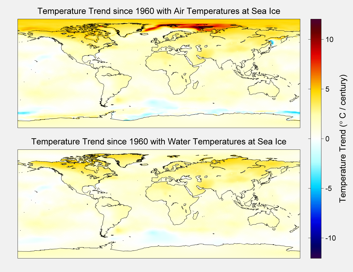
Figure 2. Trend Maps
The resultant average for each method is shown below.
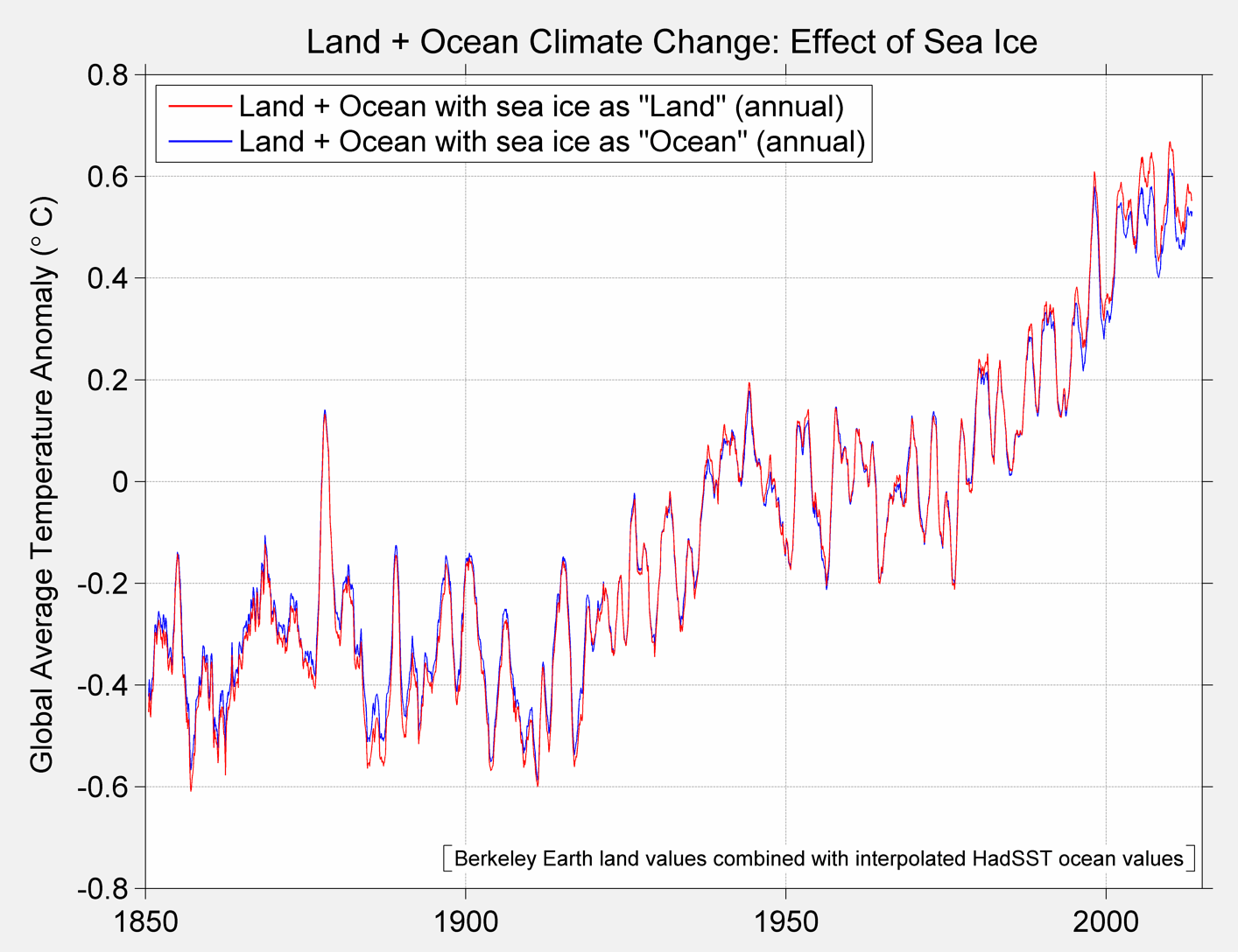
Figure 3A Berkeley Earth Global Temperature baseline and alternative treatment
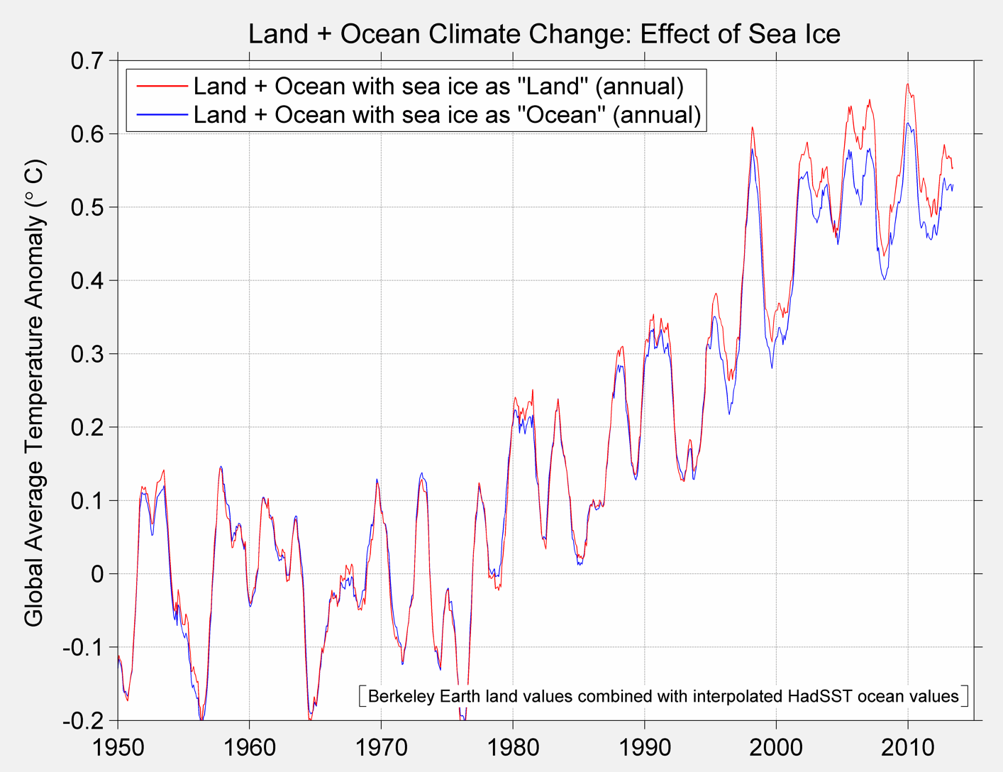
Figure 3B Berkeley Global Temperature Baseline and alternative from 1950 to present

Figure 3C. Annual Average Temperature
The reason for looking at these different approaches will also allow us to make observations about the choice that HadCrut4 makes. In their approach they leave these grids cells empty. Let me illustrate the different approaches with a toy diagram:
| 3 | 3 | 3 | 3 | 3 |
| 3 | 5 | 5 | 5 | 3 |
| 3 | 5 | NA | 5 | 3 |
| 3 | 5 | 5 | 5 | 3 |
| 3 | 3 | 3 | 3 | 3 |
Table A
In table A the average is 3.67 when we compute the average over the 24 cells with data. That is operationally equivalent to table B.
| 3 | 3 | 3 | 3 | 3 |
| 3 | 5 | 5 | 5 | 3 |
| 3 | 5 | 3.67 | 5 | 3 |
| 3 | 5 | 5 | 5 | 3 |
| 3 | 3 | 3 | 3 | 3 |
Table B
Such that when we refuse to estimate the missing data that has the same result and is operationally equivalent to asserting that the missing data is the average of all other data.
When we estimate the temperature of the globe we are using the data we have to estimate or predict the temperature at the places where we have not observed. In the Berkeley approach we rely on kriging to do this prediction. I found this work helpful for those who want an introduction: http://geofaculty.uwyo.edu/yzhang/files/Geosta1.pdf . Consequently, rather than leaving the arctic blank, we use kriging to estimate the values in that location. This is the same procedure that is used at other points on the globe. We use the information we have to make a prediction about what is un observed. In slight contrast, the approach used by GISS is a simple interpolation in the arctic. That would yield table C and an average of 3.72 as opposed to 3.67. (Note that there are times where the interpolation result will give the same answer as a Krig. ) Both approaches, however, use the information on hand to predict the values at unobserved locations.
| 3 | 3 | 3 | 3 | 3 |
| 3 | 5 | 5 | 5 | 3 |
| 3 | 5 | 5 | 5 | 3 |
| 3 | 5 | 5 | 5 | 3 |
| 3 | 3 | 3 | 3 | 3 |
Table C
The bottom line is that one always has to make a choice when presented with missing data and that choice has consequences; sometimes they can be material. Up to now the choice between ignoring the arctic or interpolating hasn’t been material. It may still not be material, but it’s technically interesting.
Once we view global temperature products as predictions of unobserved temperatures, we can see a way to test the predictions: go get measurements at locations where we had none before. Then test the prediction. With data recovery projects underway for Canada, South America and Africa we will be able to test the various methodologies for handling missing data as well as the accuracy of interpolation or kriging approaches. Another approach is to compare results from independent datasets. That is what I will focus on here.
The dataset I’ve selected is AIRS Version 6, level 3 data. In particular I’ve selected a few interesting files from the over 700 climate data files that sensor delivers. I selected AIRS primarily because of an interesting conversation I had with one of the PIs at AGU and because it allowed me to do some end user testing for the gdalUtils package for R. So this is exploratory work in progress. For the first pass at the data I’ve looked at AIRS skin surface temperature, surface air temperatures, and temperatures at 1000,925,850,700 and 600 hPA. There is more data, but I’ve started with this.
Below find snap shots from Nov 2013 for AIRS Surface Air Temperature and Skin Temperature, BerkeleyEarth and HadCrut4.

Figure 4A HadCrut
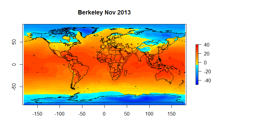
Figure 4B Berkeley Earth
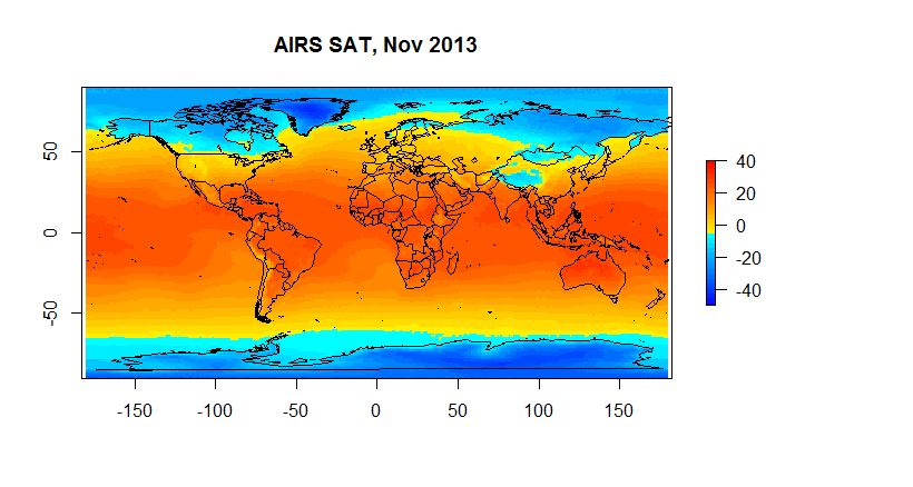
Figure 4C Airs SAT
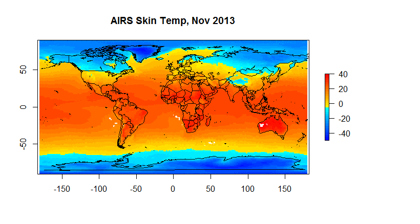
Figure 4D Skin Temperature
Hadcrut as you can see suffers from a low resolution ( 5 degrees) ; and, it has a substantial number of gaps on a monthly basis. However, when we are looking at global anomalies , the answers given by CRUs low fidelity approach end up fairly close to Berkeley Earth. If one wants to look at regional or spatial issues, Hadcrut isn’t exactly the best tool for the job.
For example, if we want to look at the arctic we have the following.
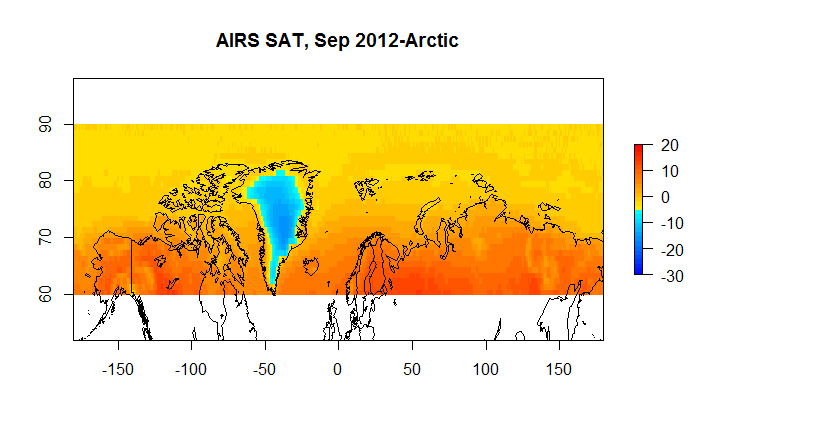 Figure 5 A AIRS SAT 60N-90N
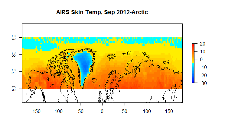
Figure 5B A AIRS Skin 60N-90N
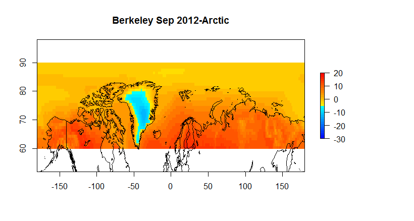
Figure 5C Berkeley Earth 60-90N
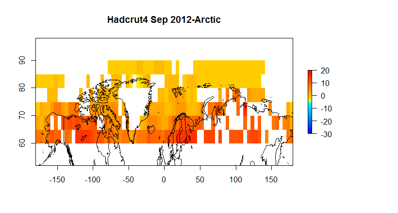
Figure 5D Hadcrut4 60-90N
The AIRS products, one should note, like other satellite temperature products, infers temperature from brightness. The simple approach of comparing the AIRS temperatures with in situ temperature is not straightforward for the following reasons.
- AIRS orbits have a 130AM and 130PM equatorial crossing time. This results in temperatures being taken at different times for the two products such that averages cannot be directly compared.
- AIRS monthly data has different counts depending on cloud conditions\QA
- Neither AIRS SAT or Skin Temp is the same as SST as collected for the Berkeley dataset
- AIRS has known biases when validated against ground stations/buoys etc.
What that means is that you do not expect the air temperature as inferred by a satellite to match the temperature as recorded by an in situ thermometer, especially given the differences in observation practice. However, the temperature fields are highly correlated and in a future post ( or perhaps paper) I’ll show how the trend in the all three ( Berkeley, AIRS SAT and AIRS Skin) are nearly identical and detail the correlation structure which is quite remarkable given the differences in observation methodologies.
To end up here are the comparison charts that most everyone will be interested in.
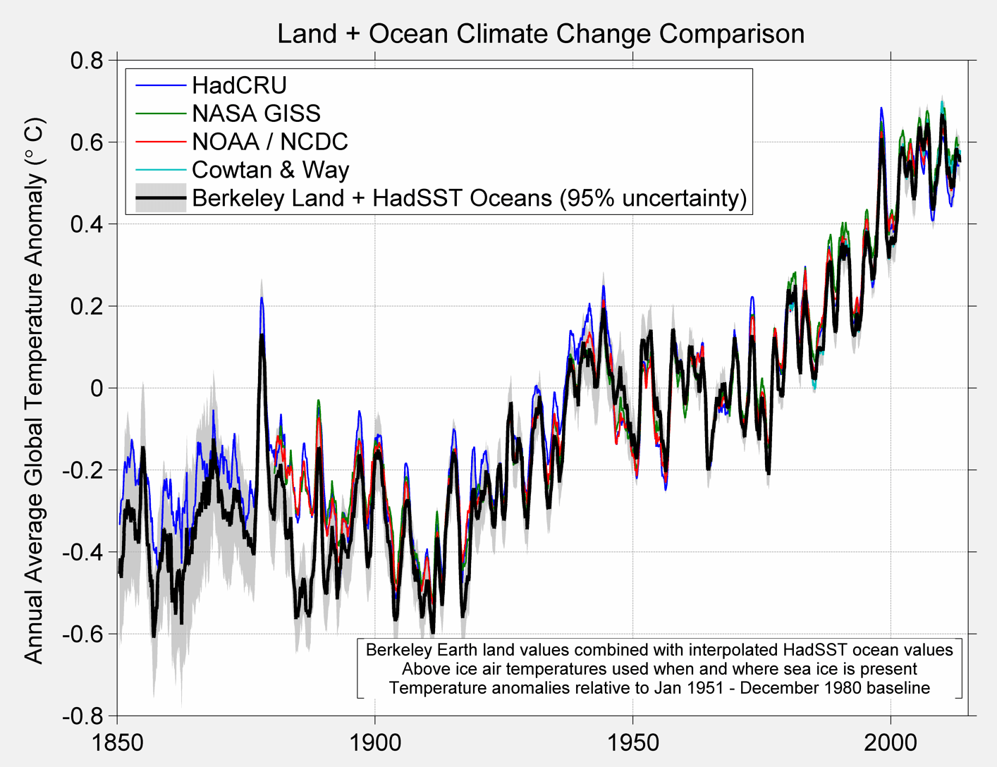
Figure 6 A. Comparison of various global temperature products
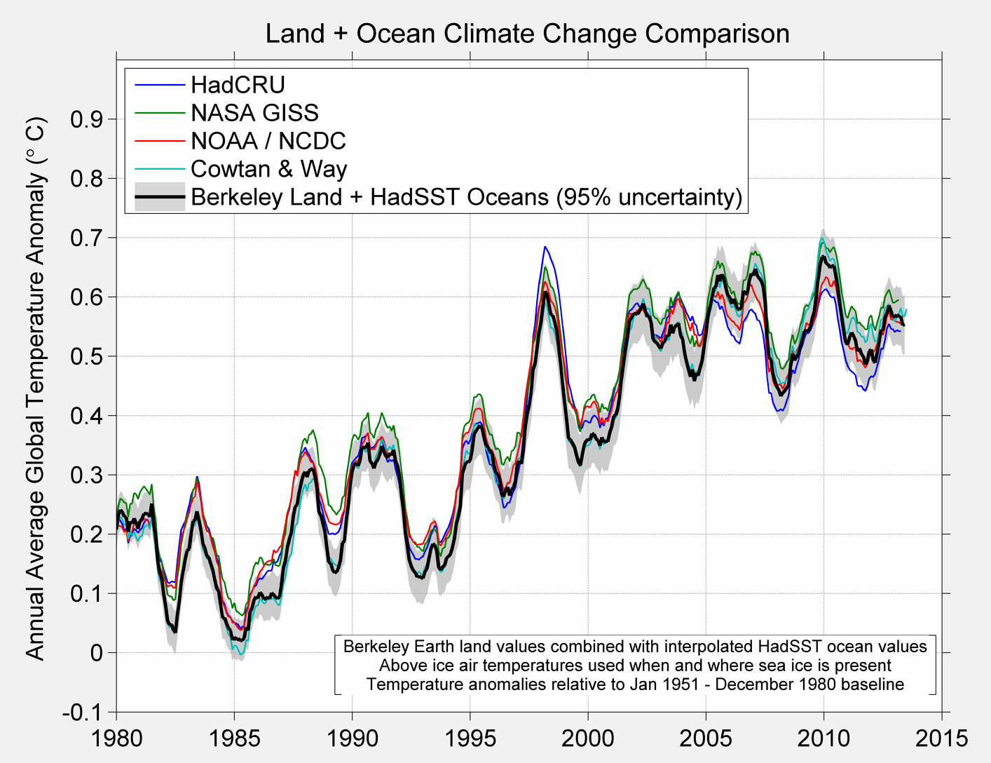
Figure 6B
If you have any questions feel free to write to me at steve @ berkeleyearth.org. There are other data products coming out that require some of my attention but I do try to answer all emails.

Nice job.
“In our solution we re-interpolate HADSST and merge it with our SAT record to produce a 1 degree product and an equal area product.”
HadSST regrids ICOADS sst from 2×2 to 5×5. In doing it curiously alters the frequency content.
They then proceed to remove more than half (upto 60%) of the variability from the majority ( >50% ) of the record.
Part of the processing involves taking the running mean of adjacent grid cells. Due to circulating ocean currents this is applying both temporal and spacial distortion. This process is repeated indefinitly until it “converges”.
http://judithcurry.com/2012/03/15/on-the-adjustments-to-the-hadsst3-data-set-2/
“By calling it an index, I mean to draw attention to this combing of SST with SAT to produce a metric, an index , which can be used in a diagnostic fashion to examine the evolution of system. ”
A notable distinction. One which you, yourself, seem to forget about by the time we get to figure 3. A quick scan seems indicate you forget that it’s and “index” almost as soon as you point the distinction.
Well, you have a nice polished “product” and I’m sure you’ll manage to raise some money selling it.
Lovely graphics.
I had a chance to look at GG’s post on analyzing the SST time series recently and thought he did a good job. There are indeed discontinuities when different calibrations were in place, such as during WWII.
This is very similar to what Leif Svalsgaard reported when the sun spot records transitioned from JR Wolf to HA Wolfer. Each scientist had his own sunspot classification system and the entire record had to be rescaled according to change in calibration.
Leif has a very long row to hoe before he gets the solar physics community at large to agree with his contention that there is no such thing as the modern solar grand maximum. The very fact that there has been a huge diminishment of sunspots over the last two cycles seems adequate to dispute it. Observation methods have not changed in the past 50 years so in order for there be a big decline in the past 20 means there has to be significant height from which to fall. Logic isn’t your strong suit but even you should be able to follow that.
My problem with exercises like this comes down to the data and methods. There is no way that I can see where we can use the data to come up with such a small change given the uncertainties and biases that are in play. Using computer algorithms to create temperature readings where none exist seems inappropriate as does using data sets that have been ‘adjusted’ many times without proper justification or archiving of old data. It seems to me that all of this exercise depends on the integrity of gatekeepers who have shown bias. As such it is doubtful that the results are meaningful. But even if they were, there is nothing in the data that can filter out the effects of land use changes from those of CO2 emissions and natural variation. As such it is difficult to establish any causality or even speculate whether the changes are beneficial or harmful.
Other than that, everything is great.
Mosher has plenty of faults but I don’t believe that molesting and torturing data is one of them. In other words, while I acknowledge there are three kinds of lies (lies, damned lies, and statistics) I trust Mosher to not use tricks to hide declines and so forth like the usual suspects in the CAGW charade.
Mosher has plenty of faults but I don’t believe that molesting and torturing data is one of them. In other words, while I acknowledge there are three kinds of lies (lies, damned lies, and statistics) I trust Mosher to not use tricks to hide declines and so forth like the usual suspects in the CAGW charade.
Sorry David but there seems to be a problem with my computer or the posting system so let me do this again.
Perhaps things are different now but when I was studying science in university we had to ensure that the quality of our data was good and that the methodology made sense. I don’t see either in this project. When you have some data coming from stations that are near parking lots or air conditioning exhaust, when sensors have moved from open fields to enclosures that are near brick walls it is hard to pretend that some magic algorithm can flesh out the changes and come up with a valid conclusion. Now it may be that I don’t really understand all the math and the methodology but I don’t think that is it. We can only get the information that is in the data and if the data is as flawed as it seems to be no amount of lipstick will give us much that is of use, particularly when we are looking at such a small change in a chaotic world where changes are driven by natural factors.
@Vangel
There is a lot of room for mischief with the older temperature data certainly. That said there is high resolution global coverage since the beginning of the satellite era in 1979. The older instrumentation continues to collect data in the meantime so methodologies to fill in missing data or correct for various changes in pre-satellite data can be verified by ensuring it performs as expected by comparing the synthetic data with actual data from satellites.
That said I tend to take global average temperature in the pre-satellite era with a grain of salt because of the hideously inadequate instrumentation that was never meant to detect changes on the order of hundredths of a degree per decade across the entire globe. Regional land-only averages in the US and Europe are more credible. Satellite data is the gold standard though and we have 35 years of it now almost half of which shows no statistically significant warming despite pCO2 increasing steadily through the entire period. The CAGW narrative is going down like a lead balloon with proper instrumentation for the task so the quality of the pre-satellite data is fast becoming irrelevant in supporting the alarmist narrative.
@Vangel
In any case the BEST narrative doesn’t really support AGW anyway. The uptrend from 1920-1940 is as severe (0.3C/decade) as the uptrend from 1980 to 2000 (0.3C/decade). CO2 doesn’t explain the former and if we assume the record is accurate that then proves there is something else that can drive global average temperature upward at that rate. And right on time beginning in 2000 GAT leveled off like it did in 1940. Now we get to see if it starts to decline or rises or what. We need a longer satellite record for attribution purposes. The pause is bringing the whole CAGW house of cards down. The decadal warming trend since 1979 is now down to 0.12C/decade. Less than 0.10C/decade is statistically insignificant.
@Vangel
It may be worse than I thought. I haven’t run the numbers in a while.
http://www.woodfortrees.org/plot/rss/every/plot/rss/every/trend/plot/rss/every/trend/detrend:0.44
The link above is the entire satellite record (35 years) which shows a 0.44C GAT increaase over the entire period. The decadal trend is 0.44 divided by 3.5 or 0.126C.decade. That’s not alarming and actually borders on statistically insignificant. As the pause continues this trend number falls further. If it continues 10 more years or the recent flat trend turns into a decline like it did in the 1940’s then it’s game over for AGW alarmism.
Hi Greg,
You said: “HadSST regrids ICOADS sst from 2×2 to 5×5. In doing it curiously alters the frequency content.”
This is incorrect. ICOADS is a data set of marine meteorological reports. ICOADS summaries are 2×2 gridded summaries of these reports. HadSST3 is based on 5×5 gridded summaries of the reports. We do not regrid from 2×2 to 5×5. Given the differences in grid resolution it would be far more curious if the frequency content didn’t change.
Anyone interested in finding out more about the HadSST data sets can find copies of the HadSST2 (Rayner et al. 2006) and HadSST3 (Kennedy et al. 2011) papers here:
http://www.metoffice.gov.uk/hadobs/hadsst2/
http://www.metoffice.gov.uk/hadobs/hadsst3/
The current version is HadSST.3.1.0.0. For those interested in understanding the uncertainties in SST data sets in general, it’s necessary to consider how HadSST3 stands in relation to other SST data sets. A recent review paper on uncertainty in SST data sets which I wrote can be found here:
http://www.metoffice.gov.uk/hadobs/hadsst3/uncertainty.html
For the exceptionally patient, there’s a more lengthy discussion on Greg’s critique of the HadSST3 data set here:
http://judithcurry.com/2012/03/15/on-the-adjustments-to-the-hadsst3-data-set-2/#comment-252391
Judith Curry’s own critique of the data set is here:
http://judithcurry.com/2011/06/29/critique-of-the-hadsst3-uncertainty-analysis/
Cheers,
John
@David Springer:
More to the point, it is unnecessary to trust Mosher, because he provides us with complete code and data, so we can reproduce his work.
QBeamus
You mean like it’s unneccessary to trust Google because they publish the source code for the Android O/S?
LOL
“A quick scan seems indicate you forget that it’s and “index” almost as soon as you point the distinction.”
maybe I should have been more verbose when I wrote this:
” In other words, it is not, strictly speaking, a global temperature although everyone refers to it as such. ”
Let me spell it out for you. Everyone refers to this thing which is techically an index as a temperature. I do not intend to change that usage. In other words I will continue to refer to it as a temperature as people customarily do, but for technical accuracy if you want to refer to it as an index, please go ahead and do so. But understand that I will refer to this index as a temperature. In fact I may use the terms interchangably.
For example,
We often refer to “the inflation rate” technically, at the bottom line, the inflation rate is actually based on an index like CPI.
You will see people refer to it as CPI or as the inflation rate. Nobody who understands the issue goes around correcting people when they use the term inflation rate to say ” but you said the inflation rate was really based on an index”
at the bottom its an index. I’ll refer to it as an index or a temperature. But dont be fooled.
QBeamus continues the trend of giving BEST more credit than it deserves:
This isn’t true. The last time there was a post on this site about new BEST results, I directly asked for data and code to be provided. Steven Mosher refused, saying the results they put all over their website were preliminary and they’d provide data and code when BEST “published” their results.
Another issue I’ve raised is the previously published BEST papers do not have code and data available to reproduce their results. The data and code published to the BEST site is inconsistently updated, and it’s impossible to tell what, if any, was used with which papers. In fact, you cannot even see the various iterations the BEST temperature series has gone through to compare them.
The latter is especially important since while BEST’s uncertainty levels have a directly demonstrable flaw at the moment, they were far more screwed up in previous iterations. A person seeking to demonstrate these problems with BEST’s uncertainty levels would want to be able to look at the code to see why the calculations have changed throughout various versions, but the data and code necessary for such is not available.
No need to mince words, Brandon. It’s a clusterphuck. Spaghetti code. A version control system used for online storage and distribution only because it was inherited and the users have no experience with VCS practices. Amateurish. An English major trying to be a programmer with no formal or even informal training or experience. No predecessors that knew WTF they were doing. Add some other colorful descriptive adjectives I’m sure you can come up with some. That’s the whole computational world of climate science in a nutshell. I’m surprised the usual suspects are computer literate enough to use email so they could get themselves into a scandal like Climategate in the first place.
John Kennedy says: ” We do not regrid from 2×2 to 5×5. Given the differences in grid resolution it would be far more curious if the frequency content didn’t change.”
Hi John, always a pleasure to here from you. Thank you for correcting that point.
It is almost a mathematical necessity that two different processing methods will produce slightly different frequency characteristics. However, maybe some auditing of the differences would be a good QA process.
Here for example is a quick look at extra-tropical N. Pacific SST. The spectra were done using autocorrelation function of d/dt(SST) to remove the long term trend before spectral analysis.
http://climategrog.files.wordpress.com/2013/03/icoad_v_hadsst3_ddt_n_pac_chirp.png
Now below 6 years, some differences in peak heights etc. seems reasonable for different processing and unlikely to be problematic. What I find less reassuring is the substantial changes in structure happening in the 7 and 18 year segment.
In particular the disappearance of the peak at 9.04 years and it’s replacement by something around 8 years.
9.07 is the harmonic mean of 8.85 years and 9.3 years. Both frequencies that derive from long term variations in lunar tide raising forces. It may not be helping attempts to understand decadal scale climate variation if the kind of signal is being removed inadvertently by data precessing methods.
You will surely retort that it could be ICOADS that is creating a false signal and both possibilities should be considered. The spectral analysis I used in the other article was rather simple and probably did not make the point as clearly as it could have. I appreciate your genuine interest at the time. This is something that I think should be assessed.
If I followed the description of the method correctly from the Hadley papers, much of it is done with 5 day mean “pentads”. It is at that level the three cell running means are applied in a loop until convergence.
I discussed the rather awful frequency characteristics of using running means as a filter here: If you have a sample window with just three points you will see the same problem in spades. If the process is repeated until it stops wriggling. there is a fair chance that it’s dead ;)
http://judithcurry.com/2013/11/22/data-corruption-by-running-mean-smoothers/
As you will doubtless be aware there are notable tidal components at 13.5 and 14.5 days. If the method works well it will remove much of the lunar signal from the data. In reality it is far more likely to invert part of (at about 10 days for a 15 day window) and introduce a spurious signal that does not exist in the data.
I did intend to write this up more fully with examples of synthetic data to illustrate, but since you have commented here, I’ll take the opportunity to outline where I see the problem.
I suspect from the evidence of N.Pac SST that the Hadley processing is removing a real lunar signal from the data and creating a spurious one at around 8 years.
This 9.1 signal is a very strong component in the cross-correlation of N.Atlantic and N. Pacific SST in ICOADS.
http://climategrog.wordpress.com/?attachment_id=754
Judith was co-author on BEST paper recently that found a similar result.
At a time when much effort is being put into trying to explain inter-decadal variability it would seem important for those reprocessing the large datasets to assess the effect of their data processing on the frequency content of the data and to ensure that no unintentional corruption of potential climate signals is occurring.
Best regards, Greg.
Vangel Vesovski, you miss the whole point; try a Popparian approach.
Mosher et al., have presented a hypothesis that states ‘by this means we can measure the global average temperature from 1876-2013’ and then, ‘this is what we believe the temperature changes over time to be’.
Now, one can disprove this hypothesis by providing a single fact that renders the whole model wrong. Find one fact that shows it is wrong and I am sure Mosher et al., will accept it and agree.
However, I doubt that one can find a single piece of data that can disprove the hypothesis. Instead one has to dig in the dirt and find a way to do it better, in a manner that explains why all the temperature reconstructions give, pretty much, the same global warming/cooling profiles.
What we do know is that we have different temperature profiles in different areas. looking where places have, ‘apparently’, heated the most or least.
Look at their out put, see what doesn’t fit your bias/view or the current model and then see where they may have been fooled in their approach.
Don’t see malice where there is none and don’t write off work that challenges your views, because it challenges your views.
I personally think a ‘UHI’ effect is contaminating all the temperature reconstructions, however, I cannot prove it as I am unsure how to identify the fingerprint. I sort of know how to look, but it isn’t as easy as you think. In science there is a saying ‘if it was easy, it would have been done before’.
Take as a model of station temperature as sawtooth. the slow rise is due to human encroachment and the sudden fall due to a station move. If you move the base post move, back up, to match the surrounding stations, then you will have a systemic steady rise.
Great postulate, hard to prove, especially if you are a bit old to learn ‘R’.
The Berkley Earth Global will no doubt be helpful in making short-term weather predictions in that any significant increase in rainfall above a particular region signals cooler temperatures a day or two later, because the supporting temperature will be lowered.
It may also help some to decide which side of the fence is the correct one. That fence divides the isothermalists and the isentropists – new words for your spell check it seems.
(a) The isothermalists (like Roy Spencer) believe the troposphere would have been isothermal in the absence of those “pollutants” like water vapour and carbon dioxide. The fact that the Uranus troposphere doesn’t have them, or a surface, or any direct solar radiation doesn’t perturb them as they bury their heads in the carbon dioxide hoax.
(b) The isentropists understand why there is in fact a thermal gradient in the troposphere of Uranus because they understand the implications of the isentropic state which the Second Law of Thermodynamics says will evolve spontaneously.
Dear Departing Physicist(?)
Please define your terms and document your assertions rather than make ad hominem comments.
You have not defined “isothermalist” or documented an example of the definition. i.e. terrestrial temperature varies vertically, latitudinally and longitudinally. Please document your assertion: “isothermalists (like Roy Spencer) believe”.
Please define what you mean by “carbon dioxide hoax” as that is not a scientific term.
Departing Physicist, you seem to misunderstand the Physics of atmospheres. There will be a lapse rate with or without absorbing gases as long as mixing is sufficient due to gravitational forces on the atmosphere causing a pressure gradient with altitude. However, for Uranus, you have it even more wrong. Look at:
http://en.wikipedia.org/wiki/Atmosphere_of_Uranus
to observe that Uranus does have water vapor, ammonia, methane and other absorbing gases in the troposphere portion of atmosphere. The very low external temperature that radiates mainly to space results in very low heat loss, so even the small residual core radioactive heating and captured solar radiation are able to maintain the bottom of the troposphere about 350K.
“Isothermalists” are those (like Roy Spencer, IPCC and climatologists) who believe that the Earth’s troposphere would have been isothermal (same temperature everywhere) in the absence of water vapour and radiating gases. Please see this comment and dozens of others of mine on Roy Spencer’s blog. – Doug
Leonard speaks garbage when he blames residual core heat in Uranus for maintaining a 5,000K temperature in the solid core that is about 55% the mass of Earth. Even Venus cools by 5 degrees in just 4 months on its dark side. There is no convincing evidence of any net outward radiative flux. In fact, there could be net inward flux within the margins of error in the measurements. A 5,000K surface would lose energy at a far greater rate if it were not being replenished by the “heat creep” mechanism which I have been the first to explain with valid physics. Maybe Leonard would also like to explain why the core of the Moon is still hotter than the surface ever is.
Leonard agrees that an autonomous thermal gradient forms on Uranus, even though there is no incident solar radiation reaching the base of the Uranus troposphere (altitude -300Km) and no surface there anyway.
It is, however, not pressure which increases the temperature or maintains high temperatures – that’s another old wives’ which climatologists teach themselves. To maintain a temperature In anything you need a new supply of energy to replace the inevitable losses – after all he says there is water vapour to radiate energy back out again. There is no net variation in pressure, and so no mechanism therein for generating new energy. All energy in Uranus comes from the Sun, and, as with all planets now, none are still cooling – the Sun is maintaining their current temperatures. For example, Venus cools 5 degrees at night and the Sun warms it back up by 5 degrees in its 4-month-long Venus day.
But how ironic that Leonard agrees the thermal gradient (badly named a “lapse rate”) forms autonomously even without a surface.
So. Leonard, why should we need a surface on Earth and any incident solar radiation to maintain Earth temperatures which would be almost as hot? There’s no radiative forcing on Uranus, or back radiation transferring heat from a cold atmosphere to a warm surface (against the laws of physics, but never mind) because there’s no surface or solar radiation needed on Uranus. Planetary temperatures are not determined primarily by radiative balance or forcing.
Thank you for your work on this project. I really admired the way you laid out the choices that had to be made and how they impacted the results – as well as using alternative choices. This looks like excellent work.
I too, appreciate the clear description of the choices made, along with the the description of the consideration of various rationales.
Thanks RickA,
One thing I like about working with Zeke and Robert is we all seem to share the approach of making your analytical assumptions clear and then testing your assumptions and showing the results of the methodological choices.
Zeke is especially keen on this approach.. from a programming perspective you can think of a zeke analysis as a big case statement with loops around everything so when I work with him its all about testing all your choices and doing sensitivity on all unknowns/uncertainty issues.
Loops upon loops on a signal lost in the noise. Much admiration for creativity.
===========
Thanks Steven for the excellent post.
Steve Mosher Thanks for your detailed discussion. Any comments on interpolating good versus poor quality instruments distorting the temperature where there the distribution of station quality changes? e.g., where there are more poor quality than good quality stations because of the urban heat island and related problems. See: Watts et al. 2012
PS Please check: “We proscribe this as -1.8 C in our treatment, corresponding to a salinity of about 33 psu.” I think you mean “prescribe” (to specify rather than to forbid.)
Yes, I neglected to make the change from proscribe to prescribe. Thanks.
On stations.
In July 2012 I requested the list of stations that WUWT 2012 had “reclassified” In short, they took the classifications of 1000 or so stations
and reclassifed 700 or so of them. The re classification had the effect of
Moving class 3 4 INTO class 1 and 2. This re classification of moving bad stations into a good class had the opposite effect of what one would expect:
According to them the warming trend of the good stations went down,
In July of 2012 when I requested the data I expressed concern that this data
( stations classification) would never be made public unless they were able to publish a paper. I privately suggested that they do a data paper. Just document their process and their classification methodology.
Any way, they proceed with their paper. we will see.
Recently I decided to reverse engineer their classification and its pretty clear why they dropped 300 stations from the re classification and how this decision actually drives the results.
Next, as to interpolating bad and good stations. Here is how it works.
If a station switches from good to bad ( or bad to good) and If that switch
is material, the algorithm will pick up the change and split the station.
That is, if a station was over grass and you switch it to being over concrete
And if concrete makes a difference, then the series will be split and there will be no trend bias. However, if a station gradually moves over time from a 1 to 2 to 3 to 4 to 5, that will be harder to detect. We (Zeke) is currently working with a team on testing methodoligies using blind studies to address this problem.
On other thing to note is that the kriging approach can handle estimating bad/good station provided the station geographical information is high quality. In my reverse engineering of WUWT I’ve been able to remotely distinguish between the good class ( CRN12) and the bad class(CRN345) with a pretty high degree of accuracy using automated processes. That will actually allow me to go back to the 1980s or so and look at the history. And further to do this globally. However, this is contingent on having very good GPS data for each site. NCDC has been pretty good about this ( problems still exist) and the WMO has been less diligent. As a data geek I’d like to see them exert the effort to survey all the stations, but we will see. I dont expect them too but I should be able to illustrate the importance of this geo data.
Finally, have a look at the AIRS data. AIRS estimate of the air temperature from 2002 to present has no UHI, no micro site. It’s independent of in situ measurement
inferring SAT from the temperatures taken at 1018 hpa and all the pressure levels above that. Examine the trend in SAT from 2002 to 2014 using AIRS. Next, if UHI and/or microsite biases the trend taken from in situ thermometers what would your expectation be?
You’d expect that the trend from in situ would exceed the trend taken from a satellite product. Correct? And if those two trends are the same what would you conclude?
Thanks for the detail. Look forward to your publishing your analyses.
Re “if the two trends are the same”? Presumably that other natural and/or anthropogenic climate variation causes are greater than the UHI. Alternatively, the measurement uncertainty may be so high relative to UHI that the UHI is hard to detect against natural background trends. e.g. such as ocean oscillations such as PDO/ENSO etc on top of warming from the Little Ice Age, with integrated impacts of solar and cosmic variations on clouds. e.g. In the TRUTHS project, Nigel Fox of NPL shows current satellite uncertainty is 10x greater than what it could be.
I’d say my position is that UHI is real but relative to other variablity it is small and thus lost in the noise. That is a result that not many people are happy with, but everything I know suggests that this is the reason
1. we know UHI is real, we have many many many independent studies of it.
2. we also know that it is variable: it varies in space and time and magnitude and even includes negative UHI.
3. we dont see the signal in global studies. that implies:
A) bad methodology
B) bad data
C) a signal lost in the noise.
On A) between me and Zeke and a bunch of other people we have tried several methodologies: pair stations, grouped stations, kriging, IDW etc
so, I dont think its methodology. However McKittrick has some points that
need further comment. However his methodological critique will also apply to WUWT 2012, directly. I suspect he wont make it although it applies.
on B) by bad data I mean bad or inaccurate urban/rural categorization.
This is an open area a research for me. I’ve tried a bunch of things, some I’ve done double blind studies on..
on C) This is what I would say is my considered judgement. I’ve tried every method. I’ve tried more than thousands of urban/rural classsification methods so, I have to say C is my considered judgment
Steven re; UHI lost in the noise on global basis
No doubt on a global basis. But it is far from lost in the noise when considering percentage of human population living within the UHI effected regions, eh?
May we say that man’s clear signal locally(urban heating) is lost in the overall noise of global warming just as man’s clear signal locally(atmos. CO2 rise) is lost in the overall noise of climate change.
========================
Steven Mosher
Thanks for obvious major effort backing thoughtful observations.
Re Ross McKitrick’s relevant papers
McKitrick’s latest paper suggests you both may be right, depending on how the analyses are done. cf
McKitrick, Ross R. (2013) Encompassing Tests of Socioeconomic Signals in Surface Climate Data. Climatic Change doi 10.1007/s10584-013-0793-5.
Steven Mosher | February 25, 2014 at 12:57 pm |
As some comfort to your position, (C), inference tends to support your view by multiple methods.
For example:
1. Estimation tells us urban coverage is small compared to the overall globe, so the intensity of UHI would need to be several orders of magnitude higher (and all in the same direction, and relatively constant) than other effects to approach the same signal strength. Studying the intensities shows this just isn’t supported by the data.
2. Bounds checking tells us that for urban areas, increased CO2 emission and decreased CO2 draw down correlate at least linearly with growth of area and often exponentially, so CO2-related effects will always grow at least as fast as UHI, and always dominate over UHI.
3. Supposing a world covered with urban area, UHI would approach unity with AGW, so at some point logically the distinction is unimportant.
Steven Mosher
PS As you prepare your papers, may I encourage using the international standard on uncertainty:
GUM: Guide to the Expression of Uncertainty in Measurement BIPM
Evaluation of measurement data – Guide to the expression of uncertainty in measurement JCGM 100:2008
There are two points in time that show extreme deviation from a model of temperature rise. On the warm side it was the Heat Wave of 1977. Some would say that this had some UHI effects because the worst of the heat wave was centered in cities such as NYC. Yet if one looks at the adjacent years, this year globally is just a temporary glitch. Same goes for the Cold Sunday of 1982, a temporary glitch.
What this shows is that the natural variability overrides the noise caused by the urban heat effect.
And I think finding any long term bias is going to be difficult as well based on what Mosh has said.
Bart R Feb 25 1:17pm – you say “urban coverage is small compared to the overall globe, so the intensity of UHI would need to be several orders of magnitude higher …..”. That’s rubbish. As Steven Mosher points out, missing data is guessed from existing data. Most stations are in urbs (or at airports which have the same problem) so the influence of urban stations on the final average is extreme.
Your points 2 and 3 are complete nonsense. One of the main points here of having a “global temperature” is to help work out the effect of CO2, if there is one. You are invalidly assuming that UHI and CO2 operate in lock-step, which is absurd – placing a patch of concrete near a station, instead of somewhere else, creates an artificial increase in “global temperature” yet makes zero difference wrt CO2. Your proposal would measure only UHI, and would provide no information at all on the influence of CO2.
Using only rural temperature data doesn’t change the outcome appreciably. Urban heat islands simply don’t contribute much to to global average temperature. Hell continents have a limited contribution because 71% of the planet is ocean. You need to come to grips with UHI not being a significant factor in GAT. If you want to make a coherent argument you can argue that for people who live in and near urban areas UHI is a big deal. So it’s a big deal for billions of people. It just isn’t a big deal for fish, crab, penguins, polar bears, wolves, elk, and so forth who don’t live in and near urban areas.
kim
Did you mean:
“May we say that man’s clear signal locally (urban heating) is lost in the overall noise of global warming just as man’s clear signal
locallyglobally (atmos. CO2 rise) is lost in the overall noise of climate change.”Max
Steven Mosher
Thanks for a good summary.
This work will undoubtedly give us more information on the surface temperature record than we had before, even if it is still a long way from complete, due to factors many of which you have mentioned.
The UHI conclusion (small positive effect, but “lost in the noise”) is a major improvement over the earlier conclusion of the BEST land only study (a negative UHI effect!), but it still raises questions about the many other independent studies, which have been made and which point to a global impact of several tenths of a degree, so I’d say the jury is still out on whether UHI (including station shutdowns and relocations, land use changes, etc.)is “lost in the noise” or a bit more significant.
At least nobody is saying it’s a negative impact!
Max
Sorry for you die-hard UHI believers, but not much urban activity near this glacier:
http://www.nytimes.com/2014/02/26/science/study-links-melting-peruvian-ice-cap-to-higher-temperatures.html?ref=science&_r=0
One more sign of net energy in the climate system increasing as all that former ice has been transformed into water or water vapor.
Mike Jonas | February 25, 2014 at 2:52 pm |
“..missing data is guessed from..” what a nice way of describing interpolation. Guess what? Taken into account in the ratio of urban vs non-urban, in processing interpolation with and without urban and comparing, in multiple other checks done by B.E.S.T. and others. If you don’t know what you’re talking about, better to phrase it in the form of a question.
It’s not an assumption that UHI is lock-stepped with CO2. It’s a general fact based on observation that spawning urban sprawl spawn more CO2 emission and less CO2 uptake in turn, and the multiple manifest mechanisms of such exceed linear correlation, notwithstanding your contrived example. If you don’t think so, then ask yourself what generally comprises “urban” vs “rural”: roads, industries, homes and highrise buildings vs. plants and agriculture. Go ahead, do a side-by-side comparison of what each of these elements does to CO2 by area. It’s not an assumption. Assuming it’s an assumption, now _THAT_ is an assumption.
Bart R Feb 25 3:15pm – re your “It’s not an assumption that UHI is lock-stepped with CO2.” : you missed the crucial word – ‘operate’ – from my original statement. I was talking about how UHI and CO2 operate on the temperature. Something I thought would be clear in context, but obviously not, as your reply was irrelevant to the argument. My apologies.
Max there is no global study that shows an effect.
Regional? Yes using other data sets.
R. Gates
Since you posted your South American glacier story on the other thread, let me give you two more data points on South American glaciers:
http://news.nationalgeographic.com/news/2009/06/090622-glaciers-growing.html
Must be the negative UHI impact down there, right?
Max
Mike Jonas | February 25, 2014 at 3:56 pm |
“Operate” begs the question.
Steven Mosher
It is true that I have not seen a single “global UHI study”.
But I have seen independent studies from:
USA (several local plus two for entire USA)
Canada
Mexico
Japan (several)
China
S. Korea
Turkey
Nigeria
In addition, several studies world wide were cited by climate scientist Douglas Hoyt on Roger Pielke’s website on March 29, 2006 (comment 16)
These all show a significant UHI effect.
Then there are studies, such as the one by Ross McKitrick on the impact of station closings and relocations.
Around two-thirds of the weather stations, mostly in remote and rural locations in northern latitudes and many in the former Soviet Union, were shut down between 1975 and 1995, with over 60% of these shut down in the 4-year period 1990-1993. This coincides exactly with a sharp increase in the calculated global mean temperature (particularly in the Northern Hemisphere), adding credence for a significant UHI distortion of the surface temperature record. There is good reason to believe that, prior to the breakup of the Soviet Union, these remote Siberian locations systematically reported lower than actual temperatures, in order to qualify for added subsidies from the central government, which were tied to low temperatures, so as this distorted record was removed, it resulted in a spurious warming trend. For a graph showing this correlation see:
http://www.uoguelph.ca/~rmckitri/research/nvst.html
http://www.uoguelph.ca/~rmckitri/research/intellicast.essay.pdf
All temperature is local, anyway, so any UHI effect would also be local, even if it has a measurable impact on the regional or global record.
But I’m glad the new BEST study no longer suggests a cooling distortion from UHI as the earlier one did.
The open question is just whether or not the UHI distortion is several tenths of a degree over the 20th C, as the above studies suggest, or small enough to be “lost in the noise”, as you suggest.
Max
Stephen Mosher
Any comments on how BEST manages the large drop off in stations ~ 1990?
Thanks Max for ref to McKitrick’s The Graph of Temperature vs. Number of Stations
McKitrick notes:
A Test of Corrections for Extraneous Signals in Gridded Surface Temperature Data, Ross McKitrick & Patrick J. Michaels
Climate Research 26(2):159-173 (2004) – Paper
Bart R Feb 25 5:05pm |you say “Operate” begs the question.”. Not at all. The question is how CO2 operates on temperature. This has been estimated using inter alia observed temperature change, one component of which is UHI. Until UHI is eliminated from the temperature record, estimates of the effect of CO2 are unreliable. CO2 and UHI operate quite differently on temperature, so it is incorrect to argue as you did that a correlation between the amounts of urban development and the release of CO2 implies that UHI and CO2 can be lumped together.
No, Max, I meant ‘locally’, but hesitated over it for fear of being misunderstood. Temperature response is only one location of climate response. But, the analogy kind of sucked anyway.
=======================
Steven Mosher: I’d say my position is that UHI is real but relative to other variablity it is small and thus lost in the noise. That is a result that not many people are happy with, but everything I know suggests that this is the reason
In a manner of speaking, everyone wants the Holy Grail of temperature data, but instead we have actual data and analyses such as yours. I think the position that you stated in that quote is hard to beat right now.
Mike Jonas | February 25, 2014 at 9:12 pm |
Again, begs the question. The data, the observations, estimation, bounds checking, reasoning by induction, all are in agreement. UHI is clearly a real thing. Odds are that UHI plus cooling due urban shadow effect are slightly net positive, in general, but we can’t really avail ourselves of the same inferences as operate vis UHI-GHE to the same degree, so cannot even say which effect dominates in this tiny effect: heat island or cooling shadow.
We can observe that UHI as a signal is miniscule compared to the signal that clearly does stand out statistically correlating CO2 and temperature, and that this GHE signal is present with approximately equal strength even when everything that could plausibly be regarded as urban is removed from the record.
Therefore, it is simply illogical to even talk about UHI, an effect we know to be real but immeasurable, unless and until dramatic new developments come about making such claims possible to support. I’d be glad if we could filter for UHI; I’m all about embracing knowledge based on observed fact. We’re not there yet.
Maybe once we resolve volcano, ocean overturning, polar ice, and a dozen other larger complicating factors, we might see climatology in a position to talk about UHI. Until then, hypotheses non fingo.
Matthew R Marler, I think the approaches people have taken to trying to find a UHI signal thus far have been misguided. Back when Steven Mosher and I were discussing a collaboration on the UHI issue (which fell through), I suggested an alternative approach I think would be far better.
Rather than looking at the end results of data processing and trying to find a UHI signal, my proposal was to work from the beginning. The first step would be to try to extract a UHI signal from the input data (multiple potential signals might be extracted). Then do the data processing on the data with and without that signal. Additionally, we’d create synthetic signals to mimic the UHI signals we find/might expect to see, add those into the data and run the processing.
The point of tests like these would be to track how a UHI signal might affect the data processing. It’d allow us to see how much of an effect it might have, how much it’d get smeared around, etc. With that information in hand, we’d be able to tell if there’s a potentially discernible UHI signal, and if so, what form it might take.
It’s a fun project, and I’ve actually done some work on it. I just have too many other things I can work on which have more immediate payoffs.
Bart R Feb 25 3:15pm says “We can observe that UHI as a signal is miniscule compared to the signal that clearly does stand out statistically correlating CO2 and temperature”. Tosh. re UHI: We haven’t been able to quantify UHI, and we haven’t been able to identify the CO2 signal in the temperature record. A number of heavily flawed attempts to isolate UHI have been made, such as the absurdly broad-brush BEST paper, and I have said in another comment here that a reasonable way to set about it would be to painstakingly go through stations one by one (as stated here, I did this some years ago, and the result was signifcantly lower temperature gradients at rural stations). Broad-brush techniques don’t work because the relevant factors are very local to each individual station. re CO2: the CO2 signal has never been identified in the modern temperature record. On the contrary, the temperature record has been used to estimate the effect of CO2, and the results have been absolutely woeful resulting in an absurdly wide range of estimates (viz. the IPCC report). To any sane person, the wide range indicates that the method is flawed, ie. that the temperature is not in fact driven much by CO2 (to put it the other way, if CO2 was the main driver of temperature, then the effect of CO2 could be identified quite accurately from temperature). Bart R’s approach to CO2 here smacks of circular logic.
manaker
Yes Im aware of the regional studies. You’ll find my name attached to one of them ( in a buried sort of way)
The problem with the regional studies are various, but most notably the ones that show the highest effect do not select from the stations that the global product uses.
So, you are making an asssumption: here is that asssumption.
A) we found a UHI effect using stations x1-xn
B) the global product, however, uses stations y1-yn
C) we Assume that the effect we found in a region, using different stations
will also be found at the global level.
That assumption has been tested.
That assumption is wrong.
The ball is in the skeptic court.
1. we have studies that show UHI at single stations. Given
2. we have studies that show UHI at a regional level, state and country, Given.
3. Hypothesis: this same bias will show up in the global product.
Test results to date: NEGATIVE.
You have a theory: bias that shows up locally and regionally will show up
globally.
People have tested that Hypothesis.
Results: Hypothesis FALSIFIED.
However, no skeptic accepts Feymans rules or Poppers rulz when it comes to this question.
A. They clearly hold the theory that IF UHI shows up in local records it must show up in global averages.
B) No skeptic has the BALLS to test there own theory. They are fooling themselves.
C) when others ( even former skeptics) test the theory and find that it fails
Skeptics universally refuse to even adjust their theory. Something must be wrong with the experiment or data..
Steven Mosher is insulting people, claiming skeptics have no BALLS, are biased and blah, blah, blah. He conveniently ignores the fact the last time he did that on this site, I offered to do everything he claims skeptics don’t do. I even designed a conceptual framework for testing for a UHI effect which has never been used before and would provide a direct way to extract its signal, if it has one. In fact, the framework I designed would allow us to directly determine the potential effects of any UHI signal people might think exists in the underlying data.
The worst part is he and I were supposed to do that as a collaboration so there’s no question he knows I’m willing to do it. The only reason we didn’t is issues between the two of us got in the way. If he would have brought a third party in to mediate like he was supposed to, or if someone else were to offer to work on the project with me, I’d be working on it right now.
Mosher has a horrible habit of insulting people based upon fabrications. It’s annoying.
It’s a character flaw to be sure. No one is perfect but some people are farther from perfect than others. ;)
Mike Jonas | February 26, 2014 at 4:27 am |
Bart R Feb 25 3:15pm says “We can observe that UHI as a signal is miniscule compared to the signal that clearly does stand out statistically correlating CO2 and temperature”. Tosh.
Let’s see how well your refutation stands up to the certainty of your assertion.
re UHI: We haven’t been able to quantify UHI, and we haven’t been able to identify the CO2 signal in the temperature record.
The former is true, quantifying UHI beyond, “probably as small as urban shadow effect, but at least so small the signal of UHI has been lost for over half a century”, is beyond present methods; the latter, correlating CO2 and temperature, has been done quite convincingly and is supported well by BEST and others. Your premise thus is faulty.
A number of heavily flawed attempts to isolate UHI have been made, such as the absurdly broad-brush BEST paper, and I have said in another comment here that a reasonable way to set about it would be to painstakingly go through stations one by one (as stated here, I did this some years ago, and the result was signifcantly lower temperature gradients at rural stations).
Heavily flawed how? Specifically. All of this number? What’s the number, exactly?
By “absurdly broad brush”, do you mean “statistics as practiced by Nobel laureates and representing generally accepted and highly reviewed”?
It appears so. That you reject the concept of regression to the mean, or don’t apprehend it, doesn’t make the concept the absurd thing in the relationship between you and statistics, or what you call “broad brush”.
Broad-brush techniques don’t work because the relevant factors are very local to each individual station.
Bzzzt. Exactly wrong. Statistical techniques work because irrelevant factors fall out due regression to the mean; what is left can be tested for relevance using a wide range of statistical methods; BEST, and others have rigorously applied such tests and there is nothing in your claims that substantiates inadequacy of BEST’s methodology. Indeed, you appear to go to great pains to sidestep examination of just how well BEST does when held up against your claims.
re CO2: the CO2 signal has never been identified in the modern temperature record. On the contrary, the temperature record has been used to estimate the effect of CO2, and the results have been absolutely woeful resulting in an absurdly wide range of estimates (viz. the IPCC report).
See, now this sounds like a claim of circular reasoning, or begging the question, but isn’t. Please, by all means, show me specifically where this has been done, if my surmise of where we have to guess your accusation is aimed errs. Cite the passages from the IPCC report (which one, the latest, the first, all of them?!).
While the temperature record has been used to estimate the effect of doubling CO2 specifically on the temperature many times and in many ways for various spans of time and ranges from regional to global, that isn’t circularity: that’s direct calculation from observed data, and it has been done to confirm hypothetical calculated values from first principles.
While the range of estimates at earlier points historically were quite wide, it has lately and with some confidence been reduced to a more narrow range of probable values as understanding of what is being asked improves. As Climate is a probabilistic subject, a range of probable values is not absurd, it’s expected. Can we expect narrower ranges? Likely not by very much, due the complexity of the subject.
To any sane person, the wide range indicates that the method is flawed, ie. that the temperature is not in fact driven much by CO2 (to put it the other way, if CO2 was the main driver of temperature, then the effect of CO2 could be identified quite accurately from temperature).
You must be talking about that 97%-99% of non-sane people who reportedly understand this in a way you don’t, due to being actual qualified students of climatology.
Bart R’s approach to CO2 here smacks of circular logic.
Let’s examine ‘my’ “circle”, vs. your circle:
Mine: The explanation with the fewest and simplest assumptions, the most parsimony of exceptions and the greatest universality of application for the interaction of sunlight, surface and atmosphere dictates by the properties of radiant transfer that as CO2e rises, surface temperature tends to rise in a roughly logarithmic relationship, allowing for the complexity of the global climate, for time spans that allow confident recognition of trends in measurement, which are observed to be on the order of 32 years.
Yours: You don’t like any CO2 explanation; any CO2 relationship deprecates an explanation; UHI doesn’t have a CO2 relationship, ergo UHI disproves CO2 explanations.
Which of these is a circle?
Steven Mosher
Re UHI
You may wish to compare your surface analysis with Jin’s satellite UHI index.
Jin, Menglin S., 2012: Developing an Index to Measure Urban Heat Island Effect Using Satellite Land Skin Temperature and Land Cover Observations. J. Climate, 25, 6193–6201.
doi: http://dx.doi.org/10.1175/JCLI-D-11-00509.1
Brandon Schollenberger: I think the approaches people have taken to trying to find a UHI signal thus far have been misguided.
I think there is a lot of wishful thinking in this field, and a lot of post-hoc reassignments of thermometer stations to classes of “good” and “bad” and so on. So far, each time someone has proposed a new way to classify “good” and “bad” stations, those lacking and those having urbanization, those kept in open fields and those moved to airports, etc, the systematic application of the the classification reveals a smaller UHI than is wished for (or hypothesized) by the proponents (this happened to Anthony Watts paper of a couple years ago, for example.) I prefer to think, as you do, that the UHI effect has been underestimated, but I have not read an analysis that supports my preference.
Matthew R Marler, I think you’d find the discussion I had with Steven Mosher on this issue back when we were going to collaborate on it interesting. One of the main issues I raised is past examinations of UHI grossly over-simplify things.
Every attempt at searching for a UHI effect I’ve seen has focused on its effect on the overall temperature trend. I think that’s silly. We could stipulate there is no UHI effect on the OLS slope of the data set, and that still wouldn’t rule out the possibility of there being a UHI signal. Adding a sinusoidal signal to a series may be trend neutral, but that doesn’t mean it has no effect.
Suppose, for example, the UHI effect was greater on dry, hot days. If the amount of UHI increased over time, that could show up by increasing extreme temperatures. Maybe heat waves wouldn’t appear so bad. Maybe 1998 wouldn’t be such an outlier. Those would be meaningful effects from UHI even if they didn’t change the trend in a discernible way.
Personally, I’m not convinced the UHI effect is trend-neutral. I’m also not convinced it’s large. What I am convinced is looking for it only in the results of linear regressions is stupid. There are so many different issues with linear regressions that using them as a metric for a signal is just bad.
Brandon Schollenberger: Every attempt at searching for a UHI effect I’ve seen has focused on its effect on the overall temperature trend. I think that’s silly.
I think the overall temperature trend is most diagnostic of the hypothetical CO2-induced global warming; and of any “global” warming. Sure the air temperature warms downwind of a new power plant, but the important question is whether that warming contributes a large portion of the estimated global warming of the region and the globe.
Steven Mosher:Skeptics universally refuse to even adjust their theory. Something must be wrong with the experiment or data..
Oh, quit that. What you say just isn’t true.
Steven Mosher
Re: “Skeptics universally refuse to even adjust their theory. Something must be wrong with the experiment or data.”
Universal overstatements does not help your case.
Logically you include: 95% of climate models agree – the observations must be wrong”
When 95% of 34 year projections by current models are too hot (ie exclude observations/evidence), I do NOT see that as following the scientific method.
You show some evidence of UHI being lost in the noise. McKitrick shows other evidence that it is not. The debate/scientific process is still open.
David L. Hagen | February 27, 2014 at 10:36 am |
For the sake of clarifying by imaginary example what is meant by “begging the question” (aka “circular reasoning”), suppose one were to fictionally argue that Mosher is likeliest right and McKitrick probably wrong because Mosher’s arguments invariably are sound inference based on rigorously-checked facts (except in the rare case where he misreads something elementary), while McKitrick’s reasoning is invariably faulty; we know Mosher’s inference to be sound because his facts are rigorously-checked; we know Mosher’s facts are rigorously-checked because they fill in gaps in McKitrick’s facts in such a way as to deprecate McKitrick’s arguments and thus support Mosher’s inferences; we know McKitrick’s reasoning is faulty because McKitrick’s conclusions disagree with Mosher’s conclusions from rigorously-checked facts and inferences. And we know the facts and inferences of Mosher’s arguments to be correct because they disprove McKitrick’s claims.
See how there are circles and circles within circles requiring we assume the conclusion in the premise?
That’s circular reasoning, or begging the question.
On the other hand, we could simply observe some third, objective standard removing the dependence on assumptions from the conclusions, such as a well-designed experiment where McKitrick’s and Mosher’s competing claims are treated as predictions, and the outcomes depend on the one claim being false while the other is true. That would remove the circularity and furnish evidence for one case or the other.
Bart R
Building on ad hominem attacks does not constitute rational logical thought. Study to avoid that and to explain circular reasoning or “begging the question”
David L. Hagen | February 27, 2014 at 6:04 pm |
Fallacies, like sorrows, often come not single spies but in battalions.
One could remove ad hominem by replacing “Mosher” with “Category A”, and “McKitrick” with “Category B” in this entirely imaginary and contrived example.
It just appears this Climate Etc. has turned its attention toward Circular Reasoning more than usual of late, and no imputation on your own logic was intended.
There were other fallacies in the argument, as well, but it appears we’re more sensitized to ad hominem than other types of fallacious argument; or at least when our own bull is gored, around here.
I notice that significant differences between the BEST update and the GISS historical record occur during the mid to late 1880’s, right after the Krakatoa explosion. BEST shows this interval much cooler (~ 0.2C) than GISS. Figure this discrepancy out and you have the differences in the estimation algorithm.
James Hansen has always said that Krakatoa’s impact on global cooling was much less than believed. But now we may have to reconsider this. Hansen is right if we believe GISS during the early years. My CSALT model places the effects of Krakatoa much less than Pinatubo, but if I use BEST, Krakatoa becomes a much more significant cooling agent for a few years .
The rest is pretty much a wash between the records. There is always that bad stretch during World War II and the Korean War where temperature needs recalibration due to the military taking over measurements, and it is hard to maintain consistency.
As always more information and analysis is good stuff.
I’m really hopeful about some of the massive data recovery efforts on going now. Beyond that there are large archives in China and India that are not shared. India, for example, would make a great place to do regional UHI studies, but I dont know what it would take to make them cough up the data.
I’ll check the projects again and see how many will cover the time period in question..
Steven Mosher
Here’s a link to two UHI studies from India
http://cities.expressindia.com/fullstory.php?newsid=229978
http://www.hindu.com/2007/04/11/stories/2007041120840500.htm
Max
Manaker.
1. You assume that UHI that shows up in India must propagate to the global record.
2. That is a testable hypothesis.
3. Did you test your hypothesis? or are you fooling yourself.
I tested your hypothesis. Guess what? Its wrong.
Further In one of the global tests I did using daily data India as a whole showed NEGATIVE UHI. Go figure that
manaker. One link was broken.
Further one of the studies compare the center of the city to the airport.
it reported a delta C.
That is not the issue.
This is hard for people to get so let me explain.
Thermometer A: Over concrete. temperature 10C
Thermometer B: Over grass. temperature 8C.
Now, impose a climate trend of 1C per century.
in 100 years A will read 11C, and B will read 9C.
The trend will not be effected. Biased stations do not effect the trend
They WILL effect the trend IF the bias changes. That is why you have to look at changes in the station history. If these changes are abrupt
Then you can split into two stations and not effect the trend.
Plus your example proves the points I made above. It is nothing new.
This is what my experience digging through data has shown as well.
Steven Mosher: Biased stations do not effect the trend
They WILL effect the trend IF the bias changes. That is why you have to look at changes in the station history. If these changes are abrupt
Then you can split into two stations and not effect the trend.
I agree (fwiw, probably 2 cents or less.) I think people (e.g. Brandon Schollenberger) are hoping or hypothesizing that there is a large subset of the records that have been perverted or distorted by non-abrupt urbanizations over long time periods that you can not identify and “split” as you describe. I think the best summary to date is that their aggregate effect is not very great.
I do something in the processing of data that i think goes a long way to reducing UHI effects, I generate a day over day change station by station, basically a daily anomaly for a single station, then I aggregate this data into groupings based on day, year, location depending what I select to report on.
I think this reduces lots of sins of changes to station environment.
I find this obsession with concrete and parking lots funny. A cursory look at where the warming is occurring most, which is in the northern continental interiors (Canada, Russia), and as you go towards the Arctic, shows that it seems uncorrelated with the regions of growth of concrete and parking lots. What is all this about? Could something else be going on in the big picture?
For what it’s worth Matthew R Marler, I don’t hope or hypothesize that. I have no ideas on how large a subset of the data might fit that description.
In fact, one of the tests I’ve proposed we do is see how large such a subset would need to be before it would have discernible impacts. People can say “not much” data fits a descriptions, but how much is “not much”? And how much does it need to be before it matters? I think if we can answer those questions we can actually start getting clear answers about UHI.
Imagine if we could say, “For UHI to affect global trends, X% of the data would need to be biased to at least Y magnitude.” People who think UHI is a serious problem could run their own numbers and come up with the X and Y they believe is “right,” or they could try to show X and Y are met. That would give clear-cut, falsifiable arguments.
A cursory look at where the warming is occurring most, which is in the northern continental interiors (Canada, Russia), and as you go towards the Arctic, shows that it seems uncorrelated with the regions of growth of concrete and parking lots.
A substantive set of the T instruments in High lat Russia and Siberia are taken at Airports.They are duel purpose (civilian/military) and have meteorological mitigation systems, such as anti-fog and heated runaways etc installed from the late 70,s
…and the Arctic ice loss and glacier over the last few decades independently backs up that there are things going on apart from urban effects.
Who knows.The increase in both Antarctic sea ice,and the recent reversal in Antarctic blue ice suggest natural variation is at work in the SH.
http://www.esa.int/spaceinimages/Images/2012/03/Change_in_blue_ice_height
Until you take UHI (Urban Heat Island) into account properly, BEST may be the best we have, it is still wrong. To do that discard the false urban/rural dichotomy ASAP and replace it with a sane urbanization/ruralization one.
In practice it means you do not only need a snapshot of population metadata at a specific instant, but a full population history. Population of the entire globe doubled almost twice during the 20th century. It is well documented, that there is a warming bias of some 0.25 K related to each doubling of local population density and this logarithmic relation extends even to settlements with fairly low population, well within your “rural” category. Therefore it does not make sense to compare warming rates at sites which are currently “rural” against those that are “urban”, but you have to pick sites where local population density have not changed and compare them to sites where it has increased at a certain pace.
Distribution of global population is fractal like, most of it concentrated over a small fraction of land, so temporal UHI effect only gives a minuscule contribution to global averages. However, it is not true for temperatures measured by meteorological stations, because their location is not random relative to said fractal, but is always close to human habitation or place of vigorous and growing economic activity (like airports), otherwise maintenance costs would skyrocket.
Please come back as soon as this necessary work is done and report, based on a careful study conducted along the lines described above, if more or less than half of the infamous 20th century warming was due to UHI.
Observed divergence between land warming rate during the last 35 years as measured by satellites or meteorological stations should serve as a dire warning.
Give up the ghost, BP.
The reason that the WUWT-crowd is so concerned over the UHI effect is that they realize land warming is twice that of ocean warming, and if they can somehow “disprove” the historical records, everything will be fine and dandy.
The “powers of denial are strong” is the only answer that I can come up with.
Hi BP,
Full population history was one of the urbanity proxies we used in our recent JGR paper, at least for the U.S.: ftp://ftp.ncdc.noaa.gov/pub/data/ushcn/papers/hausfather-etal2013.pdf
@WHUT
No one asked your inexpert opinion on the matter. And, by the way, has it ever occured to you that perhaps, just perhaps, there was a methodological flaw indeed in the way UHI effect on temperature trends was handled so far by the community? Is it not a more straightforward explanation of skepticism?
Not for you, but to the benefit of the rest of the audience: 35 years trend (between January 1979 – December 2013) in variance adjusted version of CRUTEM4 land air temperatures is 253 mK/decade. In the same timespan trend of RSS lower troposphere temperatures over land is 176 mK/decade. The former estimate is 44% higher than the latter one. Why is that? Does anyone in her right mind thinks average tropospheric lapse rate should increase with increasing temperature (and more atmospheric moisture)?
This is another effort to “make a silk purse out of a sow’s ear.”
Too many legitimate question remain unanswered. Who agreed to deceive the public after WWII about:
1. Japan’s atomic bomb facility ?
2. Neutron repulsion in nuclei ?
3. Hydrogen production in stars ?
40% of all stations are located in areas where the population density is less than 1 person per sq km.
When you estimate the temperature using only these stations, the answer is not different than using all stations.
Sorry.
@Zeke Hausfather
Thanks for the paper. It seems to be better than most attempts, but it is still lacking in that it is arranged around the flawed urban-rural dichotomy, even if one of several metrics to establish classification was “historical population growth during the period where high‐resolution data is available (1930 to 2000)”. It is not clear either how airports were treated, where local population density might have been stable, but traffic has increased tremendously during the last century with huge changes in the built up environment.
Barrow, Alaska is a rural site by any measure, but there is a considerable UHI effect on temperature trends there.
International Journal of Climatology, Vol 23, Issue 15, pages 1889–1905, December 2003
DOI: 10.1002/joc.971
The urban heat island in winter at Barrow, Alaska
Kenneth M. Hinkel, Frederick E. Nelson, Anna E. Klene, Julianne H. Bell
@Steven Mosher
Population density of North Slope Borough, Alaska, to which Barrow belogs to, was 0.04 persons per sq km in 2000, which is definitely less than 1. Still, UHI in the center of the village is 3.2 K under calm conditions (2.2 K average), while it was obviously none in the old times.
Sorry. Next strawman?
“Thanks for the paper. It seems to be better than most attempts, but it is still lacking in that it is arranged around the flawed urban-rural dichotomy, even if one of several metrics to establish classification was “historical population growth during the period where high‐resolution data is available (1930 to 2000)”. It is not clear either how airports were treated, where local population density might have been stable, but traffic has increased tremendously during the last century with huge changes in the built up environment.”
Zeke and I have done a couple studies on airports and Muller did a couple before we joined.
Here is what we found.
Airports versus non airports. No difference.
Second in one of our studies I created a urban/rural classification that
put airports into the urban class. It worked like this.
if you look at impervious area ( one of the classification methods) you will
capture a percentage of airports. If you add nightlights you’ll capture some more. If you use population you’ll capture some more, then I used the world wide airport location database for about 100K airports and picked up the remaining airports. These were added to urban.
The result? no difference.
Further when Zeke and I joined BEST I brought this classification system to the science team. We re ran our UHI results using this methodology.
No difference.
prior to our joining the team Muller and Rohde had done some study of airports versus non airports. Depending on the region of the world you get different answers. For example in japan airports have a cooling effect.
The reasons for this are pretty clear if you understand the role having a long obstacle free fetch and the role advection has on UHI at low windspeeds ( 7m/sec) and low surface roughness.
Steven, If you haven’t actually done it, I suggest you go out with some thermometers and measure some temperatures (which I have done). I can feel the effect of UHI while riding a motorcycle between the city (even a small number of buildings), to no buildings just trees and grass. There is a big difference in air temps. You can see this with with a simple weather app just switching between different stations over a few dozen square miles.
“Steven, If you haven’t actually done it, I suggest you go out with some thermometers and measure some temperatures (which I have done). I can feel the effect of UHI while riding a motorcycle between the city (even a small number of buildings), to no buildings just trees and grass. There is a big difference in air temps. You can see this with with a simple weather app just switching between different stations over a few dozen square miles.”
Of course you can. That has never ever been the issue.
The question is.
1. Is the effect persistent? answer no. The UHI effect is modulated by
A) synoptic conditions– clouds, rain, winds, season. It is worse
on clear calm days.
2. Does the effect necessarily impact the average: answer no.
this is one benefit of using tmax+timin. To bias that metric the UHI
signal has to emerge at the right time of the day.
3. Do we see the effect on a global basis. no. If we pick and choose a station ( the right synoptic conditions) we can see it. If we pick and choose a region ( cherry pick stations and synoptic conditions) we can see it.
If, however, we use a GLOBAL dataset, and use all the data for every month, then the effect gets suppressed below the noise floor.
In isolation, picking the right days, picking the right stations, we can see the signal. The literature is FULL of these examples. But globally over all space and time that signal gets washed away.
I suggest that MiCro and BP go up to Barrow and measure the temperature with rectal thermometers. That way they can also diagnose their condition when they freeze their butts off.
As long as you do dilute UHI with enough other stations I agree it.
I know you don’t like how I processed my data, but I think it has a real impact in reducing the effect of UHI and station movement and such. By comparing day over day changes it removes many of the uncertainties with the measurements. Time of day bias is reduced, most cases the same person would take the measurements at least for longer periods of time, Land use development would happen slowly, so deviations of actual temperature will be done slowly, or it shows up in only one(few) records.
Yesterday’s Rise minus Last night’s fall show a much different temperature record.
ROFLMAO, you are just so funny!
But I think my backyard has been colder than Barrow this winter, and I’m already logging temperatures, wind, humidity, rain, when it’s water not snow, I can also measure Tsky with an IR thermometer, such fun.
BTW, 2013 was about a half degree colder than 2012 54.5452149 compared to 54.02496493. Well that’s the difference from actual measurements anyways.
@Steven Mosher
You still don’t get it. It does not matter if an airport, as it is now, is cooler or warmer than an urban center close to it. What matters is what was the influence on thermometer readings of a tenfold increase in traffic and construction of several new runways covered in tarmac at that very site.
As for meteorological stations near settlements, look for cases like West Virginia, where population in 1939 was 1,868,000 while in 2013 it is 1,854,304, in other words, where population is stable. Population density there is 29.5 persons per sq km, considerably higher than your limit of 1, but I bet effects of changing UHI on measured temperature trends is much less there than on the practically uninhabited North Slope of Alaska. I mean something like this, just performed with an even more thoroughgoing &. careful analysis, that’s all.
A profound paradigm shift I suggest.
Sorry Barrow is classified as Urban. for the city as a whole the density is roughly 80
area is roughly 50 sq km, population 4000
but you actually have to look at the census tract data reprojected onto a grid at the station. its still counts as urban. Do that work and get back to me. Its not hard the census data is in arcgis format, you just need to grid it, or you can use in that format and do a little extra work. Not that hard.
Or you can compare the old barrow station with the CRN close by and actually see the differences in metadata and why Barrow is a urban site by my classification system whereas Barrow CRN is not.
Sorry barrow is an old favorite.
On other thing BP.
in addition to looking at the population at the site, I’ve also done sensitivities to look at the MAX population in any 1km grid cell within
5km, 10km and 20km of the site. so while the actual site may have
zero population, we dont stop there. we look for ANY urban population within 20km. Thus suburban sites would get tested as urban. further
cool parks ( areas in the urban fabric that have low populations or zero pop) would also get analyzed as rural in one case and urban in another as wew do sensitivity on the “population density” definition: namely population at the site and the max population within X km. Further, we look at actual population count.
Then in one study we made a combined urban classification. that looked at population, nightlight lights, impervious area, airport, such that if ANY of these indicators said it was urban it was classsified as urban. This effectively tested the error due to classification error.
Still no significant effect.
Finally, all classification system will have error ( producer and consumer error) so finding an error gets you no where. You have to demonstrate that the error is material in the global average
Steven Mosher – you are looking in the wrong place for UHI. Read Watts et al 2012.
Web,
The only reason skeptics were concerned about UHI was the possibility that claimed levels were a possible source of error. They are, but may not be as significant as some thought. The point was to find out how much it was. Most (but obviously not all) skeptics, including myself, are not for or against AGW, they only want the facts and honesty. If you were half as concerned about TRUTH, as opposed to trying to force your opinion through, you would have been a skeptic of many of the claims made in the name of AGW, especially on models. The fact that there has been some warming since 1850 does not appear to be contradictory to past trends, or threatening to humanity, as the extreme AGW fraction claimed, and the recent leveling off clearly threatens the whole AGW position. Why don’t you man up and admit we don’t know the final result and direction from here.
@Steven Mosher
I have already done that above, you may have missed it. Global average temperature trend is 44% higher in variance adjusted version of CRUTEM4 (surface stations) than in RSS lower troposphere temperatures (satellites) over land in 35 years between January 1979 and December 2013. Now, RSS measures tropospheric temperatures (up to 8 km), while CRUTEM4 measures surface temperature at 2 m from the ground. However, if the huge difference in trends is not an artifact, tropospheric lapse rate should increase considerably over time, which is pretty much impossible. Moist lapse rate is way smaller than dry one and a warmer atmosphere holds more water vapor, not less. Therefore one would expect just the opposite of what was observed.
The only way out is a systematic warming bias in temperatures measured at surface stations and UHI is matching the bill perfectly. The difference in 35 years is 0.27 K, surface stations are running that much higher at the end. In the same timespan world population increased considerably, it was 76% of a doubling on a logarithmic scale. Therefore at the average site local population density has increased in the same ratio. If decreasing lapse rate is not taken into account, it implies an average UHI of 0.35 K per doubling of local population density, which is surprisingly high, but at least the right order of magnitude based on a plethora of UHI studies. It may have something to do with the fact, that world GDP more than doubled in 35 years, which means more economic activity and more built up structures per person at the average site.
If you happen to know any other reasonable explanation for the mismatch between warming rates of land surface and bulk troposphere over it, please come forward.
Me too!. But my interest is no so much in the science of climate change as in the impacts, their probability and the uncertainties.
What is the damage function? Are GHG emissions likely to be more good of more bad over the time period we can reasonably foresee – and that we can implement policies that will succeed in doing what their proponents claim they will achieve?
Is the risk of any warming our emissions cause likely to be more or less than any sudden cooling averted (climate changes suddenly, not as per the IPCC and model projections). Are our GHG contributions to the atmosphere more likely to delay or shorten the time to the next sudden climate change event? Is it more likely to delay the next cooling event or bring forward the next warming event? And which consequence is worse – an increased magnitude of sudden warming or a decreased magnitude of sudden cooling.
When we think about all this, we really don’t have much climate science that is relevant for policy making, do we?
The real reason – Péter – is:
http://www.astro.ulg.ac.be/~mouchet/OCEA0033-1/GlacialWorldAcctoWally-sm.pdf
Or is it Berényi?
@Robert I Ellison
It is funny, I know, but we write names here in reverse order. That is, Péter (Peter) is my first name, which, obviously, comes last. Thanks for the book.
Peter,
Sorry – meant to link this – http://judithcurry.com/2014/02/25/berkeley-earth-global/#comment-466424
Lenny,
To quote BP “No one asked your inexpert opinion on the matter”.
I have a model of global warming that I have worked on over the past year. The model does not “man up and admit we don’t know”, what the model does is organize the science of what we do know.
It includes the stuff that Wyatt and Curry know, what Scafetta knows, what Bob Carter knows, and what other skeptics know. It then tells us how much those factors contribute to warming.
They might not like the results but that’s their problem, not mine.
BP – than you for so clearly describing the problem – urbanization vs. urban – that I have struggled to put into words. And thank you for continuing to push SM and others to do this analysis. I don’t understand why so many are resistant to what, to me, seems a logical “check” to do on the data at the very least.
Look at the laughably misplaced precision that Mi Cro offers up from his home brew:
54.02496493
This guy can not be a real scientist with that kind of rookie mistake, and he compounds it by asserting that his anecdotal measurements from his backyard hold any kind of significance.
We would give him a break if this was a grade school science fair, but come on.
Contrast that to what the dedicated volunteers at BEST are doing. Mi Cro is the poster child for what’s wrong with Team Denier.
Webby, I’m glad you bring this up, to be honest I’m not sure exactly how this should be treated. The source data has one decimal place, but the numbers I quoted are the average of 3.6 million such numbers.
From Wiki:
Since once you throw data away you can’t recover it, I leave the calculated scale that sql avg generates based on the input data scaled to 1.
Would it make you happier if I rounded to a scale of 1, even if wiki says my precision should be better than my measured precision?
BTW, it is easy enough to round the values I provided in your head, if it would make you feel better.
Mike jonas.
Wuwt 2012 was released as a draft and then taken down
Because of issues found by zeke. Steve mc apologized for missing the obvious mistake.
At that time I asked for the data and was refused even when I promised to sign a non disclosure.
Second that paper is about micro site not uhi.
Third I have subsequently reversed engineered the station
List. Around 30 percent of the stations were dropped from the classifying protocal.
The answer changed.
If it were tree rings you would hollar
I hope Mann loses his court case so that I can start calling Watts a fraud.
@Robert I Ellison
Nah, I don’t think it can hold water, so to speak.
This kind of thing can certainly explain transient differences, in fact no one would expect tropospheric and surface temperatures be identical. However, what I am talking about is a multi decadal divergence, increasing with time. There are no such long term changes in either the Pacific or elsewhere. In fact there is not much trend in precipitation, if anything, it is increasing. Which means a lapse rate decreasing with time, getting closer to the (smaller) moist lapse rate, implying a faster warming in the bulk troposphere than on the surface. Which is not the case according to CRUTEM4. Sorry.
@k scott denison
You are welcome.
I do not understand it either. To miss such an opportunity one either has to be less smart than average or forced to fight against some inexplicable internal resistance, which overpowers his mental capabilities, eventually. A sad state of affairs, really.
Unfortunately this misguided treatment of the temporal UHI effect has got so entrenched in mainstream climate science, that folks seldom give it a thought, in spite of carelessness being one of the gravest sins in science.
Steven Mosher – I didn’t know that Watts 2012 had been taken down. Pity, because I think it was on a reasonable track. Some years ago (well before Watts 2012) I did an analysis of temperature trends in Australia, using only long term stations with reasonably full data. I went through all the stations classifying them rural or non-rural based on proximity to structure, using Google Earth. The result was significantly lower temperature trends across the rural stations. All the data, including all the Google Earth views, was supplied. I was a severe critic of the way the Best project set about the rural/non classification, and explained why on ClimateEtc. Your attempt looks equally bad because you are trying to broad-brush the distinction, instead of taking the trouble to classify each individual station on its own merits. That’s what Watts 2012 was trying to do. As I said, I think it was on a reasonable track and it’s a pity it didn’t survive.
Webby
You’ve got it a–backward.
The land record shows more rapid warming than the sea record.
http://www.woodfortrees.org/plot/hadsst2gl/from:1900/trend/plot/crutem4vgl/from:1900/trend
Since 1900 the land record shows a decadal rate of increase of 1.08/11.4 = 0.095C per decade, and the sea record shows 0.78/11.4 = 0.068C per decade.
Over the same period the land + sea record shows a warming trend of 0.85/11.4 = 0.075C per decade
http://www.woodfortrees.org/plot/hadcrut4gl/from:1900/trend
But most of the difference between land and sea may be the result of a spurious UHI signal in the land record.
That’s the point here.
And this supposition seems to be backed by several studies from all over the globe.
Let’s say, for example, that the land record includes a spurious 0.026C per decade UHI effect (or a total of 0.30C over this 114 year period).
Then it would only have a “real” warming trend of 0.069C per decade, compared to the sea record at 0.068C per decade.
And the global warming, after correcting for UHI, would have shown warming of 0.069C (instead of 0.075C) per decade, or 0.78C versus 0.85C over the 114 year period.
This is just an example, Webby, but it could also be closer to reality than the record as we now see it, without correcting for the UHI effect.
As Mosh writes, such an impact would essentially be “lost in the noise” (0.07C difference in the warming over 144 years or 0.006 per decade difference).
Max
Peter,
You are wrong on all four counts.
The UHI explains nothing.
The land/ocean contrast mechanism – and the difference between surface and tropospheric temperature – is explained by the relative lack of water on land and the difference therefore in lapse rate. Not merely in the study I linked to.
The Pacific Ocean decadal regimes are widely recognized. Seriously – where have you been?
e.g http://earthobservatory.nasa.gov/IOTD/view.php?id=8703
Some areas of the globe has seen falls in rainfall and other not.
e.g http://www.ipcc.ch/publications_and_data/ar4/wg1/en/figure-3-14.html
The annual drought severity maps I linked to earlier showed increasing areas under drought over the last decade or so – although perhaps the total rainfall increases as hydrological patterns shift in response to the 1998/2001 Pacific Climate shift.
e.g. http://journals.ametsoc.org/doi/abs/10.1175/JCLI-D-12-00626.1
Mi Cro, If you can not understand why writing 54.02496493 as a value is pointless, there is no hope for you.
You must have taken the short bus to school.
What I said was:
I learned from stacking astrophotography images you keep all of the precision in the resultant data until the very last thing, you get better images.
Also let me point out that BEST is to thousandths of a degree, which is 2 decimal places past the starting temperature data. Does Steven have no hope as well?
And I see the parameters you get from your curve fitter are carried to 4 and 5 decimal places, which is trained by feeding in temp data that is also originally limited to a single decimal place. So you must be hopeless too.
Well, we all know that you are a chronic liar Manacker, as that is exactly what I did say — ” land warming is twice that of ocean warming”
Just give it up. You ain’t adding any value with your habitual lies.
WHT “The reason that the WUWT-crowd is so concerned over the UHI effect is that they realize land warming is twice that of ocean warming,”
You are implying 1 that the sun gives twice as much heat over the land as it does at sea and 2 that there is no heat transfer from the land to that great capacitor the sea to equalize it all out.
What planet??
Why don’t you read this Angie Baby:
http://contextearth.com/2014/01/25/what-missing-heat/
I explain how the land shows a different temperature rise than the ocean..
You and your Aussie buddies should learn that you can’t live on rhetoric alone.
bby
Let me get this straight.
I’m a “chronic liar” because I happened to agree with you that the land record showed more rapid warming than the sea record?
Huh?
Looks like you are starting to “lose it”, Webby.
But I’m not going to call you a “chronic liar” because of that – just an illogical and unpleasant nerd.
Max
That response was directed at “Webby”
Webby
Glad you got it right this time.
You’re making progress.
Now read the rest of my comment, explaining where you may have gotten it a–backward.
It’s simple: an unknown (but maybe not imperceptible) UHI distortion may be a partial reason for an apparent greater rate of warming over land than over the oceans.
But, as I pointed out, UHI cannot explain the whole warming trend, even if it is a significant part of the land warming trend.
Max
Sorry BP.
If you want to compare the temperature trends of satillite products to the surface you’ll have to wait for my next post.
I’ll be looking at two measures which are superior to TLT.
Mi Cro, I carry my correlation coefficient in the CSALT model to 5 decimal places because the CC is approaching 0.999.
How do you like them apples?
Kind of hard to argue with success. MNFTIU.
But it’s all nonsense according to you.
Do you ever tire of being a fool?
Mi Cro,
You carried 10 significant digits from a ridiculous measurement you took in your backyard.
I carried 5 because the correlation coefficient approaches one asymptotically. If I took the complement of CC, I would have used two significant digits. This would have been equivalent to a scaled error estimate, which would have needed only a couple of significant digits. Understand how that works?
Speaking of not reading, the temperature data I posted was from the NCDC Global Summary of Days data set and each value was the average of 3.6 million station records, which I did say when I posted the numbers. Yes I suppose I could have rounded the data to thousandth of a degree, but I found when dealing with comparing averages of millions of records, sometimes those digits aid comparison, but physically I doubt anyone can tell the difference of a tenth of a degree without a thermometer.
I mentioned my station as I use it to get continuous weather monitoring so I can understand trends so as I write code I have a little more insight into how sampled data relates to actual weather.
@Steven Mosher
No, I do not have to. That’s the nice thing about science; if you have the resources, you can do it yourself.
Just in case you have missed the point, I have already compared them and they are inconsistent with each other.
Only your reply to my challenge is postponed until your next post, in which you are supposed to resolve the contradiction.
Please, don’t. I mean you can look at any number of measures, but do not try to move the goalpost until the current issue is settled.
So Mi Cro doesn’t know what he is doing with the data he is trying to analyze. Now we know that the number with the excess significant digits is some sort of average he calculated. There are many reasons not to use absolute temperatures and instead use anomalies, but apparently Mi Cro has not caught on yet.
Thanks, Steve. How soon until the Berkeley Global Earth is formally introduced?
Heh, once moshe’s taken all the heat.
=======
hard to say here is what we have on our plate
1. Google product ( forth coming)
2. 1/4 degree CONUS and Europe
3. Global Daily Land back to 1880.
4. Global Land Ocean
5. Data paper
6. Validation Studies ( for methodologies)
7 Out of sample Studies.
The biggest issue is picking which ones we want to do papers on and which ones would actually be of use to people and which ones will have a chance of being published because of “novelty” requirements. Doing a better job on estimating is not a scientific finding that most journals want to publish.
Dead right! That’s why climate science is not much use for policy analysis. Engineers and economists are the ones who have to do the real work and get the data right.
I think Richard Tol is one of the few people who have been doing really good, objective research into impacts, damage function and estimating the economic consequences of GHG emissions. And he’s been dedicated to it for over 20 years.
Mebbe ’98 was the dead cat bounce.
=====
Can anyone explain the logic of taking (Tmax + Tmin)/2 from a couple of thousand land stations and mixing this with either coastal sea temperatues (are they also means) or with satellite data inferred from infrared cameras to me ?
Could someone also start presenting sea temperatures alone, as this must be the only relevant measure.
Argonauts in search of the Holy Algrailrithm.
=========
It’s been done. Lift a finger and do a Google search on SST .
BTW, why would sea temperatures be the only relevant measure? Have humans made the move to living in the ocean?
I don’t think this Engineer was being so superficial, though I understand your misapprehension; ‘sea temperature’ is ambiguous.
Ocean Heat Content: Listen to Papa Pielkie, and pray for Josh Willis.
===================
Why on earth would anybody pray for Josh Willis? Lol.
The Engineer,
You are expressing the frustration of Technicians and Engineers about the instrumentation side of Climate Science. The Min/Max temperature scheme came about when that was the only practical way to collect climate information – computers and automated data collection was about a century away. Overall accuracy when all the factors including thermometer calibration, human factors, and instrument installation are considered probably provide better than +/- 2 degrees Fahrenheit accuracy. That was quite reasonably assumed to be adequate for understanding the variety of climate conditions in different parts of the world. Since all readings were manually collected, one time per day hi/lo readings were all that were practical except in a very few locations. We thus ended up with a long term temperature record consisting of daily hi/lo readings.
A record with an accuracy of only +/- about 1 degree Celsius is what climate researchers have to work with which is obviously inadequate for the job of studying long term temperature trends of roughly that same amplitude. We thus see the campaign to squeeze more accuracy out of that record through various statistical manipulations. Examination of the data collected by the recently installed U.S. Climate Reference Network show that the hi+lo/2 values can differ from actual average temperature by +/- 1 degree Celsius, depending upon station latitude other local factors.
So… That Sow’s Ear, Silk Purse thing comes to mind doesn’t it? But it is what we have to work with. Folks just seem to forget that though the original hi/lo data collection scheme was a magnificent effort that achieved its original intent of cataloging climate conditions for many locations on the planet, it was never intended to provide the accuracy required for reliably detecting climate trends of only a degree or two Celsius.
explained in the text.
in short. SST was combined with SAT because MAT had more warts than SST, and you can show that WRT trends it makes no difference.
also. its 40000 stations, although truth be told you only need a couple hundred.
also, (Tmax+Tmin)/2 works just fine if your concerned with trends.
The Engineer says: “Could someone also start presenting sea temperatures alone, as this must be the only relevant measure.”
I’ve been presenting sea surface temperature data for more than 5 years at my website:
http://bobtisdale.wordpress.com/
Many of the posts are also cross-posted at WattsUpWithThat.
Pray for Josh Willis’ “speed bump”
That would be a ridiculous waste of praying time. Not as bad as praying for Russian seamen who were in no imminent danger, but still a waste.
JCH, the Praying Time Management Consultant.
==============================
Excellent Job Steven. A very valuable contribution to climate and weather analysis. Thanks for the detailed explanation.
Thanks. The scientific credit needs to go Robert Rohde. As I explained around here somewhere, my contribution is primarily data monkey and end user support along with some EDA when I get the chance. If the EDA looks interesting I pass it on to Robert.
The code file is 2GB! Not a practical download. Presumably because it also contains all the data.
Can you give a link to just the code?
I’ve noticed this before about some scientific IT projects. I know it’s extra work, but good practice would be to isolate code from data, so that regressions can be quickly run with modified data and/or code. And don’t tell me to do it myself, pay me and I will, although I’d guess there are people more qualified with the products used.
http://berkeleyearth.lbl.gov/downloads/Berkeley_Earth_nightly.tar.gz
or use the SVN.
2GB is nothing. The AIRS data used above took me 3 days of download.
it really messes with watching netflix.
Unhelpful answers to simple requests encourage scepticism.
2GB is practical. Arguing that it is not merely fuels the excuses that data is too hard to store or share so we better not do it. The download provides everything you need to see what we did. We’ve spent years arguing and sending out FOIAs for just this sort of thing.
If you only want to grab the code, then use the SVN. which is
here
http://berkeleyearth.lbl.gov/svn
I’ve posted the login and password in the clear.
That means if you know what youre doing as a programmer you can log into all the code. Even stuff we are working on.
Now you want me to wipe your butt and create a special download for you.
Well, that would be extremely bad practice. Log in, you know how to use SVN. do a check out, you know the command.
I would have preferred GIT but what the hell for years I demanded access to code and data, asking for it on my own personal silver platter plays DIRECTLY into data deniers hands who argued that they didnt want to give me code because i would be a pain in the ass and ask for support.
So, when Hansen finally posted his code, nobody cared that it was Fortran on AIX.. folks just went about the job of making it work. Because the demand for transparency had been met.
The hammer is there. Don’t ask for a smaller one because you never swung a big one. learn to swing a big hammer or get off the construction site.
“I’ve noticed this before about some scientific IT projects. I know it’s extra work, but good practice would be to isolate code from data, so that regressions can be quickly run with modified data and/or code. ”
the code is isolated from the data.
Paul Matthews, the code file doesn’t contain “all the data.” It contains all the data as of some point in the past (I’d have to look up the date). If you want more current data, you’ll have to download that separately. Similarly, the code in that file will not produce any of the results BEST is currently displaying. I’m not sure it’ll even produce any of the results BEST has published.
BEST’s code release is like a snapshot taken at one time. All the results they publish are like snapshots as well, taken at various points in time. Sometimes they may match up, sometimes they may not. And their SVN seems to be updated regularly with no record of past builds available so there’s no telling if it’ll match up either.
It’s all very weird. I remember trying to track down a significant change in the temperature record I found between two sets only to give up when I couldn’t find code which went with both results. When I went to revisit the issue, I found the change had been backed out and was back to its original state.
It’s all rather annoying. Steven Mosher himself has spent a lot of time talking about how code and data releases should meet certain standards. I agreed with him, but now that he’s in a situation where he ought to follow his own standards, he’s not. It’s weird.
All I want is data and code to be published alongside results. And if different results use different data and/or code, store the data/code for those results along with them so one’s work can be checked.
Brandon, Ever considered that the problem is you?
And that you just don’t have what it takes?
No. I had never considered the possibility the reason results are not reproducible when code and data for those results are not given is because of some personal failing. I suspect the reason I hadn’t is I’m not insane.
Web next up comments on style guides.
Ideally when the dev is done there would come a productionizing but that would require funding.
There are a bunch of tools that need formalizing and we will see what happens.
We picked up another volunteer so that may help.
Funny when I started at berkeley I did so as a critic.
Merely complaining is for losers
2 Gbytes is trivial these days. I remember downloading the X windows source decades ago on a 2400 bps modem. It took well over a day, with me praying that the line didn’t go down, but you should be able to get up to 1 Mbyte per second or more on the average cable link now, so not so arduous. Estimate around 20-30minutes.
One question:- Is the file compressed into a ziip or bz2 file ?. This could make the file much smaller if, for example, the data is represented as text. One would assume the code sources will be in any case…
Heh, moshe to Brandon sounds like Scafetta to moshe. Now, if I only knew enough to know how apt that is.
=======================
kim
of course Brandon forgets what my principles are.
when you publish a paper, you should make the data as used available and the code as used available. notice the ‘as used’
Ideally, one would include the entire history of your project from day 1 to publishing. But, I wouldnt make this ideal the enemy of the good. It certainly would be nice to put a keylogger on every scientists keyboard, but even if I accepted that as an ideal I would argue for a path toward the ideal. In the data transparency fight there are two foes: Those that argue its not needed and those who demand perfection right now. Some used to argue against me by saying, we’ll we will never be perfect, you’ll always find something to complain about so whats the point of changing. They made the perfect the enemy of the good. To the extent that folks like me have help to put transparency higher on the list of goals for science Im happy with the progress. Folks making progress should be encouraged. and if you want to criticize, then you need to get your ass on a keyboard and submit some code.
You’ll note that when I asked for Jones Data I did not ask for all the code he ever wrote to get to the final point. I didnt ask for all versions of the data leading up to the final version. I asked for the data he used to write the paper he wrote. Same when I asked for hansens code.
I did not ask for SVN. Did not ask for all changes, code developed but never used, branches tried, revisions. I asked for the code used to produce the last version. That was delivered. Fortran on AIX. Those of us who owrked on it didnt complain to hansen. We just worked on it. Eventually EM smith got it working and another group got it working.
A small community of people wrote to hansen with their bugs and corrections
he fixed things.
The open source way is to take the code and to improve it. We dont take somebodies code to make personal issues about THEM. we request code because A) we want to BUILD ON IT, B) we want to find mistakes and
help those who published the code to fix the problems. we put many eyes on the problem to make better code. NOT to play games. Guys who want to lecture others about how “they” would do it, have zero cred. they are a step below forkers.
Sharing your code is only made harder when folks personalize the code that is shared. Jones didnt want to share his code because it was a mess.
Honestly, if his code was a mess I would think three times before making an issue of it. And if I wanted to make an issue I would OFFER UP A FIX.
you’ll see this all the time on the R list. Folks find mistakes or suggest improvements. We do this politely without personalizing. We ask maintainers for fixes, we offer them code to improve their software. open source is not a gotcha game. Folks who play it like a gotcha game get zero respect in the community. we share code so you can use it and improve it and share it back.
So when folks ask me how I prioritize requests for changes and fixes it goes like this.
A) maintainers of open source come first. guys who are maintainers get my attention. their requests go to the top.
B) developers come second
C) users come third
D) mere critics come last
Sometimes mere critics have good ideas or simple fixes.” your url is bad”
so that is easy to decide.
Steve, Have you thought about using sourceforge for this?
It’s open source, maintained by someone else, and I think it will track versions.
I’ve only put up one snapshot (most of it worked), but I’m always doing stuff, so I get how hard it is to manage, maybe SF will make it better for everyone.
Hmmm, not so apt, eh. Thanks for the work, it seems worth the effort.
============
Mi Cro, Can’t you read? Mosh said in the first paragraph that the code is in SVN. They have their own server so apparently don’t need SourceForge to host their Subversion repository.
I personally use Git and GitHub.
kim, I wouldn’t be so sure about that if I were you. Steven Mosher’s description of other people can rarely be trusted:
I haven’t forgotten anything. I’ve specifically criticized BEST for not publishing the data and code as used in its papers as if the data and code is available, there’s no way to actually know that. BEST has published different data and code, often separately, and often in a variety of formats. There’s no way to tell what releases went with what papers.
On top of that, you can’t even see the results published in the BEST papers because they’ve overwritten their displayed results multiple times. That means just getting the data they plotted requires finding the right data and the right code (if it’s even available), downloading it all, getting it to work and running it.
On top of that, the BEST website contradicts its papers on processing steps because it has made changes to its methodology which haven’t been documented. In fact, the last time we had a post here about new BEST results, I pointed out the post contradicted the BEST website (regarding how BEST handles seasonal cycles in the data) and methodology paper. It turns out they had changed their methodology without documenting the change. In exchange for pointing this out, Mosher repeatedly insulted me and made things up to paint me as a buffoon.
Now then, it’s true I think the idea one only has to share code and data if they publish a paper is stupid. If you give press releases, news interviews and congressional testimony about your work, I don’t think it matters whether or not some journal has accepted a paper from you. I certainly don’t think you should be allowed to remove old results from your website which were used in papers to replace them with new results you won’t share data and code for. I especially don’t think you should be allowed to do that if it makes it appear those new results are directly comparable to what was done in those older papers.
But I haven’t forgotten anything about Mosher’s principles in regard to this. In fact, I’ve explicitly condemned them as stupid. Mosher is just making **** up like he usually does about me.
By the way, I should point out Steven Mosher criticized Anthony Watts for not having released the data for his 2012 paper, saying he found it “troubling.” However, that paper was never published. Watts just shared the rough draft of a paper he was writing.
It’s interesting to note he finds it “troubling” Watts didn’t share data for something which wasn’t a published paper yet he paints me as unreasonable for being troubled when BEST doesn’t release data to go with its results.
Let’s say it’s been worth all the work if Brandon can’t find anything wrong with it.
===========
“However, that paper was never published. Watts just shared the rough draft of a paper he was writing.”
That didn’t stop Watts from touting the conclusions from the paper on TV.
Six months after it had already been withdrawn too.
kim, sadly, I don’t have the interest in BEST necessary to prove the problems I’ve found. Well, I can prove their uncertainty calculations are screwed up. I just can’t prove the cause. The problem is they changed some things with their uncertainty calculations, and that affected the problem. The problem is I don’t have all the data and code I’d need to examine the problem in each iteration of the BEST temperature series.
As it stands, I think one component of the problem was “fixed” in the last six months. I could ignore it and only examine the remaining component, but I find the idea of ignoring a significant bug unpleasant simply because it was fixed and all the results showing it were deleted.
Anyway, if my interactions with BEST had been of a different nature, I’d have spent a lot more time on their work. When you get blown off/ignored/insulted whenever you raise simple issues, you either get mad and dive in, or you get disinterested and walk away. I’ve been going with the latter.
Quite frankly, I’d rather discuss things regarding John Cook and Michael Mann. At least they’re less obnoxious than Steven Mosher, the public interface of BEST.
Gotta love him, the see no, hear no, speak no attribution.
==========
@webhub
Temperature is still a measure of energy (last time I looked) and the atmosphere contains only a couple of procent of the earths energy balance, while the oceans contains around 95%. And since the natural variations of ocean temperature have such massive effects on the atmosphere it seems to me that OHC or variation in ocean temperature would be a much more relevant measure of possible changes in the earths energy balance.
While I understand that there are ssts, I feel that little work has been done to present these and OHC as a more telling measure of possible changes in the energy balance.
Well then, why don’t you take an an average temperature of the entire solid earth, down to the core?
It’s just as stupid a suggestion as yours.
Engineer, you write ” OHC as a more telling measure of possible changes in the energy balance.”
Yes, and isn’t it odd that no-one, and I mean NO-ONE, has estimated how much OHC changes for a doubling of CO2. Inquiring minds wonder why.
Actually the ocean’s heat capacity is a couple thousand times that of the atmosphere.
http://www.engineeringtoolbox.com/specific-heat-capacity-d_391.html
in cal/gram/C air = 0.24 and water = 1.00
Every 30 feet of water depth is same mass as the entire column of air above it. The average depth of the global ocean is about 12,000 feet and it covers 71% of the surface so there’s (0.71 * 12000 / 30) 284 times the mass of water as air at 4x the heat capacity for a heat capacity ratio of 1136:1.
So the ocean has over 99.9% of the ocean/atmosphere heat capacity.
Cripwell, that would be fairly straightforward to do given that it is at a point in time.
However, you don’t seem to understand that the OHC growth is an asymptotic measure and that heat will keep on accumulating as long as there is a thermal imbalance between the surface and the deep. The temporal response is fat-tailed.
Well not a couple thousand times. About a thousand times is a good rule of thumb and 99.9% is accurate enough for illustrative purposes. The problem of course is we don’t live in or upon the ocean much and the degree to which ocean temperature determines surface air temperature at human pie-hole altitude diminishes with distance from the shore. So in that sense, importance for human purposes, the air temperature four feet off the ground over the continents is still the most relevant measure.
Jim Cripwell | February 25, 2014 at 9:30 am |
“Yes, and isn’t it odd that no-one, and I mean NO-ONE, has estimated how much OHC changes for a doubling of CO2. Inquiring minds wonder why.”
It would be odd if it were true but it isn’t. It’s called equilibrium climate sensitivity and the problem is too many estimates which aren’t in satisfactory agreement.
David, you write “It would be odd if it were true but it isn’t.”
I don’t understand. It is my understanding that ECS is measured in terms of global temperature, NOT OHC. Am I wrong?
OHC and temperature are interchangeable. Like mass and energy. This raises an excellent question. How come we only hear about OHC expressed in Joules instead of basin temperature in degrees C?
The answer is, as far as I can determine, because the temperature rise caused a hundred years of however many additions jillions of Joules is accumulating in the global ocean each year is only enough to raise basin temperature by 0.2C in 100 years.
It’s blatant obfuscation. The unwashed masses are misled by huge numbers of Joules (1 followed by 21 zeroes IIRC) because they don’t understand that’s not very much relative to the huge volume of the ocean. Expressing it as rise in degrees C per centurty, which is something the unwashed masses can readily understand, is not alarming.
Engineer,
You are right on target. The vast majority of Earth’s climate energy is in the oceans, with specifically the IPWP as the big climate energy bucket of the planet, related to everything from ENSO behavior to SSW events and the MJO. The oceans are the dog that wags the atmospheric tail when it comes to energy flux in the climate system.
David, you write ” Expressing it as rise in degrees C per century, which is something the unwashed masses can readily understand, is not alarming.”
Thank you. That is precisely the point I am getting at. This whole emphasis on OHC is a complete and utter red herring. Surface temperatures are no longer rising; there are signs they may be falling. But the warmists need to pretend that CAGW is still a threat. So they obfuscate by bringing up the bogeyman of OHC, while pretending that this sort of justifies all the wild claims of doom and gloom that will happen because of a rise in surface temperature.
That is the message I am trying to demonstrate.
Jim
Keep everyone watching the rate of sea level rise. A significant increase in the rate would lead to the largest amount of the feared damage from a warmer world. A lack of an increase in the rate of sea level rise basically means that AGW is a non-issue. Watch the data and adjust your concern based on what is shows. Right now there is no evidence of a concern
“While I understand that there are ssts, I feel that little work has been done to present these and OHC as a more telling measure of possible changes in the energy balance.”
______
Plans are underway to vastly expand the ARGO program, adding many more buoys and sending them down to greater depths. Your point was exactly Trenberth’s “travesty” remark. A great bit of focus is on expanding OHC measurements.
David Springer:
Are you sure? If equilibrium climate sensitivity is 3 degrees C, you would expect the ocean to heat up by 3 degrees C? (or the OHC equivalent to a 3 degree C rise in ocean temp.) Because I thought the equilibrium climate sensitivity was an air temperature, which would then only increase the ocean temperature by a small fraction of 3 degrees C before the entire air/ocean system reached its equilibrium state.
Can you clarify that point – because I found it confusing.
Thanks.
Yes, eventually. At the rate energy is accumulating in the ocean right now it will take about 1500 years to increase basin temperature by 3C.
Seeing how many comments were added between mine and the one I was replying to – I realize my question may be confusing.
David Springer said “It would be odd if it were true but it isn’t. It’s called equilibrium climate sensitivity and the problem is too many estimates which aren’t in satisfactory agreement.”
That statement is what my question was about.
The Engineer
David Springer asks
and then answers his question.
Here’s another answer, which I posted earlier:
Joulie the Joule
[In a 6th grade science classroom]
Hi, children!
I’m Joulie the Joule.
You can’t see me because I’m invisible.
I’m also an itsy-bitsy, teeny-weeny, li’l bitty ol’ thing.
I warm things up, but I’m so tiny that I could only warm a glass of water by 0.004 degrees – can you imagine!
In fact, I’m so small you couldn’t even feel me at all if I got into your eye.
But I’m very important in the war on climate change and the carbon pollution that causes it, and that makes me very proud.
Here’s why.
Your teacher may not have told you, but global warming has stopped for a really long time. In fact it’s stopped since before any of you were even born!
But scientists know this can’t be true because grownups are still driving cars and SUVs plus turning up the thermostats in winter and the air conditioners in summer making lots of that really bad gas, CO2 – so they know it’s really gotta be warming, even if we can’t feel or measure it.
So the scientists figured out how this could be.
All that heat had to be going somewhere and since it wasn’t going to the air around us, it was probably hiding in the deep blue sea!
Nobody had really been measuring this, but scientists know it’s true anyway.
And for the last 10 years they have even been measuring it. That’s kinda hard to do because, as we all know, the oceans and seas of the world are so very, very humongous. But anyway, the scientists now have some measurements scattered around here and there and (together with some older stuff) these show that the top 2000 meters of the ocean has warmed by a total of around 0.06 degrees C over the past 50 years.
This doesn’t sound like much at all, so nobody gets very scared when they hear it.
And that’s where I come in!
The scientists have figured out that they can convert the warming to Joules – ME! – and it will sound a whole lot scarier.
Remember that I can only warm a glass of water by around 0.004 degrees so it would take gadzillions of me to warm the whole top part of the ocean by that much.
And to warm it around fifteen times that much, or 0.06 degrees, which scientists think they have measured over the past 50 years total, would take 50,000,000,000,000,000,000,000 of me! Scientists would call this 5.0×10^22 Joules.
And that sure sounds a whole lot scarier than 0.06 degrees, doesn’t it, children?
And it makes li’l bitty me very proud to play such a big and important role in the war on climate change!
Even very small things can make a really BIG difference.
Your li’l team-mate in the war on carbon pollution,
Joulie the Joule
+1×10^23 Max
Classic comment.
Yep.
At ~4 times the specific heat and ~250 times the mass of the troposphere, the ocean has ~1000 times the heat capacity.
So if doubling CO2 would cause ~1C warming of the troposphere, it would cause an imperceptible 0.001C warming of the ocean.
All those fishies down there really don’t have to worry about CAGW.
Max
I have it on impeachable authority that the global average temperature will be less than 13.8°C in the year 3000.
Wagathon
Whew!
I was really worried that it would be over 20°C (as IPCC has projected).
Thanks for the good news.
However, for Webby’s great-great-great-great-great-grandchildren up there in Minnesota, that could be bad news, We folks in Switzerland at least have the Gulf Stream, but all those hapless descendants will have is the Arctic Vortex.
Max
Max
The IPCC believes the average temperature of the globe in 3000 will be what it is right now in Sydney?
Manacker, I’m your neighbor, ha ha. Different canton likely.
It will be interesting to see, when the data is available, for how long the recent cessation in the rise of global temperatures has been going on, according to this latest data set.
data is available at the link
Figure 2 sure doesn’t seem like there’s much cause for alarm. Barely any statistically significant trend in SST/century. I understand <0.1C/decade and hence <1.0/C century is not statistically significant (per Phil Jones IIRC). Where there is statisically significant warming per century is in the higher northern latitudes which should certainly be welcomed for many reasons not least of which are longer growing seasons, less heating fuel, and perhaps milder/shorter cold and flu season.
So what exactly are we supposed to be alarmed about?
Perhaps other people are more respectful of uncertainty?
Given that you have been provided with examples of how your disrespect for uncertainty has led you to overly confident, and wrong, conclusions, you might consider giving respect for uncertainty a shot, also.
Joshua
A person can be “respectful of uncertainty” and not support implementing expensive actions that are uncertain to produce any measureable positive effects.
Joshua–Seriously- what is your largest fear if it get warmer over the next 100 years? The rate of sea level rise is showing no increase. How long does it have to be maintained for fears to lessen???
Hey Rob –
Of course. But one problem is if they get there by ignoring uncertainty w/r/t determining what will or won’t be “expensive.” For example, by not giving due consideration to the potential of improbable but highly disruptive outcomes. Or if they ignore the “opportunity cost” of trading off steps that could be taken now for steps that might have to be taken at much greater cost. Or if the ignore the cost ratio of both positive and negative externalities.
First – I’m not sure why you think I’m “afraid” of anything here. Second, I’m not fully convinced that reducing ACO2 emissions on the short term won’t affect, at least to some degree, the probabilities involved in extreme weather events. Third, I think that there is legitimate concern that failure to address ACO2 emissions on the short-term will deferentially increase the probability and magnitude of negative outcomes long-term. Perhaps if I shared you certainty about the “cost” of emissions mitigation I would be as convinced as you are that mitigation is a non-starter. I don;’t see how people get there, however. I think that there is a great deal of uncertainty related to the “cost” of mitigation – and that the certainty (seen on both sides) related to cost reflects motiva… reason…
Certain determinations about cost are inherently based on reaching certainty on the basis of subjective premises – such as estimates of NPV. I see a big red flag when I see that taking place.
The data shows the past. you dont have alarm about the past.
nobody suggests you should be afraid of the past. It’s already happened.
fear is about the future
write that down.
Comes the question, if this is the past, what does that tell us about the future? As Josh notes you might be too over confident about what the past tells you about thefuture.
Sure Steve. In the investing world a familar restrain is “Past performance is not a guarantee of future performance” given as a disclaimer. But past performance is still the best predictor we have. I’m well aware of the pitfalls. Thanks for your concern but it’s as misplaced as ever.
Steven Mosher | February 25, 2014 at 11:58 am |
“The data shows the past. you dont have alarm about the past.”
Trivially wrong, by the way. Say in the past I tripped and fell out of a window. I’m alarmed by this because it was a tenth floor window. I’m not alarmed because it was a ground floor window.
We are alarmed by the past inasmuch as it informs the present and the future.
Write that down.
Rob –
In short (uncharacteristically), I don’t think it reflects fear to say: “But what if you are wrong about subjective premise, A, B, or C?”
I see that as being skeptical, not fearful.
Joshua
You wrote-“ I’m not fully convinced that reducing ACO2 emissions on the short term won’t affect, at least to some degree, the probabilities involved in extreme weather events.”
My response- Is there any reliable evidence of an increase in the overall extent of extreme weather events as a result of increased atmospheric CO2? I am not aware of any reliable data showing this correlation. I am aware of the theory, but not the observed results.
You wrote- “I think that there is legitimate concern that failure to address ACO2 emissions on the short-term will deferentially increase the probability and magnitude of negative outcomes long-term.”
My response-What specific negative outcomes might be magnified in the future if there has not been evidence of magnification thus far? Isn’t it reasonable for those advocating such a course of action to identify the specific concerns (if not fears) and the means of determining the increase?
You are mistaken that I believe that mitigation actions are a “non-starter”. IMO, it depends upon the specifics being proposed. I do however think that in needs to be recognized that there is zero certainty that mitigation actions will produce any benefit.
Rob –
My understanding of the science (which treads into very dangerous territory) is that you can’t determine the reliability of the evidence in some absolute manner – as you seem to be suggesting – but that the evidence needs to be viewed within a framework of probabilities. From within such a framework (as Mosher alludes to above), you need to consider to what extent evidence from the past is or isn’t useful for projections into the future. That said, my sense of the evidence w/r/t more recent trends in comparison to mid-range historical data shows that there is no clearly definitive signal of increased extreme weather, but that there may be evidence of events that are consistent with increased likelihood of extreme weather resulting from increased ACO2. I suspect that you will find such an answer unsatisfactory, and maybe I do too, but I don’t see how what is or isn’t satisfying should be the criterion used for assessing policy. As Rumsfeld might say, you evaluate policies based on the data you have, not the data you want or wish to have.
Well – I think that the pronouncement of “there has not been evidence of magnification thus far” is probably overreach – but I suspect that you wouldn’t be “satisfied” with the answer that the science provides because you won’t find it definitive enough to base policy on. My understanding of the science (treading into dangerous territory) is that there are a variety of outcomes that might be magnified in the future. That’s the science, IMO. The best I can say is that the variety of scientific conclusions that have been drawn thus far, suggests uncertainty to me. And from what I can tell, most scientists include a discussion of uncertainty when they talk about potential outcomes. So, we walk into the policy war with the data we have, not the data we’d like or wish to have. Waiting for the data we’d like or wish to have doesn’t seem to me like the preferred choice.
I see people doing that. I have seen many “skeptics” react in non-skeptical and fallacious ways when that has been done, largely as a result of cultural cognition.
Sorry for misinterpreting your perspective. I am no less prone to motivat… reason… than anyone else.
FIrst, I’m not sure what the difference is between “zero certainty” and uncertainty. I find the term “zero certainty” pretty hard to wrap my brain around. So allow me to change your statement to:
“…it needs to be recognized that there is uncertainty that mitigation actions will produce any benefit.”
I see very little by way of people offering complete certainty about the benefits of mitigation. I see a lot of people talking about the range of probabilities, and often times, “skeptics” distorting what is said into statements of complete certainty, and then complaining that those statements do not reflect uncertainty.
There are many more immediate, more addressable, less uncertain things to be alarmed about. You can start to learn about what some of those things are here:
http://en.wikipedia.org/wiki/Copenhagen_Consensus
Bjorn Lomborg, the Copenhagen Consensus founder, testified to congress alongside Curry and Dessler last year. I thought it unusual as Lomborg is a Dane.
With specific regard to uncertainty in figure 2 those are largely observations not guesses based on grandiose computer climate models with a poor track record. Observations are far less uncertain… the temperature trend since 1960 is what it is with not enough room for uncertainty to make much difference.
Going forward I’m more confident that the rising temperature and rising CO2 are net benefits to the biosphere including humans than I am that they are net detriments. I’m also more confident that temperature rising a degree or two by 2100 is better than it falling by a degree or two. Times have been pretty frickin’ good since 1960 compared to almost any prior time in human history. One might justifiably link rising well-mixed CO2 in the atmosphere with a well-mixed rise ion standard of living around the world, longer average human lifespan, rising agricultural production, falling per capita death rate due to war, severe weather, and pestilence. Those correlations are at least as sound and compelling as CO2/temperature as there are well known causal links to abundant cheap energy and all those things.
Joshua
I apologize if I have given you the impression that I am suggesting that “reliable evidence” means something must be presented in an absolute manner. I merely meant that from everything I have read there is no evidence of an increase in either intensity or frequency of extreme weather events. From what I have read, skeptics have a better case to claim that there has been a benefit due to a reduction in frequency of severe events. I do agree that your answer is “unsatisfactory” in that there is no clear justification to incur higher costs.
I agree that the hypothesis or theory has suggested certain outcomes, but when observed conditions do not match the theory a reasonable course seems to be to discount the probability that the theory is fully correct. I would agree to your re-wording of my statement regarding mitigation actions to “…it needs to be recognized that there is uncertainty that mitigation actions will produce any benefit.”. Would you agree that those proposing to implement such mitigation actions do not generally make that clear when they are advocating implementation?
You do not exactly hear those advocating the implementation of mitigation actions stating-
“we want to implement these actions because we think there is a risk that these things (severe weather events, increased rate of sea level rise, etc) may happen in the future if we don’t. We are not sure that these actions will help, but there is a chance that they will so we want you to support their implementation and incur higher costs now anyway.”
IMO- that is a reasonably accurate summary.
Joshua – your suggestion to change “zero certainty” to “uncertainty” seems like oversmoothing of the source data. Perhaps “extraordinarily large uncertainties” or such, unless the goal is to krig the variations completely out of the data. ;-)
There are many more immediate, more addressable, less uncertain things to be alarmed about. You can start to learn about what some of those things are
Given the quality of the posts and comments here I suggest one of those alarming things would be the teaching of creationism in science classes of public schools. But given your posting history that’s surely not on your list.
Where is creationism being taught in public schools?
What harm does it cause if kiddies believe birds are God’s creatures instead of descendants of dinosaurs?
Let’s say we discover that one or the other of random evolution or special creation is true. Would our anatomy change upon the discovery? Would cells suddenly start working differently?
In fact reality is what it is no matter its origin. Science either is or is not the study of God’s creation. In point of fact the world doesn’t change nor does the way we study it based upon where it came from.
Josh,
RE: my sense of the evidence w/r/t more recent trends in comparison to mid-range historical data shows that there is no clearly definitive signal of increased extreme weather, but that there may be evidence of events that are consistent with increased likelihood of extreme weather resulting from increased ACO2.
I see a couple of major problems with this statement.
1) You establish two different standards. On one side the standard is “clearly definitive ” while on the other it is “may be … consistent”. That does not provide any confidence you are participating in the discussion honestly.
2) You speak about “evidence” when to date no actual mechanism(s) for how warmer air or water temperatures would cause extreme weather have been identified. At best we have a couple of hypothesis’, such as Dr. Jennifer Francis’ hypothesis about stalled jet streams, which so far is not standing up to scrutiny very well. So how can anyone have a “sense” of what the evidence is showing when we don’t know what it should look like?
Mosher,
Comes the question, if this is the past, what does that tell us about the future? As Josh notes you might be too over confident about what the past tells you about thefuture.
Before I can provide an answer to that question, I need answers to a host of other questions, most of which revolve around what we know regarding impacts from warming. From what I can tell, there is a lot we don’t know and what we do know doesn’t support alarmism.
Steven Mosher | February 25, 2014 at 11:58 am |
=====
Steven, what percentage of the earth’s existence does your analysis cover? What percentage of man’s existence?
Joshua
Worrying about uncertainty.
Some folks are literally afraid to get out of bed, because of all the horrible uncertainty out there. You could get run over by a beer truck while crossing the road. Or you might get robbed at gunpoint. Worse yet, you might get infected by a new antibiotic-resistant killer bacteria that literally eats you up from the inside.
So, as a “precautionary principle” the best thing is to stay in bed with the covers pulled over your head.
But wait!
The house could catch fire and you could be incinerated in your bed!
A casual observer might cause this psychoneurotic (or even psychotic) anxiety disorder, while you would call it “worrying about uncertainty”.
Max
Steve Mosher,
thanks for the post.
The interpolation info is useful and the tables clear but I have a question about what happens when the available of data is worse than in the table examples. For example it’s my impression that with OHC the situation is much worse. The ‘gaps’ in the data outnumber the data points, especially pre-ARGO. Are the same methods used to fill in the gaps in this situation? How do we assess the quality of a global mean value in those circumstances?
we are not looking at OHC we are looking at SST.
the key to whether or not an interpolation method will be a good predictor is the correlation structure. for SST we are pretty confident the gaps can be predicted, so we predicted them. One way to cross check is to look at other products which is what I’m doings with AIRS.
Okay thanks,
……. you show examples for recent years, where data concentration is better and alternative products are available. What happens when your interpolating in 1880 when data is sparse and alternatives are unavailable?
“What happens when your interpolating in 1880 when data is sparse and alternatives are unavailable?”
1. the stated underlying ASSUMPTION is that the correlation structure
remains constant over time.
2. There are no quantifiable, supportable, alternatives to this assumption.
So, we explicitly make the asssumption that the correlation structure from 1960 to present is unchanged going back in time. And we make our prediction based on this asssumption.
This assumption will be testable as data recovery efforts complete there job.
For example, there is new data from early records ( around this time period)
which can be used to test the asssumption. so with no knowledge of these sources we predicted the temperature for those locations based on
A) the data present for that period
B) the assumption of an unchanging correlation structure.
So, one on going project is to look at this new data. as an example there is some really cool data taken in the early 1800s with thermometers that were calibrated daily. a couple years worth that will be a nice spot check.
Other records of varying lengths exist, so testing this stuff is one of my propsed projects. Of course anybody can go out and hunt down this data on their own and do some work. On a monthly basis people hit me up with
“hey I found this data” one guy wrote about his grandmothers diary.
Why would you need to wait for new pre-1960 data to test the synthetic data? I would be absolutely horrified if you hadn’t gone through the exercise of dropping out station data from the post-1960 record so it has the sparsity of pre-1960 data (or pre-1900 and so forth). Then you synthesize data for what you dropped out and compare it to the records that were dropped to see how good the synthesis algorithms are performing.
I presumed your group has done that as it’s such an obvious validation procedure. Have you?
Steven Mosher references an issue which has troubled me about BEST from the beginning. He says:
This troubles me because global warming (and in fact, any change in planetary temperature) is expected to manifest in different areas differently meaning correlations structures will necessarily change. Moreover, the BEST results have always shown a changing correlation structure – their results contradict their own assumption.
I’ve raised this point since almost day one, and I’ve still never gotten a meaningful answer. Zeke didn’t have an answer and said he’d ask Rhode, Rhode didn’t respond to my e-mail when I contacted him, and Mosher hasn’t even deigned to address the point when I’ve raised it.
I don’t get it. I especially don’t get how they make this assumption when the changing availability in data over time forces their results to have dramatically different correlation structures over time.
Steve says “This assumption will be testable…..”
So Steve it sounds from your answer that the ASSUMPTION hasn’t yet been tested. Which would tend to put it into the category of alternatives you talk about in your point 2) (i.e, unquantified and unsupportable).
No HR the asumption has been tested. Putting together enough data for a comprehensive test depends on getting a larger selection. However we ALSO test the sensitivity of the answer to the correlation structure. It can and does change in minor ways but the answer is insensitive to this.
The reason is simple. Over 80 percent of the variance is explained by climatology.
You tell me latitude and altitude and season and 80 percent of the temperature is determined. The last 20 percent is weather.
The correlation structure determines how the weather is krigged. So even if it changes and we test the sensitivity of that the effect is minimal.
Sure Steve we might expect the temperature somewhere in central africa in June to be ~30oC but I don’t understand how that helps me to develop a data set that shows multidecadal trends in temperature of tenths of a degree.
Anyway this is getting away from what I originally wanted to understand which was the interpolation process.. I can see how in the tables you give as an example how filling in one data point, surrounded by many, would work. And how different methodologies might give slightly different values. I’m more just wondering what happens when the situation is reversed and you try to infill larger parts of the data with only a few data points. I can imagine thats a much tougher proposition. And if you’ve tested the assumptions based on the first setup then whether you can feel sure those assumption hold up in the second scenario.
(BTW the link you offer as a good starting point to understand all this is dead – http://geofaculty.uwyo.edu/yzhang/files/Geosta1.pdf )
Hr .. will get back to u. Too complex for typing on phone. Be back in 4 hours
@Brandon Shollenberger
The assumption of correlation being constant over time has indeed previously been discussed. The last time I recall such a discussion is a little more than a year ago. It is relatively easy and sufficient to demonstrate time dependence on the regional scale. Take the NCDC data–I used version 2. Grab the big data file, use awk, perl or whatever to sort the numbers of interest into files for the individual years and you are set to go. Assuming you are using R script a code that loads the ‘gstat’ library (or ‘geoR’*) and crank out the semivariogram for each year in the period of interest, w.g., 1960-2010, slap them all on the same plot and you are there. You get something like following non-refined figure
http://s1285.photobucket.com/user/mwgrant1/media/sv1960-2010_zps40eaa3ea.jpg.html?sort=3&o=0
At this point I am not sure that scatter as in the figure would matter within the BEST scheme as I understand it. This is because of a general rule of thumb that error in the semivariogram/correlation will impact the local estimated error more than the point estimate itself. [Be wary of heuristics.] However, BEST does not get it [local] estimated errors in the local estimates–they krige but do not pull out all the geostatistical stops so to say. Reaching that state of mind, I tired of the exercise–life is too short. I note here Steve comment below–written as I was writing this comment:
“It can and does change in minor ways but the answer is insensitive to this.” (So no surprise.)
However, there is maybe a related issue: when one uses multi-year data the noise inherent in variation over time might mask uncertainties associated with other factors or in methodology comparisons and hence, the impacts of variations in other effects (and differences in candidate methodologies) could be missed.
———–
* geoR used Euclidean distances but gstat can use great circle distances.
Best regards,
mwg
BTW I should indicated semivariogram were made from x,y,z detrended data–and I did not diagnostics on that scheme…it was strictly sport kriging at this stage.
Hr.
Still on my phone but I’ll give it a try.
We start with a regression to determine the climate as a function of lat and elevation and time.
Pick any latitude and altitude you like and month and the regression gives you the temp.
What is left over is a residual. The weather.
So for the entire globe down to the meter the climate can be computed. Its a continuous field.
To that feild we add the weather which is an interpolated field. That interpolation is constrained by the correlation length.
So give me the weather at point x and given the lat and alt of point z and the system will predict the temp at z
Provided that z is within the correlation length
Clarification on comment @ Brandon
Sorry, mind is elsewhere…
“However, BEST does not get it [local] estimated errors in the local estimates” —>>>
“However, BEST does not calculate local estimated errors along with the local estimates.”
HR, it can help to think of this as just doing a regression. Steven Mosher says over 80% of the variance is explained “by climatology,” but how many times have you seen similar remarks from people “explaining” the surface temperature record? We could probably “explain” 95%+ of the surface temperature record in a dozen different ways. Obviously they won’t all be correct.
One thing I find interesting about BEST is it has published a number of different versions of its temperature record, but no comparison between them has ever been given. I’m not sure just how many different versions have been uploaded to their site, but I have at least four on my hard drive at the moment. It’s interesting to compare them.
A simple test when examining the quality of a regression is to look at how it results compare when new data is introduced. A good regression should give fairly consistent results. What do you think happens with BEST? Would you believe me if I told you the latest series they publish falls outside the uncertainty range of the series they published last year 20% of the time? What if I told you for some periods of time it’s more like 80% (such as 1950-present)?
Of course, BEST has made methodological changes during that year, not just added data. That would explain some of the differences. To make it fairer, we could compare the most recent results with those from three months prior. In that case, ~40% of the previous data (over 1950-present) falls outside the current uncertainty range.
Maybe it’s just me, but getting the same “answer” over and over when your results are that inconsistent just reeks of overfitting.
mwgrant, that’s an interesting graph. It reminds me I never got around to doing one of the tests I wanted to try. I thought it’d be cool to create a map showing correlation structures. If that was done, it’d be easy to look at how those structures change over time.
But I intended to do something similar, but but it turns out I’m terrible with spatial mapping. I have no intuitive grasp of how to write code for it. I can muddle my way through well enough, but it’s such a chore I’ve never gotten around to it.
@Brandon
“But I intended to do something similar, but but it turns out I’m terrible with spatial mapping. I have no intuitive grasp of how to write code for it. I can muddle my way through well enough, but it’s such a chore I’ve never gotten around to it.”
Yes, I hear you. It can be a chore as you point out. I first started with R just before 2000 and at times developed some facility with it. That said, I have not coded seriously for more than two years, and even that little exercise I sketched above took some review. The falloff in crisp coding skill is quite rapid–computers are persnickety in the language that one use with them.
So it follows that the best time to code is when one has been and are in the midst coding a lot. The problem is that the process can being very demanding mentally and ultimately physically (well, as you get older, :OP). When one has to document the code in detail, well it is much tougher yet. People who analyze, code, write, and blog/comment on the works are the true gluttons for punishment–they know who they are.
Throw all of this in with research in the discipline where you want to apply the coding and there just may not be enough time in the day, particularly when one is making the effort alone. I suspect you are more than familiar with the dilemma ;O) Still there is a certain comfort in muddling…it is honorable (At least that is what I tell myself.) And after all the coding is not the science and it is not the inquiry. Keep on truckin’.
mw
‘. Take the NCDC data–I used version 2. Grab the big data file, use awk, perl or whatever to sort the numbers of interest into files for the individual years and you are set to go. Assuming you are using R script a code that loads the ‘gstat’ library (or ‘geoR’*) and crank out the semivariogram for each year in the period of interest, w.g., 1960-2010, slap them all on the same plot and you are there. You get something like following non-refined figure”
well I think you’ve done it wrong.
Did you remove the climatology before doing the variogram?
we krig the weather. we first remove the trend in the data ( trend due to latitude, altitude, season)
The STRUCTURE you need to look at is the structure in the RESIDUALS
not the temperatures.
I think Brandon makes the same mistake merely looking at the correlation structure of temperature.
hard to say since he didnt post post
Hi Steven Mosher
You are correct but I consider that you are not correct about incorrect :O)
Correct: Indeed the variograms I put up are for the temperature and not residuals. Thanks for pointing that out. (I’d set the whole thing aside for a few months.) I disagree that it is incorrect when to do that and will lay out my thoughts on that briefly below. But at the time I did also look at the temperature residual–to be clear here I mean
residual i =Ti-
where denotes the arithmetic average over the period of interest at station i.
For the record I actually started with the residuals but was not happy with the linearity evident over the first 1000 km. Why? I had and still have the clear expectation that structure should be evident at less than 1000 km–particularly when one begins to parse out the different physiographic regions in the US. In other words given the geography of the country some regional/subregional [coastal plains? high plains? basin and range (caution)?, etc.] subsets of stations there should be instances where the sill is reached at ranges below a 1000 km. Also in any subsequent kriging one wants to restrict as much as possible the search radius to distances less than the range–that is a major point of a spatial model.
Here are a couple of side-by-side semi-variogram plots using temperatures and using residuals. The first is using a 1250 km pair distance cutoff (~61 bins):
http://s1285.photobucket.com/user/mwgrant1/media/SVs-WATTS-2500-n30_zps9d1613fa.jpg.html?sort=3&o=1
and the second is using a 800 km cutoff (~26 bins):
http://s1285.photobucket.com/user/mwgrant1/media/SVs-all-800_zps3ad1b2a2.jpg.html?sort=3&o=0
So what tilted my preference toward temperatures versus residuals? Clearly there is variability in both the temperatures and the residuals variograms. The absolute spread is greater in the temperatures case and the relative spread is greater in the residuals case. Perhaps most important is the spread in the vicinity of the nugget and values of the nuggets relative to the sills. Kriging weights used for the estimates are impacted by the relative magnitude of the nugget to the sill. This is probably the sort of thing that should be examined at some stage. Also if I was seriously taking on the task, then playing to my own experience I would opt for an approach incorporating ‘traditional’ geostatistical error analysis and an emphasis on the variography. The temperatures variograms look more amendable for such an effort than do the residuals variograms so I would start in that direction.
In addition I have some practical, mathematical, and physical reservations with the use of residuals, but I have not worked through them at this time. Consider the residuals* as defined above. Each station will have its on distinct baseline . It is clear that the ‘s will depend on the selection on the period of interest–that period that applies to each station regardless of its individual history. The change is decreed to have started at all points at this time. Meanwhile we have to talk out of the side of our mouths and explain that differences in station history occur because all places are not changing in the same way. But all those different places did start their different change routines at the same time. Say what??? I do not buy into that. If one wishes to say ‘Sure that’s a problem, but we have to start somewhere in order to move ahead’, well that is fine, but it is a choice of convenience/necessity devoid of physical basis.
—–
* Or something analogous
On the mathematical side: the spatial structure of the residual depends on the choice of the period used to develop the residuals. Choose a different interval and your structure changes. Residuals may be the best way to go but if so it eventually ‘choice’ has to be put on a sound basis.
Still on the mathematical side: the residuals are calculated using observations from the time interval that is under study for change. Is that a reasonable baseline [set of ‘s] in the context of correlation structure changing in both time and space? At this time I do not I do not think so.
Myresistance to the residuals from the physics angle is pretty simple. Temperature is a measured/observed/divined quantity–a fundamental (or near so) physical observable. Residuals are not. I ultimately wish my down-the-road physical model for climate change to be uniquely formulated in terms of observables.
A few notes for completeness of this comment:
1.) the distances are in kilometers.
2.) Marinus projection was used here, so the pair distances are NOT great circle numbers; checks with a few online air distances, e.g., Miami-Seattle, between distances did not show any great differences from Marinus based distances–maybe a little shifting in binning at great distances.
3.) Needless to say one should note the differences in the variogram scales (y-axis) when looking at the side by side comparisons.
4.) As you might expect based on local meteorologies life is in interesting when in the vicinities where transitions occur, e.g., the eastern front of the Rockies and the Wasatch front. The basin and range may or may not be problematic–civilization and hence measurements tend to be in the basins. And of course sample density is much lower.
5,) In general the number of bins was increased at for higher cutoff plots.
6.) All of the semivariograms were construct data providing coverage for the lower 48 states and are composites. Examination of approximate subregions likely will bring some smaller scale structure out.
7.) All of the semi-variograms were constructed from data providing ‘total’ coverage for the lower 48 states and are composites. Examination of approximate subregions likely will bring some smaller scale structure out (This is based on some cursory looks in the exercise, e.g. running the intermountain West with and without stations along the Wasatch front. Even when elevation is detrended mountain areas seem problematic.
Link correction:
The 2500 km plot(s) [first link] is for the smaller ‘Watts’ 1-2-3 stations. Here is the correct link for the All station 2500 km cutoff:
http://s1285.photobucket.com/user/mwgrant1/media/SVs-all-2500_zps4790494c.jpg.html?filters%5Buser%5D=134011922&filters%5Brecent%5D=1&sort=1&o=0
Sorry, just got some really pressing stuff coming down for a few days…
Verdammtte WP or mwg. Use angle to indicate average…apparently mistaken as a bogus tag. So…
resid =Ti-[Ti]
where […] denotes the arithmetic average over the period of interest at station i.
Might be a [Ti] off further below…
mwgrant, “strictly sport kriging at this stage.”
I love the techical jargon being used in this thread :)
The other in text missing [Tl]…kind crucial of course…
“In addition I have some practical, mathematical, and physical reservations with the use of residuals, but I have not worked through them at this time. Consider the residuals* as defined above. Each station will have its on distinct baseline .It is clear that the ‘s will depend on the selection on the period of interest–that period that applies to each station regardless of its individual history. …”
“In addition I have some practical, mathematical, and physical reservations with the use of residuals, but I have not worked through them at this time. Consider the residuals* as defined above. Each station will have its on distinct baseline . It is clear that the [Ti]‘s will depend on the selection on the period of interest–that period that applies to each station regardless of its individual history. … “
@captdallas
“”I love the techical jargon being used in this thread”
Just a ploy to keep any hounds of hell at bay by evoking the Olympic spirit. If that doesn’t work I’ll fall back on Putin.
Those likely to read the material know by now I wind up on the topic of kriging and the comment is an attempt to back off a little.
mwgrant, maybe I’m missing something, but I don’t see how Mosher’s comment applies. Suppose we divide our data into two signals: 1) Climatological; 2) Weather. We apply kriging to 2 assuming a constant correlation structure over time. Mosher discusses this.
But why should we disregard 1? Are we to believe a change in the correlation structure the climatological signal wouldn’t matter? Of course not. If you define your climatological parameters in one period, say 1960-1990, you’re necessarily assuming those parameteres will hold for all other periods. If the correlation structure of the climatological signal changes over time, that won’t be true. A change in correlation structure will change your climatological parameters.
As I see it, a change in correlation structure must manifest in a change in the weather, a change in climatology or both. Any of those changes will pose a problem for BEST’s analysis. Saying it won’t affect the kriging is just creating a red herring. It’s not like the problem disappears if it only affects the detrending, not the kriging.
Or am I just missing something obvious? Is there some magical reason a change in correlation structure won’t impact results of regressions based upon specific periods? If so, wouldn’t the choice of period have to be irrelevant.
mwgrant, you are showing the absolute value of the temperature error with those curves. The error could go + or -. I think you are doing a lot of fancy footwork that doesn’t impress those of us that understand random walks which have a reversion to the mean property.
And of course it impresses Cappy the Dick, because his goal is to achieve the ultimate word salad.
WHUT
“”mwgrant, you are showing the absolute value of the temperature error with those curves. The error could go + or -. I think you are doing a lot of fancy footwork that doesn’t impress those of us that understand random walks which have a reversion to the mean property.
“And of course it impresses Cappy the Dick, because his goal is to achieve the ultimate word salad.”
Either you have landed at a bad link or can not read a plot or totally misunderstand some basics of semi-variograms–like how they are defined and calculated. While related to correlation functions are not the same. HTH.
BTW take the tone elsewhere, it does not serve you well.
6:45 AM unavoidably out for several hours…
Webster, “And of course it impresses Cappy the Dick, because his goal is to achieve the ultimate word salad.”
Perhaps Kmart has a sense of humor you can buy?
I’ve searched every aisle for the blue light joke. Maybe only in Urban Kmarters.
========
I am pretty much fed up with this garbage. Listen. If you have a temperature measurement in the northern hemisphere and you move north, you know it will get colder. If you have a measurement directly east of the Rockies, you know it will get colder as you move west and climb in elevation. If you have a measurement in the middle of the great plains, and you move a couple of miles away, the temperature won’t change by much and it is equally likely to go up or down in any arbitrary direction.
If there is an urban area in the middle of this expanse, it is easy enough to identify hot spots with something as simple as a median filter. What is a median filter? Take three points, a hot spot and two adjacent cold points. The median would be one of the cold points. Voila, you can remove the effect of the hot spot.
Huge population centers are very likely to be found along coastlines, and the climate is moderated there.
The point is that these are all pattern recognition rules that can go into an algorithm which will fill in unknown areas. Apparently, GISS does this very well because they have scientists working it that know what they are doing.
And don’t tell me I don’t know what these variograms are. Recently I spent time working on stochastic analysis of elevation changes for vehicle driving applications, optimizing fuel mileage for hybrids. The same kind of rules apply there. Nothing about any this is completely predictable because there are random elements, but you do the best you can with the information available.
My issue is that you have these community college grads such as Brandon parading around like they know something and making accusations based on some divine intuition that they think they possess because they know how to navigate their way around on a computer.
Sheez.
I unexpectedly found time and a computer…
@steven mosher, brandon shollenberger
I hope that this might avoid some misfires. The figures shown do include variation in both weather and climate–never any doubt about that. The plots are intended to show that correlation in the temperature field changes over time. This modest goal is only a first step. Demonstration of an effect of climate on the spatial correlation of the temperature field would be suggested by finding a non-random change in the semivariogram over the years. That is not show in any of my plots. I did look at quickly at using a color gradient based on the year to color the variograms but that effort was short and did not seem to bring any immediate clarity or insight in regard to systematic changes over time. Clearly more effort would be needed. I also looked briefly at using fitted model variograms instead of the experimental variograms. However, I became satisfied that 1.) the NCDC v2 temperature field’s spatial correlation structure does indeed vary over time, and 2.) parsing out the climate effect on the part of someone somewhere sometime could/would occur. It had reached a point of diminishing returns. (Sport kriging is fun; professional kriging is not–at least in climate world.)
The use of residuals–defined as I described in terms of [Ti]’s–seems conflate correlation of a physical observable, the temperature field,with with an additional variable the time-averaged local values, i.e., [Ti]’s. I do not see this as a helpful when the ultimate goal is to coax climate effects out of the temperature field. To be sure this applies to the residuals as I have defined it here. And to be sure my earlier mentioned discomfort with using residuals remain.
I am comfortable with the calcuation to the point I pursued and do not consider them incorrect. I just have a different approach to skinning a cat. The figures and discussion were provided merely to demonstrate time-change in the correlation structure and to present a different perspective. That much is fun.
Interesting discussions…thanks
(Brandon–I hope to get back to your latest comment a little later…)
Duh. The globe is warming. Warming is twice that over land as over the water. Consider a medium-large population center such as Milwaukee. With global warming, which way will that go? How will that correlation change over time?
@WHUT
“And don’t tell me I don’t know what these variograms are. ”
and
“mwgrant, you are showing the absolute value of the temperature error with those curves. The error could go + or -. … ”
By definition the variogram is non-negative.
You can not connect even the single dot, and I just connect two dots!
That’s my point. Kriging is an interpolation scheme and interpolation can go plus or minus. You are implying with your variogram that only the variance is increasing as you go away from a specific location. Big whoop.
And now you are saying that by watching this variance change over time, that you will be ably to detect an UHI or other man-made changes
The problem with that is we already know that the land-sea warming is diverging, and this will cause problems with your variance view. Most of the population lives near coastal regions and that moderates the land-sea differential. Poof. Your UHI is just swamped with a compensating factor. That’s why I said to look at a place such as Milwaukee. They will continue to urbanize but Lake Michigan will obscure that heating by providing a cooling heat sink. This is probably the reason that Mosh couldn’t find the UHI effect buried in the noise.
If you want to do something clever, monitor the ice-out conditions on lakes over time. This has very good precision, no calibration issues, and no UHI effects. Unfortunately it does not tell the story that the denialists want to hear.
What, WHUT?
—–
1.) “Kriging is an interpolation scheme and interpolation can go plus or minus.”
Yes, but I have been discussing variograms. Kriging has only been mentioned tangentially. Indeed nothing presented here has been applied to kriging. There is no need to perform kriging from the perspective of characterizing the spatial structure of the field. Look at it this way: Kriging is a class interpolation techniques that incorporate a model for for the spatial structure of the field of interest. Variograms constitute one type of these models. Now to be perfectly clear, practitioners use model variograms fitted to the experimental variograms calculated on the data.
So saying interpolation by kriging can go plus or minus has no bearing on the use of variograms to characterize the spatial structure of a field…my topic.
—–
2.) “You are implying with your variogram that only the variance is increasing as you go away from a specific location. Big whoop.”
Let’s put a small yellow penalty flag on ‘specific location’. The variograms are binned and I refer to ‘bins’ a few times. Also you probably intended some like “variance increases with pair separation distance.” Yeah, that the idea behind geostatistics. But that is/was not the thrust of my comments. My comment have to do with the changes in the variogram over time. Your comment is kind of like treading water–it doesn’t go anywhere.
I can not help you as much with the ‘Big whoop.’ I you still want to get excited at this point then by all means please do. No harm, no foul.
—–
3.) “And now you are saying that by watching this variance change over time, that you will be ably to detect an UHI or other man-made changes”
Geewillikers WHUT I never mention UHI in my comments above. In fact no-one in this entire HR comment sequence mentions it until you do. So I think I can disregard that sentence.
Huh, two more paragraphs. Oh,fortunately those paragraphs are on topics I did not address in any manner. I can’t help you with that, except to suggest that you specifically address the actual sources. But please leave me out.
@ Steven Mosher and Brandon Shollenberger.
Additional clarification on calculations behind the plots
Epiphany-I hope: I have been fixed at times on residuals different than those with which BEST is concerned. Mea culpa. [No details on why at this time.] This has lead me to blank out that indeed residuals of the nature which Steven describes are the kriged entities. (This has nothing to do with centering using averaging over the period of interest…regrettable terminology bouncing around but that is another day.
The bottomline is simple:
The variograms for each year were calculated using the ‘variog’ function from the geoR package (not gstat). For these particular plots the regression model applied to get the residuals is temperature as a function longitude, latitude, and elevation. The latter two dominant the regression–a parallel with the BEST climate choices. The residuals from that fit are then used to construct the variograms I posted. [Again I applied the calculation to each year in the period of interest. Note also that I use the annual average temperature at each location in the NVDC v2 data set.]
I apologize for any confusion–carving up old calculations seemed to entail a dull knife and memory. Also I did/do not consider latitude and elevation as climate–there are other factors. The BEST approach does this formally in its approach but this to me is a cosmetic difference–those factors are addressed in each approach. When BEST/Steven refers to taking the climate out he is referring to the detrending the latitude and elevation. I hope that facilitates communication and suggests caution in the future when using the terms. This is difficult given the time and space factors of blogs.
Now I going to watch some nordic murder and mayhem :O)
So MWGrant is going to show how the land versus sea warming is diverging over time, right in line with GHG-based AGW theory. And using variograms instead of just looking at the data.
Nice but complicated “own goal”.
Ok mw,
I’ll see if I can go through your statement tonight, but let me clarify something
As anyone can see if they bother to do the regressions those factors explain
more than 80% of the variance (I’ve gotten 86% with some datasets). When most people read this they think that its
a simple regression. Its not. Latitude is detrended with a spline. And elevation is regressed with seasonality simulataneously. You can see why this is necessary if you do a regression against elevation by month. lapse rate is seasonal.
none of this is rocket science. Its old school physical geography. somewhere around here I have a web page that shows how you can deduce location from temperature ( with error of course ).. typically two months ( jan june ) and the temperatures for both and you can deduce the location. thats the climate.
The climate of florida for example is different than the climate of arizona.
whats left over is the weather. So Arizona is 100 in july– variations from this are weather. when you get long term changes in the weather– thats climate change.
SO there is a deterministic part: position x,y,z has temperature X.. and then weather is imposed as a randomly fluctuation field on top of this.
So when you read climate think “normal” for that location x,z, season
Longitude doesnt help much unless you have a season index or east west index
Distance from coast is usally used although we dont. Still playing with that.
The other thing to look at is modelling cold air drainage which is a surface geometry/boundary layer/season effect. PRISM does this.
In any case I’ll take a look at what you did, we are currently reviewing the early part of the record ( prior to 1850 ) it tends to be really sensitive, hopefully as more data comes in from the 19th century records it will be a bit more stable. Given what existed before ( nothing),its a good first step.
I dont think brandon gets it mw.
I’ll see if I can spell it out.
old science: Physical geography: Pole cold. equator hot. valley warm, mountain cold. The “old” meaning of climate is what is normal for that location: a tropical climate.
So think of the temperature at a location as the sum of a deterministic part
The climate, and a random part the weather.
To get the deterministic part we do a “regression” splines are used for latitude
seasonality and lapse rate are solved simultaneously. This is actually a surface
That surface is defined to minimize the residuals.. think of it as least squares on steriods. What it says is that Position x,y,z,t has this deterministic temperature.
That structure doesnt change.
Whats left over: the residual which is the weather. It changes over time. And if that change persists we call it “climate change”
Its the weather structure that gets krigged.. and going back in time we assume
that the correlation structure is the same. Of course its not. I think that might be a bit thats lost on people: So we know that its different the issue is how does this bias the prediction. You basically end up biasing the past weather ( the “physical climate is deterministic) and it also goes in to your spatial uncertainty
Hence the jacknife..
Thanks, Steven. ( http://judithcurry.com/2014/02/25/berkeley-earth-global/#comment-469263 )
“As anyone can see if they bother to do the regressions those factors explain more than 80% of the variance (I’ve gotten 86% with some datasets). When most people read this they think that its a simple regression. Its not.”
Understood regarding the spline… I did not save any of the linear MR outputs I used to confirm I understood exactly what ‘variog’ was doing, but the the p-values for the latitude and elevation indeed were pretty good (low) as was good too–I was initially surprised. And as you note the longitude did not do much to improve things. [Again for any others…I only went as far as the regression–no spline; and of course, I looked at the USA one year at a time, annual average temperature at each station.
—–
“And elevation is regressed with seasonality simulataneously. You can see why this is necessary if you do a regression against elevation by month. lapse rate is seasonal.”
Obviously I didn’t/couldn’t go the season route. However, using just the annual temperatures and the MLR only and by looking at subregions such as the ‘southern coast plains and lower Mississippi Valley’ and the ‘Intermountain West’, it was clear that other things were needed when trying to tease out east-west variably.
For the record the coastal plains and lower Mississippi were of interest because assuming low rates of change in temperature with distance in this region a variogram might take on a Gaussian shape. [A common observation] Some variograms were suggestive but still things were noisy. The idea was just a cursory look for qualitative predictors of correlation. This may be fertile ground in the future.
—–
“So when you read climate think “normal” for that location x,z, season”
To me the conundrum at this stage of my understanding is one of thinking of climate or ‘normal’ in a multiyear composite data scheme where the object of study or holy grail is change in climate. However, I am patience and am used to sharing quarters with conundrums.
—–
“Longitude doesnt help much unless you have a season index or east west index”
Yes, something is needed–I wonder whether looking at defined physiographic regions might also provide some categorical variables.
—–
“Distance from coast is usally used although we dont. Still playing with that.”
No surprise.
—–
“The other thing to look at is modelling cold air drainage which is a surface geometry/boundary layer/season effect. PRISM does this. ”
Yes. Anyone who has lived in Salt Lake City can tell you that! I was not surprised in my exercise when I found out removing locations along the Wasatch Front ‘improved’ regional intermountain West variograms. (I can really remember but the Eastern Front case wwas not as strong. Again, however, the look was just a drive-by. There will be many graduate students in the future.
—–
“In any case I’ll take a look at what you did,…”
I posted in response to Brandon and only followed up as it seems it made a mess. The work clearly has finite shelf-life. I posted mostly just to hint how one can start to look at correlation structure over time and not be overwhelmed by by the scale of the system–and using readily available tools. Also the plots do demonstrate that the correlation structure does change over time. Like Brandon that is an interesting problem for me in light of the BEST approach. However, one has to keep in mind the entire BEST (or any other) scheme when evaluating its importance or lack of importance. Put more succintly, how does any time dependence impact the point (or block?) predictions in the interpolated field.
Steven Mosher | February 28, 2014 at 12:47 am |
“Its the weather structure that gets krigged.. and going back in time we assume that the correlation structure is the same. Of course its not. I think that might be a bit thats lost on people: So we know that its different the issue is how does this bias the prediction. You basically end up biasing the past weather ( the “physical climate is deterministic) and it also goes in to your spatial uncertainty”
So you share quarters with a conundrum too! And cohabitation requires respect and compromise :O)
“Hence the jacknife..”
So, anyone really trying to grok BEST had damn well better focus on the jacknife; it makes necessary medicine easier to swallow? I almost wonder whether for the newbie one should start there. Thanks.
and
“I’ll see if I can spell it out.”
Thanks for typing more slowly–it helped.
mwgrant, I hope you’ll forgive me for not responding in much detail. As far as I can see, there’s really been no response to what I’ve said. The closest I can see is Steven Mosher, in his normal insulting tone, says:
As best I can tell, this is complete and utter BS.
The obvious example is the relationship between latitude and temperature is not constant. The poles warm and cool at different rates than the equator. If you do a regression to determine the relationship between the two variables over 1950-1980, you’ll get a different relationship than if you do it over 1980-2010.
If what Mosher says here is true, we’d expect a determistic relationship between latitude, seasonality, lapse rate and temperature to be the same now as it was in the middle of an ice age. I cannot think of any way to justify that idea.
What am I missing, or what is Steven Mosher smoking?
Yes, it’s referred to as GHG-based AGW. Get used to it.
Hi Brandon
Above at Steven Mosher | February 28, 2014 at 12:47 am | — at the end of Steven’s comment there is the following:
a.) ”Its the weather structure that gets krigged.. and going back in time we assume
that the correlation structure is the same. Of course its not. I think that might be a bit thats lost on people: So we know that its different the issue is how does this bias the prediction. You basically end up biasing the past weather ( the “physical climate is deterministic) and it also goes in to your spatial uncertainty
“Hence the jacknife..”
And in his comment before that Steven Mosher | February 28, 2014 at 12:31 am | there is the one-line paragraph:
b.) “So when you read climate think “normal” for that location x,z, season”
I commented on statement b but also with the one above (a) in mind as follows:
“To me the conundrum at this stage of my understanding is one of thinking of climate or ‘normal’ in a multiyear composite data scheme where the object of study or holy grail is change in climate. …” [Remember ‘normal’ at a location here effectively means constant over time at a location]
This reflects the heart of the multiyear approach dilemma or problem or wrinkle as I see it and I suspect as you see it. In Steven’s 12:47 comment (a. above) he notes that in fact the correlation structure is not constant over time. Well, that is pretty definitive. He then goes on to say “the issue is how does this bias the prediction. …Hence the jackknife.” Spot on and spot on. I read his synopsis then as basically saying, “OK by way of our assumption of constant correlation structure (over time) we have potentially introduced both some uncertainty and bias into our calculated. To do that we have chosen a standard statistical tool, the jackknife.” So in short, they pick an approach that engenders assumption(s), execute the approach, and then go back to methodically examine the bias and uncertainty with an appropriate. (Ideally selections/choices are or will be documented-not me concern at the present.)
Note that I am speaking in terms of the conceptual approach taken and not the details of the implementation. Yeah, my understanding has got a lot of holes, but it is enough for me to move on. This is no doubt in large part because I see a parallel to the use of cross-validation used to validate the correlation model, e.g., variogram, in garden variety geostatistics.
Keep in mind that there is an lot of details in the actual implementation and most of the sound and fury on the part of both proponents and detractors of efforts such as BEST, Cowtan, etc., have quickly ventured into the weeds. The best chance at taking it in is probably a top-down approach filling in the detail as one gets deeper. HTH some.
“OK by way of our assumption of constant correlation structure (over time) we have potentially introduced both some uncertainty and bias into our calculated. To do that we have chosen a standard statistical tool, the jackknife.” —>>>
“OK by way of our assumption of constant correlation structure (over time) we have potentially introduced both some uncertainty and bias into our calculated. We now need to examine both the uncertainty and the bias. To do that we have chosen a standard statistical tool, the jackknife.”
GHG-based warming is faster over land then over water. Take a coastal area. The correlation changes over time as you take your deltaX inland.
You will further substantiate GHG warming. Be my guest.
But it will do this regardless of whether GHG’s change or not.
mwgrant, I have two problems with your response. The first problem is while you say Steven Mosher acknowledges the correlation structure changes over time, he only acknowledges that in relation to what they term “weather.” He explicitly states it doesn’t change in relation to what they term “climate.” As best I can tell, that is completely untrue.
It is also representative of a problem I’ve had with this topic all along. I brought the issue of changing correlation structures up well over a year ago. One time, Mosher said an option was to:
First he suggested we had no reason to believe the correlation structure changes (even though the slightest examination of the data shows it does). Now he acknowledges the correlation structure of one thing changes, but says that one thing is so small it isn’t important. The change in tune wasn’t brought upon by any new evidence. Why was there a change, and why does BEST downplay this issue instead of discussing it?
Which brings us to the second problem I have with your response. You say they “go back to methodically examine the bias and uncertainty with an appropriate” methodology. The jackknife approach is not an appropriate methodology. The jackknife removes random subsets of the data and tests the effect. By its very nature, it cannot test for a systematic bias like that introduced by a changing correlation structure.
Put simply, using a regression over a period decreases the variance of that period. Using a modern period for the regression will make the record appear more certain in recent times than it actually is. Additionally, the choice of what period to do the regression over is arbitrary, thus the results are, to some extent, arbitrarily chosen.
This is little different than doing a linear regression on a period then using the calculated coefficients to extrapolate over other periods. Jackknifing the data wouldn’t solve the problems introduced by that methodology, and it won’t solve the problems introduced by BEST’s.
Temporal correlation changes over time = global warming
Land temperature changes faster than ocean = global warming
Coastal areas are a mix of land and ocean.
What happens when you move inland from coastal areas with global warming happening.
Bingo. Spatial Correlation changes as well.
Plenty of own goals for the skeptics.
I think Jeff Id had some question about the jacknifing here but the term isn’t even in the index of my Walpole & Myers, so I dunno.
Brandon, the changing correlation structures are here to ‘pump you up’.
===============
kim, Jeff Id wrote about a general, and fairly simple, problem of jackknifing. In it, you remove random subsets of data and recalculate the results. The idea is each time you remove a random subset of data, you get a different data set. Compare many of these different, smaller data sets, and you can estimate the amount of variance within the whole data set.
The problem Jeff Id highlights is BEST does not compare the different, smaller data sets. It compares modified versions of them. Those modifications change the distributions of the data (by giving increased the weight to data closer to the mean), directly violating the assumptions built into the jackknifing process. That makes the results of the process unrepresentative of the actual uncertainties.
The effect of that is unknown and largely unpredictable. Similarly, the effect of the issue I highlight is unknown and largely unpredictable. The BEST team is apparently aware of both, but they’ve (as far as I can tell) done nothing to quantify either. That’s pretty bad given they’ve had two years.
The funny thing is I don’t really care about BEST, and if I hadn’t found glaring errors when I did cursory reviews of their work, I’d have never paid attention. My personal favorite was how they did a simple, naive linear regression over one period to estimate the effect of GHGs/volcanoes/ENSO/solar, making absolutely no effort to check that the regression fit over other periods.
I’d wager I could find examples of Mosher criticizing skeptics for abusing linear regressions in similar fashions.
No, the globe is not warming is the denialist’s claim. With no warming there is no rate of change to detect. The guy claimed that the variance changes over time, remember.
Typical trick-box that the denialists land into, scoring an own-goal in the process.
This is sick. A CO2-GHG/Volcano/ENSO/solar model fit of BEST actually has a very high correlation coefficient, which flies in the face of criticism by the skeptics:
http://imageshack.com/a/img541/7120/40du.gif
@Brandon Shollenberger
On your first objection – The BEST ‘climate’ doesn’t change
You have written:
“mwgrant, I have two problems with your response. The first problem is while you say Steven Mosher acknowledges the correlation structure changes over time, he only acknowledges that in relation to what they term “weather.” He explicitly states it doesn’t change in relation to what they term “climate.” As best I can tell, that is completely untrue.
My short answer that I can not resolve Steven’s thinking* one way or the other for you (or me). I try to manage my thinking–that is enough. So I knew when I replied above you likely would not be satisfied. As I have indicated before I see your issue on the here as an expression of a deeper ‘problem’–use of a multi-year composite approach I certainly do not view the BEST approach to be fatally flawed. Its utility will rest on things like how it is implemented, where and how it is ultimately, how ‘good’ results have to be, what constitutes ‘good’, etc.
Over time you have examined the evolving material and have developed some reasonable doubts about the correctness. However you are presented a problem because you are operating with incomplete knowledge and hence, you are unable resolve those doubts at this time. (Your knowledge of a BEST protocol is incomplete and by extension your knowledge of a possible problem with that protocol is incomplete.) It is unfortunate but while one may have reasonable doubts about a methodology being applied, one can not resolve that question (with the authors) without learning in detail the procedure(s) and implementation used as they are reflected in in a very specific criticism. One has to express unequivocally what part of the process is not working and why or the criticism will no be considered. If one can not do that–for whatever reason(s)–one can not produce a final critique. So for the time you are stuck.
Based on my own experience I counsel patience–it’s healthier and more efficient.
——
On your second objection: “Which brings us to the second problem I have with your response. You say they “go back to methodically examine the bias and uncertainty with an appropriate” methodology. The jackknife approach is not an appropriate methodology. …”
Here is my paragraph containing the quote you use:
“This reflects the heart of the multiyear approach dilemma or problem or wrinkle as I see it and I suspect as you see it. In Steven’s 12:47 comment (a. above) he notes that in fact the correlation structure is not constant over time. Well, that is pretty definitive. He then goes on to say “the issue is how does this bias the prediction. …Hence the jackknife.” Spot on and spot on. I read his synopsis then as basically saying, “OK by way of our assumption of constant correlation structure (over time) we have potentially introduced both some uncertainty and bias into our calculated. To do that we have chosen a standard statistical tool, the jackknife.” So in short, they pick an approach that engenders assumption(s), execute the approach, and then go back to methodically examine the bias and uncertainty with an appropriate [method(sic, omitted)]. (Ideally selections/choices are or will be documented-not me[sic] concern at the present.)”
In a nutshell. It was not my intention make a call on the appropriateness of the jack-knife as used by BEST. When you quoted from my comment you happened to eliminate qualifying context. I think that the last two sentences in the paragraph–the first a generalized distillation of the process and the second a caveat on need for documentation–convey my position at this time. Enough said.
That ‘upfront matter’ aside, what overview thoughts do I have about the jackknife? First, I consider it as just one of several classes of resampling techniques and almost automatically I extend my thinking to relating topics, e.g., bootstrapping. Have I thought thought about how the bootstrap might be used in a BEST-like setting? No, not really. However, I have reflected a very little about a bootstrap involving the yearly MLRs (or trend surfaces) and kriging–analogous to a SLR with bootstrap on the residuals. Bootstrapped kriging seems very like a natural thing to do in that context. Certainly it would be fun to try. SO now I’ve come back to my interest–addressing each year in sequence avoiding potential multi-year composite issues altogether.
still @ brandon …
The usual typo clarifications…
As I have indicated before I see your issue on the here as an expression of a deeper ‘problem’–use of a multi-year composite approach
—>>>
As I have indicated before I see your issue here as an expression of a deeper ‘problem’–use of a multi-year composite approach
Its utility will rest on things like how it is implemented, where and how it is ultimately, how ‘good’ results have to be, what constitutes ‘good’, etc.
—>>>
Its utility will rest on things like how it is implemented, where and how it is ultimately used, how ‘good’ results have to be, what constitutes ‘good’, etc.
An additional comment on resampling/jack-knife/bootstrap
A real strength of resampling is its inherent flexibility.
I should have included simulation as a resampling class.
So, if one tries a particular resampling technique, e.g., a jack-knife, and it doesn’t work out or it dies in a QA review [documentation!], then one likely has a shot at another resampling approach–stock or custom. Resampling is a resilient tactic and is a good direction for clever people to take. Spot on.
Many folks [definitely including me] appreciate the scope, quality, and significance of the Berkely Earth Effort and thank you for it, Steven Mosher!
As many have noted,
• 1°C rise (in one century) is not much to worry about, and
• 10°C rise (in one millennium) would be an unimaginable global catastrophe, and therefore
• the sustainment and/or acceleration of heating, sea-level rise, and ice-melt is rational cause for profound concern.
Question In regard to the null hypothesis “There is no pause in global warming”, is there *ANY* well-grounded statistical test, that when applied to the Berkeley Earth Global data, gives reason to *REJECT* this null hypothesis, with P ≤ 0.05?
If so, describe the test, apply it to the data, and post the results here on Climate Etc.
Skeptics, let’s see your mathematics!
What Everyone Sees The “common-sense eyeball test” says that decadal-scale fluctuations have been ubiquitous in the past century, and that there is *NOTHING* statistically remarkable about the past 10-20 years.
Evidently Climate change skepticism in general (and “the pause” in particular):
(1) has *NO* basis in microscopic physics, and
(2) has *NO* basis in macroscopic thermodynamics, and
(3) has *NO* basis in statistics.
Conclusion Climate-change skepticism presently has no well-grounded scientific justification whatsoever.
No wonder that more than 9 out of 10 climate science experts are convinced that humans have contributed to global warming!
Whence the Consensus? The reason for the strong scientific consensus that human-caused AGW is real, serious, and accelerating is simply that there is (at present) *NO* rational/scientific basis for climate-change skepticism, eh Climate Etc readers?
It must make you confused and frustrated that there has been no increase in the rate of sea level rise since we have had reasonably reliable means of global measurement (late 1992) . The largest fear of a warmer world is simply a non-issue.
Rob
You are absolutely correct. There needs to be more time devoted to this as well as other studies such as Houston and Dean who found no acceleration.
Fan,
It is difficult enough to get people interested in century long timelines. It truly takes someone who has severed the chain to their reality anchor to talk about millenium timelines.
Based on what we know, the odds are pretty good for the planet to be headed out of the Holocene and into the next ice age. If so, those in existence might want every one of your 10 degrees C.
Steve, who are the members of the team for this effort? The same as for BEST?
From a work flow standpoint I’m the data monkey, Rohde does the hard core science, Zeke, Muller, do critical review. We then drag in other folks.
For example, the first folks I share the data is Robert Way and he does his best to tear things apart. So, there is a weekly back and forth between the two of us, but he’s not a member of the team, more like an outside critic and a damn good one.
Steven Mosher
“From a work flow standpoint I’m the data monkey”
From my vantage point of earlier discussions on the topic you appear to have done a lot getting things in much, much better shape there. Also a good job representing the effort in this part of ‘the world’. Damn, I don’t want to give you a fat head but you probably are a good influence on them. Kudos. Now don’t get lazy. :O).
Steve says “this is a good opportunity to discuss what the global temperature record is exactly”, and talks about SST, SAT MAT and ways of merging them. In my opinion the convention value of GT should be the one that fits as well as possible the GT deduced from proxy methods.
And two things about figures like 6A:
– I would explain (in the footnote) from which date (1950?) temperatures in that figure are directly measured by termometers.
– Either if these temperatures were measured by proxy (or any other indirect) methods or by direct termometer measurement (plus that merging), I would shade a region around the main value obtained, in order to visualize the uncertainty obtained by any of the methods applied.
Sincere congratulations and best regards on the latest in a series of truly worthy efforts.
And best wishes to all who with proper skepticism seek with all vigor and goodwill to improve it.
Quite interesting that using sea ice as land (vs ocean) can add nearly one 20th of a degree to the temperature trend (Fig. 3b). That is about a tenth of the temp increase since the average of the 1950s. Precision really matters. Steve’s showing these details is very useful to understanding issues I wasn’t aware of.
Richard Muller has made statements in interviews and his book Energy for Future Presidents that he was surprised that BEST temps track CO2 better than anything else. Does anyone who worked on BEST (Mosher, JC, Zeke …) have any comments on this?
Is Muller still the boss?
Yes, he was surprised and went away to his office for a couple of weeks to try to disprove what Rohde found.
It went down like this.
The last part of the paper used to have some AMO stuff in it. But it really didnt fit. So a couple of us suggested cutting it. Further the novel result was the fact that we pushed the record back to 1750 which one reviewer had an ugly cow over. guess who? Any way
we discussed ways of supporting that early record from other data.
Zeke brought in some charts showing congruence between some climate recons ( D’Argio??? i vaguely recall ) that looked pretty good as support.
simply, the early record is supported by recons.
I suggested looking at volcanos /GHGs given the big eruption in early 1800s
so Rohde went off to look at that. he came back with his regression which is in the final paper. Muller didnt believe it and went off to redo ,check and test the result. When he couldnt dislodge the finding he changed his mind.
You will find disagreement among the team members about the significance of the result. Hmm over on Lucia’s zeke and I discussed this when the paper came out. the text of the article reflects the caveats some of us had about the result. Bascially C02 and volcanos explain the temperature. You can add bits and peices to tighten up the explained variance, but you dont need to. People divided into two groups: those who liked adding bits and pieces and those who were convinced by the simple explanation. Folks also took varying views about the significance of the result.
Steven Mosher
Re: ” Bascially C02 and volcanos explain the temperature.”
Any comments on separating cause and consequence? e.g. phase difference, lead/lag, co-integration analyses etc. to separate natural and anthropogenic causes?
Cf. Murry Salby’s models of ice core diffusion, and his findings of natural forces driving most CO2 by ocean temperature.
Cf. Ross McKitrick finding societal impacts in surface temperature.
PS You may find interesting McKitrick’s recent paper:
Co-fluctuation patterns of per capita carbon dioxide emissions: The role of energy markets
If the attribution is right, we’d be pretty cold without AnthroGHGs, and if it’s wrong we have a chance of remaining warm naturally.
============
The big volcano in 1815 was Tambora and it was a VEI=7 event. The one in 1835 was cosiguina which had a VEI=5 but also severely depressed the temperature for a few years.
The full explanation is CO2 plus SOI plus volcanic aerosols plus LOD stadium wave plus TSI variation. That gets to well over 90% correlation for the temperature time series.
The really full explanation is if you add orbital factors such as what Scafetta, Tallbloke, and the pattern crowd advocate. I think they are real contributions but not as strong or distinct as the main CSALT grouping. With these it is very easy to get 99% correlation and explain every peak, valley, and pause in the time series.
The caveat on all this is a temporary glitch during the WWII years and perhaps a smaller one during the Korean war whereby temperatures showed about a 0.1C warming bias.
Both the BEST and GISS data sets are the highest quality in my opinion.
David Hagen,
To reuse Berenyi Peter’s demand above ”
No one asked your inexpert opinion on the matter
”
Ha ha, I should use that more often.
Steven Mosher-
“Bascially C02 and volcanos explain the temperature”
Given this statement, if the CO2 levels were at say 1900 levels, then what would the graph Figure 6B look like?
One last bit. One team member had concerns about using the word “explain” when referring to the analysis. On his view explain was too strong a word to attach to a correlation. I sympathize with that. Lots of philosophy was flying back and forth. In my mind thats good.
Good question and easy to answer.
This is what it would look like
http://imageshack.com/a/img37/5748/v69.gif
This includes the removal of the CO2 control knob from both the data and from the CSALT model of the data.
Note that the fluctuations range around +/- 0.2 C over the past 130+ years.
I singled out two spots where there is a maximum deviation between data and model. On the warm side it was the Heat Wave of 1977. Some would say that this had some UHI effects because the worst of the heat wave was centered in huge urban areas such as NYC. Yet if one looks at the adjacent years, this year globally is just a slight glitch. Same goes for the Cold Sunday of 1982, a temporary glitch swamped by much larger year-to-year variability.
What this shows is that the natural variability overrides the noise caused by the urban heat effect. So whoever complains about the heat or cold in some regional area, come back to this graph.
Dave,
Ross’s work on temperature and societal impacts have some pretty bad data errors. Theoretically I understand his approach, but his data is crap and his gridding is way too sparse. not impressed with the terms he selected for regression
“Bascially C02 and volcanos explain the temperature.”
—–
And many have yet to comprehend the full significance of volcanoes both longer and shorter periods of time, nor the fact that there can be general periods of in increased volcanic activity globally with or without major or extremely large eruptions. Sometimes the periods of greater activity may have a mega-event accenting the period and sometimes not. A perfect example of this is the mega volcano of 1257. This came during about 50 years of globally increasing volcanic activity, with both the background increase and mega volcano seen clearly in ice core samples. This period marked the definite end of the MWP, in which there had been several centuries of lower global volcanic activity. And thus, more net solar reaching the surface.
Steven Mosher
Re: “Ross’s work on temperature and societal impacts have some pretty bad data errors.”
Any references?
On UHI, I can see how pairing nearby rural/urban sites can identify absolute UHI temperatures and differences. The absolute temperatures should make a difference on snow/ice/melting as well as on equilibrium water vapor, clouds etc.
While temperature anomalies can provide average temperature trends, I do not see how they address the base physics except in gross first order affects.
BREAKING NEWS
Scientists Speak Out Bravely
Against Ideology-Driven Cherry-Picking
As with the American Meterological Society data-set, so with the Berkeley Earth data-set.
Scientists see plainly that climate-change is real.
Ain’t that so, Climate Etc readers?
morediscourse@tradermail.info
A fan of *MORE* discourse
“Scientists Speak Out Bravely
Against Ideology-Driven Cherry-Picking”
Bleh…I swear Fan, you’ve got a ministry of propaganda tone to your comments that’s pretty chilling at tines .Hard to tell the difference between your comments and some soul crushing North Korean government broadcast.
I know you’re trying to be humorous…or at least I hope so…but I promise you, it aint’ working.
More evidence that the Left has turned English into a liars language.
I also liked the 1930-1940 video, and really like the fact that where you didn’t have data (I presume) you left it blank.
Yes we krig out to the limits of the correlation length. Beyond that we got nothing.
For SST at the poles, for an area only compare air temp over ice to air temp over ice, and SST over water to SST over water. What you don’t want is to compare air temp over ice to air temp over water, that will give an exaggerated difference. And I think this is a lot of the detected arctic warming. Technically it is warmer, but it’s warmer because warm water is flowing into the Arctic and melting ice near thermometers than otherwise measure temps over ice which will be much much colder.
Micro.
In the arctic we use the air temp over land. Sst for open water .. note ice fields change.. and for the ice in water we look at two variants. The air over ice and the sst under ice.
Steven Mosher | February 25, 2014 at 11:30 am |
“explained in the text. in short. SST was combined with SAT because MAT had more warts than SST, and you can show that WRT trends it makes no difference. also. its 40000 stations, although truth be told you only need a couple hundred.”
A couple of hundred stations globally (or 70% of globe, whatever) is a factor of ten fewer than the HadCRUT4 dataset that you earlier admonish for having, at 5 degrees, too coarse a grid.
It is interesting that the decades of data collected from 1000 or so USHCN stations has been the equivalent of smashing a mosquito with a sledgehammer, since 4 stations is apparently sufficient to represent the CONUS climate temperature trend.
Now, on to the cherry-picking of the tele-connected climatically canonical quad.
Too course for regional work was my specific concern.
For the global average a theoretically minimum of 60 optimally placed stations is required. Practically…
A couple hundred will get you the same answer.
@Steven Mosher | February 25, 2014 at 12:32 pm | said:
Bascially C02 and volcanos explain the temperature.
So, by this statement, do you mean a correlation can be constructed between CO2 and aerosols on the one hand and the temperature index on the other?
Ascribing all the temperature rise to AnthroGHGs means no natural recovery from the Little Ice Age.
It would be a first for the Holocene, an era when climate optima follow climate minima. So Muller might be right, but I hope not.
=========================
“Bascially C02 and volcanos explain the temperature.”
And the unicorns neighed
neigh, neigh!
Andrew
Yes. Thanks for reminding me. In the paper we only had air temps so not an index. Further some people objected to the word explain..
Based on what I can understand of the science (wandering into a very circumscribed domain) this analysis of data should serve rather well as a climate change inkblot test.
Test yourselves, my much beloved “skeptics.” Describe what you see.
“describe what you see.”
A shallow, smarmy, sneering know-it-all?
PG –
I know very little. I would never claim otherwise.
As always, thanks for reading. I can’t tell you how much it means to me.
Joshua, I’m not a skeptic of CO2 warming the planet, but I do think there are a lot of questions about rates and climate sensitivity and effects. But…as to what I see….I see something very close to Fig. 3 in Judith’s testimony to Congress last month:
http://www.epw.senate.gov/public/index.cfm?FuseAction=Files.View&FileStore_id=07472bb4-3eeb-42da-a49d-964165860275
I see all the squiggly lines matching up pretty well.
I see confirmation of what we already know – it has been getting warmer.
I see that BEST is indicating we may not have to worry so much about data quality.
What I don’t see – because it was not part of the scope – is how this addresses the questions those of us pose regarding to impacts. In other words, we now may have better tools and data to work with. But some of us are still waiting for the lolwot’s of the world to provide evidence for all (or any) of the bad things we should be so worried about.
Wonderful anthropogenic global warming in the high latitudes since 1960 saved the world from awful global cooling. Stasis may be what you desire but cooling is what you don’t want if you’re a rational person aware of the consequences of a colder climate where it’s already so cold that plants can’t grow most of the year, most animals hibernate, and humans have to hunker down indoors and burn a lot of fuel to stay warm.
I guess you missed the fact that species are evolved to ice age conditions.
Or is that something you don’t believe in? DaveScot.
Funny, it appears that one of Springer Spaniels Intelligent Design “fans” popped in to make an appearance.
In the ID world, it is not about the science but about crafting a rhetorical argument. That’s what you get here, shifting back and forth from denying the science to rationalizing the outcomes. It’s the equivalent of a high school debate tournament.
I’m just shining the light on Ms. Curry’s fanbase. It’s about as productive disassembling their comments as it is disassembling Ms. Curry’s ‘science’.
Humans migrated out of Africa very recently. Large mammals adapted for living in cold have heavy coats of fur. Many have evolved to hibernate. Or didn’t your obviously deficient education cover those things, Elifritz?
It’s not much of a light, Elifritz. I link back to articles I’ve penned and posted on Uncommon Descent fairly often. I started bagging on global warming there over 7 years ago. See the archives starting on page 3 and older for mine:
http://www.uncommondescent.com/category/global-warming/page/3/
You’re not disassembling you’re dissembling. JC SNIP
Humans migrated out of Africa very recently. Large mammals adapted for living in cold have heavy coats of fur.
And of course I always accept the statements of a former creationist and IDer without comment. I’m sure you can quantify ‘recently’ and I expect those furry mammals will be able to adapt to the geologically instantaneous Eocene transition coming up, with 10 billion paleohunters on the prowl. I mean those Pleistocene megafauna did so well with it, so why not?
And Judy, I recognize that language doesn’t evolve and had been static since God created human’s in their present form 6006 years ago. And everyone should speak English, it’s the law! Your fan base is really doing you a great service, pumping up your reputation within the academic community. Haven’t you noticed? Carry on. DaveScot will get it all straight.
Out of Africa somewhere between 125,000 and 60,000 years ago.
http://en.wikipedia.org/wiki/Recent_African_origin_of_modern_humans
You’re barking up the wrong tree, Elifritz. I’m an agnostic and believe the evidence is overwhelming that the earth is some 4.5 billion years old and that everything alive today is the result of descent with modification in an unbroken chain from one or possibly a few primordial cell lines that began billions of years ago.
Thanks for playing but I’m used to playing with people a phuck of lot smarter than you are.
The Arctic is mostly less saline that this (except in the deep water formation region) while the Antarctic is mostly more saline than this./i>
s/b “that”/”than”
I’m curious how close you think you are to feasibility for plotting energy rather than temperature?
That is, take into account the specific heat content; you could then add all the records into the dataset (MAT, polar under ice, etc.)
And.. volcano stuff? (Yes, at only up to 15% of the explanation for differences between model and actual, not perhaps the #1 target, but certainly order of magnitude more important than UHI.)
In the data set i have (NCDC GSoD) a lot of the stations didn’t reliably log Dew Point and Pressure, plus while we have Tmin and Tmax, we get only one measurement a day for the others.
Now since I have a weather station at home, I can see humidity varying daily based on temp (day/night), plus as weather goes through it varies. Pressure also varies regularly. And what got measured would vary based on ToD, and weather, So while IMO you could calculate an energy, it would have a wide margin of error, plus additional error from missing data.
Mi Cro | February 25, 2014 at 4:04 pm |
Agreed. Calculating the energy could be done on the back of an envelope.
Determining error and uncertainty, and the best way to reduce or communicate them, that’s the hard part, and determines whether it’s worth the trouble of trying.
After all, before B.E.S.T., I thought it likely not feasible to obtain a global temperature.
I believe Steve is saying it isn’t a global temperature, but an index.
Which is something that I agree with, though I feel once you start extrapolating into non-measured areas you don’t have a temp average anymore either, but an index. What I’ve been doing isn’t a global temperature, I’ve called it a global average of the measurements, but index is an apt term, though not the same index as what BEST has created here. IMO non of the published temp series are are truly temp series, they are all indexes, one of my big complaints of them.
Interesting idea. Ill ask robert and rich
Steven Mosher | February 25, 2014 at 5:43 pm |
Other advantage being, if you could get a relatively accurate graph of where the energy is as heat, you would also get a negative image of where the energy is something else: mechanical, mechanical-structural, carried away by some other medium (disappearing into some unmeasured sink), electrical or light.
Okay, maybe that’s always going to be infeasible in the older data, absent some truly breathtaking proxy interpolation, but with current technology there’s no reason it couldn’t start happening go-forward.
It just ain’t fair, PokerGuy! `Cuz when the far-right denial machine tries to be serious …
… the results are risably ignorant.
Say, those FreedomWorks researchers keep mighty busy, what with their pro-tobacco and pro-carbon industry interests, eh pokerguy?
The quality of FreedomWorks’ science is mighty dismal though … on *THAT* we call agree!
morediscourse@tradermail.info
A fan of *MORE* discourse
Can you please fix the SVN page? I know it’s best to use an actual program for it, but if you’re going to give the option of using a browser, you should make that option work. As it stands, all three links on the SVN page are identical. That’s clearly wrong as they are labeled “Code,” “Data” and “Documents.”
Now then, a person who catches that can guess what the links should actually be and modify the URLs appropriately, but that’s not a reasonable burden. It’d be easy to change “data” in the first link to “code” and change “data” in the third link to “documents.”
(I have no idea how this still hasn’t been fixed. It’s obvious if you try to use the browser to access the SVN, and I pointed it out ages ago.)
Send a mail to steve so I can reference it in the ticket
I’m assuming when you say “to steve” you mean “to steve@berkelyearth.org.”
Yep. Works best that way
“Now then, a person who catches that can guess what the links should actually be and modify the URLs appropriately, but that’s not a reasonable burden. It’d be easy to change “data” in the first link to “code” and change “data” in the third link to “documents.”
Fixed.
Cool. I guess I don’t need to send an e-mail after all.
Funny timing though. I only had three more e-mails to respond to before I would have. These things really pile up at times.
Using figures 6A and 6B as examples I note that the time history temperature plots of five different organizations track remarkably well, with only minor variations.
Does this mean that we have five different data acquisition systems measuring worldwide temperatures, that they track remarkably well, and that we should therefore have very high confidence in the precision and accuracy of the historic temperature data?
Or are all five organizations using the SAME data sets, collected by the same data acquisition systems, and that the differences in the overlaid plots simply represent the different data flogging techniques used by the different organizations to torture the truth out of them? In which case the close tracking between the five temperature time histories is remarkable only in they ARE different, and that it says nothing as to the precision and accuracy of the data itself.
As to handling sparse data, you said:
” With data recovery projects underway for Canada, South America and Africa we will be able to test the various methodologies for handling missing data as well as the accuracy of interpolation or kriging approaches.”
It seems to me that it would be relatively simple to test the various methodologies by simply selecting a collection station in whose data you had extremely high confidence, then select data sets from stations remote from the high confidence station by roughly the same distance and in roughly the same geometric configuration of the stations whose data you plan to ‘krig’ (or whatever) to fill in the missing data, krig it, and see how well it ‘fills in’ the actual data from the high confidence site.
All the data sets are already in hand and testing the effectiveness of ‘kriging’ (or whatever approach is being evaluated) should be pretty easy.
we use different data but there is overlap
That is essentially what we do.
Steve, do you see heat transfers from the oceans to the coast and then inland?
I would really like to see a animation of waves of heat or cold crashing against the continents. I don’t know if this happens, but I suspect it does.
Daily absolute video indicates this. Working on it now
‘A characteristic feature of global warming is the land–sea contrast, with stronger warming over land than over oceans. Recent studies find that this land–sea contrast also exists in equilibrium global change scenarios, and it is caused by differences in the availability of surface moisture over land and oceans.’ http://users.monash.edu.au/~dietmard/papers/dommenget.land-ocean.jcl2009.pdf
This leads to differences between surface (at 2m) and tropospheric temperature.
http://www.woodfortrees.org/plot/rss/plot/hadcrut4gl/from:1979
So what causes the more recent differences between tropospheric and surface temperature?
It is probably changes in precipitation largely the result of Pacific Ocean changes.
http://journals.ametsoc.org/na101/home/literatum/publisher/ams/journals/content/bams/2013/15200477-94.1/bams-d-11-00213.1/20130202/images/large/i1520-0477-94-1-83-f01.jpeg
The surface temperature record is an anachronism of little real relevance to energy and climate considerations – given that we have better sources of more relevant information – although you do like to know what the temperature is likely to be locally.
Mosher – Steve. I just want to thank you for your participation here on Climate etc. and on Climate Audit. I pay special attention to your comments and am rarely disappointed with the value you add to the conversation. Similarly, the first paragraph of this article exemplifies what I love about science and the collaborative project we are all engaged in here – to identify and optimally respond to human impacts on climate and the environment. I want to follow the evidence/science wherever it leads. I want the best understanding to win. Your contributions (in the science generally as well as the back and forth in the blogosphere) bolster my spirits in the face of what is often a contentious and petty “climate of commentary.” Namaste..
Namaste.
Too often I forget
What are the impacts of GHG emissions (i.e. what’s the damage function?). Are GHG emissions likely to be more good or more bad? How do we know? What’s the uncertainty?
Peter Lang
The questions you raise were (fortunately) not part of the new BEST temperature study outlined by Steven Mosher here.
I have not seen any follow-up comments by Muller (or anyone else) trying to make these links, when they were not even studied.
But I agree with you that they are the pertinent questions that should be addressed.
The Richard Tol study (and follow-up commentary by the author) gives good answers to these questions.
Fortunately these tell us that the next 2C warming above today (2.7C warming above a year 1900 baseline value) will be beneficial for humanity (this is the level we could theoretically reach by year 2080 if IPCC assumptions are correct).
They further tell us that the breakeven level of warming would be even higher, if energy costs can be kept low (the biggest negative impact comes from increased energy costs).
This is quite reassuring for those who have concluded that we do not face an imminent global catastrophe and should adapt to any local or regional climate challenges nature throws at us, if and when it becomes apparent that such challenges could become imminent.
Max
+1
Unfortunately that is dangerously complacent and the world cannot afford the risk of falling for it.
Muller doesnt focus on damages outside things like p2.5
His position is we need to bridge to the future using
Gas. He has a book on energy. Some like it. Zeke works more closely with rich on the energy stuff. Listen to him for insight
lolwot
“Unfortunately that is dangerously complacent and the world cannot afford the risk of falling for it.”
True only if your visin of the future is alarmist.
While we have this topic, can I ask a question? Has anyone here actually used BEST’s data from its data page? I downloaded some of the data there a while back because I wanted to look into some issues. However, the data I got was wonky.
Here are the first ten temperatures given in both the Quality Controlled and Breakpoiint Adjusted Station Data files:
There is no way those values are real even if they weren’t weren’t negative values (they’re given in Celsius). Despite that, I see thousands of values like them. I think in the first 100 series given, I found one value above 0.
I’ve racked my brain trying to figure out what I could be missing, but nothing comes to mind. It seems these values are just wrong. Does anyone have an idea/different experience?
By the way, all of these values are given with a margin of error of +/- .05 degrees. That amuses me.
Site numbers start from the bottom of the world
Those are Antarctica
1 -90.0000 0.0000 2835.00
2 -90.0000 0.0000 2850.00
3 -89.9000 45.0000 2835.00
4 -89.8000 -60.0000 2835.00
Test successful.
Another common sense politician for the Left to demonize — like they did to Bush the Great — is Ted Cruz–e.g., Cruz speaking on CNN: “…you know, you always have to be worried about something that is considered a so-called scientific theory that fits every scenario. Climate change, as they have defined it, can never be disproved, because whether it gets hotter or whether it gets colder, whatever happens, they’ll say, well, it’s changing, so it proves our theory.”
“It is ironic… the nation of Iran, with their radical Islamic jihad and – and their stated desire to obliterate, to annihilate Israel. He [John Kerry] sees a greater threat from your SUV than he does to Iranian nuclear weapons.” ~Sen. Ted Cruz
Mosher, congratulations for both your hard work and transparencies. I have one simple question relative to BP’s point on urbanization: how many of the stations are in areas where the population throughout the 20th century did not at least double?
See,
http://evilincandescentbulb.files.wordpress.com/2013/09/uhi-effect.jpg
Off the top of my head I dont know maybe you guys would like a metadata post? I need to update some old work so I could just put together a post and the answer questions on the fly
Scott a bit more on the population thing.
1. Oke who first proposed population as a proxy for UHI would later back away from this stance.
2. When we look at energy balance ( Town ergery balance ) we see that population can matter in the following ways
A) we build BUILDINGS for people and pave streets. So, the building methods
actually matter MORE than the number of people. Oke saw this because the relationship between population and UHI changed around the world and looked
to be tied to building methods ( mainly tall high concentrated cities versus urban sprawl)
B) Waste heat. Waste heat is relatively minor and scales proportionally
with population count.
In simple terms: doubling from 5 people to 10 isnt going to be the same as
doubling from 10K to 20K or 100K to 200K. because the doublings of 10K to 20K and 100K to 200K are going to involve changes to building height added waste heat from industry etc etc. In the end if we have impervious area
then population doesnt matter.
So, your answer appears to be “no” we haven’t done the analysis that way. Several reasons/excuses/rationalizations for not doing the work. But yet no testing of BP’s hypothesis. Thanks for your honesty, if not for your scientific rigor.
Mosh, I learned long ago that you can’t be nice to these people. As Richard Alley says, they are Climate Zombies. They are not sated by reason, they just want to chew on brains, or cheese in this guy’s case.
k scott.
You seem to misunderstand. I cant recall off the top of my head how many double.
However, in two studies zeke ( one with me ) looked at the issue of population growth.. so not JUST doubling but all growth.
What we found confirmed what I wrote above. That population count, population density, population growth, growth in count growth in density.. NONE of it
mattered. You will see cases where extreme population 1M+ has an effect
For a study of 419 cities looking at the factors that drive SUHI ( surface UHI )
see the following figure 4 for the stepwise linear regression
Peng results conflict somewhat with Imhoff ( your familar with his studies I presume )
“We also tested whether the heat islands of cities are related to
their population density and their size. Figure 4 shows that
SUHII difference between cities is not explained by the
difference in population density (δPD) between urban areas
and suburban areas. This indicates that metabolic heating,
about 100 W per person, accounts for only a very small
fraction of the urban anthropogenic heat flux. ”
http://cybele.bu.edu/download/manuscripts/peng-uhi-est-2012.pdf
A while back I had a project started to extend this work to small cities
its on my blog.
Its not entirely true that population doesn’t matter, though its a less predictive proxy for urban-correlated biases than stuff like satellite nightlights and impermeable surface area. For the U.S. at least we found an urban-correlated bias equal to about 14-21% of the century-scale trend in the minimum temperatures in the raw (and TOBs-adjusted data). However, the pairwise homogenization process (and presumably the scalpel used by Berkeley Earth, though that hasn’t been as explicitly tested) seems to do a pretty good job at picking up and removing inhomogenities that introduce urban-correlated biases. This is true even if you only use rural stations to detect breakpoints and homogenize.
Well call me skeptical, but if the temperature trend in a station where the population grew around it didn’t show warming, I’d be concerned. Why? Because we know the UHI effect is real, that areas with large population density are warmer (but not necessarily warming) more than those without.
So, if the trend in stations which significant changes in population, buildings, etc. isn’t different I’d be concerned and want to know why. Stations with change versus stations without should show a different trend.
Zeke & Steven – a final ask. Take one station where the population, siting and surroundings are roughly the same today as in 1900. Take one where the population and surroundings have changes but the siting not. The size of the population is irrelevant in this exercise as is whether the stations are urban or rural. All that is necessary is that one be “static” and the other “dynamic”.
I take it from your comments you believe the trends in these two will be the same. I can’t imagine how they could be except by sheer serendipity. Otherwise, one would not observe temperature difffencec between urbanized and non urbanized stations in the same area on the same day.
“I believe that UHI and land use change are a major component of the observed warming trend. Multidecadal cycles in the sun and oceans account for most all of the rest… [historical readings from ] Central Park NYC shows what a mess the UHI and versioning by NOAA of data has been… there is no way jose we could hope to estimate global changes to a precision of 0.1 F. In the words of John von Neumann, father of the computer and of algorithms, There’s no sense in being precise when you don’t even know what you’re talking about.” ~Joseph D’Aleo, CCM
This was a good read. Thank you.
By calling it an index, I mean to draw attention to this combing of SST with SAT to produce a metric, an index , which can be used in a diagnostic fashion to examine the evolution of system.
There is a long history of debates among scientists about when such “indexes” (multivariate summaries, etc.) do and don’t mean something about reality, as with the 19th century debates on the atomic theory, and the debates in quantum mechanics about representing “the” state of a system by its mean with respect to a distribution of possibilities. In principle there is a “true mean” of the climate (say at 1m as you describe) which people are trying to estimate with a sample of measurements. The estimate has bias and variance; the mean square error is the sum of the variance and the squared bias. If the bias squared were small enough compared to the variance, we could ignore the bias, but there isn’t enough evidence to support ignoring the bias. .
Given our pitifully short perspective we were by analogy born yesterday –e.g., compressing time to one of our years, from the age of the solar system the beginning of life on Earth has been in just the last few minutes with America being about 3 seconds old. Accordingly we’re incapable of understanding anything at all — we’re babies: creatures of a dynamical Sun-air-sea living model who use computers to play numbers games with toy models to scare each other.
I strongly second the view expressed here by Peter Berenyi and others here that BEST does nothing to discriminate effectively between UHI-corrupted and unbiased station records in constructing their indices. Their entire methodology of piecemeal synthesis of long “regional” data-series from woefully short ones at highly disparate stations intrinsically precludes that. And their recourse to “scalpeling” what long records are available only serves to butcher the low-frequency content of actual regional variations.
That may be a valid point, however, one needs to show its isn’t so.
My guess is that the land price monster forces station changes, warm to cool, and the urbanizaion monster heats them up again. So for individual locals, we would see a saw tooth, slow rise then drop. This drop is removed by the mathematical ‘thingamebob’ used, so we have a slow, systemic component.
However, I can’t prove the postulate, nor yet have I worked out a way to test it.
As it is I don’t really care about the slope. The slope is telling us that TCS is <2 and that TCS=ECS, so I am not worried about Thermogeddon.
Far more interesting are the spikes, say the one around 1880. We have heat being thermalize, raising the global surface temperature by almost half a degree. This then collapse and we have a period of cooling. Now this rapid warm/cool over five years or so, may tell us about the process that happens over decades.
Also, did you watch the 30-40 animation? Did you see heat chasing across the globe, west to east, like a set of dominoes ? My guess is that if we followed the precipitation records across the northern hemisphere, we might be able to see what is the horse and what is the cart.
Far more interesting are the spikes, say the one around 1880.
el nino.. look at the movie
Steven, I have a large dip in temps during 1969-71 that originates in Eurasia, I see it in both Russia’s and China’s data, did you find this, and did you figure out what caused it? It seemed to show up in a large number of stations, so I’ve left it in, but I’m not sure if it’s “real” or not.
Mosh is right, the spike right before 1880 is due to an El Nino.
This spike was very easy to predict with the CSALT model:
http://contextearth.com/2014/01/19/reverse-forecasting-via-the-csalt-model/
This figure is a hindcast based only on training data after 1880.
http://contextearth.com/wp-content/comment-image/4848.gif
One can see that it can predict the warming spike at 1877-1878 because the SOI showed a significant spike at the same time.
That is why it is important to be able to predict the SOI, as it dictates the natural variability of the global temperature. See the SOIM on the contextEarth blog.
scalpeling doesnt do anything to the true frequency content
Doc:
The fact that BEST’s scalpeling technique tends to either suppress multidecadal components or stitch apparent jumps found in some station records into more smoothly trending series of values is readily apparent from power density comparisons. Notwithstanding Mosher’s peremptory denial, they show that BEST’s results are highly deficient in power at the lowest frequencies relative to all other indices–a feature also noted by Stephen Rasey, who remarked on the effective “low cut” filtering of the manufactured time series.
Met stations occupy very tiny patches of land and are almost never moved because of land-price considerations. Relocations deemed by WMO standards to be significant are usually assigned a separate station ID number. Stevenson screens, however, deteriorate at different rates in different climates and jump-introducing refurbishings are sporadic; economics no doubt can lead to gross neglect in third-world countries. Scalpeling thus tends to provide a bogus solution to data quality issues.
What the video of daily anomalies shows most persistently is the transport of weather systems by westerly winds in the temperate climates. That global feature has been known by meteorologists for well nigh a century. There is no comparable transport, however, of CLIMATIC time-scale anomalies.
It’s amazing how everybody jumps into the weeds (details) of any specific topic on this blog — without putting it into “context” of a “bigger picture”.
Dr. Curry gave us the “big picture” context last year discussing the 3 major “Hypotheses” of Climate Change: http://judithcurry.com/2012/02/07/trends-change-points-hypotheses/
In Hypothesis I, the temperature record is very important. In Hypothesis III (which Judith says she’s inclined), this isn’t very useful.
One can poke all the holes they want into Hypothesis I, but this doesn’t show the validity of Hypothesis III — saying it does is the definition of anti-science, just like the creationism versus evolution debate.
It just appears we talk mostly about the weakness of Hypothesis I on this blog, and not the weaknesses of Hypothesis III (which Dr. Muller has professionally criticized Dr. Curry about).
Anastasios Tsonis, of the Atmospheric Sciences Group at University of Wisconsin, Milwaukee, and colleagues used a mathematical network approach to analyse abrupt climate change on decadal timescales. Ocean and atmospheric indices – in this case the El Niño Southern Oscillation, the Pacific Decadal Oscillation, the North Atlantic Oscillation and the North Pacific Oscillation – can be thought of as chaotic oscillators that capture the major modes of climate variability. Tsonis and colleagues calculated the ‘distance’ between the indices. It was found that they would synchronise at certain times and then shift into a new state.
It is no coincidence that shifts in ocean and atmospheric indices occur at the same time as changes in the trajectory of global surface temperature. Our ‘interest is to understand – first the natural variability of climate – and then take it from there. So we were very excited when we realized a lot of changes in the past century from warmer to cooler and then back to warmer were all natural,’ Tsonis said.
Climate shifts explain the recent climate record – i.e. abrupt shifts in the trajectory of surface temperature associated with changes in the frequency and intensity of ENSO events.
The latest shift to more intense and frequent La Nina in the late 1990’s early 2000’s is associated with a step change in cloud cover.
e.g. http://www.benlaken.com/documents/AIP_PL_13.pdf
The science is extensive and quite conclusive.
Let me Google Scholar that for you – http://www.lmgstfy.com/?q=nonlinear+climate+dynamics
No matter which academic hypothesis–if any–best explains the “big picture” of Mother Nature’s workings, an ACCURATE empirical record is ALWAYS important in advancing sound science. Alas, despite the impressive count of short station records and a whole array of computational methods employed (e.g. kriging), what BEST produces is great volumes of manufactured data (and pretty maps) that in many regions misrepresent demonstrable reality.
Robert Ellison (and others): If Hypothesis III is believed to be better, why aren’t predictive models being developed this way?
Judith talks a lot about this need: http://science.energy.gov/~/media/ber/berac/pdf/20120216Meeting/Curry_Feb2012.pdf
If Dr. Muller can get millions of $’s from Koch Industries (where obviously Koch didn’t get the answer they would have liked) — why can’t Hypothesis III folks get gazillions of $’s from Industry?
Dr. Muller said (the equivalent of) that Hypothesis III is like going down into a rabbit hole. There must be some very strong weaknesses why Hypothesis III is not being vigorously advanced.
What is your problem? Just come up with a test that will disprove one of the Hypotheses.
What this dataset shows is that Hypothesis I is bollocks, we masses of spikes and decadal warming and cooling events.
The lack of aerosols in the last decade, along with rising CO2, and no warming is pretty clear. It is clear even to Thermogeddonists who have now resorted to behaving like pigs, in public, rather than in SKS’s backroom forums.
Robert I Ellison: The latest shift to more intense and frequent La Nina in the late 1990′s early 2000′s is associated with a step change in cloud cover.
e.g. http://www.benlaken.com/documents/AIP_PL_13.pdf
Beguiling; thanks for the link.
‘Abrupt climate changes were especially common when the climate system was being forced to change most rapidly. Thus, greenhouse warming and other human alterations of the earth system may increase the possibility of large, abrupt, and unwelcome regional or global climatic events. The abrupt changes of the past are not fully explained yet, and climate models typically underestimate the size, speed, and extent of those changes. Hence, future abrupt changes cannot be predicted with confidence, and climate surprises are to be expected.
The new paradigm of an abruptly changing climatic system has been well established by research over the last decade, but this new thinking is little known and scarcely appreciated in the wider community of natural and social scientists and policy-makers…
What defines a climate change as abrupt? Technically, an abrupt climate change occurs when the climate system is forced to cross some threshold, triggering a transition to a new state at a rate determined by the climate system itself and faster than the cause. Chaotic processes in the climate system may allow the cause of such an abrupt climate change to be undetectably small.
To use this definition in a policy setting or public discussion requires some additional context, as is explored at length in Chapter 5, because while many scientists measure time on geological scales, most people are concerned with changes and their potential impacts on societal and ecological time scales. From this point of view, an abrupt change is one that takes place so rapidly and unexpectedly that human or natural systems have difficulty adapting to it. Abrupt changes in climate are most likely to be significant, from a human perspective, if they persist over years or longer, are larger than typical climate variability, and affect sub-continental or larger regions. Change in any measure of climate or its variability can be abrupt, including change in the intensity, duration, or frequency of extreme events. For example, single floods, hurricanes, or volcanic eruptions are important for humans and ecosystems, but their effects generally would not be considered abrupt climate changes unless the climate system is pushed over a threshold into a new state; however, a rapid, persistent change in the number or strength of floods or hurricanes might be an abrupt climate change.’ http://www.nap.edu/openbook.php?record_id=10136&page=R1
This is pretty much mainstream thinking – destined to be the dominant climate paradigm – and requires a different mathematical approach. –
http://www.pnas.org/content/105/38/14308.full
http://www.ucl.ac.uk/~ucess21/00%20Thompson2010%20off%20JS%20web.pdf
Wally Broecker coined the term global warming in 1975.
‘Could global warming cause the conveyor to shut down again, prompting another flip-flop in climate? What were the repercussions of past climate shifts? How do we know such shifts occurred? Broecker shows how Earth scientists study ancient ice cores and marine sediments to probe Earth’s distant past, and how they blend scientific detective work with the latest technological advances to try to predict the future. He traces how the science has evolved over the years, from the blind alleys and wrong turns to the controversies and breathtaking discoveries. Broecker describes the men and women behind the science, and reveals how his own thinking about abrupt climate change has itself flip-flopped as new evidence has emerged.’
http://press.princeton.edu/titles/9162.html
A reminder of what Judith wrote two years ago:
“III: Climate shifts hypothesis: 20th century climate variability/change is explained by synchronized chaos arising from nonlinear oscillations of the coupled ocean/atmosphere system plus external forcing (e.g. Tsonis, Douglass). The most recent shift occurred 2001/2002, characterized by flattening temperatures and more frequent La Nina’s. The implication for the next several decades is that the current trend will continue until the next climate shift, at some unknown point in the future. External forcing (AGW, solar) will have more or less impact on trends depending on the regime, but how external forcing materializes in terms of surface temperature in the context of spatiotemporal chaos is not known. Note: hypothesis III is consistent with Sneyers’ arguments re change-point analysis. Challenges: figuring out the timing (and characteristics) of the next climate shift. …
“Hypothesis III derives from a nonlinear dynamical system characterized by spatiotemporal chaos. … [It] is the hypothesis that I find most convincing, from a theoretical perspective and in terms of explaining historical observations, although this kind of perspective of the climate system is in its infancy. …
“In terms of projecting what might happen in coming decades, Hypothesis III is the best bet IMO, although it is difficult to know when the next change point might occur. Hypothesis III implies using 2002 as the starting point for analysis of the recent trend. …
“And finally, looking at global average temperatures makes sense in context of Hypothesis I, but isn’t very useful in terms of Hypothesis III. …
“IMO, the standard 1D energy balance model of the Earth’s climate system will provide little in the way of further insights; rather we need to bring additional physics and theory (e.g. entropy and the 2nd law) into the simple models, and explore the complexity of coupled nonlinear climate system characterized by spatiotemporal chaos.”
So, yes, Stephen, if Judith’s view is correct, then it deserves attention, not just seeking weaknesses but further development and assessment of its viability and usefulness. This has been considered on CE, not least by Robert I Ellison. And, yes, this suggests that obsessing about the finer details of temperature assessment is not necessarily the best use of CE’s time and energy.
I rarely get involved in discussions of such issues for two reasons. First, I lack the scientific and technical background, and generally have little or nothing to contribute. But I do read much of it, and glean what I can.
Second, because, as a former economic policy adviser, I’m not sure how useful it is. There are many uncertainties as to how climate changes, what the drivers are, the importance of various drivers, the timing of cycles of various types, etc, etc. All of which means we have no clear idea of what will fall out in the medium to longer term, and can make no sensible assessment of the very long term, say a century plus.
We do know that policies adopted in the last 20 years in response to potential CAGW have been very costly, both in economic terms and in terms of cost per unit of emissions reduced, and that, whatever truly drives climate change, our costly efforts have made very little difference to it. Continuation along the same lines seems worse than pointless.
So I come back to a point I’ve made many times before, that our best approach is to pursue policies which give us the greatest opportunity of dealing well with whatever befalls. All we know of the future is that it will surprise us, there will be major developments which we did not foresee and therefore can not have a planned response too. I touched on this in a post below replying to a post of Peter Lang’s.
Of course, in spite of the “Etc,” this blog is more about climate science and not policy, and that will continue to be the main focus even though it seems to me at times, from a policy perspective, to be somewhat futile.
Hypothesis III has no predictive value. It can’t say whether the temperature will warm again as it did in the last 60 years, or whether it will cool back, or just stay the same. I don’t call this a hypothesis because it doesn’t say anything except that the future is all random chaos. Hypothesis I has predictive capabilities that are proven. E.g. Hansen in 1981 already had a model with a sensitivity of 2.8 C per doubling that provided a good prediction of the warming 30 years later, while Hypothesis III would have had a scatter centered on the 1980 temperature wit cooling just as likely as warming.
Jim D, an hypothesis offers an explanation of the world. If H III is correct, than we have little capacity to determine future climate. That does not invalidate it, although it would, of course, be useful to have an hypothesis with predictive power, and the capacity to correctly predict would certainly go in an hypothesis’ favour. I’m not going to argue for or against any hypothesis, it’s not my field, but the range of hypotheses, including one feasible hypothesis which lacks predictive power, reinforces my view as to policies which enhance our capacity to adapt, in preference to those which promise little benefit at great cost if a particular hypothesis proves correct.
Ar you nuts? The authors of that article say that the data is full of spurious artifacts:
RobbIE the Aussie likes to take you rubes for a ride. His “step change” is spurious, but that’s not the way he sells it. Better to raise the FUD level that way, and to propagate the psuedo-science that the Australian denialists are becoming known for.
A half-way normal scientist would conclude that absolute humidity over the oceans increases with increasing temperature. More humidity in the air means more clouds, and a shift in elevation of the cloud deck as the sea-level atmospheric pressure changes. Voila, correlation between cloud cover and ENSO-related SST variations.
If you are working to the wrong theory – then it is equivalent to the drunk finding the wrong key under the lamppost. The right key is elsewhere.
I was looking at volcanic forcing and came across this. You will note in particular that recent warming occurred after the late 1970’s. Let’s by all means be precise.
http://www.ncdc.noaa.gov/paleo/pubs/ammann2003/fig3.jpg
It shows for a start that webby’s ‘forcings’ are incorrect – although finding out why is equivalent to the disagreeable task of pushing sh_t uphill.
In the latter period at least – the late 1970’s onwards – the Ammann et al 2003 chart is also nominally wrong.
‘In summary, although there is independent evidence for decadal changes in TOA radiative fluxes over the last two decades, the evidence is equivocal. Changes in the planetary and tropical TOA radiative fluxes are consistent with independent global ocean heat-storage data, and are expected to be dominated by changes in cloud radiative forcing. To the extent that they are real, they may simply reflect natural low-frequency variability of the climate system.’ AR4 WG1 s3.4.4.1
Nominally we have 2.4W/m2 warming from less reflected SW and 0.5W/m2 cooling in IR between the 80’s and 90’s. Well outside error bounds for anomalies. So – nominally – most of the warming between the 80’s and 90’s related to ‘natural low-frequency variability of the climate system’.
As I say above – this switched to increased cloud cover in the 1998/2001 Pacific climate shift.
Looking in the right place increases the chances that the right climate key will be found.
e.g. http://journals.ametsoc.org/doi/abs/10.1175/JCLI-D-12-00626.1
This won’t – btw – be with another anachronistic surface temperature record. A God’s eye view is required and not a worms perspective no matter how blatantly kriged.
Jim D
You write:
There is a flaw in your logic. A hypothesis does not have to have a “predictive value” to be valid. But it has to show correlation with past physical observations.
This is where Hypothesis I fails. It cannot explain the 1910-1940 warming, the 1940-1970 slight cooling and the current pause, without elaborate rationalizations. It can also not explain past earlier climate shifts (e.g. MWP, LIA, Roman Optimum). It claims “predictive value”, but has failed to predict the current pause.
Hypothesis II theoretically has short-term “predictive value” (30-year natural warming/cooling cycles superimposed on a gradual AGW signal), but cannot explain the longer-term earlier climate shifts.
Hypothesis III, which our hostess appears to prefer, combines a component of natural climate shifts with a superimposed component of AGW warming. This hypothesis correlates well with past observations, although the mechanism for the natural climate shifts is not identified as yet (“work in progress”) and, as a result, they can not be predicted. It also makes it difficult to establish the magnitude of the AGW signal
Without going into the intricacies of climate science, past physical observations would indicate that Hypothesis III is the most logical of the three. It is not acceptable to the “consensus group”, however, because it puts AGW into a secondary role (with unpredictable Mother Nature in the primary role) and makes future model-based projections meaningless.
But, Jim, I’m afraid that’s where we really are today, and our hostess is right.
Max
‘Clouds are a critical component of Earth’s climate system. Although satellite-based irradiance measurements are available over approximately the past 30 years, difficulties in measuring clouds means it is unclear how global cloud properties have changed over this period. From the International Satellite Cloud Climatology Project (ISCCP) and Moderate Resolution Imaging Spectroradiometer (MODIS) datasets we have examined the validity of long-term cloud changes. We find that for both datasets, low-level (>680mb) cloud changes are largely a reflection of higher-level (≤680mb) variations. Linear trends from ISCCP also suggest that the dataset contains considerable features of an artificial origin.
Despite this, an examination of ISCCP in relation to the MODIS dataset shows that over the past ten years of overlapping measurements between 60°N–60°S both datasets have been in close agreement (r = 0.63, p = 7×10⁻⁴). Over this time total cloud cover has been relatively stable. Both ISCCP and MODIS datasets show a close correspondence to Sea Surface Temperatures (SST) over the Pacific region, providing a further independent validation of the datasets.’ Palle and Lake 2013.
I thought I would quote the abstract in context. The ISCCP cloud anomalies stem from angle of viewing issues with optically thin cloud. Nonetheless the radiant flux data doesn’t have that issue and shows a trend to less cloud. Note also the cross-validation of the data series using tropical Pacific cloud cover.
‘The overall slight rise (relative heating) of global total net flux at TOA between the 1980’s and 1990’s is confirmed in the tropics by the ERBS measurements and exceeds the estimated climate forcing changes (greenhouse gases and aerosols) for this period. The most obvious explanation is the associated changes in cloudiness during this period.’
The warming trend was 2.1W/m2 in SW and 0.5W/m2 cooling in IR. Depends on what you call slight. Note that it was confirmed by the ERBS.
‘Changes in the planetary and tropical TOA radiative fluxes are consistent with independent global ocean heat-storage data, and are expected to be dominated by changes in cloud radiative forcing. To the extent that they are real, they may simply reflect natural low-frequency variability of the climate system. ‘
AR4 – WG! – 3.4.4.1
A real scientist would call it ‘low frequency variability of the climate system’.
The step jump in albedo after 1998 was also captured by Project Earthshine.
http://s1114.photobucket.com/user/Chief_Hydrologist/media/Earthshine-1.jpg.html?sort=3&o=123
‘Earthshine changes in albedo shown in blue, ISCCP-FD shown in black and CERES in red. A climatologically significant change before CERES followed by a long period of insignificant change.’
JC SNIP
The link for the NASA ISCCP-FD site – http://isccp.giss.nasa.gov/projects/browse_fc.html
JC SNIP You post a figure with three unmarked and unidentified lines on it and claim that you win based on that.
It really is just a game to you …
Someone who gives a rat’s arse might notice that he got the first paragraph, the link and the final paragraph – but somehow missed the penultimate passage – the one between the link and the final paragraph that described the graph.
What would someone who gives a rat’s arse think this person is all about?
Stephen Segrest @ February 25, 2014 at 5:49 pm
You have started (probably inadvertently) one of the more interesting sub-threads I’ve seen here for a while. I think the debate and testing of Hypothesis III is where a significant proportion of the science effort should be (together with improving the understanding of the damage function and reducing its uncertainties). I suspect the IPCC and climate modellers’ nice, visually appealing, progressively rising global temperature and climate damages projections (leading to inevitable catastrophe) are likely to be unrealistic and nothing like what happens in the real world.
I strongly support Faustino’s comments, and thank him for quoiting excerpts from Judith’s description of Hypothesis III. It seems sensible to me. I also, especially, agree with Faustino’s comments about the policy implications and policy relevance.
I suspect Robert Ellison is on the right track with his oft quoted statements that the climate is wild and that the climate changes suddenly. There is paleoclimate evidence to show this is true: see for example Figure 15.21, p391 here: http://eprints.nuim.ie/1983/ – climate in Ireland, Iceland and Greenland changed from glacial conditions to near present temperatures in 7 years (14,500 years ago) and in 9 years (11,500 years ago). We can also see in this chart a ‘stadium wave’ of ~1000 year period (cold at 15,500, 14,500, 13,800, 13,000, 12,600, 11, 600 years ago). And the ‘waves’ seem to continue during the warmer times but with smaller amplitude. [As an aside, does this suggest climate changes are of greater magnitude and more rapid when the climate is colder? Is this another reason to prefer a sudden warming to as sudden cooling? Is increasing the CO2 concentrations actually reducing the risk of massive starvation of billions of people?]
Faustino said and I strongly agree:
For those interested in policy and what climate science can usefully provide to assist policy analysis, I suggest they should take not of Faustino’s comments.
Jim D said:
That argument doesn’t make sense to me. Firstly, Hypothesis I does not have predictive value. Secondly, if Hypothesis II is the better description of reality, why avoid it and stick with the Hypothesis I? What is the use of Hypothesis I if it is wrong? If Hypothesis II is correct, it means we should ramp up our efforts to increase our “robustness” or better still our “thriveability”. We should not be wasting our time, resources and money on politically and ideologically driven policies that cost a fortune and will almost certainly fail to deliver any measureable change to the climate or climate damages avoided. Examples of such wasteful, damaging and delaying policies are: Kyoto, carbon pricing, renewable energy targets, mandates and subsidies, and policies that impede the development and roll out of low-cost nuclear power.
”
The step jump in albedo after 1998 was also captured by Project Earthshine.
http://s1114.photobucket.com/user/Chief_Hydrologist/media/Earthshine-1.jpg.html?sort=3&o=123
”
JC SNIP
You say that there is a step jump after 1998, but the data on your graph only starts after 1999
JC SNIP
Looks like someone’s been a-playin’ the potty mouth. :-)
Improved data measurements and open access to workings all good.
Trying to predict into the future the behaviour of a complex coupled non-linear climate system characterized by spatio-temporal chaos,
cloud-like, not clock-work behaviour, that’s another thing.
Assumptions that the future will be like the past? Er, which bit
of the past? Are we there yet? Nope. Will we be there soon ???
I suppose I could note that 1999 is after 1998.
The stadium wave seems more a demonstration of the interconnectedness of global systems than a fundamental causative mechanism. It is looking at the system as a whole rather than at bits at a time.
‘Our research strategy focuses on the collective behavior of a network of climate indices. Networks are everywhere – underpinning diverse systems from the world-wide-web to biological systems, social interactions, and commerce. Networks can transform vast expanses into “small worlds”; a few long-distance links make all the difference between isolated clusters of localized activity and a globally interconnected system with synchronized [1] collective behavior; communication of a signal is tied to the blueprint of connectivity. By viewing climate as a network, one sees the architecture of interaction – a striking simplicity that belies the complexity of its component detail…
[1] Synchronization refers to the matching of rhythms among self-sustained oscillators; although the motions are not exactly simultaneous. If two systems have different intrinsic oscillation periods, when they couple, they adjust their frequencies in such a way that cadences match; yet always with a slight phase shift (lags).’ Marcia Wyatt
While it is possible that these synchronized modes play out over thousands of years – it is probably better to think in terms of small changes in control variables – solar output, atmospheric composition, biology, orbital eccentricity, etc. – driving nonlinear changes through a globally synchronized system as negative and positive feedbacks kick in..
The problem remains that this dynamic mechanism implies high sensitivity at tipping points.
Hypothesis III requires not only the actual existence of much-conjectured “tipping points,” but also low thermal inertia in the system. Given the dominant role of the oceans in regulating climate, this seems unlikely; I hasten to add, however, that the rapid climate shift following 1976 was seen most strongly in marine data. (BTW, there’s scarcely a hint of that shift in BEST’s results!) Clearly, there’s much that remains to be learned scientifically about the actual workings of the climate system Manufactured time series masquerading as physical reality only detract from such learning.
This comes back to the dog-leash analogy. The temperature (dog) is constrained by a climate trend (the walking owner) but can wander to an extent. E.g. see here
http://www.woodfortrees.org/plot/hadcrut4gl/from:1970/mean:12/plot/hadcrut4gl/from:1970/trend/plot/hadcrut4gl/from:1970/trend/offset:0.1/plot/hadcrut4gl/from:1970/trend/offset:-0.1
From this we see the leash length is about 0.1 C around a steady trend of 0.167 C per decade. Furthermore, the leash appears to be elastic because the temperature doesn’t spend much time at the extremes.
Jim D
You “dog leash” oversimplification has a couple of errors.
If you look more closely at the temperature record, you will see that the underlying trend is around 0.7C per century (not 1.6C per century, as you ASS-U-ME). That’s how fast the “man” is walking. “Why” he is walking is another question – he’s been doing it since the record started back in 1850, so it’s unlikely to be primarily a result of human GH gases (but that’s another question).
The observed amplitude of the multidecadal cycles of warming and slight cooling is +/-0.2 to 0.25C (rather than +/- 0.1C as you ASS-U-ME).
So the old boy is walking very slowly (after all, he’s over 160 years old) and his dog is on a very long leash.
Max
manacker | February 26, 2014 at 8:50 pm |
If you look more closely at the temperature record, you will see that the underlying trend is around 0.7C per century (not 1.6C per century, as you ASS-U-ME).
Nope. You’re dead wrong on that.
http://www.woodfortrees.org/data/hadcrut4gl/from:1970/mean:12/plot/hadcrut4gl/from:1970/trend/plot/hadcrut4gl/from:1970/trend/offset:0.1/plot/hadcrut4gl/from:1970/trend/offset:-0.1
#Least squares trend line; slope = 0.0162724 per year
I don’t see 0.007C. Do you see 0.007C?
http://www.woodfortrees.org/plot/hadcrut4gl/mean:29/mean:31/plot/hadcrut4gl/to:1879/trend/offset:0.1/plot/hadcrut4gl/to:1879/trend/offset:-0.1/plot/hadcrut4gl/from:1910/to:1944/trend/offset:0.1/plot/hadcrut4gl/from:1910/to:1944/trend/offset:-0.1/plot/hadcrut4gl/from:1944/to:1976/trend/offset:0.1/plot/hadcrut4gl/from:1944/to:1976/trend/offset:-0.1/plot/hadcrut4gl/from:1976/trend/offset:0.1/plot/hadcrut4gl/from:1976/trend/offset:-0.1/plot/hadcrut4gl/from:1879/to:1910/trend/offset:0.1/plot/hadcrut4gl/from:1879/to:1910/trend/offset:-0.1
What we do see is a sigmoid curve, generally rising as far back as the instrumental record is reliable, with rising phases getting longer and sharper while dropping phases are getting shorter and shallower.
While I believe we’re likely in for at least four more years of volcano-dominated slight rise, and thus one could find a point around 2007 to begin another short, shallow sigma phase, it’s just as likely we’ve seen an end to multidecadal cooling trends for the next two centuries.
Abrupt change in the climate seems more the norm than otherwise – far less than speculative and little less than paradigm status. Data elevates it to the status of truth.
‘… the paleorecord clearly demonstrates that the Earth’s climate system is far from self stabilizing. Rather, it has undergone large responses to seemingly small forcings. Not only have major changes occurred, but some of the largest have taken place on the time scale of a few decades. Further, the magnitude of these shifts is far greater than expected from any known forcing (i.e., fluctuations in solar output, variable interception of sunlight by dust and aerosols, changes in seasonality resulting from variations in the Earth’s orbital parameters…). Thus I am driven to the conclusion that the Earth’s climate system has several distinct modes of operation.’ http://www.astro.ulg.ac.be/~mouchet/OCEA0033-1/GlacialWorldAcctoWally-sm.pdf
The NAS defines abrupt change as –
‘What defines a climate change as abrupt? Technically, an abrupt climate change occurs when the climate system is forced to cross some threshold, triggering a transition to a new state at a rate determined by the climate system itself and faster than the cause. Chaotic processes in the climate system may allow the cause of such an abrupt climate change to be undetectably small.’ http://www.nap.edu/openbook.php?record_id=10136&page=14
The decadal tipping points lead to regimes that persist for 20 to 40 years – wood for dimwits notwithstanding.
To put the forcing from CO2 into perspective, two thirds of all the CO2 added in the last 160 years has been added in only the last 40 years. This is the acceleration that leads to CO2 becoming a dominant forcing in the period since 1970. In the above analogy, whatever else was walking the dog earlier, it is the CO2 that has taken over now, being a six times higher addition rate in 1970-2010 than it was from 1850-1970.
Jimmy, Jimmy, Jimmy…
You are assuming that which is to be proven. A logical fallacy.
If “something else” was able to “walk the dog” from 1920-1940 the same something else may have walked that dog from 1980-2000. You cannot assume it’s CO2. That is a classic case of assuming that which is to be proven also called ‘begging the question’.
http://en.wikipedia.org/wiki/Begging_the_question
I got a perfect score on all tests in the formal logic class I took in college. Half the class failed the course. I know which half you’d have been in. :-)
Hey dickweed, how does it feel to be schooled by Mosh?
The BEST is the BEST.
David Springer | February 27, 2014 at 12:27 am |
Ahem. Strictly speaking, it isn’t.
Begging the question, that is.
The conclusion would need to rely on the premise’s assumption of the conclusion. That circularity is absent in what was said. The premises Jim D offers throughout the thread are strictly observational, relying in no part directly on assumptions, from their own conclusions or otherwise. The conclusions Jim D offers are given in the form of analogy, except in the case of forcing, which again is simply an observation, or the categorization of a set of observations into the ‘forcing’ pigeonhole.
There is an elision, or leap from premise to conclusion; however, as we’ve all heard the whole case from premises to conclusions, by this late date many times, the contraction of the case from faster CO2 emission to larger forcing, for example, as a form of shorthand is only objectionable to readers who failed to familiarize themselves with the materials.
This is not to say that circular reasoning hasn’t been present at Climate Etc. It’s just that it’s not here.
Speaking as someone who while in high school tutored college students who failed logic to the point they could get perfect grades on logic tests.
I could suggest that the earlier trend was aided by a solar increase, but the only evidence I have of that is that sunspots tripled in that period. Just because we don’t have full quantification of forcing changes for 1910-1940 doesn’t mean we can’t suggest that CO2’s effect has become strong enough to cause the later trend, while also noting that sunspots didn’t show an upward trend after 1950. The temperature trend is large enough to be accounted for by the CO2 forcing change alone.
The thermodynamics of planetary atmospheres is a very specialised field in which major advances have been made since about the year 2002 when some physicists began to realise there is a fundamental fallacy in the garbage promulgated by the IPCC, namely that their assumption of isothermal conditions is wrong, because the Second Law of Thermodynamics implies isentropic conditions prevail, thus smashing the GH conjecture.
Furthermore, the concept of “pseudo scattering” of radiation is also just starting to be understood. I was one of the pioneers in this field with my peer-reviewed paper “Radiated Energy and the Second Law of Thermodynamics” (Douglas J Cotton) published on several websites in March 2012.
You do know we all know you are bonkers don’t you?
Why not go away, have a bit of a read for a decade or so, then have a think.
When you DocMartyn can correctly explain the temperature gradients in the Uranus and Venus tropospheres, or the solid crust of the Earth, or the hot core of the Moon, then I will have somewhat greater respect for your own understanding of thermodynamics – and it needs to be somewhat greater I assure you.
I don’t find this Cotton character any different than his Aussie pseudo-science buddies that have infiltrated this blog’s commenting section.
See what Ketan Joshi wrote for the Guardian today:
Australia’s most effective pseudoscience: climate change denial
Webby
Ketan Joshi.
Whodat?
According to the Guardian, who posted his blog comment:
Aha!
So he’s selling Infigen’s renewable energy solutions.
Good for him.
Max
Max,
This is the way the Aussie pseudos operate:
Webby
If “Aussie pseudos” are spreading silly BS, as you claim, then I agree that this should not be taken seriously.
But that does not mean that every Australian who happens to disagree with you is an “Aussie pseudo”.
Right?
Max
Yawn! I’m still waiting for anyone else to attempt to answer the questions about Uranus, Venus and the Moon. The text of my book was finalised over a month ago, so I’m not changing my explanation therein. What’s yours?
DJC, your assumption of isothermal conditions is wrong in the sense that this is not the IPCC assumption. The atmosphere is nowhere near isothermal through the troposphere, so the lapse rate is governed by convection which explains why it gets colder as you go up, as you may notice on mountaintops or reading the plane’s thermal sensor display. Your attribution to the IPCC is just a straw man.
Yawn is right, cottonmouth. These planets all have polytropic atmospheres.
Here are a couple of charts I annotated with overlaid polytropic curves:
http://imageshack.us/a/img850/6898/bigplanets.gif
http://4.bp.blogspot.com/-i2lEWZqMwlY/UYGOdrObauI/AAAAAAAADdY/tHgspVyPoW4/s1600/planets_mars_earth_big.gif
Read the following and the introductory link and maybe you can catch up someday
http://theoilconundrum.blogspot.com/2013/05/the-homework-problem-to-end-all.html
It seems to me that since latent heat is an important part of the planet’s cooling system that the way one calculates the sea/air interface should be such that the latent heat of evaporation is correct.. That is point 1. Point 2 should assure that the correctly calculated latent heat is correctly apportioned to air and sea. Of course, wind over the sea makes a huge difference to evaporation as does temperature difference between air and sea. Presumably if air temp. is less than sea surface temp. then evaporation ceases.
Could it be that the assumption is made that since the latent heat of precipitation exactly equals equals that of evaporation, that the two cancel in the total system? Well, they don’t. Because precipitation normally occurs high in the troposphere, where heat can more readily escape into space. So the net effect of evaporation is to cool the planet.
Let us consider further the diurnal effect of the earth’s rotation. During daylight hours the earth receives more heat from the sun, so a polar diagram of the earth’s IR emission will have a bulge that rotates with the earth. If the data I have used in my theoretical model (underlined above) from the Australian BOM showing near 100% absorption of IR by CO2 is correct, then the bulge could be ‘chopped off’ , in effect, by a model that failed to include the diurnal variation of the earth.. The net effect would be for the model to under calculate the heat loss from the earth, i.e. to erroneously increase predicted future temperatures..
Radiative forcing is not the primary determinant of planetary atmospheric and surface temperatures. The fallacy in the GH conjecture is the assumption of isothermal conditions, whereas in fact isentropic conditions apply, as is blatantly obvious on Uranus. Read my posts elsewhere.
In the complete cycle, rain water that is about to re-enter the ocean ends up being nearly the same temperature as the ocean from where it previously evaporated, because it warms as it falls through the air near the surface. There is no major net cooling in this cycle.
It is not latent heat release which reduces the “lapse rate.” It is intermolecular radiation – the same thing that causes moist air in the space between double glazed windows to reduce the insulating effect.
DJC: . “There is no major net cooling in this cycle. ”
Thank you for your replies, but I disagree. The instant that water vapor turns back into water, it release its latent heat. This normally occurs high in the troposphere where a proportion of the latent heat can be more readily radiated into space. This has to be a net cooling effect on the planet.
One Aussie pseudo-scientist goes after another Aussie pseudo-scientist. How quaint. You guys are supposed to be working as a team.
http://www.theguardian.com/commentisfree/2014/feb/25/australias-most-effective-pseudoscience-climate-change-denial
WebHub:Unlike the IPCC who are forced into by their rules, Australian scientists are independent scientists who write what they think is right. You will get more diversity of views from Australian scientists than from the IPCC.. I have frequently critisised the IPCC for ignoring the 1910 to 1940 man-made rise of 0.5C, and so failing to understand the on/off nature of climate dynamics. Thank you for replying, but if yo want to help why not come up with something constructive.
Biggie, Here is some constructive advice:
Your theory is wrong, time to give up and move on.
Take a look at the CSALT model which explains the pre-1940 rise as a combination of Wyatt&Curry’s LOD Stadium Wave plus the low-end log sensitivity due to CO2.
The issue is that I actually read and then apply the skeptical arguments as appropriate, whereas you have some sort of pre-ordained tunnel vision that prevents you from doing the physics correctly. You share this problem with the CottonGuy and your fellow Aussies.
Alexander
Yes but I was referring to a net change over the whole cycle. Sure the water drops leaving the cloud are cold, maybe soon frozen, but they warm (maybe melt) on the way down. So they cool the air on the way down. As I said, if they end up at nearly the same temperature as they had before evaporating, there’s not much transfer of energy to the atmosphere as a whole.
All this doesn’t matter much anyway, because these are not the primary determinants of planetary atmospheric and surface temperatures. The thermal energy trapped under the autonomous gravitationally induced temperature gradient over the life of the planet is.
Peter Lang, at 25/2 3.31 you wrote that “we really don’t have much climate science that is relevant for policy making, do we?” On a recent thread I wrote that the arguments on climate science were not crucial to policy:
“Economist Andrew Lilico’s line in the Telegraph is that, if AGW is occurring and if we should be concerned about its impacts, then the policies pursued in the last 25 years – aimed at reducing emissions, with a high cost per unit reduced – have actually worsened the situation. If we had followed growth-promoting policies instead, not only would we be much better off, but our capacity to deal with any adverse effects of warming would be greater than it is.
“He further argues that growth-promoting policies now are still the best approach, whether or not AGW is real and dangerous. I have to agree, as I have long argued on similar lines.
“Such argument seems to have passed by a number of those linked to by Judith. The argument is in effect that costly measures to reduce emissions will have a negligible impact on future temperatures, and therefore that those concerned about potential warming (of whom few are policy-oriented economists) have driven policy in a harmful direction. If they are genuinely concerned, they will find that the best response is not futile attempts to reduce emissions, but following growth policies which increase our capacity to deal with the future, whatever befalls.
“From a policy viewpoint, this is far more important than arguments on climate science.”
That said, I appreciate Mosher’s work and his patient responses on this thread, as a contribution to improving climate data rather than to policy.
Faustino;
Nicely written. The real ballgame.
Steven Mosher:
Can I at least persuade you or other members of the BEST team to address in public nine pages of precise experimental data from many well known research facilities that falsify post-1945 models of the Sun and the nuclear reactions that power it:
https://dl.dropboxusercontent.com/u/10640850/Chapter_2.pdf
Oliver,
I read what you asked me to read.
and . . . ?
Are climate predictions the same around pulsars?
Mr Mosher,
Thanks for being here and providing all this info. As you probably know I wont be diving into the data but I appreciate all of the explaination, charts, and graphs. It is obviously important to have a good record to base assumptions on. Thanks for the good work.
welcome. Robert Rohde is the head scientist so all the creative stuff is his work.
Nice work Steven,
I’ll leave it short and sweet.
Thanks Bob, It’s Robert Rohde who deserves the science credit. I’ll let him know his work is appreciated
No one can prove with valid physics that CO2 raises Earth’s mean surface temperature.
The evidence now emerging (since physicists have started to take an interest in the thermodynamics of the atmosphere) is overwhelmingly compelling that all the carbon dioxide in the atmosphere has no warming effect whatsoever.
As none of you have any other explanation than mine for the near -g/Cp thermal gradient in the Uranus troposphere, and as you have no other explanation than mine as to how the required energy gets into the Venus surface to raise its temperature by 5 degrees over the course of its 4-month-long day, and as you have no other explanation than mine for the thermal gradient within the Moon, I rest my case unless and until you produce such.
Steven a fantastic effort
However as a skeptic who believes that other factors will take CO2 ‘s known GH warming effect out of the equation [as evinced by the pause] I wish to comment on some of your remarks.
“You tell me latitude and altitude and season and 80 percent of the temperature is determined. The last 20 percent is weather.
What is left over is a residual. The weather.” [20% is a pretty big residual surely]
“simply, the early record is supported by recons.”
[No, a reconstruction can never ever support a record, only interpret it to the reconstructors glee].
“Theoretically I understand his approach, but his data is crap and his gridding is way too sparse.”
[really? try the other Mosher ]
“also. its 40000 stations, although truth be told you only need a couple hundred. ”
I still look forward to you and Joshua coming over th the dark side.
Hope I haven’t been too mean.
And weather goes positive and negative in equal amounts so it averages out to zero. Therefore, it’s a wash and all we are left is the climate trend.
http://contextearth.com/2014/02/05/relative-strengths-of-the-csalt-factors/
You scored an OWN GOAL ! You lose.
Second comment is you mentioned that you know the length of the pause from your data and I am sure everyone here would like to know if it is approaching the magic 17 years.
I also mentioned on an earlier thread that the degree of Arctic warming, and hopefully Antarctic cooling would show up on this data.
To Steve Mosher: Steve, I really don’t know diddly about climate science and I have a question (my professional training is in agriculture and biology). When you and others present your time charts on temps, you are asking folks to view it as a linear function. But in my work, I don’t see Nature doing this — It’s almost always a log function. Does Climate Science just see a lot of linear relationships? If log functions are highly present in climate science, how should we look at the charts always presented? Or should the charts be presented differently? Thanks.
StephenS, Yes the log function is prevalent in climate science. In particular the sensitivity of temperature to the log of CO2 concentration is so solid that it leads to agreements between data and warming model such as this:
http://imageshack.com/a/img823/7237/wif.gif
Note the log scale on the X-axis.
Hi Steven Mosher,
3 questions
1. Why did you choose HadSST, given their weird overwriting (!) of meta data in the 1940s, which increased the difference between the 1940s and 2000s maxima ?
http://climateaudit.org/2011/07/12/hadsst3/
2. Might the Japanese data set have been a better choice ?
3. Your dataset certainly has the same weird behaviour like all others, which is that land and ocean temperatures increased synchronously until about 1980, but thereafter the land temperatures increased much faster.
(Phil Jones expressed the view in the climate gate emails, that this can’t go on, also a very good argument for strong UHI since 1980)
http://www.woodfortrees.org/plot/hadsst3gl/mean:10/from:1900/plot/crutem4vgl/mean:10/from:1900
The WWII data had a significant warming bias due to ships pulling in trailing buckets and instead placing the thermometers into the water intake next to the engine.
War wreaks havoc on many routine activities.
Manfred
Your point becomes even clearer when you add the trend lines before and after 1980.
http://www.woodfortrees.org/plot/hadsst3gl/mean:10/from:1900/plot/crutem4vgl/mean:10/from:1900/plot/hadsst2gl/from:1900/to:1980/trend/plot/hadsst2gl/from:1980/trend/plot/crutem4vgl/from:1900/to:1980/trend/plot/crutem4vgl/from:1980/trend
Max
We looked at NCDC and Hadsst. We did both. The had product comes out first because they provide the information required to calculate uncertainties.
the other two are doable.. It will depend which project we greenlight next
@WebHubTelescope (@WHUT) | February 26, 2014 at 2:17 am |
———————————–
You miss the point. Measurements method is “corrected” for..
But they did something very strange. They overwrote meta data. They asserted that 30% of the ships shown in existing metadata as measuring SST by buckets actually used engine inlet.
And the “justification” is just that:
“It is probable that some observations recorded as being from buckets were made by the ERI method. The Norwegian contribution to WMO Tech note 2 (Amot [1954]) states that the ERI method was preferred owing to the dangers involved in deploying a bucket. This is consistent with the rst issue of WMO Pub 47 (1955), in which 80% of Norwegian ships were using ERI measurements. US Weather Bureau instructions (Bureau [1938]) state that the \condenserintake method is the simpler and shorter means of obtaining the water temperature” and that some observers took ERI measurements \if the severity of the weather [was] such as to exclude the possibility of making a bucket observation”. The only quantitative reference to the practice is in the 1956 UK Handbook of Meteorological Instruments HMSO [1956] which states that ships that travel faster than 15 knots should use the ERI method in preference to the bucket method for safety reasons. Approximately 30% of ships travelled at this speed between 1940 and 1970.”
Manfred, you might have a point.
Forget about the UK temperature time series and go with the USA versions, NASA GISS, NOAA NCDC, and now the BEST series.
This explains why you have to remove that warm bias during WWII. It is very short, only 4 years at max value, but it completely flattens the model residual around that point if the error is compensated for:
http://imageshack.com/a/img585/3182/eez.gif
That is what you would call a significant epistemic error.
Hi Manfred,
Metadata in the 1940s are not overwritten. In fact, there are few metadata attached to individual observations in the 1940s. Most of the information we do have comes from observer instructions, which are incomplete, WMO technical notes and WMO publication 47, which doesn’t start till the mid 1950s.
Even in the modern period, when we have information from both ICOADS and WMO publication 47, metadata from the two sources disagree in something like 20-50% of cases. See Figure 2 of Kent et al. (2007) (http://journals.ametsoc.org/doi/full/10.1175/JTECH1949.1)
Putting the available information together gives an *estimated* metadata history, but there are other ways of doing that and the information we do have is not 100% reliable. To test the sensitivity of the HadSST3 bias adjustment method to those kinds of choices and uncertainties we use different estimated metadata histories in each of the 100 different versions of the data set. In some, we consider the metadata to be accurate in others we allow for a larger degree of inaccuracy.
Regarding your point 2, the new COBE-2 SST data set also has SST bias adjustments. The size and timing of the adjustments are estimated by comparing subsets of the data. It’s a very different approach to that used in HadSST but the adjustments lie within the uncertainty range of the HadSST3 adjustments. The COBE team don’t consider uncertainty in the metadata as far as I know.
Cheers,
John
Berényi Péter
Is your argument that the only way to isolate the UHI effect is by looking at stations history? In principle that would be longitudinal analysis? So you would take stations which have not been subject to any urbanisation, take stations which have been, quantify the amount of urbanisation in some way, and then arrive at a view of the effects of urbanisation?
Are you also arguing that using sea surface temperatures which by definition don’t have any urbanization effect is a way in to that? And that satellite measurements are also a way in to that?
If this is the argument, what is Mosher’s reply? Have they done anything like this? Or is their whole treatment of UHI based on comparisons between stations with different levels of urbanization at the same time and date?
I suppose that if you take rural stations and nearby urban stations and find no difference in actual temperatures at a given point, then you could conclude that urbanization could have no effect. Is this what they are finding?
michel its simple.
We took all stations over time and divided them into very rural and not very rural.
very rural was defined as : No human built area within 10km
I may not be understanding. Is it possible that the warming is an artifact of urbanisation? That is, the places where a lot of the stations currently are have become hotter, and the stations are showing this, but not because atmospheric temperatures are warming over time, but because these specific places have gotten hotter because they have urbanized?
I am sure you guys have an answer to this, I may be missing it in your account. Have you looked at stations showing warming longitudinally and compared those with no urbanization over time with those with urbanization? And if so, are the trends identical?
The level of personal comments in this thread is puzzling and disturbing. Its a fairly straightforward scientific question this, what is all the animosity about?
Mosher: I am puzzled. You seem to have said several times above that you took various subsets of the station data and got the same results. My understanding is that something like a third of the stations actually show cooling. If so then this means there is a lot of variability among the stations. In fact there are a large number of subsets that should show cooling. That you should get identical results with your subsets is extremely unlikely. The pure error of sampling probability distribution implies this I think. How do you explain getting the same results under these conditions?
“My understanding is that something like a third of the stations actually show cooling. If so then this means there is a lot of variability among the stations. ”
This is a misreading of the paper. I will say that I tried to get folks to change the description of what was done to be more clear.
I’ll give you a flavor.
Series 1: 1874 to 1950: negative trend
Series 2 1900 to 2104: Positive trend
Series 3 1850 to 2014 Positive trend
In the paper we described this as 1/3 have a cooling trend
It was an imprecise manner of describing what we were looking at and why we were looking at it
Mosh
You will remember the article from Verity and myself from nearly 4 years ago
http://diggingintheclay.wordpress.com/2010/09/01/in-search-of-cooling-trends/
At the time Richard was still compiling BEST and I asked him to clarify the cooling trends we had observed. He was very specific that at any one time (in the period covered) he agreed that around 30% of the stations were cooling for a significant period. It certainly wasn’t a misunderstanding or that he meant it in the manner you have just described (negative, positive, positive.)
He was quite explicit.
We didn’t follow this through as we didn’t want to be accused of cherry picking. however there does appear to be a significant number of stations running contra to the warming trend , CET being the most famous.
tonyb
Dr Roy Spencer is stumped on his own blog …
http://www.drroyspencer.com/2014/02/3-days-till-launch-of-the-global-precipitation-mission-gpm-core-observatory/#comment-106063
Guaranteed a good read!
Doug is wrong. There is no confusion, except on his part.
A very interesting explanation followed by some learned debate, but whatever happened to the the idea of simply saying two things.
First, that the average (or whatever other statistic) for locations for which you hold data is what it is. Second, state the locations for which you do not hold data?
By all means use some method to estimate temperature in a location for which there is no measurement. Then test your estimate by taking actual measurements.
Sorry to be naive, but I just don’t see this statistical wizardry to be at all related to science.
Forrest, the statistics are mostly for past events so there is no way to now take actual measurements. On the other hand it is my understanding that the BEST method estimates a temperature filed covering all or most of the earth, including in present time. The accuracy of that field can presumably be locally tested in real time. Perhaps it has been. Mosher should know.
David is wrong.
yes the stats are about history. BUT there is a ‘way” to check the past.
1. Create the fields with a subset and hold out data.
2. Check the results AS OLD DATA IS RECOVERED. there is a growing
pile of data from data recovery efforts. Some of it in canada, south america, and africa.
3. There are thousands of stations in the world were one could go pay for the data to check. Send me $$ I’ll do the test
Which has the higher specific heat: ocean or land? Which controls the other.
More Mosh mush.
Steve:
At what point do you accept that the BEST data and the satellite data over land do not match and have significantly different trends?
They cannot both be right.
our product predicts the surface air temperture.
AIRS has a unique product that does this.
UAH does not predict this surface
RSS does not predict this surface
Comparing like for Like our surface with Airs surface?
its within a BCH
Given that you are indeed looking at a slightly different part of the atmosphere, I still fail to understand how you can have a different trend over time.
How does that problem get addressed?
RLH,
Whose problem is it?
Why don’t you ask Spencer for the UAH code that transforms raw sensor readings into a temperature?
I am sure you will be able to straighten things out after you get your hands dirty.
WHT: Why would I distrust what the work he has already done on UAH? He has managed to get it verified by comparison to an independent source. The alternative that was setup to ‘prove’ he was wrong ended up producing the same answers.
The simple fact is that the thermometer series has a larger trend since 1979 which has never been resolved (except when Cowtan & Way do it for a very local area and a very short time span – not a problem then apparently!).
It still remains a question that has not been answered. Why do the thermometer and satellite series differ in trends over their overlap period, and continue still to do so?
Richard
start here to understand what UAH is estimating when they create their
product
https://www.skepticalscience.com/Primer-Tropospheric-temperature-measurement-Satellite.html
You’ll see that TLT is an interesting beast.
Looking at AIRS data I prefer to look at all the pressure levels from the surface upwards.
So starting with Skin, then SAT, then 1000hPa, etc
The other thing I like about AIRS is that the resolution is nice and sharp.
UAH is 2.5 degrees. I wrote John and asked him what it would take to reprocess down to the native sensor resolution and apparently it would take a lot of work. AIRS level 2 data gives me 1/2 degree resolution and level 3 gives 1 degree. Its really time to move beyond the low res 2.5 degree and 5 degree stuff.. thats fine for some things,
Also, it will be cool to get into the daily product that underlie these datasets.. especially in the GCR work I have going with AIRS which shows no GCR effect.. cool thing there is I have clouds at 24 pressure levels so I can look discretely at low clouds. One of the other files has 100 pressure levels.. very cool
Anyway, the AIRS work is preliminary, lots of validation ahead. But from what Ive seen of comparing satellite products (all of them) with ground based products the answer isnt as easy as going to woodsforthetrees. However, that may be all you can handle. Dont expect me to be impressed until you actually go get a few terabytes and do some frickin work
richard
‘WHT: Why would I distrust what the work he has already done on UAH”
Wrong question.
The question is not why would i distrust UAH.
The question is.
1. What are ALL the data sources I can use to understand the question.
2. What do each of these sources say.
3. Is there any reason to trust one over the others?
Very often when we find a data source that confirms our belief we stop looking. I do JUST THE OPPOSITE. I look for all data sets and do an exhaustive comparison.
Steven Mosher: its within a BCH
I don’t get it. What does that mean? What is a BCH?
Mattstat, “I don’t get it. What does that mean? What is a BCH?”
That means it is PDC or mighty close. BCH and RCH are sexist terms of tolerance.
Richard
“Given that you are indeed looking at a slightly different part of the atmosphere, I still fail to understand how you can have a different trend over time.”
Huh.
With AIRS im able to look at 2002-2014.
Lets see what UAH and Hadcrut look like.
maybe woods for trees will add berkley global but for now hadcrut is a good proxy..
What do we see?
http://www.woodfortrees.org/plot/hadcrut4gl/from:2002/to:2014/every/plot/hadcrut4gl/from:2002/to:2014/trend/plot/uah/from:2002/to:2014/every/plot/uah/from:2002/to:2014/trend
Guess what?
here is a hint. if you look at RSS you’ll see something different.
Bottom line. Comparing satellite products to in situ products requires more work than you can do on woodsfortrees.
So the last 12 years of UAH and AIRS match the in situ perfectly.
RSS differs.
Star gives a different answer.
In you push back to 1979 you get different answers.
if you look at reanlysis you get different answers
UAH, RSS and Stars all patch together different products. I like AIRS cause its one sensor. when its done there be about 20 years of data
Bottom line. its not as easy as just using woodsfortrees. But if you like to rush to judgement go ahead
OK. SO tell me why they are all to within a nothing on this graph then within their period of overlap?
http://climatedatablog.files.wordpress.com/2014/02/hadcrut-giss-rss-and-uah-global-annual-anomalies-aligned-1979-2013-with-gaussian-low-pass-and-savitzky-golay-15-year-filters1.png
If you really want me to I can pull out just the 1979 to 2013 data but it shows the same thing, after adjusting for the different base periods that are all basically the same and that in fact both the satellite figures show that both the thermometer figures have a larger trend since 1979. Just how long do you believe that you can continue to support that state of affairs?
Do you seriously believe that the satellite figures are that wrong? Or do you have some other explanation?
Steve: No I do not rely on data I have not checked for myself. I have downloaded the WFT data and verified it with my own downloads from the sources and plotted with R.
The answers are still the same. Satellite figures and thermometer figures have drifted apart ever since they started. RSS was basically started to prove UAH wrong and failed to do so.
HadCrut, GISS, BEST all show a larger trends than UAH or RSS. As some one said in a different context, “it’s a travesty”.
Unless you really believe that 2m up the temperatures ARE on a different trend somehow!
RichardRH.
Color me unimpressed.
You wont understand what you are doing until you go down to the sources.
a discrepancy tells you nothing. zero. That is the start of the game.
Especially when you consider how UAH and RSS have been pencil whipped.
When you find a discrepancy thats the start. if you look at the history of UAH and RSS you’ll find a long string of changes and adjustments.
That’s normal. That should also clue you in that they are not direct observations.. which is why we calibrate them against the surface record and not the other way around.
My sense is that anyone who limits his view to data he downloaded from woodsfortrees isnt serious.
Steve: That WFT jibe shows you to be stupid and defensive. The data used there is just as good as if I downloaded it from the sources and ran some procedures on it myself (as I normally do just in case you were in any doubt, in R, C# and Excel depending on need).
The reason I used WFT was to show my workings so that there could be no doubt as to the accuracy of what I said. So that others can replicated the work. Otherwise you will just say that I have done something wrong and ask for the code, etc. Up front and clear instead.
So these are the various data sets from 1979 on, UAH, RSS, GISS, HadCrut and BEST.
http://www.woodfortrees.org/plot/uah/trend:/plot/rss/trend:/plot/gistemp/from:1979/trend/plot/hadcrut4gl/from:1979/trend/plot/best/from:1979/trend
and this is what happens if you do a best attempt to align them during their overlap period
http://www.woodfortrees.org/plot/uah/trend/offset:0.09/plot/rss/trend/plot/gistemp/from:1979/trend/offset:-0.3/plot/hadcrut4gl/from:1979/trend/offset:-0.2/plot/best/from:1979/trend/offset:-0.55
Any objections as to the methodology?
Cae to discuss what it shows?
Land warming is stronger than average land+ocean warming.
Big whoop. Everyone seems to understand this but you and your skeptic buddies
And GISS matches satellites pretty good. That is apples and apples.
Thanks for scoring OWN GOALS!
WHT:
So the land in England (where nothing is more that 100 miles from a sea) has for 34 years warmed at a faster rate that the ocean we sit in. Right.
You need your logical processes sorted out. The gaps are showing.
RLH, You make my point. England’s temperature is moderated by the ocean.
More OWN GOALS!
WHT: And yet, somehow, the land temperatures trends are exceeding the water? Over 34 years worth of time? Please.
The facts are that the thermometer data is trending higher that the satellite over the whole of that period. So unless they are on different planets one or the together must be wrong.
You really do need to go away and think more carefully before you speak/write.
WHT: BY the way this is what CET looks like.
http://climatedatablog.wordpress.com/cet/
RLH,
I don’t know what you are trying to say. England is not directly on the water so it will warm at a rate somewhere between a pure aquatic environment and a completely land-locked environment.
In other words your observation doesn’t really prove anything, other than you can score own goals. So what else is new?
WHT: The UK is classified as a maritime environment for good reason. Its temperatures are dominated by the sea that surrounds it. Western end of a very large Atlantic fetch with the winds blowing almost reliably from that ocean.
As I mentioned, nowhere is further than 100 miles from the sea and most is much closer than that. The weather changes some times in hours, sometimes in days. Rarely longer periods than that.
Geography not your strong point either or so it would seem.
WHT:
“RLH, England is not directly on the water and so it will warm at a rate somewhere between a pure aquatic environment and a completely land-locked environment.”
Mostly water based with a small land component AFIK. I have never claimed elsewise.
“Lots of people here have used the Central England Temperature record as proof that global warming isn’t very strong.”
It is usually considered to be a fair proxy for a large part of the Northern Hemisphere (or so it has been argued).
“Now you want to say that it is strong. The temperature is obviously moderated by the ocean.”
Now you are completely off your tree. I am pointing our the complete opposite – as you would have realised if you had bothered to visit the link.
http://climatedatablog.files.wordpress.com/2014/02/cet-monthly-with-full-kernel-gaussian-low-pass-annual-15-and-75-years-filters-with-a-15-year-savitzky-golay-projection.png
What I shows is that the CET has done this sort of thing before. A sharp rise and fall. It is not unusual. And it CANNOT be CO2 driven (or do I have to add that line to the plot so that you can see it as one image or can I just reply on your own capabilities?
“What I shows is that the CET has done this sort of thing before. A sharp rise and fall. It is not unusual.”
Never before has it risen to 10C. That’s not just unusual, it’s unique.
The longterm trend is up. Most likely due to CO2.
Lolwot: Did you bother to look at the graph or do you know it all already?
http://climatedatablog.files.wordpress.com/2014/02/cet-monthly-with-full-kernel-gaussian-low-pass-annual-15-and-75-years-filters-with-a-15-year-savitzky-golay-projection.png
The early rise to 9 degrees from 8 is very similar if not identical to the recent rise from 9 to 10.
There is NO evidence that CO2 had any part of either of those two events.
You could try for the general underlying trend to be the 1 degree part but I think you will discover that the timing does not fit there either.
RichardLH
“Any objections as to the methodology?”
Yes, you continue to use a pre publication, preliminary series for Berkeley earth, after you have been informed that this is not correct.
“Yes, you continue to use a pre publication, preliminary series for Berkeley earth, after you have been informed that this is not correct.”
Smack my hand! I am so sorry. Please publish a correct version of my mistaken observation.
Please also tell me by just how much that ‘incorrect’ series differs from the one I used. In actual figures, not bland assertions.
Just what is the trend in BEST since 1979? Land and/or Global? Per decade or as you wish so that it can fairly be compared to the other series over that timespan.
You obviously won’t trust me to create the figure, so please do it for me.
I will state that I believe it is greater than all the other Global (land /ocean)temperatures series that are available and that cover the same timespan. Just as the graph I sowed described.
You have implied that is not the case but cleverly never managed to actually say it. Just said that the others are wrong.
If it does indeed have a larger trend since 1979, what is your reasoning for that discrepancy?
http://www.woodfortrees.org/plot/best/from:1979/compress:12/plot/rss-land/compress:12/plot/uah-land/compress:12/plot/best/from:1979/trend/plot/rss-land/trend/plot/uah-land/trend
Sorry wrong BEST. that’s the pre publication data.
real work requires more dilgence than using woodsfortrees
Sure it does. As I do also. I used WFT just so that the work is sharable in the shortest possible time and with the most clarity. If you believe that WFT data is wrong then please reproduce the above with the ‘correct ‘ data.
Just OLS trends will do from 1979, I, by habit, included the data itself because that helps people to get context. A bad habit I know. Clarity.
Are you saying that your OLS trends since 1979 are significantly different in the published work from that on WFT? If so please demonstrate with a simple graph.
Use the right data.
STeve: Which part of the data, as the various databases you publish do not reconcile, one with another? (in the details true – but details matter. If those details are not right how can I trust the rest?)
Just what IS the trend since 1979 in your data?
I make it 0.27/decade for BEST (rounding errors included) 1979-2009. What do you believe it is?
It’s starting to look like Steverino doesn’t want different revisions of BEST plots to be compared and contrasted. Probably some embarrassing differences given the amatuers doing the work and the inadequate data underlying it all.
Now watch him sidestep by telling me if I’m interested to do it myself or some other lame dodge.
Anyone using WFT isn’t serious? The whole global warming circus isn’t serious because there’s not a phucking thing that can be done to change it. The world won’t stop burning fossil fuel until there’s a replacement that costs the same or less. ECS estimates published by IPCC vary from 1C (beneficial) to 6C (end of civilization). These are utterly useless and haven’t been improved in decades. The whole enterprise is simply rotten to the core with no hope for redemption.
Use the right data. The data is clearly marked preliminary. In fact you can see an obvious problem with the data which was noted at the time.
Part of the reason for posting preliminary data was to gather just the sorts of inputs we did from other scientists and to make improvements based on those suggestions. The data sources have improved, errors in over 600 stations have been corrected. The seasonality approach was improved. the lapse rate regression was improved. The breakpoint detection and correct was improved. Data sources were added. The principle is this: Folks like me and mcintyre have criticized folks for not using current data. Folks like mann santer and you continue to ignore the fundamentals of good research. If you want to be taken seriously do not use preliminary data. EVEN IF it is not materially different. Of course the largest material difference is the length of the series. There are two possibilities
A) you will find no material difference. In this case you will prove
1) the improvements we made do not matter, and consequently you
should use the current data because it would strengthen your conclusion
B) you will find a material difference in which case you will show how important the improvements suggested by others ( including reviewers) were.
In either case it is not my job to wipe your butt. Its your job to use current data. write your code. show your work.
Spectrum-disorder cognition by timg56, links by FOMD.
Seriously timg56, the Dunning-Kruger effect commonly obstructs libertarians/economic fundamentalists from appreciating that their characteristically short-sighted cognition, flat social affect, obsessive interest in markets, and deficiencies in sympathy and cognition, all are characteristic of cognitive spectrum disorders.
The majority of human beings, however, appreciate that ecosystems, genomes, epigenomes, moral codes, great artworks, great literature, great architectures, great mathematical scientific frameworks, great universities, great moral frameworks, and even national constitutions, all span multiple past centuries and millennia … and will span multiple future centuries and millennia too.
It may help you to reflect upon these ubiquitous millennial time-scale, timg56!
`Cuz the too-common libertarian notion that Ayn Rand had the first-and-last-word in these matters is risable, eh timg56?
There’s more to life — FAR more! — than annual profit-and-loss statements and every-two-year congressional elections. Contrary to what the pundits and astroturfers from the Heartland Institute / National Review / Competitive Enterprise Institute / FreedomWatch are trying to tell us!
We can feel sorry for folks who think only on decadal time-scales … but these folks cannot be entrusted with responsibility.
That’s ordinary human common-sense, eh Climate Etc readers?
Fan, it is said that money is like the sixth sense, without it you can’t get to use the other five. Everything you describe as being important, are only important if you are not terrified as to how you are going to be able to feed the kids tomorrow.
It is economic activity, wealth, that underpins our mental activity. Without health and wealth, we cannot afford the opportunity cost of art and education. The people in the third world don’t send their children to work in the fields, as opposed to school, because they want to, but because they have to.
Actually, the problem is that people like FOMD (and most alarmists) can’t even think on decadal time-scales.
Despite all the bluster:
People like FOMD don’t think that technological development also spans “multiple past centuries and millennia” will also continue over those “multiple future centuries and millennia”. The technology of 1776 may have contained the seeds of the modern Industrial Revolution (much to the horror of socialists like FOMD (AFAIK)), but that of 1900 was incredibly advanced relative to it. And that of 1976 was incredibly advanced relative to 1900. And that of today is incredibly advanced relative to 1976. We can’t predict with surety what the next few decades will bring in technological advances, much less those “multiple future centuries and millennia”.
But one thing we can say for sure, the likes of FOMD are assuming there won’t be any. Wishful thinking on their part.
Money ain’t the foundation of human society, DocMartyn … money is the infrastructure!
• The American Constitution wasn’t written to make money.
• Spinoza’s Ethics wasn’t written to make money.
• Jonas Salk’s polio vaccine wasn’t developed to make money.
• Einstein’s relativity theory wasn’t conceived to make money.
• Grothendieck’s schemes weren’t conceived to make money.
Do the greatest artists, mathematicians, scientists, entrepreneurs, physicians and political radicals (including America’s founders) like money? Sure they do!
But money’s not the point, eh DocMartyn? Because no amount of money could purchase from any creative person, assent to the notion that their ideas would be forgotten after a decade.
In a nutshell great thinkers seek to create works that endure for centuries and millennia.
That is the ordinary human truth that the members of NPD/BPD/OCD-afflicted institutions like the Heartland Institute / National Review / Competitive Enterprise Institute / FreedomWatch are (physiologically?) unable to (cognitively) grasp.
Conclusion Creative folks embrace millennial timescales. Politicians, shills, ideologues, and spectrum-disorder folks, not so much.
That’s ordinary human common sense *AND* a fundamental teaching of scientific history … *AND* a fundamental teaching of of 21st century cognitive science, eh DocMartyn?
I see that you guys are falling back on the tried an true tactics of the denialist — to invoke the concepts of minimization, rationalization, and projection when you realize that you can not defeat the AGW theory on its own terms.
From the Wikipedia entry on Denial:
And if you don’t like the Wikipedia entry for Denial, then edit it !
“Fan, it is said that money is like the sixth sense, without it you can’t get to use the other five.”
———
Money is a symbolic form of energy. It represents the ability to do work. It can be readily changed between various forms. You can convert it directly to mass, etc. it can both create and destroy. A person’s values will be readily apparent by both how they acquire and use money.
I see it as a proxy for human labor (work). The more value your work has the more you will be paid for it. People who improve the productivity of others peoples work, usually get a bit of that increased works value.
It was written to allow any citizen to make money according to their own choices. (Within certain legal limits.)
LOL … yet somehow the ideology-first astroturfers from the Heartland Institute / National Review / Competitive Enterprise Institute / FreedomWatch remain startlingly unappreciative of arch-conservative Ronald Reagan’s great wisdom in embracing (for example) the ozone-protecting Montreal Accords.
As with 20th century ozone-protection, so with 21st century climate-protection, eh AK?
Suggestion The study of histories like (for example) Jonathan Israel’s Democratic Enlightenment: Philosophy, Revolution, and Human Rights 1750-1790 can help greatly to remediate both the willful ignorance (both scientific and historical) and the toxic selfish short-sightedness of denialist faux-conservatism … the ignorance and selfishness that (in recent decades) has so grievously harmed the cause of traditional Reagan-style conservatism.
“…can help greatly to remediate both the willful ignorance (both scientific and historical) and the toxic selfish short-sightedness of denialist faux-conservatism … the ignorance and selfishness that (in recent decades) has so grievously harmed the cause of traditional Reagan-style conservatism.”
____
Nicely put. It seems faux-skepticism and faux-conservatisim might be birds of a feather?
“remain startlingly unappreciative of arch-conservative Ronald Reagan’s great wisdom in embracing (for example) the ozone-protecting Montreal Accords.”
Funny, I don’t remember the Montreal Accord resulting in a refrigerator tax or an appeal to Americans to cap the number of air conditioners in the country. In fact, my recollection is that what made the Montreal Accords work was a functional alternative to CFCs. If the Montreal advocates had spent the last 40 years demanding that we all replace our HVAC systems with paper fans (promising, of course that they work just as well as AC), I wonder if you’d be singing hosanahs to the success of the accords.
But of course, that leads us to your other argument. Opposition to natural gas and nuclear is “willful ignorance (both scientific and historical) and the toxic selfish short-sightedness of denialist” faux-liberalism… “the ignorance and selfishness that (in recent decades) has so grievously harmed the cause of” environmentalism.
With a few edits, see how your case suddenly makes sense?
Fan,
You and the term “seriously” do not belong in the same sentence. Quick, name one organization that is actively planning 1000 years out. Since you are so close to Pope Francis, perhaps you can ask him if the Church has plans that far out. All I have to go on in that regard is what I hear at Mass each Sunday. Perhaps my parish priest hasn’t gottem the word, as the focus is on how each of us can develop our personal relationship with Jesus, which, I am sure you are aware, is the definition of faith in the Catholic Church.
As for you insinuating that I am among the “libertarians/economic fundamentalists”, with “characteristically short-sighted cognition, flat social affect, obsessive interest in markets, and deficiencies in sympathy and cognition” – whom,ever they may be – how would you know? With the possible exception of my political philosophy leaning a bit towards libertarian, what evidence do you have for any of your accusations? My cognitive abilities are at least developed enough to recognize the lack of seriousness of the majority of your posts and your seeming inability to provide links and references having anything to do with the discussion at hand.
They are developed enough to know that your claim of “The majority of human beings appreciate that ecosystems, genomes, epigenomes, moral codes, great artworks, great literature, great architectures, great mathematical scientific frameworks, great universities, great moral frameworks, and even national constitutions, all span multiple past centuries and millennia is a typical example of Fan BS. I’ll wager that the “majority” of people can’t spell genome (let alone epigenome), have little, if any exposure to great literature, art, or architecture, have access to universities, great or otherwise and would be hard pressed to tell you whether their nation had a consitution or not. Another snap quiz for you fan – name a country (other than Iceland) with a constitution more than a couple of hundred years old.
Regarding Ayn Rand, I have to admit I’ve never read her works. For awhile I thought she was a guy. So what ever “word” she has or carries, first last or otherwise, it has yet to fall upon these ears.
Here is a challenge for you fan – lets see who spends the greater percentage of the time (or wealth) in improving the lot of others.
Your example of willful, sustained, ingenuously faux-conservative ignorance regarding ozone-depletion public policy is appreciated, jeffn!
Further reading in regard to (science-driven, immensely successful) sulphate-emission cap-and-trade programs is commended to Climate Etc faux-conservatives, corporate shills, and ideology-driven astro-turfers too!
How I envy the great adventure in conservative conservation scholarship that awaits you and Climate Etc’s faux-conservatives, jeffn!
That’s why this guy has invited this gal to speak at this workshop.
Her talk will be titled Scientific Consensus and the Role and Character of Scientific Dissent.
That’s a mighty good topic, eh DayHay?
Observation Notably absent from the program are faux-conservative ideologues, astro-turfers, cranks, and shills representing National Review (NI), the Competitive Enterprise Institute (CEI), Heartland Institute (HI), and FreedomWorks (FW).
Question Is the NI/CEI/HI/FW’s cabal’s peculiar brand of faux-conservatism dying-out? Or is the willful ignorance of faux-conservatism simply ceasing to be relevant?
The world wonders, eh DayHay?
FOMD- Your link regarding the “Montreal Accord” (actually called a protocol) makes no mention of Sulphates, but it does mention CFCs – used as refrigerants and propellants and banned (phased out) to be replaced with the new refrigerants and propellants already developed.
Nobody has fewer refrigerators, air conditioners or hair spray bottles.
There were no activists demanding that people abandon refrigerators and air conditioners. An none insisting on “unicorn” alternatives, like adopting paper fans in place of air conditioning.
So, that raises some questions:
Are you asking for a ban (phase out) of the car and the coal plant similar to the Montreal Protocol? If so, what do you think is the alternative to the car and coal plant that works the same at nearly the same cost? Do you find it interesting that conservatives – including Reagan! – supported an alternative that meets those conditions, but the “denialist faux-environmentalists” didn’t?
Which climate advocates are demanding that we ban coal plants and replace them with nukes or gas-powered plants and whose stopping them? (Hint: the advocate’s last name starts with an H, the political movement that opposes that starts with an L, but not a C)
Do you think removal of sulphates and removal of CO2 is the same? A cap on sulphates didn’t bring an end to the coal-fired power plant. Given that carbon capture technology is not available, tell us again how you see doing a cap and trade for carbon that works exactly like the sulphate example- ie leaves in place coal plants but removes the CO2 emissions to a point necessary to save us from global warming.
Fan of *MORE* discourse: the Dunning-Kruger effect commonly obstructs
that’s one of the many ideas beyond your understanding.
Because your comment is exceptionally free of facts, it is exceptionally pleasurable to assist you toward an appreciation of the deep historical roots of science-denialism.
As with ozone-destruction denialism in the 20th century, so with global heating denialism in the 21st century, eh Climate Etc readers?
… [working link] the deep historical roots of science-denialism.
As with ozone-destruction denialism in the 20th century, so with global heating denialism in the 21st century, eh Climate Etc readers?
That is a link to a page in a book that talks about how Silent Spring lead to a “ban” on DDT. Shhh don’t tell Joshua, he’s angry at anyone who says that ban was a ban. It killed people you know.
Anyway, I didn’t see anyone on that page calling for a refrigerator ban. There hasn’t been a refrigerator ban. So, eventually you might grasp the fact that Montreal worked precisely because it didn’t require much from most people. But good luck banning coal and oil.
Jeff,
Most here have learned not to waste time clicking on fan’s links, as they rarely have much of anything to do with his points.
It is rather humorous to see him accuse you of being fact free in your comments. Freedon from facts is a staple in fan’s world.
A mass die-off of scallops near Qualicum Beach on Vancouver Island is being linked to the increasingly acidic waters that are threatening marine life and aquatic industries along the West Coast.
Rob Saunders, CEO of Island Scallops, estimates his company has lost three years worth of scallops and $10 million dollars — forcing him to lay off approximately one-third of his staff.
“I’m not sure we are going to stay alive and I’m not sure the oyster industry is going to stay alive,” Saunders told The Parksville Qualicum Beach NEWS. “It’s that dramatic.”
Ocean acidification, often referred to as global warming’s “evil twin,” threatens to upend the delicate balance of marine life across the globe.
‘On the basis of our observed O2 values and estimated O2 consumption rates on the same density surfaces (Hales et al., 2005; Feely et al., 2002; Feely et al., 2004), the upwelled water off northern California (line 5) was last at the surface about 50 years ago, when atmospheric CO2 was about 65 ppm lower than it is today. The open-ocean anthropogenic CO2 distributions in the Pacific have been estimated previously (Sabine et al., 2004; Feely et al., 2002; Sabine et al., 2002). By determining the density dependence of anthropogenic CO2 distributions in the eastern-most North Pacific stations of the Sabine et al. (2002) data set, we estimate that these upwelled waters contain ~31 ± 4 μmol kg–1 anthropogenic CO2 (fig. S2). Removing this signal from the DIC increases the aragonite saturation state of the waters by about 0.2 units. Thus, without the anthropogenic signal, the equilibrium aragonite saturation level (Ωarag = 1) would be deeper by about 50 m across the shelf, and no undersaturated waters would reach the surface. Water already in transit to upwelling centers carries increasing anthropogenic CO2 and more corrosive conditions to the coastal oceans of the future. Thus, the undersaturated waters, which were mostly a problem for benthic communities in the deeper waters near the shelf break in the preindustrial era, have shoaled closer to the surface and near the coast because of the additional inputs of anthropogenic CO2.’
http://www.pmel.noaa.gov/pubs/outstand/feel3087/feel3087.shtml
This water travels from the north Atlantic – between Australia and Antarctica – north through the Pacific and upwells on the North American coast. It is quite natural upwelling associated with the decadal pattern of the PDO. Residence in the deep ocean is much more commonly estimated at 1000 years.
CO2 is well mixed in the atmosphere. Ocean acidification due to it is thus the same everywhere. If there’s more acidification in certain areas than in others it’s not due to CO2. Write that down.
The argument in the passage above is that anthropogenic 50 year old greenhouse causes lower aragonite saturation in some areas of deep ocean upwelling.
Write that down.
David Springer
If the ocean “acidification” is the result of absorption of CO2 from the atmosphere, you are correct. This is the prevailing “consensus” opinion.
If it is the result of CO2 from submarine volcanoes, mounts and fissures in the Earth’s crust (as suggested by Plimer and others) there could be significant regional variance in ocean CO2.
Max
Robert I Ellison: http://www.pmel.noaa.gov/pubs/outstand/feel3087/feel3087.shtml
This water travels from the north Atlantic – between Australia and Antarctica – north through the Pacific and upwells on the North American coast. It is quite natural upwelling associated with the decadal pattern of the PDO. Residence in the deep ocean is much more commonly estimated at 1000 years.
Thanks for the link. What is the significance of the aragonite saturation?
Robert I Ellison, from the Science article that you linked to: (here’s hoping this is “fair use”):
that atmospheric CO2 concentrations could exceed
500 ppm by the middle of this century, and 800
ppm near the end of the century. This increasewould
result in a decrease in surface-water pH of ~0.4 by
the end of the century, and a corresponding 50%
decrease in carbonate ion concentration (5, 9). Such
rapid changes are likely to negatively affect marine
ecosystems, seriously jeopardizing the multifaceted
economies that currently depend on them (10).
The reaction of CO2 with seawater reduces
the availability of carbonate ions that are necessary
for calcium carbonate (CaCO3) skeleton and
shell formation for marine organisms such as
corals, marine plankton, and shellfish. The extent
to which the organisms are affected depends
largely on the CaCO3 saturation state (W), which
is the product of the concentrations of Ca2+ and
CO3
2− divided by the apparent stoichiometric
solubility product for either aragonite or calcite:
Warag = [Ca2+][CO3
2−]/K′sparag (1)
Wcal = [Ca2+][CO3
2−]/K′spcal (2)
where the calcium concentration is estimated
from the salinity, and the carbonate ion con-
1Pacific Marine Environmental Laboratory/National Oceanic and
Atmospheric Administration, 7600 Sand Point Way NE, Seattle,
WA 98115–6349, USA. 2Instituto de Investigaciones Oceanologicas,
Universidad Autonoma de Baja California, Km. 103 Carr.
Tijuana-Ensenada, Ensenada, Baja California, Mexico. 3Fisheries
and Oceans Canada, Institute of Ocean Science, Post Office Box
6000, Sidney, BC V8L 4B2, Canada. 4College of Oceanic and
Atmospheric Sciences, Oregon State University, 104 Ocean
Administration Building, Corvallis, OR 97331–5503, USA.
*To whom correspondence should be addressed. E-mail:
richard.a.feely@noaa.gov
Fig. 1. Distribution of the depths of the undersaturated water (aragonite saturation < 1.0; pH < 7.75) on the continental shelf of western North America from Queen Charlotte Sound, Canada, to San Gregorio
Baja California Sur, Mexico. On transect line 5, the corrosive water reaches all the way to the surface in the
nuts: I got the axis labels of the graph (which I deleted), but not the graph.
They explain that aragonite saturation <1 inhibits shell growth. That answers my question.
OstrichesUnite: A mass die-off of scallops near Qualicum Beach on Vancouver Island is being linked to the increasingly acidic waters that are threatening marine life and aquatic industries along the West Coast.
CO2 is not the only source of acidity in ocean water, and humans are not the only source of CO2.
This word “link” is losing its importance in the CO2 debates: every time something bad happens, no matter how often such bad events have occurred in the past decades and centuries, somebody “links” it to anthropogenic CO2.
CaCO3 + CO2 + H2O ↔ Ca2+ + 2 HCO3-
Soluble aragonite and calcite are supersaturated in most places. It exists in equilibrium in the water column with crystallized calcium carbonate in shell, limestone, chalk etc. Increased carbonic acid – from increased CO2 concentrations – causes the dissolved forms to dissociate neutralizing the acid. Although somewhat neutralized – the new phase equilibrium results in both a decrease in pH and reduced concentrations of soluble calcium carbonate.
There is – however – so much solid phase calcium carbonate available it is difficult to imagine that there is a limit to the amount that can dissolve into the water column. Even in open oceans it seems much more likely that reductions in calcium carbonate deposition (from sinking dead organisms) will occur rather than decreases in calcium carbonate saturation. Super-saturation in seawater is the result of inhibition of crystallization – possibly by phosphorus compounds. e.g. http://moureu.iupac.org/publications/pac/1997/pdf/6905×0921.pdf
Calcite and aragonite – btw – are polymorphs of calcium carbonate.
http://geology.about.com/od/minerals/ig/minpiccarbonates/minpicaragonite.htm
I like experiments rather than have chemists tell me how biological systems will respond to a biotic gas.
“Growth experiments with Arctica islandica from the Western Baltic Sea kept under different pCO2 levels (from 380 to 1120 µatm) indicate no affect of elevated pCO2 on shell growth or crystal microstructure, indicating that A. islandica shows an adaptation to a wider range of pCO2 levels than reported for other species. Accordingly, proxy information derived from A. islandica shells of this region contains no pCO2 related bias.”
http://www.plosone.org/article/info%3Adoi%2F10.1371%2Fjournal.pone.0070106
“The majority of marine benthic invertebrates protect themselves from predators by producing calcareous tubes or shells that have remarkable mechanical strength. An elevation of CO2 or a decrease in pH in the environment can reduce intracellular pH at the site of calcification and thus interfere with animal’s ability to accrete CaCO3. In nature, decreased pH in combination with stressors associated with climate change may result in the animal producing severely damaged and mechanically weak tubes. This study investigated how the interaction of environmental drivers affects production of calcareous tubes by the serpulid tubeworm, Hydroides elegans. In a factorial manipulative experiment, we analyzed the effects of pH (8.1 and 7.8), salinity (34 and 27‰), and temperature (23°C and 29°C) on the biomineral composition, ultrastructure and mechanical properties of the tubes. At an elevated temperature of 29°C, the tube calcite/aragonite ratio and Mg/Ca ratio were both increased, the Sr/Ca ratio was decreased, and the amorphous CaCO3 content was reduced. Notably, at elevated temperature with decreased pH and reduced salinity, the constructed tubes had a more compact ultrastructure with enhanced hardness and elasticity compared to decreased pH at ambient temperature. Thus, elevated temperature rescued the decreased pH-induced tube impairments. This indicates that tubeworms are likely to thrive in early subtropical summer climate. In the context of climate change, tubeworms could be resilient to the projected near-future decreased pH or salinity as long as surface seawater temperature rise at least by 4°C.”
http://www.plosone.org/article/info%3Adoi%2F10.1371%2Fjournal.pone.0078945
Thanks, Doc. I prefer experimental science over narrative science too. From what I’ve read of experiments conducted on marine organisms with regard to higher CO2 levels it’s more beneficial than not and there are plenty of species ready, willing, and able to exploit any increase in dissolved plant food. What the catastrophists seem to continually under-appreciate is that the evolution that took place in the 500 million years since the Cambrian explosion was almost exclusively under much higher CO2 levels than present. Those high levels are what evolution optimized metabolisms around and a recent few million years of ice age has not erased the genetic memory built up over hundreds of millions of years. Alleles in various populations for exploiting higher CO2 levels are still present at a lower frequency and that frequency will quickly rise in changing conditions. If you asked most of the climate change numbnuts to describe allele frequency they won’t know WTF you’re talking about.
“David Springer | February 26, 2014 at 2:48 pm |
CO2 is well mixed in the atmosphere. Ocean acidification due to it is thus the same everywhere. If there’s more acidification in certain areas than in others it’s not due to CO2. Write that down.”
—–
What Mr. Springer should write down are some key points from this excellent paper on CO2 induced ocean acidification:
http://www.unc.edu/~lbuckley/GCE/uploads/Main/Doney%20et%20al%202009.pdf
What Mr. Gates needs to do is cite the portion of the paper which disagrees with my saying that CO2 induced acidification is less in some places and more than other.
What Gates is doing is affectionately called “a literature bluff” where he implies the paper disagrees with me but in fact, upon inspection, it does not.
I suggest you do some further digging. The PNW coast is subject to upwelling of deep water currents. This is a significant source of CO2. How significant we don’t really know.
Also, mullusks tend to be at risk from a change in pH only during the first couple weeks of development. After that they do fine. Which is why many NW producers are shipping their larvae to Hawaii for that period of development. It also begs the question, why are the waters off Hawaii not “acidifying”. Lack of upwelling currents perhaps?
Steve, 3 ref from non-peer reviewed studies:
Climate Science
Urbanization bias III. Estimating the extent of bias in the Historical Climatology Network Datasets
R. Connolly, and M. Connolly (2014).
Open Peer Rev. J., 34 (Clim. Sci.),, ver. 0.1 (non peer reviewed draft).
URL: http://oprj.net/articles/climate-science/34
R. Connolly, and M. Connolly (2014).
Open Peer Rev. J., 34 (Clim. Sci.),, ver. 0.1 (non peer reviewed draft).
URL: http://oprj.net/articles/climate-science/34
Climate Science
Urbanization bias II. An assessment of the NASA GISS urbanization adjustment method
R. Connolly, and M. Connolly (2014).
Open Peer Rev. J., 31 (Clim. Sci.), ver. 0.1 (non peer reviewed draft).
URL: http://oprj.net/articles/climate-science/31
Climate Science
Urbanization bias I. Is it a negligible problem for global temperature estimates?
R. Connolly, and M. Connolly (2014).
Open Peer Rev. J., 28 (Clim. Sci.), ver. 0.1 (non peer reviewed draft).
URL: http://oprj.net/articles/climate-science/28
@ Bob
Has anyone ever noticed, in a science that routinely quotes variations in annual planetary temperatures with hundredths, and sometimes thousandth of a degree resolution, how often the words ‘estimate’ and ‘adjustment’ appear in papers on the subject of planetary temperatures?
Stupid.
1. they get the berkeley system wrong.
2. they fail to realize that long records with changing conditions of observation are not favorable over shorter records with consistent observation practice
3. They use the WORST metadata in the world for urban/rural.
WRT #3.
I started in metadata of these files back in the climate audit days, effectively demonstrating that the data is wrong and useless.
They use metadata that is innaccurate and not even current.
The biggest factor in failed UHI tests is bad metadata.
Before you classify urban/rural you have to check your sources and
actually verify what you work with,
so its a fail.
1/ How are the error bars estimated? The plots imply that you know the statistical + systematic error to with ~ +/- 0.05C of the deviation from a calculated quantity called “mean global temperature”. This seems, shall we say, rather optimistic.
2/ Kriging is no substitute for actual measurement.
It only increase the systematic error/bias without adding any new information. The old saying, that “you can’t recover with software what you should have measured with hardware” applies.
3/ Is “mean global temperature” a physically meaningful quantity?
Does an open dynamic system far from thermodynamic equilibrium have a physically meaningful “mean temperature”? If one divides up the globe into cells with a measurement site at the centre of each, then does one not assume that each entire cell is in local thermodynamic equilibrium, not just the immediate region of the measurement site? Should one not instead be calculating an extensive thermodynamic quantity such as total energy?
go read what i wrote
Steven Mosher | February 26, 2014 at 6:35 pm | wrote:
“go read what i wrote”
I did read what you wrote, hence my questions and comment,
which it appears are above your pay grade.
Hiro Sato | February 26, 2014 at 10:44 pm |
Steven Mosher | February 26, 2014 at 6:35 pm | wrote:
“go read what i wrote”
I did read what you wrote, hence my questions and comment,
which it appears are above your pay grade.
——————————————————————————–
He does this work gratis. Which makes just about everything above his pay grade. It seems to be the story of his life. Nothing wrong with that really unless one lets one or two lucky successes be mistaken for great talent. From what I gather Steverino is an English major with a minor in philosophy and has continually eschewed that for forays into science and engineering, none of which were successes judging by lack of any patents or papers in science/engineering. One successful investment during the dot.com boom when it was hard to make a mistake has gone to his head allowing him to pose as a genius which he clearly isn’t. He hasn’t got the chops for science and engineering. He’s out of his league.
#3 is true.
Global temperature is a physical meaningful quantity because together with an average heat capacity, we have a thermodynamic factor that people can relate to.
The Cause of the Pause is due to thermodynamic Laws.
http://contextearth.com/2013/11/21/variational-principles-in-thermodynamics/
“In a nutshell great thinkers seek to create works that endure for centuries and milennia.” Uh, no. The truth itself endures. Great thinkers seek the truth, but can be proved wrong as soon as new data is presented. Great thinkers wanting to get grant money or some of that $1 billion gravy train Obama is offering can only think one way. Otherwise that money is not available. But we all know science and scientists are not affected by money, right?
Reply above, DayHay!
I’m more familiar with an RCH, which would be a larger unit of measure than a BCH. Though an RCH is suppose to be the smallest unit of practical measurement.
One of the problems with the BCH unit is chemical bleaching can lead to spurious results.
Perhaps things are different now but when I was studying science in university we had to ensure that the quality of our data was good and that the methodology made sense. I don’t see either in this project. When you have some data coming from stations that are near parking lots or air conditioning exhaust, when sensors have moved from open fields to enclosures that are near brick walls it is hard to pretend that some magic algorithm can flesh out the changes and come up with a valid conclusion. Now it may be that I don’t really understand all the math and the methodology but I don’t think that is it. We can only get the information that is in the data and if the data is as flawed as it seems to be no amount of lipstick will give us much that is of use, particularly when we are looking at such a small change in a chaotic world where changes are driven by natural factors.
Climatology — as it has come to be symbolized by the IPCC’s use of Mann’s ‘hockey stick’ — essentially is nothing more than a fierce polemic against the use of the scientific method as a means to discern fact from fiction.
In destroying the integrity of the scientific method as a valid means to discern fact from fiction, . . . humans threatened their own survival.
“Homo Sapiens will hang together, and share information honestly, or risk sudden – but unexpected – death from natural causes.” [See p. 28 of my autobiography].
““Homo Sapiens will hang together, and share information honestly, or risk sudden – but unexpected – death from natural causes.” [See p. 28 of my autobiography].
_____
Hmmm…well maybe that’s the nature of the Great Filter:
http://en.wikipedia.org/wiki/Great_Filter
Noah beat the Great Filter?
V. INEXPENSIVE HYDROCARBON-BASED ENERGY IS CENTRAL TO ECONOMIC GROWTH AND TO ENABLING THE POOR TO RISE UP FROM POVERTY
The “triggering” determination at issue here is at the core of EPA’s current program to restrict hydrocarbon based energy and make it more expensive and less available. The Endangerment Finding and subsequent triggering determination came about when Congress failed to pass President Obama’s proposed “cap and trade” legislation during his first term. As described by the President during his 2008 campaign, that legislation was specifically intended to reduce carbon emissions by forcing a massive increase in the price of energy: “Under my plan . . . electricity rates would necessarily skyrocket.” Erica Martinson, Uttered in 2008, Still Haunting Obama in 2012, Politico (Apr. 5, 2012, 11: 37 PM), http://www.Politico.com/news/stories/0412/74892.html. Adding C02 to the stationary source PSD permitting program seeks to accomplish the same result through forcing the massive closure of coal based power plants (a process already well underway) and hindering and delaying the construction and operation of power sources that use the cheapest forms of energy, which are hydrocarbon based energy. And EPA seeks to achieve that result without new legislation, and instead as a supposed interpretation of over 35-year-old legislation never previously thought to cover this subject matter.
(See, Amicus_curiae-EF_SC_Merit_12-1146etseq.tsacScientistsFinal_Final)
Steve, can I ask you again if you have examined the rate of warming for low and high altitude stations. We should be able to see a differential effect of rising CO2 with altitude, the effect should be greatest with altitude. In the US, either side of the Rockies could serve as controls for the mile high thermometers.
The signal your looking for would be the negative lapse rate feedback.
too small to see.
long ago zeke and I looked at this. I can look again
Lapse rate feedback is too small?
Soden and Held (2006) model it from -0.5W/m2 to 1.3W/m2. That magnitude is exceeded only by the mythical water vapor feedback and it isn’t exceeded by much.
http://www.ipcc.ch/publications_and_data/ar4/wg1/en/figure-8-14.html
Lapse rate feedback is too small?
Soden and Held (2006) model it from -0.5W/m2 to -1.3W/m2. That magnitude is exceeded in the positive direction only by the mythical water vapor feedback and it isn’t exceeded by much.
http://www.ipcc.ch/publications_and_data/ar4/wg1/en/figure-8-14.html
Oh wait. You are saying you can’t observe it. But the models say it should be there and it should be big.
Good going Steven. You just broke the models. :-)
Seriously though, no one else can find it either. It’s the fingerprint of warming due to increased greenhouse gas concentration. You need to look in the tropics at an altitude of at least several kilometers above sea level and compare to near surface temperature. Ostensibly the upper troposphere warms faster than the lower troposphere.
Good luck.
DS, I don’t know what you expect the lapse rate feedback to be over land at 1-2 km altitudes, but it is much smaller than in the upper troposphere over the tropical oceans, and probably hard to see at all.
I wrote “at least several kilometers” and you somehow translated that as 1-2 kilometers.
Amazing. Is English not your first language?
In the Lost and Not Found Department.
Missing MWP and LIA.
Missing ‘hide the decline.’
Missing ocean heat,
Missing hot spot.
http://joannenova.com.au/2013/04/ipcc-plays-hot-spot-hidey-games-in-ar5-denies-28-million-weather-balloons-work-properly/
“The CO2 in the troposphere is not a “control knob””
—–
Please provide the proof as robust as Lacis provided on the other side. The energy storage of the troposphere is tiny compared to the ocean. A little warmer atmosphere means a lot more relative energy in the ocean.
DS, the use of Rocky Mountain surface stations won’t get you anything much above 2 km, hence those lapse rates apply. Maybe you need to read the original chain of comments to see why I said that. I assumed you had.
Uh oh, faux-skeptics aren’t going to like this:
http://www.nature.com/nclimate/journal/v4/n3/full/nclimate2145.html
Hurricanes and tornados have declined during the same time. Seems like a good tradeoff.
Yes, the “look squirrel” response from skeptics is predictable. Soon, they will be saying they never cared about the hiatus anyway.
And offshore wind turbines may reduce hurricane strength
http://www.usatoday.com/story/news/nation/2014/02/26/offshore-wind-farms-tame-hurricanes/5813425/
Rationalization amongst deniers is fun to watch.
Yes but the rationalizing deniers in the case of wind turbines reducing hurricane strength are the alarmists who promote wind turbines. What that particular group denies is the many benefits of CO2 such as being plant food, reducing the fresh water requirements per unit growth of plants, and providing the bulk of the GHG warming in the high northern latitudes where warming translates to milder winters and longer growing seasons. The tradeoff appears to be rising sea level which is rising so slowly as to not present an immediate or insurmountable threat.
If the data says total energy in the climate system is increasing by 0.7 x 10^22 Joules, the Faux-skeptic says: but but but look…the troposphere, the troposphere!
R. Gates, Skeptical Warmist: If the data says total energy in the climate system is increasing by 0.7 x 10^22 Joules, the Faux-skeptic says: but but but look…the troposphere, the troposphere!
What is it that makes such a skeptic “faux”? The troposphere is where the CO2 absorbs the radiations that emanate from the Earth surface. The CO2 in the troposphere is not a “control knob”, it is the most sensitive part of the total reservoir.
Jim D:
If they do (we will see) – it will occur after the CAGWists questioning of “what hiatus”.
R. Gates, Skeptical Warmist, thanks for the link: Observational data show a continued increase of hot extremes over land during the so-called global warming hiatus. This tendency is greater for the most extreme events and thus more relevant for impacts than changes in global mean temperature.
I wish they had told us this before the observed hiatus began. Back to UHI, I think that this is where the UHI effects are most likely to turn up.
Wouldn’t that have to mean there was also extreme cold temps to revert to mean?
Not look squirrel at all; so warming over land is still on the increase but the oceans are flat.
Given that downward energy fluxes haven’t got a damned clue if they are going to hit land or water, what this tells you is that measurements of temperature over land have different properties to those of the ocean.
This raises, yet again, the fact that warming occurs more where there are people and the UHI effect, however it is manifest, may be the problem.
As it is, rising northern hemisphere land temperature dominate the ‘global’ warming and this cannot be modeled as due to an increase of IR by an atmospheric CO2/H2O mechanism.
So Jim, you are screwed, the models that model the effects of CO2 do not bung the majority of it where all the people are, or are moving to.
The paper is about the continuing rise of hot extremes during the hiatus, also saying cold extremes show little trend.
Not really. The CSALT model can tell you about all sorts of interesting behaviors.
Here are two extreme conditions that occurred in recent history.
#1 : The Cold Sunday of 1982. This is where the polar vortex first made a memorable appearance in the media. In the upper midwest, cold temperature records were made in many states and into Canada
http://en.wikipedia.org/wiki/Cold_Sunday
#2 The Heat Wave of 1977. This hit big urban centers such as NYC hard, but also achieved records in places such as Libya and Turkey.
But according to the fluctuation model, those events weren’t particularly memorable in comparison to the average surrounding years
http://imageshack.com/a/img37/5748/v69.gif
So how could this huge urban heating effect make barely a dent in the overall temperature? Because it is just isolated regions of a very large world. Sure, it registered but it only formed a slight outlier that only the CSALT model could pick out. In the figure below, you can see that 1977 and 1988 formed the largest positive and negative outliers in the model residual:
http://imageshack.com/a/img845/1371/rjpn.gif
Same thing can be said for these polar vortex events. They make little difference to the overall global temperature, but only add to the extreme event statistics.
Glad I can be of help in the educational process.
“The CO2 in the troposphere is not a “control knob””
—–
Please provide the proof as robust as Lacis provided on the other side. The energy storage of the troposphere is tiny compared to the ocean. A little warmer atmosphere means a lot more relative energy in the ocean.
WebHubTelescope:The CSALT model can tell you about all sorts of interesting behaviors.
The csalt model says nothing about the distribution of extremes. For example, it says nothing about sea surface and land surface differences. It is a model of mean global temperature, nothing more: no land/sea differences, no latitudinal differences, nothing more than global mean temperature.
It’s a good enough model until (perhaps) it gets disproved by evidence, but don’t claim more for it than it is due.
R. Gates, Skeptical warmist: The energy storage of the troposphere is tiny compared to the ocean
No disagreement here. That is what makes it the most sensitive part of the climate. But “control knob” is still an inappropriate analogy, since the tropospheric CO2 is a part of the reservoir.
That’s what I said ! The fact that it didn’t quite capture the events of heat wave of 1977 and the cold snap of 1982 means that it doesn’t model the distribution of extremes. And the residual shows it !
This is good because it is showing where the differences are in terms of off-nominal conditions.
And it models the land vs ocean differences very effectively because these are mean value approximations. So there you go. MNFTIU.
Incorrect. The control knob analogy is perfect because if the CO2 was not there, all the water vapor would condense out of the atmosphere and the earth would turn into a snowball over time.
WebHubTelescope (@WHUT) | February 27, 2014 at 3:23 am |
“Incorrect. The control knob analogy is perfect because if the CO2 was not there, all the water vapor would condense out of the atmosphere and the earth would turn into a snowball over time.”
Incorrect. You describe an on/off switch not a control knob. The on/off switch analogy is perfect because, near as I can tell (and that’s very near) CO2 is the kindling which ignites the water cycle. Once ignited the kindling is of course no longer needed unless the fire happens to go out. The fire has gone out a few times over the course of billions of years in so-called snowball earth episodes.
WebHubTelescope: And it models the land vs ocean differences very effectively because these are mean value approximations.
You must have meant something else. That the csalt model is a model of the global mean says nothing about how well it models the difference between land and ocean surface.
No I didn’t you putz. On land, the CSALT factors such as volcanic aerosols are more important while on the ocean, the LOD factor is stronger. These can be linearly combined as means by the 30/70 factor to get the global average.
Btw, I called you a putz because you are just putzing around, trolling, not even thinking to lift a finger and get your hands dirty with the data. It must pain you that people like Mosh and myself have the insight that you lack. And it is all because you haven’t done any of the hands on work. That goes for the rest of the pseudo-skeptics that comment here.
I’m curious, do you wear your clown costume all the time in your Mom’s basement, or only when you go out in public?
Mi Cro, the only guy in the world that knows how to measure the temperature.I will add you to the Field Guide to Climate Clowns web page. MiCro, Mr.Thermometer
No, I just feel like we should actually report what is measured, not a model that includes lots of area that is never actually measured.
Just because it is not measured doesn’t mean it doesn’t have a temperature.
I believe in sampled data statistics. I believe that you don’t have to count every last vote for a lop-sided election. And global warming will win in a landslide, no matter how you dice the temperature readings.
But you just don’t know what it is unless you measure it.
If temperatures were linear spatially, then maybe. But weather moves across land and has fronts, and on one side of the front the temp will be different than the other side, now if fronts moved only towards or away from stations, but they don’t. Take a front that’s tracking the jet stream which whips around and all of a sudden the area bounded by a series of fronts changes in a non-linear way, and therefore the average temperature changes in a non-linear way.
Huey, Dewey, Louie and UHI all fell off the turn-up truck.
====================
I got snipped, twice, for using the expression “fell off the turnip truck yesterday”. Let’s see how fair and balanced the moderation is around here, eh?
Put this in your atomic bomb and smoke it:
Yottajoule
The yottajoule (YJ) is equal to one septillion (1024) joules. This is approximately the amount of energy required to heat the entire volume of water on Earth by 1 °Celsius.
https://en.wikipedia.org/wiki/Joule
That’s a yotta jewels.
I want to thank all you BEST guys your hard work and especially Steven Mosher for your illuminating answer to my question about Muller’s surprise at the close relation between CO2 and temp. A lot of this stuff is over my head, but I see absolutely nothing that sets off my BS detector (even the volume).
When BEST’s and Anthony’s papers were being announced and compared at the same time, I was really rooting for Anthony and I’m still rooting for the ‘pause’. If there’s one thing skeptics can learn from the warmist, it’s not to be too smug. There’s a long noisy upward trend and we may someday have to deal with a ‘jump’.
CO2 and volcanoes explains it all?
That’s death for the CAGW narrative. No wonder Muller is having a hard time believing it. Water vapor and other positive feedbacks are required to turn AGW into CAGW. The so-called feedbacks, which are hypothetical, triple the base warming caused by CO2 alone.
Steven Mosher,
You say : –
“By calling it an index, I mean to draw attention to this combing of SST with SAT to produce a metric, an index , which can be used in a diagnostic fashion to examine the evolution of system.”
Apart from the spelling and grammar errors, this appears to be mere gobbledygook. What system are you diagnosing? How can you determine what it will evolve into?
I can see that parts of the Earth have different surface temperatures, but I didn’t realise that some people apparently don’t know this. Why bother to estimate figures where none exist? Is there a point to all this?
The utility of this whole exercise appears to be zero, in relation to anything useful. Calling it a product is something only a Warmist would attempt. Next you’ll be saying that the words index, metric, estimate, diagnostic, evolution and system have special meanings that ordinary people cannot understand without many years of specialised and arduous training requiring the ability to read, write and perform basic arithmetic.
What nonsense. If someone is silly enough to actually pay you for this, I congratulate you. Living proof that a fool and his money are easily parted.
Live well and prosper,
Mike Flynn.
Steven Mosher –
Are you saying that the trend from stations which are and always have been rural in your sense – no human built area within 10km – is the same as that from those which were equally rural at the start but have been subject to urbanization during the same period?
If that were true one would have to agree that it shows that the observed trend cannot be influenced by urbanization. I’m a priori skeptical, but if that is what the data shows, OK.
I took the Mosh’s BEST Land+Ocean monthly data and mapped the CSALT model to it:
Modelled temperature series from 1880 onwards
http://imageshack.com/a/img812/2345/3yn9.gif
Residual of model against BEST data
http://imageshack.com/a/img545/7402/v8wc.gif
In comparison to GISS, they both give R values above 0.99. The BEST does much better with the GISS volcanic aerosol model maintained by Sato, mainly because it models the temperature dip after Krakatoa (post 1883) more accurately.
The largest residual error occurs during WWI, the errors during WWII and Korean use the same correction that I used previously for GISS.
The TCR for BEST is slightly below 2C whereas for GISS it is slightly above 2C.
The reason that BEST doesn’t do as good as GISS in correlation coefficient is because the CSALT model could not capture slightly cooler conditions right before the Pinatubo eruption. You can see that in the residual, which is not as quite as flat overall as the residual for GISS.
So the rankings with the highest model CC are
1) NASA GISS 0.996
2) NOAA NCDC 0.995
3) BEST Land + Ocean 0.992
4) HadCrut4 0.991
GISS and NCDC are very similar while BEST and HadCrut4 are very similar.
p.s. Notice how well the pause is modelled.
After thinking about the results and figuring out the commonality, the reason that BEST is closer to HadCrut is because it shares the same HadSST data model.
Both GISS and NCDC share the NOAA SST data model.
Since the ocean is 70% of the surface, that explains why BEST tracks HadCrut so closely.
I would recommend that you switch over to the NOAA SST, as the HadSST has been tampered with too much over the years, particularly after WWII. I can do it myself by taking BEST land with 30% and NOAA ERSST, and mixing this with a 70% fraction.
But you may not want to do this because ERSST only goes back as far as 1880, while HadSST to 1850.
Isn’t it interesting what ultimately drives the decisions?
OT but interesting, from BBC News online: New research suggests a strong link between the powerful smell of pine trees and climate change. Scientists say they’ve found a mechanism by which these scented vapours turn into aerosols above boreal forests. These particles promote cooling by reflecting sunlight back into space and helping clouds to form. The research, published in the journal Nature, fills in a major gap in our understanding, researchers say. …
“In a warmer world, photosynthesis will become faster with rising CO2, which will lead to more vegetation and more emissions of these vapours,” said lead author, Dr Mikael Ehn, now based at the University of Helsinki. “This should produce more cloud droplets and this should then have a cooling impact, it should be a damping effect.”
http://www.bbc.com/news/science-environment-26340038
Well, what a surprise. Nature has feedback mechanisms which help to constrain temperature changes. Who would have thought it?
(Accidentally posted on Week in Review)
@Mosher
In my view attempts to determine the UHI effect by comparison of urban versus rural stations is of little value when based on population, night lights etc., as for that matter is calculating a global temperature anomaly and using it to model climate change – as the recent hiatus has shown in relation to model output. Why, because climate is regional as per the Köppen Classification that reflects the impact of climate in different zones and the dominance of precipitation from changes in the hydrological cycle that is the major factor in our weather and over longer periods in our climate:
http://hanschen.org/uploads/Chen_and_Chen_2013_envdev.pdf
http://meetingorganizer.copernicus.org/EMS2012/EMS2012-137.pdf
– see for example the recent paper on the demise of Mid East Civilization:
http://www.eurekalert.org/pub_releases/2014-02/uoc-dob022614.php
Temperature is an intensive property, thus when comparing heat flux from radiative and other sources in rural versus urban one needs to know the changes in heat capacity of the station – as well as of the land area surrounding the station – as there are local temperature effects due to changes in soil moisture content that is linked with soil type and water holding capacity.
Clive Best has shown a significant effect of differing soil moisture levels on MAST values and diurnal temperature range. In addition there is a significant effect of elevation such that homogenization between stations at differing elevations will suffer from both of these factors. This can be seen in the data from the Reynolds Range:
http://hydrology.usu.edu/Reynolds/documents/climate.pdf
This study is interesting because, unlike most Met sites, these have Class A Pan Evaporation units and measured wind speed, thus meeting the need for a measurement area with constant heat capacity and giving a direct measure of solar input and DLR from evaporative losses.
Another relevant study was done at Armagh, one of the longest running temperature series on a single site that has shown a 0.6 oC increase in temperature over the 20th century with the cooling period in the 1940’s to 70’s:
http://wattsupwiththat.com/2010/08/26/uhi-study-of-the-uk-armagh-observatory/
But a study by Coughlin and Butler of MAST values at three UHI evaluation sites meeting WMO standards only 1-2 km from the main site found that there was mean difference between the three sites and the official Observatory site of 0.11 oC for Tmax and 0.41 oC for Tmin. But also, the differences between the three “standard” sites had a range of 0.76 oC for Tmax and 0.48 oC for Tmin.
In addition one needs the effect of surface roughness that affects wind speed that affects advection of this water into the atmosphere and its consequent effect on temperature. This is complicated where there is also movement within the water table.
http://static.msi.umn.edu/rreports/2008/319.pdf
http://www.newton.dep.anl.gov/askasci/wea00/wea00105.htm
http://biomet.ucdavis.edu/biomet/SoilHeatFlow/SoilHF.htm
Thus when comparing an urban area with a high heat capacity from concrete and tar with differing degrees of roughness between airports and towns, as well as varying heat loads from domestic and industrial sources with a rural site, also with a high heat capacity from soils with a high water capacity linked to agriculture and forestry that affect wind flow, you may well not be comparing the effects of population. Since precipitation and wind flow change with ocean cycles the effects you note will be regional – drought/flood situations in the SE USA, Monsoons in India etc.
A further complication is the aerosol effects of soot and black carbon over urban areas, especially in the BRICS and underdeveloped countries but also in rural areas where the stations are close to forests that emit aerosols that promote cloud cover – particularly pertinent as the AIRS satellite data shows that the increase in atmospheric carbon dioxide has stimulated a large increase in global biomass, mush of it in NH forests.
A large source of low-volatility secondary organic aerosols, Mikael Ehn et al; Nature 506, DOI: 1038/nature13032
http://www.nature.com/nature/journal/v506/n7489/full/nature13032.html
Thus to attempt to determine whether increased levels of atmospheric carbon dioxide is a major driver of climate or is offset by other effects one must first untangle these factors and this can only be done by examining climate change on a regional or zonal basis and then by separating out minimum and maximum temperature responses.
A good start in this area that demonstrates the above points for the USA is the thesis of Rebecca Anne Smith:
“Trends in Maximum and Minimum Temperature Deciles in Select …
diginole.lib.fsu.edu › Grad School › etd › 357
“The maximum deciles seem to be affected by some localized change. The minimum deciles are discontinuous, and the trends are a result of a minor station move. … Title.Trends in Maximum and Minimum Temperature Deciles in Select Regions of the United States. Author. Rebecca Anne Smith, Florida State University …”
and
Trends in Maximum and Minimum Temperature Deciles in Select …
http://www.powershow.com/…/Trends_in_Maximum_an…
I’ve looked at by Koppen classifications.
found nothing.
Here is the state of play.
1. Folks note UHI at local levels
2. They hypothesize this MUST make its way into the global average
That is a hypothesis. Its testable.
I’ve tested it 6 ways from sunday. none of those tests showed UHI in the global record.
Why did I test it and why did I even get into this business?
Why? because i saw that #1 was true
And, because I saw #2 as a testable hypothesis.
Why did I ask for hansens code?
Simple, so that I could change his definition of urban/rural and test whether or not this explained his findings ( no UHI globally)
So, I believe #1. I have from the start. Go read me on Climate Audit in 2007
AND I believe that #2 is a testable hypothesis. We Expect to find it
in the global record. Other guys ( hansen jones parker) Looked.
They found nothing.
I criticized their work.
Then I tried to test the hypothesis for my self. Hundreds of different ways over a 6 year period.
Guess what.? I could not find a UHI bias. No matter what I tried. In one study I found maybe .05C around what Jones found, a bit higher perhaps.
Note this.
no skeptic has seen fit to test the hypothesis. they fool themselves
Steven Mosher
It’s not about whether a “skeptic has tested the hypothesis”.
It’s about all those many studies out there, which point to a distortion of the surface temperature record as a result of the UHI, including the impact of land use changes, station shutdowns, poor station siting, etc.
A feeble attempt to refute these by Parker et al. 2006 using a strange calm-windy night approach was shot down by Steve McIntyre on Climate Audit.
http://climateaudit.org/2007/06/14/parker-2006-an-urban-myth/
The studies are out there, Mosh.
The question is still wide open, and BEST has been unable to settle it.
Sorry ’bout that.
Max
I think this is proof Steven Mosher doesn’t know what a skeptic is:
Or maybe he believes he has ESP and his psychic powers lets him know what skeptics have and have not done. Either way, his statement strikes me as delusional. For example, I have tested the hypothesis. Either I’m lying right now, or Mosher is wrong.
Or I guess you could argue I’m not a skeptic. That’d be an interesting thing to see someone try.
This line of inquiry is intriguing to me. My summary of Mosh: Apples and Oranges.
– There are theoretical and local data reasons to be concerned about UHI on GST.- everyone here agrees on this. (apples)
– Mosh is claiming that, despite his initial skepticism and after years of trying to find the distortion in global data, when you average across all of the data sets, these issues work themselves out. (oranges)
– further, that it is only when you deal with the whole data set that you can test for a UHI effect on the global data set. Looking at theory or local data will not do the job.
– Mosh asserts that the “skeptics” have not yet critically examined the global data, but only postulate that local/theoretical effects OUGHT/MIGHT impact GST – hence their critique doesn’t address the painstaking work he has done because the “skeptics” don’t understand his contribution to the science/conversation..(Oranges are not bad Apples).
Question: how is this different than McIntyre’s critique of the hockey stick?
– If the underlying statistics of kriging is inappropriate for the nature of the data, it doesn’t matter that UHI washes out in a kriged GST. If the methodology uses the result of not finding a UHI effect as proof that it doesn’t exist – where do we draw the line between chicken and egg?
– Mosh – on what principles do you draw that line? (I’m only partially interested in this post for the specific “how” you draw the line, which I recognize is a detailed conversation). What is the logic involved?
“Question: how is this different than McIntyre’s critique of the hockey stick?
– If the underlying statistics of kriging is inappropriate for the nature of the data, it doesn’t matter that UHI washes out in a kriged GST. If the methodology uses the result of not finding a UHI effect as proof that it doesn’t exist – where do we draw the line between chicken and egg?”
There have been several methods tried.
1. Regression
2. Kriging
3. Pairs testing.
In short, the SAME methods used to find UHI in regional studies have been applied to global studies.
The data exists. try to find the effect. in other words, do the science of testing your hypothesis
manaker
‘The studies are out there, Mosh.”
parker found no effect. I was part of CRITICIZING Parkers approach
Why? because he used the wrong metric for wind and because he didnt use the data used in global studies
Point 1. Criticizing a study that find NO EFFECT is not the same as doing a study which shows the effect. DUH
point 2. There is one study.. so I was wrong. McKittrick 2007-2010
I am prepared to expose the gross data errors made in that paper. Thank you for reminding me
knowing Brandon,I would say he is lying.
and if he is asked to publish his test he will quicky cobble something together and back date it.
But actually I was wrong, a few skeptics have tried to test the hypothesis, I’ll do a post on one of them. Others may have done the tests and never talked about them or published them.
Steven Mosher –
Kudos and thanks to you and your team members. The contribution is much appreciated.
Has much work been done with land use impacts? My thought is that systemic bias w.r.t. land use could partially mask UHI. If so, attribution to anthro non-ghg would increase and of course, CO2 sensitivity would decrease..
It behooves everyone to understand the pitfalls of three premises that
underly BEST’s manufacture of time-series data around the globe:
1. The common datum level (regional average) of station records can be
robustly estimated by combining monthly data from short, often
non-overlapping data-series.
Adopting the model that data = regional average + local offset +
noise can scarcely solve rigorously for the regional average, although
dynamic programming can provide close estimates when the spatial
temperature variations vary only by a constant local offset, i.e., are
spatially homogeneous and temporally coherent. But this ignores the
oft-observed fact that they are not; there are significant temporal
variations in offset and even larger variations in cross-spectral coherence
that have nothing to do with faulty data. And the “region” in which the
model premise may robustly hold is generally limited to a few
hundred kilometers with unknown boundaries.
2. Large gaps in geographic data coverage can be reliably filled via
kriging.
Kriging was developed as an optimal technique for spatially interpolating
time-invariant properties, such as mineral concentrations, in a homogenous
field. The technique fails badly, however, when there’s a strong
inhomogeneity, such as a fault displacement structure. Similar
inhomogeneities in the temperature field are often encountered in crossing
distinct climate zones.
3. UHI has minimal impact upon regional or global averages.
There are far too few sufficiently-long records from “highly rural” stations
in much of the world to effect the meaningful comparison that BEST claims to
have made. Nor is the PRESENT population or location of structures near a
station the esential determinant. Such a determination requires
comparisons between stations whose locations have undergone minimal changes
and those where urban growth took place.
Clearly BEST’s premises are scarcely pillars of wisdom.
Well summarized.
Thank you John.
Or, in the immortal words of someone or the other: “GIGO”
Not really.
1. This is just intuitive averaging that everyone can grasp. Hard to get this wrong or to manipulate this in hidden ways.
2. This is just intuitive interpolation that everyone can grasp. Same deal
3. This is just the idea of “don’t sweat the small stuff”.
Give some examples of how the data processing is being manipulated or is missing some hidden factors that will change the overall trend.
I would really like to know, because I can deduce contributing factors in the data as it is being presented currently. Cripes, we can pick out ENSO signals in the global warming time series, TSI factors, volcanic aerosols, even tidal factors, see
http://contextearth.com/2014/02/05/relative-strengths-of-the-csalt-factors/
Now, if you say that all this is wrong, will it make this analysi even better or worse?
Funny, how you presume to be the guy that claims all these scientists are doing it all wrong. Separate groups from NASA, NOAA, and university consortiums at Berkeley and East Anglia are doing it all wrong. Yea, sure.
A suggestion: Pick out specific areas like I am doing. I think NASA GISS might be getting the temperatures wrong in the 1880’s based on the effects of Krakatoa. I think Hadley may need to relook at their bucket adjustment algorithms. I would ask why BEST used the HadSST for oceans instead of providing both HadSST and ERSST as error margins. Hey, that’s a great idea that I just came up with while I was typing!
Web
We did both. Turns out that the data supplied to calculate final uncertainty were more clearly documented in Had products.
For a final product we could probably supply both. but no promises
John
1. The common datum level (regional average) of station records can be
robustly estimated by combining monthly data from short, often
non-overlapping data-series.
Adopting the model that data = regional average + local offset +
noise can scarcely solve rigorously for the regional average, although
dynamic programming can provide close estimates when the spatial
temperature variations vary only by a constant local offset, i.e., are
spatially homogeneous and temporally coherent. But this ignores the
oft-observed fact that they are not; there are significant temporal
variations in offset and even larger variations in cross-spectral coherence
that have nothing to do with faulty data. And the “region” in which the
model premise may robustly hold is generally limited to a few
hundred kilometers with unknown boundaries.
#######################################
Well you are wrong. Temperature variations are temporally and spatially homogeneneous. The thing most people forget is that the temperature field is sampled at its max and min. If course the claim that it not is testable.
so, go test it. Further we do not model the temperature as a regional average + local offset. so, go read the math.
Temperature is decomposed into a deterministic component at a given point
and the random component at that point.
#########################
2. Large gaps in geographic data coverage can be reliably filled via
kriging.
Kriging was developed as an optimal technique for spatially interpolating
time-invariant properties, such as mineral concentrations, in a homogenous
field. The technique fails badly, however, when there’s a strong
inhomogeneity, such as a fault displacement structure. Similar
inhomogeneities in the temperature field are often encountered in crossing
distinct climate zones.
Wrong. While originating in the mining business it has a long and success use on temperature data. You can go read the various technical reports comparing it to other methods (IDW, splining etc) Second. you still dont get how we decompose temperature. Third, there are no inhomgeneneities like
fault dosplacements in temperature data ( min=max/2) there is one exception.. cold air drainage. that means when we get down toward the 1km
size we would have to account for that. There are a couple of proven methods of which you are blissfully unaware. luckily these areas are small and the effect is transitory and season dependent.
#########################
3. UHI has minimal impact upon regional or global averages.
There are far too few sufficiently-long records from “highly rural” stations
in much of the world to effect the meaningful comparison that BEST claims to
have made. Nor is the PRESENT population or location of structures near a
station the esential determinant. Such a determination requires
comparisons between stations whose locations have undergone minimal changes
and those where urban growth took place.
##############
wrong. been there and done that comparsion.
For the global time series it is easy enough for anyone to generate. Assuming land is 30% of the Earth’s surface and ocean is 70%, then
BEST_global = 0.3 * BEST_Land + 0.7 * HadSST
or
BEST_global = 0.3 * BEST_Land + 0.7 * ERSST
This is what I get for the latter composition, with the CSALT model superimposed:
http://imageshack.com/a/img541/7120/40du.gif
I would create a combined curve where the differences between the two represent uncertainties. Then look at where they differ and figure out why.
For example, why does the HadSST time series have all the corrections after WWII ? Look at the difference between HadSST and ERSST:
http://imageshack.com/a/img35/3662/1jy8.gif
The big correction should be during WWII and it appears that both may have applied the correction there. But then why do they diverge so much right after WWII?
That can’t be right. It almost looks like he HadSST people are trying to smooth out the data. I think BEST is making a mistake by going with HadSST without figuring out what is going on here.
Also look at the 1880’s where HadSST is depressed right where Krakatoa is, and ERSST isn’t. Why?
You would think the Uncertainty Monster people would be all over this. Why aren’t they? This has huge implications for explaining 20th century warming in my opinion.
Historical note. Gandin was apparently using a variant of kriging in the early 1960’s in the Soviet Union. Kolmogorov is in the mix even earlier–1940’s I believe. Soviet science was more obscure in those ‘cold’ days. I remember waiting to for the library to get their transtion of JETP and the various Uspeckhi’s translations.
Oh, I left out the best part…Gandin was working in meteorology
.
Web,
The post-WWII difference you reference was introduced in HadSST3 – see here for a comparison with HadSST2 which looks similar to your comparison between HadSST3 and ERSSTv3. As linked on that page these adjustments were born from an identification of artifacts in post-WWII SST data detailed in Thompson et al. 2008, and also described here.
ERSSTv3 was introduced in 2008 so it doesn’t take into account this issue identified by Thompson et al.. Whether a future revision produces similar results to HadSST3 remains to be seen.
This might be telling you about something of which you are already aware, but the way HadSST3 handles uncertainty is a bit different from other products. What the Hadley group did was setup an ensemble of 100 “realisations”, each using a unique set parameter values to process the raw SST data, and without favouring any of the 100 as being more correct than any other. The time series you plot to represent HadSST3 is actually the median of these 100 realisations. This makes such a plot something of a Frankenstein concoction and, by design, unlikely to be realistic when you get down to the details. I believe the purpose of this setup is that data users are supposed to access the individual realisations, which should be internally consistent, and test against all of them rather than using the median. If you think your modelling can provide a guide to the realism of SST data it might be worth going through each of the realisations to see if any appear to stand out as better than others.
Mosher:
It’s obvious to anyone thoroughly experienced in real-world geophysical
signal analysis that all your claims here are empty.
1. The model of data = regional mean + constant local offset + noise is
simply a verbal recasting of Roman Mureika’s plan “B” for combining records from different stations. You yourself have gone on record as saying that BEST adopted it in its work. Furthermore, aside from diurnal and annual cycles, temperature variations are broad-band stochastic everywhere. There is no “deterministic” component to be separated from the “random” one, unless you’re talking about some non-climatic “trend.” In any event, credible separation of signal from noise in the time domain would require knowledge of cross-spectral relationships–which are nowhere even
considered by BEST.
2. The temporal variation of the global temperature field is NOT spatially
homogenous, as is readily seen from distinctively different spectral
structures manifested by validated, century-long records in different
climate zones. While there are regions (e.g., the great western
Siberian plain)that are quasi-homogeneous over distances of several hundred km, fairly abrupt transitions to different spectral structures are found even on the Great Plains (e.g., Nebraska to Kansas) and are commonplace in mountainous country inside of 100km. Even neighboring station records in the same zone almost never differ simply by a datum offset plus white noise. Kriging across an entire hemisphere, as BEST does to arrive at the global average temperature for 1750–when Rio de Janeiro was the only station in the SH–is ludicrous.
3. UHI manifests itself over decades and centuries as a consequence of
growth of the urban footprint and the local production of heat by
motorization and electrification. The whole idea that any meaningful
assesment of its secular impact upon station temperatures can be made by
comparing only data from 1970 onward–roughly coinciding with the upward
global climate shift–is naive, if not deliberately misleading. Nothing
less than a FIXED set of century-long station records is necessary for this
purpose. It’s a neat trick to SHUFFLE short station records and then
summarily dismiss UHI, thereby passing off the secular trend of the
overwhelmingly urban data base as “global warming.”
It’s always the least experienced in geophysics who cling most firmly to
their misconceptions. I’ll leave it at that.
Web I will circle back with robert and go through the choices. Its been a while since that decision was discussed
Paul S,
Thanks. That is an explanation that I had not seen before. If HadSST3 really is just a median of the realizations, and the intent is for users to determine the actual realization on their own, then BEST might want to be aware of this, because they are applying the median in their combined land-ocean time series.
John S said:
Who is this guy? Wolf Blitzer? He comes in here and leaves a floater in the executive washroom.
The reality is much more pedantic than this ridculous critique. We should really blame the ills of the 20th century temperature record on H!tler and Hirohito. If it weren’t for those fools and their followers, we wouldn’t have had to deal with that anomaly in the temperature record around World War II.
It looks like the BEST Land data is simply added to HadSST to get the global time series. The final result looks very close to HadCRUT.
I did the experiment of adding BEST Land to NOAA’s ERSST and this result approximates GISS.
Figures 4: Why does temperature follow the US/Canadian border EXACTLY!?!?!? Just look closely: Canada blue, USA red, the border is the cut off…. Last time I checked there is no such sharp contrast…. This is a huge model artifact. Please explain and more importantly CORRECT it!
remember: all models are wrong, some are useful.
It doesnt follow it exactly. however there is a span where it does for this one month.
1. In hadcut which uses a different data set and different method
2. in berkeley
3. In AIRS which using and entirely different sensor from space
@dohbro
Yeah, I noticed the same thing. It happens in a number of places. The odds against temperature following sovereign borders like that is astronomically high (like change in OHC quoted in Joules).
That Mosher just blows it off without acknowledging it’s an artifact of some sort is revealing of his inexperience, his overconfidence, his lack of honesty, or some combination of all three. Basically he doesn’t have the chops for this, he’s working beyond his pay grade, and is way out of his league.
@Mosher
How do you reconcile the following and similar papers from China and India on the UHI effect with your claim that it has little consequence for the BEST and other temperature series.
http://link.springer.com/article/10.1007%2Fs00704-014-1127-x
Urbanization effect on long-term trends of extreme temperature indices at Shijiazhuang station, North China
• Tao Bian,
• Guoyu Ren,
• Bingxiang Zhang,
• Lei Zhang,
• Yanxia Yue
•
http://link.springer.com/article/10.1007%2Fs00704-014-1127-x
Abstract
Based on daily temperature data from an urban station and four rural stations of Shijiazhuang area in Hebei Province, North China, we analyzed the trends of extreme temperature indices series of the urban station (Shijiazhuang station) and rural stations during 1962–2011 and the urbanization effect on the extreme temperature indices of the urban station. The results showed that the trends of annual extreme temperature indices of the urban station and the rural stations are significantly different in the recent 50 years. Urbanization effect on the long-term trends of hot days, cold days, frost days, diurnal temperature range (DTR), extreme maximum temperature, and extreme minimum temperature at the urban station were all statistically significant, reaching 1.10 days/10 years, −2.30 days/10 years, −2.55 days/10 years, −0.20 °C/10 years, 0.16 °C/10 years, and 0.70 °C/10 years, respectively, with the urbanization contributions to the overall trends reaching 100, 38.0, 42.2, 40.0, 94.1, and 47.0 %, respectively. The urbanization effect on trend of ice days was also significant, reaching −0.47 days/10 years. However, no significant urbanization effect on trends of minimum values of maximum temperature and maximum values of minimum temperature had been detected. The urbanization effects in the DTR and extreme minimum temperature series of Shijiazhuang station in wintertime were highly significant.
Peter.
It is simple.
1. There are many many studies that show UHI effects at the local
and regional level.
2. you and other folks have a hypothesis that this effect will
bias the GLOBAL record.
3. We tested that hypothesis.
4. It failed.
I refer you to Popper and Feynman who both suggested that if the evidence goes against your theory, you should dump your theory.
Now, why does your hypothesis fail.
1. very often local studies use different stations for their studies. This is especially true in China and India who do not share all the data they have.
2. very often these studies look for MAX UHI rather than average UHI
3. the studies are meant to find UHI so you look in places more likely to exhibit it.
4. They often restrict the sampling period to show the maximum effect. They do this to drive urban POLICY.. white roofs, green roofs etc
I have no obligation to explain why your hypothesis failed
“1. There are many many studies that show UHI effects at the local
and regional level.
2. you and other folks have a hypothesis that this effect will
bias the GLOBAL record.
3. We tested that hypothesis.
4. It failed.”
—–
And to somewhat his credit, Watts wasn’t happy but saw the writing on the wall (i.e. The facts did not support his ideas) and let the issue eventually quietly fade away. This is not to saw he did not nearly go mad with his anger at Muller, but at least he essentially let it go. At least he seems to…unless someone thinks he still has plans to go forward like Don Quixote rushing toward his windmill…
Wuwt is still being worked on.
The uhi and microsite issue wont go away
Because they refuse to follow popper.
The battleground will shift to uncertainty
The Uncertainty Monster is Don Quixote’s new windmill.
Re Barrow:
The UHI in Barrow in winter:
“There was a strong positive relation between monthly UHI magnitude and natural gas production/use.”
That is: more UHI when cold. Warming will give less UHI-effect. As Alaska has been getting warmer that means lessening of winter-UHI in Barrow. That is an negative bias if the termometer readings are affected. It wil produce less warming in the termomoter-readings than outside this UHI-area of Barrow.
Steve: So please tell me why the trend in BEST is higher than the trend in all other temperature sources.
That state of affairs cannot be true (assuming that all of the sources are attempting to refer to the same underlying facts anyway).
RLH, given the limited time frame of the data, the trend should be higher if you krige the poles. The poles over/under shoot the “global” mean by quite a bit and the ~1880-1900 start was a severe low point. You might notice that BEST is quite a bit different around 1880 due to the undershoot in the NH. BEST just shows that there is considerably more variability than assumed in the other data sets.
CD:
BEST relies on less and less thermometers as it goes back in time. Therefore its variability increase. This is not a good thing. It is based on less and less evidence.
There are only 16 thermometers with longer than 200 years of data, and only 55 with longer than 150 years of data. Not a good position at all.
RLH, you really are out of control.
WHT: You don’t like the facts?
Is our trend higher.
Maybe maybe not.
1. We tested giss method and cru method using synthetic data. Our errors in all regards were lower.
2. Giss method and cru method are not based in accepted geostatistics.
3. Youll find no method paper for either giss or cru.
4.they both throw data away using arbitrary untested decisions
5. They both use adjusted data.
So the question is why are they cool biased
Why do we match the skeptic method of jeff id and romanM?
So why do they get a cooler trend when they use untested methods on adjusted small datasets
Richard:
The dirty little secret behind the manufacture of “global temperature indices” is the dearth of reliable measurements of sufficient duration to resolve questions about climate variability in a scientifically rigorous way. All of the 150 stations with more than 200 years of data are in urban locations. It’s only since the fairly recent development of AWS systems that measurements in truly rural locations have been made. And, aside from weather ships and offshore platforms, there were no time-series available at all over the oceans until the satellite era; the overwhelming majority of observations were made haphazardly by transiting ships of opportunity! That’s why index manufacturers are loathe to discard urban data (which is all they have in vast regions of the globe) and resort to all sorts of devices to statistically massage what scraps of data they have.
But classical statistics is not time-series analysis. And recognition of systematic bias in measurement series requires experience–which geophysical novices lack. That is the crux of the problem with the identifying the UHI effect, which has been verified throughout the inhabited globe. The physics of the effect doesn’t change with the continent. BEST’s putatative testing of the impact of UHI-corrupted data relies upon circular reasoning. They simply don’t know what the true global surface temperature average is for any month. And the time-frame of their testing is grossly inadequate. BEST’s dismissal of the ubiquitous UHI effect produces not only the highest secular trend, but also the lowest correlation with LT satellite measuremenets. Their authoritative stance is all hat and no cattle.
Satellite data rules. Everything else drools.
Steven Mosher | March 1, 2014 at 1:53 pm |
“Is our trend higher. Maybe maybe not.”
You don’t know how to compute trends – or you don’t care?
I can tell you that from a statistical analysis of your data that your trend is higher. That ALL other data sets. And your answer is…..so what!
Your analysis is drawn on a very limited long term data set with built-in inaccuracy spread all over it.
How many thermometers do you have with more than 150 years of continuous data? 200 years? And where are they?
How many grid cells (percentage wise) do you actually have data for?
At 50, 100,150 and 3200 years?
Why is it that your databases do not reconcile, one with another?
3200 years might be a little to large! 200 years is what I meant to type.
It’s much more pedantic than all that. The most uncertain or biased part of the temperature time series is during WWII. The measurements appear to have lost calibration and the number of stations reporting dropped.
I can substantiate this because a model such as CSALT captures all the fluctuations rather well except for one interval during WWII which ends up sticking out like a sore thumb.
The options are to censor this interval and express it as a demilitarized zone in the time series or to try to capture the correction and apply it to the series.
John S.
“That is the crux of the problem with the identifying the UHI effect, which has been verified throughout the inhabited globe. The physics of the effect doesn’t change with the continent. BEST’s putatative testing of the impact of UHI-corrupted data relies upon circular reasoning. They simply don’t know what the true global surface temperature average is for any month.”
1. Actually it hasnt been verified. There are many local studies all using different metrics and methods. There is no test showing UHI in a global dataset ( a large effect)
2. The physics of the effect MOST DEFINATELY changes with continent.
It changes size with latitude, season and hemisphere. Dont be stupid.
3. There is no circular reasoning. We separated stations into two piles
Very rural and Non very rural. No difference found
4. “true global surface temp?” What in gods name are you talking about
It doesnt exist why would we look for it. There is no TRUE average.
There is only a prediction of what you would see had you been observing
WHT: So if the data disagrees with your model – the data must be wrong!
Back to the design stage with your model I suggest. Do you need a copy?
http://i29.photobucket.com/albums/c274/richardlinsleyhood/HeathRobinsonPotatoPeeler_zps5197e1e9.png
“There is only a prediction of what you would see had you been observing”
I am sure there is an ‘Alice in Wonderland’ quote that would be appropriate for that statement.
If the model gets 99% of the data bang on but 1% is out, then yes that’s a very plausible explanation.
Lolwot: So how come the models do not explain or even admit that there is a well observed ~60 signal to the data series?
UAH, RSS, HadCrut and GISS
http://climatedatablog.wordpress.com/combined/
AMO/NAO
http://climatedatablog.wordpress.com/amo/
PDO
http://climatedatablog.wordpress.com/pdo/
100% wrong in that then.
RLH, It’s called the Stadium Wave. I have it included in the CSALT model and it improves the correlation coefficient significantly. MNFTIU.
Remember to tell Paul Clark that he needs to rename the AMO to the Stadium Wave. Also you should rename the relevant Wikipedia article on the AMO.
Vaughan Pratt:
I find a similar signal to the one described in JC’s Stadium Wave paper is present in all the climate data series. The hard part appears to be to get anyone to recognise that it is there!
http://climatedatablog.wordpress.com/2014/02/19/first-post/
For a description of using your 1.2067 inter-stage multiplier when looking at climate data.
That’s what the Stadium Wave paper is all about. They found the same cycle in dozens of time series, differing primarily by a phase shift.
WHT: In the Artic. Did you bother to read the paper?
RLH, I don’t have to answer that assertion as the co-author of that paper runs this blog.
I just counted 15 members in the stadium wave network that is graphed. The PDO and AMO are included.
WHT: As evidenced in the Arctic and for the last few years. All my data is from much longer and has been published much longer.
There is even evidence of it in CET which must be one of the first papers published on climate!
Back to playing with your model which can reproduce none of it anyway.
It takes Mosher’s polemical genius to take the statement that the “physics
of the [UHI] effect doesn’t change with the continent” and then pretend that
it stupidly meant that the magnitude of the effect is everywhere constant.
But chutzpah is no substitute for competence. In fact, the highly locally
varying magnitude is what introduces a persistent evolutionary component
that corrupts long urban records to lesser or greater extent. That
component is nowhere accounted for in BEST’s simplistic data model. Yet it
stands out clear as day when stratified comparisons are made between
quasi-continental-scale averages based solely on century-long records from verified urban and remote small-town stations.
BEST’s Wickham et al. only make decadal-scale “trend” comparisons between the ENTIRE data set and myopically defined SUBSET of “very rural” stations, with little consideration of prevailing winds that can carry urban-heated air masses tens of kilometers or the volatilty of decadal-scale trends in long temperature records. Their naive study proves nothing more than the inconsequential effect of excluding little-available, short “rural” series from widely-kriged averages. The conclusion that UHI has no effect upon BEST’s much scalpeled data product on truly climatic time-scales is patently circular reasoning.
I happen to like the kriging approach because if your going to interpolate, it should be done by some form of physics based assumptions rather than a mathematical approach like RegEM that relies on correlations to generate weighting. It is certainly a more controlled process.
This link isn’t working for me:
http://geofaculty.uwyo.edu/yzhang/files/Geosta1.pdf
So Best could use the method of images to get an idea of the uncertainty of their data reduction?
From the Keiging paper linked by Jeff:
The goal of geostatistics is to predict the possible spatial distribution of a prop-erty. Such prediction often takes the form of a map or a series of maps. Twobasic forms of prediction exist:
estimation(Figure1.1) and simulation(Fig-ure1.2). In estimation, a single, statistically \best” estimate (map) of thespatial occurrence is produced. The estimation is based on both the sampledata and on a model (variogram) determined as most accurately representingthe spatial correlation of the sample data. This single estimate or map is usually produced by the kriging technique. On the other hand, in simulation, many
equal-likely maps (sometimes called \images”) of the property distribution are produced, using the same model of spatial correlation as required for kriging.
DiÆerences between the alternative maps provide a measure of quantifying the uncertainty, an option not available with kriging estimation
Also, the fact that McIntyre was a mining engineer, where techniques like kreiging are used, is why he is able to dissect some of the climate science papers. Plus his unwavering attention to detail.
jim2
In time some of those with the computing power will probably move to the use simulation. You have to generate 100’s to 1000’s of realizations. It is also only a matter of time before some clever folks apply related techniques for incorporating soft data, multl-point geostatistics, etc. I would also hope we start seeing some bootstrap approaches. Good stuff waiting out there for those that look. Its only starting. Sigh, I am envious.
I believe Mosher mentioned somewhere the incorporation of other, older data. Overall, I see it as a good thing.
Mailed it to you
The link started working – sorry.
I just sent a second message to the US National Academy of Sciences and the UK Royal Society explaining my concerns for mankind concisely:
https://dl.dropboxusercontent.com/u/10640850/CLIMATE_POLICY.pdf
I encourage Steven Mosher to share those concers with members of the BEST team.
Steve:
So how come 4 other data sets produce different and fairly consistent outputs which yours fails to reproduce?
What magic sauce is it that you have that they don’t? After all, they use the same basic thermometers that you do.
Are they just reading them wrong – or is it that your algorithm cooks up some heat where they together see none?
http://climatedatablog.wordpress.com/combined/
All of the temp series for GAT are models that are based on measurements. But they all use different methods to fill in for areas not measured.
If you follow the link in my name you’ll see how I processed only the measurements and produced an average of station readings for various areas.
1. they use algorithms ( methods) that were made up without testing.
We followed the advice of skeptics and used well known methods: kriging
2. To show that their methods were wrong we tested with synthetic data.
You take a temperature time series. You “clone it” ( so it has the same AR structure for example). You populate a globe with millions of these. You calculate a “true average”. Then you randomly remove data.. you limit yourself to the the 5000 locations that CRU uses. Then you decimate the time series so it has the same gaps that the real CRU series have. Then you run CRU metho, GISS method, and the standard krigging method that we use. End result: they are biased. We do a similar experiment using GCM data. documented in our memos.
3. They throw away data
4. They adjust data
The real question is why dont they match a method that is used in industry, forestry etc every day
Next, the other series are not consistent with each other.
Further, on out of sample testing we kick their ass
next
OK Steve. So you believe that your methodology is so good that is will stand a test when compared to all the others.
So a simple test then.
Reproduce as a gridded the area that HadCET data cells cover.
This is a derived data set of well renowned value. It covers in length all of your data series and therefore can act as a long term comparator.
A sub-set of your data that is relevant can therefore be compared for trend, variability and values over the whole time that the series overlap.
As it is only pulling a few pixels out of the movies you have made it should not be a great challenge.
I offer you those same grids cells as a time series for you to compare to
http://climatedatablog.files.wordpress.com/2014/02/cet-monthly-with-full-kernel-gaussian-low-pass-annual-15-and-75-years-filters-with-a-15-year-savitzky-golay-projection.png
Mi Cro: I understand the difference between comparing individual stations and extending them to cover an area and what the problems in doing so are.
I was trying to create an independent test that can verify the accuracy of Steve’s claims.
@ Mosher
Peter.
It is simple. ……
The point I was making is that when you think you are testing urban versus rural temperatures you are making the assumption that the rural sites have not been affected by UHI type effects over their life but in fact many have been affected by changes in agricultural practices and natural factors such as ground water depletion and in many cases these effects are cyclical.
For your methodology to be acceptable you need to use rural sites that have remained pristine over the period of your temperature series. In effect this restricts the sites to those in National Parks and a limited number of other areas where such conditions exist or nearly so. This has been looked at by Ronan & Ronan and your methods and those of GISS, CRU, NCDC, NOAA and the Japanese and Russians found wanting . They in fact find only eight sites outside of the USA that meet this criteria and then in most cases barely so as there are local UHI effects. There are of course other suitable sites, like Armagh and Prague, that are excluded from the temperature series that would fit the bill:
http://globalwarmingsolved.com/2013/12/summary-urbanization-bias-papers-1-3/
Note that I do not claim that there has not been warming (and cooling) since 1850/80 that the temperature series span – nor that increased atmospheric carbon dioxide does not have an effect – but rather that the trends have not been correctly displayed due to dubious revisions, especially with the GISS record, The result is that the records and trends are acceptable since the launch of satellites in 1979 but trends reaching further back than that are of doubtful value unless you can base the trend on pristine rural records over the period 1880 to 2013 and be certain you do not have any UHI or other biases.
You quote Richard Feynman, a scientist whom I as a scientist greatly admire.
“I refer you to Popper and Feynman who both suggested that if the evidence goes against your theory, you should dump your theory.”
Well the CAGW meme -I hesitate to call it either a hypothesis or theory as it is not as Feynman states based on the physics of all the known factors: omitting solar effects linking changes in UV levels and frequencies, changes in the level of the solar wind and geomagnetic effects to major effects on the stratosphere and hence via impact on atmospheric circulation on the distribution of heat in the troposphere – that is why 30% of the BEST record shows cooling not the start date of the records.
Also, following Feynman’s advice, the CACW meme has failed as it is based on models of the CAGW “physics” that have failed and those models were based on HadCRUT and GISS temperature series that fail to adequately account for UHI, as well as the natural anthropogenic climate change due to changes in agriculture and forestry, as well as cloud dynamics, ocean cycles and lunar impacts. Note that I do accept that anthropogenic changes exist and that they can be large regionally when irrigated crops replace forest, tilled crops grassland and especially deforestation for fuel that continues in Africa, Asia and S America in the absence of adequate supplies of fossil fuel based energy as a result of the IPCC program.
I will end on another “proof” – according to the CAGW meme – the warming of the surface of 1.2 C from a doubling of atmospheric carbon dioxide (the physics of which I do not dispute) is then leveraged through increased evaporation of water, such that the resulting increase in atmospheric water vapour as a stronger GHG raises the temperature by some larger extent. However, this has not shown up in the claimed hot spot nor reflected in increased atmospheric relative humidity, though there has been an increase in specific humidity in some regions.
These data are confirmed by the internationally available data from Class A Evaporation Pan studies used in irrigation.According to the IPCC CAGW meme the increase in temperature should have caused a significant increase in evaporation but the data show a decrease in many international regions, and even opposite responses within regions, that has been put down to offsetting changes in TSI (cloud cover), specific humidity and lower wind speed :
http://agis.ucdavis.edu/publications/2011/Identification%20of%20dominant%20climate%20factor%20for%20pan.pdf
http://www.agu.org/wps/ChineseJGeo/55/05/rys.pdf
http://www.academia.edu/4367521/A_GIS_analysis_of_the_spatial_relation_between_evapotranspiration_and_pan_evaporation_in_the_United_States
These and similar data support my view that temperature measurements, especially nighttime minimum values have little meaning in the absence of wind speed and ground heat capacity flux linked to precipitation and changes in the ground water- such as one sees in the SE USA with ENSO cycles and seeing now in Californai with the “Pineapple Express” .Also that they are regional and zonal such that the use of global temperature series in modelling global climate change is untenable as the failed models show.
These observations simply confirm the view of Pielke Sr that land temperature series are not fit for purpose and that OHC is a better metric – at least since the Argo buoys came into widespread use. In another 25 years we may have enough data from this source to produce models that have some predictive skill.
@Peter Azlac
Outstanding. Thanks!
+ many
Every once in a while, a skeptic comes by with the talent and breadth of knowledge to sum things up in such a way that any fair minded warmists (are there any left?) would have to concede, yes, this guy makes some valid points.
Alas, the alarmist mind is a kind of strainer shaped such that only warmist arguments make it through.
Kriging is a powerful technique for interpolating variables in a HOMOGENEOUS spatial field. Even there, however, it requires robust determination of the semi-variogram to be reliable. What the geophysical novices of Team BEST fail to realize is that the actual temperature field is far from homogenous and the density of stations throughout the globe is hardly conducive to robust estimates. Their adoption of a universal “correlation length” model makes their data product largely fictional.
Steve:
So your claim is that if I use that data at
http://berkeleyearth.lbl.gov/auto/Global/Complete_TAVG_summary.txt
I will find that BEST is not an outlier in trend terms since 1979? That 4 other data sources will not be grouped fairly close together and BEST out all on its own?
If I do find that the trends are as I have described previously, how would you explain such a finding, given that all of the methodologies are supposed to be representative of the same underlying value, that is, Earth’s Global Temperature?
Steve:
So a first pass at this gives
http://i29.photobucket.com/albums/c274/richardlinsleyhood/BESTGlobalaligned_zpsa0f78fcb.png
which is exactly the same as with your earlier data. So your obfuscation has led nowhere.
Why is it that BEST is so out of line to all the other sources?
“If I do find that the trends are as I have described previously, how would you explain such a finding, given that all of the methodologies are supposed to be representative of the same underlying value, that is, Earth’s Global Temperature?”
They are all models, and they all model unmeasured areas differently. Since only a fraction of the surface is measured there is lots of room to do things differently.
Mi Cro:
That does not answer the question of why BEST is such an outlier.
Different methodologies may produce different detail, but should not produce completely different outcomes.
If they were all based on hard measurements they wouldn’t, but they all make up the missing edges differently. Beyond that does it matter, none of them give a real value.
BTW, I’ve read Steve say BEST does a better job on the Arctic, and that’s why their number is higher.
Mi Cro: BEST says the planet is warming at about twice the rate of the other sources (over the last 34 years). It needs a VERY good explanation of why that should not be considered to be an algorithm error as opposed to fact.
Again I’ll try to quote what Steven has said, the other series under estimate the Arctic’s warming.
Steven, If I miss quoted you, please let us know.
At least in the data I’ve been using, the Arctic(and Antarctic) is vastly undersampled over space and time.
Mi Cro: Filling in data where none is present is always going to be tough. It is as easy to overestimate as to underestimate. Getting it just right is a very non trivial problem.
The facts are that BEST is a twice the rate of warming since 1979 as anything else. That needs a bit more than ‘the Arctic is more accurate in these figures’ for an explanation.
RLH, you are so out of control with your assertions that it is embarrassing.
The BEST LAND temperature shows a greater amount of warming and this is completely understandable. Land warms at a rate twice that of the ocean according to AGW models.
http://contextearth.com/2014/01/25/what-missing-heat/
In contrast, this more recent BEST LAND+OCEAN set that Mosh is reporting is very much in line with the other data series such as GISS gistemp and HadCRUT. They each show about the same amount of warming.
All you are doing is contributing to the FUD with your hysterics. Simma down now.
WHT:
You are just wrong. Plain and simple. The BEST Global data set does not match the other sets at all well. There are considerable areas of disagreement, and some surprising ones of agreement as well. Please go and do your own work to decide if what I am saying is true or not. I have already as I don’t talk out of my …..
Ah, so it is artifactual, eh. That’s not surprising, considering the artisans.
===================
WHT;
Data set
http://berkeleyearth.lbl.gov/auto/Global/Complete_TAVG_summary.txt
Result
http://i29.photobucket.com/albums/c274/richardlinsleyhood/BESTGlobalaligned_zpsa0f78fcb.png
Agreement and disagreement
http://i29.photobucket.com/albums/c274/richardlinsleyhood/BESTGlobalaligned1850onwards_zpsd41f16aa.png
RLH, What kind of rubes do you take us for anyways?
You link to a data set that clearly says “land-surface average results” and then claim it as comparable to the land+ocean of hadcrut and giss data sets.
If I made that kind of mistake , I would own up to it, but for Richard the Racehorse, no way. Once that chute is open, no stopping him.
WHT: So tell me in what universe you can have the land (30%) warming at a faster rate than the ocean (70%) for 34 years without any crossover between them?
Only in one where the two are not in the same world obviously. Me I would have thought that at some point, one would have noticed the other. Even slightly You obviously don’t think so. Nice to have two separate parts of the brain. Pity they don’t talk to each other.
Once that chute is open, its off to the races. Just let him run out of air, nothing else will stop Richard the Racehorse.
WHT: As I thought – not a thought in there. Back to the potato peeler.
There goes Richard the Racehorse again. Now claiming all of climate science is wrong because land is warming faster than the oceans. Or is it because BEST is wrong?
Can’t tell because he won’t slow down.
WHT: Well if you can figure out how the land can store and remember that it should be warming faster than the oceans that surround it then go for it. I wonder where this new ‘missing heat’ is hiding through the winter to pop back out next spring? Must be magic. Or is like the ocean ‘missing heat’ just sidesteps all that surface stuff and just jumps straight back?
You do really need to think this though. Just because the land heats faster and cools faster than the ocean during a year as the season or day progresses, there is no logical reason how it can then develop a memory about what last year was like (or 34 years ago). If there is any memory – where is it hiding?
WHT: Just so you can have your ‘all land’ only comparison.
http://www.woodfortrees.org/plot/rss-land/trend/offset:-0.126/plot/uah-land/trend/plot/best/from:1979/trend/offset:-0.6/plot/crutem4vgl/from:1979/trend/offset:-0.45/plot/crutem3vgl/from:1979/trend/offset:-0.4
Surprisingly the Crutem3 is closer to the satellites than either Crutem4 or BEST. I do wonder why that is?
I am sure your potato peeler can tell us.
RichardLH, land responds to forcing faster due to its lower thermal inertia. For example it warms more in the summer than the ocean. Sustained positive forcing like from GHGs being added is just like that. It drags the climate in one direction, land leads and the ocean follows. It is especially clear since 1970 when comparing land and ocean temperatures. This signals a positive forcing imbalance about as clearly as you can imagine.
http://www.woodfortrees.org/plot/hadsst3gl/from:1900/mean:120/mean:60/plot/crutem4vgl/from:1900/mean:120/mean:60
‘A characteristic feature of global warming is the land-sea contrast, with stronger warming over land than over oceans. Recent studies find that this land-sea contrast also exists in equilibrium global change scenarios, and it is caused by differences in the availability of surface moisture over land and oceans.’
http://oceanrep.geomar.de/13338/
It is an artifact of taking temps at 2m – and is not an indication of the energy content of the troposphere. The former is relevant to weather and the latter to climate.
http://www.woodfortrees.org/plot/rss-land/plot/rss
Jim D: “land responds to forcing faster due to its lower thermal inertia.”
I totally agree with that during a day or a year. What puzzles me is how that translates into longer than a year. What (and where) is it on the land that holds the extra heat for those periods?
Alternatively, when were the oceans warmer than the land? For periods of greater than 30 years? So far I cannot find such periods in the data. If the thermal inertia is the answer, then it works both ways surely?
Take, for instance, the UK. A maritime environment which is almost totally dominated by the sea temps to windward of it. Should it not follow the sea temps over long term periods? If not, why not?
Over thousands of years this has to pan out to even. So where is the balance point? Continuously moving I am sure, but what range is it in?
It was -1.7F this morning here, can someone point me to where the summer climate change warming is hiding?
Richard:
You ask: “when were the oceans warmer than the land?” That question is scarcely resolvable on a long-term global basis, since we only have air temperature and SST data. The long-term air-sea temperature difference, however, is almost universally NEGATIVE, even in the tropics.
RichardLH, the ocean is warmer than the land in the winter. However on the climate timescale where we use annual averages, the ocean would not have been warmer than the land unless the forcing and imbalance had been negative, which has not happened recently. It would require a sustained negative forcing to overcome the positive imbalance first and then produce net surface cooling. At that point the land could become cooler than the ocean by cooling faster.
Jimd
That’s a sweeping statement. The ocean is some 100 yards from my house. It’s temperature is around 8 degrees C.
The land temperature has been 11 c the last few days and is often warmer than the ocean during the day. Could you clarify your statement?
Tonyb
It is an utterly incoherent narrative.
‘Model simulations illustrate that continental warming due to anthropogenic forcing (e. g., the warming at the end of the last century or future climate change scenarios) is mostly (80%-90%) indirectly forced by the contemporaneous ocean warming, not directly by local radiative forcing.’
http://s1114.photobucket.com/user/Chief_Hydrologist/media/DIETMARDOMMENGET_zps939fe12e.png.html?sort=3&o=87
http://oceanrep.geomar.de/13338/
Oceans provide a heat store that moderates temperature variability globally – and keeps things warmer than they would otherwise be. The surface temperature contrast over land and oceans is due to differences in latent heat flux due to differences in moisture availability.
Tonyb, obviously certain areas with prevailing winds from the ocean are more closely controlled by the ocean temperature. This is known as a maritime climate. Most land is not maritime, and the areas warming fastest are also farthest from the ocean, as Robert Ellison should also note. There is no way that the interior continents can be influenced more by the ocean than the maritime areas. Look again at the graph I plotted upthread. The land warming rate is twice that of the ocean since 1970. This is a response to a positive forcing that leads both temperatures. As I mentioned above, the positive forcing change drags both land and ocean temperatures behind it. With less inertia, the land warms faster in a warming climate. This is a transient response to a changing forcing.
“There is no way that the interior continents can be influenced more by the ocean than the maritime areas. ”
So you’re saying the whole ECS higher than 1.1C due to increased water vapor is impossible because there no additional water vapor in land.
The areas furthest from oceans also tend to be the driest.
One would like to see some science and not just wood for dimwits graphs and uninformed speculation and ad hoc rationalisation.
Although – http://www.woodfortrees.org/plot/rss/plot/rss-land
The temperature at 2m is pretty irrelevant. It only means there is less evaporation over land than water. Now who would of that? Rhetorical really – everyone but jimmy dee.
Air temperature anomalies, whether at 2m or at LT altitudes, cannot begin to answer the question whether the oceans are warmer than the land areas in absolute terms. Thermodynamics tells us, however, that water has far greater specific heat capacity than air or land.
This means that the oceans respond far more slowly to changes in insolation at all time scales; i.e., they damp diurnal and annual cycles far more than land surfaces. And we know that seawater becomes ice at roughly -3C. Neither land surfaces nor air have a comparable lower limit. There are many stations in polar regions whose annual average air temperature falls well below that! There’s no need to invoke manufactured temperature indices, academic speculations of “anthropogenic forcing” or considerations of climatic continentality to understand the fundamental role of the oceans in setting absolute global temperature levels.
Robert Ellison, the land also responds faster because it is drier, but mostly because it has a low thermal inertia. The paper you linked shows that the land responds more easily to forcing, and even though, due to area, the ocean gets more heat, it ends up warming the land anyway. We see the net effect of this on the surface temperature from the plot. I think you are agreeing now, even though you now don’t want to talk about surface temperatures because of this inconvenience for you in its behavior. If this is irrelevant should the “pause” also be irrelevant? You used to talk a lot about that.
Oh I have no problem with the land operating faster on a daily or a seasonal basis. That is lag/inertia and is to be expected.
My problem is with how that translates into next year/decade.
Given that the range for a year can be 10’s of degrees, how does those 1/10’s to 1/100’s of a degree accumulate? And where and by what mechanism? On the land faster than on the sea? The land will go lower in the winter than the sea. What pulls it back to higher than it was last year in the summer? How does it remember?
CO2 could be the answer, but why did it change in the same/similar way before 1900 then? How did we get TO the Little Ice Age?
You can’t just wave your hand and say, look it happens as shorter timescales and be serious. You do need some physics to go with that.
As to BEST.
http://i29.photobucket.com/albums/c274/richardlinsleyhood/BESTGlobalaligned1910to1970_zpsc8987ce7.png
The question is how come it tracks the global ocean/land data (even though it is a land only data set) quite well between 1910 and 1970 if I align it in the centre of that range but outside of that range it is totally different. 60 years of almost identical up and downs within a few 1/00’s of a degree, but beforehand totally unconnected and even going in the opposite direction and afterwards takes off like a rocket.
All of the real warming signal is since 1970!
Richard:
Indeed, knowledge of physics is required to understand the behavior of a
capacative system under arbitrary forcing. The simplest example of that is
a linear RC circuit, whose exponentially decaying impulse response function
is characterized by a time constant tau = RC. It represents the time
required to discharge the capacitor through a resistor by a factor of 1/e.
Its frequency response is that of low-pass filter. With long enough tau,
all the questions that seem to puzzle you answer themselves.
As for questions regarding BEST(and all the other manufactured indices), the answers are likewise quite obvious. Of course you’re going to get
close agreement by rebasing the anomalies to the fairly flat period
1910-1970; that’s to be expected when a common data base is employed and, outside of well-traveled sea-lanes, the ultra-sparse SST data is often
anomalized using nearby island stations as a guide. BEST’s divergence
outside that cherry-picked period is indicative of the singular biases
introduced by spurious scalpeling and the abuse of kriging.
The fundamental flaw that all the manufactured indices share is the failure
to FIX the location where measurements are made for the ENTIRE duration of estimation. There simply is no reliable way of establishing a common datum level for mere snippets of data in an inhomogenous temperature field. Without that, short records carry no useful information of low-frequency signal components. (BTW, world-wide station averages obtained on far sounder basis show a deep trough in temperatures prior to the abrupt shift in 1976). Simply running digital filters on flimsily manufactured anomaly indices tells us precious little about physical reality.
Mi Cro: We basically have 2 different sets of basic instruments, interpreted in 5 different ways.
The satellite data is interpreted in 2 ways, the thermometer in 3.
There are only 2 underlying instrument series. One would expect, all other factors being equal, that the 2 series interpretations would be similar, with small detail differences. The satellite ones are very close together, 2 of the 3 thermometer ones are. Why should we place any reliability in the one series which grossly differs from them all?
RLH, none of the surface series represent the actual measurements well.
Mi Cro: I could make the same observation about the satellite also. All the series have their difficulties and challenges. All suffer from one form of under sampling or another. All will,, therefore, be proxies to the ‘real’ underlying figure, some closer than others.
I agree.
I chose representing the actual measurements, In particular the difference between yesterday day and today, station by station.
Mi Cro: So what does your methodology show as a trend since 1979?
I don’t really produced a Tavg trend, I think it’s a stupid metric, I’ve spend my effort on the daily change of Tmin and Tmax. You can see what I have produced by following the url in my name. but from 1940 to 2013 the day over day change averaged for all of the measurements of Tmin is -0.344 F and 0.002 F for Tmax.
There are a number of pages where I explain what I do, what data I’m using, and various analyses of the NCDC Global Summary of Days data.
Perhaps it’s a good idea to let Dumb and Dumber hash this out between themselves, and the rest of us can ignore the discussion.
WHT: Anytime you feel like not replying to what Is say is fine by me. You don’t contribute anything of value in any case.
Mi Cro: In order to compare the various series, one with another, you do need a metric which is measured by them all. TAvg is the only one that is present – so that is what I use. I understand the potential problems with TAvg but, provided we assume that the errors will be consistent from whichever source it comes, it seems a fair choice.
RLH, I understand, my intention when I started was to not repeat what others were doing, but look into how much temps dropped over night from yesterday’s increase. And to limit this to actual station measurements, not stuff made up for locations where no measurements were made.
Mi Cro: I have no problems with that approach. It does mean that each station then get a unity weighting factor in the output as opposed to the variable weighting factors that apply when you try to ‘infill’ the spaces in between :-)
RLH, this is true. Though the weighting is more normalize when looking at smaller areas that have a similar amount of sampling.
Mi Cro:
What you do is add an over unity weighting that is applied to stations around any area to be ‘in-filled’. That’s just the way the maths works. I suspect that people need to consider just how their algorithms actually play out down at this most basic level rather than the 10,000ft view that often obscures these tiny but important implementation details.
That’s one reason I don’t really focus on temp averages.
Consider a single station, and generating a difference of yesterday’s Tmin, and today’s Tmin, the actual temp doesn’t matter. Then consider any group of stations, where you average these differences together, again actual temperature doesn’t matter.
So, after typing this, I can see how a wide range in station longitudes could influence the weight, the largest impact would be with stations crossing the tropics. But many of the groupings I did were broken up by the tropical zones, as well as groups done by continent, and they show similar effects, no trace of Co2 reducing night time cooling. But I am going to review my code to see how I aggregate stations to see if I can eliminate this.
Oh, and I don’t fill in any missing areas, I just processes the measurements.
@ Mosher 2
Further to my earlier comments concerning comparisons of urban and rural temperature records and the use of kriging and homogenization techniques, here are references to papers that support my statements.
First, covering temperature change in N Carolina since 1800 shows no trend over that period though it does show the same warming as the CRU and similar series from the 1970’s. It also shows an urban bias in minimum temperatures due to differences in surface moisture contents between urban and rural stations.
http://www.nc-climate.ncsu.edu/climate/climate_change
Second using a larger number of local stations in Scandinavia than in the CRU records gives trends that do not agree with those displayed in the IPCC reports. It also shows a high error in SH data and a low error for the NH and globe only because of the cancellation of high and low errors, presumably through homogenization but bad data is bad data!
http://www.homogenisation.org/files/private/WG1/Bibliography/Applications/Applications%20(K-O)/moberg_alexandersson.pdf
Similar results were found for this area by Karlen with only Denmark showing a late 20th century warming whereas Finland, Sweden and Norway were warmer in the 1930’s.
Much of the warming shown in the various series, and especially GISS and Hadcrut4, is in the Arctic. This is the area where Arrhenius predicted that increased atmospheric carbon dioxide would cause increased temperature in winter and at night – as someone who lives in Scandinavia an increase of anything up to 10 C would be welcome at that time, (as Arrhenius stated), when temperatures are typically in the range 0 to -50C! However, a long run meteorological station representative of this area – Sodankylä in Finnish Lapland – shows only a 1 C increase over the past century with a warming of around 1.6C between 1860 and 1940, when atmospheric carbon dioxide levels were largely unaffected by the use of fossil fuels, followed by a similar decrease between 1940 and 1984 as atmospheric levels increased, and a similar increase to the 1860 to 1940 period since then. This suggests that these changes are due to natural variation and not the burning of fossil fuels. It should also be noted that these results are after the data has been homogenized and otherwise massaged. The raw data is different and shows a much greater warming of around 4C between 1910 and 1938 with little trend thereafter through much annual variability that fits to the data on cloud cover and surface TSI.
http://www.john-daly.com/stations/sodankyl.gif
This increase between 1910 and 1938 fits with the large increase in temperature at Spitsbergen that has been attributed to a large pulse of warm water from the Gulf Stream entering the Arctic Ocean at that time.
Third temperature trends in Colorado show the greatest warming pre 1940 with wide variability across the State and that whilst kriging has some accuracy between stations oriented N – S it does not in an E – W direction.
http://digitalcommons.unl.edu/cgi/viewcontent.cgi?article=1028&context=greatplainsresearch
Doubtless one can find similar records from other US States.
Finally we have the claim made in the FAR that the diurnal temperature range would decrease with higher atmospheric levels of carbon dioxide but, in Europe, this has not happened:
http://pielkeclimatesci.wordpress.com/2011/05/13/guest-post-european-diurnal-temperature-range-dtr-is-increasing-not-decreasing-by-francis-massen/
Similarly a paper by Falls et. al. does not find any trend in DTR over the period from 1900 to 2010.
http://wattsupwiththat.com/2011/05/19/according-to-the-best-sited-stations-the-diurnal-temperature-range-in-the-lower-48-states-has-no-century-scale-trend/#more-40240
To me, these facts call into doubt the value of the CRU/GISS/NCD/NOAA/BEST land temperature series in determining either regional or global temperature or climate trends – despite whatever statistical slicing, dicing, homogenization, kriging and cooking is involved. What I would like to see is a comprehensive analysis of satellite data from the “A train” comparing grid values for LTT min and max, cloud cover/surface TSI, water vapour/precipitation, SW/OLR etc by season, longitude and latitude by night light values, atmospheric CO2, biomass growth trends, urbanization and land use change etc over the 30 odd years of satellite use to determine regional and zonal trends and then relate areas with similar trends to ocean cycles, surface pressure and changes in the stratosphere linked to the effects of changes in solar activity on UV levels, proton and electron flows and geomagnetic changes. And you can throw in the impact of Lunar Saros cycles on heat distribution. When these analyses have been done we may be in a position to produce some meaningful models or at least understand the key uncertainties. Till then the future climate trends using models is pure guesswork on a par with reading entrails or throwing bones with a much greater certainty to be obtained by examination of past cycles which indicates our descent into a period of prolonged cooling.
@Peter Azlac
“Till then the future climate trends using models is pure guesswork on a par with reading entrails or throwing bones with a much greater certainty to be obtained by examination of past cycles which indicates our descent into a period of prolonged cooling.”
Itemizing…
1.) To me, these facts call into doubt the value of the CRU/GISS/NCD/NOAA/BEST land temperature series in determining either regional or global temperature or climate trends – despite whatever statistical slicing, dicing, homogenization, kriging and cooking is involved.
Sorry Peter. You lose ground here going emotional with slicing, dicing, and cooking. However, something like
These facts underscore potential limitations of the current crop of land temperature series in determining either regional or global temperature or climate trends. These limitations are and will remain independent of procedures used in subsequent data reduction and/or fusion.
works better for me. ;O)
2.) …pure guesswork
My instinctive reaction here was , “Anything but pure.” Pure guesswork would be obvious, and perhaps less hazardous for that reason. Without ascribing intents or causes, I would venture that the real problem is one of omission (in discussions)–and that varies among groups and individuals. Tar where necessary but give credit where due. Emphasize partial credit.
3.) …with a much greater certainty to be obtained by examination of past cycles which indicates our descent into a period of prolonged cooling.
No guarantees there either. Guesswork is guesswork.
4.) Having been involved at times in the past with modeling the vadose zone and having a sense of the difficulties in modeling heat and mass transport in that regime, your earlier comment on soil moisture was a particular thunderbolt for me. Of course, we can dig to ever deeper levels of detail but there are practical limits and approximations are made. Somewhere there are always uncertainties that have to be propagated back up the chain to higher levels of abstraction.
stinky aka mwgrant. i don’t like anonymity for serious comments… sorry about that.