
by Judith Curry
The conclusion is that the oscillatory mode (mostly due to the AMO) is significantly more important than the monotonic mode (mostly due to increasing atmospheric CO2) in explaining the 1980–2000 U.S. temperature increase. – Bruce Kurtz
The failure of global climate models to simulate regional climate variability on decadal time scales suggests that the multidecadal ocean oscillations such as the AMO and PDO might play a dominant role in determining climate variability on these scales.
This issue is addressed in an interesting new paper published in PLOS One:
The Effect of Natural Multidecadal Ocean Temperature Oscillations on Contiguous U.S. Regional Temperatures
Bruce Kurtz
Abstract. Atmospheric temperature time series for the nine climate regions of the contiguous U.S. are accurately reproduced by the superposition of oscillatory modes, representing the Atlantic multidecadal oscillation (AMO) and the Pacific decadal oscillation (PDO), on a monotonic mode representing, at least in part, the effect of radiant forcing due to increasing atmospheric CO2 . The relative importance of the different modes varies among the nine climate regions, grouping them into three mega-regions: Southeastern comprising the South, Southeast and Ohio Valley; Central comprising the Southwest, Upper Midwest, and Northeast; and Northwestern comprising the West, Northwest, and Northern Rockies & Plains. The defining characteristics of the megaregions are: Southeastern – dominated by the AMO, no PDO influence; Central – influenced by the AMO, no PDO influence, Northwestern – influenced by both the AMO and PDO. Temperature vs. time curves calculated by combining the separate monotonic and oscillatory modes agree well with the measured temperature time series, indicating that the 1938-1974 small decrease in contiguous U.S. temperature was caused by the superposition of the downward-trending oscillatory mode on the upward-trending monotonic mode while the 1980-2000 large increase in temperature was caused by the superposition of the upward-trending oscillatory mode on the upward-trending monotonic mode. The oscillatory mode, mostly representing the AMO, was responsible for about 72% of the entire contiguous U.S. temperature increase over that time span with the contribution varying from 86 to 42% for individual climate regions.
Published in PLOS One [link]
Main Figures
Below is a summary figure, one that was not included in the final manuscript (but was in an earlier version of the paper that BK emailed to me) that combines the content of 3 figs in the final paper.
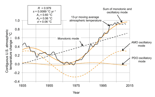
Caption. Measured and calculated global temperature change. The calculated global atmospheric temperature-time curve (orange solid line) is obtained by combining the monotonic mode (black dashed line) and the oscillatory mode (orange dashed line). The centered moving average temperature (black solid line) includes fewer than thirteen years after 2007 and is increasingly unreliable (black solid line changes to dashed).
Fig 8 shows the contribution of the calculated monotonic and oscillatory modes to the 1980–2000 increase in atmospheric temperature for the individual climate regions. The oscillatory mode is responsible for about 85% of the temperature increase in the Southeastern mega-region, compared to about 67% in the Central mega-region. The Southeastern mega-region has the smallest absolute monotonic mode contribution. Again, the NR&P doesn’t fit exactly into either the W or NW climate region since the oscillatory mode in the NR&P accounts for 60% of the temperature increase compared to 42 and 52% in the W and NW, respectively.
 Fig 8. Contributions of the monotonic and oscillatory modes to the 1980–2000 contiguous U.S. regional temperature increases. The stacked bars show the contributions (K) of the monotonic and oscillatory modes for each climate region. The inset numbers are the percent of the total temperature increase attributable to the oscillatory mode. The climate mega-regions are shown by the colors.
Fig 9 shows the mega-region boundaries (red dashed lines) corresponding to the approximate locations of the NCDC climate regions comprising the mega-regions. The NR&P climate region should probably be divided between the Central and Northwestern mega-regions, but the location of the boundary separating those mega-regions within the NR&P is unknown. The figure also summarizes the mega-region characteristics in terms of oscillatory and monotonic mode influence.
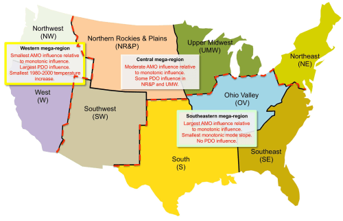
Fig 9. Contiguous U.S. climate mega-regions. The three mega-regions are shown relative to the approximate locations of the NCDC contiguous U.S. climate regions. Within the NR&P climate region the location of the boundary separating the Northwestern and Central mega-regions is unclear and is, accordingly, left undrawn
Summary of data sets and methodology
Surface temperatures obtained from NOAA/NCDC [link]
AMO: de-trended, un-smoothed monthly data from the ESRL Physical Sciences Division [link] These data are calculated from the Kaplan dataset.
To calculate the North Atlantic SST trend, used the ERSL “not de-trended” dataset [link]
For the PDO used Nate Mantua’s monthly data at JISAO [link]
For both the AMO and PDO monthly datasets, first converted the monthly data to yearly averages and then converted that result to a 13-year moving average.
JC comment: Bob Tisdale has remarked that NOAA’s new SST dataset [link] has resulted in reclassification of many weak El Nino years (e.g. 2014 is no longer classified as El Nino). The calculations of AMO and PDO depend not only on the underlying data set, but also on the methodology used. It would be worthwhile to assess the uncertainty in Kurtz’s results associated with uncertainties in both the regional surface temperature data sets and also calculations of AMO and PDO.
JC reflections
I find this paper to be of interest on two fronts:
- the regional attribution of climate change, including ‘fingerprints’ associated with the multidecadal ocean oscillations
- projections of future regional climate variability on decadal time scales
With regards to attribution, ‘fingerprint’ detection methods do not account for the fingerprints associated with the multidecadal oscillations. Kurtz conducts a straightforward and simple attribution analysis. However his methodology may be too simple for attribution – apart from uncertainties associated with the datasets, it is not straightforward to disentangle the forced response from the ocean oscillations. This issue was raised in a recent paper by Michael Mann [link]; the stadium wave team has submitted a critique to Science that is winding its way slowly through the review process).
You may have spotted this graphic from NASA, promoted by Bloomberg [link] that purports to demonstrate that the warming was caused by CO2 (and not the sun or volcanoes). Well, I have a number of problems with that diagram, but the Kurtz paper reinforces yet again that you can’t properly do late 20th century warming attribution without considering the multidecadal (and longer) ocean oscillations.
The second application for this paper was raised in my talk at last year’s UK-US Workshop on Climate Adaptation entitled Generating possibility distributions of scenarios for regional climate change. Consider the southeast U.S. (my home territory), which is one of the globe’s cool spots (i.e. it has not been warming). Nevertheless, regional planners find it important to account for the impacts of climate change in their plans out to 2050. Something like 5+ years ago, I was invited by the Atlanta Regional Commission to give a presentation on the latest climate model simulations; they felt they couldn’t act on regional water policy until the climate model results were clarified (the AR4 simulations were all over the place for the southeast U.S.). Because of the dominance of the AMO in this region, planners would be much better off accounting for the multidecadal variability of the AMO rather than AGW.
So how unusual is the U.S. in having multidecadal ocean oscillations being a dominant factor in climate change? We don’t know, because climate scientists have been mostly focusing on the anthropogenic effects.
Bio notes: I have been corresponding with Bruce Kurtz via email for the past 5 years. Bruce Kurtz has a PhD in chemical engineering. He has conducted hands-on R&D and also has held managerial positions in companies that include AlliedSignal (now Honeywell) and one of the Unilever specialty chemical companies (subsequently acquired by ICI). After retiring he became interested in climate science, particularly aspects related to heat and mass transports; hence his interest in the AMO/AMOC.

“Therefore, it may be concluded that much of the prominent continental Arctic warming and cooling in Greenland during the last half of the last century is due to natural changes, perhaps to multi-decadal oscillations like the Arctic Oscillation, and the Pacific Decadal Oscillation (PDO).”
~Syun-Ichi Akasofu (4/30/2009) – “Two natural components of the currently progressing climate change are identified.”
“However his methodology may be too simple for attribution – apart from uncertainties associated with the datasets, it is not straightforward to disentangle the forced response from the ocean oscillations.”
It may be just simple enough. Occam’s Razor and all that. I think it’s very straightforward to separate the monotonic from the oscillatory and that Loehle and Scafetta (2011) nailed it.
http://judithcurry.com/2011/07/25/loehle-and-scafetta-on-climate-change-attribution/
Even the monotonic rate of increase since, for example, the end of the LIA, must change over time. For whatever the interrelationships between unknown or unappreciated factors comprising such a rate may have been before the last half of the 20th century, we know that a systemic warming bias has been introduced over the last half century due to the UHI effect.
Is the AMO cycle driven by top down forces e.g.solar? (Solar cycle deceleration)
Good question, but the best reply might be that if climate scientists knew what drives these oscillations, then the general circulation models would be ten times more accurate than they are.
This is a good question. Since it is generally agreed that the AMO is caused by oscillation in the AMOC flow rate, the question becomes – what causes the oscillation in the AMOC? I have suggested that this is caused by interaction between the effective thermal conductance of the AMOC (the heat transport is actually advective, but it behaves as though it is by thermal conductance) and the thermal capacitance (heat capacity) of the North Atlantic upper layer. Look at this link…
http://journals.plos.org/plosone/article?id=10.1371/journal.pone.0100306
When reasonable estimates for the values of AMOC thermal conductance and North Atlantic thermal capacitance are plugged into the equation for the period of oscillation of an R-C electrical network (the flows of heat and electricity behave analogously in this instance) the answer obtained is a decent approximation of the actual AMO period.
Too bad there aren’t any climate research centers near me. I’d like to get in on the occlusal guards that are going to be sold as the AMO goes negative.
The cost of polar bear coats may skyrocket.
For those interested NAS, national academy, released an ocean sciences 10 year survey report on status of studies. For free as a PDF if one registers with them.
http://nap.us4.list-manage.com/track/click?u=eaea39b6442dc4e0d08e6aa4a&id=f347a7f869&e=fce00ba69f
Scott
For further interest, below is a link to the NSF response to recommendations in the above NAS report.
http://www.us-ocb.org/archives/email12bmay.html
Scott
thx for the link
Another AMO science report for CLIVAR is here:
http://usclivar.org/sites/default/files/amoc/2015/USAMOC_2014AnnualReport.pdf
Scott
thx for another good link
Don’t clog the blog, but there are lots of links on the unsettled science.
Scott
Too many options for too few fits results in an automatic fit.
You could do even better giving each station a weight into each input oscillation, and requiring spatial smoothness of the weights.
On top of that, the monotonic mode is indistinguishable from a long cycle, though perhaps the point is made that you can account for most of the variation with linear combinations of shortish cycles.
I’d expect a 1/f spectrum in any case, just on intuitive grounds, meaning that longer cycles have more influence unless blanked out by the fitting techniques with available short cycles.
recent reminder that the PDO is the big dawg, and the AMO largely irrelevant
We have a human compulsion toward nice clean periodicities, maybe because the regular diurnal and seasonal cycles are so important.
But when I look longer term, I see a cluttered, chaotic mess.
That much being said, the satellite era temperature trends do appear quite similar to the PDO fluctuation:
http://climatewatcher.webs.com/SatelliteEraMap.gif
http://research.jisao.washington.edu/pdo/pdo_warm_cool3.jpg
Because you’re not thinking right!
\the cyclists go into the ditch around 1983. The SAT is being driven down by the declining PDO index from 1983 until 2006
ACO2 is that nasty..
So, the ‘warm phase’ ( the one on the left ) actually appears to have lower average Pacific temperatures than the ‘cool phase’ on the right.
If that’s so, why would we expect PDO and global T to correlate?
Kinda begs for a look.
TE, if you look at the first graph I posted, 2015 started with a very high SAT and a very high PDO index. The moment the PDO dropped, the SAT dropped. The AMO went up, and the SAT does not give a flip. The graph is a joke. Too short a period.
If you look at mid-century cooling, the SAT and the PDO move in almost perfect concert. ACO2 not big enough at that time to thwart the PDO. In 1983, ACO2 was obviously big enough to thwart the downward trend in the PDO index. Look at the AMO during mid-century cooling. It’s doing nothing.
Believers in the AMO get low climate sensitivity. They’re wrong.
Here is what I get when I correlate the annual averages of PDO and GISSTEMP global temperature average:
http://climatewatcher.webs.com/GISS_PDO.png
With a correlation of 0.08, PDO alone certainly doesn’t describe much of the global temperature anomaly.
You really are not getting it:
1983 – GMST up
1983 – PDO went down
So how would you expect that to correlate?
http://2.bp.blogspot.com/-Fkg790Q3b8o/VMRGN17t2oI/AAAAAAAAHwo/GTCVnmku248/s1600/GISTempPDO.gif
It seems pretty f00lish to me to use the above figure to “prove global warming”. The most obvious thing to me is a short-term correlation with PDO, and a longer-term correlation with the integral WRT time of the PDO. With a bunch of other junk thrown in.
Certainly, the period from ~1902-1946 seems to me to have roughly the same slope as ~1975-1998. The level/downwards slope in-between corresponds to a very cool PDO.
Thing is, there’s a many-decades-long upward slope reaching back far before any significant CO2 rise. This could easily be century scale variation: the exit from the LIA.
the PDO ran the show until around 1983, and then ACO2 laid on a snot knocker
The AMO just hangs out; tags along for a ride; drifts around doing its own thing.
The AMO is very relevant.
Watch it go up. It has no choice. Too puny to go down.
The problem with using a narrow time range to predict the future is a major problem. The 30years from 1975-2015 show an 0.9C increase which would give incredible projections for the future, if taken alone or with no weight given to the past behavior. It is encouraging to see Kurtz’s effort to describe the data in a “natural causal” manner. Those who are interested might find my recent posting Earth Temperature Anomalies are Not 2nd Degree Polynomial Behaviors interesting. It shows the primary wave character that Kurtz is modeling from 1900-2015. What seems to be missing in all of this is when the natural 100-1000 millennial behavior will kick in.
The underscored “title” is hyperlinked to the download page. Downloading is free.
I think al the ingredients for cooler global temperatures lie ahead.
Milankovitch Cycles -slightly positive
Geo Magnetic Field -becoming more positive as it weakens and enhances solar variability.
Land/Ocean Arrangements- favorable.
Ice Dynamic – neutral but S.H. sea ice increase needs to be monitored.
PDO – will be in cold phase next 10 years favorable.
AMO – will be in cold phase next 10 years favorable.
Volcanic Activity- increasing favorable.
Atmospheric Circulation- mostly meridional . Favorable.
ENSO – inclined toward more La Nina’s. Favorable.
Even if you knew when El Nino or La Ninas were coming,
they appear to come in different flavours:
http://www.columbia.edu/~mhs119/ElNino-LaNina/ElNino+LaNina_maps.gif
Increased tidal mixing/sloshing until 2036…
AND I FORGET ONE
Solar Variability – becoming very favorable.
I am trying to learn how to be more skeptical.
According to a recent paper published on misconduct in scientific papers there is probably less than a 14% chance this paper contains fraudulent data and a possible maxim of 72% chance it was done with questionable research practices.
http://www.nature.com/news/political-science-s-problem-with-research-ethics-1.17866
Try to read the papers you quote correctly. It says 72% of scientists asked say they have witnessed questionable research practices in colleagues. There is no way on earth that can be interpreted as saying that 72%of research papers are questionable,
A detailed investigation of the precise alignments between the lunar synodic [lunar phase] cycle and the 31/62 year Perigee-Syzygy cycle between 1865 and 2025 shows that it naturally breaks up five 31 year epochs each of which has a distinctly different tidal property (i.e. Full Moon Epochs and New Mon Epochs). The first 31 year interval (a Full Moon Epoch) starts with the precise alignment on the 15th of April 1870 with the subsequent epoch boundaries occurring every 31 years after that:
Epoch 1 – 15th April 1870 to 18th April 1901 – Full Moon Epoch
Epoch 2 – 8th April 1901 to 20th April 1932 – New Moon Epoch
Epoch 3 – 20th April 1932 to 23rd April 1963 – Full Moon Epoch
Epoch 4 – 23rd April 1963 to 25th April 1994 – New Moon Epoch
Epoch 5 – 25th April 1994 to 27th April 2025 – Full Moon Epoch
During New Moon Epochs, the peak seasonal tides are dominated by new moons that are predominately in the northern hemisphere.
During Full Moon Epochs, the peak seasonal tides are dominated by full moons that are predominately in the southern hemisphere.
Now lets assume that the effects of the changing lunar tidal patterns upon the North Atlantic ocean are lagged by ~ 10 years [Note: the dates below are obtained by just adding 10 years to the tidal epoch boundaries cited above] and then compare these dates to those for the maxima and minima of a roughly 30 year sinusoidal fit to the linearly de-trended AMO index.
10 year__Lagged Tidal_boundaries___________AMO Max & Min
__________1880____________________________1879___MAX
__________1911____________________________1912___MIN
__________1942____________________________1945___MAX
__________1974____________________________1974___MIN
__________2004____________________________2005___MAX
__________2035____________________________????___MIN
These lagged tidal boundary dates also seem to correspond reasonably closely with the dates on which the relative dominance of the El Ninos to La Ninos changes in the tropics.
I think that this is more than just a coincidence.
http://astroclimateconnection.blogspot.com.au/2015/01/the-el-ninos-during-new-moon-epoch-5.html
Pingback: Estudios científicos: Sólo se puede achacar al hombre (CO2 y tal) el 34% (USA) y el 42% (Mediterráneo) del calentamiento. El resto es natural. | PlazaMoyua.com
Way ahead of you all:
http://www.newclimatemodel.com/the-real-link-between-solar-energy-ocean-cycles-and-global-temperature/
Published by Stephen Wilde May 21, 2008
From the linked paper at PLOS1:
“The slope of the monotonic mode is 0.0089 K yr-1” [That is for the contiguous US].
I can’t see any comment on whether this provides an estimate of the rate of anthropogenic warming, considerably less than the 0.1K/decade IPCC current lower estimate, and much lower than its earlier estimates in the 0.2-0.5 K/decade range.
Of course that is just the US. Perhaps everywhere else is warming faster, to compensate.
Very sensible that there’s obviously an unstated agenda afoot when government-funded climate models uniformly ignore the role of the sun. As time goes by a simple truth emerges that explains everything. “Everything government touches turns to crap.” ~Ringo Starr
I always welcome more modeling. Credence in these model outcomes awaits a stringent test against future data. It is good to see the separate modeling by regions. That can probably be extended to temperature series from other regions.
I’ve found similar results, except the ocean cycles drive the temps on all of the continents.
I think heading forward cooler temperatures for the globe are looking more likely. The geo -magnetic field will have a bigger role then what many think because it enhances the effects of solar activity when weakening or when weak.
I do expect sea surface temperatures to decline in response to prolonged solar minimum activity and I think unlike some others that a -NAO will equate to a -AMO phase and more Arctic Sea Ice when Solar Minimum conditions are PROLONGED, and reach certain criteria in regards to duration of time and degree of magnitude change, which results in a much different climate outcome then when the sun is in a more or less 11 year rhythmic solar cycle mode of activity where solar minimum conditions under that scenario may for example go along the lines of what Ulric, has been suggesting and has some support from past data of his assertions.
I think under the scenario of prolonged minimum solar conditions however , that Sea Ice may start to form in the NORDIC SEA which could impact the AMOC and slow it down if enough fresh water via the Sea Ice got incorporated into the mix. This would have cooling implications for Europe, and Eastern North America.
The Arctic itself may not be all that cold under this scenario due to the Meridional Atmospheric Circulation but cold in the Arctic is relative and cold in the Arctic is much more meaningful during the summer season then the winter season, when temperatures in the Arctic are well below freezing regardless if the Arctic temperatures are above normal or not
-NAO never equates to a -AMO.
http://snag.gy/hjc6M.jpg
THE CRITERIA
Solar Flux avg. sub 90
Solar Wind avg. sub 350 km/sec
AP index avg. sub 5.0
Cosmic ray counts north of 6500 counts per minute
Total Solar Irradiance off .15% or more
EUV light average 0-105 nm sub 100 units (or off 100% or more) and longer UV light emissions around 300 nm off by several percent.
IMF around 4.0 nt or lower.
The above solar parameter averages following several years of sub solar activity in general which commenced in year 2005..
IF , these average solar parameters are the rule going forward for the remainder of this decade expect global average temperatures to fall by -.5C, with the largest global temperature declines occurring over the high latitudes of N.H. land areas.
The decline in temperatures should begin to take place within six months after the ending of the maximum of solar cycle 24.
NOTE 1- What mainstream science is missing in my opinion is two fold, in that solar variability is greater than thought, and that the climate system of the earth is more sensitive to that solar variability.
NOTE 2- LATEST RESEARCH SUGGEST THE FOLLOWING:
A. Ozone concentrations in the lower and middle stratosphere are in phase with the solar cycle, while in anti phase with the solar cycle in the upper stratosphere.
B. Certain bands of UV light are more important to ozone production then others.
C. UV light bands are in phase with the solar cycle with much more variability, in contrast to visible light and near infrared (NIR) bands which are in anti phase with the solar cycle with much LESS variability.
Given that the temperatures are getting adjusted 1.57°C /century/century (per century per century) this would mean a net cooling of 0.42°C over 5 years.
The temperature adjustment that will make 1900 3.14°C cooler by 2100 A.D. relative to the current temperature. than it was in 2000 A.D. has to be taken into account
Judith: Unless one places this analysis in proper CONTEXT, this post is the crudest form of cherry-picking. The oscillatory behavior from the AMO may have contributed more than 50% of the warming over 1980-2000 in much of the US. So what? Oscillatory behavior contributed less than 10% of the warming over any 65-year period (assuming the period of the AMO is this long and the contribution from the PDO is a small as shown). The subject is climate change and any 20-year period is only marginally important. Furthermore, the US covers only a small fraction of the planet – though the AMO effects more than just the US. Worst of all, this ignores the UNCERTAINTY inherent in any estimate of the amplitude of the temperature change driven by the AMO. We have instrumental data from two cycles at most. Look at the ENSO over any period with just two cycles. How representative are these two cycles of the ENSO as we understand it? [I’d like to know more about the AMO before 1900. CET, for example, shows a strong signal for the AMO.]
Even the IPCC’s iconic attribution statement covers a period of almost one cycle of the AMO. It doesn’t appear likely that the AMO and PDO contributed 50% of the warming since mid-century.
If climate sensitivity is as high as the IPCC’s models suggest, the state of and effects from the AMO around 2100 will be trivial compared with AGW. I happen to preferred your estimates from energy balance models, but they predict AGW about 5X bigger than the amplitude of effect from the AMO.
Unforced variability and “naturally forced” variability are important to understanding past change and what might happen in the next few decades. However, all current evidence apparently suggests they will be relatively unimportant to what happens 50-100 years from now and the uncertainties that plague rational policymaking.
Frank writes–“The subject is climate change and any 20-year period is only marginally important.”
My response–Isn’t the question how much warming will occur how quickly due to human released CO2 and if that will lead to net negative changes in the climate for humans? The climate has always been changing. Do you claim to know that more CO2 will result in net negative conditions?
Rob Starkey asked: My response–Isn’t the question how much warming will occur how quickly due to human released CO2 and if that will lead to net negative changes in the climate for humans? The climate has always been changing. Do you claim to know that more CO2 will result in net negative conditions?
I gather that we probably have enough fossil fuel left to reach 800 ppm (double today) by the end of the century. No matter what developed nations do, I expect developing nations to follow China’s footsteps and burn it, unless a non-fossil fuel source of energy becomes practical in the next few decades. The lowest estimates of TCR are about 1.35 degK and ECS 1.5-2.0 degK. Pessimists estimate that there will be no further benefits from warming, while optimists think up to 1 degK or warming could be net beneficial and a second degK of warming could be tolerated before net damage begins. Taken together, we probably need to get lucky with some combination of these factors to avoid significant degradation from burning fossil fuel.
Climate is always changing, but probably not as much and fast as it will in the next century.
It is very strange to hear that natural cyclical (repetitive) effects are not going to be “relatively unimportant” in the next 50-100 years. Unless there are some drastic changes in the way the solar system works, the main cosmic factors affecting the earth’s climate will be as relevant in the near and distant future as there were in the past. Little and big ice ages have not been “man-caused”! These were a bit more significant in magnitude than any of the changes we seem to be encountering now. No wonder the majority of the non-scientific masses don’t believe what they are hearing about mankind being the major factor in changes in the earth’s climate. The situation would be more credible if the spread in the “natural’ effects were laid out and mankind’s potential effects were overlaid. Mankind may be polluting the earth in a grand way, but somehow mankind does not seem to be so big (even as a collective!) relative to the cosmic entities.
The figure below is from one of my web papers.
Would a blog monito/editor, please load this jpg for me where I have indicated it would be above:
http://pages.swcp.com/~jmw-mcw/US%20ave%20temp%201900-2015%206-deg%20poly%20lores.jpg
Joel: The LIA probably was a deviation from “normal” about the size of 20th-century warming. Both appear relatively small compared with what is likely to come in the 21st century. So “climate is always changing”, but probably far less than what we will see by the end of the 21st century.
You are right to mention ice ages, which probably represent more dramatic change than AGW is likely to cause. However, it has been more than a hundred centuries since the last ice age and no one seems willing to predict when the next one will arrive. So chances are that an ice age is unlikely to descend upon us for the next century or two, and the rate of that descent is likely to be much slower than the rate of AGW. Long-term planning for a governments is about a decade. So I don’t pay much attention to the ice ages when I think about AGW and climate change.
There is one exception: SLR and ice ages. The last ice age was associated with 120 m of sea level rise from about 5 degK of warming – 24 m/degK. The area of ice covered polar regions does shrink with warming, so there is no reason to expect another 20 m of SLR from the warming since 1900. However, even 1/10 as much would be significant. I’m not sure why the GIS survived the Holocene climate optimum (apparently it shrank a lot and recovered) and it may already be doomed. The lapse rate (0.65 degK every 100 m) means that the top will keep getting warmer as the altitude of the top of the ice sheet begins to drop. As the last ice age ended, SLR rose at the rate of more than 1 m/century for 10 millennia.
franktoo,
By 2025, none of the curves predict sufficiently different levels that will “verify” it, considering the tremendous scatter of past observed data points. I assume that you are taking the position that the red line will the one that world governments need to address. I assume that you are taking the position that the current “2nd-order curve-fit” of CO2 levels will continue unabated and “overlays” the red line as the only factor involved. Below is the CO2 curve plotted on the same graph, scaled so its 2nd order fit agrees more or less with the 2nd order regression of the annual contiguous US temperatures. Sort of belies the fact that the observed temperatures are not 2nd order over the period addressed except by ignoring its ups and downs. The projection into the future also ignores all factors except that in agreement with the CO2 2nd-order curve. Such ignoring of everything else does not seem scientifically justified considering how climate temperatures have historically varied without significant changes in CO2 levels.
http://pages.swcp.com/~jmw-mcw/US%20ave%20temp%201900-2015%20with%20CO2.jpg
Mankind has enjoyed 8000 years of “relatively” narrow temperature changes. Hospitable, but some, like during a LIA, probably would be not be appealing to today’s choosy inhabitants. Below is a look at how our current, long-term, global “heat wave” looks relative to the previous 3. Very different. I wonder why? How much longer (time-wise) before the next big chill sets in? Lots of Ice core data suggesting that it will be big-time and long. What should mankind be focusing its attention on in anticipation of earth’s next big “thermal squeeze”? Are we now in the proverbial uncontrolled behavior that is exemplified by “fatting procreating” lab rats? What happens when deprivation is applied to them? Lots to think about. Current and projected near-future CO2 levels will likely be insignificant in the grand scheme of the future. Controlling non-CO2 pollution is probably what inhabitants are actually concerned about now. China will/must lead the way, as it is now the major global “smogger”. Chinese citizens are becoming more affluent and will get “picker” about their living conditions to the benefit of the rest of us!
The fig is from “Can Mankind Really Expect To Tame Earth’s Climate And Remove It From Cosmic Control?” http://gsjournal.net/Science-Journals/%7B$cat_name%7D/View/6066.
http://pages.swcp.com/~jmw-mcw/Duration%20of%20warm%20periods.jpg
Joel: IMO, science rarely makes progress by arbitrarily fitting a large number of possible mathematical curves to observational data, especially with systems that behave chaotically. There are too many functions that can fit the data approximately equally well. Even worse, chaotic systems are known to produce periods of regular behavior followed by periods of irregular behavior. Predicting how the AMO will behave in the future – after observing just two cycles with instruments of growing sophistication – is mostly guesswork. Select two cycles of the ENSO at random: Do extrapolations from those observations give us a good idea of how ENSO really behaves? Even after having observed a half dozen cycle of ENSO from space and another dozen with increasing coverage with instruments and hundreds via proxy data, we can’t tell how much unforced variability from ENSO will contribute to the global temperature change two years from now! And you want me to have confidence in how much the AMO will contribute to climate change over the next century?
Science usually makes progress through the scientific method: Picking a hypothesis and testing it under the most rigorous conditions. In the case of forcing and climate, we have some extremely well-tested theories that explain the interactions between radiation and GHGs and some aspects of heat transfer. Those theories could never have been developed by observing the whole planet, but – after doing experiments in the laboratory -we can accurately predict what happens in the atmosphere. These theories have been incorporated into climate models; but, for some phenomena, computations can not be performed on small enough scale and tunable parameters must be used. These models appear to have “failed” because (IMO) their developers haven’t been candid about how much uncertainty these tunable parameters introduce and because more time is being spent using models to make scary predictions about the future rather than fixing flaws and properly characterizing uncertainty. Nevertheless, models with some basis in physical reality – not arbitrary curve fitting – are the best hope.
Well, we really only have good data from when the Argo system was more or less completed in 2003 (it started in 1999).
Warmers say it is going to warm. There are people claiming it is going to cool.
After 15 years of little or no change we have time to get it right. Let everybody place their bets for 2030. In 15 years when we see who is right we can make some policy decisions if we need to.
If the coolers are right we might want to amp up CO2 production. Cold is more deadly than warm.
Standard linearly detrended AMO? Weak…
Yeah, it’s too simple. Old fashioned stuff. Not up to SkS kidz standards. If he wants to pass this off as robust climate science, he needs to do some imaginative data juggling. Throw in some canny kriging, esoteric extrapolating, interpolate it a little, homogenize the crap out of it and if that don’t give you the results you are looking for, go to the satellites for a little help (only use them, when they are convenient).
Still, junior is probably right on this one. weak
I hope this climate catastrophe thing works out. If not, it will have been a very bad career move for the bright young kidz, who are hitching their star to the that big ole slow-rolling CAGW Bandwagon.
> Still, junior is probably right on this one. weak
You just redefined the concept of violent agreement, Don Don.
Well played!
Thanks, willy. That means a lot to me. I was just expanding on junior’s curt comment. Was that ‘hitching star to bandwagon’ part OK? When I wrote that, I was worried you might ding me.
Inserting the pause killing the cause would have perfected the violent agreement, Don Don.
That would be a little rough, willy. He’s just a kid trying to make the big time. The next Michael Mann. I don’t want to discourage the little fella.
What ever did we do before computers improved our ability to put dots on a graph and made Squiggly Lines Science a reality?
What ever did we do before computers improved our ability to put dots on a graph and made Squiggly Lines Science a reality?
Low-rez Squiggly Lines Science and lumped parameters
how the pause make complete fools out of a bunch of really smart AMO believers: or, look at the PDO cause the pause
JCH commented
The AMO has it’s zone of action, as does the PDO. It influences weather downwind (eastward), and can alter the path of the jet stream, which has some impact to the west.
Lastly, those temp series are junk.
The believers in the AMO are aren’t a joke. They’re just funny. This includes one of the main authors of AMO mythology: Michael E. Mann.
I’ll go to Google Scholar and look for all those papers that show NASA’s temperature series is a joke.
You won’t find any, they all drank the same koolaid.
But you should ask yourself how much of the series is from actual measurements, and how much of the planets surface is from infilling and homogenization.
Anyone representing the CO2 effect with a linear trend has failed at step one. If you want to represent CO2 forcing, use an increasing trend that has doubled since 1950.
Jim D: Anyone representing the CO2 effect with a linear trend has failed at step one. If you want to represent CO2 forcing, use an increasing trend that has doubled since 1950.
CO2 “forcing” is proportional to the log of the concentration (c.f WebHubTelescope’s csalt model), which has increased approximately exponentially. So a model of the CO2 effect that is linear with time is reasonably accurate.
No, put the numbers in. The added CO2 above 280 ppm may be growing exponentially, not the total CO2. This leads to an accelerating forcing, and the forcing trend only goes linear when we far exceed 280 ppm. We are still in the accelerating phase which is why the forcing change rate is now double what it was in 1950. A linear trend for this period is plain wrong.
Fco2 = 5.35 * ln ( C / C0 )
http://atoc.colorado.edu/~seand/headinacloud/?p=204
“So how is Radiative Forcing calculated? For the most part, it is estimated using data from what is referred to as General Circulation Models (GCM’s)..
Overall, the total net anthropogenic Radiative Forcing is equal to an average value of 1.6 W/m² [0.6 to 2.4 W/m²]. “
Given that there was a 0.2 W/m2 increase during a period of a 22 PPM CO2 atmospheric increase with a 45% emissions increase, it is pretty obvious the actual forcing is at the bottom (about 1.05 W/m2) of the GCM range, but it is in the GCM range.
Why the global warmers use 2.4 W/m2 or higher (the top of the GCM range) is sort of crazy and indefensible.
https://upload.wikimedia.org/wikipedia/en/5/51/NOAA_Annual_Greenhouse_Gas_Index_2012.png
NOAA estimates of GHG forcing change appear to be uniformly about 50% too high.
The Southeast mega-region can be described as warm and humid when compared to the average of the CONUS. The effect of CO2 using Figure 8 is the lowest there. I hope I am using the right words, it’s suggested that there is more water vapor GHGs. But in places that are already considered humid, that effect seems muted.
50+ years of looking at weather and climate through infrared colored glasses.
(If only it were true, if we had high resolution ir imagery for the past 30 years even we’d know a lot more about feedback.)
Certainly a warm AMO mode will reduce rainfall and hence increase surface temperatures across the continental interior:
http://www.atmos.umd.edu/~nigam/GRL.AMO.Droughts.August.26.2011.pdf
But the key point is that a warm AMO mode is a negative feedback to weaker solar forcing, which is a direct measure of how weak the increased GHG forcing has been.
Denser and faster/hotter solar wind through the mid 1970’s increased La Nina and strongly cooled the AMO, thereby increasing precipitation across continental interiors, causing them to cool.
http://snag.gy/HxdKY.jpg
Looks like an El Nino 2015-2016 which should mean more rain.
Scott
Thank you, Professor Curry, for your efforts to restore integrity to science and sanity to society. They’re related:
http://www.thetruthaboutthelaw.com/#comment-3108
http://junkscience.com/2015/06/28/you-are-known-by-your-allies-big-popey/comment-page-1/#comment-369080
Here is a clue.
If you take a time series and smooth it.
and then look for correlations in 9 different regions…..
guess what?
The $19.95 Chop-o-matic works wonders…you smooth-talking devil. I see the correlation with little residual effect.
Steven Mosher: guess what?
A clear and consistent separation of CO2, AMO, and PDO effects?
Just a guess!
matthewrmarler,
Yeah, I QSWAGed. but I tried to keep it ambiguous in response to Steven3’s drive-by Socratic leanings. But I am betting on a consistent separation of CO2, AMO, and PDO non-real effects. I’m not losing any sleep over it however. Just testing intuition…sometimes yes and sometimes no.
dont smooth.
and learn to adjust for multiple tests
Thanks
For the last few years the academic establishment has begun to notice the
60 year periodicities which any high school graduate can easily see in the temperature data. See Fig 15 at
http://climatesense-norpag.blogspot.com/2014/07/climate-forecasting-methods-and-cooling.html
When will it occur to them that the ” upward monotonic mode” is actually part of the final upward phase of the millennial quasi periodicity which is equally obvious in the temperature data ( Figs 5-9 at the Link )
The same link contains forecasts of the probable coming cooling . We have probably been in the downtrend since 2003 and are headed towards the next LIA at about 2635.
http://www.woodfortrees.org/plot/rss/from:1980.1/plot/rss/from:1980.1/to:2003.6/trend/plot/rss/from:2003.6/trend
TCS is likely less than 0.5 and hard to even measure empirically within the natural variability.
> For the last few years the academic establishment has begun to notice the
60 year periodicities which any high school graduate can easily see in the temperature data.
It goes beyond that:
https://en.m.wikipedia.org/wiki/Sexagenary_cycle
And if we extended regional correlations to amo and pdo to gridded cells all over the planet, ignoring That most of the cell’s temperature data is unknown and infilled, and the result was a patchwork, would we know more than the correlations to gmat?
“ignoring That most of the cell’s temperature data is unknown and infilled, and the result was a patchwork,”
That is an awful lot of stink to ignore, better bring a gas mask and some air freshener.
No doubt, but sometimes you nibble a poop sandwich when there’s nothing else to eat.
JCH – …AMO [is] largely irrelevant
AMO / Hadcrut4
Nice graph of the biggest tease in climate history.
Awesome. All your climate change are belong to AMO.
It is very arbitrary how they partition the rise between the “AMO” and a linear trend. You are equally justified in having a larger trend and smaller AMO oscillation, or an increasing background trend and smaller AMO (as other studies have done). Here they have chosen a massive “AMO” with a full amplitude of 0.5 C, even larger than El Ninos, and it is just a choice. They prefer to attribute trends to “AMO” rather than solar or global dimming aerosol effects, and assume it is periodic after making this attribution. They have not considered that larger variations occur over the land in CRUTEM4 and that these lead their so-called “AMO” by up to a decade. When the land leads, it is the forcing that is changing, not an internal ocean variation.
” When the land leads, it is the forcing that is changing, not an internal ocean variation.”
citation?
Physics
Here is CRUTEM4 leading AMO (see last crest and trough)
http://www.woodfortrees.org/plot/esrl-amo/mean:120/offset:-0.7/mean:240/plot/crutem4vgl/mean:120/detrend:0.8/mean:240
So Jim, the several published papers I have shown you many times aren’t based on physics. How many times have you been shown those now? 5? 6? 8?
There is no internal variation on land, so if it is warming, it can only be from forcing, especially if it is warming more than the ocean and ahead of it.
So I didn’t show you published literature that stated the oceans wereleading the land? Is that what you are saying?
http://www.woodfortrees.org/plot/hadsst3gl/mean:120/mean:240/plot/crutem4vgl/mean:120/mean:240
Unproven, unprovable BS.
The land surface has a very low thermal inertia. As such it responds quickly to forcing changes and has little memory. This makes it fundamentally different from the ocean and a better gauge of forcing changes.
A great deal of the “weather” that makes up “climate” involves both sea and land. Thus, the land has access to “memory” available in the sea. The distinction is completely artificial.
If you apply an external forcing to the land and ocean surface, the land responds earlier and more sharply. That is exactly what is happening in CRUTEM4 and HADSST3. It should be no surprise.
Land temperatures are far more sensitive/driven by precipitation/evaporation which depends on evaporation over and transport from the sea. And with the sea, changes to global circulation patterns driven by internal variation are far more important than the tiny effect of changing greenhouse effect.
The land warms even faster when it is drier, and it is getting drier because the ocean is not keeping up, so that just enhances the difference.
In ohio, there is a 20 – 30F difference in temperatures between cool dry air coming from Canada as opposed to hot humid coming up from the gulf of mexico.
For example, a desert warms faster than a swamp.
It also cools faster, opposite what the effect of Co2 is reported to be.
If the forcing was decreasing, the land would cool faster. Clearly that is not happening in the global land data. It is warming faster consistent with a steadily increasing forcing.
“If the forcing was decreasing, the land would cool faster. Clearly that is not happening in the global land data. It is warming faster consistent with a steadily increasing forcing.”
Land cools more at night than it warms the prior day.
It can only do this if more warm air is transported in from the tropics regularly.
Sorry, the format of the overall got trashed
Degree’s F
9999 42.37539614 69.58612645
It is? Citations?
Over land the humidity is not keeping up with Clausius-Clapeyron so the relative humidity is declining. This is likely because the moisture for land is mostly supplied by the now relatively cooler ocean. You can find RH trends on the internet. The effect should be noticeable by now.
Jim D,
If the RH is declining over the land, the obvious solution is to burn vast amounts of fossil fuel. The H2O resulting will boost the moisture content, and the CO2 content will assist more plants to grow.
As the deserts green, the land temperature will drop, as you pointed out. The greening is occurring as we speak, but we need more CO2 and H2O in the atmosphere.
Wouldn’t you agree that this is a Good Thing™?
Jim D:
“The land surface has a very low thermal inertia.”
Thermal inertia of Antarctica? Greenland?
Mike Flynn, greening is a reduction in albedo and therefore a positive feedback.
“Mike Flynn, greening is a reduction in albedo and therefore a positive feedback.”
But green areas are cooler than areas with no vegetation.
Ragnaar, yes, but when ice-covered areas warm up to freezing point they just melt instead of warming more. The energy goes into a phase change instead of warming, until the ice is gone that is.
Jim D:
We’ve discussed this before. Instead of writing, “leads”, perhaps we can say land has a higher sensitivity than the oceans. Thermal inertia implies mass and sustain which can be at odds with high sensitivity. The oceans will be fine. It’s us on land that needs to worry. As AK said, land’s memory probably mostly resides in the oceans. And one of my favorites, in the Greenland and Antarctica ice sheets.
The land warming rate is twice the ocean’s. I don’t think this rate is sustainable because the ocean will limit it at some point, but that hasn’t started yet. Until then, the land is responding much more quickly to the forcing change and, yes, leading the way to a warmer world. The land trend is 0.3 C per decade making its transient sensitivity nearly 4 C per doubling since 1980.
“The land warming rate is twice the ocean’s. I don’t think this rate is sustainable because the ocean will limit it at some point, but that hasn’t started yet. Until then, the land is responding much more quickly to the forcing change and, yes, leading the way to a warmer world. The land trend is 0.3 C per decade making its transient sensitivity nearly 4 C per doubling since 1980.”
Land responds quickly to air warmed from the tropics, where it radiates more energy to space quicker that higher humidity tropics, the land is a cooling plain, and dehumidifier as nightly cooling limits water to 100% rel humidity.
Jim D,
I really can’t understand why you want a dry, desert world, rather than a nice green moist one.
Plenty water seems to equal plenty clouds. Plenty clouds seems to result in lower temperatures on the ground. Not a lot of clouds over Death Valley or the Libyan Desert.
Obviously the Warmist physics resulting in lower temperatures in deserts, and the higher temperatures of greenery due to increased positive feedback forcing due to lower albedo is beyond me.
I might be quite mad, but it seems to me that tropical arid deserts are hotter than green, moist vegetated areas. As you said, a desert warms faster than a swamp. How can that be, if the desert has a higher albedo?
I’m happy with increased water and plant life. Any excess water just runs off into the ocean, to be turned into rain – good for flowers and crops.
More CO2 and H2O – good. Less – not so good.
Jim D:
I’ll try to re-purpose Swanson’s plot:
https://pantherfile.uwm.edu/kswanson/www/rc_fig1.jpg
Land is blue. Oceans are green. That not what the key says but I am saying it’s similar. Land is the hyperactive child. The Oceans are the parents. I believe Swanson said something like high variability goes hand in hand with high sensitivity. Now I wonder, why one sensitivity when it seems there is one for land and one for the oceans? How about we solve for the sensitivity of the oceans? As Willie Sutton said, that’s where the money is.
The actual plot is this. It is a classic demonstration of the different thermal inertias in response to a positive forcing.
http://www.woodfortrees.org/plot/hadsst3gl/mean:120/mean:240/from:1900/plot/crutem4vgl/mean:120/mean:240/from:1900
Jim D,
That was a very strange graph, with smoothing of smoothing (120 and 240 months?!), which seems to have been designed mainly to show a lag in response which doesn’t actually exist. There is tight correlation between global land temperatures and the AMO index, with very little lag. What lag there is shows the North Atlantic a little ahead of the global land anomaly on average. http://www.woodfortrees.org/plot/esrl-amo/mean:48/from:1970/plot/crutem4vgl/mean:48/from:1970/detrend:0.55/offset:-0.1
another excellent graph demonstrating the AMO has nothing to do with GMST
stevefitzpatrick, while AMO closely mimics CRUTEM4 on 4-yr scales, my plot was using a good approximation to bring out only periods of 30 years and longer, such as the much hyped stadium wave, and at those frequencies the detrended CRUTEM4 does actually lead AMO. The continued rise of CRUTEM4 at the end does not portend well for the AMO turning down any time soon.
I don’t think the AMO is going to consult with the CRU to decide what to do.
The people who think AMO drives everything studiously ignore that CRUTEM4 leads it. What leads CRUTEM4, you may ask? The anthropogenic forcing.
Didn’t we have this conversation last night?
The Oceans drive the land surface record, which as far as I’m concerned excludes CRUTEM4.
Willis has a good discussion on autocorrelation noise here
http://wattsupwiththat.com/2015/07/01/a-way-to-calculate-effective-n
Including the author of the paper mentioned even showing up to confirm his calculations.
Jim D, your insistence that the land/ocean warming ratio is some sort of proof that the oceans aren’t the major factor in land warming ranks right up there with the guy that used to argue visible light couldn’t warm anything.
New Tab
New Tab
PS, I’m really tired of looking thru my references on this one. Just because you decide to ignore arguments doesn’t mean they aren’t there and repeating errors over and over doesn’t make them any more true.
http://users.monash.edu.au/~dietmard/papers/dommenget.land-ocean.jcl2009.pdf
http://www.esrl.noaa.gov/psd/people/gilbert.p.compo/CompoSardeshmukh2007a.pdf
JimD,
The land measurements have been increasing relative to ocean, but strangely enough, the difference between land and ocean in the satellite lower troposphere data sets is much less than in the surface data. Makes it seem like there is a more going on than simple GHG driven warming. Like maybe changes in the behavior of the land night time boundary layer. There is very little convincing evidence for very high sensitivity; there is convincing empirical evidence of sensitivity near the low end of the IPCC range.
“Like maybe changes in the behavior of the land night time boundary layer.”
Night time cooling is reduced as air temp approaches dew point.
Bruce – pretty creative data fitting job. Unfortunately, it is all for nothing. First, a thirteen year moving average gives an incorrect impression of global temperature trend. It wipes out El Ninos and La Ninas alike which jointly determine global mean temperature. If you want to smooth the trend choose a method that will reduce the fuzziness without wiping out ENSO. I bet you don’t even know that El Ninos and La Ninas come in pairs if smoothed temperature is all you look at. The correct global mean temperature is the midpoint between an El Nino peak and its neighboring La Nina valley. The trend is obtained by connecting the dots, something quite impossible to do with a 13 year moving average. You have done some modeling and after playying around with three modes you found one combination that fit the temperature record of your thirteen-year moving average. What you have done reminds me of what John von Neumann said about modeling an elephant: “… give me four variables and I can make it walk. Give me one more and I will make it wiggle its trunk.” Your model sure enough fits the curve you have been told that describes global temperature. The problem is that this curve does not actually describe real temperature and your modeling effort went into matching a bogus temperature curve. First, you speak of the “small decrease” in 1938 to 1974. It ain’t a small decrease. What happened in the early century was a global temperature increase from 1915 to 1940 that no one has yet had the nerve to call greenhouse warming. That is because it stopped abruptly in 1940 and you have to take carbon dioxide out of the air to stop greenhouse warming. It so happens that 1940 was the beginning of World War Two cold wave that lasted a good 5 years. The battle of Suomissalmi in the Finnish Winter War was fought in January 1940 at minus forty Celsius. The Finns wiped out two Russian divisions and destroyed their tanks by throwing gasoline bottles at them. The postwar period was a slow recovery from that cold snap and global temperatures did not get back to 1940 levels again until 1980 or so. 1947 was still cold enough for a blizzard to shut down New York City for weeks. Next you worked on the 1980 to 2000 segment. The eighties and the nineties are given the resounding name of “late twentieth century warming.” Sounds good but it ain’t so. Fact is, that period had no warming whatsoever from 1979 to 1997. That is what we call a hiatus today. But in 2008 when I discovered it the word hiatus had not yet been invented to describe cessation of warming. I was working on my book “What Warming?” and simply put a graph of that hiatus into the book as figure 15. It takes an 18 year stretch out of the warming that IPCC temperature curve shows for the eighties and nineties. You were of course happy to to be able to fit that phony warming into your model curve. I discovered immediately that HadCRUT3 had already over-written that hiatus with a fake warming as shown in figure 24 in the book. Later I found that GISS and NCDC were part of the conspiracy to cover it up. The connection is with common computer processing of data that left its footprints on all three publicly available temperature curves. Ground-based temperature sources have adopted these fake temperatures for the eighties and nineties as their own but fortunately they do not control satellites. As a result, you can still download the temperature history of this hiatus from both UAH and RSS satellite sources. This means that we now have two hiatuses, not one for those true believers to fight. Together these two have blocked out 80 percent of the warming that should have happened in the satellite era. The remaining 20 percent includes the super El Nino of 1998 and a short warming in 1999. Neither one is a creation of carbon dioxide in the atmosphere. Hence, we can say that there has been no greenhouse warming whatsoever during the entire satellite era that began in 1979.
The climate change carny game:
Step right up folks, don’t be shy!
Just fit your curves to the adjusted data!
Try your luck! Anybody can play!
(but the guy with the supercomputer has the game krigged)
Fitting simple sinusoids to AMO and PDO is a mistake because a lot of what appears to be sinusoidal is actually autocorrelation + noise. Take the fourier transform of AMO and PDO and you will see that it has the classic profile of autocorrelation + noise (magnitude slowly decreases as frequency increases).
If you remove AR(1) autocorrelation from the AMO, then some peaks do remain in the fourier transform, but they aren’t as strong. For the PDO, it is basically all auto-correlation plus noise. If you look at reconstructions of AMO and PDO prior to 1850, you see that there is as clear discrepancy between what is expected based on a sinusoidal trend and what is observed.
There are of course other issues that people bring up such as the choice of the smoothing is arbitrary and anthropogenic global warming is unlikely to have just a linear trend (at least do parabolic).
If think this plot is particularly interesting. There is not much room for anthropogenic forcings here (almost no discrepancy between the curves)
http://woodfortrees.org/plot/uah/from:1979/plot/esrl-amo/from:1979
Hasn’t it dawned on any one that the 2015/16 El Nino reached a moderate El Nino threshold during May 2015. This is almost precisely 18.0 years after the 1997/98 El Nino reached a moderate El Nino threshold in May 1997.
2015.4 – 1997.4 = 18.0 years
Ring any bells? 18.0 years is the Saros cycle for the Moon. It is part of the 31/62 Perigee-Syzygy lunar cycle that synchronizes the lunar tidal cycles with the Earth’s seasons.
“18.0 years is the Saros cycle for the Moon.”
Now that’s just crazy talk!
/sarc
“El Niño” is a myth. A political football, like “inflation”. Notice how they keep changing the definition, probably at least partly for political reasons.
climate scientists have been mostly focusing on the anthropogenic effects.
And climate scientists have been mostly funded by governments.
And governments will benefit most from public belief in anthropogenic effects (that seem to justify more taxes etc).
It all makes sense.
Pingback: Weekly Climate and Energy News Roundup #186 | Watts Up With That?