

by Steve Mosher
We’ve completed the first draft of our global monthly product.
The files are available [here] . A video of the product is available [here]. If you visit the FTP ,you’ll also see files for a global daily product (Land only ), more on that later. I’ve created a movie for daily TMAX (1930-40) [here]. Code for generating the data is found in the SVN which is located [here]. If you have questions about the code, contact me steve @ berkeleyearth.org.
This is a good opportunity to discuss what the global temperature record is exactly. It is customary since Hansen and Jones to combine Sea Surface Temperatures (SST) with Surface Air Temperatures over land (SAT). This combination, one might argue, doesn’t really have a precise physical meaning. Jones notes that one might rather combine Marine Air Temperature (MAT) with SAT which would have a more consistent physical meaning: the temperature of the atmosphere 1m above the surface of the planet. The difficulty with this approach, according to Jones, is that the inhomogeneities in MAT are greater than those in SST. And further, since the anomalies in MAT are substantially similar to those in SST, we can take SST as a good surrogate for MAT. That is an argument we may want to revisit, but at this time we adopted the customary solution of combining SST and SAT to produce what I would call a global temperature index. In our solution we re-interpolate HADSST and merge it with our SAT record to produce a 1 degree product and an equal area product.
By calling it an index, I mean to draw attention to this combing of SST with SAT to produce a metric, an index , which can be used in a diagnostic fashion to examine the evolution of system. In other words, it is not, strictly speaking, a global temperature although everyone refers to it as such. If we just looked at Air temperatures at 1m, then we could accurately describe it as the global air temperature at 1m, but since we combine SST and SAT, I’ll refer to it as an index.
I parse this description finely because we face a choice when constructing the global temperature index: what do you do about ice, especially in light of the fact that the area covered by ice changes with time? In our approach we looked at two ways of handling that issue. For areas at the poles where there is changing ice cover we consider using the temperature of water under the ice, and we consider using the air temperature over the ice. As an index, of course, you could use either as long as you did so consistently. Our preferred method looks at the air temperature over ice and the “Alternative” method uses SST under ice as the values for those grids. When and where ice is present we proscribe -1.8C for the SST under the ice. The freezing point of sea water varies depending on local salinity of the water. A range of salinity values typical for the polar regions implies a freezing point range of -1.7 to -2.0 C. We proscribe this as -1.8 C in our treatment, corresponding to a salinity of about 33 psu. The Arctic is mostly less saline that this (except in the deep water formation region) while the Antarctic is mostly more saline than this. The difference between our baseline case where estimate the temperature of air over ice and our alternative case where we proscribe SST under ice is instructive. That is one of the motivations behind the exercise. You should view this as a sensitivity exercise to judge the impact of different methodological choices. Note, that if an area is always covered by ice, it will have zero trend in the proscribed SST.
The changes in sea ice cover are shown below in figure 1.

Figure 1. Change in sea ice coverage since 1960
Figure 2 below shows the trend maps of the two treatments.
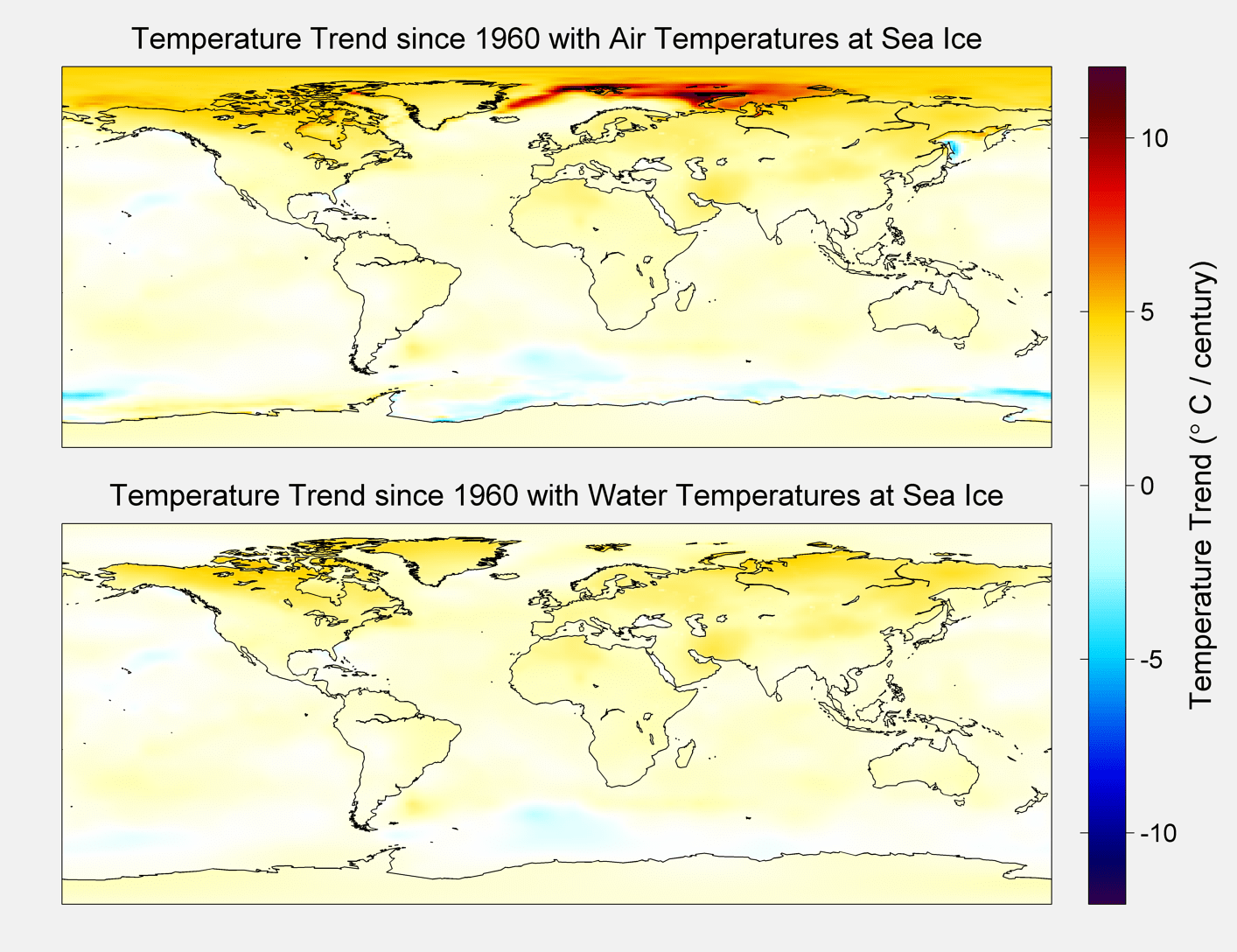
Figure 2. Trend Maps
The resultant average for each method is shown below.
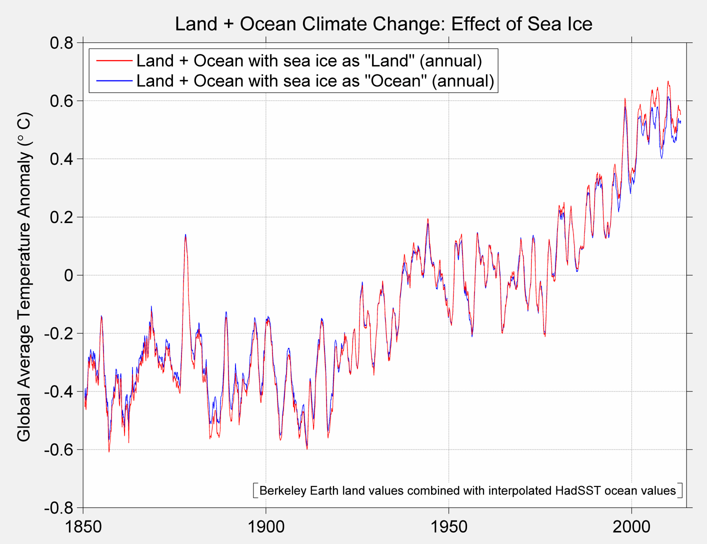
Figure 3A Berkeley Earth Global Temperature baseline and alternative treatment
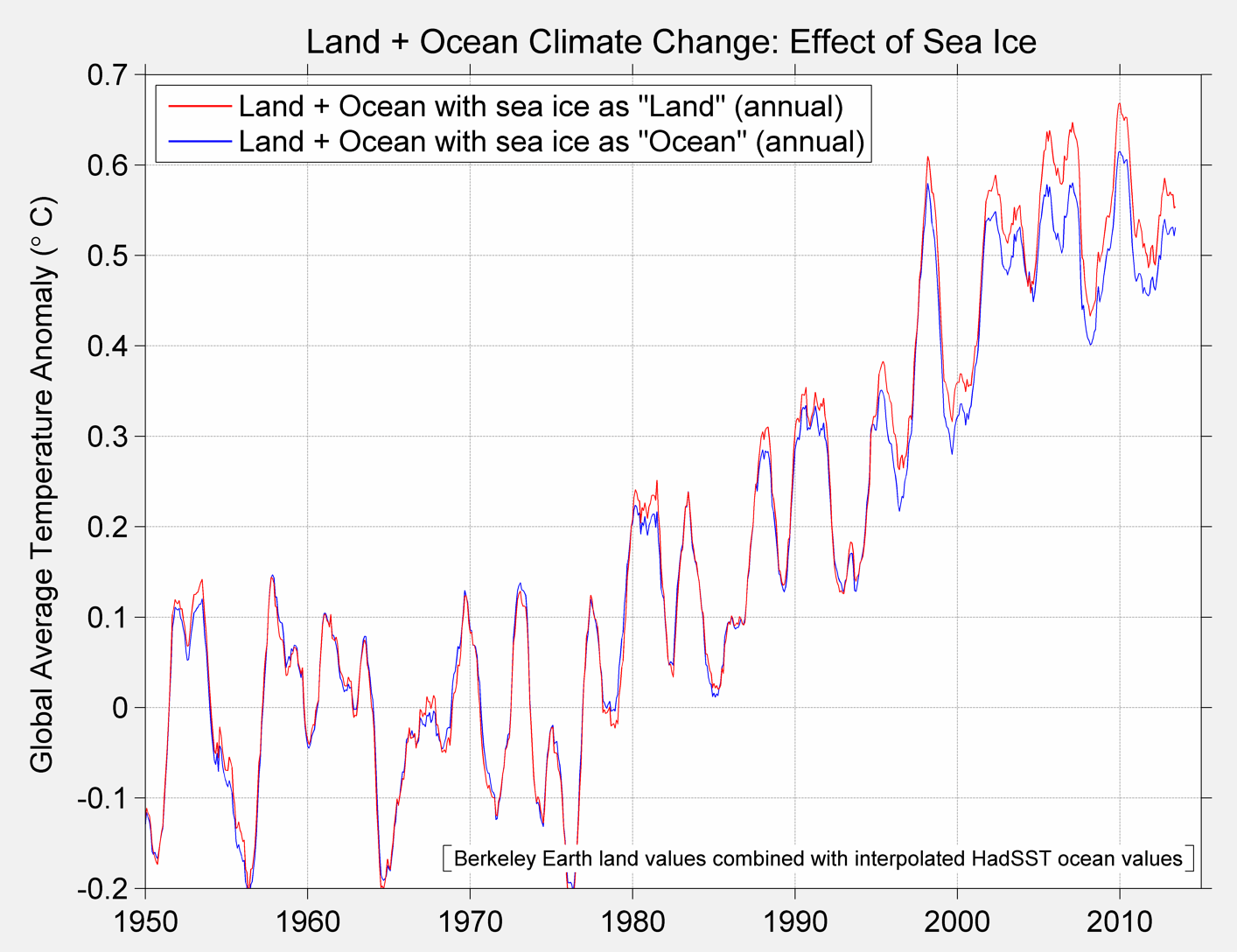
Figure 3B Berkeley Global Temperature Baseline and alternative from 1950 to present

Figure 3C. Annual Average Temperature
The reason for looking at these different approaches will also allow us to make observations about the choice that HadCrut4 makes. In their approach they leave these grids cells empty. Let me illustrate the different approaches with a toy diagram:
| 3 | 3 | 3 | 3 | 3 |
| 3 | 5 | 5 | 5 | 3 |
| 3 | 5 | NA | 5 | 3 |
| 3 | 5 | 5 | 5 | 3 |
| 3 | 3 | 3 | 3 | 3 |
Table A
In table A the average is 3.67 when we compute the average over the 24 cells with data. That is operationally equivalent to table B.
| 3 | 3 | 3 | 3 | 3 |
| 3 | 5 | 5 | 5 | 3 |
| 3 | 5 | 3.67 | 5 | 3 |
| 3 | 5 | 5 | 5 | 3 |
| 3 | 3 | 3 | 3 | 3 |
Table B
Such that when we refuse to estimate the missing data that has the same result and is operationally equivalent to asserting that the missing data is the average of all other data.
When we estimate the temperature of the globe we are using the data we have to estimate or predict the temperature at the places where we have not observed. In the Berkeley approach we rely on kriging to do this prediction. I found this work helpful for those who want an introduction: http://geofaculty.uwyo.edu/yzhang/files/Geosta1.pdf . Consequently, rather than leaving the arctic blank, we use kriging to estimate the values in that location. This is the same procedure that is used at other points on the globe. We use the information we have to make a prediction about what is un observed. In slight contrast, the approach used by GISS is a simple interpolation in the arctic. That would yield table C and an average of 3.72 as opposed to 3.67. (Note that there are times where the interpolation result will give the same answer as a Krig. ) Both approaches, however, use the information on hand to predict the values at unobserved locations.
| 3 | 3 | 3 | 3 | 3 |
| 3 | 5 | 5 | 5 | 3 |
| 3 | 5 | 5 | 5 | 3 |
| 3 | 5 | 5 | 5 | 3 |
| 3 | 3 | 3 | 3 | 3 |
Table C
The bottom line is that one always has to make a choice when presented with missing data and that choice has consequences; sometimes they can be material. Up to now the choice between ignoring the arctic or interpolating hasn’t been material. It may still not be material, but it’s technically interesting.
Once we view global temperature products as predictions of unobserved temperatures, we can see a way to test the predictions: go get measurements at locations where we had none before. Then test the prediction. With data recovery projects underway for Canada, South America and Africa we will be able to test the various methodologies for handling missing data as well as the accuracy of interpolation or kriging approaches. Another approach is to compare results from independent datasets. That is what I will focus on here.
The dataset I’ve selected is AIRS Version 6, level 3 data. In particular I’ve selected a few interesting files from the over 700 climate data files that sensor delivers. I selected AIRS primarily because of an interesting conversation I had with one of the PIs at AGU and because it allowed me to do some end user testing for the gdalUtils package for R. So this is exploratory work in progress. For the first pass at the data I’ve looked at AIRS skin surface temperature, surface air temperatures, and temperatures at 1000,925,850,700 and 600 hPA. There is more data, but I’ve started with this.
Below find snap shots from Nov 2013 for AIRS Surface Air Temperature and Skin Temperature, BerkeleyEarth and HadCrut4.

Figure 4A HadCrut
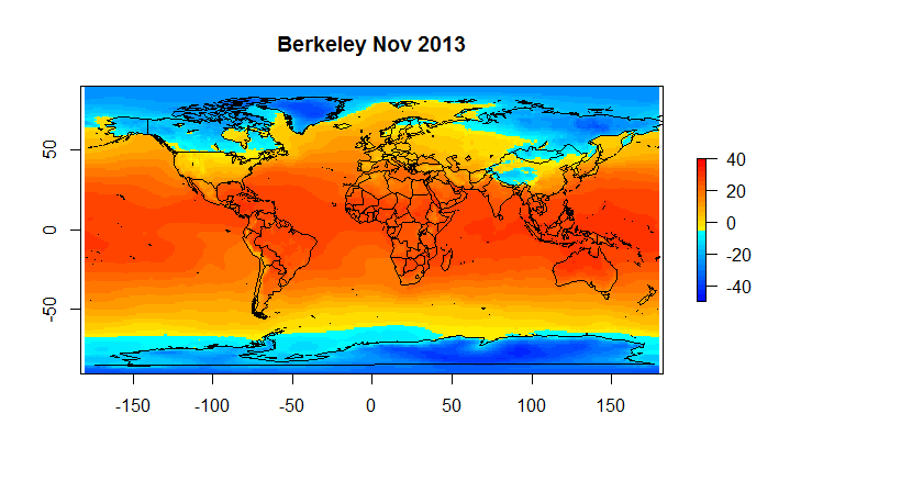
Figure 4B Berkeley Earth
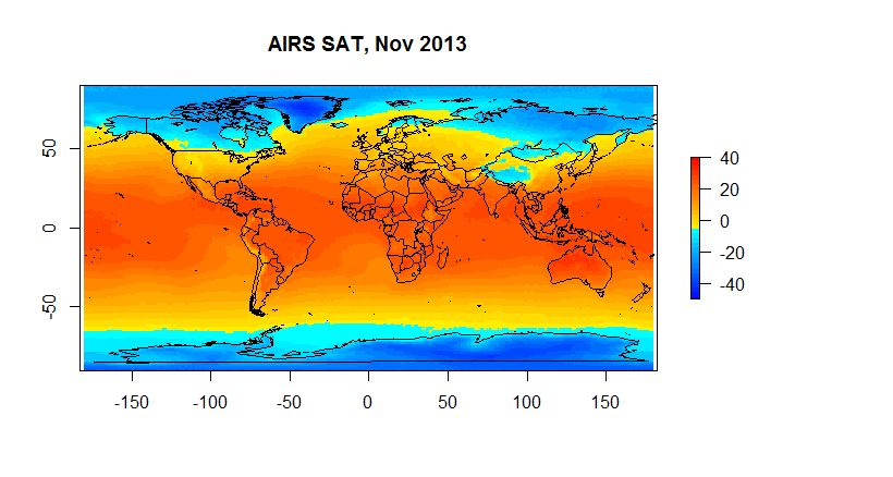
Figure 4C Airs SAT
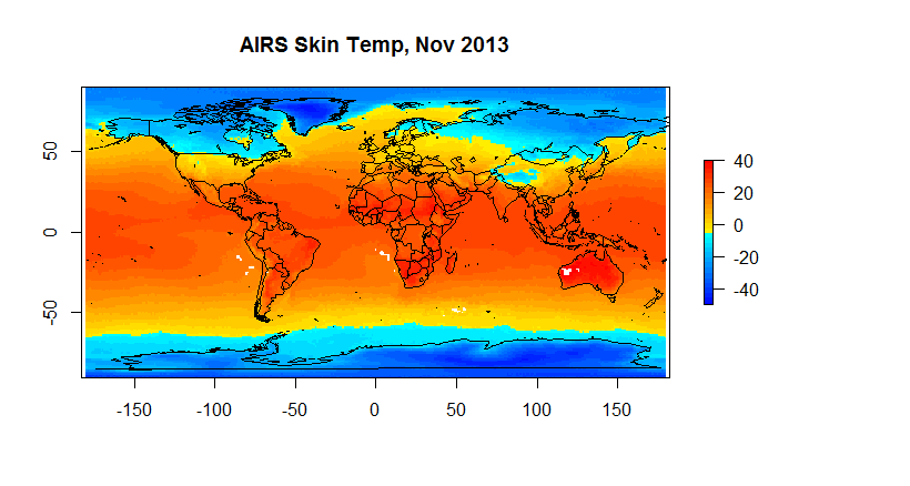
Figure 4D Skin Temperature
Hadcrut as you can see suffers from a low resolution ( 5 degrees) ; and, it has a substantial number of gaps on a monthly basis. However, when we are looking at global anomalies , the answers given by CRUs low fidelity approach end up fairly close to Berkeley Earth. If one wants to look at regional or spatial issues, Hadcrut isn’t exactly the best tool for the job.
For example, if we want to look at the arctic we have the following.
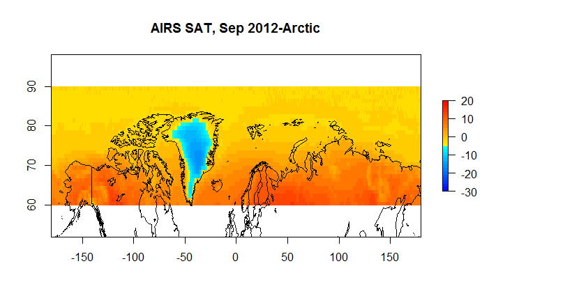
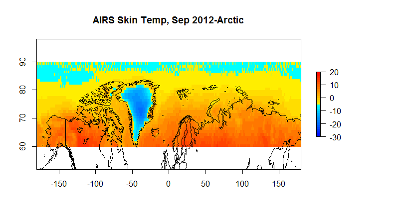
Figure 5B A AIRS Skin 60N-90N
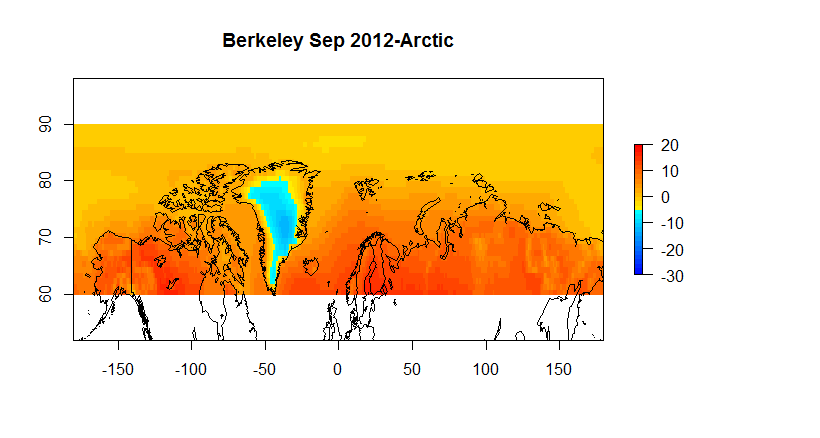
Figure 5C Berkeley Earth 60-90N
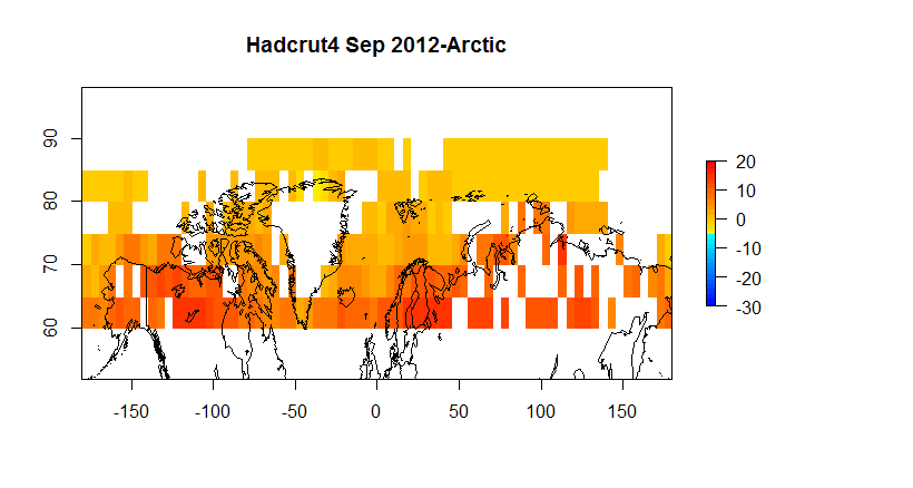
Figure 5D Hadcrut4 60-90N
The AIRS products, one should note, like other satellite temperature products, infers temperature from brightness. The simple approach of comparing the AIRS temperatures with in situ temperature is not straightforward for the following reasons.
- AIRS orbits have a 130AM and 130PM equatorial crossing time. This results in temperatures being taken at different times for the two products such that averages cannot be directly compared.
- AIRS monthly data has different counts depending on cloud conditions\QA
- Neither AIRS SAT or Skin Temp is the same as SST as collected for the Berkeley dataset
- AIRS has known biases when validated against ground stations/buoys etc.
What that means is that you do not expect the air temperature as inferred by a satellite to match the temperature as recorded by an in situ thermometer, especially given the differences in observation practice. However, the temperature fields are highly correlated and in a future post ( or perhaps paper) I’ll show how the trend in the all three ( Berkeley, AIRS SAT and AIRS Skin) are nearly identical and detail the correlation structure which is quite remarkable given the differences in observation methodologies.
To end up here are the comparison charts that most everyone will be interested in.
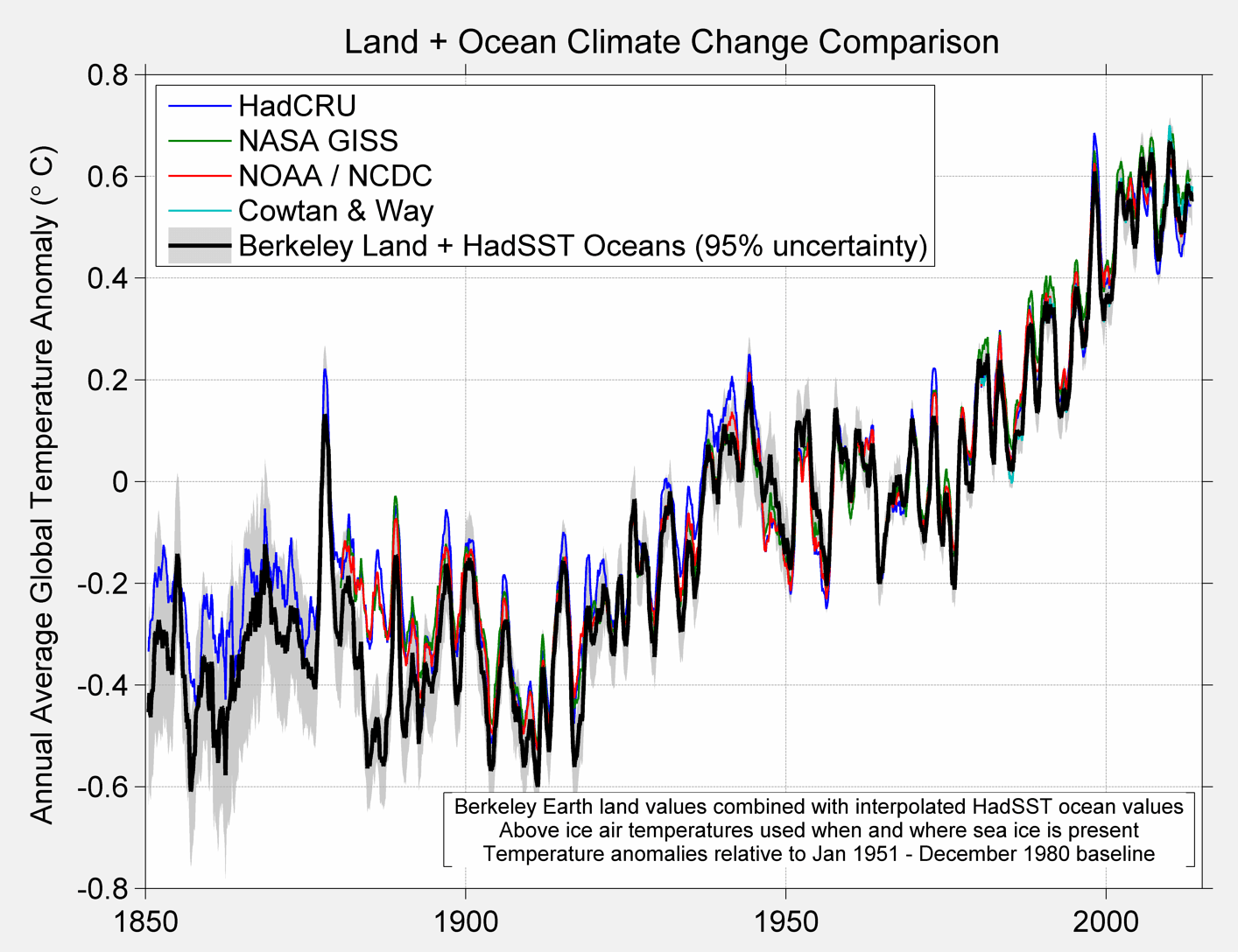
Figure 6 A. Comparison of various global temperature products
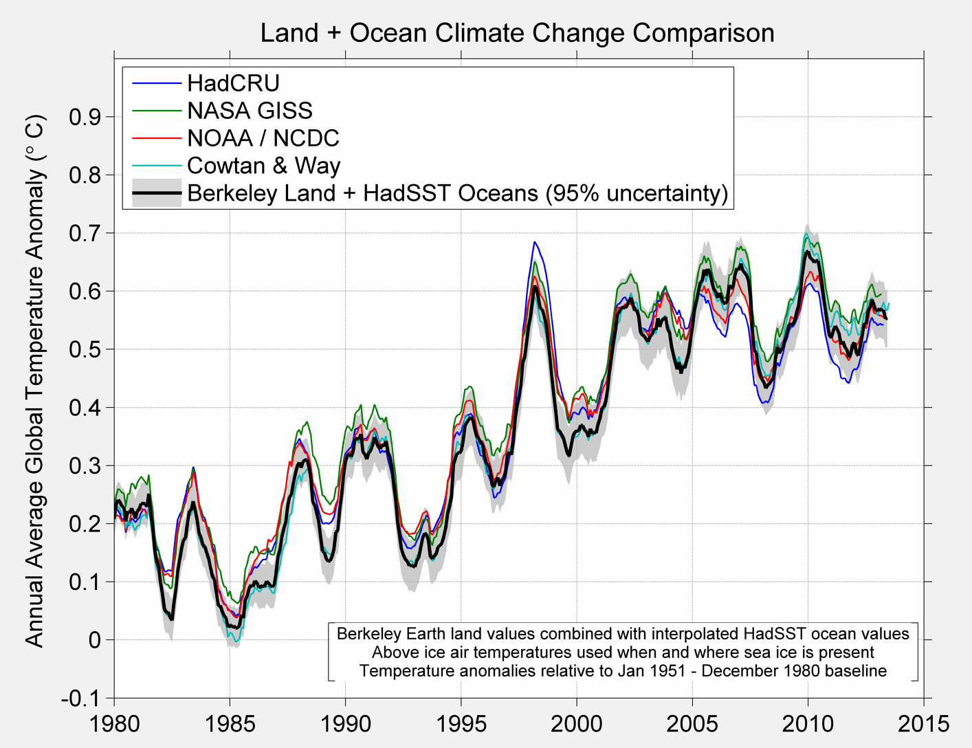
Figure 6B
If you have any questions feel free to write to me at steve @ berkeleyearth.org. There are other data products coming out that require some of my attention but I do try to answer all emails.