
by Javier
A conservative outlook on 21st century climate change
Summary: For the past decade anthropogenic emissions have slowed down, and continuation of current trends suggests a peak in emissions by 2050. Atmospheric CO2levels should reach 500 ppm but might stabilize soon afterwards, as sinks increase their CO2uptake. Solar activity is expected to continue increasing after the present minimum, as the millennial cycle works its way towards a late 21st century peak. The reduction in the rate of warming might continue until ~ 2035 followed by renewed warming, and temperature stabilization at about +1.5°C above pre-industrial. The pause in summer Arctic sea ice melting might also continue until ~ 2035. Renewed melting is probable afterwards, but it is unlikely that Arctic summers will become consistently ice free even by 2100.
Introduction
“The future is unknowable, but the past should give us hope.”
Winston Churchill. 1958.
Karl Popper’s falsifiability criterion for science requires that hypotheses not only explain known evidence, but also must be testable by evidence still unknown. However, a problem arises when any failed ex-ante prediction made by a hypothesis, can be post-hoc explained in multiple ways leaving the hypothesis nearly intact. An example is the pause in global warming that took place between 2001-2013, while accelerated warming was the CO2-hypothesis outstanding prediction for the 21st century (IPCC-FAR, 1990). The pause was explained in multiple ways (see: Nature Climate Changevol. 4, issue 3, 2014, and Nature’s“Focus: Recent slowdown in global warming“). To meet Karl Popper’s scientific criterion, the CO2hypothesis of climate change must make predictions that cannot be post-hoc explained when they fail. When demanding urgent action on CO2emissions, the predictions that can falsify the hypothesis are being made for a period ending in 2100, more than 80 years away. Its falsifiability is being removed until it no longer matters for present policy decisions.
This article deals with scientific forecasting of future climate change and its consequences. As with any other activity, forecasting has been the subject of systematic studies, and three of the foremost experts in forecasting principles have established the golden rule of forecasting: “be conservative by adhering to cumulative knowledge about the situation and about forecasting methods”(Armstrong et al., 2015). Research has shown that ignoring the guidelines deduced from the golden rule greatly increases forecasting error. However, climate forecasting is dominated by radical predictions, many of which are absurd, yet they are given disproportionate positive attention. Two of the authors (Green & Armstrong, 2007) analyzed the IPCC-Fourth Assessment Report, concluding that its forecasts were not the outcome of scientific procedures, but “the opinions of scientists transformed by mathematics and obscured by complex writing,” and warned that research on forecasting has shown that experts’ predictions are not useful in situations involving uncertainty and complexity. Previous research by Philip E. Tetlock had already demonstrated that expert forecasting is usually worse than basic extrapolation algorithms, and that there is a perverse inverse relationship between fame and accuracy in forecasting (Tetlock, 2005). J. Scott Armstrong went further and in 2007 challenged the IPCC prediction of 3°C/century (IPCC-TAR, 2001) with a no-change forecast for the next 10 years (2008-2017). Using the UAH dataset and judging by cumulative absolute error, the no-change forecast reduced forecast errors by 12% compared to the IPCC projection, showing that the IPCC projection had no value, since it was beaten by a no-change forecast (Climate tipping alarm vs scientific forecasting).
The first eight articles in this series analyzed the cumulative knowledge about climate change necessary for conservative forecasting.
- The Glacial Cycleis necessary to understand our interglacial evolution and the role of Milankovitch forcing.
- The Dansgaard-Oeschger Cycleresearches the causes and consequences of the most abrupt climatic changes in the past.
- Holocene Climate Variability (Aand B) analyzes climate change during our interglacial.
- The 2400-year Bray Cycle (A,B, and C) describes the major solar cycle that has determined important climatic shifts in the past, impacting human societies.
- The 1500-year Cycleadds a much studied and little understood non-solar climate cycle, of a proposed tidal-oceanic origin, and its relationship to the Dansgaard-Oeschger cycle.
- Centennial to Millennial Solar Cyclesfills the gap of shorter solar cycles, of which the millennial cycle shows a big climatic effect on the Early and Late Holocene.
- Climate Change Mechanismsanalyzes the way the planet responds to different climate forcings and internal variability, including the 60-year oceanic oscillation that has characterized climate change for the past centuries.
- Modern Global Warmingdescribes the features of climate change since the Little Ice Age and the perceptible effect of anthropogenic forcing for the past seven decades.
With that knowledge we can attempt to conservatively forecast future climate change for the next decades. After all, if a no-change forecast can beat IPCC forecasts, it should be a lot easier for knowledge-based conservative forecasts. The starting premise for the conservative forecast presented here, derived from past and present climate change evidence, is that greenhouse gases (mainly CO2), solar variability, and oceanic oscillations, are all significant climate variables in the centennial timeframe considered. It is important to remark that forecasts only consider a very limited number of variables and the rest is assumed asinvariant. This necessary simplification means that with increasing time the chance of a forecast being correct decreases even if the variables considered were correctly projected. The future is, after all, unknowable.
Changes in CO2emissions and atmospheric levels.
Atmospheric CO2levels are very likely to continue increasing for the next 30 years, even if changes in the rate of emissions take place. Due to the large size of natural stores, sinks, and sources, the trend in atmospheric CO2levels responds slowly to changes in emissions. A 2009 decrease in emissions due to the financial crisis is not perceptible in atmospheric CO2levels. A conservative forecast by extrapolating the average increase in CO2values for the past 10 years gives 491 ppm of CO2by 2050. Slightly higher values could be reached if the observed acceleration in the rate of increase of CO2values is maintained (figure 111), but this acceleration has been decreasing with time and is currently very small.
Regarding CO2emissions, the failure of past projections shows how difficult it is to forecast future emissions. It is very easy to extrapolate fossil fuel consumption that has experienced continuous growth for over a century, but several factors are very likely to have a significant impact in fossil fuel production for the 2018-2050 period, making a simple extrapolation a non-realistic forecast. The UN population forecast shows that there is a profound and inevitable demographic change taking place (United Nations, 2017). The UN medium-variant projection shows every region except Africa reaching peak population by 2050. The aged >60 population is the fastest growing group and by 2050 all regions of the world except Africa will have at least a quarter of its population above age 60. Population demographics suggests a growing negative pressure on per capita energy use, whose increase has been driven in the 21st century by the growing Asian middle class. For countries with high dependency ratios of old people (% >64 / working age), what it is observed is a decrease in per capita energy use with time (figure 116). China’s former one-child policy is going to turn its demographic dividendinto a demographic burden very fast. China’s working population has already peaked in 2010, and by 2040 it should have a dependency rate, old, similar to Japan.

Figure 116. Declining energy per capita for countries with aged population. Primary energy consumption (tons of oil equivalent) per person, for the world (black line) and the three countries with highest dependency rate, old (number of people above 64-years old per 100 people in working age. Italy, dark grey; Japan, medium grey; Finland, light grey). Japan’s population has been declining since 2010, Italy’s population since 2014, while Finland’s population is still growing. Source of data: BP Statistical Energy Review 2018, and World Bank.
Besides an increasing fraction of older people, population decrease should also reduce the total energy demand. From the supply side, coal production is showing an unexpected lack of growth, and oil production is generally expected to peak within the 2018-2050 period for a variety of reasons, including reducing energy return on energy invested (EROEI, manifested in increasing costs of production), energy transition mainly to natural gas, but also to alternative energy sources, and active global policies to reduce oil and coal burning.
Because of these and other economic factors, our CO2emissions have been growing more slowly for the past six years, having already reached its lowest 5-year average value since the early-1990s, over 20 years ago (figure 117, purple line). Our emissions are growing now at a rate like RCP4.5 (figure 117, black line). If the present trend slowing continues, a decrease in CO2emissions should start before 2050 and should continue for the foreseeable future, unless demographic trends change. The slowing in emissions rate started years before the Paris Agreement, but there is little doubt that its continuation will be fully attributed to its success.

Figure 117. Global CO2emissions have almost stalled. Yearly percentage rate of increase in global CO2emissions from fossil fuels and industry (blue bars, LHS), and its 5-year average (purple line, LHS). Global CO2emissions from fossil fuels and industry, in gigatons of CO2(black line, RHS). CO2emissions considered by the four IPCC emissions scenarios in the four representative concentration pathways (red, orange, light and dark blue lines, RHS). Since 2011 our emissions have been growing at a similar rate to RCP4.5. Source: Boden, T.A., Marland, G., & Andres, R.J. (2017). U.S. Department of Energy. Data for 2015-17 from BP Statistical Energy Review 2018, adding cement and flaring contribution estimates. RCP from IPCC AR5.
What would happen to atmospheric CO2levels under a likely decreasing emissions scenario from 2050? This scenario is similar to RCP4.5 that shows stabilizing atmospheric CO2at ~ 500 ppm (van Vuuren et al., 2011; table 2). However, carbon sinks have been a considerable source of positive surprises to climate researchers. First, it was the “missing sink”(Schindler, 1993), since it could not be explained where the emitted CO2that did not remain in the atmosphere was going. Environmentalists were slow to accept that the biosphere was expanding and greening in response to increasing CO2and warming, despite the opposite effect being well-documented during glacial periods. Then climate scientists became worried that the land (Canadell et al., 2007) and ocean (Schuster & Watson, 2007) carbon sinks were saturating. However, the opposite has been found, and sinks are actually increasing their rate of uptake (Keenan et al., 2016). If in the 1960’s they were taking up ~ 40% of our CO2emissions, they are now taking up ~ 55% of our much larger current emissions (figure 118; Hansen et al., 2013).

Figure 118. The decreasing airborne fraction. The airborne fraction (light blue) is the fraction of our CO2emissions (red, in gigatons of carbon) that remains in the atmosphere each year. The 7-year mean (dark blue) shows how over time a smaller part of our much larger emissions remains in the atmosphere. Source: J. Hansen, et al. 2013. Environ. Res. Lett. 8, 011006. Updated by J. Hansen.
The reason why sinks are taking up more CO2from the atmosphere is that we are farther from equilibrium. Since atmospheric CO2changed very slowly before anthropogenic emissions from fossil fuels, it can be assumed that sinks (K) and sources (S) were at equilibrium at 280 ppm (ΔK = ΔS). Due to warming the oceans release ~ 16 ppm/°C, so current equilibrium is ~ 290 ppm. Since the current level (~ 400 ppm) is above equilibrium level, sinks are larger than sources (ΔK > ΔS), and the the farther we are from equilibrium, the larger the difference between sinks and sources (ΔK–ΔS). If we stabilize emissions (E) near present levels, as current trend suggests, the difference between sinks and sources will continue increasing until it matches emissions (ΔK–ΔS = E), reaching a new equilibrium for constant emissions. Since we are ~ 120 ppm above equilibrium and sinks are absorbing 55% of our emissions (ΔK–ΔS = 0.55E), it can be calculated that for constant current emissions the new equilibrium lies at 220 ppm (120/0.55) above the present equilibrium value of 290 ppm, or 510 ppm.
Given constant emissions at present levels, atmospheric CO2should increase logarithmically towards 510 ppm, at which point sinks should match sources plus emissions (ΔK = ΔS + E). One of the biggest mistakes in the climate change debate is assuming that we need zero emissions to stabilize CO2levels. Deep ocean carbon stores are so large that carbon sinks can be considered unlimited in terms of anthropogenic emissions. The planet has dealt with much higher perturbations of CO2atmospheric levels in the past, as supported by the large δ13C excursions associated with the formation of large igneous provinces that formed over tens of thousands of years. The IPCC hypothesis predicts that under constant emissions there should be a constant increase in atmospheric CO2levels and the airborne fraction of anthropogenic CO2should increase as sinks saturate. However, after 10 years of stabilizing CO2emissions it should become apparent that the airborne fraction of fossil fuel CO2is decreasing and the rate of increase in total atmospheric CO2is slowing down. Once more we are poised for another positive surprise by carbon sinks.
Fossil fuel CO2emissions are growing more slowly (figure 117) and there is the possibility that they will decrease in a few decades. Once our emissions decrease, atmospheric CO2will start slowly decreasing, as sinks and sources equilibrate to our decreasing emissions.
Fossil fuel changes.
The biggest part of our CO2emissions is due to the burning of fossil fuels, and a cursory analysis of future fossil fuel production is required for a more accurate forecasting of future CO2levels.
Coal production reached a maximum in 2013 and although it is increasing again (BP Energy Review 2018; figure 119 a), it is still below 2013 levels. The decline in coal production has been completely unexpected. It is probably helped by an increasing trend in coal plant retirements reaching 30 GW/year (Shearer et al., 2017; figure 119 b), as many coal plants are very old. There are plans to increase the number and capacity of coal plants worldwide and coal production should increase again, but coal plant implementation rate has been low lately (37% for the period 2010-2016), with most plant projects halted, cancelled, or shelved. From January 2016 to January 2017 the amount of coal power capacity in pre-construction planning decreased from 1,090 to 570 GW (Shearer et al., 2017). We cannot discard a higher future coal production, because coal reserves are abundant, but as coal is being increasingly substituted by gas and other energy sources, it is unlikely that coal production will return to the vigorous growth of the 2002-2011 period. The unexpected drop in coal production from 2013 to 2016 increases the chances that Peak Coal could take place several decades earlier than forecasted. ExxonMobil Outlook for Energy 2018places Peak Coal in 2025.

Figure 119. Peak Coal in 2013.a)Coal production 1981-2017 in million tons for the world (black line), China (orange line), OECD (blue line), and the rest of the world (grey line). Source: BP Statistical Energy Review 2018. b)Annual coal plant retirement 2000-2016 in megawatts. Source: Shearer et al., 2017. Boom and Bust 2017 Report.
Oil is the least abundant fossil fuel. Several signs indicate we are approaching the end of oil growth (Peak Oil). Oil is categorized by its density (specific gravity), and with time the proportion of light oil from tight formations, liquid condensate from natural gas, and heavy oil, has been growing at the expense of more desirable intermediate density oil. It is also clear to anybody that we would not have to resort to fracturing shale rocks with high pressured water to obtain low-producing wells that decline by 75% in just three years, if we could still get sufficient oil by more conventional methods.
The impression that peak oil is approaching is confirmed by analyzing the oil growth curve. For the past 30 years oil growth has been declining from ~ 2% to ~ 1% (figure 120). This is a period when oil production has not been constrained, and more oil could have been produced if more demand for it existed. The decline can be attributed to a multitude of factors, including global economy growth rate, increasing oil use efficiency, economic changes that reduce energy intensity, demographic changes, and active policies to reduce oil consumption. If this long-term trend continues, peak oil is expected to be reached ~ 2065 when oil growth should cease, but linear trend extension is a poor way of forecasting. While it is hard to imagine realistic scenarios that would invert a 34-year trend towards slower oil growth, there are several scenarios that might accelerate Peak Oil. Obtaining oil from more difficult geologic formations leads to a higher cost oil that, to be sustainable over the long term, must be adequately reflected in oil price, and should promote oil substitution. The net energy yield of our global oil operations is decreasing, becoming a less efficient, less competitive process. Concerns over CO2emissions are also driving oil substitution with policies that for example support the increase in electric vehicles.

Figure 120. Decrease in the rate of change of world oil production. Ten-year average of the percentage change in oil production between 1983 and 2016 with its linear trend. The time of the peak in conventional oil and the shale revolution are indicated. Source of data: BP 2018 Energy Review.
The conservative forecast for oil production proposed here is in stark contrast to every single official projection by the International Energy Agency, the U.S. Energy Information Administration, British Petroleum Statistical Review of World Energy, or ExxonMobil Outlook for Energy, as none of them projects a decline in world oil production for the next decades. Therefore, it is fair to ask if it is really conservative to predict a Peak Oil within the next three decades. After all the business-as-usual projection has proven superior so far despite repeated claims of impending Peak Oil in the past. Each one must decide about that and I have exposed the reasons that lead me to believe Peak Oil is a conservative prediction. I am also certain that no official projection will ever anticipate a decline in production as they cannot afford to be wrong on that. They will only see a decline after a decline is taking place, and therefore have no predictive value. The decline in coal production is an example. It was never predicted before it took place, but it is predicted in some scenarios afterwards.
If Peak Oil does take place before 2050, the lack of oil growth will have to be compensated by other energy sources, if global energy consumption is to continue growing unaffected. While our response to Peak Oil might be to increase our coal consumption, it is reasonable to assume that we will also substitute it by gas and other energy sources, leading to a decrease in CO2emissions. Climate change scenarios that consider GHG emissions must factor in the almost inevitable reduction in our CO2emissions during the 21st century to avoid being unrealistic.
Changes in solar activity.
Forecasting solar activity has proven difficult. There is currently no known mechanism that can explain long term solar-variability, and accurate prediction beyond the next cycle has not been demonstrated so far. Cycle forecasting takes advantage of the presence of repeating features like solar extended minima every ~ 100 years (centennial lows) identified from past activity, despite not knowing what causes them. Humans predicted seasons thousands of years before they could explain them.
Solar activity has been increasing for the past 300 years according to sunspot observations and solar proxies (figure 121, trendline). The centennial solar cycle defines three oscillations (C1-C3, figure 121) delimited by the lowest sunspot minima every ~ 100 years. The last oscillation, C3, has the highest average sunspot number (93.4 ss/year). This period, and particularly between 1935-1995, has been termed the modern solar maximum (Kobashi et al., 2015). We are currently in a centennial extended minimum in solar activity between C3 and C4, that has been proposed to be named the Eddy solar minimum. The cycle-based forecast indicates it should affect mainly SC24 and SC25 with increasing solar activity afterwards. SC25 has already been forecast to be intermediate between SC24 and SC20 by the reliable polar fields method (Svalgaard, 2018), suggesting cycle forecasting is correct. My cycle-based solar activity forecast was made in 2016.
A cycle-based forecast for 2018-2050 must consider the centennial periodicity. Analogues for SC25-27 are SC6-8, and SC15-17. Also, since long-term solar activity is increasing within the millennial periodicity towards its 2050-2100 maximum, SC25-27 should have higher activity than SC15-17, as that period had higher activity than SC6-8 (figure 121). The forecast therefore is:
– SC25 should be slightly above SC24, but below SC23.
– SC26 should also be above SC24, and probably above SC23.
– SC27 should be similar to SC22.

Figure 121. Sunspot forecasting based on solar activity cycles. International annual sunspot number 1700-2016 in black, with rising linear trend. The centennial periodicity represented as a sinusoidal curve with minima at the times of lowest sunspot numbers, defining the centennial periods C1-C3, with their span indicated by the dates below. Horizontal bars mark the average sunspot number for each period. C3 shows the highest solar activity of the three. C2 was affected by the presence of a bicentennial (de Vries) cycle low at SC12-13. Forecasted solar activity for 2017-2090 is shown in blue. C4 is set to coincide with a peak in the millennial Eddy cycle identified from Holocene solar proxy records, and likely to have more sunspots than C3 despite another de Vries cycle low expected for SC31-32. SC1, SC10, SC20, and SC29 constitute lows in the pentadecadal solar periodicity, that reduces sunspot numbers at the peak of the centennial periodicity. Source of data: SILSO, Royal Observatory of Belgium, Brussels.
From 2018-2035 solar activity is forecasted to be below average. From 2035-2055 activity should increase inversely to the 1980-2000 decline (figure 121). SC29 should have somewhat reduced solar activity due to the pentadecadal periodicity that also affected SC20 and SC10. From 2080 solar activity should decrease due to the bicentennial (de Vries) periodicity that affects solar activity a few decades in advance of the centennial minima.
In summary, 21st century solar activity should be a little higher than 20th century solar activity, due to being at the peak of the millennial Eddy solar cycle. This level of solar activity corresponds to the Holocene highest 25%, and no doubt is contributing to the present warm period. Lower than average solar activity should only take place in the 2006-2035 period. The Sun should promote warming during the 2035-2100 period but should reach maximal millennial activity during the 2050-2080 period.
A mid-21st century solar grand minimum is highly improbable
A mid-21st century solar grand minimum (21stC-SGM) prediction breaks the golden rule of forecasting, as it is a non-conservative prediction. Surprisingly a high number of well-known authors that question the CO2hypothesis have embraced the 21stC-SGM hypothesis. In the famous for the wrong reasons first issue of the Pattern Recognition in Physicsjournal, N.-A. Mörner and eighteen more authors signed a letter (Mörner et al., 2013), stating a conclusion and two implications that challenged IPCC interpretation of climate change and triggered the termination of the journal by its owners. Of interest here is the second implication that served as a basis to doubt IPCC claims:
“Several papers have addressed the question about the evolution of climate during the 21st century. Obviously, we are on our way into a grand solar minimum.”
I am sorry to disagree with such a long list of prominent scientists, but I just can’t find any convincing evidence for a 21stC-SGM, that would justify such a non-conservative forecast. Abdussamatov (2013), probably the first to write about this issue in Russian in 2007, mistakes the current centennial low with a bicentennial one, and ignores the modulating effect of the 2400-year Bray solar cycle on the bicentennial (de Vries) cycle amplitude. But the consensus dissolves upon scrutiny, as many of those authors have not published on the issue, and Scafetta (2014), and Charvátová & Hejda (2014) actually don’t predict a 21stC-SGM, but a tame run-of-the-mill centennial low. Charvátová foresees nearly identical activity for SC24-26 as for SC12-14, very far from SGM low values. Mörner, the first signatory, is so convinced of the coming 21stC-SGM that he doesn’t present any evidence in his numerous articles about the issue (Mörner, 2011). Salvador (2013), and Shepherd et al. (2014) rely on different models for their 21stC-SGM prediction, the first a tidal torque model, and the second a solar dynamo model. Salvador’s model disputes the approaching millennial peak in solar activity, with a projection of 160 years of very low solar activity, while the highly publicized by the UK press dynamo model from Zharkova’s group doesn’t adequately hindcast past solar activity. Together with Steinhilber & Beer (2013) evidence-based forecast, they all have the problem that the very reliable polar fields method has already forecasted a SC25 with more activity than SC24 (Svaalgard, 2018), contradicting their proposed continuous decline in solar activity towards the predicted SGM.
A conservative forecast that a SGM is not going to take place doesn’t need supporting evidence, as the Sun only expends ~ 17% of its time in SGM conditions (Usoskin et al., 2007), so the chances are skewed against it. However, an analysis of what is known about SGM builds a strong case against the 21stC-SGM hypothesis. 30 SGM have been identified during the 11,700-year Holocene based on a very high rate of cosmogenic isotopes production (Usoskin et al., 2007; Inceoglu et al., 2015; Usoskin et al., 2016; figure 122). The average is one SGM every 400 years, but SGM show a tendency to cluster. 17 SGM (57%) are at around two centuries of another SGM, and 7 clusters of 2 or more SGM can be recognized. That is why the de Vries bicentennial cycle is so important for SGM as it is a very favored spacing. Usoskin et al (2016) have shown that SGM have a statistically significant tendency to cluster at the lows of the 2400-year Bray solar cycle, challenging random-probability based analyses (Lockwood, 2010). If we also consider the 1000-year Eddy solar cycle, we can see that 26 SGM (87%) fall at or right next to the periods when one of these two cycles is at its lowest 20% (red areas in figure 122, 54% of time). The conclusion is clear, SGM tend to occur nine out of ten times when solar activity is at its lowest coinciding with the lows of the ~ 2400 and ~ 1000-year solar cycles. In periods like the present, outside the lows of both solar cycles, the Sun expends only 7.5% of its time in a SGM, and with a frequency of ~ 1 SGM in 1000 years.

Figure 122. Solar Grand Minima distribution during the Holocene. Thirty Solar Grand Minima (SGM) from solar proxy records during the Holocene, identified in the literature, are indicated by black boxes of thickness proportional to their duration. The ~ 2450-year Bray solar cycle (black sinusoidal) and the ~ 980-year Eddy cycle (red sinusoidal) identified in solar proxy records are displayed at their proposed time-evolution that best matches both solar activity and climate changes consistent with their periodicity. Periods where any of the cycles are at the lowest 20% of their relative sinusoidal function are marked in red, and comprise 54% of the Holocene. Present position is indicated by a dashed line. SGM show a bias towards clustering at the red areas. RWP: Roman Warm Period. DACP: Dark Ages Cold Period. MWP: Medieval Warm Period. LIA: Little Ice Age. MGW: Modern Global Warming. Source for SGM data: Usoskin et al., 2007; Inceoglu et al., 2015; Usoskin et al., 2016.
Forecasting a SGM for the mid-21st century is really a low-probability non-conservative proposition. I would expect the probability for a next SGM to become high again ~ 2450 AD.
Changes in global surface average temperature anomaly.
Over periods of a few years climate variability appears to be dominated by ENSO variability (figure 123), that so far has resisted forecasting attempts. The failure of the 2014 and 2017 El Niño forecasts (figure 124), shows the difficulty of forecasting ENSO and global temperatures even for a few months.

Figure 123. ENSO-Global temperature relation. June 2013-January 2018 Niño 3.4 region sea surface temperature anomaly (red, LHS), and monthly global surface average temperature anomaly (black, RHS). Sources: Australian Bureau of Meteorology and UK HadCRUT4.6 dataset.

Figure 124. February 2017 failed El Niño forecast. Niño 3.4 region sea surface temperature anomaly forecast from 1 February 2017 by the European Centre for Medium-range Weather Forecast. El Niño conditions are considered above +0.5°C anomaly. After only 7 months the outcome was completely out of the anomaly plume even though it extended over a range of 2.5°C. Source: ECMWF Seasonal System 5 Public Nino plumes.
2018 is already poised to be less warm than 2017 given winter conditions and the ENSO situation. The Pacific Decadal Oscillation (PDO) index is in decline and back to predominantly negative values since July 2017. The conditions that drive a negative PDO make a La Niña more likely in the near future. If a La Niña finally develops in 2018-2020 we should see a continuation of the short-term cooling trend that started in February 2016. By 2018-20 the solar minimum between cycles 24 and 25 should have some effect on global temperature. A decrease of ~ 0.2°C in global average surface temperature has been measured from solar maximum to solar minimum (Tung & Camp, 2008), so a similar effect is expected from 2014 to 2019 due to solar forcing alone. The combined effect of ENSO, oceanic oscillations, and lower solar forcing from the 11-year cycle suggest that the temperature decrease should continue at least until 2020. By then the global average anomaly should reach values close to the 2003-2013 average (the Pause), and below the linear trend from 1950 (figure 125).
The effect of multiple solar cycles with lower than average activity on temperatures is not well known, but previous similar periods, known as solar extended minima, coincide with cooling periods (Gleissberg, Dalton, and Maunder minima). A lag of ~ 10-20 years has been found between the decrease in solar activity and its effect on tree-ring growth and ice core temperatures in several reconstructions (Eichler et al., 2009; Breitenmoser et al., 2012; Anchukaitis et al., 2017). A longer lag has been found on the maximum effect of solar activity reduction on the increase in heat transport, causing cooling in low latitudes and warming in high latitudes (Kobashi et al., 2015). The present solar extended minimum, known as the Eddy minimum, includes SC24 and SC25. A conservative forecast on the effect of the Eddy minimum on temperatures indicates no additional global warming before 2035, and perhaps even a slight cooling. This forecast is also supported by the position of the 60-year oscillation (figure 102), that also indicates no warming for the first 3 decades of the 21st century.

Figure 125. Global temperature change 1950-2018: comparing observations to models. Global surface temperature anomaly (black curve; °C; monthly HadCRUT4 13-month averaged) with its linear trend (thin continuous line). Source: UK MetOffice. Coupled Model Intercomparison Project Phase 5 (CMIP5) multi-model mean temperature anomaly 1950-2045 under RCP4.5 conditions (fine blue line; 13-month averaged) with 25-75%, and 5-95% values (medium and light blue areas) for the 42 models used. Source: KNMI climate explorer. CMIP5 models were initialized in 2006 (vertical line) and reproducing historical climate to that point was a prerequisite.
It is remarkable that a knowledge-based conservative forecasting for the next 15 years as the one presented here, agrees so well with the naive no-change 2007 forecast by Armstrong for the past 10 years, that showed to be superior to IPCC early forecast. It is important to emphasize that although very variable in the short term at different places, Earth temperature is extraordinarily constant over the long term. 0.2°C is a small variation in temperature at temporal scales of less than one year, but a significant variation on yearly averages, an important variation in decadal temperature scales, and a huge variation in millennial scales. The Neoglacial trend that has driven glacier expansions all over the globe, culminating at the LIA, was just 0.2°C/millennium or less over the past five millennia (0.38°C/millennium in Greenland; Kobashi et al., 2015), due to Milankovitch forcing. The planet lost about one degree from the Holocene Climatic Optimum to the second millennium AD average, and this amount caused considerable glacier expansion and biome changes, reducing the tropical forests and expanding the tundra. Higher temperature changes are observed on shorter timeframes, but they also have lower and shorter effects. From July 2013 to February 2016 the global surface average temperature anomaly increased by 0.4°C but has since lost most of it (figure 125). Multidecadal to centennial temperature forecasting, to be conservative, must strongly constrain the amount of temperature change that it allows. That is the reason why Armstrong no-change forecast was better than IPCC 0.3°C/decade forecast. Frequent claims that we are on course to +2°C above pre-industrial average temperature by 2100, included in some official climate scenarios, require sustained long-term warming rates above what it has been observed over the past seven decades, and thus are highly unlikely to be correct in any case.
For the past 120 years, the global temperature anomaly has been changing by a long-term trend and a 60-year oscillation that have not been affected much by the increase in CO2. The long term temperature trend is ~ +0.12°C/decade in global temperature anomaly, while the 60-year oscillation departs from trend by ~ ±0.2°C (figure 125). After 2035 a likely increase in solar activity, and an expected change in phase in the 60-year oscillation, suggest a forecast for resumed warming during the ~ 2035-2065 period. Therefore, for the entire period 2018-2065 we should expect a continuation of the observed linear increase in temperature since 1950 (figure 125) of ~ 0.12°C/decade. Any small deviation from this linear trend should be towards lower values if emissions decrease or if solar activity is lower than expected. An increase in any of them beyond what is calculated is unlikely as they are already considered a high scenario.
Of the two most important external forcings contributing to Modern Global Warming, stabilizing emissions suggest that maximum CO2levels could be reached by ~ 2075, while maximum solar forcing is forecasted for the 2050-2080 period. If those forecasts are correct, it follows that maximum temperatures should be reached in the 2050-2100 period at ~ +1.5°C above pre-industrial values, and remain essentially stable, with variability due to natural oscillations and a small declining trend, for the rest of the present warm period (figure 126). This warm period, currently unofficially known as the Anthropocene, could last 2-3 centuries more, until ~ 2250-2350, if the Medieval Warm Period is a good analog.

Figure 126. Conservative temperature, CO2level, and emissions forecast to 2200 AD. CO2emissions from fossil fuels forecast (brown continuous line) based on a peak in oil consumption by 2030-40 (dashed brown line), a second peak in coal consumption by 2050-60 (dotted brown line) and increasing gas consumption to 2100 (dash-dotted brown line), producing a peak in CO2emissions from fossil fuels at ~ 35 Gtons by 2050. Historical CO2emissions from fossil fuels are from T. Boden, G. Marland, and B. Andres, archived at CDIACand updated with BP Statistical Review 2018. Atmospheric CO2levels (blue line) should therefore stabilize at ~ 500 ppm by 2080 before starting to decrease slowly as sinks remove more than is added. Historical atmospheric CO2levels are fromLaw Dometo 1958 and from NOAAafterwards. An idealized millennial cycle in solar activity is represented by the orange line, peaking at 2050-2080, temporarily reduced by centennial and bicentennial lows indicated with their names. CMIP5 model-mean temperature anomaly (red line) projects reaching +1.5°C above pre-industrial by the 2030’s, and +2.0°C by the 2050’s. Temperature anomaly should stabilize until 2030s, increasing afterwards and peaking ~ 2070’s at ~ +1.5°C above pre-industrial, due to CO2and solar activity forecasts, and oceanic oscillations. Afterwards temperature anomaly could enter a slightly declining undulating plateau as both CO2and solar activity slowly decline. Historic temperature anomaly is from UK MetOffice HadCRUT4.
This conservative forecast of essentially no change in temperature for the next 200 years, allowing for ±0.5°C multidecadal changes, rests on the following assumptions:
– A continuation of the CO2emissions stabilizing trend observed over the past 7 years with a small declining trend of 0.3%/year after 2050.
– An increase in solar activity peaking ~ 2080 and a decrease afterwards.
– Unsaturating carbon sinks for the period and amounts considered.
– A trend to equilibrate carbon sinks and sources plus emissions at an airborne fraction close to zero.
The forecast does not depend on any change in policies or heroic reductions in emissions. Policies already being implemented, limitations in fossil fuel availability, and natural demographic changes set the course for future reductions in emissions. Faster reductions should not affect the forecast very much, as atmospheric levels should react slowly to them, and the effect of CO2on temperature appears to be lower than estimated by the IPCC (see: Modern Global Warming).
Consequences for Arctic sea ice
The 30% decline in Arctic sea ice extent that took place between 1995 and 2007 led to numerous radical forecasts, predicting in some cases a summer ice-free Arctic by 2016 (Maslowski et al., 2012) due mainly to albedo feedback leading sea ice into a death spiral (Serreze, 2008). Of course, radical forecasts are seldom true, and the albedo effect on sea ice has turned out to be lower than expected, because summer Arctic sea ice extent has refused to decline any further for the past 10 years. Green and Armstrong (2007) are proven correct in their assessment that experts’ predictions are not useful in situations involving uncertainty and complexity, when biases tend to go unchecked.
A knowledge-based Arctic sea ice forecast must take into account the known 60 and 20-year periodicities in sea ice (Polyakov et al., 2004; Divine & Dick, 2006; Wyatt & Curry, 2014; figure 126) probably responsible for the present Arctic summer melting pause. These oscillations are likely to produce no change to slight growth in Arctic summer ice until ~ 2035, when significant melting is more likely to renew. A conservative forecast is that Arctic summer sea ice will decrease at a slower rate for the period 2018-2050. By 2050 there should still be close to 4 million km2of summer sea ice in the Arctic (figure 127; table 2). A return to a warming, melting phase around 2040 might further reduce Arctic sea ice that could be down to ~ 2.5 million km2of summer sea ice (table 2) by 2100. With such low levels it cannot be ruled out that some summer might see an ice-free condition (< 1 million km2). This forecast is not too far from the IPCC RCP4.5 projection (figure 127; table 2), probably because the cryosphere (except Antarctica) is showing a strong response to increased CO2and soot levels.

Figure 127. Projected Arctic sea ice decline. Model simulations (colored lines), historical simulation (black dotted line), and observations (black line) of Arctic sea ice extent for September (1890-2090). Colored lines for RCP scenarios are model averages (CMIP5) and lighter shades of the line colors denote ranges among models for each scenario. Source for original figure: Walsh, J.D. et al. 2014. Modifications to the original figure: Brown line is a model based on the known 60 and 20-year periodicities in Arctic sea ice. Source: Javier 2017 WUWT. Black continuous line is NSIDC September Arctic sea ice extent for the satellite window (1979-2017), while 1935-1978 September Arctic sea ice extent data is from Cea Piron & Cano Pasalodos 2016 reconstruction. An extrapolation of the observed trend to 2012 (exponential fit) triggered multiple predictions of an essentially ice-free Arctic in summer (< 1 million km2) before mid-century, likely to be wrong. The conservative projection (brown line), explains the pause in Arctic sea ice melting since 2007 and suggests over 2 million km2of Arctic sea ice remaining by summer 2100.
The conservative forecast however is in stark contrast to the many alarmist projections from polar scientists that believe Arctic sea ice is past a tipping point and only accelerated rates of melting are possible now. Those projections that see an Arctic free of ice every summer before 2100 are very likely to be wrong. Lack of significant melting progress for the next decade and a half might clarify the issue.
Consequences for sea-level rise
In 2007 the IPCC made public its Fourth Assessment Report (AR4). Among AR4 emissions scenarios was B1, that contemplates slow growth in CO2emissions to 2050 followed by moderate decrease in emissions afterwards. This scenario is the one that best agrees with the conservative projection outlined above, and projects a 300 mm increase in sea levels for 2000-2100 (central estimate; figure 128). Seven years later the IPCC published its Fifth Assessment Report (AR5), and among the new scenarios RCP4.5 is the most like B1. However, the IPCC sea-level model is now a lot more aggressive and projects 525 mm for similar emissions (table 2). Such a strong upward revision responded to claims that models used in the 4th report substantially underestimated the observed past sea-level rise, although no acceleration has been observed since 1993. Despite the 60% increase due to a change of assumptions, the IPCC was severely criticized for producing estimates of sea-level rise that were too conservative. To provide a view that satisfied the consensus, Horton et al. (2014) conducted an expert elicitation (poll) on sea-level rise among authors of articles related to sea-level rise. Although they were only asked for a low and high scenarios, a mean projection can be obtained by averaging both (figure 128). This intermediate scenario derived from Horton et al. (2014) projects a rise of ~ 800 mm for 2000-2100. In 2017 NOAA published their updated global sea-level rise scenarios where the intermediate scenario, that is most consistent with RCP4.5, forecasts one meter of sea-level rise for 2000-2100 (Sweet et al., 2017; figure 128). Surprisingly, and despite lack of acceleration in sea-level rise since 1993, projections are becoming significantly more pessimistic with time.

Figure 128. Sea-level rise intermediate scenarios for 2100. Red curve, sea-level rise measured since 1993 and zeroed in 2000. Source: NASA. Dashed curves, sea-level rise projections for the 2000-2100 period under intermediate emissions scenarios from different sources. 2007 IPCC AR4 B1 scenario (dashed black); 2014 IPCC AR5 RCP4.5 scenario (dashed dark grey); 2014 Horton et al., survey intermediate scenario (average of the high and low scenarios; dashed medium grey); 2017 NOAA intermediate scenario (dashed light grey, Sweet et al., 2017). Black curve, Conservative oscillatory forecast based on 65-year oscillation and observed acceleration. All models were started at zero in 2000 but shown since 2017. The conservative oscillatory forecast is so far the closest to the observed value.
A conservative sea-level rise forecast considering only past sea-level increases, that for the last 70 years have taken place under rapidly increasing emissions, must consider the 65-year oscillation in sea levels (Jevrejeva et al., 2008), and the small 0.01 mm/yr2acceleration detected by most researchers (Church & White, 2011; Jevrejeva et al., 2014; Hogarth, 2014; figure 114). Such a forecast would see a 115 mm increase in the first half of the 21st century, and 175 mm increase in the second half, for a total 290 mm increase (figure 128; table 2). This increase is too small to constitute a problem on a global basis but might add to the problem of local sea-level rise in areas where land subsidence or lack of sufficient sedimentation are going to require adapting measures.
Other climate change consequences for the 21st century.
A conservative forecast is that most extreme weather phenomena should continue occurring in an unpredictable manner without a significant change in frequency. Storm data from the last 6500 years shows clearly that storms increase in frequency and strength with cooling, and decrease with warming (figure 75 b). The reasons are that warming reduces heat transport due to a decrease in the latitudinal temperature gradient, and that the atmospheric heat engine has a reduced ability to generate work due to an increase in the power required by the intensification of the hydrological cycle (Laliberté et al., 2015).
The only extreme weather phenomenon that is credibly projected to increase is the frequency and intensity of heat waves. However, the change could be smaller than anticipated as Modern Global Warming is having more effect on minimum, rather than on maximum, temperatures producing generally warmer winters. From a societal point of view, adaptation to increased heat-waves requires cheap, abundant energy.
The effect over the biosphere is more difficult to forecast, as it has shown very high adaptability through much bigger climate changes in the past. If we accept that the world in 2017 was ~ 0.95°C above the pre-industrial average, the conservative forecast indicates it might only increase a further 0.55°C before stabilizing. Therefore, we might have already seen over 60% of the total expected warming. The negative effects strictly from climate change over the biosphere are very limited, while the positive effects are abundant and profound. Most biomes, but particularly semi-arid ones, have responded to warming and CO2increase through an increase in leaf area (also known as greening; Zhu et al., 2016). These three factors appear to have caused an increase in global terrestrial net primary production of 12% between 1961-2010 (Li et al., 2017). The effect of this increased energy flux through ecosystems is beneficial to nearly all species. The net effect of the warming and increased CO2is clearly positive for the biosphere. It is reasonable to think that too much of a good thing should reach a point when the net effect starts being negative, but there is no evidence that we are close to that point or that it should be reached within the 21st century.
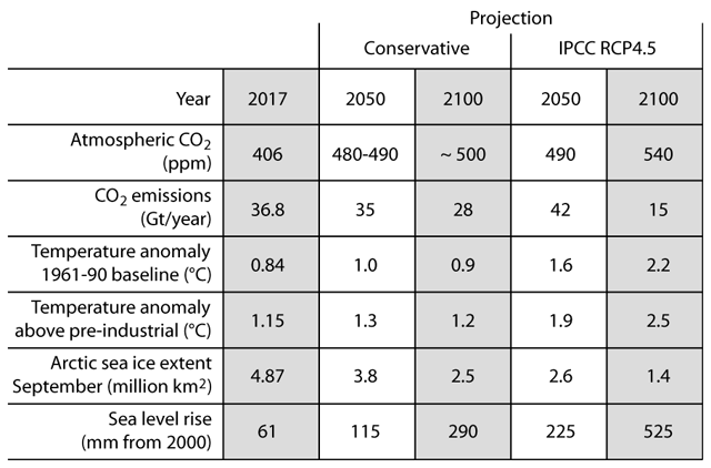
Table 2. Twenty-first century climate projections. The 2017 values for some climate indexes are given in the first data column. The rest of the columns give the projected or assumed corresponding values for 2050 (white background) and 2100 (grey background), for a conservative prediction and IPCC RCP4.5 emissions scenario. The biggest differences are for sea-level rise and temperature increase, where the conservative prediction is closer to observed changes for the past decades.
The loss of Arctic sea ice has been proposed to be a clear risk to polar bears, and the species was included in the US endangered species list solely on those grounds. However polar bears might not be very sensitive to summer ice reductions as their ice-dependent hunting takes place in spring and is negatively affected by too much ice. The species has survived very reduced or even absent summer Arctic sea ice during the Holocene Climatic Optimum and the past warmer interglacial. The main danger to polar bears has historically been human hunting, and since the international hunting limitation by the Oslo agreement of 1973, polar bear population estimates have been increasing, apparently unaffected by the loss of 30% of summer Arctic sea ice in the 1995-2007 period (Crockford, 2018). At present there is no evidence that polar bears are threatened during the 21st century from climate change, even if the projected summer ice loss in the Arctic takes place (figure 127).
Regarding other possible consequences, our knowledge is too limited to say much. Claims of sinking nations, hordes of climate refugees, and a new normal every time there is an extreme weather event, are wildly exaggerated and agenda-driven. The highest return for our limited resources is very likely to come from adaptation policies, and no-regrets policies. Policies to prevent or reduce climate change are destined to be highly ineffectual given the strong natural component of climate change, as the past demonstrates.
Projections
1) Human CO2emissions are stabilizing. Peak coal and oil, and current trends make a decrease in emissions very likely before 2050. Atmospheric CO2levels should reach 500 ppm but might stabilize soon afterwards.
2) According to solar cycles, solar activity should increase after the present extended solar minimum, and 21st century solar activity should be as high or higher than 20th century. A mid-21st century solar grand minimum is highly improbable.
3) Global warming might stall or slightly reverse for the period 2000-2035. Cyclic factors suggest renewed warming for the 2035-2065 period at a similar rate to the last half of the 20th century. Afterwards global warming could end, with temperatures stabilized around +1.5°C above pre-industrial, and a very slow decline for the last part of 21st century and beyond.
4) The present summer Arctic sea ice melting pause might continue until ~ 2035. Renewed melting is probable afterwards, but it is unlikely that the Arctic summer will become consistently ice free even by 2100.
5) The rate of sea-level rise can be conservatively projected to a 290 mm increase by 2100 over 2000 levels. Most rates published are extremely non-conservative and very unlikely to take place.
6) Climate change should remain subdued and net positive for the biosphere for the 21st century. Adaptation is likely to be the best strategy, as it has always been.
Acknowledgements
I thank Andy May for reviewing the manuscript, and providing useful comments towards improving its content and language.
Moderation note: As with all guest posts, please keep your comments civil and relevant.

Conservative predictions, but bold predictions. Risky enough to make the late Karl Popper proud! I’ll let you know every time oil production goes up, but I’ll keep quiet when it goes down. I learned how to do that studying climate science. ;-)
We live in an age where wild predictions are common and prudent predictions are seen as uninformed. The only sure thing is that the future will surprise nearly everybody, both for the things that will change as for the things that will not change.
I could only be surprised if something happened to climate temperature that was outside the bounds of the last ten thousand years.
More CO2 and more things growing better than ever and a better and better life for more people with more affordable energy is outside the bounds of the past ten thousand years and I do expect that.
“We live in an age where wild predictions are common and prudent predictions are seen as uninformed.”
The “prudent” prediction of Armstrong that you celebrate and apparently follow didn’t work so well. The IPCC didn’t forecast 0.3°C;/decade one could infer 0.2 from the AR 4. Armstrong’s “prudent” was 0. The HADCRUT outcome was 0.37°C/decade.
Oh yes, it did. The A1B (balanced) scenario showed +3°C for 2100. That works out as 0.3°C/decade.
https://www.ipcc.ch/ipccreports/tar/vol4/english/pdf/spm.pdf
Figure 6-1:
http://www.ipcc.ch/ipccreports/tar/vol4/images/fig6-1.jpg
“It is assumed that emissions of gases other than CO2 follow the SRES A1B projection until the year 2100 and are constant thereafter.This scenario was chosen as it is in the middle of the range of the SRES scenarios.””
The middle of the range scenario in TAR shows 0.3°C/decade.
We still have 0.12°C/decade in HadCRUT4 (figure 125 above). A null hypothesis works better than IPCC.
Nick Stokes – Reality check: The actual graph of temperatures since 2007 versus Armstrong and Gore predictions shows Armstrong winning the climate bet NOT Gore. see http://www.theclimatebet.com/graph-full.png
http://www.theclimatebet.com/
Javier,
“That works out as 0.3°C/decade.”
By linear interpolation. The curve shown clearly isn’t linear. But the SPM does have a forecast for this period, in big bold letters:
“For the next two decades a warming of about 0.2°C per decade is projected for a range of SRES emission scenarios.”
“We still have 0.12°C/decade in HadCRUT4 (figure 125 above)”
Please present some supporting arithmetic. The OLS trend of HADCRUT from Jan 2008 to Dec 2017 was 0.369 °C/decade. The IPCC said 0.2. 0.0 is not an improvement.
David
“Armstrong winning the climate bet NOT Gore. “
Using nonsensical criteria for a bet that was never made. But Javier’s claim was that zero trend was a better prediction, not that it would win a concocted bet.
It would seem our prudent predictions for future solar activity are similar. One based on patterns from the past, the other based on solar angular momentum. I have not seen a rational arguement for a forthcoming Maunder type event.
http://www.landscheidt.info/images/200predsm.jpg
Nick,
Observed (HadCRUT4 13-month avg):
Jan 1950 = -0.096
Jan 2018 = 0.669
Increase = (0.765/68)*10 = 0.112/decade.
Observed (HadCRUT4 13-month avg):
Jan 2002 = 0.458
Jan 2018 = 0.669
Increase = (0.211/16)*10 = 0.132/decade.
Clearly not what TAR (2001) predicted.
Javier,
“Clearly not what TAR (2001) predicted.”
Well, I see you are swapping to a new range. The proper measure of trend (OLS) says that for Jan 2002 to Jan 2018, HADCRUT 4 warmed at 0.1489°C/Decade. That is right in mid-range of what TAR (2001) predicted in the SPM p 13:
“This approach suggests that anthropogenic warming is likely7 to lie in the range of 0.1 to 0.2°C per decade over the next few decades under the IS92a scenario, similar to the corresponding range of projections of the simple model used in Figure 5d.”
And again, a “concervative” prediction of zero change is not better.
The TAR Summary for Policymakers from 2001 says in its page 8:
“For the period 1990 to 2025…, the projected increases are 0.4 to 1.1°C”
That works out as 0.114-0.314/decade.
What we’ve got is in the lowest range of TAR prediction. The problem is that the lowest range in TAR prediction means no change from 1950 trend. And no change means no effect from increasing CO₂ levels.
Javier, and others.
I think that the only hope for model comparisons is to:
1. choose a criterion or measure of model error. I propose the Mean Squared Prediction Error over all temperatures following the prediction (monthly or yearly).
2. at the time the model forecast/expectation/prediction is reported, write it down and start accumulating the squared prediction errors thence forward.
Trying in retrospect to select data intervals for model comparisons strikes me as almost hopeless, not noninformative, perhaps, but not supporting “tests” — there are too many opportunities for an informed person to select one of many proposed intervals, and to choose one of many proposed measurement statistics. And too many ways to rationalize mistakes instead of accepting them.
An alternative measurement of accumulated error is median absolute error; and another is mean absolute error.
Ii think formulating and then testing and choosing a really good model is going to take a long time.
Matthew,
I agree, but we don’t have 2 models from different hypotheses to test. The CO₂-hypothesis doesn’t have a competing hypothesis because it is so dominant in academia that nobody in his right mind would propose an alternative. Those that disagree must wait in silence until the CO₂-hypothesis fails to explain the evidence, or risk their careers. It could be a long wait. Many wrong scientific paradigms have taken decades to be dispelled.
The no-warming hypothesis of Armstrong is not really such a good idea, as we know the planet has been warming for several centuries. The important question is if CO₂ is accelerating the warming and by how much.
Andy, I noticed over in your recent post over at watts’ a graph that showed oil’s decline in its share of electricity generation. How much of the share of oil is for electricity generation verses gasoline production? (iow, what percentage of total oil production goes toward electricity generation?) If inflation is tied to the price of oil here in the states, then cheaper oil may mean larger future economies both here and abroad. (we have had an oil glut here in recent years which may account for our current low inflation and thus higher growth/ larger economy) Of course, should oil become scarce in the not so distant future then that would likely suppress economic growth and likewise emissions…
Liquid fuels are used for electricity generation in Saudi Arabia, islands, and remote locations. Oil prices will increase over time. My projection for the peak CO2 emissions is 2040, driven by the peak in refinery throughput..
afonzarelli, low grade fuel oil is used to produce electricity only when other sources are not available because it is very expensive electricity. It is often used on islands. It is used a lot in Hawaii and the Virgin Islands. Electricity where I live in Texas mostly comes from natural gas and costs ~10 cents/kwh, in the Virgin Islands it is about 75 cents. In Hawaii, it is around 33 cents, but this is lowered because Oahu has a large coal burning power plant.
The advantage of fuel oil (usually #2 is used, similar to vehicle diesel) is it has a very high energy density and can be trucked or shipped and does not require a pipeline or large port and land to store coal. Before countries had modern infrastructure (large ports, railroads, pipelines) fuel oil powered generators were widely used for electricity and electricity use was low, relatively speaking. But, the huge cost per kwh, has caused it to be replaced by coal or natural gas wherever possible. Today, Hawaii and the Virgin Islands are trying to replace it with solar panels, but have found they are very vulnerable to hurricanes and other tropical storms.
replace it with solar panels, but have found they are very vulnerable to hurricanes and other tropical storms.
solar panels are vulnerable to night and that happens after every day.
Dr Curry, you might want to send this one to the trash bin…
Reblogged this on Climate Collections.
The Glacial Cycleis necessary to understand our interglacial evolution and the role of Milankovitch forcing.
Study ice core data. It snows more when oceans are higher, warmer and thawed. That is the only time you can get enough snowfall to cause a major ice age. It snows less when oceans are lower, colder and frozen. All major ice ages end because of this.
All the other complicated stuff is meaningless complicated stuff.
Lesser ice ages start and end for lesser amounts of the same causes.
Warmer thawed oceans cause snowfall to cause a little ice age. Colder frozen oceans cause less snowfall that causes a little ice age to end.
Occam would look for a simple answer like this that always correlates with ice core data.
Major ice ages are created in both hemispheres at the same time because oceans are higher and warmer and thawed at the same time.
It takes a lot of evaporated ocean water to provide ice for a major ice age.
Major ice ages end at the same time in both hemispheres because low cold frozen oceans do not provide moisture for snowfall at the same time and both warm because the ice thaws and depletes and the oceans must rise again at the same time in both hemispheres. Ocean levels coordinate major ice age start and end. Orbit parameters alternate influence in the hemispheres. That does not work for the ice ages, they go together.
This is all based on actual data from ice cores in both hemispheres and just plain common sense.
Someday, some one of you may think, that makes sense, more snow happens when more warm thawed water is available. Ice ages happen as the more ice volume advances after it snowed more.
“Someday, some one of you may think, that makes sense…”
Perhaps not. Chaos is the parsimonious explanation. The US National Academy of Sciences (NAS) defined abrupt climate change as a new climate paradigm as long ago as 2002. A paradigm in the scientific sense is a theory that explains observations. A new science paradigm is one that better explains data – in this case ice core data – than the old theory. The new theory says that climate change occurs as discrete jumps in the system. Climate is more like a kaleidoscope – shake it up and a new pattern emerges – than a control knob with a linear gain.
There is no chaos in climate. There is only chaos in the theory of people who do not understand climate. When oceans are warmer, it snows more and ice accumulates and then later advances and it gets colder. When oceans are colder, it snows less and ice depletes and later retreats and it gets warmer. There have been larger cycles of this before 20 thousand years and and smaller cycles since 10 thousand years ago. The difference is easy to understand if you study ice core data. Correlations between thawed oceans and warmer and frozen oceans and colder are offset by many years. People have huge problems understanding correlations that don’t happen at the same time. If they studied ice extent and temperature correlations, they would be more likely to get the right answer, they would treat ice extent as cause and not just result.
There are people who do understand this. Some are in positions they would lose if they said climate is caused by the same natural factors that has always caused climate. Some are in positions that would not be needed if it was known that we did not cause climate change. There is a lot of money made by scaring people to sign up to pay taxes and make donations and allow regulations to stop the sky from falling.
Javier, thank you for another fine essay.
+1
This one is sure to cause some fire works in the comment section. (and just in time for the fourth of july!) i noticed that Javier has been away from commenting in recent days & now we know why. Such dedication and devotion…
And Andy, thank you, too, for improving its content and language. (one small quibble — old people should always read as seniors… 😉)
Yes, this is a great summary of the state of thing and likely future.
Projected Arctic sea ice decline. — Consequences for sea-level rise
Easy,
Open oceans promote snowfall and lower sea level.
Frozen oceans prevent moisture from evaporating and decrease snowfall and promote sea level rise.
Consensus theory uses forcing to make earth cold and then gets moisture from frozen oceans to create snowfall and cause ice ages.
That never happened.
Pope, I agree that to build up the ice-sheets requires a massive transfer of humidity from the tropics to high latitudes, but by definition interglacials end when the ice-sheet building begins, so the transfer is made progressively during the glacial period. In the case of the Weichselian/Wisconsian/Würm glacial period the build up of the ice-sheets took place from MIS 5d to MIS 2, for > 100,000 years after MIS 5e/Eemian/Sangamonian ended.
What we are observing for the Modern Warming is more open oceans, increased precipitation, criosphere reduction, and increasing sea levels. Not exactly what you propose.
more open oceans, increased precipitation, results in decreasing sea levels. oceans rise when it snows less, oceans drop when it snows more, This is just common sense and ice core data for proof.
What actually happens is exactly what I propose.
What we are observing for the Modern Warming is more open oceans, increased precipitation, criosphere reduction, and increasing sea levels. increased precipitation, increased snowfall, and increasing sea levels. That clearly does not make good common sense.
Evidence is evidence. Increasing sea levels are coming from increasing ocean temperature and increasing ice melting. For as long as sea levels are increasing a glaciation is not possible.
Your hypothesis of increasing precipitation leading to continental ice expansion doesn’t match the evidence for the past 300 years.
You are missing a very important factor. Temperatures must decrease. Without a temperature decrease there is no increase in ice.
Milankovitch Theory creates ice ages from snowfall from moisture from cold frozen oceans. Go Figure! Think about it! Give it a second or third thought!
Nope! That did not, could not, happen!
Outside the wild cards (variations in solar activity and volcanic eruptions) the best estimate of future climate probably will be what it is today. But, that leaves us with a big problem… what is today’s climate, 14°C (~57F), the annual average global temperature? We can effect that overnight by moving official government thermometers from cities to the countryside.
Climate has never stayed the same, the best estimate of future climate is a continuation of the climate cycles of the most recent ten thousand years. Ten thousand years of the same cycles repeating is a really good baseline, supported by ice core data and history and other proxies.
I agree that natural sinks are important, but we have to help ourselves to gain that benefit and stabilize CO2 levels at a reasonable level by halving emissions by 2100.
When you propose that emissions will drop by half in 2100, this implies a large per capita drop in CO2 emissions. Today we globally average 6 tonnes per year per capita with the top third of the population sorted by per-capita emissions averaging double that. By 2100 halving the emissions with a population of 10 billion instead of today’s 7 billion means averaging 2 tonnes per capita, a two thirds reduction in today’s average, and that would mostly have to be the advanced countries reducing by at least 80% while making sure developing countries also don’t go above 2 tonnes per capita which is something like India’s level today. This will not happen automatically in such a short time. Policies are needed for 80% reductions in those countries by 2100. So this optimistic view requires a large decarbonization effort especially among today’s high per-capita emitter countries somewhat consistent with what countries intend to do under the Paris Agreement which typically amount to targets of 80% reductions. Even if you argue depletion of fossil fuels and their consequent price increases will force that, the target remains the same, and you can justify it by those means too if you don’t like climate stabilization as a goal.
http://www.drroyspencer.com/wp-content/uploads/mauna-loa-co2-vs-emissions.jpg
Except for the fact that the atmospheric carbon dioxide growthrate is not driven by emissions. Temperature drives the long term trend as can clearly be seen in the data. The CO2 growthrate has been following the SSTs of the southern ocean for well over half a century now. Were it not for the well known step rises in temps in the late 70s and again circa 2000, the airborne fraction would be down around 25%. No one, not even engelbeen, has an explanation for why the step rises in temperature coincide with the step rises in the growthrate. (and, no, hand waving does not constitute an explanation)…
You make a common error. Temperature affects the sink, not the source.
Fully agree. Here is a plot of SH sea surface temperature and the CO2 growth rate:
http://www.woodfortrees.org/plot/hadsst3sh/from:1958/plot/esrl-co2/mean:12/derivative
Jim D
“Temperature affects the sink, not the source.”
Is it not the other way around? It only affects the source, not the sink. The flow from atmosphere to ocean is not depending on ocean temperatures, only on atmospheric pressure – not on ocean temperatures. The flow from ocean to atmosphere depends on concentration and ocean temperatures.
http://www.woodfortrees.org/graph/plot/esrl-co2/from:1958/mean:24/derivative/plot/hadsst3sh/from:1958/scale:0.25/offset:0.1
(johan, here’s a wft graph properly scaled)…
Jim, assuming you’re correct (knock on wood), so what? We’re still not going to get a change in the growthrate without a corresponding change in temperature. Regardless of the amount of emissions or even any proposed reduction of emissions, we’re going to get the same temp driven growthrate none the less. (were it not the case, we would have seen a divergence of the growthrate and temperature already)…
fonzie, you seem not to have quite understood. Emissions increase CO2 in the atmosphere, and that part does not depend on the temperature, but the amount that goes in the biosphere and ocean is moderated by the temperature. Less in warmer years, more in cooler years, but always about half. Year on year, the CO2 level always rises and the gradient has increased too with emission rates.
http://woodfortrees.org/plot/esrl-co2/mean:12
Jim, the only reason it is always about half is because it has been coincidentally warming to keep it about half. Were it not for those step rises in temperature the airborne fraction would be down around 25% and the growthrate would be just 1ppm per year. We don’t get a change in the growthrate without the corresponding change in temperature for whatever the reason. It’s been that way for the entire breadth of the MLO era (save the pinatubo years). And no amount of hand waving on your or anybody elses part is going to change that. As Cronkite used to say, and that’s the way it is…
*(you, my friend, are the one who needs to be lectured to about that which you don’t understand; especially when you don’t seem to understand the bleedin’ obvious)
Look, we emit 2x and x ends up in the atmosphere, the other x goes to the ocean which acidifies because it is also gaining CO2. Why is this so hard to understand?
(and why is it so hard to understand that that doesn’t happen without those step rises in temperature?)…
fonzie, your theory falls apart when the ocean and land is also gaining CO2. Where does your CO2 come from and where does all that from emissions go? You have two loose ends to tie up there. Do a budget. The terms are (1) emissions, (2) gain by atmosphere, (3) gain by ocean and land, (4) others of your own invention(?), given that (1)=(2)+(3) already. Not sure how much of this you’re following. Gain by atmosphere is (1)-(3) and (3) is a function of temperature, so that makes (2) a function of temperature, but not (1).
Jim D, i don’t have a theory! (i only have an observation) And that observation is that we never get a change in the growthrate without a corresponding change in temperature. This observation applies to both the interannual variability as well as the longer term trends. Hasn’t been otherwise for well over half a century now. Why this is so hard for people to grasp is beyond comprehension. (i’m only picking on you here because you just so happened to be think first to comment about it) If i were concerned about agw, and to some extent i am, i would rejoice at the news of the possibility of a lower than expected growthrate over time because of this. That and the realization that more emissions doesn’t mean a higher growthrate. Now, this is an observation that can be checked over time. Should we get Javier’s expected cooling (or lack of warming) and the growthrate follows suit that could bust this thing wide open. Engelbeen himself has acknowledged that he’s willing to conceed the point should that happen. But, until then, no one has an explanation for why there is this close match with the trend features. (exceptin’, as i sez, hand waving) It’s a powerful observation; one that’s difficult for people to deny, but that doesn’t stop them from trying…
It’s not a change in the emissions, only a change in the sink that absorbs half the emissions. You seem to have some kind of conceptual block on understanding how modulating the sink, modulates the net growth even when the source is steady, and, as you can see from this, that modulation by temperature is barely visible, if at all. You only see emissions growth.
http://woodfortrees.org/plot/esrl-co2/mean:12
Jim D, your (3) is due to an increase in photosynthesis on a global scale, which is a function of higher CO2 levels in the atmosphere.
Not temperature.
willb, no just Henry’s Law for the equilibrium of CO2 over carbonates in water as a function of temperature accounts for most of this. In fact, this variation is about half of what the Henry’s Law adjustment would produce, perhaps a dilution effect in the ocean. If there were no emissions, we would see this oscillation with global temperature anyway – no net source there, just equilibrium adjustments of several ppm per degree. The net source is emissions.
Jim D, NASA satellite data shows plant biomass has increased by approximately 15% over the last 35 years. That translates to a pretty significant increase in the CO2 sink due to photosynthesis.
Yes, the land and ocean are both net sinks. The ocean at least also has a temperature dependence, based on equilibrium chemistry, that explains what the CO2 does in warmer years. Not sure if the land does something similar in warmer years. I have not seen a mechanism for that.
Jim D, most photosynthesis takes place in the oceans. If land plant biomass has increased, then marine plant biomass must surely have increased as well. Both are being fed by the increased levels of CO2. The ocean sink increase is due primarily to carbon fixation through photosynthesis, not temperature.
willb, that doesn’t sound right at all. The ocean is acidifying as a result of gaining CO2. That would be the primary sink while also explaining the temperature dependence. Your thing only works if it net dies and gives back CO2 every time it gets warmer. I don’t see a reason for that. Do El Ninos kill these things? What are you saying?
CO2 goes up during el nino years (when temp is up) because of less water available for photosynthesis. Also increased emissions during this time because of decomposition during draught and increased fires.
There is also less uptake in ocean as nutrient from from EP upwelling is cut off (actually reducing acidification there).
aaron and willb, I am calling this out as made up stuff unless you can cite an actual scientist saying it is photosynthesis and that it is not acidification that accounts for the majority of the CO2 uptake. It should be easy to show in a lab. Warmer water holds less CO2, so it is just chemistry where the equilibrium responds to warming, the way it did in the recovery from the last Ice Age. This rate is ~10 ppm per degree. If chemistry didn’t do this it would be a major blow to Henry’s Law.
Regarding CO2 uptake, remember Henery’s law indicates increased uptake with decreasing temperature until temperature falls to freezing, at which point uptake drops to zero because of intervening ice.
Probably, the governing factor is not temperature, but rather wind.
The velocity of CO2 into the oceans increases exponentially with wind speed:
https://www.pmel.noaa.gov/pubs/outstand/feel2331/images/fig04.gif
TE, the equilibrium CO2 level itself is not changed by the wind, only the speed with which equilibrium is approached. The level depends on the temperature and ocean CO2 content.
Jim, you’re forgetting land use changes and how they factor into the whole. At the turn of the century atmospheric CO2 levels were at 297 ppm. That was 20 ppm above the pre-industrial concentration of 277 ppm. Cumulative human emissions were only 5 ppm at that point. Using your numbers, that would be 1.5°C* of warming pre-industrial (or rather before 1900) which, of course, did not come close to happening. Changes in land usage affect that henry’s law figure. Imagine what the change in co2 concentrations would be from glacial to interglacial were there no trees…
*(ferdinand pegs the number at 16 ppm/ 1°C based on global temperatures not just those at the poles)
Jim D, I’m not quite sure what you think is made up. Are you saying you don’t believe photosynthesis is a major carbon sink wrt the oceans? Or are you saying you don’t believe photosynthesis has increased by a significant amount over the last few decades as a result of increased atmospheric CO2?
fonzie, landuse changes are important for the source too but don’t factor into how the sink depends on the temperature via Henry’s Law. So are you changing the subject at this point?
No, jim, y’all changed the subject and i’m just chimin’ in. (if that’s o. frickin’ k. with you… ☺️) Doesn’t matter, jim, in the nineteenth century we did not get a growth rate of 16 ppm/ 1°C. It was much greater than that (& without human emissions) and that’s all that matters. You can throw out the rule book based on what happened during the ice ages because something, presumably land use, has changed. From 1840 to 1900 we got an increase of 13 ppm while temps ultimately went down. Certainly since the end of the LIA, the old temperature/ growthrate relationship no longer holds…
Deforestation, used to be more important prior to 1900, still important today. Net biomass sink? In whose world?
http://zfacts.com/metaPage/lib/zFacts-CO2-emissions-1750-2004.gif
In ferdinand engelbeen’s world, that’s who. (which only goes to show that a 200 i.q. doesn’t necessarily make a person right!) Jim, i would think that it may be worse than that. Deforestation not only takes out trees, but it also takes out the potential for trees to reproduce. That would leave us with fewer trees still over time as the earth warms. Add to that the relatively rapid rise in temperature over the last century and a half. (is the maximum biosphere growth attainable in such a short time with 1°C of warming?) And thirdly, there’s the uptake of ACO2 by trees which in turn don’t take up natural sources at the same rate. This trifecta amounts to a compromised biosphere which is not capable of doing the work that it normally would in keeping down atmospheric concentrations of CO2…
Don’t tell me. I agree it is effectively a source to take out forests. Tell willb who thinks greening has or will some day in the foggy future completely reverse this (not sure which).
(jim, i’d jump into the fray, except that i don’t like to get ‘neath my fingernails dirty… ☺️)
That’s fine, it’s hard to keep straight arguing with one person who doesn’t believe in a sink and another who doesn’t believe in a source. They should talk to each other.
Jim, you do a lot of telling other people what to do in these comments. (i suggest that you work on your own sorry comments before you go round telling others what to do)…
Of course, i believe in the source. i also believe that the source is only 5% of total emissions. And, i also believe that if the source can sink at a rate of over 50% then there’s no reason why it can’t be sinking at a rate much closer to 100% (with natural sources making up the difference). And lastly, i believe that changes in the sinks due to human activities have made it impossible to tell just exactly what is going on. Bottom line is that we don’t get an observed change in the growthrate without a corresponding change in temperature regardless of the reason for it. And you’ve done nothing to counter that observation saving hand waving*…
*(yer pretty good at hand wavin’, jim; the queen ain’t got nothin’ on you… ☺️)
What we see is that the CO2 growth rate is higher than ever, so whatever that sink is doing, it is not keeping up.
http://woodfortrees.org/plot/esrl-co2/mean:72/mean:48/derivative/scale:12
http://woodfortrees.org/plot/esrl-co2/mean:12/derivative/scale:12
(oh really, jim?)…
The smoothed 30-year trend cleans up all that noise.
http://woodfortrees.org/plot/esrl-co2/mean:240/mean:120/derivative/scale:12
(comment’s a no show, i’m outa hea… ☺️)
(comment’s a no show take two; i’m outa here… ☺️)
O.K., gotta refresh (didn’t realize that)…
willb, photosynthesis is indeed not a major sink of carbon in the oceans. Excess CO2 is just directly absorbed by water via a chemical equilibrium process and acidification rises as a result.
Jim, see Ferdinand Englebeen.
Also see biological pump.
aaron, the biological pump is important on geological time scales, but not on these time scales, e.g. “However, the biological pump is not believed to play a significant role in the net uptake of CO2 by oceans. This is because the biological pump is primarily limited by the availability of light and nutrients, and not by carbon.” Wikipedia. What does Englebeen say about this?
Jim D, yearly global photosynthesis (i.e. how much carbon is processed by plants in a year) is estimated to be between 150 and 175 GtC/yr (link). The portion attributable to marine plants is estimated to be between 50% and 85% (link). This suggests that oceanic photosynthesis is sinking somewhere between 75 and 150 GtC/yr. The Wikipedia page on the carbon cycle also shows oceanic photosynthesis sinking 92 GtC/yr.
Wouldn’t you consider this a major carbon sink?
Don’t confuse an annual cycle with a net sink over time. CO2 varies globally by 6 ppm in a year due to the annual vegetation cycle, but the year-on-year change due to vegetation is pretty much zilch. Vegetation gains carbon and then gives it all back again as the seasons change. By what percentage does the global vegetation mass change in a full year? Probably much less than going from winter to summer and back again.
The oceans are both sink and source for CO2. There is a large flux (in the atmosphere) from the tropics to the polar regions that dwarfs the flux of CO2 from burning fossil fuels. This flux reacts on the global mean temperature.
This WFT graph, in which the long term trends are removed, shows that the CO2 respons on hadcrut4gl is better then on hadsst3sh.
http://www.woodfortrees.org/plot/esrl-co2/from:1958/mean:12/scale:0.25/isolate:60/plot/hadsst3sh/from:1958/mean:12/isolate:60/plot/hadcrut3gl/from:1958/mean:12/isolate:60
Jim D, I will simply repeat my earlier comment. NASA satellite data shows plant biomass has increased by approximately 15% over the last 35 years. That translates to a pretty significant increase in the CO2 sink due to photosynthesis (link).
willb, you still haven’t accounted for the temperature effect, which Henry’s Law does. Does the biomass increase include deforestation losses, because last I saw, net landuse changes still made a positive contribution to CO2. How long will it take for biomass increases to overtake the deforestation losses?
Jim D, it’s satellite measurement data! Of course it includes deforestation losses!
willb, it doesn’t, and where do you get 15% in 35 years from? Net deforestation has always been a source term especially in the last 35 years. Did the sign switch while no one was looking? If so, when? What are you saying?
Jim, I already sent you one link. Here is another.
willb, these don’t say anything about the sink from greening versus the source from deforestation. It stands to reason that replacing large trees with small ones is still a net loss of biomass, and therefore an effective source for CO2. The numbers on CO2 show deforestation as a net source in the last few decades (and I showed a graph of it somewhere above). You have not yet shown otherwise. Are you saying it is a net sink now, or some time in the future, or what exactly are you talking about here?
Jim D, don’t play dumb. You know exactly what increased greening means in the face of deforestation. The new-growth leaf index area more than compensates for that lost through deforestation.
willb, show that greening has overtaken deforestation then. Everything so far shows LULC change as an additional source of CO2 because of all the biomass loss over the last few decades.
https://terra.nasa.gov/about/terra-instruments/modis
MODIS measures photosynthetic activity.
https://www.biogeosciences.net/13/1163/2016/bg-13-1163-2016.pdf
Apparent increase in coccolithophore abundance 1994-2014
Jim, your sources are probably only looking at direct anthropogenic changes and see very little change in sink. The net is a increase in co2, not attributed to direct effects of man.
Uptake has been increasing by land and ocean.
aaron, the discussion started with there being a sink and it being less effective in warmer years. Henry’s Law can explain that just in terms of equilibrium CO2 fluxes at the interface. If the biosphere is doing anything like this, it needs photosynthesis to decrease in warmer years. I’m skeptical of that because I see no mechanism for it.
Yes, and you were told that during el nino years, circulation changes in the tropics reduce photosynthesis because of less rain on land cause and more decay and fires.
Whose theory is that? Some areas get more rain in El Nino years. Is more warmth in general bad for photosynthesis? There’s only a few tenths of a degree difference between these years, so is it really that sensitive? Bad news for the future trend, right?
http://eospso.nasa.gov/sites/default/files/publications/OceanColor_508.pdf
No, it’s about hydrology on land and upwelling in the ocean. Will already provided you with several links and I have severe arthritis, so do your own f’ing home work. Plenty of direction in this thread. You seem willfully obtuse.
…so it’s algae blooms and nothing to do with rain? You need to get on the same page with your own comments. Hard to keep up. What about Henry’s Law and ocean uptake equilibrium chemistry, acidification, etc? Doesn’t that figure at all?
https://phys.org/news/2017-10-huge-spike-global-carbon-emissions.html
If it’s warming in general, that’s bad for the future trend. Not just what I said about Henry’s Law limiting ocean absorption, but also plants under stress, they say. Everything is adding up to larger CO2 growth rates in warmer conditions. And that is before we even mention methane releases from the (not-so-)permafrost. Worse than we thought.
https://earthobservatory.nasa.gov/Features/ElNino/page4.php
A reminder of the inverted ocean food pyramid.
https://www.quora.com/How-is-the-pyramid-of-a-biomass-in-oceans-inverted-Does-it-not-go-against-the-basic-law-of-conservation-of-mass
No evidence of big methane from permafrost thaw.
Plants are becoming less stressed.
Only if the GHE causes el nino. That’s what reduces uptake.
Your NASA link on El Ninos gives a long list of extremes, mostly with bad outcomes, that occur with El Ninos. These years push new temperature records, so extremes would be what to expect. Global warming will lead to more frequent and widespread extremes, not just in El Nino years. They just lead the general upward trend and portend what will become normal a decade later. I always say that the leading edge of climate change is where the damage is because that is where the unprecedented extremes are. The faster the change, the worse it is.
Jim, I don’t think anything is required from us.
On one hand we have fossil fuel limits. On the other we have a population that is stabilizing and aging, a recipe for a future decrease. It is inconceivable that we will go crazy looking for more coal and burning lots more of it even if we don’t need it, as RCP8.5 proposes.
Production should peak and demand should decrease. Our efforts should concentrate on other sources of energy, particularly nuclear, that holds more promise.
If CO₂ emissions aren’t going to grow much, then we don’t have a CO₂ problem and we are wasting our time with a non-issue. And that is regardless of climate models overheating. If we consider that the evidence shows CO₂ having less effect on warming than expected (figure 126), and a clearly beneficial effect on planetary primary productivity, then it is clear that we should not worry the least about CO₂, and should concentrate on real problems, like real pollution and wildlife preservation.
Your prediction amounts 2 tonnes per capita per year by 2100 which is a massive decarbonization problem to address, somewhat in line with the Paris goals, and I would not just dismiss how difficult this is like you. One success is that people already realize coal is not the path, and carbon efficiency makes various new oil sources rather too costly and this goes with energy independence that is gaining popularity. This type of planning for alternatives and efficiency is already in place for most governments together with the idea that we need to stabilize CO2 levels and quick, hopefully below 500 ppm, for the good of the planet.
Decarbonization is not required. Natural sinks are absorbing fast increasing amounts of CO₂, and natural sinks have no idea how much we emit. They are only responding to increasing atmospheric levels. If we stop increasing our emissions, as we are doing, sinks will take care of the problem and will stabilize atmospheric levels.
Our goal should be to increase our energy from low-carbon and non-carbon sources to match our energy growth. This is a much easier task, specially since our population is peaking and aging and with time the increase in energy demand should drop.
stabilize CO2 levels and quick, hopefully below 500 ppm, for the good of the planet.
Vegetative biomass evidently is increasing with increased CO2.
So if you are speaking of increased life, increasing CO2 is “good for the planet”.
The increase in CO₂ so far has been net positive for the planet. Of course too much of a good thing can be bad. Stabilizing CO₂ emissions sounds like a reasonable achievable proposal. Decarbonization does not.
Rapidly changing ecosystems, including the cultivated ones are not good. Increasing biomass could largely be invasive weeds as extant life struggles. Rapid change is not friendly to nature. Extinction rates increase.
Jim D, you have no idea what you are talking about. There is an increase in energy flow in ecosystems due to the increase in primary productivity. The result is very beneficial to ecosystems. There may be a few losers, but the great majority of species benefit from it.
The tropical environment is an example of a warmer ecosystem. Humans have shorter lifespans in those environments, largely because of the thriving of insects and various tropical diseases. The lack of a proper winter to cleanse things is a major drawback. So be careful for you wish for when you want things to be more like the tropics. It may be good for “life”, but that life is not good for us.
“Two major factors contribute to the poverty of tropical countries compared to temperate countries: diseases and agricultural productivity. The tropics are notoriously unhealthy… ” Jared Diamond.
You make the wrong associations. Humans have shorter lifespans in places that are not developed economically.
One of the cornerstones of biogeography is the latitudinal biodiversity gradient. The tundra is almost sterile compared to the tropics. Only one species lives in Antarctica.
The trend is that warmer countries are less healthy and more poor. This is not a coincidence. It is the environment. Biodiversity is not so good for humans to live among. They do better when they are shielded from it.
So you say, but I don’t believe you.
You dismiss it as just coincidence.
Of course, because I also know a little about history, and history of science.
Humans are a tropical species, culturally adapted to other environments.
They moved away at the first chance, and then developed in more friendly environments.
You have little understanding. Life is easy in the tropics and Nature generous. The farther away you move from the tropics the more civilization you need to make a living. Surviving winters in temperate areas was a tough challenge without cultural adaptations for our species.
Rapidly changing ecosystems, including the cultivated ones are not good. Increasing biomass could largely be invasive weeds as extant life struggles. Rapid change is not friendly to nature. Extinction rates increase.
You are a pretty good example of negativity bias.
You need to say how good things will be at 700 ppm. We don’t see that narrative enough except from the loony fringe.
I don’t see how could we get to 700 ppm. Where would the carbon come from? Everybody that knows about fossil fuels (EIA, IEA, BP, ExxonMobile) is predicting little growth in coal and oil for the next decades. Perhaps you know more than they do about fossil fuels.
700 ppm is what you get if you don’t reduce per capita carbon and allow for population growth and development. So far we have not been carbon-limited and if you see that changing, that has not been figured into the US policy yet, though some countries are aware of this from the energy independence perspective. To achieve even 600 ppm or below requires real reductions at a per capita level that need to figure into energy and fuel efficiency policies and quickly.
That’s a ridiculous argument. Per capita carbon is absolutely heterogeneous in the World. Population is expected to grow until ~ 2050 only, and accompanied by a serious increase in average population age. At the current (low) rate of increase in emissions that is not 700 ppm, but 500 ppm.
You can work out the per capita CO2 by 2100 for yourself with your numbers and the projected 10 billion population. It will be much lower than today possibly because in your scenarios the fossil fuels have all run out by then. For you, depletion is the limiter, and decarbonization just happens due to that. Same end result. Planning for alternatives is needed either way.
I am not very interested in numbers that are meaningless. perhaps you can point me to a serious credible study about where the carbon is going to come to reach 700 ppm. I just don’t see how it can happen taking into account population and fossil fuel trends and projections.
How about reserves in Canada that may eventually exceed Saudi Arabia, if more dirty and difficult to extract, or untapped reserves in the Arctic Ocean, or deep coal reserves, or methane hydrates that sit in cold coastal areas and can be extracted with a little more technology? There are ways, but luckily there is not the will to explore them, and it is because of climate change which is a deterrent.
It’s never been a question of reserves. There’s plenty of oil. The question is cost of production. Oil is already too expensive to produce electricity, so it was substituted (except on islands). Increase in cost of production leads to substitution.
Substitution with what?
Substitution by cheaper sources of energy.
And non-fossil ones too. Advanced countries will have to change 80% of their energy production and fuel usage to non-fossil to meet your goal of half the global emissions by 2100.
A big part should come from reduced energy demand from a smaller more aged population.
A more aged population has a lower GDP per capita. That looks like a recipe for disaster in socio-economic terms. Immigration from more vibrant populations should counteract that kind of decline and support the economy in a more sustainable way.
Global GDP rate of growth has also a clear decreasing trend.
GDP per capita declining is a sign of economic decline in those countries. This happens in countries where immigration can’t make up for the birth-rate shortfall leading to a top-heavy population that needs to be supported by a declining ratio of workers.
Jim D:
You’ve brought this issue up a few times.
“At the core of this long-term growth was the continued development of technology, a process that has benefitted the temperate-zone countries much more than the tropics. Production technology in the tropics has lagged behind temperate-zone technology in the two critical areas of agriculture and health. The difficulty of mobilizing energy resources in tropical economies also has contributed to the income gap between climate zones.”
http://www.nber.org/digest/jun01/w8119.html
Into there, we pour lame energy sources and get sound bites and then go back home. It seems to me that the problem is an old one. It is not that warm will expand, but that it will expand into areas with good energy sources and production technology already. We aren’t saving ourselves because we don’t need to be saved. If we want to solve their problems, it’s foolish to deploy wind turbines in Minnesota. That’s just one more failed, do nothing virtue signal. Our message to them is, we will not make it better. It will get worse for you, but not as bad as it could get.
“The income gap also has been amplified in the tropics as poor public health and weak agricultural technology have combined to slow the demographic transition from high fertility and mortality rates to low fertility and mortality rates.”
How to address the above? To make their situation a little less bad, or transform it.
Ragnaar, the idea that expanding the warm area is a benefit is the problem. It expands diseases, heatwaves, droughts, fires, stronger storms, floods, to areas that are not adapted to them. Also, the leading edge of climate change is extreme events and that’s what we will notice most, being where the costs are, for which the faster the worse.
The market will take care of reductions. I have a model which predicts the same concentration as Javier does by 2050, and a bit higher by 2100. My model simply tracks what prices are required to produce fossil fuels, the achievable rates, and the gradual replacement by nuclear energy and renewables. It projects lower GDP growth because energy gets too expensive, and assumes fusion and extraordinary technology breakthroughs don’t have an impact. Renewables are constrained by lack of minerals and inputs. And the left wing proposals for climate justice and central policy control don’t happen because Marxism will be defeated (this is a key event, if we allow socialists/Marxists to get control the world will be toast).
The energy market is changing and a lot of nations are encouraging those new growing industries and the necessary research and development to reduce emissions. Not so much the US, who instead lean towards fossil fuels, even coal, discourage reducing emissions, and disregard the trends.
The energy market is changing and a lot of nations are encouraging those new growing industries and the necessary research and development to reduce emissions. Not so much the US, who instead lean towards fossil fuels, even coal, discourage reducing emissions, and disregard the trends.
US per capita CO2 emissions peaked in the 1970s.
US CO2 emissions peaked around 2005 (EDGAR).
Your narrative is based on politics, not fact.
“That is the reason why Armstrong no-change forecast was better than IPCC 0.3°C/decade forecast”
The Armstrong foreacst was only “better” in a contrived metric that only a “forecasting expert” could dream up. Number of months where it agreed better, which depends on starting from a high point, and of course, completely making up the IPCC end, including a false IPCC 0.3°C/decade that you have parroted. But even if the IPCC had given that number, they would have undershot. The trend from 2008 to 2017 for HADCRUT was 0.368°C/decade. The “conservative” forecast was 0.
The IPCC 0.3°C/decade prediction is present in TAR from the A1B scenario. A middle scenario, as I showed in my comment above.
As for the result of the bet, regardless of starting and ending points, it is clear from figure 125 that the world is still warming at ~ 0.12°C/decade since 1950, so clearly a no change is a much better bet than a 0.3°C/decade bet.
“it is clear from figure 125 that the world is still warming at ~ 0.12°C/decade since 1950”
You said forecast. “Since 1950” is not a forecast. The trend in the forecast period was 0.369 °C/decade.
As always, it depends how you count. Using UAH and the starting point defined in their figure:
http://www.theclimatebet.com/graph-full.png
Jan 2007: 0.43
May 2018: 0.18
That’s a decline!
“Using UAH and the starting point defined in their figure”
The IPCC was forecasting surface temperature, not lower troposphere. And it was forecasting properly measured trend. Not a trend line extended artificially from some local high point.
At that point, since the bet was never accepted, we are just discussing Armstrong’s terms. He proposed it to hyper-alarmist Gore, so he seems to have taken IPCC’s upper range. And he decided on UAH.
He is correct that on his terms no change is a better prediction than IPCC’s worst fears.
Reblogged this on Tallbloke's Talkshop and commented:
A wide-ranging discussion of climate scenarios here, including the likely efficiency of global carbon sinks and the pros and cons of a forthcoming solar grand minimum.
“These oscillations are likely to produce no change to slight growth in Arctic summer ice until ~ 2035, when significant melting is more likely to renew.”
If the AMO shifts to its cold phase from 2035, that would cause an increase in sea ice.
“Cyclic factors suggest renewed warming for the 2035-2065 period at a similar rate to the last half of the 20th century.”
A cold AMO phase would cause cooling, not renewed warming.
“The only extreme weather phenomenon that is credibly projected to increase is the frequency and intensity of heat waves.”
Many heatwaves wouldn’t even exist without short term solar drivers.
The analysis of the 60-year oscillation for the past 120 years includes previous AMO oscillations. Its projection already includes AMO trends.
Your projection is totally irrational. Given the observed 65-69 year envelope, the AMO can only shift to its cold phase from the 2030’s.
Lows in AMO:
http://www.climate4you.com/images/AMO%20DetrendedGlobalAnnualIndexSince1856%20With11yearRunningAverage.gif
1915 – 1975 – (2035)
If past is prologue, AMO should start increasing again ~ 2035.
You mean decreasing?
No. I mean increasing from 2035.
https://i.imgur.com/5Av9Dfk.gif
I don’t know how Ulric keeps track of the AMO oscillation and why he thinks it should decrease from 2035. I obviously checked all these thinks while writing the article.
Javiers’s argument that the AMO will warm from 2035 is specious, the mid 2040’s should be cooler still, 69 years on from the mid 1970’s. My point is that the AMO should shift to its cold phase from around 2035, like from around 1965.
I see you don’t understand. It is not the temperature but the trend. AMO cooling trend took place from 1955-1975. AMO warming trend took place from 1975-2005.
The new cooling trend should happen from 1955 + 60-65 years to 1975 + 60-75 years. This is 2015-20 to 2035-2040. Your idea that the cooling trend should start in 2035 is unsupported.
Started cooling properly from the mid 60’s, coldest mid 70’s. Add 69 years. Why 69? because the heliocentric Jovian configuration type responsible for the very strong solar wind conditions in the mid 70’s next occurs in the mid 2040’s.
“Your idea that the cooling trend should start in 2035 is unsupported.”
It’s your idea that the AMO signal is as short as 60 years that is unsupported. I do have a rational reason why the AMO should remain generally in its warm phase until the mid 2030’s.
https://www.linkedin.com/pulse/association-between-sunspot-cycles-amo-ulric-lyons
“I see you don’t understand. It is not the temperature but the trend. AMO cooling trend took place from 1955-1975. AMO warming trend took place from 1975-2005.”
And the steepest trends are following the phase changes from 1965 (cooling) and from 1995 (warming).
http://www.woodfortrees.org/graph/esrl-amo/from:1940
“There is currently no known mechanism that can explain long term solar-variability, and accurate prediction beyond the next cycle has not been demonstrated so far.”
Mail me, and take a thorough look at my findings.
So far, Professor Curry’s El Nino forecast is looking good:
https://i.imgur.com/gbU98jc.png
https://i.imgur.com/Nr2rFCN.png
The AMO is huffing like an out-of-shape ocean oscillation. The cold phase, brr, will become a warm-gas burp.
Lol. When the AMO flips it will be quicker than a Mary Lou Retton triple tuck.
She was a gymnast? Since you’re doing fantasy make believe, I guess you could add a lot of trend to one her floor exercises.
I bet you failed to predict the huge 0.2°C drop in annual GSAT between February 2016 and May 2018. What a surprise for you, eh?
This is an article about a new study that indicates the Barents Sea is taking on aspects of the Atlantic Ocean instead of the Arctic.
https://www.nature.com/articles/s41558-018-0205-y.epdf?referrer_access_token=KQWlGx0HOeTL6qleyoKZJtRgN0jAjWel9jnR3ZoTv0O7-oCeAcCfITWjkQj15xXYC9HXHc08ks2LAiaLxIqzgNE7urbTorZA5a8Z2cwYzcO6qa6BMjYPPCJCVDHGQxY7EbsEqtj1laVf13TUQ8w0W7LRodlxC4bCjDx5mxR9LZKk6t7G7wqIIyOjfGr_ynvHatxxBG1aW1z_8Xdd73DtWh22aLH9OkwPHL4EqZUyLFbiSjqK1ypr5MABU_jPsCxGsYqnYHuJN7nx4n4vqRWtt-Wd90T7A6KfV7kyvNVc30rvpgjqjiCSJmYMQtdCp853RNIfHMtv_V6XFebYEOPiwVRPput8vDeoEZPLJCsZDQEdmNhzil1UzZPea1BiDLV713uK7vmsWz4XNxtz005NqMmny51KQj4_FOxx3XoJB4w%3D&tracking_referrer=www.washingtonpost.com
It will be interesting to see if recent Cooling of SST off southern Greenland will spread to contiguous seas.
https://www.ospo.noaa.gov/data/sst/anomaly/2018/anomnight.6.28.2018.gif
No problem then, there was no failure. Natural internal variability has always been expected at magnitudes affecting short-term trends (e.g. 2001-2013). The “CO2 hypothesis” never suggested that internal variability didn’t exist.
Lack of visibility of a 2009 emissions decline in CO2 concentration has not much to do with pace of response. The size of emissions difference in comparison to 2008 was equivalent to about -0.02ppm/yr which compares with typical inter-annual variability in growth rate of about 0.5ppm/yr.
That is not what Keenan et al. found. What they identified was a recent short-term decline within the context of a longer-term increase in airborne fraction (since 1959). Updating their analysis to present reveals the airborne fraction trend is still upwards over 1959-2017, though there is considerable uncertainty largely due to complexity of land use flux contributions. Land use fluxes are also why your use of Hansen’s graph is not accurate – that only includes fossil fuel emissions. Inclusion of land use fluxes means no downward slope.
In summary, your inclusion of an increasing CO2 sink has no evidential basis so your CO2 levels forecast should show much greater growth with no stablisation.
What the CO₂ hypothesis suggested is that CO₂ is the main climate driver, and therefore the huge increase for the past century to levels not seen in millions of years should swamp natural variability. It clearly doesn’t, leading to doubts about “main climate driver” status.
“we report a recent pause in the growth rate of atmospheric CO2, and a decline in the fraction of anthropogenic emissions that remain in the atmosphere, despite increasing anthropogenic emissions. We attribute the observed decline to increases in the terrestrial sink during the past decade”
Land use changes effect on CO₂ emissions is just a made up number. Nobody can calculate that with any degree of confidence.
Yes it does. The response of atmospheric levels to increased emissions levels.
Your Keenan et al. quote confirms what I said. The key word is “recent“. But there’s no need to quote mine. Just look at Figure 1b in the paper, showing overall increased airborne fraction compared to the beginning of the record (1950s/60s).
Land use changes effect on CO₂ emissions is just a made up number.
You think deforestation is made up? It’s an uncertain number but it clearly isn’t zero. Therefore an analysis such as yours which ignores land use fluxes is wrong.
Yes it does. The response of atmospheric levels to increased emissions levels.
Except I’ve shown that’s not true. There’s no real evidence for a declining airborne fraction.
Figure 1b from Keenan et al., 2016 is identical to figure 118 in my article from Hansen for the period 1980 to 2015, but completely different for the period 1960-1980. The increase in airborne fraction 1960-1980 is disputed. The decrease in airborne fraction 1980-2015 is not.
Ignoring data whose contribution is unknown is the proper way to go. Very recently we have discovered that leaf area index has been growing for the entire satellite era. This means we don’t even know the sign of the land use changes and deforestation/greening contribution to atmospheric CO₂ levels.
You haven’t shown such thing.
van Marle, M., van Wees, D., Houghton, R. A., Nassikas, A., & van der Werf, G. (2017, December). Increasing efficiency of CO2 uptake by combined land-ocean sink. In AGU Fall Meeting Abstracts.
http://adsabs.harvard.edu/abs/2017AGUFMGC14A..02V
“Carbon-climate feedbacks are one of the key uncertainties in predicting future climate change. Such a feedback could originate from carbon sinks losing their efficiency, for example due to saturation of the CO2 fertilization effect or ocean warming. An indirect approach to estimate how the combined land and ocean sink responds to climate change and growing fossil fuel emissions is based on assessing the trends in the airborne fraction of CO2 emissions from fossil fuel and land use change. One key limitation with this approach has been the large uncertainty in quantifying land use change emissions. We have re-assessed those emissions in a more data-driven approach by combining estimates coming from a bookkeeping model with visibility-based land use change emissions available for the Arc of Deforestation and Equatorial Asia, two key regions with large land use change emissions. The advantage of the visibility-based dataset is that the emissions are observation-based and this dataset provides more detailed information about interannual variability than previous estimates. Based on our estimates we provide evidence that land use and land cover change emissions have increased more rapidly than previously thought, implying that the airborne fraction has decreased since the start of CO2 measurements in 1959. This finding is surprising because it means that the combined land and ocean sink has become more efficient while the opposite is expected.”
Gaia is in control, not us.
Javier,
The increase in airborne fraction 1960-1980 is disputed. The decrease in airborne fraction 1980-2015 is not.
Trying to statistically manipulate visuals by breaking down into carefully selected subsections is not a good way to go. The overall trend found by Keenan et al. for the full 1959-present period is upwards.
Ignoring data whose contribution is unknown is the proper way to go. Very recently we have discovered that leaf area index has been growing for the entire satellite era.
It’s not unknown, it’s uncertain, and the proper way to go is to represent that uncertainty. You seem to be confusing sinks with anthropogenic emissions. Increase in leaf area index is a natural sink and not hugely relevant for consideration of the effects of human land use change such as deforestation.
Also, increase in leaf area has long been expected as part of the biome response to elevated CO2, it’s not a new idea.
You haven’t shown such thing.
The paper (or talk, rather) you cite simply demonstrates the impact of uncertainty I highlighted in my first comment: ‘though there is considerable uncertainty largely due to complexity of land use flux contributions.’ Other papers (e.g. Keenan et al., Raupach et al. 2014, LeQuere 2010,Ballantyne et al. 2012 – note the title is referring to something different. The relevant figure for this discussion is in Table 1, AF with FF +FL) have found increasing airborne fraction. It depends on magnitude and trends in land use flux. Cherry picking the one paper which gives the sign of the result you want is not a good look. And I suspect it’s only the sign. I very much doubt the decline they find is nearly as large as that assumed by your model.
That’s how you see it. I see it as pre-1980 data being under dispute, while post-1980 data is not.
Au contrair. Increase in leaf area index is a sink increase, and deforestation is a source increase. Depending on which one dominates the contribution is negative or positive.
Your beliefs are yours. Sinks have always been underestimated by alarmists. Hansen’s predictions about CO₂ levels were completely wrong because of it. Sinks are increasing, the airborne fraction is decreasing. The most parsimonious explanation is that it has been decreasing since emissions started and atmospheric levels moved out of their temperature equilibrium.
Javier,
I see it as pre-1980 data being under dispute, while post-1980 data is not.
Based on what?
Au contrair. Increase in leaf area index is a sink increase, and deforestation is a source increase
Not sure what I’ve said which you think contradicts those statements? The point is that LAI is not at all relevant for accounting direct anthropogenic fluxes of CO2 into the atmosphere. You get the airborne fraction from estimating fossil fuel emissions + land use fluxes and comparing to growth in CO2 concentration. Increase in LAI is already an implicit term (assuming it acts to remove CO2 from the atmosphere) in this equation, so any further attempt to include it would be double-counting.
Sinks have always been underestimated by alarmists.
Based on what? Who are the “alarmists”? Mainstream scientists?
Hansen’s predictions about CO₂ levels were completely wrong because of it.
Scenario A has 2017 CO2 at 408ppm, scenario B at 402.5ppm. Actual Mauna Loa 2017 CO2 average was 406.5ppm. This fits with your definition of “completely wrong”?
…the airborne fraction is decreasing.
The majority of published papers assessing this question have found that most likely the opposite is true (though again, uncertainties). Your conclusion appears to be based on a single unpublished study and Hansen’s presentation, which we know is wrong through not including an important term in the equation. This is extremely weak.
Paul, this is really a quite simple issue made complicated because it doesn’t fit the hypothesis and the models.
Fossil fuel accounting is quite good compared to most other data, and atmospheric CO₂ is also very good data. The only source of problems is land use change emissions data which is awful.
If you take atmospheric CO₂ data, rate of increase went from 0.8 to 2.4 ppm/year from 1960 to 2017.
If you take fossil fuel emissions they went from 1.2 to 4.7 ppm/year from 1960 to 2017.
Airborne fraction for fossil fuels went from 0.6 to 0.5 from 1960 to 2017.
https://i.imgur.com/NkwBzfj.png
Land use change emissions are quite unknown but it is estimated that between 1950 and 2010 they have remained between 1-1.5 Pg C/year (IPCC AR5 figure 6-8), while fossil fuels have gone from 1.5 to over 10 Pg C/year. Land use emissions are now less than 10% of emissions.
https://www.researchgate.net/profile/Montserrat_Roca-Marti/publication/318463053/figure/fig1/AS:616385038274567@1523969053246/Annual-anthropogenic-CO2-emissions-Pg-C-yr-1-from-fossil-fuel-combustion-cement.png
It is clear that the increase in atmospheric CO₂ is being driven by fossil fuel emissions, and not land use change emissions. And it is clear that the airborne fraction is decreasing, as the fossil fuel airborne fraction is decreasing and land use has become proportionally very small and is too invariant to affect it.
So what is the problem? That models hindcast an increase in airborne fraction that hasn’t taken place, and forecast an increase in airborne fraction for every emissions scenario above RCP4.5. But the problem goes further. There is one fashionable metric of climate change named the Transient Climate Response to Cumulative CO₂ Emissions (TCRE). It comes from models showing a linear relationship between cumulative emissions and temperature change. The problem is that it goes against basic physics of the diminishing radiative forcing per unit mass of CO₂ in the atmosphere. So where does it come from? From an increasing airborne fraction due to oceans taking less heat and less CO₂.
So what we have here is another disparity between observations and model predictions. The usual response is a flurry of articles changing the way the data is computed in the past to defend that airborne fraction was increasing in the past and will increase again in the future, and this is just a temporary decrease.
Common sense indicates that if fossil fuel emissions show a declining airborne fraction, the airborne fraction is indeed declining.
The planet increase in primary productivity and increase in leaf area index are reasons that help explain the reduction in airborne fraction beyond ocean uptake. As long as there is warming, the biosphere will soak up more CO₂.
Those that believe the world is going to hell because of CO₂ emissions, obviously. Whether they are scientists or not it is irrelevant, as it is a belief. Scientists also have beliefs.
The problem is that to get to those levels he predicted much lower emissions that we have had, so he got the sinks completely wrong. The forcing too as the McKitrick and Christy article shows.
The atmospheric CO2 airborne fraction and carbon cycle feedbacks Chris Jones, Peter Cox1, Chris Huntingford21 Exeter University, UK 2 Centre for Ecology and Hydrology, Wallingford, UK
https://www.google.com/url?sa=t&rct=j&q=&esrc=s&source=web&cd=2&cad=rja&uact=8&ved=0ahUKEwicoYqGjIPcAhVr7IMKHYGZD7MQFggwMAE&url=https%3A%2F%2Fwww.esrl.noaa.gov%2Fgmd%2Fco2conference%2Fposters_pdf%2Fjones1_poster.pdf&usg=AOvVaw1ha7SWlFPX55Oc00Fwz7Ng
A linear increase leads to a decreasing AF.
Thanks Ragnaar. Yes, simple models show AF declining unless exponential growth in emissions. More complex models show a declining AF for RCP4.5 scenario. Observations show a declining AF even with the exponentially growing emissions we have had.
Javier,
Land use change emissions are quite unknown but it is estimated that between 1950 and 2010 they have remained between 1-1.5 Pg C/year (IPCC AR5 figure 6-8), while fossil fuels have gone from 1.5 to over 10 Pg C/year. Land use emissions are now less than 10% of emissions.
It is clear that the increase in atmospheric CO₂ is being driven by fossil fuel emissions, and not land use change emissions. And it is clear that the airborne fraction is decreasing, as the fossil fuel airborne fraction is decreasing and land use has become proportionally very small and is too invariant to affect it.
It seems like you’re not thinking this through clearly. The lack of trend in land use change and proportional decrease compared with fossil fuel emissions is exactly why the true airborne fraction is generally found to show a slight increase despite the fossil fuel-only AF sloping down. The reason why the van Marle paper you cited found a slight decline in true AF is because their results suggested a significant increase in land use flux since the 1950s/60s, contrary to most other work.
Those that believe the world is going to hell because of CO₂ emissions, obviously. Whether they are scientists or not it is irrelevant, as it is a belief. Scientists also have beliefs.
That’s very vague. We were talking specifically about carbon sinks and change in the airborne fraction. In your world is anybody who has published results indicating an increased AF since the 1950s an “alarmist”?
The problem is that to get to those levels he predicted much lower emissions that we have had
He didn’t predict emissions at all, so I’m not sure where you’re getting that from. The CO2 scenarios used simple concentration growth formulae – Scenario A 1.5% pa, Scenario B 1.5% pa until 1990, 1% pa thereafter.
It’s possible he would have underestimated emissions if asked about them, but that could be partly through under-appreciating land use flux contributions, making the same mistake you are now, though in his case without the benefit of 30 years of research.
Ragnaar,
Thanks, that’s another paper finding most likely increasing AF since the 1950s. That’s five-to-one by my count.
Paul,
It seems to me you are the one not thinking this through clearly. From a declining trend in a component that is gaining weight, and a flat trend in a component that is losing weight you can never get an increasing trend.
I know a scientist is a doomer only when he makes a doom prediction without supporting evidence, just by playing with a model. Otherwise I don’t know what his beliefs are. But climate science is currently dominated by doom predictions, as my article leaves very clear. CO₂ levels, temperatures, sea-ice, sea-level rise, are all predicted way beyond anything that has been observed based on models and baseless extrapolations. A decreasing airborne fraction is clearly a problem for that people.
Read the next entry in the blog. Hansen’s mistakes are very clearly stated in the article and comments. He got to the right CO₂ levels from the wrong extrapolation in emissions due to his mistake in calculating the effect of sinks.
Javier,
It seems to me you are the one not thinking this through clearly.
Nope, it’s you. I’ll illustrate for you:
First we have estimates for 1960:
Emissions at 1960: Fossil fuel = 2.5GtC | Land use = 1.5GtC
Mauna Loa average growth rate around 1960 = 0.8ppm/yr = 1.7GtC/yr
Fossil Fuel Airborne Fraction (FFAF) = 1.7/2.5 = 0.68
Total Airborne Fraction (AF) = 1.7/4 = 0.43
Now some estimates for 2017:
Fossil fuel emissions = 10GtC
Mauna Loa average growth rate around 2017 = 2.4ppm/yr = 5.1GtC/yr
FFAF = 5.1/10 = 0.51, this shows the decline in FFAF since 1960
Now, to get the true AF trend we consider two land use flux scenarios…
Scenario A (as per van Marle et al.) has increasing land use flux, let’s say 2017 emissions at 2.5GtC
AF = 5.1/12.5 = 0.408, a small decline from 1960
Scenario B (as per CDIAC/Global Carbon Project) has no change in land use flux, 2017 emissions at 1.5GtC
AF = 5.1/11.5 = 0.44, a small increase from 1960
In your words Scenario B involves ‘a declining trend in a component that is gaining weight, and a flat trend in a component that is losing weight’ but it can clearly be seen that this results in an increased airborne fraction, contrary to your beliefs. A small decrease in AF since 1960 is possible if land use flux has increased, as van Marle et al. suggest.
A decreasing airborne fraction is clearly a problem for that people.
So, again, are you suggesting that scientists who have published results indicating that AF has increased since 1960 are “alarmists”? What do you call people for whom an increasing AF is clearly a problem?
Read the next entry in the blog.
What blog and what next entry? Is whatever you’re talking about analysing supposed CO2 emissions estimates by Hansen et al. 1988, which is the topic here?
Javier,
This from my response is wrong:
In your words Scenario B involves ‘a declining trend in a component that is gaining weight, and a flat trend in a component that is losing weight’
I initially read the first part as ‘an increasing trend in a component that is gaining weight’ in my head, because that actually makes sense. I’m not sure what the ‘declining trend’ refers to in this context. The FFAF? But then you’re comparing the FFAF trend with the land use flux emissions trend (not an airborne fraction unit), which doesn’t make any sense.
By comparison to the FFAF, a Land Use AF would show a huge increase since 1960 under a flat trend scenario. From 1.1 in 1960 (1.7/1.5) to 3.4 in 2017 (5.1/1.5).
Anyway, not important to the main point of my comment.
I’ve been playing around with the numbers. As I expected the rate of change in AF is very insensitive to changes in land use emissions whether there are constant or decreasing land use emissions. Only increasing land use emissions affect the way AF changes. But that scenario is not considered realistic.
By contrast AF is extremely sensitive to changes in the rate of fossil fuel emissions and/or the rate of atmospheric change.
After studying Keenan et al. more in detail, it is clear that the decrease in AF is due to the rapid increase in CO₂ emissions between 2002 and 2011, together with the slowdown in atmospheric CO₂ increase between 2002 and 2014. Plugging those numbers in reproduces the decrease in AF.
https://i.imgur.com/mP3BIKg.png
The simple accounting appears to support Keenan et al. calculation of an increasing AF prior to 1990 (and your position). However the simple accounting is incorrect. Wolfgang Knorr in his 2009 article “Is the airborne fraction of anthropogenic CO2 emissions increasing?” did a very complete analysis taking into account the uncertainties involved. The study had two conclusions. The first one is that the rate of change in AF since 1850 is not significantly different from zero. The second one is that the best fit is obtained if land use emissions had been overestimated.
I’ll take into account that the decrease in AF is recent, and previously it was essentially constant in any rewriting of the article or future articles. Thank you for your contribution, I have now a better understanding of this issue.
February 6, 2018 at 5:31 pm
Andrew Dessler “… no one in the scientific community is going to take low values of ECS from the 20th century seriously.”
niclewis says: “I’m sure you’re right that most people employed in the field of climate science prefer to trust GCM based ECS estimates to instrumental observation based ones.
Andrew Dessler “… no one in the scientific community is going to take low values of ECS from the 20th century seriously.”
There is no money in saying everything is really ok, you scare people so they will let you tax and control them.
paulski0 | June 29, 2018 at 6:52 am | Reply
” To meet Karl Popper’s scientific criterion, the CO2hypothesis of climate change must make predictions that cannot be post-hoc explained when they fail.
No problem then, there was no failure. Natural internal variability has always been expected at magnitudes affecting short-term trends (e.g. 2001-2013). The “CO2 hypothesis” never suggested that internal variability didn’t exist.”
–
Some misunderstanding?
There is failure.
Blaming it on NIV is a post hoc explanation.
There is a problem.
Blaming it on NIV is a post hoc explanation.
That might make some small amount of sense if NIV were not acknowledged to exist prior to the 2000s. But it was plainly part of mainstream understanding of climate change prior to then, hence warming up to 1990 not being considered clearly beyond natural variability by the IPCC FAR.
“The “CO2 hypothesis” never suggested that internal variability didn’t exist.”
So “There isn’t really a claim that climate models can identify with high confidence the proportion of the 20th century warming that was human-caused as opposed to natural.”
Understood.
Your argument doesn’t make any sense. Internal variability existing doesn’t automatically mean there are no constraints on its magnitude.
It makes perfect sense, if you don’t understand natural variability you know nothing about what it did or did not cause.
“In summary, your inclusion of an increasing CO2 sink has no evidential basis”
https://www.researchgate.net/profile/Paul_Hearty/publication/280878280/figure/fig47/AS:614087889256460@1523421370105/Fig-S23-Global-fossil-fuel-CO2-emissions-top-curve-Measured-CO2-increase-in-air-is.png
An increase in “CO2 disappearing” is part of the mainstream picture, simply due to the increase in emissions and concentration. This is not really relevant to Javier’s argument, which is essentially about the airborne fraction.
Natural Climate change has billions of years of history and proof.
Man Made Climate change actually has no proof yet.
I place my bets with Mother Nature!
Pingback: Nature Unbound IX – 21st Century Climate Change « How to s..t on humans
Let us not forget that one of the deepest centennial solar minima periods of the last 2000 years occurred at a high in the proposed Bray cycle, and near a high in the proposed Eddy cycle; The Early Antique Little Ice Age from around 350 AD. Then uncannily, the very warm 8th century AD sits right at an Eddy low. The problem is that you have artificially shifted the actual chronology of the DACP forwards into the early MWP to suit your proposed solar cycles.
https://curryja.files.wordpress.com/2018/06/figure-122.png
The only chronology in that figure is for Solar Grand Minima and the long solar periodicities.
The Dark Ages Cold Period has been loosely placed by different authors within 350-800 AD. At 350 AD the millennial cycle was already 250 years past its peak, so definitely decreasing.
As the 11,200 Boreal oscillation shows it is enough that one of the cycles is close to its low. It doesn’t matter what the other cycles are doing. They don’t have a subtractive effect.
You don’t have a low close to 350 AD. Your next low is at 700 AD, at the start of a very warm century, which you have erroneously marked as the Dark Ages Cold Period.
What is going on here? You have marked a grand solar minimum 500 AD, which is right on the warmer period between the two halves of the Antique Little Ice Age. And secondly a grand solar minimum in the early 700’s AD, where’s the evidence for that?
https://snag.gy/27dYPo.jpg
I don’t need a low at 350 AD. There was no SGM at 350 AD. The 8th century is below average in Ljungqvist 2009 NH reconstruction, and the effect of the millennial solar cycle on climate is very clearly highlighted by David Middleton in this figure based on Ljungqvist’s data:
https://debunkhouse.files.wordpress.com/2014/04/wpid-holo_mc_1_zps7041a1cc.png
The low is in the 6th century, not the 8th.
Those are the 650-720 AD (1300-1230 BP) Roman SGM as per Usoskin et al., 2007 and Inceoglu et al., 2015, and the 407-461 AD (1543-1489 BP) unnamed SGM as per Inceoglu et al., 2015. I have used their lists without interpreting their criteria. If you have a problem with this you can take it up to them.
“There was no SGM at 350 AD.”
There was, from around 350 AD, the start of the Early Antique LIA.
“The 8th century is below average in Ljungqvist 2009 NH reconstruction”
The 8th century was the warmest period in the last 1400 years according to a number of regional land proxies, except for GISP2 which was at its coldest. The oceans would also be more in their cold phases.
“Those are the 650-720 AD (1300-1230 BP) Roman SGM as per Usoskin et al., 2007 and Inceoglu et al., 2015, and the 407-461 AD (1543-1489 BP) unnamed SGM as per Inceoglu et al., 2015.”
On that basis you have placed the one in your chart at 500 AD way too late.
My heliocentric model plots solar minima commencing from around 350, 460, and 570 AD, which agrees nicely with Esper2014. There was a shorter centennial minima from around 690 AD, but not a grand minimum by any means. The longest of those was the first one, from around 350 AD.
https://4k4oijnpiu3l4c3h-zippykid.netdna-ssl.com/wp-content/uploads/2014/12/esperetal2014b.jpg
“The low is in the 6th century, not the 8th.”
You show an Eddy low at around 690 AD, which is the late 7th century, and a GSM from around 700 AD, which is the early 8th century.
https://snag.gy/27dYPo.jpg
Reference for a 350 AD solar grand minimum, please?
The Eddy cycle shows highs at 100, 1100, and 2100, and lows at 600, and 1600 AD.
SGM take place preferentially when solar activity is low, not precisely at the lows of the cycle.
I refer to my own empirical model, and the regional proxy evidence that it agrees with.
You say that the Eddy low was at 600, but you show it at around 690 AD.
Understood. You defend the existence of a past SGM based solely on your model.
It is the sole means to hindcast them.
Javier,
Thanks for providing a forecast that makes reasonable assumptions about all the parameters. You don’t often see the increased uptake at higher level of CO2 taken into account. (One of my pet peeves). This type of analysis should be mainstream.
Pingback: Searching Evidence -3 – Melitamegalithic
The Sun and the Earth systems are aperiodic wobbles from state to state. Nothing is periodic – prediction is impossible. Climate will shift 3 or 4 times this century – just as in the past.
https://watertechbyrie.files.wordpress.com/2018/06/red-intensity.png
Laguna Pallcacocha, ENSO proxy – greater red intensity shows El Niño conditions (Source: Tsonis, 2009)
Moy et al (2002) presented the record of sedimentation shown above which is strongly influenced by ENSO variability. It is based on the presence of greater and less red sediment in a lake core. More sedimentation is associated with El Niño. It has continuous high resolution coverage over 1,000 years. It shows periods of high and low El Niño activity alternating with a period of about 2,000 years. There was a shift from La Niña dominance to El Niño dominance that was identified by Tsonis 2009 as a chaotic bifurcation – and is associated with the drying of the Sahel. There is a period around 3,500 years ago of high ENSO activity associated with the demise of the Minoan civilisation (Tsonis et al, 2010) – with red intensities greater than 200. For comparison red intensity in the 1997/98 event was 99.
The wavelet analysis you present shows two very clear periodicities at 1000 and 2500-year frequencies.
The same two frequencies appear in cosmogenic isotopes records.
ENSO frequency is responding to solar variability forcing.
It has coverage over 11,000 years….
The sun and planet simply do not work like that – it is dynamic rather than periodic.
In the words of Michael Ghil (2013) the ‘global climate system is composed of a number of subsystems – atmosphere, biosphere, cryosphere, hydrosphere and lithosphere – each of which has distinct characteristic times, from days and weeks to centuries and millennia. Each subsystem, moreover, has its own internal variability, all other things being constant, over a fairly broad range of time scales. These ranges overlap between one subsystem and another. The interactions between the subsystems thus give rise to climate variability on all time scales.’
The theory suggests that the system is pushed by greenhouse gas changes and warming – as well as solar intensity and Earth orbital eccentricities – past a threshold at which stage the components start to interact chaotically in multiple and changing negative and positive feedbacks – as tremendous energies cascade through powerful subsystems. Some of these changes have a regularity within broad limits and the planet responds with a broad regularity in changes of ice, cloud, Atlantic thermohaline circulation and ocean and atmospheric circulation..
In spite of all this complicated stuff, oceans warm, ice thaws and it snows more until it gets cold. Then ice shelves advance over some of the ocean, sea ice forms, it snows less until it gets warm. Temperature bounding by ice cycles keep the other stuff from causing too much trouble.
pushed past a threshold at which stage changes in thawed ocean areas increase snowfall and it snows until it passes the threshold going the other way when oceans freeze and decrease the snowfall.
I don’t care how you think they work. The periodicities are in the data.
Even the most basic 11 year cycle is not strictly periodic. Solar variability evolves with a chaotic n-body modulation of the solar magneto – and with dynamic internal flows – resulting in aperiodic variability and unpredictable excursions.
https://watertechbyrie.files.wordpress.com/2017/05/isotope-9400-e1523225842663.png
Solar variability exhibits quasi-predictability, similar for example to the seasons, when truly chaotic systems do not. It is the result of a periodic forcing on a chaotic system resulting in atractors and boundary conditions. Thus one of the conditions of a pure chaotic system, that small differences in the initial state can result in large differences, is no longer true.
We might not be able to precisely predict the timing of the next solar maximum, but we can be pretty sure it will take place within the next decade. And we are already capable of estimating its magnitude. It should be slightly more active than the previous maximum.
A large part of the unpredictability in solar periodicities comes from our ignorance, not from intrinsic properties. The seasons have been successfully predicted for many thousands of years.
Seasons are the result of axial tilt – and this is something that evolves over very long periods in ways that are essentially chaotic in an n-body system that is dominated by the mass of the sun. It is a Hamiltonian central force problem. But that chaos is not true in such a system is a pretty silly argument. Or that there is pure or impure chaos. You come late to chaos and make things up. And there are very much faster chaotic processes in internal fluid dynamics and in the climate response. With chaos it is turtles all the way down.
Can ‘we’ predict the sun?.
https://www.swpc.noaa.gov/news/solar-cycle-24-status-and-solar-cycle-25-upcoming-forecast
Your certainty in the next 11 year ‘cycle’ let alone the rest of the century is impossible.
Yes, ‘we’ can predict it. The past four cycles were correctly predicted by the polar fields method.
Hathaway, D. H., & Upton, L. A. (2016). Predicting the amplitude and hemispheric asymmetry of solar cycle 25 with surface flux transport. Journal of Geophysical Research: Space Physics, 121(11).
“Direct measurements of the polar fields have been used to successfully predict the last four cycles: cycle 21 [Schatten et al., 1978], cycle 22 [Schatten and Sofia, 1987], cycle 23 [Schatten et al., 1996], and cycle 24 [Svalgaard et al., 2005].”
I guess you don’t know much about solar predictions, since you don’t believe they are possible. But that doesn’t stop you from talking about what you don’t know.
So vaguely predicting a ‘quasi-decadal cycle’ after it has started using a rule of thumb justifies centennial prediction by cyclomania? Such an absurd little conceit.
Our capacity to predict solar activity increases with our knowledge.
The current extended minimum in solar activity was predicted by some scientists on account of the centennial cycle. They were right.
One would have to assume a greater degree of understanding than is in evidence.
Javier : We might not be able to precisely predict the timing of the next solar maximum, but we can be pretty sure it will take place within the next decade. And we are already capable of estimating its magnitude. It should be slightly more active than the previous maximum.
Robert I Ellison: Your certainty in the next 11 year ‘cycle’ let alone the rest of the century is impossible.
“pretty sure within the next decade” does not read to me like “certainty”. It is of the order with your confidence in an as yet unspecified “climate shift within 2018-2028.
Hi Javier. Thanks for an interesting conservative reality check. A cooling wild weather scenario might be more fun but expensive.
.
.
Do you know of a source for annual number of Mesoscale Convective Systems (MCS) storms, either state, regional, or national?
.
.
Sandy,
Minister of Future
Sorry, I don’t.
@Javier said- but by definition interglacials end when the ice-sheet building begins,
.
.
*Whose definition, where? My definition is when obliquity drops below 23.5 deg and insolation above 65 N drops below 500 w/ m2. About 1300 AD.
.
.
Sandy,
Minister of Future
The definition of glacial inception has not been agreed upon, and different authors place it at different times at the end of the last interglacial. However there is general agreement that the build-up of extensive ice-sheets marks glacial inception.
Orbital parameters cannot define glacial inception, as the correspondence between orbital parameters and climate hasn’t been worked out satisfactorily. Many periods with obliquity above 23.5 deg and 65 N insolation above 500 w/m² are not interglacials.
A very illustrative article about the problems of defining interglacials and their duration is:
Past Interglacials Working Group of PAGES. (2016). Interglacials of the last 800,000 years. Reviews of Geophysics, 54(1), 162-219.
https://agupubs.onlinelibrary.wiley.com/doi/pdf/10.1002/2015RG000482
Javier- Thanks for replies
Sandy
Warming times are times of decreasing ice extent. The warmest time is the time of the least ice extent. During the warming, snowfall increases and ice volume starts to increase. The warmest time is when the ice extent stops decreasing and starts increasing, I consider that the end of the warming and the start of the cooling, it is that way in ice core data.
You are putting the cart before the horse. It is the cooling what causes the ice increasing, not the other way around.
Consider basic laws physics. To produce ice on land you need snowfall. To get snowfall, you need much solar in to evaporate water from the surface. To produce the ice you need much IR out of the clouds to dissipate the energy, that happens most in warmest times. If you make it cold first, you reduce the solar in and the IR out, you reduce the capability to produce ice. Get the basic laws o physics right first, you don’t! Then study the ice core data, ice accumulation is most in warmest times. Ice accumulation is least in coldest times.
You have no understanding of what it takes to produce and deplete ice.
I understand everything you say, but to get ice to increase you need to get temperatures to decrease first. That is what happened at the LIA. There was cooling from 1100 to 1350 before the ice started to grow.
No cooling. No ice increase.
Large ice machines that humans use, require large amounts of energy in and large amounts of energy out. If you don’t have the energy in and/or you don’t have the energy out, you don’t produce ice.
Earth is a huge ice machine. It produces the most ice when solar in is the most and when IR out is the most. It produces the least ice when solar in is the least and when IR out is the least. It produces the most ice when albedo is the least and it produces the least ice when albedo is the most. Again and again, I say look at the ice cores, they do tell this as I do. Ice ages occur because it snows more when oceans are high and warm and thawed. Ice ages end because it snows less when oceans are low and cold and frozen, ice core data does show this to be true.
I have looked at ice-cores, and what I see is that ice sheets were most developed at the last glacial maximum, after 100,000 years of a glacial period, not after the last interglacial.
Low temperature is what makes ice accumulate. Otherwise it melts regardless of how much precipitation you get.
There was cooling from 1100 to 1350 before the ice started to grow.
Look at ice core data, ice started growing during the Medieval Warm Period, ice accumulation records do show this. The cooling started when the ice volume and weight increased enough to cause ice advance faster than thawing. When it started getting colder, ice core data shows ice accumulation rates decreased.
Cold cycles do not cause more ice accumulation. Cold cycles occur because the warm cycles caused more snowfall.
Data, data, data, look at actual ice core data.
If cold caused more ice to accumulate, ice ages would never end.
If warm caused less ice to accumulate, warm periods would never end.
Climate temperature is bounded because it snows more when oceans are thawed and it snows less when oceans are frozen.
This is Occam simple basic laws of physics at work.
You have a very basic error. It is summer ice ablation/accumulation rate what determines interglacial and glacial periods. And this is determined astronomically by summer energy. Additional factors like eccentricity and ice-sheet instability also play an important role.
Your hypothesis is not sound. If at the end of each summer there is more snow the interglacial ends. And this is controlled by summer temperature, that depends on insolation.
I have looked at ice-cores, and what I see is that ice sheets were most developed at the last glacial maximum,
The ice extent was the most at the coldest time, ice extent stopped increasing and started decreasing at the coldest time. Max ice volume was during the cooling when the ice volume and weight was most and cooling was the fastest.
Warming started when the ice was depleted to the point it did not have enough weight to push ice faster than it was thawing.
Works just like glaciers. when glaciers have volume and weight they advance faster than thawing. After ice is depleted and they have lost their volume and weight, then advance slower than thawing.
ice sheets were most developed at the last glacial maximum,
if ice volume was a max at the so called LGM and you did something that could thaw the ice quickly, it would have suddenly gotten colder.
Put salt and ice in an ice cream maker and stir it, see what happens when you melt a lot of ice quickly, it does not warm like the earth was said to do when ice was said to melt quickly. Earth warmed because ice was depleted and started to retreat. Max ice volume could have not done that.
Again, consensus can be and is wrong.
Glaciers and ice sheets don’t retreat when they are at max ice volume. Glaciers and ice sheets deplete and retreat after volume and weight have decreased. Ice extent max is long after ice volume max.
That is not correct. Plenty of glacial advances and retreats during the last Wichselian/Wisconsian/Würm glacial period.
https://i.imgur.com/aatCBMM.png
They are linked to changes in insolation produced by orbital changes.
Your hypothesis doesn’t fit the evidence available
that depends on insolation.
You already said that insolation was not always in phase to cause ice ages.
The factors that intervene in a glacial termination are not the same as those intervening in a glacial inception.
That is also a problem for your hypothesis, that is based on a single cause.
Your hypothesis doesn’t fit the evidence available
Back at you, you produce ice when there is little energy in to evaporate moisture and little IR out to dissipate the energy, your hypothesis doesn’t fit the evidence.
That is also a problem for your hypothesis, that is based on a single cause.
Yep, ice ages are caused by ice, that is a single cause. Ice ages end by depletion of ice, that is a single cause. Occam would be proud to sign up to this.
Decreasing obliquity cools the poles at the time it warms the tropics. The insolation gradient increases and the temperature gradient increases. More humidity is produced in the tropics. More humidity is transported to the poles and colder poles accumulate more ice.
Simple and it fits the evidence.
The factors that intervene in a glacial termination are not the same as those intervening in a glacial inception.
Thawed oceans and more snowfall starts and causes glacial inception. Frozen oceans and less snowfall starts and causes glacial termination. Occam simple!
Repeating things over and over doesn’t make them any more correct. It just tires people.
Ice ages start with more snowfall and end with less snowfall
More humidity is transported to the poles and colder poles accumulate more ice.
got you on that, ice core data shows colder poles accumulate less ice.
Data rules over you opinion!
Not really. There is a very strong correlation between temperature rate of change in Antarctica (Epica Dome C deuterium), and LR04 proxy for global ice volume.
The ice is accumulated at progressively lower latitudes expanding the ice-sheets.
I am going to take a break for now and work on some home projects, I will check for responses later, I am surprised others have not read and commented on this exchange.
LR04 proxy for global ice volume.
Global ice volume proxies got it wrong, they put the max ice volume at the end of the long cold period, the max ice volume was 80 or 100 thousand years before that. That is the problem, they do not understand ice.
Repeating things over and over doesn’t make them any more correct. It just tires people.
The media does that all the time because it does work. People may disagree, but they remember, and later, when they think, they finally understand. It does tire people, but it works, You do that with your opinions. Not everything you write is wrong, but just about everything you write about ice is wrong, You get more moisture from cold oceans to form snowfall and you dissipate less IR out to form the ice in the clouds.
During the long cold of an ice age, most snowfall and ice advance comes from advancing ice that is already on land and snowfall comes mostly from meltwater as the ice is being advanced and transferred to Antarctica and Greenland. Meltwater is trapped on land and can’t return to the oceans, so it spreads ice and provides moisture for more snowfall. Oceans are low and cold so they only supply some of the moisture. The meltwater cycles cause little warm and cold periods inside the long cold. This shows up in Greenland ice cores and not in Antarctica ice cores.
The ice is accumulated at progressively lower latitudes expanding the ice-sheets.
Less and less, more and more from meltwater, until the ice is depleted enough and starts to retreat.
Extremely interesting.
The only comment I might make is in the energy arena.
Technology shifts can be significant.
Automobile, oil exploration, extraction, etc
Right now it is safe to bet that rapidly expanding genomic processing technology could affect energy “recycling” (waste conversion) and “production” (biodigestion).
This could have effects similar to catalytic converters on cars.
But – no way will I forecast its effects on “climate”
Again – great post and discussion
Thanks
Thank you M Anderson,
While a general increase in knowledge is a conservative assumption, there are a lot of things that for their very nature cannot be predicted, like large volcanic eruptions or disruptive technologies.
Projections are only useful to provide a rational base to our present decisions. We must be aware that the future is unknowable and will be different to what we can perceive in the present.
“The future is unknowable, but the past should give us hope.”
Examining the last 3 million years [since the closing of the isthmus of the Americas, see https://earthobservatory.nasa.gov/IOTD/view.php ] of proxy evidence of global temperatures, CO2 levels, sea levels, and climate, show that the current miniscule rises in CO2 levels, global temperatures, and sea levels are anything to be alarmed about.
Just look at the overall temperature rise that has happened since 1850 till now, unalarmingly miniscule!
Nature is still in control, and not any egotistical, half-witted humans!
Shorter Tom: CO2 is definitely not a greenhouse gas. All scientists are wrong, including Curry. I don’t think the rise in temps is a problem, so why worry?
Fertility rates indicate falling population where most of the CO2 emissions are currently coming from. Evidently, CO2 has always been a non-problem since the invention of the pill.
http://climatewatcher.webs.com/2018_TFR_CO2.png
Advanced countries have low fertility rates but high emissions rates, about 10 tonnes CO2 per person per year. As the world advances, emission rates still increase as fertility rates decrease. It’s the emission rates per capita that need to be reduced, otherwise global emissions just rise towards 10 tonnes per capita with advancement where they are currently at 6.
“It’s the emission rates per capita that need to be reduced, otherwise global emissions just rise towards 10 tonnes per capita with advancement where they are currently at 6.”
Evidently, global CO2 emission rates peaked in 2012:
https://data.worldbank.org/indicator/EN.ATM.CO2E.PC
Sorry, Jim, the world seems to keep getting better without your vision of totalitarian government.
US per capita emissions are about twice Europe and they have no plans to reduce this profligacy.
TE,
It seems like a paradox. Measured atmospheric CO2 levels are still rising.
Maybe it’s because ocean dead zones are are doubling every ten years and are affecting the carbon cycle. I get frustrated with all the attention CO2 gets when there are so many other changes we are making to the chemical composition of the biosphere.
On June 7, the National Oceanic and Atmospheric Administration (NOAA) reported that the amount of carbon dioxide in the air exceeded 411 parts per million (ppm) during the month of May, which is the highest monthly level ever recorded. The Scripps Institution of Oceanography, which runs the CO2 monitoring station at the Mauna Loa Observatory in Hawaii, echoed the finding.
According to NOAA, May’s average CO2 reading was 411.25 ppm. Scripps’ figure was slightly higher, 411.31 ppm.
Moreover, the growth rate of CO2 in the atmosphere is increasing, according to NOAA. In 2017 it increased to 2.3 ppm per year.
“It seems like a paradox. Measured atmospheric CO2 levels are still rising.”
The rates of CO2 emissions peaked, but are not zero, so no paradox – one would expect CO2 levels to continue rising, though at somewhat lower levels going forward.
Remember that in terms of forcing, the response is logarithmic, so to have a constant rate of increase of forcing, one needs exponentially increasing CO2. So annual rates of radiative forcing from CO2 are likely falling going forward.
“Moreover, the growth rate of CO2 in the atmosphere is increasing, according to NOAA. In 2017 it increased to 2.3 ppm per year.”
CO2 uptake does vary. per: https://www.co2.earth/monthly-co2
April 2018: 410.31
April 2017: 408.95
yields 1.36 ppm per year.
Check the graph:
https://www.researchgate.net/profile/Paul_Hearty/publication/280878280/figure/fig47/AS:614087889256460@1523421370105/Fig-S23-Global-fossil-fuel-CO2-emissions-top-curve-Measured-CO2-increase-in-air-is.png
Note the 1987 and 1997 El Nino events marked by very low CO2 uptake.
So the El Nino of 2015-2016 may have impacted those numbers somewhat.
According to EDGAR, through 2016, 39% of all nations are past peak CO2 emissions, including 8 of the top 10 emitting nations:
Year of Peak [Country]
2014 [China]
2005 [US]
1990 [Russian]
2012 [Japan]
1990 [Germany]
2000 [Canada]
2012 [South Korea]
2014 [Brazil]
Global CO2 growth rates are still higher than the were a decade ago. How does that work?
Yes, the problem of horse manure in New York is probably unsolvable.
They probably thought it would collapse the global economy to try anything new.
Science does not care about credentials.
Science does not care how many initials are in front and behind your name.
Science does not care about the number of your publications and citations.
Science cares that the rules are followed.
Science does not waive those rules based on who you are, who you know or your noble cause.
(What follows is for those who actually did the homework.)
288 K – 255 K = 33 C warmer with an atmosphere does not follow the rules.
396 W/m^2 LWIR upwelling from a BB surface powering a GHG energy loop does not follow the rules.
These two broken rules invalidate RGHE theory.
RGHE theory failure negates any role for CO2 and mankind in the behavior of the climate.
nickreality65: 288 K – 255 K = 33 C warmer with an atmosphere does not follow the rules.
396 W/m^2 LWIR upwelling from a BB surface powering a GHG energy loop does not follow the rules.
How much warming is effected by the atmosphere?
How much upwelling LWIR should there be?
Why do the greenhouse gases stop absorbing and emitting in their absorption and emission spectra?
The atmosphere and the 30% albedo it creates reduces the amount of irradiation and lowers/cools the operating temperature of the earth.
The atmospheric “warms” the same way the insulated walls of a house “warm” – Q = U A dT. Wander the insulation aisle at HD. See all those “R” values? Well, the atmosphere has one.
The K-T diagram has 63 W/m^2 IR which is part of the 160 in/out balance of the surface.
Absorption/emission spectra is QED handwavium.
0.04% of the atmosphere is not capable of any meaningful effect.
nickreality65: Absorption/emission spectra is QED handwavium.
Well, I did ask.
“Global CO2 growth rates are still higher than the were a decade ago.”
That doesn’t appear to be correct.
2017 indicates very slightly below the mean for the 2000s:
https://www.esrl.noaa.gov/gmd/webdata/ccgg/trends/co2_data_mlo_anngr.png
And year-over-year from April indicates 1.36 ppm per year.
Uptake varies, but especially with El Nino events ( see 1983, 1998, and 2015-2016 ).
The trend in a 9-year average is at its highest and still rising.
http://woodfortrees.org/plot/esrl-co2/mean:72/mean:36/derivative/scale:108
https://i.imgur.com/0q2pHig.png
https://i.imgur.com/gqjRP0i.png
“For investors, “Growth Rates’ typically represent the compounded annualized rate of growth of a company’s revenues, earnings, dividends or even macro concepts such as gross domestic product (GDP) and retail sales.”
Using JCH’s plot, we have a declining growth rate. Same base, same per year in units is a diminishing growth rate. A flat upward sloping line shows a declining growth rate in most cases. A constant growth rate would look exponential.
What would sound alarm bells is a greater than constant growth rate in CO2. JCH’s plot causes one to relax. We do our best, and the results are a yawn. We are shown the unrelenting massive power of nature.
The growth accelerated 20% in 10 years is what that plot showed. A 2% per year growth rate is business as usual and leads to hundreds more ppm by 2100.
Acceleration has more than one meaning.
https://3c1703fe8d.site.internapcdn.net/newman/gfx/news/hires/2016/studycarbonh.jpg
Image from: Carbon-hungry plants impede growth rate of atmospheric CO2
It’s funny that the plot brings to mind the pause. Let me see, to make a faster a airplane keep upping the HP. Wait, that has diminishing returns and a practical limit.
Maybe the plants are in charge. We will kill them with CO2. They just eat it.
I can’t imagine what they thought when the CO2 disappeared. Couldn’t have been fun.
Jim D,
You are terrible at predicting. That is extremely non-conservative. The growth in atmospheric CO₂ is due to the growth in emissions. Despite rapidly accelerating emissions from 1950, atmospheric CO₂ has shown a decelerating increase over time as a reflection of a decreasing airborne fraction (a lower percentage of emitted CO₂ remains in the atmosphere).
For the past decade the rate of emissions has been decelerating. Together with the decreasing airborne fraction that is a double brake on atmospheric CO₂ increase. The only conservative prediction is that atmospheric CO₂ rate of growth is going to decrease towards zero, leading to a slowing and eventually halting of atmospheric CO₂ increase.
As I have shown, the atmospheric CO₂ equilibrium now resides at about 290 ppm and that is where atmospheric CO₂ will go unless we keep emitting to maintain current level.
I call a 2% growth rate in the anthropogenic part of the total CO2 business as usual because that has been the growth rate over the last century. That extrapolation would get us to 1000 ppm in 2100. Is it likely? No. However, even halving that to 1% gets us to 650 ppm by 2100. Can we halve the growth rate going forwards given that it is still near 2% in the last decade? I don’t know. It won’t be easy given the joint pressures of population growth and development in the less developed world, and the burden is on the advanced world to more than compensate that expected growth.
Looking only to the demand side of fossil fuels and ignoring recent trends will get you nowhere.
The demand has to change because you say the supply can’t meet it. That’s debatable because there are exploitable resources, and the thinking has to change instead to not go after them, and that is where being proactive about alternatives helps. Technology has two paths, towards more exploitation of fossil fuels, further increasing potential reserves, or towards alternatives. Currently the thinking is transitioning from the former to the latter, but it’s not there yet.
That’s not what I said. I said that extrapolating demand is clearly not the way to go. Try to extrapolate the 1960’s growth in oil demand to 2010 and you will see what I mean.
Transitioning the supply is the key point. It requires an energy revolution of almost the type and speed targeted by Paris. In 2100, the energy and fuel sources will look nothing like today’s to meet your goal of effectively 2 tonnes per capita, a major reduction from today’s 6.
We can be pretty certain that by 2100 humankind will be using significantly less fossil fuels than now. What nobody knows is where our energy will be coming from, how much energy per capita humankind will have, or how much population the world will have.
So one of the few things we can be pretty certain is that emissions are going to decrease.
My above plot. I was trying to think of any system that would behave such that increasing exponential inputs would could cause a higher equilibrium while stably increasing inputs would not. This assumes a pause. For instance only high additions cause temperature increases because there are negative feedbacks countering lower increases. So negative feedbacks are overloaded during non-pause times but function more or less Okay for lower increases.
Say the GMST is fast responsive to CO2 increases as with the El Nino peak around 1998 above. The negative feedback is overwhelmed. But it is suggested that is the oceans below the SST level are a negative feedback to GMST increases and do handle lower CO2 increases.
We do not live below 100 meters of ocean depth. For our purposes, that is not part of the system more than being a near bottomless sink, as good as the TOA. And CO2 is the cause of that, being so good at doing what it does, as to drive some excess joules out of the relevant system.
So we could look at the break around 2002 as the system switching from cooling throughput overwhelmed to not overwhelmed. Straddling the throughput limit.
“After 2035 a likely increase in solar activity, and an expected change in phase in the 60-year oscillation, suggest a forecast for resumed warming during the ~ 2035-2065 period.”
The AMO is expected shift to its cold phase in the 2030’s. And that will be due to stronger solar wind conditions. As occurred during cold AMO anomalies in the early to mid 1970’s, mid 1980’s, and early 1990’s, and multi-year La Nina in the 70’s and 80’s.
The popular association of low sunspot numbers with 1970’s cooling is the wrong sign for the global mean signal, as weaker solar increases El Nino conditions and drives a warm AMO.
For example, there was a rough doubling of the mean El Nino episode frequency through the colder parts (e.g NW Europe) of Maunder and Dalton, which then drive the larger AMO warm pulses, with an ~8 month lag.
http://www.woodfortrees.org/graph/esrl-amo/from:1965
https://snag.gy/d2v3aJ.jpg
The above chart is solar plasma, temperature, density and pressure.
Source:
https://omniweb.gsfc.nasa.gov/form/dx1.html
Well that graphically confirms the very simple mathematical extrapolation of when the next cold AMO phase will likely begin, from around 2035. Yet you claim that is shows otherwise. Is your surname Houdini?
I would say that you have not properly considered the effects of the coming AMO shift to its cold phase in your global temperature and your sea ice projections.
It is expected by you. A simple projection shows otherwise:
https://i.imgur.com/5Av9Dfk.gif
Well that graphically confirms the very simple mathematical extrapolation of when the next cold AMO phase will likely begin, from around 2035. Yet you claim that is shows otherwise. Is your surname Houdini?
Hmm, I don’t know your problem. In 1975 AMO was at its bottom and shifted from cooling phase to warming phase. The same would happen in 2035 if the oscillation repeats, as the arrow marks.
“A simple projection..”
Looks like you have shifted the analogue forward by around 63 years, that’s too short. You don’t know what the level of the coldest anomalies will be through the next cold AMO phase, so you cannot claim warming from 2035 solely based on the pattern of the last cold AMO phase. With a 69 year projection the AMO would likely have the coldest anomalies in the mid 2040’s, close to a sunspot cycle minimum, as in the previous cold AMO phases.
https://snag.gy/pPQRUY.jpg
AMO is not the only factor in my conservative projection of renewed warming after 2035, but a shift to a warming AMO after 2035 is a conservative projection based on the last AMO oscillation.
You want to predict something different that’s fine with me, but don’t go around saying that I didn’t considered AMO for my forecast, because that is not true.
I would say that you have not properly considered the effects of the coming AMO shift to its cold phase in your global temperature and your sea ice projections.
Perhaps, but everybody that has made a non-conservative cooling prediction in the recent past, like Syun-Ichi Akasofu or David Archibald, has been completely wrong. So good luck with that.
Yet I expect the current warm AMO phase to continue longer than you do, because I have understood that low solar drives a warm AMO.
Javier: Perhaps, but everybody that has made a non-conservative cooling prediction in the recent past, like Syun-Ichi Akasofu or David Archibald, has been completely wrong.
I appreciate your hanging around and responding to comments.
“3) Global warming might stall or slightly reverse for the period 2000-2035. Cyclic factors suggest renewed warming for the 2035-2065 period at a similar rate to the last half of the 20th century. Afterwards global warming could end, with temperatures stabilized around +1.5°C above pre-industrial, and a very slow decline for the last part of 21st century and beyond.”
So no cooling or slight cooling with the shift of the AMO into its cold phase. Warming similar to late 20th century warming during the next cold AMO phase from 2035, and maybe no warm AMO phase after that.
This doesn’t add up at all.
None of it adds up. The moving goalposts are amazing to watch.
30 years ago “scientists” predicted cooling was coming. Wrong.
20 years ago “scientists” (some of them the same people) said cooling was coming. Wrong.
10 years ago many “scientists” said cooling was coming very soon. Just you wait and see! Wrong.
What we are witnessing is the much better projections from climate scientists who know which wheels are within wheels, and what is driving the warming vs what is shifting heat around.
Not really. After the Little Ice Age we have had 350 years of discontinuous warming. Everybody on the warming side has been correct, but that doesn’t mean they understand the causes of the warming. They might have been right for the wrong reasons.
After so long, most people are only able to predict additional warming to the point they are declaring the present interglacial as continuing for > 50,000 years more.
This is really laughable given they couldn’t predict or satisfactorily explain the Pause.
What you are saying is like saying that since the people that have predicted Peak Oil have been wrong, Peak Oil won’t happen. Getting the timing right is the most difficult thing, but as Peak Oil will arrive one year, the ending of the Modern Global Warming will also arrive one year. In my humble opinion not before the last decades of the 21st century. And I’ll have confidence of being right from what happens from now to 2040, as the predictions from the CO₂-hypothesis are so opposite to mine.
“Everybody on the warming side has been correct, but that doesn’t mean they understand the causes of the warming. They might have been right for the wrong reasons.”
CO2. Pretty darn obvious if you have been reading anything. Pretty laughable since “skeptics” have been unable to tel us why it is warming if not CO2.
“Skeptics” seem to want to ignore the fingerprints. Why is that?
Not so… For the luke warmist it’s not a matter of finger prints, rather climate sensitivity. Are feedbacks after the fact negative or positive (and if so by how much)?
Furthermore, skeptics have suggested that the warming could be from solar or internal variability. Until we understand natural variability we cannot possibly ascertain how much of the warming is anthropogenic verses how much is natural…
Ice Ages were discovered by Louis Agassiz in 1838. From the mid-19th century two theories have been competing to explain past climate changes. The first astronomical theory was proposed by Joseph Adhémar in 1842. The first to propose greenhouse gases as an explanation was John Tyndall in 1861.
The astronomical theory scored a big win in 1973 when it was demonstrated that past glaciations occurred at orbital frequencies. As there is no reason why greenhouse gases would present such frequency, proponents of the GHG theory had to accept that Pleistocene climate is ruled by the Sun and the planets.
So they retreated and now propose that other than the glacial cycles of the Pleistocene everything else is ruled by CO₂. But they are still wrong. The Sun, the planets, and the Moon are behind every important climate change of the sub-Milankovitch frequencies all the way down to the seasons.
“The Sun, the planets, and the Moon are behind every important climate change of the sub-Milankovitch frequencies all the way down to the seasons.”
Very interesting. Wrong, but interesting. I guess fingerprints and timeframes/magnitudes are still a tough concept for many. None of those explain out current warming.
Are you sure, koonzie?
Marine fossils on mountains and plains were once saw as fingerprints of the Biblical Flood. In science there is no such thing as fingerprints that confirm a hypothesis, as hypotheses cannot be demonstrated. There is evidence that refutes a hypothesis, and evidence that doesn’t. The concept of anthropogenic warming fingerprints is a propaganda scheme that you have swallowed hook, line, and sinker.
Vey sure, fonzie.
“The concept of anthropogenic warming fingerprints is a propaganda scheme that you have swallowed hook, line, and sinker.”
So the increase in a greenhouse gas doesn’t warm the earth, but more to your point the cooling of the stratosphere (and a few other observations like nights warming faster than days) are not indications that it’s CO2. So what is warming the earth? Not the sun.
It is not science to put your hands on your hips and shout “it cannot be CO2” and then not explain why not and what does explain the warming.
“Marine fossils on mountains and plains were once saw as fingerprints of the Biblical Flood.”
Funny. Science won that round as well.
Evidence says the earth is warming (this is not in dispute.) Evidence says not the sun (why all the articles about less solar irradiation.) Evidence says man is the reason for the CO2 increase (not in dispute.) Evidence points to CO2 as the primary forcing, while no other forcing has been shown to exceed CO2.
Why is the earth warming? Why do you think nights are warming faster than days? Why do you think the stratosphere is cooling?
Scott Koontz: Very interesting. Wrong, but interesting. I guess fingerprints and timeframes/magnitudes are still a tough concept for many. None of those explain out current warming.
There isn’t any quantitatively accurate complete explanation for all of the evidence. Some obvious questions remain unanswered: Starting today (or recently) will the water vapor feedback to surface warming/increased_downwelling_LWIR be positive or negative? Whatever has been responsible for the evidence of an approximate 1000 year period in warming/cooling, how much of current warming did it produce? What are the internal dynamics of the climate system that produce approximate “cycles”? What are all of the effects of variations in TSI and variations in the particular wavelengths of the insolation?
What you call the “fingerprints” are a few of the predicted consequences of increased CO2. Very few skeptics have claimed that CO2 is entirely without effects (some of them post here regularly); but the (arguably CO2-induced) cooling of the stratosphere hardly says anything about the nature of the water vapor feedback or the intensities and periods of the natural cycles, or possible changes in cyclonic storm frequency, duration or intensity.
And to get to the policy question that Peter Lang repeatedly brings up, Is there any evidence that warming to date has been bad for biota in general or civilization in particular — or that the solidly evidence-based projected warming will be worse?
Scott,
You must have not read any of my articles to say what you say. CO₂ is not without effect. But the concept of fingerprints is silly. It is an association with the law enforcement system of finding the culprit, while science doesn’t work that way. The fingerprints only say that CO₂ was on the scene. They don’t say it was responsible for most of the warming. Continuing with the analogy, in science scientists must fill both the role of prosecution and defense. But CO₂ has not been allowed a fair defense. Any scientist that wants to take the defense of CO₂ is publicly mobbed. This is not a fair trial.
And yes, the Sun did it, but it is getting away with it because the prosecution will not look into it. They already have a suspect and don’t want to muddle the trial, as their careers are on the line. Paleoclimatologists CSI have been pointing to Sun’s past involvement in similar crimes, but they are ignored. The jury is being presented a mockery of a trial.
Fine. Let’s wait and see.
That’s like waiting to see if 2+2 may equal 5 and 3 at some point. Logically, the strongest warming period ahead would naturally commence from the end of the next cold AMO phase with the shift to the following warm AMO phase, from around 2065.
Ulric Lyons: That’s like waiting to see if 2+2 may equal 5 and 3 at some point.
Don’t be absurd. It is not mathematics that is in dispute here, but fit of hypotheses to processes generating phenomena. You have each made your case, and now we can wait and see how the climate evolves. Neither of the forecasts will be perfectly accurate, but we shall be interested to see which is less inaccurate.
It’s the logic of the AMO that is in dispute here. And it’s rather absurd to expect little or no cooling or gain in Arctic sea ice with the next shift to a cold AMO phase, the strongest warming during the next cold phase, and maybe no following warming with the AMO reverting to its warm phase from around 2065. It all defies reason.
Ulric Lyons: It’s the logic of the AMO that is in dispute here.
It’s not logic at all, but contrasting abductions. Javier has reviewed a large number of time series data sets, and stated his abduction; you seem fascinated by one data set, and stated a different abduction. Future measurements will disclose who is least inaccurate.
His reasoning may have been abducted to project such a response to ‘cyclic factors’ through this century. No Matthew we are both talking about the same phenomena, the same multi-decadal oscillation.
Did anyone win the climate yet? Asking for a friend.
Adam Smith did. Western Europe is starting to admit that.
Interesting new paper out of the University of Exeter which goes along with some of the questions raised in this post. The paper is titled “Climate predictions should include impacts of CO2 on life” It address feedback on climate from the biosphere where CO2 is increasing. It suggests that in a slowly warming world that CO2 levels might have to reach over 700 ppm to achieve a warming of 1.5C. Unfortunately the paper is paywalled, but a precis can be found below. https://www.sciencedaily.com/releases/2018/06/180629114715.htm
Thank you.
CMS:Interesting new paper out of the University of Exeter
Thank you for the link.
Pingback: Weekly Climate and Energy News Roundup #320 | Watts Up With That?
Pingback: Weekly Climate and Energy News Roundup #320 |
That time of the month.
Another -0.04 JCH ?
Or a raging El Nino backlash?
Sometimes I want the future to come so quickly. and at other times not.
Lol. Your back-to-back La Nina events have been astoundingly weak. Raging? Ridiculous.
From lowest to highest:
blue line: 30-year trend through 2013, the end of the “paws”.
red line: 30-year trend to the end of the 15-16 El Niño.
green line: 30-year trend to present, which includes your vapid “there temperature has dropped a gigantic amount since the last El Niño” nonsense.
https://i.imgur.com/ipSvaNG.png
http://www.drroyspencer.com/wp-content/uploads/UAH_LT_1979_thru_June_2018_v6.jpg
A little bit better perspective here. (i’m sure that southern man will give us his expert opinion on just how good uah is)…
“The Version 6.0 global average lower tropospheric temperature (LT) anomaly for June, 2018 was +0.21 deg. C, up a little from the May value of +0.18 deg.”
No. The satellites must be wrong!
JCH wins round 14.
only consolation is if GISS does the opposite.
Same thing with UAH, though I cannot imagine why anybody cares about the silly series:
https://i.imgur.com/YOjP30P.png
NH summer anomalies are often the lowest of the year, which would, if that is the case again this year, which it sure could be given the El Niño forecast currently has no headwinds and several tailwinds.
I understand you have a short attention span. NH summer anomalies are often the lowest of the year:
https://i.imgur.com/2jEUyDw.png
If you’re a migrating goose, UAH might be useful. You certainly sound like one.
The 30-year trend continues to go up. To normal people, that would indicate the great ballyhooed post 15-16 brr is light in the loafers.
If the trend were going down, as it did in the PAWS that was killed off with extreme prejudice, more than once, you would have something. But you don’t.
“The 30-year trend continues to go up.”
It’s going the other way now round the corner.
Like Wiley you are standing on air and about to go down.
Whoops, sorry you missed the warning signs.
Based upon what? Your fantasy? The AMO? LMAMOAO. A religious miracle?
“The reason why sinks are taking up more CO2from the atmosphere is that we are farther from equilibrium. “
I actually think airborne fraction is fairly constant. As you’ll expect, it doesn’t come easily to me to doubt the maths of Hansen and even the AR4. But I think looking at and averaging annual airborne fraction is the wrong thing to do.
Each year i we have a measured emitted e_i, and a measured accumulation in the air a_i, and the fraction
f_i = a_i/e_i.
Now the problem with this is that a_i comes from accurate CO2 measurements, but e_i is less accurate, In particular, a lot of e_i comes from when fuel is mined or pumped, or at least sold. We don’t actually know when it was burnt. So economic conditions could lead to stockpiling and transfer emissions from one year to another. It is possibly to get f_i>1.
We also don’t know if lags are affecting the result. If not so much is going into the sea this year, was that because a lot went in last year, rather than a real dip in AF.
And that is a problem in averaging, because e is in the denominator. You can get a more reliable measure by using a longer period. But even better, get the ratio of the cumulative emission and cumulative accumulation. It is true that this is less sensitive to short term changes. But it actually tells you what you want to know – long term accumulation.
I wrote a post about this here, with link to earlier. Here is my graph from there, which includes land use change in the source term:
https://s3-us-west-1.amazonaws.com/www.moyhu.org/misc/ghg/m2.png
The slope (=AF) is extremely constant.
You are entitled to your own beliefs, but that is not what the evidence shows:
van Marle, M., van Wees, D., Houghton, R. A., Nassikas, A., & van der Werf, G. (2017, December). Increasing efficiency of CO2 uptake by combined land-ocean sink. In AGU Fall Meeting Abstracts.
Emissions from fossil fuels are pretty accurate as we keep good track of them for tax purposes. Our capacity to store fossil fuels is tiny compared to the amount we burn each year. We consume huge amounts but we don’t have huge stores. Essentially what it is demanded is produced. Gas and oil private storage is very limited. Many coal plants keep one year reserves on site, but that is just buffer storage and is kept pretty constant. Strategic reserves are the only significant reserves, but again their rate of change is small compared to what we consume. Spare capacity is fossil fuel that can be produced at a short notice. It shows that the best way to stockpile fossil fuels is to keep them in the ground.
And cumulative data is not a good way to look at changes in rate of growth.
Looks interesting, this is an abstract, any sign of published paper related to this? Thx
I looked for it, but not yet.
Lead author has a PDF (in Dutch) of a later work on Google Scholar:
Google translation of last paragraphs:
Javier,
“You are entitled to your own beliefs”
It isn’t a belief; it is a calculation, easily reproduced from published data.
“And cumulative data is not a good way to look at changes in rate of growth.”
A constant rate of growth, cumulatively, is indicative.
It is a belief that you can get the correct answer with that calculation from that data.
No it is not. It is one of the worst ways you could devise to detect changes in rate of growth.
As an example take a look at world oil production and world cumulative oil production.
http://rsta.royalsocietypublishing.org/content/roypta/372/2006/20130179/F3.large.jpg
You can’t detect the huge changes that have taken place in the oil rate of growth by looking at cumulative production.
http://www.drroyspencer.com/wp-content/uploads/mauna-loa-co2-vs-emissions.jpg
Here are the growth rates of (at least)* those emissions in nick’s graph. And as can be seen they are anything but <extremely constant. Were it not for the step rises in the trends of the atmospheric growth rate, circa the late 70s & 2000, there would be no such cumulative emissions graph. (and the parameters of the cumulative graph are such that these stark changes in the growth rate do not even show up)…
*cumulative emissions graphs show the exactly same thing as nick’s combined emissions/ land use graph
“And as can be seen they are anything but <extremely constant."
Yes. But the ratio of C in the air to cumulative emissions is near constant, for both FF emissions and total emissions (with land use). And C in the air that is what we actually care about. Not fluctuations in rate of change.
Javier’s Dutch link contends that land use emissions are wrong. Well, if so, maybe it makes a difference, maybe not. We’ll see.
Don’t forget that what they find is consistent with the data from Hansen on decreasing airborne fraction. So it is a confirmation more than a new proposition.
But, nick, without those step rises in the growthrate the ratio would not be constant. (those step rises are the only things keeping it constant) And, of course, those step rises are coincident with well known step rises in temperature. Can you, nick, explain those step rises in the growthrate? And can you explain why they are coincident with step rises in temperature? (engelbeen can’t, can you?)
Not simply further from equilibrium. With growing CO2 and water availability plants invest more each year in the next year’s productivity by transferring nutrients to soil and symbionts, producing more robust seeds which germinate earlier and more successfully, and adding more to their own growth (storing more water and sugar to become productive earlier and starting from a larger size).
The miracle of CO2? Nutrients come from the soil parent material. Plants supply sugars to fungi in particular that create acidic environments to breakdown rock particles to supply about 20 critical plant (and human) nutrients. Changing land use practices has the potential to transfer 500 GtC to the terrestrial system to address food security, build resilience to flood and drought, conserve and restore environments, reclaim deserts and retain biodiversity. This is the great project for the 21st century.
https://watertechbyrie.files.wordpress.com/2018/07/soil.png
Another excellent paper! Is it fair to say that we are in the equivalent of an Indian Summer as far as our interglacial is concerned?
With the Little Ice Age being considered as the first good hard frost of the coming winter?
That is a matter of discussion that will indeed be discussed in the next article. In the past 2.6 million years no interglacial has been successful in crossing the trough in obliquity, so the precedents are not good. However the present low eccentricity guarantees a soft landing into a mild glacial in the worst case. But the big question is the effect of CO₂. Nearly all scientific articles defend that high CO₂ levels will prevent a glacial inception. I am not so sure. I think they might be wrong on that. It is a fascinating academic question, but the answer is centuries away.
“The climate system has jumped from one mode of operation to another in the past. We are trying to understand how the earth’s climate system is engineered, so we can understand what it takes to trigger mode switches. Until we do, we cannot make good predictions about future climate change… Over the last several hundred thousand years, climate change has come mainly in discrete jumps that appear to be related to changes in the mode of thermohaline circulation.” Wally broecker
NH summer insolation provide favorable conditions for snow pack survival and runaway ice sheet growth – the latter causing cooling and not the insolation changes. Nothing is ‘guaranteed’ except perpetual change and surprises.
But the place to look for a glacial trigger is the deep water formation zones of the North Atlantic. That may indeed be modulated by AGW.
https://agupubs.onlinelibrary.wiley.com/doi/abs/10.1002/2017GL076350
Wally Broecker made the classical cause-effect mistake. As an oceanographer he saw thermohaline circulation changes as driving climate changes when in reality climate changes caused thermohaline circulation changes. Same mistake is being made with CO₂.
Coupled ocean and atmosphere circulation changes modulate AMOC and thus climate.
The climate system has jumped from one mode of operation to another in the past. We are trying to understand how the earth’s climate system is engineered, so we can understand what it takes to trigger mode switches.
People refuse to study data. Ice Core Data tells everything important.
When oceans are warm and thawed it snows more until there is enough more ice on land to advance and cause earth and oceans to cool.
When oceans are cold and frozen it snows less until there is not enough ice to advance faster than the thawing of ice, ice retreats and causes the oceans and land to warm.
When ice shelves and sea ice and land ice extent is low, it snows more. When ice shelves and sea ice and land ice extent is high, it snows less.
When ice freezes or thaws, it triggers mode switches.
This is recorded in ice core data. If you don’t study the data, that is your own fault, it is available to all.
Scientists that obtained the data and obviously dedicated their careers to study it have come to different conclusions. There are always alternative explanations for the evidence. Your hypothesis of a precipitation oscillator explains nothing. Glaciations are obviously paced by orbital changes, but the result is irregular. Your hypothesis doesn’t explain why a glacial period can last 30,000 years (Early-Pleistocene) or 100,000 years (Weichselian/Wisconsian/Würm).
But the place to look for a glacial trigger is the deep water formation zones of the North Atlantic. That may indeed be modulated by AGW.
Deep ocean water is at the temperature of max salt water density! That never switches!
Look somewhere closer to the surface of the oceans where it can be sea ice covered or thawed. That can switch!
Over the last several hundred thousand years, climate change has come mainly in discrete jumps that appear to be related to changes in ice extent due to changes in snowfall rates due to thawed or frozen ocean.
One would have to be a complete idjit who fills posts with repetitive nonsense to opine that Wally Broecker has not studied ice core data.
Broecker don’t understand much about ice cycles if he cannot see higher snowfall rates when oceans are thawed and lower snowfall rates when oceans are frozen. There can be no better, clearly visible/ switch than that.
explain why a glacial period can last 30,000 years (Early-Pleistocene) or 100,000 years
I have done that many times. None of you even discuss these natural responses of earth and oceans and ice. Earth climate is self correcting, when the tilt of earth puts more energy in one hemisphere or the other, both adjust and stay in the same bounds. Major ice ages were different in the hemispheres because the land and ocean currents are different and most of the major ice in a major ice age was in the NH. Major ice ages were coordinated in the hemispheres because oceans were warm and high to produce snow at the same time and oceans were low and cold to not produce snow at the same time.
The 30ky year cycles were happening and repeating , then the 100ky cycles happened and repeated, now 1ky year cycles are happening and repeating. The balance between water volume in oceans and ice volume on land has changed. Different amounts of ice volume form, which take different times to build and different amounts of ice volume take different time to thaw. The balance between the water in the oceans and the ice on land that take part in the cycles is what changed.
This evolved over the past fifty million years as continents drifted and ocean currents changed. As more warm water from the tropics circulated more in polar regions, more warm water in cold places supported more snowfall. These cycles resonated differently as time went on. In fifty million years solar cycles and orbit and tilt cycles repeated the same things, over and over, ocean water and ice on land did evolve and cause the differences.
I think I read somewhere that the sun has warmed while the earth cooled.
Energy changes do not change the temperature that oceans thaw and increase snowfall. We have a lot of water and its wonderful phases, that is why earth climate is well regulated inside the bounds around the temperature that water changes state.
Javier, You wrote:
Wally Broecker made the classical cause-effect mistake. As an oceanographer he saw thermohaline circulation changes as driving climate changes when in reality climate changes caused thermohaline circulation changes. Same mistake is being made with CO₂.
I agree with you about this!
Thank you, Javier, for an engaging essay. I enjoy perspectives that tackle the many entangled facets of climate science, but also considerations and sensibilities needed to arrive at a rationale approach to climate change policy.
Discussions that touch on energy metrics, of all types, always brings me back to reflect on the ever increasing speed, and massive advances in post industrial age science and technology. While admittedly it’s difficult to quantify specific timeframes for energy breakthroughs in specific technologies, science and technology in myriad fields is still intrinsically exponentially advancing nonetheless. I don’t believe it’s a question of “faith” that an energy solution is on the horizon, that it’s a “risk” for one to bank on (for the doomsdayers); but rather one must be dense to not intrinsically “know” it will arrive sooner rather than later, because it IS demonstrable in virtually every facet of science and technology.
Sometimes change announces itself with a whisper, few may be listening in the din of debate. This might be expected when a “thoroughly debated” subject revisits as a potential change agent based on an obscure technological breakthrough.
A recent example:
Recent advances in algae biofuel technology (a doubling of algal oil content announced by Exxon in March 2018) stands to potentially create an alternative energy paradigm shift in as little as 10 years. Exxon’s technology has moved out of the lab and is set for field testing, 12 years before the biased DOE said the technology would advance far enough to attempt such testing: http://news.exxonmobil.com/press-release/exxonmobil-and-synthetic-genomics-algae-biofuels-program-targets-10000-barrels-day-202
An already obsolete 2014 DOE study attempts to pick winners and losers (I can’t imagine the Obama Administration doing that;) it posited a long wait on algal based biofuel, that it would be 2030 before the tech could move towards a demonstration-scale production, excerpt: “Specifically with current algal biomass production, promising algal feedstock development may be developed in laboratory settings under ideal and tightly controlled environments…A challenge for research and pre-pilot-scale integration is aligning production capacity with harvest and processing unit operations, as this can require significant commitment of human capital and financial resources.” The report closes by celebrating other biomass conversion technologies that the government has funded: https://www.energy.gov/sites/prod/files/2014/11/f19/mypp_beto_november_2014.pdf
Exxon apparently didn’t get the memo as it plows ahead in partnership with Synthetic Genomics.
Of course nothing is guaranteed, but algal biofuel metrics are intriguing, it’s now in the realm of scalable feasibility based on the technological trend. If the tech succeeds then a successful scaling could entail:
• Algae biofuel production would require about 15-20% of the total land currently used for corn harvesting to replace all the petroleum fuel in the U.S. (consider that 40% of todays corn production is used to produce ethanol)
• Algae does not affect freshwater sources, it can be produced using waste and sea water, it’s biodegradable and generally has almost no negative environmental impact. Biomass waste can be used for value added products, I.e., Omega-3 and omega-6 fatty acids can be extracted for vitamin supplements that are potentially more valuable than the fuel itself. There are many uses.
• Through production efficiencies and evolutionary technological processes as it scales, algae biofuel could eventually cut the price of energy, possibly becoming a self-sustainable feedback loop; recycling CO2.
If one believes this is far fetched, or not, the point isn’t about just the promise of algal biofuels unto itself; but to point out the scientific and technologically inept, myopic, nature of warmists who peddle fears and who see dark unicorns at every turn; they’re the faith based regressive science dogma class who peddle “settled” nonsense. Either the before or they’re political contortionists, those who are more concerned with protecting sacred political cows, who imagine that solutions must first require massive governmental interdiction as the necessary first step in order to satiate collectivist needs. Of course they could be both examples. They’re boring deniers with many faux concerns.
Yes, Mop-Up-Crew, disruptive advances in knowledge happen with regularity, but there is no guarantee that what is required to solve our needs will happen at the right time. The seer size of our energy system and infrastructure guarantees that it will take a very long time to transition. Over the past 30 years the transition hasn’t gone anywhere. Pretty sobering considering the predictions about new energies, including fusion.
But I am 100% with you. Let’s hope that algal biofuels, or nuclear fusion, or something else happens and solves our needs. Just in case, we should also prepare for that not happening.
“there is no guarantee that what is required to solve our needs will happen at the right time.”
Very true. But as you stated: 6) “Climate change should remain subdued and net positive for the biosphere for the 21st century. Adaptation is likely to be the best strategy, as it has always been.”
This is the most reasonable takeaway; rendering the concept of “right time” objectively moot. Therefore, a near-term revolutionary technological advancement for energy, if nothing else, would mean economic expansion and improving living standards for the global population as efficiencies and scale take hold. While no doubt it would take some time to scale whatever revolutionary tech solution arrives; markets will respond immediately as they always do with visibility, ushering in massive investment to exploit the circumstance, jobs, wealth. The beauty of capitalism.
Why should anyone trust your claims on 21st century trends, when you don’t even represent pre-21st century trends accurately?
To put the point another way, why are the following two graphs different?:
https://curryja.files.wordpress.com/2018/02/figure-105.png
(from: https://judithcurry.com/2018/02/26/nature-unbound-viii-modern-global-warming/)
https://1.bp.blogspot.com/-PJ9rnNSb0PI/Ww63pBWGKOI/AAAAAAAABlY/Y30QKYsav8AXZyySZECPgk67E4A65i5oQCLcBGAs/s400/Moberg%2B2005.JPG
(Figure 2b on page 3 of Moberg et al. 2005: “Highly variable Northern Hemisphere temperatures reconstructed from low- and high-resolution proxy data”;
https://www.researchgate.net/publication/200033310_Highly_variable_Northern_Hemisphere_temperatures_reconstructed_from_low-_and_high-resolution_proxy_data)
The first graph was made by you, and it’s supposed to based on the paper (Moberg et al. 2005) the second graph comes from. Yet the two graphs are not the same.
For your graph:
1A) If the natural cycle continued into the past, then temperature should be greater around 1AD, near a peak in temperature.
2A) Recent temperature is on par with temperature from the 1000s or 1100s.
3A) The rate of recent warming in the natural cycle is on par with the rate of pre-1000s or pre-1100s warming.
4A) Data from before 500AD is not included.
For the second graph that actually comes from the paper:
1B) It is not the case that 1AD represents a near-peak in temperature.
2B) Recent temperature is on greater than temperature from the 1000s or 1100s.
3B) The rate of recent warming is greater than the rate of pre-1000s or pre-1100s warming.
4B) Data from before 500AD is included.
For point 3B, Moberg et al. note in their paper that:
“The peaks in medieval times are at the same level as much of the twentieth century, although the post-1990 warmth seen in the instrumental data (green curve in Fig. 2b) appears to be unprecedented.”
Obviously points 1A – 3A for your image don’t fit well with points 1B – 3B for the paper’s image. So it’s fairly clear that you offered an image that distorts Moberg et al.’s analysis. Some might call that a fabrication on your part; I would.
Trust has nothing to do with science. I expect nobody has to trust what I present. I have explained how I arrive to those 21st century trends quite clearly. People can agree or disagree.
They are different for two reasons:
– They don’t cover the same period. That article is about Modern warming, so I have only included one entire 1000-year oscillation prior to it. I dealt with the Roman Warm Period and the entire Holocene 1000-year periodicity in a previous article that you might have not read.
– Moberg et al., chose to stitch in a Frankesteinian way two records of completely different nature. The instrumental record has a very high resolution and is global. The proxy record has a much lower resolution and is a regional reconstruction from sparse local records of varied nature. This is a bad scientific practice as it is an apples-oranges comparison that confounds people like you into thinking they are measuring the same thing.
Moberg et al. record ends too soon to capture the late 20th century warming. That is why I added a dotted line as an estimate. I guess you didn’t even bother to read the figure caption, where it says:
“As Moberg’s reconstruction ends in 1978, the dotted line represents the 1975-2000 warming, that is similar in magnitude to the 1910-1945 warming.”
You probably didn’t even look at the figure enough to notice the dotted line before you started shooting at me.
I see you have chosen to attack me and my credibility rather than the science I present. Would it be too much to ask that at least you read what I write before doing so?
Re: “They don’t cover the same period. That article is about Modern warming, so I have only included one entire 1000-year oscillation prior to it. I dealt with the Roman Warm Period and the entire Holocene 1000-year periodicity in a previous article that you might have not read.”
Oh, I know they don’t cover he same period. For example, you removed the pre-500 D data that would argue against your “natural cycle” explanation. That’s called “cherry-picking”. Also, you modified the end of the graph so that the recent warming trend wouldn’t be unprecedented compared to the past 2000 years, in direct contradiction to the paper you claimed was your source. It’s pretty obvious why you would engage in that sort of distortion.
Re: “Moberg et al., chose to stitch in a Frankesteinian way two records of completely different nature. The instrumental record has a very high resolution and is global. The proxy record has a much lower resolution and is a regional reconstruction from sparse local records of varied nature. This is a bad scientific practice as it is an apples-oranges comparison that confounds people like you into thinking they are measuring the same thing.”
The instrumental record used is not global, and instead covers the northern hemisphere. Please read the research you’re misrepresenting:
“To calibrate the reconstruction, its mean value and variance were adjusted to agree with the instrumental record of Northern Hemisphere annual mean temperatures in the overlapping period AD 1856–1979.”
https://www.researchgate.net/publication/200033310_Highly_variable_Northern_Hemisphere_temperatures_reconstructed_from_low-_and_high-resolution_proxy_data [accessed Jul 04 2018].”
And yes, I’m familiar with the talking points you contrarians repeat on this topic. Those talking points don’t change the fact that:
1) You didn’t make it clear to people that you modified Moberg et al.’s graph in a way that contradicts what their own paper says.
2) You presented the graph as if it was an accurate representation on Moberg et al.’s work, when it wasn’t.
I also suggest you go back and read Moberg et al.’s paper, especially table 1. They make it clear that their study has enough resolution to catch a trend matching the 130+ year modern warming period. Here’s another, more recent analysis rebutting your “resolution” point (the image is also global, in contrast to your “regional”, hemispheric reconstruction):
https://1.bp.blogspot.com/-dqegYz8qFHk/Ww7RphGS7ZI/AAAAAAAABmA/SdtTYlY-K_QbhHf524pVzngKvjgLLYNZACLcBGAs/s640/global%2Bmulti-proxy%2Banalysis.JPG
(Figure 7: https://www.nature.com/articles/sdata201788)
Notice the clear difference between the low resolution graph in panel f, and the high resolution graph in panel a. Also notice that your “natural cycle” is nowhere to be found.
Re: “Moberg et al. record ends too soon to capture the late 20th century warming. “
No, it doesn’t, which is why the paper discusses and depicts post-1990 trends. I already showed that from the paper. Here’s another example:
“We find no evidence for any earlier periods in the last two millennia with warmer conditions than the post-1990 period—in agreement with previous similar studies.”
https://www.researchgate.net/publication/200033310_Highly_variable_Northern_Hemisphere_temperatures_reconstructed_from_low-_and_high-resolution_proxy_data [accessed Jul 04 2018].”
So please don’t misrepresent scientific research to people who’ve actually read the research. I’m not a fawning, politically-motivated contrarian who won’t check what you say.
Re: “I guess you didn’t even bother to read the figure caption, where it says: “As Moberg’s reconstruction ends in 1978, the dotted line represents the 1975-2000 warming, that is similar in magnitude to the 1910-1945 warming.””
Oh, I noticed that. If you paid attention, then you’d notice I asked you why that part of your graph didn’t accurately represent the paper you claimed was your source. See points 2A, 3A, 2B, and 3B from before.
Here’s a word of advice: when you claim a graph came from a source, either make sure your graph accurately represents the source or make it clear that you’re modifying the graph in a way that disagrees with the source you’re citing.
Re: “I see you have chosen to attack me and my credibility rather than the science I present. Would it be too much to ask that at least you read what I write before doing so?”
There’s no need to falsely play the victim here. Anyone here can see that I addressed the (fabricated) graph you offered, and compared it to an actual graph from the paper you cited. No need to pretend that’s just an “attack” on you.
I decide the part of the data I present. You are entitled to your opinion. Presenting part of the data in no way constitutes misrepresentation.
And no, you are wrong, and malicious. I did not modify any graph. I took the data from the repository as it is and plotted the part of it I was interested. The modern instrumentation data is not part of the available data. Its inclusion in the figure by the authors is opinion, as it did not originate from their research. Opinion that I do not share. As you are not inside my head all your statements about my motivations are pure speculation on your part.
Instrumental data records maximal and minimal temperature every single minute of the year. No proxy works that way. Biological proxies integrate the temperature only during the season they grow, and disregard short maxima and minima. Comparing proxy and instrumental, particularly in the same graph is silly. You are defending silliness.
1) I did not modified any graph. I plotted the data as it comes in the file.
2) The data is Moberg et al.’s work, therefore my figure accurately reproduces Moberg et al.’s work, as it is a direct plot of their data.
It doesn’t matter as the data ends in 1978. The modern warming is truncated in the data.
Instrumental data normally has a daily resolution or higher. That’s several orders of magnitude higher than any proxy.
Different studies different conclusions. The millennial cycle is clearly seen in several reconstructions, like Loehle, 2007, Ljungqvist, 2010, Christiansen & Ljungqvist, 2012.
It does. Look at the data. It ends in 1978. From there is all opinion.
You are the only one here making unsupported claims about what I think, and what my intentions are. You don’t like what I write, fine. I don’t care. But the data that I present is the data provided by the authors. It is not my fault if they overplay the conclusions that can be extracted from their data.
What went into my figure was clearly stated in the figure caption. It is not my fault if you have reading problems. The data from Moberg et al. was not modified in any way. It was plotted as it is provided by the authors, from 500 AD to the end. What was added to the figure was indicated in the caption.
It is very reassuring that all you can find is that you don’t like the way I present the data. Your smearing tactics of attributing occult motivations are lost with me. I live in a world of science and evidence, and for all your writing, you provide none. If all you can say is that starting my figure in 500 AD gives you the fits, what a let-down.
Javier: I decide the part of the data I present. You are entitled to your opinion. Presenting part of the data in no way constitutes misrepresentation.
It would have been more “transparent” if you had presented the full data, and explained why you downweighted the data that you indeed did not plot. So it looks to me (an informal idiosyncratic “score keeper” for no one but myself) as if Atomsk’s Sanakan has scored “a palpable hit”.
However, it was clear that you cited the source of the data, but did not attribute your interpretation to the authors. So I think it is fair to say that you did not misrepresent the authors or the study.
Matthew,
EPICA Dome C or Vostok span 800,000 years. GISP2 spans 120,000 years. Lots of researchers use only the part of the data relevant to their study and never state that they have truncated the data. They just simply state and show the part they are using and do not have to justify why they are not using the entire data record. It is something really obvious to any scientist that they can choose the part of the data they are interested without being accused of misrepresentation. If Atomsk believes the earlier part of the data contradicts any of my conclusions he is welcomed to raise that point (it has already been answered in another article). Accusing me of misrepresentation is ignorance and bad manners.
Re: “I decide the part of the data I present.”
And you decided to cherry-pick in a way that excluded evidence that goes against your “natural cycle” hypothesis. Hence you excluding pre-500 AD data and Moberg et al.’s presentation of post-1979 data. That is pretty ironic since you previously wrote this:
“Nice try, but there is no escaping the evidence whenever it doesn’t fit your pet hypothesis.”
https://judithcurry.com/2018/02/26/nature-unbound-viii-modern-global-warming/#comment-867530
Look like Brandon was right, like usual:
https://twitter.com/brandonrgates/status/1002743506778009600
Re: “And no, you are wrong, and malicious.”
“malicious”, eh? That looks like a personal attack, which again is pretty ironic, since you previously wrote:
“I see you have chosen to attack me and my credibility rather than the science I present.”
https://judithcurry.com/2018/06/28/nature-unbound-ix-21st-century-climate-change/#comment-876232
Don’t worry, though; I’m not bothered by personal attacks, as long as there is some substance to go along with them. And you clearly won’t have your comments edited for personal attacks, unlike many of the people on here who correct your misrepresentations. So feel free to continue saying things like:
“It is not my fault if you have reading problems.”
Re: “I did not modify any graph. I took the data from the repository as it is and plotted the part of it I was interested.”
Thus you modified the graph, by choosing to plot it in a way that excluded the pre-500 AD data and the post-1979 data. You didn’t have to make that decision. For example, you could have just presented Moberg et al.’s graph, as I did. You know you could have done this, since you did the same thing for graphs from other papers, as I pointed out elsewhere:
https://judithcurry.com/2018/06/28/nature-unbound-ix-21st-century-climate-change/#comment-876252
But you chose not to do that for Moberg et al.’s graph. Instead, you decided to modify the graph in a way that excluded the graph’s pre-500 AD data and post-1979 data. Your decision/choice results in the distortions I discussed in my contrast of points 1A to 4A, vs. points 1B to 4B.
Re: “As you are not inside my head all your statements about my motivations are pure speculation on your part.”
*sigh*
In the very same paragraph, you wrote this:
“And no, you are wrong, and malicious.”
Please at least try to be intellectually consistent.
Re: “Instrumental data records maximal and minimal temperature every single minute of the year. No proxy works that way. […] Comparing proxy and instrumental, particularly in the same graph is silly. You are defending silliness.”
You’re attacking a straw man, and presenting a false dichotomy. I already explained the problem with that in my previous post. You act as if there are only two possibilities:
1) Proxies have the same resolution as instrumental records.
2) It is silly to compare proxies to instrumental records.
Of course, those are not the only two possibilities. There is a third possibility:
3) One can justifiably compare proxies to instrumental records, when using a proxy database who’s resolution is fine enough to capture a trend of the same magnitude and time-scale as the trend you see in the instrumental data.
A couple of other points.
First, instrumental records don’t cover every minute of every year. You should know that. Even contrarians like Christy admit that temperature series (ex: land-based, radiosonde-based, etc.) at particularly locations sometimes have days missing.
Second, your point runs afoul of how proxies are generally used in science, ranging from radiometric dating in archaeology to biomarkers in medicine. Scientists often compare different proxies, even if the proxies do not have exactly the same resolution. By your flawed logic, all of these scientists are wrong, even though their results lead to accurate predictions that you rely on everyday. Amazing.
Re: “Different studies different conclusions. The millennial cycle is clearly seen in several reconstructions, like Loehle, 2007, Ljungqvist, 2010, Christiansen & Ljungqvist, 2012.”
Is there some reason you keep cherry-picking reconstructions of the northern hemisphere? Oh, it’s because when one includes the southern hemisphere in order to get a more global picture, your “natural cycle” explanation collapses. I already showed that in the the global analysis I presented before. Here’s another example:
https://3.bp.blogspot.com/-2J3kaSzzC1o/Ww7c6d5_QhI/AAAAAAAABmU/QDKA99XxgacIqG3BryW7EDN9B8Q40JAvwCLcBGAs/s1600/MWP%252C%2Bnorthern%2Bhemisphere%252C%2Bsouthern%2Bhemisphere.PNG
(from: “Pacific ocean heat content during the past 10,000 years”, figures 2A and 2B)
By the way, Ljungqvist compared proxies to instrumental records when examining the extra-tropical northern hemisphere, despite your baseless complaining on such comparisons:
https://2.bp.blogspot.com/-GKohmW2N-wo/WdgFavCVqtI/AAAAAAAAA2U/-iViuZhuw8EpH1y-IoJzOrjxsl_PVCguQCKgBGAs/s1600/non-fabricated%2BLjungqvist%2Bgraph.PNG
(from: “A new reconstruction of temperature variability in the extra-tropical Northern Hemisphere during the last two millennia”, figure 3 on page 345)
And Loehle falsely claimed that he included recent warming, when he actually hadn’t. See:
“Comments on Loehle,“Correction to: A 2000-Year Global Temperature Reconstruction Based on Non-Tree Ring Proxies”, E&E, 18 (7 and 8), 2007”
“Correction to: A 2000-year global temperature reconstruction based on non-tree ring proxies”, page 95
Re: “From there is all opinion.”
Instrumental temperature records do not become “opinion”, just because they rebut the false claims you make. But feel free to continue evading evidence that shows your “natural cycle” hypothesis is wrong.
Selecting part of the data is not cherry-picking, nor truncating, nor misrepresenting. Scientists do that all the time when they analyze parts of a longer record, like analyzing only the late glacial or the Holocene from GISP2, or studying only MIS 19 from EPICA Dome C.
If you want to raise the point that the earlier part of the record contradicts the millennial cycle, that’s fine. But that issue was already answered in the Nature Unbound VI article (that you didn’t read).
The millennial cycle is conspicuous in the Early Holocene and Late Holocene, but inconspicuous in the Middle Holocene. This would be a problem for the hypothesis if it weren’t because the same behavior is seen in climate proxy records and solar activity proxy records.
https://curryja.files.wordpress.com/2017/12/figure-81.png
You might think it is OK to stitch two records of completely different nature, one a proxy, the other a measurement. Most scientists think that shouldn’t be done. Putting them side by side in the same graph is just a way of misleading people into thinking they are directly comparable. Putting them on top so they hide an undesired behavior by the proxy is called Mike Nature’s trick.
Re: “Selecting part of the data is not cherry-picking”
It’s cherry-picking when you exclude the part of the data that rebuts your hypothesis, and you provide no non-ad-hoc reason for doing so. You did that, so you cherry-picked.
Here’s another way to illustrate the point, via a question:
Why did you exclude the pre-500 AD data from your presentation of Moberg et al.’s analysis?
You previously said that:
“I decide the part of the data I present. […] I took the data from the repository as it is and plotted the part of it I was interested.”
That doesn’t answer my question, since it only tells me that you excluded the data you weren’t interested. It doesn’t tell me why you excluded it.
That stands in contrast to competent scientists like Michael Mann. For example, when Mann excluded some tree ring proxies, he had a well-evidenced, non-ad-hoc reason: previously published evidence on the divergence problem. Similarly, when scientists exclude carbon dating as a proxy dating method for various marine organisms, they have a well-evidenced, non-ad-hoc reason for doing this: the reservoir effect. And closer to my own scientific field, scientists have well-evidenced, non-ad hoc reasons for keeping some biomarkers as proxies for women, except when those women get pregnant: because of biological changes during pregnancy that make those biomarkers largely useless.
Yet unlike the aforementioned examples of excluding proxy data, you give no well-evidenced, non-ad hoc reason for excluding the pre-500 AD data from Moberg et al. 2005.
Of course, I already know why you excluded it: because the pre-500 AD data goes against your “natural cycle” hypothesis. But that isn’t a non-ad-hoc reason. It’s just excluding the data for the sake of saving your hypothesis, which counts as ad hoc.
Re: “If you want to raise the point that the earlier part of the record contradicts the millennial cycle, that’s fine. But that issue was already answered in the Nature Unbound VI article (that you didn’t read). The millennial cycle is conspicuous in the Early Holocene and Late Holocene, but inconspicuous in the Middle Holocene. This would be a problem for the hypothesis if it weren’t because the same behavior is seen in climate proxy records and solar activity proxy records.”
Once again, this does not answer my question; it does not explain why you chose to exclude the pre-500 AD data in your post. If your cycle does not show up in the data, then you still need to show the data and what your model retrodicts for that data, unless you can provide a non-ad-hoc well-evidenced reason for excluding the data. You have yet to give such a reason.
Re: “Most scientists think that shouldn’t be done.”
You’re just inventing a claim for which you’ve provided no evidence. I’ve already shown that the scientists you cite (ex: Moberg et al., Ljungqvist) think that it should be done, as shown by the fact that they do it in the very papers you cite. And I’ve cited a number of other scientists who have done the same thing, showing that they think it should be done.
So I’ll remind you again, Javier: I’m not some politically-motivated contrarian/denialist who won’t fact-check because I’m so desperate to not accept AGW. You’re not going to mislead me that easily.
Another flaw in your logic:
You cite multi-proxy records that draw on proxies that each have different resolution. For instance, this was illustrated in table 1 of Moberg et al. 2005, as I explained to you before. So in order for you to remain consistent, you cannot demand that different sources have the same resolution in order to be compared in the same graph. Yet this is what you’re demanding in order for instrumental records to be compared to proxy records. So your position is internally inconsistent.
No part of the data rebuts my hypothesis. I already told you. I have analyzed the millennial cycle over the entire Holocene.
Obviously as you are not inside my head you have no idea why I excluded the pre 500 AD data. I did it because it adds nothing and makes the figure longer. What I put was enough to fit the 980-year cycle.
There are thousands of articles showing proxy temperature data. Only a handful of them add an instrumental temperature curve to them.
I see you have a problem differentiating between direct measurement in the present, and proxy records from the past.
Re: “No part of the data rebuts my hypothesis.”
I already showed other when I contrasted points 1A to 4A with points 1B to 4B.
Re: “Obviously as you are not inside my head you have no idea why I excluded the pre 500 AD data.
A fairly hypocritical for you to say, since you claimed I was malicious, and thus made a claim about my motivations.
Re: “I did it because it adds nothing and makes the figure longer.”
That excuse makes no sense, as I already explained:
“You didn’t have to make that decision. For example, you could have just presented Moberg et al.’s graph, as I did. You know you could have done this, since you did the same thing for graphs from other papers”
The pre-500 AD portion adds data, and thus it is not the case that it “adds nothing”. The width of the figure also does not increase when adding the pre-500 AD data, nor does the resolution of the graph decrease to the point that one would not be able to see your “natural cycle” trend (if the trend was actually there).
You really should try a different explanation, because your excuses don’t make sense.
Re: “There are thousands of articles showing proxy temperature data. Only a handful of them add an instrumental temperature curve to them.”
And there are thousands of scientific papers discussing viral diseases, many of which never discuss AIDS. That does not imply that most scientists think AIDS should not be discussed when bringing up viral diseases. To say otherwise is to conflate 1 with 2:
1) Many scientists didn’t do X.
2) Many scientists think X shouldn’t be done.
This is the sort of fallacious conflating you’re engaging in. Remember, your claim was that:
“You might think it is OK to stitch two records of completely different nature, one a proxy, the other a measurement. Most scientists think that shouldn’t be done.”
Showing that many scientists didn’t do X, does nothing to support your “shouldn’t be done” claim. Did you really think you could mislead me with that sort of conflation? In contrast, my reasoning did work, since showing that scientists did X, shows that those scientists do think X should be done.
Re: “I see you have a problem differentiating between direct measurement in the present, and proxy records from the past.”
Let me know when you can address what I actually said, instead of your misleading straw man.
By the way, I’m not rebutting your points because I think you’re on par with Royer, Scotese, etc., nor because I think you’ll change your mind. There’s a reason you’re writing blogposts on a non-peer-reviewed, contrarian blog, while folks like Royer, Scotese, etc. are publishing peer-reviewed scientific research on this topic.
I don’t care what makes sense to you or not. I don’t care if you believe that the pre-500 AD part of Moberg et al. data rebuts the millennial cycle. I really don’t care about anything you say.
The reason climate researchers publish peer-reviewed scientific research on this topic is that they actually conduct research on this topic. The reason I don’t is because I am not a climate scientists and I don’t conduct research on climate. Simple enough. There is no new research on my articles. Just my point of view on the research of others. Useful to some people, annoying to others.
Re: “I really don’t care about anything you say.”
Then feel free to stop responding. As I already explained to you, I’m not responding to you because I think you can be convinced by evidence.
Re: “The reason climate researchers publish peer-reviewed scientific research on this topic is that they actually conduct research on this topic. The reason I don’t is because I am not a climate scientists and I don’t conduct research on climate. Simple enough.”
No, I think the real reason is something else…
“Unlike mainstream climate scientists, who publish primarily in peer reviewed journals, these critics typically employ a range of non-peer-reviewed outlets, ranging from blogs to the books we are examining. […]
The general lack of peer review allows authors or editors of denial books to make inaccurate assertions that misrepresent the current state of climate science. Like the vast range of other non-peer-reviewed material produced by the denial community, book authors can make whatever claims they wish, no matter how scientifically unfounded.”
http://abs.sagepub.com/content/early/2013/05/01/0002764213477096.full.pdf
Your thoughts, beliefs, and convictions are yours only, and you have as much faith on them being correct as on the undemonstrated hypothesis that CO₂ is the main climate controller. Likely to be wrong too.
But as I said I don’t care about your beliefs.
Re: “Your thoughts, beliefs, and convictions are yours only, and you have as much faith on them being correct as on the undemonstrated hypothesis that CO₂ is the main climate controller. Likely to be wrong too. But as I said I don’t care about your beliefs.”
Looks like you’ve been reduced to giving evidence-free responses like that, in the face of the scientific evidence against your position. Good. It shows you’re unable to address the evidence and arguments cited to you.
You can now go back to making baseless insults against scientists who know more than you, and who rebut your ideologically-motivated position:
“I am very aware of basic physics and logic, the consensus scientists, however, appear to be living in a dream.”
https://judithcurry.com/2018/02/26/nature-unbound-viii-modern-global-warming/#comment-867662
“We don’t know how much warming is natural and how much is not. Whoever says he knows is lying.”
https://judithcurry.com/2018/01/16/sea-level-rise-acceleration-or-not-part-i-introduction/#comment-864702
Knowing more is not the same as being correct. My scientific arguments and the scientific bibliography supporting them are in my articles. If you have a different interpretation I am fine with that. The last thing I would attempt is to convince you of anything.
Re: “My scientific arguments and the scientific bibliography supporting them are in my articles.”
I already showed you misuse your sources, to the point that you contradict the sources you cite (ex: Moberg et al. 2005). Hence you having to modify what your sources show. So your sources don’t support your arguments; they debunk them.
You opined that I misuse the sources. From Moberg et al., 2005 I just used the data, so no misuse is possible.
The data from my sources supports my arguments. You are just all opinion, and wrong opinion clearly.
As I discussed above, I don’t see a reason to trust you on 21st century trends, when you don’t even represent pre-21st century trends accurately. Below is another example illustrating this point.
You previously offered the following graph for the Phanerozoic period:
https://curryja.files.wordpress.com/2018/02/figure-115.png
(Figure 115 of: https://judithcurry.com/2018/02/26/nature-unbound-viii-modern-global-warming/)
You’re going off of this paper, Eyles 2008:
“Glacio-epochs and the supercontinent cycle after∼ 3.0 Ga: tectonic boundary conditions for glaciation” (figures 2A, 2D, and 2E on page 92)
You then use this to argue against increased CO2 causing substantial warming, since you claim the results show no very little (if any) correlation between changes in CO2 and changes in paleotemperature:
https://judithcurry.com/2018/02/26/nature-unbound-viii-modern-global-warming/
There are at least couple of problems with with what you did. For instance, you used a paleotemperature estimate that’s known to be deeply flawed, as Dana Royer discussed over a decade before you made your post. See:
“CO2 as a primary driver of Phanerozoic climate”
“CO2-forced climate thresholds during the Phanerozoic”
Those two papers also show CO2 as a major driver of climate change during the Phanerozoic, in contrast to what you said. Moreover, the paper you cite (Eyles 2008) cites Berner as a source for the CO2 estimate. Yet Berner explicitly disagrees with your conclusion, noting the correlation between CO2 and paleotemperature, as per the greenhouse effect:
“Geocarb III: A revised model of atmospheric CO2 over Phanerozoic time
[…]
This means that over the long term there is indeed a correlation between CO2 and paleotemperature, as manifested by the atmospheric greenhouse effect.”
So what’s going on here? Why does the peer-reviewed research of Berner and Royer disagree with your claims on a non-peer-reviewed contrarian blog? Well, I covered one of the issues already: your use of a deeply flawed paleotemperature estimate. The other problem is your failure to account for control variables, such as changing solar output.
To illustrate the point:
Suppose a child did not account for their control variable (changing amount of sunlight), leading them to falsely conclude there was no relationship between their independent variable (changing water levels) and their dependent variable (plant growth).
You did the same thing:
You did not account for your control variable (changing solar output), leading you to falsely conclude there was no relationship between your independent variable (changing CO2 levels) and your dependent variable (changing temperature).
Berner and Royer know better than to engage in your child-like mistake. For example, Berner notes that solar output was lower in the distant past, as per the faint Sun paradox:
“Geocarb III: A revised model of atmospheric CO2 over Phanerozoic time
[…]
Ws = factor expressing the effect on global mean temperature of the increase in solar radiation over geological time”
Royer has covered the faint Sun issue before, in papers such as:
“Future climate forcing potentially without precedent in the last 420 million years”
So if you only take into account increasing solar output over geological time, you’re not going to get much of a correlation with paleotemperature, especially for warmer periods in the distant past.
Thus Royer went a step further. Instead of just using Berner’s Geocarb-III-based CO2 estimate (which you implicitly did, via Eyles 2008), he incorporated other relevant control variables (as per GEOCARBSULFvolc), including changing solar output. GEOCARBSULFvolc is covered in papers such as:
“New constraints on atmospheric CO2 concentration for the Phanerozoic”
“Climate sensitivity constrained by CO2 concentrations over the past 420 million years”
Royer thus ended up with the graph below:
https://static.skepticalscience.com/pics/Royer_2009_present_smaller.JPG
(From: “Climate sensitivity during the Phanerozoic: Lessons for the future”)
For people who want to learn more about this topic and move beyond the distortions you offered in your original blogpost, I suggest reading the following two recent review papers:
“Palaeoclimate constraints on the impact of 2 °C anthropogenic warming and beyond”
“Climate sensitivity in the geologic past”
In addition, the following Youtube videos from potholer54 do a good job of dumbing down this issue to a laymen’s level:
“Response to Patrick Moore’s “What They Haven’t Told You about Climate Change”” from 7:32 to 11:03;
“Top 10 climate change myths (find the answer to your favorite)” from 03:28 to 07:00;
“Monckton Bunkum Part 3 – Correlations and Himalayan glaciers” from 00:00 to 10:00
“Response to Bill Whittle’s “Is climate change real?”” from 09:28 to 12:09
Atomsk’s Sanakan,
Thank you for your many interesting and constructive comments. In the above comment you made several references to paleotemperature, including:
What is regarded as the most authoritative chart of GMST versus time during the Phanerozoic Eon? Can you post it here and also provide a link to the source.
What do you think of Scotese’s 2016 update of his widely referred to chart of average temperature during the Phanerozoic Eon:
https://html2-f.scribdassets.com/9mhexie60w4ho2f2/images/1-9fa3d55a6c.jpg
Source: Scotese, 2016, Figure 15 https://www.academia.edu/12114306/Phanerozoic_Global_Temperature_Curve
[He explains how he produced the paleotemperature chart. The link is to a working paper that is intended to be a chapter in a book].
Re: “What is regarded as the most authoritative chart of GMST versus time during the Phanerozoic Eon? Can you post it here and also provide a link to the source.”
I’d say it’s Royer’s analysis, which I depicted above as a red line, though someone else can feel free to correct me if I’m wrong. That analysis was first published here:
“CO2 as a primary driver of Phanerozoic climate”, red line in figure 4A:
https://www.geosociety.org/gsatoday/archive/14/3/pdf/i1052-5173-14-3-4.pdf
Re: “What do you think of Scotese’s 2016 update of his widely referred to chart of average temperature during the Phanerozoic Eon:”
I’m familiar with the document it comes from and have cited it elsewhere in sections 2.5 and 2.10 of: http://blamethenoctambulantjoycean.blogspot.com/2018/04/myth-attributing-warming-to-co2.html
It matches previously published research on how changing CO2 levels (and decreased solar output in the distant past) affected climate in the distant past. However, I’d still like it to undergo peer review.
Thank you for your reply. I agree it would be very helpful if Scotes would publish the chapet in a peer reviewed journal. Could I urge you to write to him. You can contact him through
https://www.researchgate.net/publication/275277369_Some_Thoughts_on_Global_Climate_Change_The_Transition_for_Icehouse_to_Hothouse_Conditions
Royer’s adjustment to the paleo-temperature record is contentious. It is not convincing to me.
Re: “Royer’s adjustment to the paleo-temperature record is contentious. It is not convincing to me.”
That’s not much of a response from you. You’ve presented:
1) No evidence that it’s contentious.
2) No evidence that the analysis was contentious for a well-supported reason.
3) No good reason why the analysis is not convincing to you.
Simply saying someone, somewhere once disagreed with this is not a sound objection. Really, your response is on par with a creationist saying that the evidence on transitional fossils is “contentious” and “not convincing”, without the creationist bothering to actually cite some evidence or give an argument.
Royer is an expert on paleo CO₂, not on paleo temperature. The biggest expert in Phanerozoic paleo temperature is Jan Vezier.
He has this to say about Royer’s occurrence.
“The preference of life for optimal conditions is a rule of nature, not an exception, and exceptions should not be therefore invoked to justify special pleadings invented solely for disposal of the unpalatable consequence of too hot oceans. For example, Royer et al. (2004) argued that a pH correction on δ18O, due to high carbon dioxide levels, can account for the discrepancy in temperature. In response, Shaviv and Veizer (2004) pointed out that any such correction would only be marginal, even if applied twice as done by these authors (Ridgwell, 2005). Moreover, the required acidification of the ancient oceans would have to be by whole units of pH if the calibrations of Zeebe (2001) or Beck et al. (2005) are utilized, an unrealistic proposition in view of the huge and multiple buffer systems.”
Veizer, J., & Prokoph, A. (2015). Temperatures and oxygen isotopic composition of Phanerozoic oceans. Earth-Science Reviews, 146, 92-104.
That’s the end of the story for me. Royer lacks credibility vs. Vezier regarding paleotemperature.
Javier,
Thank you for your reply to Atomsk’s Sanakan. The discussion is interesting.
You said:
Could you please post the Vezier chart you are referring to. I know we have discussed this extensively in the past but from my recollection you never did post a chart by Vezier if GMST versus time for the Phanerozoic Eon, which is what I was asking about. Again from memory you posted a Vezier chart of detrended O18 versus time and also one where you had turned it upsdide down and changed the vertical axis labels from O18 to temperature. But I was later advised that the charts was based on tropical temperatures only, not GMST. Scotese is a plot of GMST versus time over the Phanerozoic Eon.
Javier,
I can’t access the Vezier paper your cited so I cannot see the chart of temperature v time for the Phanerozoic Eon. The abstract says (my bold added):
This “implies ecologically unpalatable hot early oceans” like an argument to make adjustments to get the result they want.
However, as I said above, I understand Vezier’s chart is of tropical temperatures not GMST. Therefore, I prefer Scotese’s chart. Scotese’s chart is GMST v time for the Phanerozoic Eon, and the methodology is understandable for non experts. He’s a renowned world authority on plate tectonic movements and paleroclimate. He started and has led the Paleomap project since the 1970’s: http://www.scotese.com/climate.htm
Re: “Royer is an expert on paleo CO₂, not on paleo temperature. The biggest expert in Phanerozoic paleo temperature is Jan Vezier. […] That’s the end of the story for me. Royer lacks credibility vs. Vezier regarding paleotemperature.”
A few problems with your response, the first two I’ll deal with in this comment.
First, I also cited Royer’s evidence as a rebuttal to your abuse of paleo CO2 estimates. So by your logic, I just rebutted your position there, by citing an expert like Royer.
Second, nowhere did you show that Royer is not an expert on paleotemperature, nor that the biggest expert is Veizer. You simply asserted it. One way in which one measures expertise in a scientific field, is by publication record in that field. That’s why, for example, scientists cite their publication record when applying for an academic position, funding agencies look at one’s publication record, etc.
Royer has a strong publication record in paleoclimate estimates of CO2, temperature changes, etc., and that evidences his expertise in that topic. Hence his publication record on the temperature response to CO2 changes in the distance past (as illustrated by climate sensitivity). You could have figured that out quite easily. I’ve cited some of his relevant publications to you before. Here are some of them again, with a few more added:
“Climate sensitivity in the geologic past”
“Future climate forcing potentially without precedent in the last 420 million years”
“Making sense of palaeoclimate sensitivity”
“Climate sensitivity constrained by CO2 concentrations over the past 420 million years”
“CO2 as a primary driver of Phanerozoic climate”
“CO2-forced climate thresholds during the Phanerozoic”
“Geologic constraints on the glacial amplification of Phanerozoic climate sensitivity”
“Fossil soils constrain ancient climate sensitivity”
“Geobiological constraints on Earth system sensitivity to CO2 during the Cretaceous and Cenozoic”
As an added indication of Royer’s expertise, he’s invited by reputable journals to write review papers on the temperature response to increased CO2, and his work on this is cited frequently in the peer-reviewed literature. Moreover, other experts in the field pay serious attention to what he shows on the temperature response to changes in CO2. For example:
“Addendum: Plio-Pleistocene climate sensitivity evaluated using high-resolution CO2 records
[…]
We thank Dana Royer (Wesleyan University) for bringing this issue to our attention.”
So let me know when you actually have some evidence that Royer doesn’t have expertise.
And I’ll remind you again, Javier: you’re not going to mislead me as easily as you mislead some of the other people on here (who lack training in science).
That only shows that Royer likes to lucubrate on the effect of CO₂ on temperatures and that he has an audience. Jan Veizer actually works on how paleo temperatures are determined, through measuring isotopic concentrations in sediments. He has built several sedimentary isotope databases that everybody that wants to reconstruct past temperatures must use.
You don’t need me to mislead you. You do that very well on your own.
Re: “Royer is an expert on paleo CO₂, not on paleo temperature. The biggest expert in Phanerozoic paleo temperature is Jan Vezier. […] That’s the end of the story for me. Royer lacks credibility vs. Vezier regarding paleotemperature.”
In my previous comment, I rebutted your claim that Royer is not an expert on paleotemperature. In this comment I’ll address your citation of Veizer in the context of your previous discussion on Phanerozoic trends.
You originally cited the temperature trends in order to argue against what you called the “CO2 hypothesis”:
“The CO2 hypothesis proposes that changes in atmospheric CO2 levels are the main driver of Earth temperature changes (Lacis et al., 2010).
[…]
Another problem with the hypothesis is that it is generally accepted that a progressive decrease in CO2 levels has taken place for the past 550 million years (the Phanerozoic Eon), from ~ 5000 ppm in the Cambrian to ~ 225 ppm in the Late Pleistocene. This decrease does not appear to have produced a progressive decrease in temperatures, that display a cyclical range-bound oscillation (Eyles, 2008; figure 115), alternating between icehouse and hothouse conditions over the entire Phanerozoic.”
https://judithcurry.com/2018/02/26/nature-unbound-viii-modern-global-warming/
Your claim is flawed, since you’re misrepresenting Lacis et al. 2010. Lacis et al. 2010 is this paper:
“Atmospheric CO2: Principal control knob governing Earth’s temperature”
http://www-atm.damtp.cam.ac.uk/people/mem/co2-main-ct-knob-lacis-sci10.pdf
I’ve read that paper multiple times. It doesn’t say “changes in atmospheric CO2 levels are the main driver of Earth temperature changes”. It says that CO2 is the principle gas regulating Earth’s greenhouse effect. That is compatible with changes in solar output also being a main driver of Earth’s temperature changes.
That ties into another flaw in your claim, as I noted above in a previous comment: you committed the child-like mistake of not accounting for control variables, such as solar output being much lower in the distant past. Experts in this field like Scotese, Royer, etc. don’t make that mistake, which is one reason why that don’t reach the same false conclusions you do. I’ve already noted some of Royer’s published work on this, such as:
“Climate sensitivity in the geologic past”
“CO2 as a primary driver of Phanerozoic climate”
“CO2-forced climate thresholds during the Phanerozoic”
Other published research supports Royer’s point about changes in CO2 driving climate change within the Phanerozoic, such as during the Cenozoic:
“Changing atmospheric CO2 concentration was the primary driver of early Cenozoic climate”
“Atmospheric carbon dioxide linked with Mesozoic and early Cenozoic climate change”
Veizer himself co-authored research supporting the idea that CO2 drove or amplified climate change within the Phanerozoic. So that seems to undermine the case you’re making, if you actually want to follow your cited “expert” on this topic. See:
“Coupling of surface temperatures and atmospheric CO2 concentrations during the Palaeozoic era”
My ability to access the Internet (and to make detailed responses) may be dodgy for a couple of days. So I’ll leave things here for now.
You asked for evidence that Royer’s paleotemperature reconstruction was contentious and I provided it.
Again, the misrepresentation thing. Apparently saying that an article entitled “Atmospheric CO2: Principal control knob governing Earth’s temperature” supports that changes in atmospheric CO2 levels are the main driver of Earth temperature changes is misrepresentation. Good grief. This is turning into a discussion on English language meanings in which I am not participating.
As I said you are entitled to your opinions, but I don’t really care about them. Your criticism is pathetic.
Re: “I can’t access the Vezier paper your cited so I cannot see the chart of temperature v time for the Phanerozoic Eon”
Here:
http://sci-hub.tw/10.1016/j.earscirev.2015.03.008
Royer:
“He co-authored a paper in 2008[3] with famed climate scientist James Hansen and others that suggested humanity aim for 350 parts per million CO₂ in the atmosphere to avoid climate change that could threaten human civilization.”
In the paper:
“Humanity’s task of moderating human-caused global climate change is urgent. Ocean and ice sheet inertias provide a buffer delaying full response by centuries, but there is a danger that human-made forcings could drive the climate system beyond tipping points such that change proceeds out of our control.”
“Continued growth of greenhouse gas emissions, for just another decade, practically eliminates the possibility of near-term return of atmospheric composition beneath the tipping level for catastrophic effects.”
It’s been 10 years since 2008.
“The greatest danger is continued ignorance and denial, which could make tragic consequences unavoidable.”
Denial. And you’re ignorant. That’s some good objectivity.
The following sentence is a paraphrase of what Atomsk’s Sanakan said:
There are no alarmist climate scientists.
If I say 350 ppm and then take bets on that happening in 30 years, what odds do I get? At least 10 to 1 with me putting up 1 and winning 10 if it happens. I could say we need to do 350 ppm. That if we don’t, it’ll be bad. Then the next person might say we need 400 ppm. Which one is the alarmist?
This plot:
skepticalscience.com/pics/Royer_2009_present_smaller.JPG
is not peer reviewed as far as I know. If this is the paper:
CO2 as a primary driver of Phanerozoic climate
It doesn’t contain that plot.
As far as I can see, we have a paper which doesn’t even contain the plot. But if the plot was correct, we’d have other similar plots.
Re: “This plot: skepticalscience.com/pics/Royer_2009_present_smaller.JPG
is not peer reviewed as far as I know. If this is the paper: CO2 as a primary driver of Phanerozoic climate
It doesn’t contain that plot. As far as I can see, we have a paper which doesn’t even contain the plot. But if the plot was correct, we’d have other similar plots.”
Given previous discussions with you, I know no amount of evidence will ever convince you. So I’m not responding to you because I think there’s any chance you’ll actually engage with the evidence. It’s instead so you don’t get away with misleading people, like usual.
The plot contains two portions: a paleotemperature estimate, and GeoCarbSulfVolc with solar radiation effects included. Both of those portions had been published already, as you would know if you actually bothered to read what was cited to you. So once again:
GEOCARBSULFvolc:
“New constraints on atmospheric CO2 concentration for the Phanerozoic”
“Climate sensitivity constrained by CO2 concentrations over the past 420 million years”
Paleotemperature:
“CO2 as a primary driver of Phanerozoic climate” (figure 4A)
“CO2-forced climate thresholds during the Phanerozoic”
Accounting for decreasing solar forcing in the distant past (not to mention the numerous papers on the faint Sun paradox that’s reflected by this decreased solar forcing):
“Future climate forcing potentially without precedent in the last 420 million years”
“Geocarb III: A revised model of atmospheric CO2 over Phanerozoic time”
“CO2-forced climate thresholds during the Phanerozoic”, figure 2
Re: “Denial. And you’re ignorant. That’s some good objectivity.”
Do you know what “objectivity” means? It doesn’t mean that you pretend that denialism and ignorance don’t exist. People have repeatedly explained this to you, with examples scientists dicussing such as AIDS denialism, young Earth creationism, etc. You simply don’t listen.
Re: “The following sentence is a paraphrase of what Atomsk’s Sanakan said: There are no alarmist climate scientists.”
Congratulations on misrepresenting what I said, like usual. As I said before, I know you’ll simply repeat your long-debunked talking points, while never engaging with the evidence. But the sake of the people who want to understand while your rhetoric on “alarmist climate scientists” is baseless and a waste of time, I’ll explain it again below.
The IPCC tends to under-estimate the impacts of climate change, which runs contrary to the charge of alarmism:
https://www.scientificamerican.com/article/how-the-ipcc-underestimated-climate-change/
“Climate Change Skepticism and Denial: An Introduction
[…]
A constant refrain coming from the denial campaign is that climate scientists are “alarmists” who exaggerate the degree and threat of global warming to enhance their status, funding, and influence with policy makers. The contribution by William Freudenburg and Violetta Muselli provides an insightful empirical test of this charge and finds it to lack support.”
And this is some of the relevant supporting research on this point:
“Reexamining Climate Change Debates: Scientific Disagreement or Scientific Certainty Argumentation Methods (SCAMs)?”
“Climate change prediction: Erring on the side of least drama?”
“Global warming estimates, media expectations, and the asymmetry of scientific challenge”
Furthermore, the IPCC’s tone tends to be more tentative and less “alarmist”, with sufficient attention paid to uncertainty:
“The language of denial: Text analysis reveals differences in language use between climate change proponents and skeptics”
“Comment on “Climate Science and the Uncertainty Monster” by J. A. Curry and P. J. Webster”
“Guidance note for lead authors of the IPCC Fifth Assessment Report on consistent treatment of uncertainties”
And to wrap things up: scientists like Royer cite evidence for their claims. Whining about them being “alarmist” does not actually address their evidence-based claims. It’s just your means for dodging the evidence.
Ragnaar,
Thank you for this.
The good part of this thread is I now know this from Hansen and Royer:
“The most difficult task, phase-out over the next 20-25 years of coal use that does not capture CO2, is herculean, yet feasible when compared with the efforts that went into World War II. The stakes, for all life on the planet, surpass those of any previous crisis. The greatest danger is continued ignorance and denial, which could make tragic consequences unavoidable.”
Target Atmospheric CO2: Where Should Humanity Aim?
The biggest crisis ever. The enemy. Us. We are Hercules. And the WWII flag for good measure.
I was going to walk back my quotes from the paper. It must have been from an article on the paper right? They’re right in the paper. Policy is in the paper as well as warnings. It has over 1500 citations.
So are we at where we concede there are alarmist climate scientists?
The last line of the paper:
“The greatest danger is continued ignorance and denial, which could make tragic consequences unavoidable.”
This could be a line from Climate Ball.
The plot at issue has some importance. But not enough to make it into a peer reviewed paper. I mean we have paleo and the modern temperatures. So we can just put those two together. I think I’ll start doing that. I know it’s a lot to ask for a somewhat independent replication of the plot. I mean we want to put the issue to rest and prove the paleo sensitivity or some such thing.
“Congratulations on misrepresenting what I said, like usual.”
You and I both know the accuracy level of my above paraphrase of what you said. You may recall something if you search IPCC AR5 and catastrophe.
“The IPCC tends to under-estimate the impacts of climate change, which runs contrary to the charge of alarmism…”
And I as a smart person will do my own assessments of the climate science and we’ll use that instead of AR5. It’s even a talking point not used by you, that this is a new underhanded skeptic mode. As they read what was actually said and then go from there with policy. The status quo is now denialism.
“The stakes, for all life on the planet, surpass those of any previous crisis.”
The statement is unambiguous. No room for doubt. This is it. Not the Axis, not the Soviet Union.
Hansen and Royer point out the greatest danger of the biggest ever crisis. Ignorance and denial. The biggest problem of the biggest problem ever. Never mind that they’re selling something, and shouldn’t make it too complicated with flow charts of all the mostests.
Anyways, they don’t agree with the consensus. And the consensus of AR5 is now denialism. And somebody is ignorant and that’s a real problem. We have some unhappy people here.
Let me know when you actually have some evidence-based points to make, or can actually address the evidence cited to you. I’m not interested in baseless, politically-motivated ranting.
There is value in this exchange. My opinion of Hansen. Right on nuclear, right on his rant about COP 21 or whatever it was being an ineffective scam or whatever he said. Alarmist about climate. I read a headline and expect it to say at least a meter of SLR in about 50 years. I think his granddaughter is suing somebody. I care about my kids, but I don’t advise or scheme for them to sue some large entity. They grow up and make their own decisions.
Hansen has his own movement. Join with him. 1500 citations is quite the accomplishment that few climate scientists will achieve on their own. He’s savvy to a point, when we disregard effective solutions.
His thing, what he’s known for, has been a failure. Profiteers and the economic illiterate having a party that means little while posturing against the same things Hansen is against. They stole it from him and turned it into not much.
Broadly ridiculed in the beginning, his thing has become an astounding global success.
“…has become an astounding global success.”
So much so that we have this:
“When you add up all these actions, the U.S. government, more than anyone else, is responsible for the level of carbon dioxide pollution that will determine the climate in my lifetime.”
http://csas.ei.columbia.edu/2017/06/30/sophies-op-ed/
I guess we have to sue the Federal government since it’s been so successful.
It’s July. Prune in your puny little 26% victory while you can.
JCH:
I think you’re referring to the people who voted for President Trump. Hasn’t it been a kick? You could bring up Soybean farmers and flooded fields in SW MN. People are driving into sink holes.
Atom-san
“Geocarb III: A revised model of atmospheric CO2 over Phanerozoic time”
“CO2-forced climate thresholds during the Phanerozoic”, figure 2
Odd isn’t it that any research failing to show CO2 dominating and driving global temperatures – will inevitably be “revised” by new data that does.
That’s what belonging to the ruling class in an intellectual dictatorship does for you. Sieg Co2. Sieg heil.
Re: “And I as a smart person will do my own assessments of the climate science and we’ll use that instead of AR5.”
Which about as much sense as someone with cancer (who has no background in biology, and likely didn’t graduate college) doing their own “assessment” of oncology, instead of deferring to expert oncologists at the NIH or their local hospital.
I wonder what Curry has to say about this?:
“Read the literature and the IPCC”
https://judithcurry.com/2015/10/23/climate-closure/#comment-739361
Re: “You may recall something if you search IPCC AR5 and catastrophe.”
*sigh*
“Another claim advanced by those who reject the mainstream scientific agreement on climate is that the consensus position consists of a claim of catastrophic anthropogenic global warming or the frequently used acronym CAGW […]. However, CAGW is rarely, if ever, defined or sourced to a mainstream scientific organization or study. Any scientific study’s result, or statement by a researcher, that does not fit a contrarian’s personal, flexible definition of CAGW can therefore be adopted as ostensibly supporting their view and refuting the mainstream, even when such results are actually consistent with the mainstream position on climate […].
[…]
Additionally, we find that catastrophic anthropogenic global warming [CAGW] is essentially a term that is never used in the relevant scientific literature by mainstream sources. Furthermore, in the press it appears to be used exclusively by climate contrarians. The term is typically neither defined nor attributed to a mainstream scientific source. Our conclusion is therefore that CAGW is simply a straw man used by climate contrarians to criticize the mainstream position (50).”
https://link.springer.com/chapter/10.1007/978-3-319-20161-0_3
Atomsk’s Sanakan,
Why do you believe GHG emissions will do more harm than good? Note that this question is about what is relevant for justifying policy – i.e. the impacts of global warming – not about how much GMST change might occur.
Re: “Why do you believe GHG emissions will do more harm than good? Note that this question is about what is relevant for justifying policy – i.e. the impacts of global warming – not about how much GMST change might occur.”
Not the topic at hand. I’m not interested in being side-tracked in discussions of policy and effects, when the topic at hand is causal attribution.
I’t6’s not a side traqck because you have been calling other ideologues and deniers for not agreeing with your beliefs that climate changes is a serious problem. I suggest is your beliefs that global warming is dangerous that is ideological.
Re: “I’t6’s not a side traqck because you have been calling other ideologues and deniers for not agreeing with your beliefs that climate changes is a serious problem. I suggest is your beliefs that global warming is dangerous that is ideological.”
I’m not really interested in the misrepresentations and straw men you decide to invent. This thread was a discussion of paleoclimate trends, causal attribution of warming, etc. Ragnaar decided to introduce his long-rebutted nonsensical claims about “alarmist” scientists. I cited evidence rebutting his claims.
Your question has no bearing on any of those issues, nor does what you just wrote have any bearing on that. So stop trying to side-track in an attempt to evade the topic at hand.
You made assertions that are clearly alarmist and you accuse others of being deniers. It is clear from your comments, and pejorative comments, that you believe that GHG emissions will do more harm than good. But, if you cannot or will not say why you believe that, it is simply an unfounded belief. Furthermore, if you cannot or will not justify it, your beliefs and arguments about need for GHG emissions reductions are baseless.
Re: “You made assertions that are clearly alarmist”
Let me know when you can address what I actually said (preferably with direct quotes of what I said), not what you wish I said or pretend that I said.
Re: “It is clear from your comments, and pejorative comments, that you believe that GHG emissions will do more harm than good.”
It is clear that you’re erecting a straw man, since you can’t actually address what I said, nor the evidence that I cited. Did you really think you were going to get away with that?
Here’s a hint: if you’re going to claim I said something, then quote where I said it.
Re: “Furthermore, if you cannot or will not justify it, your beliefs and arguments about need for GHG emissions reductions are baseless.”
Now you’re just fabricating, pretending I said something about the “need for GHG emissions reductions are baseless”. Your fabrication is as ridiculous as saying that pointing out that HIV causes AIDS, means that one is necessarily arguing for politically-mandated reductions in the behavior of HIV-infected people
Please learn the difference between “science” and “science-informed policy”. Because I’m getting tired of your pretending that my discussing the science on causal attribution, is the same as my taking a policy stance.
I don’t think climate scientists have a clue about carbon dioxide sinks and sources. Witness the embarrassed silence greeting the results of the CO2 satellite observatory, which showed that forests emit more CO2 than cities.
Crickets.
Ridiculous.
Re: “I don’t think climate scientists have a clue about carbon dioxide sinks and sources.”
Don’t assume scientists are ignorant, if you’re simply willfully ignorant of the scientific literature.
https://pbs.twimg.com/media/DgSl3auXUAAooz4.jpg
https://twitter.com/AtomsksSanakan/status/1010114770580770816
There are variable stars, most notably the Cepheids so useful in calibrating distance. Is our sun a variable star?
Our sun is a variable star. .
Thanks. Then Javier must be on the right track.
Those who don’t believe in intrinsic oscillations should reflect on the Cepheid variable stars
https://en.m.wikipedia.org/wiki/Cepheid_variable
Why and how do they oscillate?
What external forcing makes them grow alternately bigger and smaller, brighter and dimmer?
How is CO2 involved in this, as presumably it must be?
Pingback: Nature Unbound X – The next glaciation | Climate Etc.