
by Dr. Ronan Connolly & Dr. Michael Connolly
Satellite observations indicate that the average Arctic sea ice extent has generally decreased since the start of the satellite records in October 1978. Is this period long enough to assess whether the current sea level trend is unusual, and to what extent the decline is caused by humans?
This change in Arctic climate is often promoted as evidence that humans are causing drastic climate change. For instance, an April 29th 2017 article in the Economist (“Skating on thin ice”, pg 16) implied that the Arctic is melting unusually, dramatically and worryingly:
“The thaw is happening far faster than once expected. Over the past three decades the [Arctic sea ice extent] has fallen by more than half and its volume has plummeted by three-quarters… SWIPA estimates that the Arctic will be free of sea ice in the summer by 2040. Scientists previously suggested this would not occur until 2070.”
However, is the 1978-present satellite record really long enough to allow us to:
- a) Assess how unusual (or not) the recent trends are?
- b) Determine how much of the recent climate change is human-caused vs. natural?
Recently, we published a study in Hydrological Sciences Journal (HSJ) in which we extended the Arctic sea ice estimates back to 1901 using various pre-satellite era data sources (Abstract here).
HSJ have chosen this article as one of their “Featured Articles” which means that it is free to download for a limited time: here. But, if you’re reading this post after that offer has expired and you don’t have paywall access, you can download a pre-print here.
In our study, we found that the recent Arctic sea ice retreat during the satellite era actually followed a period of sea ice growth after the mid-1940s, which in turn followed a period of sea ice retreat after the 1910s. This suggests that the Arctic sea ice is a lot more dynamic than you might think from just considering the satellite records (as the Economist did above). So, in this post, we will review in more detail what we currently know about Arctic sea ice trends.
Sea ice trends during the satellite era
The Arctic and Antarctic sea ice extent satellite data can be downloaded from the US National Snow & Ice Data Center (NSIDC) here. In the graphs below, we’ve plotted the average annual sea ice extents from this satellite data for both the Arctic and the Antarctic. For comparison, we’ve also shown Arctic air temperature trends since 1900 (adapted from our HSJ article).
We can see that, yes, the average Arctic sea ice extent has generally decreased since the start of the satellite record. Although, interestingly the average Antarctic sea ice extent has generally increased over the same period. However, when we look at the much longer Arctic temperature record we can see that this is not surprising. The Arctic region has been warming since the late 1970s (when the satellite records began), but this followed a period of Arctic cooling from the 1940s to the early 1970s! In other words, if the satellite records had begun in the 1940s and if the Arctic sea ice extent is related to Arctic temperatures, we would probably have detected a period of Arctic sea ice growth.

Arctic sea ice changes during the pre-satellite era
One of the reasons there has been such interest in the satellite-based sea ice records is that the satellites are monitoring most of the planet and provide almost continuous coverage. But, people were also monitoring Arctic sea ice before the satellite era using various land, ship, submarine, buoy and aircraft measurements.
In the 1990s and early 2000s, Profs. Walsh and Chapman decided to try to combine together some of these pre-satellite measurements to extend the satellite record back to the early 20th century. You can see from the figure below, that their estimates implied that there was almost no variability in Arctic sea ice extent before the satellite era!
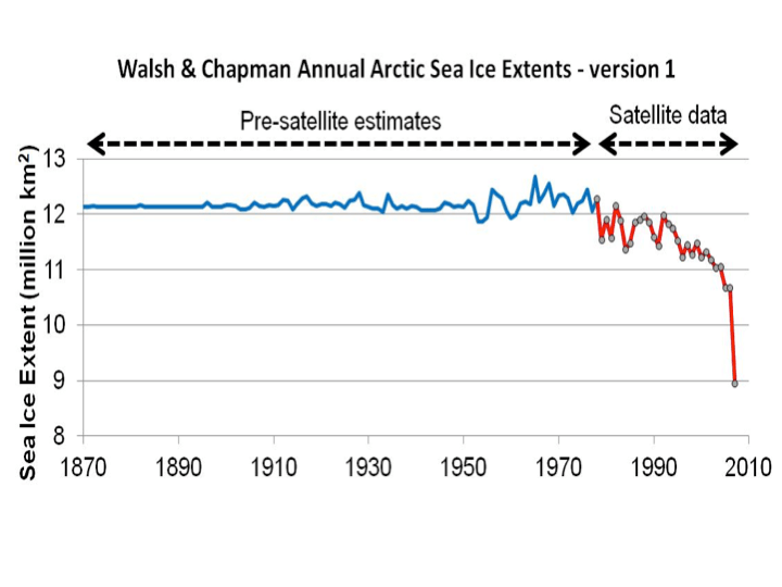
For many years, their “Walsh and Chapman dataset” was assumed to be fairly reliable and accurate, and it was widely used by the scientific community.
As can be seen from this clip, it even was shown in Al Gore’s 2006 An Inconvenient Truth film, although Gore seems to have been confused about what data he was showing and mistakenly claims that the Walsh & Chapman graph is based on “submarine measurements of ice thickness”.
https://www.youtube.com/watch?v=vTFuGHWTIqI
By the way, we suspect the submarine measurements Gore refers to are probably the ones from Rothrock et al. 1999 (Open access), but those measurements are a lot more limited than Gore implies, and it had already been published in 1999, so it’s unclear why Gore felt he needed to “persuade them to release it”.
However, when we looked in detail at the available pre-satellite data, we realised that there were serious problems with the Walsh & Chapman estimates.
The main problem is that the pre-satellite data is unfortunately very limited. If a ship travelled through a particular region in a given season, then they could have reported how much ice was in that region, or whether it was ice-free. But, what do you do if there were no ships (or airplanes, buoys, etc. ) in that region?
It seems that in a lot of cases when Walsh & Chapman didn’t have measurements for a given region they effectively ended up assuming that those regions were ice-filled!
For example, in the figure below, the map on the left shows the main data source used by Walsh & Chapman for August 1952. It’s an estimate of the Arctic sea ice extent that was compiled by the Danish Meteorological Institute (DMI). On the map, the red lines indicate the ice boundaries where the DMI actually had taken measurements – in this case, mostly around Greenland and eastern Canada. The white regions on the rest of the map indicate regions where “ice supposed, but no information at hand”. In other words, the DMI was guessing that there might be ice there, but didn’t know!

This period was in the middle of the Cold War and unfortunately there was very little data-sharing between the Soviet Union and western countries like Denmark. So, the DMI had almost no information for the Russian Arctic. However, as it happens, the Russians were making their own observations of the Russian sea ice using aerial reconnaissance, ships, buoys, etc. In the 21st century, some Russian scientists began digitizing this data and publishing it. The map on the right hand side shows the Russian observations for the exact same month (August 1952). The blue regions were ice-free, the white regions were ice-filled and the grey regions were regions they weren’t measuring.
Notice how all of the Siberian Arctic regions that the Russians could see were ice-free were assumed to be ice-filled by the DMI?
The Walsh & Chapman estimates assumed that the DMI’s guesses were accurate, but they weren’t!
Now, we must point out that while we were carrying out our study which used both the Russian data and the DMI data, Walsh and Chapman also updated their estimates. And, the new 2017 Walsh et al. dataset (Open access) uses the Russian dataset too.
However, as we discuss in the paper, their approach still ends up effectively assuming that most of the regions without observations were “ice-filled”! To us, this is a very unwise assumption, particularly for the earlier years when there were very few observations.
So, we realised that the pre-satellite data needs to be re-calibrated to account for the limited observations and also the changes in different data sources (airplanes vs. ships vs. buoys, etc.) for different regions and times. For a detailed discussion of our re-calibration procedure, we’d recommend reading our paper (Abstract here). But, essentially, we used Arctic temperature records from weather stations on land to ensure that the sea ice measurements from each of the data sources show a similar response to Arctic temperatures to that observed in the satellite era.
After re-calibration, we obtained the following result including error bars:

There are several points to notice:
- While Arctic sea ice has indeed been generally decreasing since the start of the satellite era, this coincidentally followed a period of Arctic sea ice growth from the 1940s to 1970s!
- Indeed, the Arctic seems to routinely alternate between periods of sea ice growth and sea ice retreat. This is quite different from the previous Walsh & Chapman estimates which implied that Arctic sea ice was almost constant before the satellite era!
- If we ignore the error bars, perhaps you could argue that sea ice extents since 2005 are lower than they have been since 1901. However, we shouldn’t ignore the error bars. We can see that the lower error bars for the pre-satellite era have been lower at several stages than the upper error bars for the entire satellite era. In other words, the recent low values are still consistent with our estimates for the pre-satellite era.
A useful test of the Global Climate Models used by the IPCC reports (called “CMIP5” models) is to see how good they are at “hindcasting” Arctic sea ice trends. A “hindcast” is a “forecast” that goes backwards in time.
Below, we compare our summer reconstruction with the average of the IPCC’s climate model hindcasts.

We can see that the IPCC climate models were completely unable to reproduce the different growth and retreat periods.
Arctic sea ice changes over the last 10,000 years
In recent years, several researchers have developed an interesting new “proxy” for Arctic sea ice cover, called “PIP-25”, which can be used for estimating long-term changes in Arctic sea ice extent. A “proxy” is a type of measurement which can be used to indirectly approximate some property – in this case, Arctic sea ice cover.
In 2007, Prof. Simon Belt and colleagues noticed that a type of algae which seems to only grow in sea ice produces a specific group of molecules called “IP-25” – see Belt et al., 2007 (link to abstract, link to Google Scholar). They found that if the sea ice in a region melts in the summer, some of this IP-25 will sink to the bottom of the ocean as part of the ocean sediment. However, if there is no sea ice, or if the sea ice remains frozen all year, then the ocean sediment for that year doesn’t contain any IP-25. They realised that if you drill an ocean sediment core for that region, you could use the presence of IP-25 as a proxy for “seasonal sea ice”, i.e., ice that only forms for part of the year.
Later, it was realised that if the IP-25 was absent you could also use the presence of certain species of phytoplankton to distinguish between periods with permanent ice cover (less phytoplankton growth because the sea ice reduces the amount of sunlight under the ice) and ice-free conditions (more phytoplankton growth). So, by combining the IP-25 and phytoplankton measurements in an ocean sediment core, you have a “PIP-25” proxy series (“P” for phytoplankton) which can distinguish between three types of sea ice cover:
- Permanent ice cover (low IP-25 and low phytoplankton)
- Seasonal ice cover (high IP-25)
- Mostly ice-free (low IP-25, but high phytoplankton)
In Stein et al., 2017 (abstract here, although the paper is paywalled), Prof. Rüdiger Stein and colleagues presented the results from two new PIP-25 ocean sediment cores (from the Chukchi and East Siberian Seas) and compared them with another two cores from earlier studies in different parts of the Arctic (one from the Laptev Sea and the other from Fram Strait).
We have adapted the maps below from Figure 2 of Stein et al., 2017, with some editing to make the locations easier to see. The maps show the location of the four cores relative to the maximum and minimum Arctic sea ice extents in 2015. The four cores are quite well distributed throughout the Arctic and so should give us a reasonable estimate of how sea ice has varied throughout the Arctic over longer time scales.
Notice that all four locations were ice-free during the summer minimum (06 September 2015), but three of the locations (the Chukchi Sea, East Siberian Sea and Laptev Sea cores) were ice-covered during the winter maximum. In other words, these three locations currently experience “seasonal sea ice cover”. The remaining location (the Fram Strait core) was still outside the ice extent even during the winter maximum (17 March 2015). So, currently that location is “mostly ice-free”. However, as we will see, the PIP-25 sediment cores suggest that these conditions have changed over time.

For the four plots below, we have digitized the PIP-25 results for the four sediment cores from Figure 10 of Stein et al., 2017. Roughly speaking, PIP-25 values below about 0.5 indicate that the region was mostly ice-free at the time (Stein et al., 2017 use the term “reduced sea-ice cover”), while values above about 0.7 indicate that the region was permanently ice-covered, i.e., it remained ice-covered throughout the entire year (Stein et al., 2017 use the term “perennial sea-ice cover”). Values between 0.5 and 0.7 indicate that the region experienced “seasonal ice coverage”, i.e., it was usually ice-covered during the winter maximum, but ice-free during the summer minimum.

As we discussed above, three of the locations (the Chukchi Sea, East Siberian Sea and Laptev Sea sites) currently experience “seasonal ice coverage” and the Fram Strait site is currently “mostly ice-free”. However, according to the PIP-25 data, over the last 10,000 years, all four of these sites have gone through extensive periods with less ice coverage as well as extensive periods with more ice coverage. In particular, all four locations seem to have experienced much less ice coverage 6,000-8,000 years ago (i.e., well before the Bronze Age) than they do today.
This suggests two points particularly relevant to our discussion:
- Arctic sea ice extents have shown a lot of variability over the last 10,000 years (at least), so we shouldn’t be too surprised that the extents have substantially changed since the start of the satellite records in 1978.
- Despite the widespread belief that the current Arctic sea ice coverage is “unusually low” (based on a combination of the 1978-present satellite records and computer model results), it seems that the coverage was actually a lot lower 6,000-8,000 years ago.
Summary
- After re-calibrating the pre-satellite data, it now transpires that Arctic sea ice has alternated between periods of sea ice retreat and growth. The satellite record coincidentally began at the end of one of the sea ice growth periods. This has led to people mistakenly thinking the post-1978 sea ice retreat is unusual.
- The results from new sea ice proxies taken from ocean sediment cores suggest that Arctic sea ice extent has varied substantially over the last 10,000 years. They also suggest that Arctic sea ice extent was actually less before the Bronze Age than it is today.
- The current Global Climate Models are unable to reproduce the observed Arctic sea ice changes since 1901, and they seem to drastically underestimate the natural sea ice variability
Moderation note: As with all guest posts, please keep your comments civil and relevant.

Thank you for the essay, and for the links to the versions of the paper.
Arctic sea ice acts like a thermostat. When it shrinks it exposes more ocean surface to evaporation which rapidly transports energy high into the atmosphere were it can efficiently radiate to space. When it builds up it acts as an insulator trapping heat in the ocean below.
A shallow argument is often made that less sea ice means lower albedo and thus acts to heat the ocean rather than cool it. This is wrong. The angle of sunlight in the arctic is so small that water doesn’t present a dark surface is largely reflected so the direct change in albedo is insignificant.
Not so insignificant is the albedo change over land fostered by open ocean in the arctic. The greater evaporation, in addition to transporting energy high up in the atmosphere where it can radiate more efficienctly, also causes more precipitation over land in high latitudes which helps glaciers build and advance. Permanent snow cover and even non-permanent snow cover that persists more of the year in arctic and sub-arctic latitudes does act to cover up dark land surface with highly reflective ice. Unlike water, the albedo of dirt doesn’t change with sunlight’s angle of incidence.
So arctic sea ice works almost like the thermostat in a water-cooled auto engine. As the water heats up the thermostat opens up and allows it to flow through a radiator which stops further heating. Open ocean in the arctic is a great radiator (think swamp cooler) compared to sea ice.
We can see that the lower error bars for the pre-satellite era have been lower at several stages than the upper error bars for the entire satellite era. In other words, the recent low values are still consistent with our estimates for the pre-satellite era.
Unless you have some justification for choosing 1943 as a breakpoint, you have no evidence that the pre-satellite ice cover time series is anything other than stationary. The pre-post satellite eras are defined by the launching of the satellites, not an ice-cover analysis, so it is a justifiable breakpoint. What you present is an inadequate analysis of whether 1979 was a statistically significant “change point”; merely looking at overlaps of some of the confidence intervals is a very weak statistical test.
MM, there is ex ante evidence for a break atound then in Larsen’s 1944 single season Northwest Passage transit. See essay Northwest Passage for details.
ristvan: MM, there is ex ante evidence for a break atound then in Larsen’s 1944 single season Northwest Passage transit.
For this essay, could you list a few as bullet points? I would appreciate it.
MM, the essay turned around four themes. 1. Arctic ice cyclicality, shown by early DMI ice maps and Larson’s NWP transit, supported by several footnotes to DMI equivalent Russian ice information. Basically a qualitative answer while this post provides an equivalent quantitative one. 2. The satellite ice measurements are much less certain than warmunists maintain. Illustrated were melt pools, also discussed and illustrated was the definition of ice extent. 3. The notion of ‘ice free NWP’ is itelf very misleading. I used pictures of previous NWP transits on large vessels from 2010, 2011, and 2012 to illustrate how much ice is still there. 4. The foolhardy warmunists of various sorts who attempted the passage in ‘ice free’ 2013 on jet skies, kayaks, sailboats, small motor vessels. Most turned around, or had to be rescued by Canadian icebreakers, or (in one case) abandoned for the winter. Heaping much sarcastic ridicule after ridicule on CAGW adventurers who did not do their homework.
Was rather pleased with how the illustratd essay turned out. Even worked in a paraphrase of the famous Princess Bride quote from the Indigo Montoya character–“I don’t think ice free means what you think it means.”
BTW, you might enjoy the whole illustrated and footnoted ebook, Blowing Smoke. Foreword from Judith herself. Cheapest is Amazon Kindle. Reader is free, I have it on my iPad. Second cheapest is iBooks version, I have that one also on iPad (cause annotation is better, and I am thinking of a second expanded edition with typo corrections, improved wording, and additional essays). Also available KNOBO, B&N Nook, and any other ebook format. All are under $10.
ristvan: 1. Arctic ice cyclicality, shown by early DMI ice maps and Larson’s NWP transit, supported by several footnotes to DMI equivalent Russian ice information.
All that shows is an extreme in the oscillation, where the arc of the trajectory is continuous and twice continuously differentiable (more properly, a close-fitting mathematical approximation is continuous and twice continuouslydifferentiable.)
The same breakpoints are evident in hydrological datasets across the planet – for reasons that are understood by any with the requisite intellectual tools. The breakpoints are an emergent behaviour of globally coupled chaotic oscillators in the spatio-temporal chaos of the Earth system.
“Yet even in the general case it appears completely clearly that the system doesn’t follow any dynamics of the kind “trend + noise” but on the contrary presents sharp breaks , pseudoperiodic oscillations and shifts at all time scales. Of course the behaviours in the case when the coupling constants vary will be much more complicated and are not studied in the paper.
Unfortunately people working on these problems are not interested by the climate science and those working in climate science are not even aware that such questions exist , let alone have adequate training and tools to deal with them.” Tomas Milanovic
Tomas was being a little unfair – there are no tools for the infinitely dimensioned coupling of the spatio-temporal chaos of the climate system. Ab alternative to a math that may or may not develop over coming decades is network techniques.
“Considering index networks rather than raw three-dimensional climate fields is a relatively novel approach, with advantages of increased dynamical interpretability, increased signal-to-noise ratio, and enhanced statistical significance, albeit at the expense of phenomenological completeness.” Marcia Wyatt
Tsonis and colleagues identified the climactically important 20 to 30 year breakpoints in the 20th century using network math and 4 NH ocean and atmospheric indices. Breaks occurred around 1912, the mid 1940’s, the late 1970’s and the late 1990’s. It is a simple coincidence that the break in the 1970’s involving in part a shift in the Pacific Ocean state occurred at the start of the satellite era.
https://watertechbyrie.files.wordpress.com/2017/03/tsonis-1.jpg
http://onlinelibrary.wiley.com/doi/10.1029/2007GL030288/abstract
Tessa Vance and colleagues identified the 20 to 30 year regimes in a high resolution millennial ENSO proxy from a Law Dome ice core – but also variability that mirrors variability of cosmogenic isotopes over a 1000 years. Both the shift to high intensity El Nino and the change in the ENSO beat in the early 20th century suggests that we should be looking for a solar origin of stochastic ENSO forcing that varies with about a 20 to 30 year scale.
https://watertechbyrie.files.wordpress.com/2014/06/vance2012-antartica-law-dome-ice-core-salt-content.jpg
http://journals.ametsoc.org/doi/abs/10.1175/JCLI-D-12-00003.1
More salt in the ice core is La Nina and more generally a cool Pacific state – and more rain in Australia. My hypothesis is that solar UV/ozone chemistry modulate surface pressure at the poles – e.g. http://iopscience.iop.org/article/10.1088/1748-9326/11/3/034015/meta – and this influences the evolution of the the polar annular modes. There are many of these studies emerging but typically they focus on the NH and reject any global implications on the basis of that shuffling energy around the NH doesn’t amount to changes in the global energy budget. I tend to agree – but it also reinforces Tomas’ view of a lack of perspective in climate science.
Working backwards may help. There are both satellite and surface observation of cloud – with a significant impact on energy dynamics at toa – in the eastern Pacific that is anti-correlated with sea surface temperature. Sea surface temperature there varies substantially with the volume of upwelling. Upwelling is related to flows in the Peruvian and Californian current which in turn is influenced by the polar annualr modes – so we come full circle. This is an extreme simplification of the spatio-temporal chaos of the Earth system -but it does involve physical mechanisms – including catastrophe theory as there is no simple cause and effect – in a major mode of climate variability.
But that has been the basis of climatology for the last three decades because they KNOW the cause of the trend and don’t seem able to do anything more that high school linear trend analysis.
As they say: If all you have is a hammer ….
Robert I Ellison: The same breakpoints are evident in hydrological datasets across the planet – for reasons that are understood by any with the requisite intellectual tools.
1943 in particular?
Robert I Ellison: Both the shift to high intensity El Nino and the change in the ENSO beat in the early 20th century suggests that we should be looking for a solar origin of stochastic ENSO forcing that varies with about a 20 to 30 year scale.
I don’t deny the possibility, but autoregressive and other dynamical processes oscillate quasi-periodically without “regime changes”, so the mere appearance of oscillations and zero-crossings (as in the figure below that quote) are not evidence of regime change.
You do not have the intellectual tools for ‘synchronised chaos’ Matthew. We have certainly established that.
Matthew
“1943 in particular?”
The year of Stalingrad, where the tide was finally turned against the founding fathers of today’s green movement the Na31s.
Quite fitting that the scientific demonstration of multidecadal climate oscillation should include a 1943 break point, and turn out to be a break point for the stealth power grab agenda of our friends the ecofasc1sts.
What a priori reason could their possibly be for climate to oscillate? What business does a dissipative open heat engine with numerous frictional negative feedbacks and excitable positive feedbacks – have in oscillating? Would not any rational postmodern scientist expect such a system to be static and at rest?
Where’s a toolbox when you need one?
Breakpoints were discovered in east Australian stream morphology in the 1980’s by geomorphologists Robin Warner and Wayne Erskine.
https://www.researchgate.net/publication/233871224_Geomorphic_Effects_of_Alternating_Flood-_and_Drought-Dominated_Regimes_on_NSW_Coastal_Rivers
They have the same temporal signature as Arctic ice changes and Tsonis’ ‘synchonous chaos’ in his 4 NH ocean and atmosphere index network model. The same temporal pattern is seen in the Law Dome ice core ENSO proxy posted above – along with climate shifts over a 1000 years. None of this is random it is all completely deterministic – albeit of a complexity that precludes prediction in any quantitative sense. Regime shifts are the basis for understanding Hurst dynamics in Nile River flow.
“Lorenz was able to show that even for a simple set of nonlinear equations (1.1), the evolution of the solution could be changed by minute perturbations to the initial conditions, in other words, beyond a certain forecast lead time, there is no longer a single, deterministic solution and hence all forecasts must be treated as probabilistic. The fractionally dimensioned space occupied by the trajectories of the solutions of these nonlinear equations became known as the Lorenz attractor (figure 1), which suggests that nonlinear systems, such as the atmosphere, may exhibit regime-like structures that are, although fully deterministic, subject to abrupt and seemingly random change.” http://rsta.royalsocietypublishing.org/content/369/1956/4751
The evidence for uncountably infinite coupling in the Earth system is overwhelming – and you must first come to terms with this other paradigm before you can understand anything about the dynamic evolution of climate.
“You can see spatio-temporal chaos if you look at a fast mountain river. There will be vortexes of different sizes at different places at different times. But if you observe patiently, you will notice that there are places where there almost always are vortexes and they almost always have similar sizes – these are the quasi standing waves of the spatio-temporal chaos governing the river. If you perturb the flow, many quasi standing waves may disappear. Or very few. It depends.” Tomas Milanovic
The effect of solar variability may be the climate equivalent of perturbing flow in the mountain river. Anthropogenic greenhouse gases may likewise perturb the flow. How many quasi standing waves will this influence? It depends.
Robert
You’re dead right.
Anyone not expecting oscillation to be the norm at all timescales in climate has either not read or not understood Lorenz 1963 Deterministic nonperiodic flow.
Robert I Ellison: You do not have the intellectual tools for ‘synchronised chaos’ Matthew
Asserting the presence of synchronized chaos and demonstrating its presence among a lot of time series measured with autocorrelated error are two different things. Showing a “regime shift” is even yet another thing.
I think you don’t understand the problems entailed in making evidentiary cases about dynamic systems in the presence of autocorrelated noise.
“This paper provides an update to an earlier work that showed specific changes in the aggregate time evolution of major Northern Hemispheric atmospheric and oceanic modes of variability serve as a harbinger of climate shifts. Specifically, when the major modes of Northern Hemisphere climate variability are synchronized, or resonate, and the coupling between those modes simultaneously increases, the climate system appears to be thrown into a new state, marked by a break in the global mean temperature trend and in the character of El Niño/Southern Oscillation variability. Here, a new and improved means to quantify the coupling between climate modes confirms that another synchronization of these modes, followed by an increase in coupling occurred in 2001/02. This suggests that a break in the global mean temperature trend from the consistent warming over the 1976/77–2001/02 period may have occurred.” http://onlinelibrary.wiley.com/doi/10.1029/2008GL037022/full
We are talking about coupling in a continuum at the scale of micro eddies to ocean and continent continent spanning standing waves.
“To know the state of the system, we must know all the fields at all points – this is an uncountable infinity of dimensions. As the fields are coupled, the system produces quasi standing waves all the time. A quasi standing wave is a spatial pattern that oscillates at the same place repeating the same spatial structures in time.” Tomas
You insist that something is not proven when the evidence is right there in all the data. Including in this post. The US National Academy of Sciences (NAS) defined abrupt climate change as a new climate paradigm as long ago as 2002. A paradigm in the scientific sense is a theory that explains observations. A new science paradigm is one that better explains data – in this case climate data – than the old theory. The new theory says that climate change occurs as discrete jumps in the system. Climate is more like a kaleidoscope – shake it up and a new pattern emerges – than a control knob with a linear gain.
So the theory says that we should have discrete jumps and regimes (persistence) in the system and it is validated by data in the usual way – as with Hurst and Nile river flow. It is up to you propose a different hypothesis if you imagine there is a better explanation.
The Tsonis test works in an entirely different manner. It tests for resonance in the network across multiple chaotic oscillators viewed as nodes in a network. This is as far different to the usual modes of statistical analysis as quantum mechanics is to classical mechanics.
Ptlemy2: What a priori reason could their possibly be for climate to oscillate? What business does a dissipative open heat engine with numerous frictional negative feedbacks and excitable positive feedbacks – have in oscillating? Would not any rational postmodern scientist expect such a system to be static and at rest?
You addressed me, but I am not arguing against oscillations.
Robert I Ellison: So the theory says that we should have discrete jumps and regimes (persistence) in the system and it is validated by data in the usual way – as with Hurst and Nile river flow. It is up to you propose a different hypothesis if you imagine there is a better explanation.
So this is how you know that the year 1943 was the year of a discrete jump? How about 1979, 1885, or 1815?
Is there a step change in the Pacific Ocean state? Is there a change in the trajectory of surface temps? Best if you worked it out yourself.
Robert I Ellison: Is there a step change in the Pacific Ocean state? Is there a change in the trajectory of surface temps? Best if you worked it out yourself.
The question I have been posing is whether there is evidence of regime change ; lots of examples show that you can have step changes in measured output without regime change, my favorites (for discussions of heat flow) being those in the later chapters of the book “Modern Thermodynamics” by Kondepudi and Prigogine. At least since the end of the Ice Age, there is no evidence of regime change . With respect to ENSO, for example, Henk Dijkstra in “Nonlinear Climate Dynamics” says that el Nino and la Nina are merely extremes in the continuous oscillation, not separated identifiable regimes. imo you jump too quickly from observable changes in outputs to regime change , when there is no evidence that the trajectories are in different regions of the state space.
Back to Arctic Ice, the only evidence for regime change is the 1979 dramatic break in the trajectory of measured ice, and that may be nothing more than a change in instrumentation and coverage, not a change in any regime.
A regime is a pattern of persistence – seen in many systems at all scales – but commonly the term is used in hydrology, ecology and fire.
These are statistical associations – for instance based on ocean regimes.
https://watertechbyrie.files.wordpress.com/2015/10/drought_freq-pdo-amo-e1495660206290.jpg
mrm: when there is no evidence that the trajectories are in different regions of the state space.
I meant: when there is no evidence more than that the trajectories are in different regions of the state space.
Robert I Ellison: A regime is a pattern of persistence
Like night following day, or winter following summer — nothing new in the system? Every region in the phase space is a different regime, even when the parametric description of the complex of influences determining the trajectory is unchanged?
Not even close Matthew.
Excellent hydrological paper btw.
As ever it’s a pleasure to read reasoned rational evidenced based argument.
I wonder that in the west in times of such unprecedented real affluence and such a reduction and loss of religious
belief we as a people need to have a threat or scare to give us some sort of meaning.
Perhaps the whole Climate Change Debate provides this and people are so prepared to deprecate science as there is need for a threat, crisis, rendition to hell of some sort. Humanities endless search for meaning. “It was better before” narrow minds and thought- racist Brexit.
Excellent guest post. Permalinked. Plus, I have downloaded your paper into my permanent climate papers library. Interesting that your short term (1900 on ) conclusions mirror my qualitative conclusions reached differently in essay Northwest Passage. Larson made a single season east west NWP transit in 1944 via the northern route that was impassible last year. Strong circumstantial evidence for Akasofu’s 2010 hypothesis paper about a ~60-70 full Arctic seasonal ice cycle from nadir to nadir.
Yes, the presence of a strong circa 70y cyclic variation is consistent with the recent satellite data for anyone capable of doing more than fitting a straight line to the entire dataset:
https://climategrog.files.wordpress.com/2015/12/ct_ice_area_short_anom_nh_2015_final.png
“On identifying inter-decadal variation in NH sea ice”
https://climategrog.wordpress.com/2013/09/16/on-identifying-inter-decadal-variation-in-nh-sea-ice/
Anther relevant indicator is Arctic Oscillation index, which seems quite closely related to the length of the melting season. AO goes back as far as 1950.
https://climategrog.files.wordpress.com/2013/05/arctic_freeze_melting_daily_ao.png
Greg Goodman
Either the increased open water since the OMG 2007 minimum and the OM-OMG 2012 min has produced a strong negative feedback, or the entire system is being driven by an external cycle of circa 70y.
CG, thanks for that reminder. You had posted on that some years ago; I had forgotten. If I do a second edition of Blowing Smoke, you definitely become an additional foonote to at least two essays, with that chart now bookmarked for reference. Second edition with revised wording and more essays depending on what I might decide to add from various subsequent guest posts here and elsewhere. Plus I would have to write from scratch one new essay on fracked shale oil supply and crude oil prices since 2014. Not hard, just a bit of an unwanted technical chore.
The ice is neither more nor less comparable to the ice of a lake. If spring arrives early the ice melts earlier. But in the Arctic there are two phenomena that are likely responsible for the summer size of the pack ice. 1- the spring melt, 2- the exit of the ice by the sea of Greenland. Melting of ice mainly affects the previous ice age of the previous winter. The extent of this ice is increasing, year after year. On the other hand, ice watches diminish during the early winter, so they can not melt. It is the currents or winds of autumn storms that push them out of the Arctic Sea. Moreover, as in a lake, the volume of water does not change depending on whether it freezes or not. All this can be seen on the graphs of the NSIDC
Bravo.
Posted ad nauseum, but the seasonality of temperatures trends corroborates the decline, post WWII accumulation, followed by the satellite era decline of Arctic sea ice. Much more winter warming during declines, much colder winters during the accumulation:
http://climatewatcher.webs.com/ArcticFingerprint.png
Not coincidentally, the meridional temperature gradients increase during Arctic sea ice increases.
Increased Arctic sea ice -> more extreme climate.
Decreased Arctic sea ice -> less extreme climate.
Turbulent Eddie
Your charts are very revealing, and your persistence warranted.
EPTG circulation is overstated and secondary. The EPTG reduces as a result of the increased volume of the primary atmospheric circulation stimulated by troposphere mid latitude thermal pressure.
Your images record the end results of that stimulated primary circulation nicely over two warm periods. Warmer Arctic temperatures and lower sea ice volume.
Thanks for the charts.
TE, thanks. I just learned something from you.
BTW, your observation confirms Dr. Richard Lindzen (MIT emeritus) observation that polar amplification means less extreme weather via reduced latitudinal temperature gradients. The laws of thermodynamics teach that work (wind) is a function of temperature gradient. Less gradient means less work so less wind so less weather extremes. QED.
Excuse me for my poor translation. I hope this one will be better The ice is neither more nor less comparable to the ice of a lake. If spring arrives early the ice melts earlier. But in the Arctic there are two phenomena that are likely responsible for the summer size of the pack ice. 1- the spring melt, 2- the exit of the ice by the sea of Greenland. Melting of ice mainly affects the new ice of the previous winter. The extent of this ice is increasing, year after year. On the other hand, the old ice diminish during the early winter, so they can not melt. It is the currents or winds of autumn storms that push them out of the Arctic Sea. Moreover, as in a lake, the volume of water does not change depending on whether it freezes or not. All this can be seen on the graphs of the NSIDC
Very nice presentation. I love it when we rewrite history. If there was only some way to figure out how the much lower ice extent from 8,000 years ago affected the jet stream since that is the mechanism that seems to have the biggest effect on the climate where the biosphere is most active.
Thanks again for all the work you put into this.
As for the current state of the ice caps you can’t beat Neven’s Arctic Sea Ice Forum http://forum.arctic-sea-ice.net/
Pingback: What do we know about Arctic sea ice trends? – Enjeux énergies et environnement
Judith kindly references the article I wrote on this subject under ‘related’ at the foot of this paper.
The latest study very closely follows my own research results and subsequent comments. it is a mistake to believe the arctic was in a state of a constant deep freeze. ice extent/area/thickness varied considerably year on year.
It should be noted that Scoresby senior reached 81 degree north in 1806 and noted open water ahead and was only some 600 miles from the pole but had insufficient supplies to go further. Whalers noted a lot of open water from the 1790’s and the royal society eventually mounted an expedition there in 1817 .
his son was also a noted arctic explorer and led the royal society expedition. He is buried not two miles from my house.
I wrote of the arctic ice melt of the early nineteenth century here.
https://wattsupwiththat.com/2009/06/20/historic-variation-in-arctic-ice/
Tonyb
I had one of those moments when I had to shout at the stupidity of a BBC reporter some time ago when they were reporting on the ice loss in Greenland.
They reported on a small coastal village in Greenland, where the melting of ice “due to global warming” had uncovered a small jetty and whaling station buildings that nobody knew existed. At no point did the reporter wonder how this whaling station had been built under the ice!
Steve
Well the Romans managed to work their silver mines under ice and the Vikings were able to bury their dead under permafrost, so I guess operating a whaling station under the ice would be childs play.
tonyb
Steve Taylor,
Are you suggesting that the image burnt in my toast is not the face of our Virgin Mother?
You do not except the truth of Spiraling Arctic Ice Death Without Resurrection?
Refreezing is myth created by sin to challenge the faithful.
jeez … accept
proper English was not my birth language
Pingback: What do we know about Arctic sea ice trends? — Climate Etc. – NZ Conservative Coalition
I know you think I am a dumb old man, but the Iceberg that broke off in the Antarctic broke off because we have switched from ice melting to ice making. The oceans at the time of the time of the change were at least 400’ lower than present. The ocean water around the poles are always turned over. I hope you know what that means. If you don’t, don’t read any more.
The ocean at the edge of the ice berg, before it was an ice berg, was 400’ lower and it was the edge of the Continent, and the ice and snow were deep back to the center of the continent. The new snow, ice, began to grow, and the ocean began to rise. Because the ocean has turned over the upper level of the ocean is 32’F. Because the 39’F heavier water is a little bit lower, as the ocean rises it begins to melt the ice form the bottom and work its way inland. It has been doing this for the last 12,000 years. The ice and snow have been growing on the top, as the bottom is being eaten inward. The average iceberg is 80% underwater. After 12,000 years the weight hanging out over the land got over the water got heavy enough and off it came. Thus a big iceberg.
The Arctic ice at the north pole is doing the same. If you look at the Northwest passage, most is over land 400’ or less. The mane ice at the pole is an iceberg. As the ice and snow on top grows the iceberg gets heavier, and it sinks. The 39’F water works on the edge and the center gets thicker and the edge melts away, thus it looks like it is getting smaller but it is actually getting a lot thicker.
“The Arctic region has been warming since the late 1970s (when the satellite records began)”
This UAH v5.6 I believe, but v6.0 also shows cooling Dec 1978 to Mar 1995:
https://snag.gy/mfOI7.jpg
https://bobtisdale.files.wordpress.com/2012/10/4-northern-no-atl.png
Because it is not a global data set?
Positive NAO driving a cold AMO, until solar plasma strength declined from the mid 1990’s.
http://snag.gy/PrMAr.jpg
That there are regional variations that can cause trends different from the global ones.
But then it went back to warming.
I am assuming that you have a point here.
Believe it or not yes, reasons for the north pole cooling in the first chart above.
Why don’t you post the UAH north pole chart up to 2016 or so, instead of stopping at 1995?
Obviously you are trying to hide the data.
Obviously I am just showing that the Arctic cooled from Dec 1978 to Mar 1995. You can safely assume that it warmed after that, else I would have continued further until the cooling trend had ceased.
Do you have the uncertainty value for the cooling trend?
Looks pretty noisy, I would bet the uncertainty is more than the trend, meaning that I am skeptical that there is an actual cooling trend for that period.
Do please spin me a yarn as to why the uncertainty would have biased over time to produce only a false cooling trend. Yes Arctic temperature anomalies are very noisy, so what.
Thanks to the authors for their extensive work putting into context our current satellite sea ice dataset. The research seems exhaustive and their conclusions well supported. Just a few points.
The study focuses on recalibrating and integrating various data sources, so I don’t fault them for not getting into analyses of why the ice extents are so dynamic. Readers may be interested to know that some of the referenced research documents do address internal dynamics of the ocean/ice/atmospheric system.
For example, Frolov 2009 looks at wind circulation regimes and the constant movement of ice parcels around the Arctic. A summary of this work is provided in https://rclutz.wordpress.com/2016/03/02/the-great-arctic-ice-exchange/.
Zakharov is also mentioned but without noting his description of Arctic Ice as a self-oscillating system. Summarized at https://rclutz.wordpress.com/2015/12/23/arctic-sea-ice-self-oscillating-system/.
My only disappointment with the review is that the American contribution to naval sea ice charting (MASIE) was not mentioned along with work done by Danes, Norwegians, Russians, and Canadians.
Also, in the satellite era, no evidence that year to year changes in seasonal extreme sea ice extent can be explained by changes in temperature.
https://papers.ssrn.com/sol3/papers.cfm?abstract_id=2869646
Look at the voyages of Captain Joseph-Elzear Bernier. He sailed many times to the Arctic waters for the Government of Canada, met with Inuit groups, wintered in the North, took soundings, described the ice conditions, sailed through the Northwest Passage on one of his voyages because conditions were favourable. A most remarkable man. No mention should be made of the North without mentioning this brave and intelligent Captain.
Reblogged this on Climate Collections.
Looking at the Minoan, the Roman and Medieval warming periods we see the birth of new religions that replaced other religions whose beginnings were more closely associated with periods of glaciation. Giving flight to our minds’ eyes we can almost feel the birth of these new metaphysical truths corresponding to epochal shifts of populations during these periods of changing climate as travelers crossed the frozen Arctic at one time, and in another time Vikings plundered Paris and founded colonies in Greenland and even in Canada.
This repeating cycle of 100,000-year glaciations and 10,000 to 20,000 year interglacials has been fairly consistent over the past 2.6 million years. ~Mario Loyola (“Twilight of the Climate Change Movement”)
“A “proxy” is a type of measurement which can be used to indirectly approximate some property – in this case, Arctic sea ice cover.”
Jeez, I had never made the connection with proxy and approximate.
I subconsciously assumed that “proxy’ was more sciency and less approximating.
Thanks for this work, especially since I’ve been forced flee the news media and reduced to reading only climate stuff.
You guys realize that Spiraling Arctic Ice Death Without Resurrection is the core tenet of the religion and you will be branded heretics, if that hasn’t already happened.
Tenure?
Just a coincidence. A proxy is a substitute. In a meeting, if you can’t attend, you can give someone a written proxy to allow them to vote for you (as well as for themselves). I checked and did not see any common latin roots either.
Thanks, as noted above my heritage did not promote the proper understanding and usage of words.
Good infantry stock though.
“Proxy” – from latin – prōcūrāre – on behalf of. Later in several European languages, Procurator, a lawyer.
Any plans to make a grided sea ice reconstruction? A time series of ice extent is useful, but grided sea ice data would be even more useful.
“and they seem to drastically underestimate the natural sea ice variability”
Don’t you think it’s unfair to make this claim based on a comparison with the CMIP5 multimodel mean? Wouldn’t it make more sense to look at the variability within each individual run?
Javier: If you would like to show the dependency of the Arctic sea ice on an UNDETRENDED AMO ( it’s the SST-pattern of the NA itself?) you overestimate the influence of the “AMO” on the sea ice much more than with the AMO as ist’s defined ( with linear deterending). You show more or less the modulated forcing of the NA, mostly by GHG. I don’t know if this was your intention.
-1: Of course the forcing due to volcanos has another time-behaviour than the slowly GHG/Aero- forcing. However, the volcano eruption should be a good “Dirac impulse” which shows the response in time for a defined forcing change no matter how this change is generated. (This is the classic approach to investigate the behaviour of an unknown electronic circuit.) If the delay is short on annual time spans one should expect that the delay of SST to any forcing is also quite fast?
In respect to spatially shifted Aero-forcing: What could be the uncertainty due to this effect? Or the other way around: Justifies this uncertainty to hold on the linear detrended SST for AMO instead of using the (global) forcing regressed index? Perhaps it’s an iterative process…
Frank,
I don’t show dependency of sea ice on AMO, I show co-variance of both. And if you want to compare two series, it is obvious that you should not detrend one of them. You should detrend none, or both.
You show the covariance of the Sea Ice on the SST of the NA, NOT on the AMO. Okay?
@ Frank – suppose that your step response function consists of a sum of exponentials with different decay times. When you convolute such a function with something that approaches a dirac delta function (like a volcanic eruption), the exponential with the shortest time decay dominates over all others. So the response to volcanic activity only gives you information on the short term response to forcing, not the long term response.
I’ll cite again:
“The AMO is identified as a coherent pattern of variability in basin-wide North Atlantic SSTs with a period of about 60–80 years [Schlesinger and Ramankutty, 1994].”
Trenberth, K. E., & Shea, D. J. (2006). Atlantic hurricanes and natural variability in 2005. Geophysical Research Letters, 33(12).
http://onlinelibrary.wiley.com/doi/10.1029/2006GL026894/full
Javier, a short summary about the AMO:
“The Atlantic Multidecadal Oscillation (AMO) is characterised by an average over SST in the northern Atlantic. As global warming also affects SST, a way must be found to separate the effects of global warming from those of the natural oscillation or variability — the observed record is too short to decide whether there is a well-defined period.
The first solution to this was to subtract a linear trend. However, global warming has not been linear over the last 130 years, so this unphysical procedure tended to mix effects of global warming and effects of the AMO. If you really want it, you can construct the index yourself by averaging SST over an area in the North Atlantic, and subtracting a regression against time.
Trenberth and Shea (2006) proposed to use the region EQ-60°N, 0°-80°W and subtract the global rise of SST 60°S-60°N to obtain a measure of the internal variability, arguing that the effect of external forcing on the North Atlantic should be similar to the effect on the other oceans.
Van Oldenborgh et al 2009 chose to leave out the tropical region, as this region is also influenced by ENSO. Guided by model experiments that show a low correlation between global mean temperature and variability in the overturning circulation (AMOC), they proposed to force the AMO index to be orthogonal to Tgobal by definition, lading to the second definition included here.”
It’s all cited from here: https://climexp.knmi.nl/start.cgi?id=someone@somewhere .
If you are looking for the variability allone you have to try to remove the forced part of the NA SST, the rest is the “AMO(V). If you don’t try this you don’t get the AMO but the NA SST. That’s why one of the authors of your cited paper ( Trenberth) developed an Index in which he removed the global SST 60S…60N from the NA SST.
Javier: PS: As I see you cite the same paper as I. Please read on to Fig.3 with the “revised AMO index”.
-1: I’m not quite sure how a long time delayed response to a forcing can be established in the SST ( in the mixed layer with the atmosphere). I agree when looking at the upper OHC. If you look at the intrannual temperature gauge of the NA SST, which is also a result of solar forcing due to the earth axis tilt, you’ll note a constant delay of 2 month and nothing else.
I’ve been updating this figure for the past 2 years and will update it again next October.
http://i.imgur.com/Pu6dBzN.png
It shows Cea Pirón & Cano Pasalodos 2016 reconstruction of September sea ice extent from 1935 to 1978 based on previous databases including the Russian data. The reconstruction is overlaid over the IPCC prediction based on different emission scenarios, with the essentially ice-free condition of less than 1 million sq. km.
Already the early melting alarmist predictions based on an exponential decay from 2007-2012 values has been shown incorrect. If the AMO relationship defended in Miles et al., 2014 and Wyatt & Curry, 2014 is correct we should not see any significant melting until at least 2030-40, By then we should be able to dismiss IPCC projections as excessively pessimistic.
The AMO relationship is based on the similar behavior of both AMO and Arctic ice, and does not imply a causal relationship, as both could be responding to the same changes and be in the same “Stadium wave” position.
http://i.imgur.com/mJFmfkX.png
a linear trend in temperature or sea ice after removing AMO doesn’t make any sense. Forcing changes have been non-linear, and there is a delayed response to forcing.
Arctic sea ice shows an integrative response to multiple factors, some of which are chaotic, like weather associated storms.
As we can see from the behavior of the past 10 years Arctic sea ice does not respond primarily to GSAT.
https://wattsupwiththat.com/2017/08/11/arctic-melt-season-changes-and-the-arctic-regime-shift
It also doesn’t depend primarily on the length of the melt season.
However all these factors and more can affect Arctic sea ice extent. But the primary factor is a different one. We can speculate that it is probably Arctic water temperatures. Water temperatures and pressure are linked, so it is not surprising that AMO and Arctic sea ice share stages and trends.
Since the world has been warming for the past 400 years a general multicentury trend towards less sea ice would also not be surprising. If the world was cooling, after removing every other factor, a linear trend towards more ice would also fit the data.
Whether true or not, the situation presented is consistent with the available evidence, and defended in several articles.
But only 14,000 years delayed response:
http://euanmearns.com/the-vostok-ice-core-and-the-14000-year-co2-time-lag/
-1: indeed the used AMO-definition with this unphysical linear detrending needs to be revised IMO, see https://judithcurry.com/2016/12/29/internal-climate-variability-as-a-confounding-factor-in-climate-sensitivity-estimates/
The regression on the forcing leads to a reduction of the overestimation of AMO in the later years. Delay: I’m not quote sure if this has big influence for the case of the SST of the Northatlantic. In http://iopscience.iop.org/article/10.1088/1748-9326/6/4/044022/meta they estimate only a few month ( for solar forcing only 0..1) delay for the GMST. In some papers one estimates the response of SST to volcano forcing ( Pinatubo…) of about 12..18 month. For the AMO(V) this seems to be only a small uncertainty.
The AMO data in the figure is not detrended.
Javier: AFAIK the AMO itself is defined in this way: “The AMO signal is usually defined from the patterns of SST variability in the North Atlantic once any linear trend has been removed.” (Wiki) The index as it’s downloadable here https://www.esrl.noaa.gov/psd/data/timeseries/AMO/ is the detrended series of the NA SST 0…70N. Because the forcing of course also works in the NA one get’s too much AMO beyond about 1980. The forcing is nonlinear as mentioned also by -1.
Frank,
As you can imagine I have been over this multiple times. While the AMO is usually detrended, it wasn’t originally defined as such and it is not a requirement. Obviously if you want to compare AMO with Arctic sea ice extent that is not detrended, you should use a non-detrended AMO, specially if you want to understand the long term trend.
“The AMO is identified as a coherent pattern of variability in basin-wide North Atlantic SSTs with a period of about 60–80 years [Schlesinger and Ramankutty, 1994]. It has been identified with changes in North American rainfall and river flow [Enfield et al., 2001; Rogers and Coleman, 2003; McCabe et al., 2004; Sutton and Hodson, 2005], and Sahel drought [Rowell et al., 1995]. The AMO also affects the number of hurricanes and major hurricanes forming from tropical storms first named in the tropical Atlantic and Caribbean Sea [Goldenberg et al., 2001; Molinari and Mestas-Nun ̃ez, 2003].
Indices of the AMO have traditionally been based on the average SST anomaly for the North Atlantic north of the equator [Enfield et al., 2001] (Figure 1), where the SST (from HADISST [Rayner et al., 2003]) northern limit was kept at 60°N to avoid problems with sea ice changes. We use a 70-year (1901–70) base period as it covers roughly one full cycle of the AMO. The AMO is given by smoothing from a 10-year running mean [Goldenberg et al., 2001; Enfield et al., 2001] or similar low-pass filter (Figure 1). In most cases the variability has been highlighted by detrending the data [Enfield et al., 2001; McCabe et al., 2004; Sutton and Hodson, 2005; Knight et al., 2005], and a linear trend is provided in Figure 1 for reference.”
Trenberth, K. E., & Shea, D. J. (2006). Atlantic hurricanes and natural variability in 2005. Geophysical Research Letters, 33(12).
http://onlinelibrary.wiley.com/doi/10.1029/2006GL026894/full
The figure that I have provided shows the linear trend as a dashed line. Tilt the figure until this trend is horizontal to see the effect of detrending.
@ Frank – apparently delayed response to forcing does matter, see http://onlinelibrary.wiley.com/doi/10.1002/2014GL059233/full . Also, in the case of your approach, you ignore the spatial distribution of forcing, particularly the fact that aerosol forcing has shifted from USA/UK to China since the 70s, which would cause the North Atlantic to warm.
With respect to the delays of volcanic forcing and solar forcing. Volcanic forcing generally consists of small impulses of forcing, and solar forcing over such a period is essentially the 11 year solar cycle. That’s different from a long term increase in forcing lasting hundreds of years, so the ‘lag’ should be very different.
As usual the “replay” bottom is my enemie :-) … please see my response here https://judithcurry.com/2017/08/16/what-do-we-know-about-arctic-sea-ice-trends/#comment-856454
“we should not see any significant melting until at least 2030-40”
We should see a significant increase in sea ice extent from the mid 2030’s as the AMO shifts to its cold phase.
Javier, what do you think of the Arctic pulse pattern?
https://rclutz.files.wordpress.com/2017/02/amo-pulses-2.png
We note firstly the classic pattern of temperature cycles seen in all datasets featuring quality-controlled unadjusted data. The low in 1913, high in 1944, low in 1975, and high in 1998. Also evident are the matching El Nino years 1998, 2009 and 2016, indicating that what happens in the Pacific does not stay in the Pacific.
Most interesting are the periodic peaking of AMO in the 8 to 10 year time frame. The arrows indicate the peaks, which as Dilley describes produce a greater influx of warm Atlantic water under the Arctic ice. And as we know from historical records and naval ice charts, Arctic ice extents were indeed low in the 1930s, high in the 1970s, low in the 1990s and on a plateau presently.
https://rclutz.wordpress.com/2017/02/08/amo-atlantic-climate-pulse/
I totally subscribe it, Ron.
The ~ 50-90 year periodicity in most climate parameters is absolutely clear, and Wyatt & Curry, 2014 provided an interesting view linking similar periodicities all over the planet with the “Stadium wave” hypothesis.
In the case of the North Atlantic Current, responsible for water temperatures in the Arctic, it appears that the relative contribution by the Tropical Gyre and the Sub-polar Gyre is an important determinant, linking changes in SST to changes in wind strength and atmospheric pressure.
The cause of this oscillation is as far as I know still a mystery. It could be a simple oscillation originated within the ocean-atmosphere system due to internal variability, or it could be a climate system response to the variable forcing from the pentadecadal and centennial solar cycles.
A useful collection of references, a good overview using currently popular analytical methods – but – it would be better if the treatment of error was more realistic. It is wishful to suggest that the displayed uncertainty envelope accounts for the main uncertainty that arises simply from a lack of data.
Here in Australia, there is often mention of a mid 1970s major climate shift that is close to the start of satellite data. If studied in detail it might give more support to a climate break then, not just a data break.
Finally, a minor point, do say goodbye to the exclamation marks forever.
Geoff
Breakpoints were discovered in east Australian stream morphology in the 1980’s by geomorphologists Robin Warner and Wayne Erskine.
https://www.researchgate.net/publication/233871224_Geomorphic_Effects_of_Alternating_Flood-_and_Drought-Dominated_Regimes_on_NSW_Coastal_Rivers
You are 30 years years behind the curve Geoff. Suck hey?
Oh!!! And btw!!!!
+!
I drove up to the Arctic coast about 7 tears ago, and traveled to Banks Island, one of the large Arctic islands. I’m a geologist do I notice landscape and could meaningfully discuss what I saw with working federal government geologists I met up there.
Since the glaciers left the area some 6,0000 to 8,000 years ago, the area has risen 21 m. The shoreline cliffs are some 6 m high on southern Banks Island; they are composed of offshore silts and muds. The MacKenzie Delta is some 200 km long, though we think of it now as only the widest part nearer the ocean at Inuvik. Both these facts say that 6 – 8 thousand years ago the Arctic ocean was MUCH bigger than it currently is.
I have also been to Churchill, on Hudson Bay (2009). Not only are there more polar bears there now than in the 1970s when the American nuclear defense post was in operation (soldiers shot polar bears on the base and generals were taken on hunting trips for them), but the evidence of shoreline advance is everywhere. On train (300 km journey) and small plane flight (some 200 km) you can see the abandoned beachlines. In fact, one is only 5m above the shore on the outskirts of Churchill, in an area infested with polar bears: I know because I sank my rental F150 to the axles in the paleo beach gravel and had to hike out sans weapon or phone through said infested area. I needed several Scotches to recover from the fright. Right now Hudsons Bay is some 150 km smaller on the Churchill side that when the glaciers left.
So, ice cover now and in millenia past: we are not talking apples to apples. Back then huge areas must have been ice free. How would that have affected gobal temperatures or circulation patterns?
I’ve seen nearshore sandbars 17 km from the Arabian Gulf, about 1.5 m above sea level. Apparently 3000 old. I’ve seen abandoned former full freshwater outlets along the Yucatan of a similar age – the ocean rose and turned the outlet salty. The ocean edges change.
So – sea ice extent over thousands of years. How about sea extent by itself? This question invalidates the comparison.
Regardless, the comparison cuts no mustard with the CO2/Goreites anyway. Two causes are possible for the same result. And today is “special” because of A-CO2. My skepticism of CAGW is rooted in my geological experience, but it is useless for repudiation purposes.
CAGW will never disappear until the temperatures drop for decades despite the IPCC model projections. Even then the switch to “weird/strange/extreme variability/non-predictable” weather complaint will be enough to keep it alive. Once you deem today to be “special”, even the ordinary can be seen as unexpected and unusual.
Agreed. When milder winters are “extreme” temperatures, you know you are through the looking glass or down the rabbit hole or whatever the expressions are that I can’t quite remember just now.
Peter Lang about your link – Been working on something for a bit. My conception is that circulation is changed and water vapour causes the rise in temperatures as warm water heads north adding water vapour to a vast new area and as water vapour is the greatest GHG. As forrest grow they produce a lot of nuclei for the water vapour removing them and lowering the water vapour and temperatures kind of like how SO2 causes depression of temperatures and cooler temperatures cycle changes to water vapour as well as albedo. Mankind changed the cycle a bit by using livestock and removal of trees due to agriculture extending this interglacial. What causes circulation change, still working on that right now looking at Antarctic circulation changes.
The aim of this article seems to make a plausible case the the development of Artic Sea Ice in the last 40 years is more or less natural, and that the sea ice is not qualitatively different to day, compared to the last hundred years;
“If we ignore the error bars, perhaps you could argue that sea ice extents since 2005 are lower than they have been since 1901. However, we shouldn’t ignore the error bars……”
That is simply not the case. In the last couple of hundred years it has not been possible to reach the Pole by surface ships. Otherwise both Nansen, Amundsen and a lot of other Polar explorers had just rented one of the ice breakers that was available in the beginning of the 20th century, and just steamed to the pole. Such a journey was unthinkable until the late 70’s when Arktika was the first surface ship to reach the Pole. In 2017 the Pole can with ease be reached by any ice enforced surface ship.
rune
in 1809 Scoresby senior reached 81 degrees North or some 600 miles from the North Pole after confirmation by whalers of a lack of sea ice close to the poles. He had insufficient stores to go any further but reported little sea ice ahead.
He had neither a heavily fortified ship, access to ice breakers, nor radar or satellite.
with all these things earlier explorers might have got even closer.
The Northern sea route became useable in the 1930’s which was a help to allied shipping.
Documentation I have seen in the Scott Polar Institute archives in Cambridge suggest the northern sea route was open in the early 1500’s but there is no definitive evidence.
Remarkably the Vikings probably didn’t have satellite to aid their navigation either.
I think the main point of the article is to confirm that the Pole isn’t in a permanent deep freeze but waxes and wanes regularly.
tonyb
tonyb, H.U. Sverdrup, a Norwegian polarscientist was north of 82 in 1931, also back in the 17th century the ice egde in the Barents was far north
http://www.geoforskning.no/images/2016/Solheim_FalkPetersen_Humlum/530x364_fig4_NY.jpg
Nansen tried to drift to the Pole by freezing Fram in to the ice
https://upload.wikimedia.org/wikipedia/commons/thumb/d/d9/Fram_March_1894.jpg/375px-Fram_March_1894.jpg
But missed it a bit:
https://upload.wikimedia.org/wikipedia/commons/thumb/d/d9/Fram_March_1894.jpg/375px-Fram_March_1894.jpg
And then tried to walk to the Pole but had to turn at 86°13.6’N.
There is no way the Polar Ice has been in the same condition to day, as in the last hundred years, we have been doing a lot of stuff in The Artic for several hundred years and have extensive records etc. And remember, we was only around the edges where the ice usually ar thinner than in the CAB.
Wrong picture, here is the map showing Fram’s drift;
https://upload.wikimedia.org/wikipedia/commons/0/02/Kart_over_Fridtjof_Nansen%27s_Polarexpedition_1893-1896_-_no-nb_krt_00913.jpg
Rune
My point is that considerable arctic ice variability has been well documented for hundreds of years. The first official arctic expedition was the one by Scoresby at the request of the Royal Society who found considerable melting. 50 years before that the Hudson Bay co had been noting considerable variability in ice and temperatures.
We know that global temperatures have been rising in fits and starts for some 300 years. For some 300 years prior to that we had considerable periods of extreme cold during the LIA. Several hundred years before that we had the Vikings who, despite lack of navigational aids, managed to get round the region and even over to Canada.
During the bronze age we had the Ipiatuk cities in Alaska.
In a planet that has been warming for hundreds of years it would not be surprising if ice was currently at times less than in the previous 300 years but that does not escape the fact that the arctic ice was never consistent in extent but waxes and wanes.
tonyb
Hello again Tony!
“The Northern sea route became useable in the 1930’s”
Useable for what exactly? I note that you still haven’t answered the points I raised the last time you asserted that in these hallowed halls. Please see:
http://GreatWhiteCon.info/2016/12/a-brief-history-of-the-northern-sea-route-in-the-1930s/
jim
we had all this out previously. If I remember, in your own blog, you cited a book that confirmed the northern sea routes existence. The authority for opening it was given, from memory, around 1928 when the relevant Russian authority was set up to administer it.
There is a particularly good section on Russian achievements in the Arctic, held in the library of the Scott Polar institute in Cambridge. The Met office in Exeter also has some information but not as extensive. I have been to both
I am not- and never have done- claimed it is as open as it has sporadically been in recent decades, although whether that is because of greater use of ice breakers or the weather I don’t know.
I do not know what point you think you are making.
tonyb
We didn’t “have all this out previously” Tony.
You didn’t answer the points I raised in these hallowed halls, which was why I wrote the article I linked to above.
You haven’t answered the points I raised over there either as yet!
was that supposed to read sea ice , not sea level??
Nice work.
However, I’d like to point out that the pre-1953 data that you are recalibrating for the North American and Nordic Arctic still rely heavily on the white regions displayed on DMI charts (since you are using Walsh’s data).
If those white regions have been proven wrong at the Siberian Sector, why should we trust them at the North American or Nordic Sectors? The point is that the white regions displayed on DMI charts are just regions without data, and hence they shouldn’t be used as a valid sea ice data source.
It’s also worth noting that the updated new Walsh dataset before 1953 still relies on the white regions displayed on DMI charts. These white regions (through their source 4: “Kelly ice extent grids”) are by far their most important data source before 1953. For instance, the following map shows the data taken from those white regions for August 1939 on the new Walsh dataset: https://diablobanquisa.files.wordpress.com/2017/08/39w.png This heavy reliance on the white regions from DMI charts is typical between 1901 and 1952. Thus, the uncertainties and error margins of the new Walsh dataset before 1953 are huge.
If this weren’t enough, it seems that Walsh et al. have misplaced by a month the Kelly grids. That is, in August they are using the white coloured regions from July charts, in July they are using the white regions from June charts, etc. This could lead to a high bias on the pre-1953 data.
Although, as I have stated above, even if the white coloured areas were used at the right month, they are not a reliable nor a consistent data source, and I think thay they should be taken out of the reconstruction.
Earlier this year I wrote a piece presenting some of the uncertainties that we can still find on the updated new Walsh dataset: https://diablobanquisa.wordpress.com/2017/06/03/walsh_2016_uncertainties/
Nevertheless, according to our dataset, September Arctic sea ice extent since 2002 is clearly lower than in the 1930s or 1940s: https://diablobanquisa.wordpress.com/2016/01/14/new-time-series-september-arctic-sea-ice-extent-1935-2014/
Maybe there are multidecadal oscillations on Arctic sea ice, but it seems that these oscillations are superimposed on an overall downward trend.
(Currently we are working on another reconstruction of August Arctic sea ice, without the white regions from DMI charts, of course, but it is far from being ready yet)
“The point is that the white regions displayed on DMI charts are just regions without data, and hence they shouldn’t be used as a valid sea ice data source. ”
That seems to be basis of Walsh too. anywhere without data you just draw a straight line back from the last data point you have.
All apparently based on that spurious ASSUMPTION that climate never changed until human activity took off.
We were taught as school that climate, though it was different in different regions of the world, was constant.
It seems you have rushed to judgement with less than complete understanding. The problems with the Walsh data were discussed and compensated for by ‘recalibration’ using temperature data. e.g.
https://watertechbyrie.files.wordpress.com/2017/08/arctic-temp.jpg
Sea ice may have a lower cover since 2005 than in the 1930’s and 1940’s – as they say – but this is not certain within the limits of precision of any of the relevant datasets.
Your problem remains that the nature of the spatio-temporal chaotic Earth system is clearly not noise and a trend – “but on the contrary presents sharp breaks , pseudoperiodic oscillations and shifts at all time scales.” Predicting a continuation of the 20th century pattern is clearly unwise.
Robert I Ellison wrote: It seems you have rushed to judgement with less than complete understanding. The problems with the Walsh data were discussed and compensated for by ‘recalibration’ using temperature data.
If the problems with the Walsh data were compensated for by “recalibration” , what is the point of using AARI data for the Siberian Sector? Wouldn’t they get the same result using the old Walsh data instead? Their problems could be compensated by “recalibration” too…
The more reliable input sea ice data, the more reliable results after the recalibration.
Regardless of the merits of the procedure – and I believe that they used satellite era data for calibration – your comment didn’t address it and you went off on a tangent.
Robert I.; Climate4You is not always a reliable source, read the small print under Your graph;
“Note to the three Arctic temperature diagrams above: As the HadCRUT4 data series has improved high latitude data coverage (compared to the HadCRUT3 series) the individual 5ox5o grid cells has been weighted according to their surface area. This is in contrast to Gillet et al. 2008 which calculated a simple average, with no consideration to the surface area represented by the individual 5ox5o grid cells.”
The original paper – Gillet et al.(2008) has an overall rise of temperatures on about 1,5 C from 1940 to 2006.
Ole Humlum is always a reliable source – and it is not clear that a non-spatially weighted source is better than the spatially weighted Met Ofice source. Not is it clear that there is a substantive difference between the sources. They show a similar signature of observed warming and cooling – although Gillett et al seem to suggest that models have some ability to model natural variability. It is about attribution of the observed pattern after all.
Nor have you taken on board the importance of accommodating break points in your accounting of temperature changes.
Let me interpret the ‘fine print’ for you – the Met Office has expanded coverage since HadCRU3 and uses a better areal weighting method than Gillett et al.
Frankly your comment seems to be entirely trivial nonsense.
The original paper – Gillet et al.(2008) has an overall rise of temperatures on about 1,5 C from 1940 to 2006, that’s all You need to know, and if You want to trust Humlums non peer reviewed metodologi, feel free.
And here’s another study telling the same story;
https://www.ncbi.nlm.nih.gov/pubmed/24025852
Again this other study use HadCRU4 temperatures. And uses models for attribution – which is basically pretty nuts.
https://watertechbyrie.files.wordpress.com/2017/08/arctoic-temps-2.jpg
The relevant climate system breakpoints are the mid 1940’s and 1998/2001.
You do not need peer review to reproduce data from reputable sources – such as the Met Office. So far it seems Ole Humlum +2 and you negative many. God only knows you think you are saying.
God only knows what you think you are saying.
And not even God knows what You are saying.
Regarding Your Humlum nonsense, Humlum don’t have a clue regarding Polar Temperatures and that’s a proven fact.
In this paper;
http://www.sciencedirect.com/science/article/pii/S1364682612000417
They predicted;
“For the measuring stations south of 75N, the temperature decline is of the order 1.0–1.8 °C and may already have already started. For Svalbard a temperature decline of 3.5 °C is forecasted in solar cycle 24 for the yearly average temperature. An even higher temperature drop is forecasted in the winter months (Solheim et al., 2011).”
So far, Svalbard has had 88 consecutive months above the normal, and the winters has been the warmest.
https://gfx.nrk.no/Tk6yRc8HiWVJ3oueZG6qYA5Ycfm61uokwEKdfKJqrfNQ
Yes of course you don’t understand.
http://iopscience.iop.org/article/10.1088/1748-9326/5/2/024001/meta
https://www.nature.com/articles/ncomms8535
But the relevant fact here is that HadCRU4 is the data used in both of your attribution studies. Yet you seem to imagine that it is different to the HadCRU4 data at climate4you. There is a lot of very interesting data there that is regularly updated – but all that is proven by you is that you are one of these strange climate fanatics with inflexible opinions at the shallow end of the science pool.
Insults, and citations from papers that already has shown to be wrong, can not compete with the thermometer. The Artic temperature has risen the last 50 years and there is no sign of a slowdown. Something will probably happen when the AMO turns, but these predictions of a cooler Arctic and North – Europe, has been going on for 10 – 15 years. So show me some hard data. Poorly crafted insults isn’t a substitute.
You may consider climate fanatic an insult – but it is the unfortunate truth of the times.
Rune
Here is some hard data. It should be read in conjunction with my reply to you today at 12.10.
It shows a variety of thermometers in your part of the world
https://s19.postimg.org/vws4z68s3/arctic_temp.png
It should be noted that these are decadal temperature. The most notable one missing is Svalbard, which has been especially warm the last few years, although I understand that 2017 generally has been cold.
There are other thermometers in the region, but few that have either not moved or are continuous. The two warmest consecutive decades in the Greenland ice sheets according to Professor Phil Jones has been the 1930’s and 1940’s.
My own surmise has been that we should look at the LIA period as separating two periods of warmth in the arctic region. The warm period around the MWP took in the Vikings.
There have been a number of warm episodes since the LIA-approximately 1400 to 1700-, of which the 1730’s-noted by the Hudson Bay co, the 1820 period, noted by The Royal Society and the 1920 to 1950 period which is well documented and captured on British Pathe news reel, are the most notable.
Presumably we had natural variation during this post LIA period, but the main characteristic was the substantial melting of ice over many decades which was probably not wholly replaced.
We had a especially cool period during the 1960’s and 1970’s. when some regrowth would have been likely, but then another warmer period since then, during which the already thinner and weaker multi year ice would have melted further.
So this current melting of the ice over the last couple of decades, when looked at in a long term historical context, would not appear to be unprecedented.
tonyb
Climate fanatic, really? And that’s Your best performance after been revealed in flagranti as a no nothing, no data windbag?
Climatereason;
“It shows a variety of thermometers in your part of the world”
It show’s a cherrypick of thermometers in my part of the world. I do not need Climate etc. to be told anything about the climate in my part of the world, we have this;
https://en.wikipedia.org/wiki/Norwegian_Meteorological_Institute
We also have this;
https://en.wikipedia.org/wiki/Norwegian_Polar_Institute
So please stop this nonsense and disinformation about the development in the Artic, You are a bunch of no nothing no data rookies in this game.
Rune
I think you overuse the phrase ‘cherry picking’ I provided you ŵith hard data from some of the relatively few long lived and continuous thermoters in your part of the world.I told you of their shortcomings.
I suggest you select a different variety of long lived and continuous temperature readings from your part of the world back to 1880 and post them here in an easily comparable form, instead of insulting me and this blog.
Then we can all view your interpretation of the arctic climate and see for ourselves how you believe the arctic world has evolved over the last century or more. do you not believe in the substantial warmimg from around 1912 to around 1950?
By the way of course we are aware of the excellent work provided by your national weather service. We have an excellent one called the met office in my own country who I visit frequently in order to use their library and archives.
Now, stop insulting us and provide your own interpretation of the evolution of the arctic world.
Tonyb
He’s got you there, boys. Who woulda thunk that they had all that firepower in Norway.
Tony – thanks for the chortle – I had anticipated exactly this response from Rune.
Diablobanquisa,
Exactly. The overall downward trend is what should be expected from a warming planet, but the multidecadal oscillations are crucial to understand how climate change operates, and to make reasonable predictions on the evolution of Arctic sea ice, that are extremely important to many countries, people and companies.
It is not the same to get an ice-free Arctic in 2060 than perhaps not until the next interglacial in ~ 70,000 years.
“The overall downward trend is what should be expected from a warming [Earth]”
The recent downward trend should be expected from a net decline in global climate forcing, solar. It’s easier to see the wood for the trees by comparing Earth to warmer and colder bodies. Venus with its extreme levels of climate forcing has very strong polar vortexes that trap the cold in, creating polar temperatures hundreds of degrees lower than elsewhere. Saturn’s polar regions are only around 10°C colder than its mid latitudes because of powerful poleward heat transports. Low solar drives a warm AMO. Forecast the AMO, and one can forecast the sea ice. I made forecasts in early 2013 for a relative increase in summer sea ice extent 2013 & 2014, from solar based NAO forecasts for those summers, and this, which includes a long term forecast:
https://www.linkedin.com/pulse/association-between-sunspot-cycles-amo-ulric-lyons
Javier, I agree, but I’m afraid that 2060 could be a reasonably accurate estimate for the first “ice-free” Arctic (i.e. the first year when the September monthly average goes below 1 M sq km), even taking into account multidecadal oscillations.
However, we don’t exactly know how the Arctic natural variability works, so, who knows…
Given that nobody has demonstrated skill in predicting temperatures and warming rates a few decades in advance, I am surprised everybody is so convinced warming is going to continue in the future. It is also my experience that when almost everybody is convinced something is going to happen, it rarely happens. We also know that the cooling of the 50-70’s, the warming of the 70-90’s, and the pause of the 00-10’s have caught the experts by surprise. I don’t see them learning that lesson. As Mark Twain said, “It ain’t what you don’t know that gets you into trouble. It’s what you know for sure that just ain’t so.”
Javier, It’s very much like the stock market:
Some may ask, why is this bullish sentiment not positive for the market? The answer is simple: when everyone is fully invested, there is no money left to drive stock prices higher. When finally the evidence says that perhaps the environment isn’t as great as thought, the selling starts. But money managers can’t buy more stocks at lower prices because they are already fully invested. Therefore, the decline continues, the selling accelerates, the bad news items become more frequent. And that is how bear markets start.
https://www.forbes.com/sites/investor/2014/01/06/the-most-reliable-indicator-of-an-approaching-market-top/#b34003e3a58e
diablobanquisa
I think I saw you discussing areas and history on Neven’s blog 2 years ago.
–
This worries me
“(Currently we are working on another reconstruction of August Arctic sea ice, without the white regions from DMI charts, of course, but it is far from being ready yet)”
You cannot argue for inaccuracy
“If those white regions have been proven wrong at the Siberian Sector, why should we trust them at the North American or Nordic Sectors? The point is that the white regions displayed on DMI charts are just regions without data,”
but then compute areas based only on “known” areas which must also be wrong due to underestimation of the unknown areas.
All you are doing is establishing an artificial and wrong lower limit.
Hi angech, I’m afraid I’m not getting your point.
Maybe I didn’t explain it well.
If you are working on a gridded sea ice dataset, and you don’t have observations at a given grid cell, you should infill that cell by whatever methodology you prefer: an observational climatology, an analog algorithm, a proxy (for instance, temperature data), etc.
(Otherwise, for comparison purposes, you should mask the cells that don’t have available observations every year. Or stop the reconstruction at the year when you don’t have observations at every grid cell.)
In our previous work (for September 1935-2014: https://diablobanquisa.wordpress.com/2016/01/14/new-time-series-september-arctic-sea-ice-extent-1935-2014/), we infilled the grid cells without observations (before 1953) using a climatology derived from the correlation between Arctic sea ice extent and Arctic surface temperature (we were using temperature data as a proxy, as Connolly, Connolly & Soon 2017, or as Alekseev 2016 did)
The white regions of DMI charts had nothing to do with our previous work, because DMI didn’t produce September charts.
Now, we are working on August. There are DMI charts for August (1901-1956). We will use the actual observations from those charts (red lines and symbols) but we won’t assume the white regions as ice covered (they are just regions where DMI hadn’t actual observations). In those regions, we will use other data sources. Where there are not alternative data sources, we will have to infill the cells.
I can’t understand why we were or we are ” establishing an artificial and wrong lower limit”.
Regarding Connolly, Connolly & Soon, I think that their methodology is a valid one. I just believe that the more reliable sea ice data, the more reliable results after the recalibration. Of course, Connolly et al. recalibrated the available data. Unfortunately, the available data for the North American Arctic before 1953 (Walsh dataset, mostly derived from DMI charts, and assuming as ice-filled their white regions) are not reliable enough. Even if the time series is scaled, the year-to-year variability will be wrong, and even the trends during the scaled period could be wrong.
We know that Arctic sea ice trends have been downward since we measure them, and it is reasonable to assume that they have been generally downward for the past four centuries since the LIA.
It is also reasonable to assume that they were generally upward both between the MWP and the LIA, and during the entire Neoglacial period between ~ 3000 BC and 1700 AD, although probably interrupted by multi-centennial decrease periods.
It is also quite clear that during the Holocene Climate Optimum sea ice was very much reduced and probably underwent a long period when the Arctic was essentially summer ice-free, according to proxies.
The most interesting question to me is where do we stand now within the Neoglacial trend. We do not have enough data about the Arctic to answer that question now, but Arctic sea ice appears to have followed a general trend similar to global glaciers, and we do have plenty of data on glaciers. Most glacier experts appear of the opinion that current glacier levels are as reduced as at the start of the Neoglacial period, 5000 years ago, and the evidence they show supports that interpretation. It is possible therefore that current Arctic sea ice levels are the lowest for the second half of the Holocene. Such unusual departure from Neoglacial trend, if true, would indicate that there are unusual factors affecting the climate. That shouldn’t be a surprise since we do know there are unusual factors affecting the climate, don’t we?
Unusual greenhouse gases?
Reblogged this on Quaerere Propter Vērum.
One of the reasons the Bismarck and Prinz Eugen were able to slip around the British North Sea Fleets patrols in 1941 was because the British “knew” where the margin of the ice was “supposed” to be and the Germans didn’t.
* Fleet’s (yes, yes, thank you autocorrect)
https://notalotofpeopleknowthat.wordpress.com/2017/03/17/arctic-ice-loss-and-the-amo/
It’s all natural, nothing to do with the soon to be defunct AGW theory.
To my layman’s eye, other than the obvious “minor” variations in sea ice extent, there’s not a lot of difference between Chapman & Walsh’s chart and the updated “summer extent” chart. The error bars and the associated comments confuse the issue – though perhaps necessarily.
The overall impression is a rather steady decline starting at 1980, as opposed to a pretty level experience prior to 1980. And the decline seems fairly pronounced – from a level of around 9 mm sq. km to around 7.5.
And again, to my layman’s eye, the coincidence of increased global temps and decreased ice extent (on the newer chart) seems almost like an agw smoking gun.
To a guy like myself this presents a pretty weak argument that the decline during the satellite era is not unprecedented. Maybe that’s the point to be taken from this post.
Comments?
“…agw smoking gun.”
How about a “gw smoking gun” instead. We still have the problem of attribution once the link is established with declining sea ice and rising temps. Just because something is consistent with theory doesn’t mean that it proves the theory. (correlation does not necessarily mean causation, though it’s a good place to start)…
Well, you’re right about the “gw smoking gun”. But my primary point is that, even with the flaws in the earlier study, it seems pretty clear that the recent sea ice decline is without precedent in the last 100 or so years. Interesting that the 1920 – 1940 warmup wasn’t accompanied by a sea ice decline nearly as large as the recent one.
There is no way to tell what arctic sea ice extent was prior to the recent satellite era, and even those so-called measurements are anything but. (Last i knew any picture with 15% ice in it was ice covered.) Your smoking gun is a statistical artifact, a toy.
As is most of climate science. Do you really think we know what the average temperature was in the arctic 50 or 100 years ago? Or even today? How is that possible? Think about it. By the way, which average temperature are we talking about? 6, 200 or 5000 feet up?
This entire discussion is mathematically absurd. There are well known ways to crudely estimate actual spatial averages. None are followed in this instance. Hey, I found a tree ring that tells me what the regional temperature was. Or was it a sediment? Maybe it was ice, not temperature. I forget. No matter; I got published.
Scraft1, your assertion about unprecedented low ice isn’t likely correct. Canadian Mountie Larson made the first single season northwest passage (NWP) transit in 1944. There are actually 3 general NWP routes (with several subvariants), northern, middle, and southern. Last year Northabout missed being icelocked for the winter by about 12 hours using the southern NWP route. The northern and middle routes were impassible. That strongly suggests the present situation is NOT unprecedented. Covered with maps and photos in essay Northwest Passage in ebook Blowing Smoke, foreword by our gracious hostess Judith Curry.
Pingback: What do we know about Arctic sea ice trends? | Watts Up With That?
“Now imagine that you have never seen the device and that it is hidden in a box in a dark room. You have no knowledge of the hand that occasionally sets things in motion, and you are trying to figure out the system’s behavior on the basis of some old 78-rpm recordings of the muffled sounds made by the device. Plus, the recordings are badly scratched, so some of what was recorded is lost or garbled beyond recognition. If you can imagine this, you have some appreciation of the difficulties of paleoclimate research and of predicting the results of abrupt changes in the climate system.” https://www.nap.edu/read/10136/chapter/3#13
It would seem to apply equally well to sea ice reconstructions. This graph is not recent – but it illustrates the point of multiple, abrupt, synchronous changes in the Earth system.
https://watertechbyrie.files.wordpress.com/2017/08/younger-dryas.jpg
“The Younger Dryas (YD) climate event, as recorded in an ice core from central Greenland and a sediment core from offshore Venezuela. The upper-most curve is the gray-scale (light or dark appearance) of the Cariaco Basin core, and probably records changes in windiness and rainfall (Hughen et al., 1998). The other curves are from the GISP2, Greenland ice core. The rate of snow accumulation and the temperature in central Greenland were calculated by Cuffey and Clow (1997), using the layer-thickness data from Alley et al. (1993) and the ice-isotopic ratios from Grootes and Stuiver (1997), respectively. The independent Severinghaus et al. (1998) temperature estimate is shown by the circle near the end of the Younger Dryas. Methane data are from Brook et al. (1996) (squares) and Severinghaus et al. (1998) (x), and probably record changes in global wetland area. Changes in the d15N values as measured by Severinghaus et al. (1998) record the temperature difference between the surface of the Greenland ice sheet and the depth at which bubbles were trapped; abrupt warmings caused the short-lived spikes in this value near the end of the Younger Dryas and near 14.7 thousand years. Highs in sea-salt sodium indicate windy conditions from beyond Greenland, and even larger changes in calcium from continental dust indicate windy and dry or low-vegetation conditions in the Asian source regions (Mayewski et al., 1997; Biscaye et al., 1997). Calcium and sodium concentrations measured in the ice have been converted to concentrations in the air over Greenland, and are displayed by dividing by the estimated average atmospheric concentrations over Greenland in the millennium before the Little Ice Age, following Alley et al. (1997).” https://www.nap.edu/read/10136/chapter/4#26
This is a whole battalion of smoking guns for natural, chaotic in the mathematical sense, variability in the Earth system.
But I caution that over-interpreting the wiggles on some pseudo deterministic basis is the road to ruin.
Very true.
” Therefore, we only use GHCN stations
that are “fully rural”, i.e., rural in terms of both associated population and night-light intensity – see Soon et al.
(2015) for a discussion”
Sadly this is wrong.
Both the nightlights data in GHCN v3 meta data and the population data
are not fit for the purpose of identifying rural stations.
What peer reviewer Missed this?
Thank you Ronan and Michael C for this very interesting and informative post. I also congratulate you and Willie Soon on publication of your new paper.
Seconded.
Carried
A vote is required for the motion to carry.
There was a vote – obviously. You missed it. Demand a recall and see if anyone gives a rat’s arse.
When one examines current Arctic sea ice, there’s a clear distribution:
https://www7320.nrlssc.navy.mil/hycomARC/navo/arcticictn/nowcast/ictn2017081718_2017081500_046_arcticictn.001.gif
very thick ice in a sliver along the Greenland/Archipelago, diminishing eastward.
Dynamics can account for this, while temperature distribution:
http://cci-reanalyzer.org/reanalysis/monthly_maps/output/map_7364.png
not so much. Were temperature the main determinant of Arctic sea ice, one might expect the remaining core to be more uniformly distributed with a maximum near the pole, not a wind blown, elongated max far from the pole.
Evidence is presented supporting the hypothesis of polar synchronization,
which states that during the last ice age, and likely in earlier times, millennial-scale temperature changes of the north and south Polar Regions were coupled and synchronized. The term synchronization as used here describes how two or more coupled nonlinear oscillators adjust their (initially different) natural rhythms to a common frequency and constant relative phase. In the case of the Polar Regions heat and mass transfer through the intervening ocean and atmosphere provided the coupling. As a working hypothesis, polar synchronization brings new insights into the dynamic processes that link Greenland’s Dansgaard-Oeschger (DO) abrupt temperature fluctuations
to Antarctic temperature variability. It is shown that, consistent with the presence of polar synchronization, the time series of the most representative abrupt climate events of the last glaciation recorded in Greenland and Antarctica can be transformed into one another by a pi/2 phase shift, with Antarctica temperature variations leading Greenland’s. This, plus the fact that remarkable close simulations of the time series are obtained with a model consisting of a few nonlinear differential equations suggest the intriguing possibility that there are simple rules governing the complex behavior of
global paleoclimate.” https://www.researchgate.net/publication/275796089_Synchronization_of_polar_climate_variability_over_the_last_ice_age_In_search_of_simple_rules_at_the_heart_of_climate's_complexity
Intriguing indeed – although there is perhaps a stochastic trigger in solar UV/ozone chemistry that modulates both the northern and southern polar annular modes.
Very interesting – the study of the oceanographic processes associated with thr YD and Holocene inception also show Antarctica to be leading. Thus the current cooling trend and multidecadal sea ice growth at the south pole are noteworthy.
Looking at ocean circulation in 3D around Antarctica shows it to be “Grand Central Station” of the THC:
http://arizonaenergy.org/WaterEnergy/Soceanracetrack.jpg
Good graphic – thanks.
Robert
I have tried to find the original source of this graphic with better resolution but so far without success.
Excellent paper
OK I found one:
http://www.nat.vu.nl/environmentalphysics/SIMULATION%20Experiments/newpage/Two-Dimensional%20Oceans%20Model_old/general/3D%20ocean%20circulation/scan100dpi.jpg
It is all turbulent flow in eddies at scales from micro-eddies to that of the largest hurricanes. It is driven by planetary rotation, surface temperature variations and density of both ocean and atmosphere. There are wind driven currents that produce turbulent eddies to substantial depth. Where flow is past obstacles like mountains on the land and ocean floor it creates turbulent wakes – just like Tomas’ mountain river. There are regions where air descends from the stratosphere and regions closer to the equator where air rises past the troposphere. There are regions in the ocean where cold and higher salinity water descends and areas where perturbation of the thermocline allows it to bubble up.
https://earth.nullschool.net/#current/wind/surface/level/orthographic=-134.94,-89.04,257
“The current Global Climate Models are unable to reproduce the observed Arctic sea ice changes since 1901, and they seem to drastically underestimate the natural sea ice variability”
A near consensus that rising greenhouse gases will increase positive North Atlantic and Arctic Oscillation states. A warm AMO is driven by increased negative NAO, so if anything rising GHG’s should have damped the current AMO-Arctic warming phase, and not exacerbated it.
http://www.ipcc.ch/publications_and_data/ar4/wg1/en/ch10s10-3-5-6.html
Sea temperatures from HMS Beagle
http://joewheatley.net/wp-content/uploads/2017/05/beaglesst-1024×613.png
By Dr Joseph Wheatley
Biospherica: http://joewheatley.net/category/climate/
Correction: URL is http://joewheatley.net/sea-temperatures-from-hms-beagle/
Accounts from 19th-century Canadian Arctic Explorers’ Logs Reflect Present Climate Conditions
https://seagrant.uaf.edu/nosb/2005/resources/arctic-explorers.pdf
A very interesting read. I never would have expected that many expeditions in the 19th century.
Except the average sea ice extent for 2016 is 88% of the value for 2003.
So present condition are not the same as 2003, therefore they are not the same as the 19th century.
For what is worth, “present climate conditions” = 1971-2000 average
I think that this paper was written to show that there was no LIA and you can figure out yourselves why it was done.
The current Global Climate Models are unable to reproduce the observed Arctic sea ice changes since 1901, and they seem to drastically underestimate the natural sea ice variability.
How is it possible for models to reproduce climate variability when they acknowledge only one driver of climate, CO2?
“What do we know about Arctic sea ice trends”
It’s a shorthand but it cuts out an obvious possibility, that “trend” disallows “cycle.”
Finding a trend is an input to analysis, not an output from it. It’s all a matter of what function set you choose to fit with.
Of course you can’t tell a trend from a long cycle, but the omission leaves you blind to the fact.
Probably not a zero sum game, could have a trend and a cycle at the same time.
The trouble is that mathematically you can’t tell them apart.
The telling apart is done at the input, not the output, of the data analysis.
What you think you know is determined by a choice that you don’t realize you’re making.
Don’t try to bs me, in order to show that it’s a cycle you really need to have 5 complete cycles in the data, until you have that, all you have are trends.
For arctic sea ice extent, you barely have one quarter of a cycle.
Which August will we get?
https://nsidc.org/arcticseaicenews/
Average sea ice extent for July 2017 ended up fifth lowest in the satellite record. This reflects weather conditions that were not favorable for ice loss. It will be important to monitor August 2017, as weather conditions and storm events during this month have been closely related to the seasonal minimum sea ice extent in the recent years.
Overview of conditions
Figure 1. Arctic sea ice extent for July 2017 was 8.2 million square kilometers (3.2 million square miles). The magenta line shows the 1981 to 2010 average extent for that month.
Figure 1. Arctic sea ice extent for July 2017 was 8.21 million square kilometers (3.17 million square miles). The magenta line shows the 1981 to 2010 average extent for that month. Sea Ice Index data. About the data
Credit: National Snow and Ice Data Center
High-resolution image
Arctic sea ice extent for July 2017 averaged 8.21 million square kilometers (3.17 million square miles), the fifth lowest July in the 1979 to 2017 satellite record. The average July extent was 1.58 million square kilometers (610,000 square miles) below the 1981 to 2010 long-term average, and 270,000 square kilometers (104,000 square miles) above the previous record low July set in 2011. July 2017 tracked 250,000 square kilometers (97,000 square miles) above the July 2012 extent and 20,000 square kilometers (7,700 square miles) above the July 2007 extent.
Ice extent was lower than average over most of the Arctic, particularly on the Pacific side where the ice retreated throughout July in the Beaufort, Chukchi, and East Siberian Seas. In the eastern Beaufort Sea on the other hand, extent slightly expanded during July. This may relate to the cyclonic (counterclockwise) pattern of winds favoring the drift of sea ice into the region.
Conditions in context
Figure 2a. The graph above shows Arctic sea ice extent as of August 1, 2017, along with daily ice extent data for five previous years. 2017 is shown in blue, 2016 in green, 2015 in orange, 2014 in brown, 2013 in purple, and 2012 in dotted red. The 1981 to 2010 median is in dark gray. The gray areas around the median line show the interquartile and interdecile ranges of the data
Figure 2a. The graph above shows Arctic sea ice extent as of August 1, 2017, along with daily ice extent data for five previous years. 2017 is shown in blue, 2016 in green, 2015 in orange, 2014 in brown, 2013 in purple, and 2012 in dotted red. The 1981 to 2010 median is in dark gray. The gray areas around the median line show the interquartile and interdecile ranges of the data. Sea Ice Index data.
Credit: National Snow and Ice Data Center
High-resolution image
Figure 2b. The plot shows differences from average for Arctic air temperatures at the 925 hPa level (about 2,500 feet above sea level) in degrees Celsius. Yellows and reds indicate higher than average temperatures; blues and purples indicate lower than average temperatures.
Figure 2b. The plot shows Arctic air temperature differences relative to the 1981 to 2010 long-term average at the 925 hPa level (about 2,500 feet above sea level) in degrees Celsius. Yellows and reds indicate higher than average temperatures; blues and purples indicate lower than average temperatures.
Credit: NSIDC courtesy NOAA Earth System Research Laboratory Physical Sciences Division
High-resolution image
The air temperature pattern over the Arctic was rather complex in July. Temperatures were above average over Alaska, extending into the Beaufort Sea (1 to 2 degrees Celsius or 2 to 4 degrees Fahrenheit) and the Kara and Barents Seas (2 to 4 degrees Celsius or 4 to 7 degrees Fahrenheit). By contrast, temperatures were 2 to 4 degrees Celsius (4 to 7 degrees Fahrenheit) lower than average over Greenland, East Central Siberia, and the Laptev Sea. The air pressure pattern at sea level was dominated by a broad area of low pressure covering most of the Arctic Ocean, with the lowest pressures centered just south of the Pole and west of the date line. Another locus of low pressure was centered over the southern Canadian Arctic Archipelago.
A cyclonic circulation over the central Arctic Ocean is generally viewed as unfavorable for rapid summer ice loss. Ice loss rates tend to be higher when the central Arctic Ocean is dominated by high pressure during summer.
Pingback: Den arktiska isens variationer - Stockholmsinitiativet - Klimatupplysningen
At their Fig 11, Connolly et al. compare their Arctic summer sea ice extent reconstruction with several other estimates in the literature.
One of those estimates (Fig 11 b) is our September time series (https://zenodo.org/record/44756#.WZoJDelLeUk) . The agreements and discrepancies are discussed below by Connolly et al.
Just to provide a closer comparison between our results, I have prepared the following graphs:
The same comparisons but including NSIDC Summer data:
The graphs:
https://diablobanquisa.files.wordpress.com/2017/08/1901_2014_2.png
https://diablobanquisa.files.wordpress.com/2017/08/1901_2014_anom_2.png
https://diablobanquisa.files.wordpress.com/2017/08/1901_2014.png
https://diablobanquisa.files.wordpress.com/2017/08/1901_2014_anom.png
There is no data for large areas until satellites – any reconstruction would seem to require a temperature factor at least?
There are almost complete observations (for summer) since 1953 (just assuming the Central Arctic, often unobserved, as ice covered).
Before that year, there are large areas without observations, and temperature can be useful as a proxy, of course. Although there are other options, for instance Walsh et al. 2016 used an ‘analog algorithm’ to infill the missing areas.
Regarding the correlation with temperature, I think the following graph could be interesting. It shows Connolly’s summer reconstruction, our September time series, NSIDC summer satellite observations and Arctic temperature (CRUTEM4, 70-90ºN, April-September – inverted):
The graph (Connolly’s summer reconstruction, our September time series, NSIDC summer satellite observations and Arctic temperature (CRUTEM4, 70-90ºN, April-September – inverted)) :
https://diablobanquisa.files.wordpress.com/2017/08/sat.png
Thank you. The annual data says something about colder winters then. It seems – if it is OK to source HadCRU4 from a ‘climate skeptic’ site. There was some doubt above on this above.
https://watertechbyrie.files.wordpress.com/2017/08/arctic-temp.jpg
But the familiar 20 to 30 year modulation – in oceans, atmosphere, coastlines biology, fisheries, polar annular modes, hydrology – seems too great to be random. It has been argued the planet tends naturally to maximum entropy through globally coupled quasi standing waves – and that this is more unpredictable than random. So we are there within a swing and a smash of the spatio/temporal chaos ballpark.
Another graph, comparing the summer values from: Connolly et al. 2017, the old Walsh dataset (Walsh & Chapman 2001) and the new Walsh dataset (Walsh et al. 2016):
https://diablobanquisa.files.wordpress.com/2017/08/walsh.png
Diablo – Connolly & Son seem to differ more than somewhat from the other two series.
Do you have any suggestions as to why that might be?
Hi Jim.
Yes, they are very different.
(Although the old and the new Walsh datasets are also pretty different before 1960, specially between 1930 and 1960. I think the new version is more reliable, although it still has some problems).
Regarding the difference with Connolly’s results, it seems that Connolly et al. have ‘rescaled’ the old Walsh dataset (and some Russian data) pushing them down.
But, it seems that they have ‘rescaled’ the satellite data as well, pushing the latest years up.
(Since the satellite record is the longest and most reliable and consistent sea ice data source, I don’t think it should be ‘scaled’ or altered)
Curiously, despite Connolly’s claim (Indeed, the Arctic seems to routinely alternate between periods of sea ice growth and sea ice retreat. This is quite different from the previous Walsh & Chapman estimates which implied that Arctic sea ice was almost constant before the satellite era!, the variability according to their results doesn’t seem to be larger than according to the old Walsh dataset.
And it looks like the Arctic sea ice multidecadal variability is larger according to the new Walsh dataset than according to Connolly’s results. (I think that the new Walsh’s dataset is more reliable than Connolly’s reconstruction. Although, as I stated above, the new Walsh dataset still presents some problems: basicly, contamination from Kelly grids and lack of consistency through the 1978/1979 boundary).
Hi Diablo,
A “thumb on the scale” to “hide the decline”?
* They explain the rescaling of satellite data as follows:
” the standard deviations of the satellite dataset are larger than our temperature-based proxy for 1979–2015. Therefore, in order to maintain consistency between the pre- and post-satellite eras, we also rescaled the satellite estimates to have the same means and standard deviations for this period.”
This rescaling leads to somewhat higher values during the satellite era.
* In addition, they have calculated the seasonal mean as follows:
” we define the seasonal sea ice “extent” as the total area of those gridboxes with a mean sea ice concentration of at least 15% for that season.”
– So, if I understand correctly, they calculated the seasonal extent from 90 gridded daily concentration fields, whereas I have calculated the NSIDC seasonal extent as the arithmetical average of their three summer monthly mean values (JAS).
– Connollys’ methodology (the one used by NSIDC to create their monthly means from their 30 daily fields) gives somewhat higher values than mine.
– (It also gives higher values than the arithmetical average of the 30 or 90 daily extent values).
– (That’s the reason why, for instance, NSIDC’s September 2016 monthly mean is 4.74 M sq km (ftp://sidads.colorado.edu/DATASETS/NOAA/G02135/north/monthly/data/N_09_extent_v2.1.csv) whereas the arithmetical average of their daily values gives 4.50 M sq km (ftp://sidads.colorado.edu/DATASETS/NOAA/G02135/north/daily/data/N_seaice_extent_daily_v2.1.csv) )
– (Another problem is that the pre-satellite data sources that Connolly et al. are using (basicly, the old Walsh dataset and Mahoney’s AARI data) are monthly data, so Connolly et al. had to calculate the seasonal mean from 3 monthly values (Mahoney) or 3 monthly gridded fields (old Walsh) instead of the 90 daily gridded fields they used in the satellite era. So, I think that maybe using also 3 monthly values or concentration fields for the satellite era would be more consistent)
Diablo – As you say, “rescaling” the Sea Ice Index seems “dubious” at best.
Have Connolly & So(o)n responded to the points you raise somewhere that has escaped my notice?
No.
Although they could argue that some of the points are already discussed on their paper.
1. Rescaling of satellite data: As I stated above, they address that on their paper. I agree that it is dubious at best, and I stand by my opinion: since the satellite record is the longest and most reliable and consistent sea ice data source, I don’t think it should be ‘rescaled’ or altered. However, it’s not a “crime”, Titchner and Rayner 2014 (HadISST2 paper, http://www.metoffice.gov.uk/hadobs/hadisst2/Titchner_and_Rayner2014.pdf) rescaled the satellite data too.
2. Their method to calculate the seasonal mean extent: it’s perfectly valid. But my concern was the consistency with how they calculated the seasonal extents during the pre-satellite era.
I think this hasn’t been answered.
3. My third point was the use of the old Walsh dataset as a primary data source. Well, they simply used the available data, it seems the new Walsh dataset was published when their paper was almost finished.
4. Finally, their results (rather flat before the satellite era) don’t seem to support their conclusions as expressed on this blog post: “the Arctic seems to routinely alternate between periods of sea ice growth and sea ice retreat (…) This suggests that the Arctic sea ice is a lot more dynamic than you might think from just considering the satellite records”.
And I think that relying on the lower and upper bounds of their error margins to state that: “the recent low values are still consistent with our estimates for the pre-satellite era” is dubious as well.
Similar to the previous graph but comparing Connolly et al. 2017 vs. Walsh et al. 2016 and vs. our September time series (https://diablobanquisa.wordpress.com/2016/01/14/new-time-series-september-arctic-sea-ice-extent-1935-2014/):
https://diablobanquisa.files.wordpress.com/2017/08/walsh_pp_conn.png
Expressed as anomalies vs. 1981-2010
Pingback: Weekly Climate and Energy News Roundup #281 | Watts Up With That?
Hi everyone, first of all, apologies for not being available until now! Unfortunately, both Michael and I have been unexpectedly busy the last week and we had almost no time for replying to comments.
However, I am glad that our post (and our recent HSJ article) has created such interest. Thanks to Judith Curry for posting our article. And thanks to all the supportive comments!
It’s quite late here, but I will try to briefly address a couple of the questions & comments now, and I will also try to set aside some time tomorrow:
-1=e^i Pi asked on August 16, 2017 at 7:25pm and 7:28pm:
“Any plans to make a grided sea ice reconstruction? A time series of ice extent is useful, but grided sea ice data would be even more useful.”
Unfortunately much of the pre-satellite data is very spatially and temporally inconsistent and this makes constructing a reliable gridded dataset very challenging, especially pre-1953. Walsh and others have created gridded datasets regardless, by ignoring these problems. But, as Aldous Huxley pointed out, ”facts do not cease to exist because they are ignored”. As several commenters have noted, there are a lot of “white patches” where there are simply no measurements.
Moreover our recalibration approach only produces time series. However, we do provide separate time series for each of the three sectors: Nordic, North American and Siberian. So, this may be of some use for researchers looking at regional analysis.
“Don’t you think it’s unfair to make this claim based on a comparison with the CMIP5 multimodel mean? Wouldn’t it make more sense to look at the variability within each individual run?”
As we discussed in Section 5 of the paper (p20-21), the CMIP5 models are remarkably inconsistent in their estimates of the mean sea ice extent. For instance, the average 20th century September extents predicted by each of the models varied from an unrealistically low ~4 million km2 to an unrealistically high ~20 million km2.
However, the trends of all of the hindcasts were remarkably similar. To illustrate this, we plotted both the multimodel mean and the modal average. You might have initially missed this when you were looking at the plot, as the modal average was almost identical to the multimodel mean.
Diablobanquisa, nice to hear your comments, and I’m glad to hear you’re working on a follow-on study to Piron & Pasalodos, 2016. By the way, are you Piron or Pasalodos?
Sorry I wasn’t here to address your initial comments earlier in the week. But, I see you were able to answer them yourself later.
With regards to your more August 23rd comments,
“1. Rescaling of satellite data: As I stated above, they address that on their paper. I agree that it is dubious at best, and I stand by my opinion: since the satellite record is the longest and most reliable and consistent sea ice data source, I don’t think it should be ‘rescaled’ or altered. However, it’s not a “crime”, Titchner and Rayner 2014 (HadISST2 paper, http://www.metoffice.gov.uk/hadobs/hadisst2/Titchner_and_Rayner2014.pdf) rescaled the satellite data too.”
I would agree with you that if you are only studying the satellite era, the rescaling is unnecessary. The problem however is when comparing the satellite era to the pre-satellite era. We argue that maintaining consistency over the entire 1901-2015 period was more important, and so we applied the rescaling for all of the data. But, I agree with you that there is also some validity in your argument of leaving it unrescaled too.
“2. Their method to calculate the seasonal mean extent: it’s perfectly valid. But my concern was the consistency with how they calculated the seasonal extents during the pre-satellite era.
I think this hasn’t been answered.”
As you say, the pre-satellite era datasets were monthly data, whereas for the satellite era we had daily data. Our reconstructions were seasonal (3-monthly) and annual (12-monthly), so in the case of the pre-satellite data we were obtaining the averages of 3 monthly values, while for the satellite era we were obtaining the averages from ~90 daily values.
Since our final reconstruction is seasonal/annual, your suggestion of also using the monthly averages for both the satellite era and the pre-satellite era to be more consistent is reasonable. We went with directly averaging the daily satellite data as we felt it was a bit more direct and possibly more accurate. But, since I used the same argument above to justify applying the rescaling to the entire reconstruction to be more consistent, I can hardly criticise you for arguing it should be applied to this second point!
I guess this highlights the fact that even on these points, there is also some subjectivity on which are the best approaches.
As we discuss in our comparisons, we think our reconstruction is somewhat intermediate between your reconstruction and Alekseev et al.’s temperature-derived proxy reconstruction. Which is perhaps not surprising since our reconstruction used temperature-derived proxies for the recalibration process.
“3. My third point was the use of the old Walsh dataset as a primary data source. Well, they simply used the available data, it seems the new Walsh dataset was published when their paper was almost finished.”
Yes, we had nearly finished our analysis by the time they had published the new Walsh dataset. By the way, for what it’s worth, we had already carried out a good chunk of our analysis when your paper was published, but we felt there were sufficient differences between our approaches to continue.
Ronan
Thanks for taking the time to come over and comment
Tonyb
Thank you for your comments, Ronan.
(By the way, I’m Pirón (in fact Cea-Pirón)
As I see it, we currently, if anything have Arctic warming not global.
Breaks. Oddly, the global temperature recordings started at the end of a Little Ice Age and the satellite coverage nearly exactly began at the start of the 20th century average break point temperature.
We indeed do have Arctic warming.
Aug. 25, 2017
“The icebreaking LNG tanker Christophe de Margerie has completed a milestone unaided passage from Europe to Asia via the Arctic’s Northern Sea Route”
http://www.youroilandgasnews.com/lng+carrier+makes+landmark+arctic+transit_144684.html
The russians knew this was coming just like Exxon knew and bet $500 billion they would get a piece of it.