
by Turbulent Eddie
Adjusted USHCN data indicate a decrease in CONUS hot days TMAX >= 100°F
As part of his 2016 testimony to Congress, Dr. John Christy presented this chart:

Figure 1. The average number of 100°F days in the USHCN data set from Christy.
This result evoked some amount of discussion on climate related blogs. After initially reproducing a similar result, I considered some of the blog comments which questioned raw versus adjusted data, station moves and how global records might compare. I examined these issues and the results follow.
Data
The raw daily USHCN data are available at the Carbon Dioxide Information Analysis Center (CDIAC). The monthly USHCN data are available from the National Climatic Data Center (NCDC). The Global Historical Climate Network (GHCN) data is also available from NCDC as are the global annual temperature data and Contiguous United States (CONUS) summer precipitation data.
Methods
The monthly data sets include both raw and adjusted data. The adjusted data includes quality control checks, correction for time of observations (TOBS), and applies the USHCN pairwise homogenization algorithm to correct for shelter changes, station moves and other changes. To adjust the raw daily maximum temperature (TMAX) data, the analysis below adds the corresponding difference between raw and adjusted monthly TMAX data to each raw daily observation. This adjustment is notional. No daily adjusted USHCN TMAX data are available, but the monthly adjustments provide, on average, a best available estimate of adjustment.
The analysis excludes any missing data from means and counts. The analysis excludes complete years of a station missing more than 15 Summer days. To prevent bias from transient stations, the analysis completely excludes stations with more than two consecutive years missing excessive summer data. These selection criteria reduce the total number of stations used, but result in a consistently measured data set.
Decrease of Hot Days in Adjusted USHCN TMAX
After selecting stations for consistency, the mean number of days reaching 100°F results in Figure 2(a) below. The raw data(red) differ from the adjusted data(gold). The largest factor of adjustment is thought to be the transition from Stevenson screen shelters to “bee hive” enclosures beginning in 1984. This effect is evident in Figure 2(a) with the difference between raw and adjusted data decreasing after 1984. For both the raw and adjusted data there is a decrease in the frequency of 100°F days from the first half to the last half of the record. The stations meeting the selection criteria are indicated in Figure 2(b).
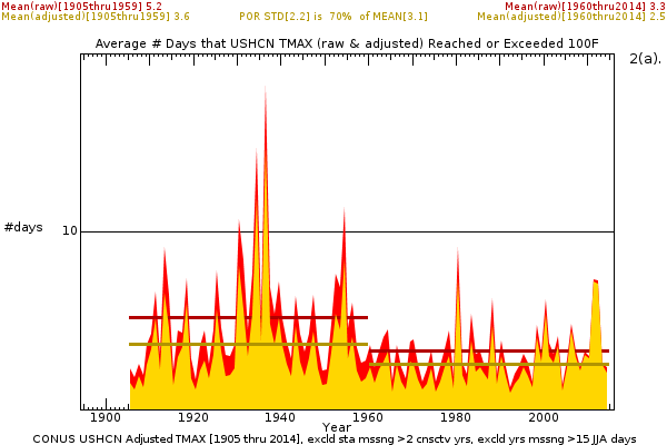
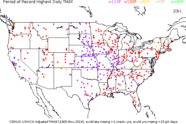
Figure 2. (a) The mean number of days in which TMAX reached or exceeded 100° F decreased from the first half to the second half of the period 1905 through 2014; (b) the stations used and the period of record maximum temperature.
What Causes Hot Days?
Figure 3(a) indicates that the occurrence of 100°F days in CONUS and the annual global average temperature are very weakly anticorrelated (r=-0.07). Figure 3(b) indicates that the occurrence of 100°F days in CONUS and the June-July-August precipitation for CONUS are strongly anticorrelated (r=-0.70).


Figure 3. (a) The mean number of days in the US with temperatures reaching or exceeding 100°F is not correlated (r=-0.07) with global average temperature; (b) the mean number of days in the US with temperatures reaching or exceeding 100°F is correlated (r=-0.70) with the total June-July-August precipitation in the US.
Of course, correlation is not causation and multiple factors can occur simultaneously. It’s worth considering the anticorrelation of hot days with summer precipitation in the context of the conceptual model of a heatwave.

 .
.
Figure 4. (a) Heatwaves are typically induced by strong, large, persistent or recurrent anticyclones during summer (JPL); (b) Average July latent heat flux from the surface over the US averages over 150W/m^2 in places as seen in this NCEP/NCAR Reanalysis(physicalgeography.net).
Heatwaves are typified by the presence of a surface anti-cyclone (high pressure area) as depicted by the educational graphic in Figure 4(a). Anticyclones exhibit subsidence (sinking air) and light winds. The subsidence often results in an inversion which traps heat in the layer between the surface and the subsidence inversion. Subsidence also tends to inhibit the formation of both clouds and precipitation. Figure 4(b) above depicts the mean July latent heat transfer from the surface from reanalysis. Much of the Eastern US experiences average cooling of the surface by latent heat transfer of 125W/m^2 or more. As precipitation tends toward zero because of persistent or recurrent anticyclonic circulation, so too does the cooling of the surface by latent heat tend toward zero as the precipitation supplied soil moisture decreases. The potential for natural variation of precipitation to induce hot days (125W/m^2) is much larger than the potential from doubled CO2 (~3.7W/m^2).
What about the global record of hot days?
Of course, it is of interest as to how hot days varied, not just in the US, but around the globe. Unfortunately, there are many issues with constructing a global record from the GHCN TMAX data. Lack of stations in the early twentieth century, transient stations which reported for only for a few decades, missing data through out, lack of adjustment analysis for many stations, and other issues limit available consistent data. In spite of these factors, a similar analysis of the raw Non-US ( GHCN stations outside the US ) TMAX data appears as Figure 5(a) and 5(b) below.


Figure 5. (a) The mean number of days for consistently reporting stations in the GHCN, outside the US, in which TMAX reached or exceeded 100°F from 1905 through 2014; (b) the NonUS GHCN stations used and the period of record maximum temperature.
The mean number of 100°F days indicates a slight decrease, but the land area covered by consistent measurement is quite limited (on the order of 10%). By examining a briefer and more recent fifty year period ( 1962 through 2011 ), a greater coverage and density of stations meets the selection criteria as in Figures 6(a) and 6(b). There are many regions of missing stations data in the GHCN from 2012 through the present which is the basis of choosing the period end of 2011.


Figure 6. (a) The mean number of days for consistently reporting stations in the GHCN, outside the US, in which TMAX reached or exceeded 100°F from 1962 through 2011; (b) the NonUS GHCN stations used and the period of record maximum temperature.
The land area coverage of stations with consistent data is larger than that of the century scale analysis, but still not global (perhaps 50%). For this period and area, the frequency of 100°F days increased. Such an increase did also occur in the smaller regions (the US and the NonUS measured since 1905) as part of the longer term decrease for those regions. This comparison is depicted by Figures 7(a) and 7(b) below.


Figure 7. Shorter and longer term changes of 100°F days for both (a) the USHCN adjusted TMAX and (b) the Non-US GHCN raw TMAX data.
Of course, the smaller regions may not represent the global frequency at all. Unfortunately, the lack of TMAX observations limits the ability to assess global hot days.
What doesn’t this analysis mean?
This does not mean that global warming is not occurring. The trend for spatially weighted CONUS annual TMAX data (not just hot days) indicates a positive trend which is roughly consistent with other assessments of the global warming trend of the last century.
This also does not indicate a trend of decreasing hot days. The past variance (standard deviation 70% of the mean occurrence of hot days) is high and could impose a variety of trends.
What does this analysis mean?
What this means is that the assumption that global warming has led to more frequent hot days in the US is incorrect. Before examining the data, I would have agreed with probably most Americans in assuming that we have experienced more hot days than our ancestors did. Observations indicate just the opposite: our ancestors experienced more hot days the we have.
Also what this means is that the confidence expressed by the IPCC may be unwarranted when they write that for the next century “Warmer and/or more frequent hot days and nights over most land areas are virtually certain”.
Comments

Figure 8. The change of mean occurrence of days within each ten °F temperature band for the consistently reporting stations of the USHCN from 1905 through 2014, from the first half of the record (grey) to the second half of the record (dark gold).
Figure 8 represents the changes from the first half of the record (grey) to the second half of the record (gold) in the mean number of days that US TMAX values fall within a given ten degree temperature band. The largest changes have been an increase in the number of days with maximum temperatures in the 70s and 80s °F, and a decrease in the number of days with maximum temperatures above 90°F. The decrease of hot days in the US appears to be counter-intuitive. Counter-intuitive observations can occur because of faulty assumptions. The assumption that the signal of greenhouse gas forcing has emerged to exceed natural climate variability of hot days in the US is contraindicated by the record of more than a century.
Moderation note: As with all guest posts, please keep your comments civil and relevant.

Pingback: On the Decrease of Hot Days in the US – Enjeux énergies et environnement
“decrease in hot days in the US”
The effectiveness of Trump’s policies are being demonstrated already. Thank you Donald Trump!
Amen!
I see the same thing in Canada:
https://cdnsurfacetemps.wordpress.com/table-of-contents/ottawa-data-station-4333/ottawa-station-4333-tmax-tmin-tmean/
I expect the number of 100 degree days in Canada to hold steady.
While the number of hot days is too noisy from year to year to detect the signal, the summer mean (JJA) temperature has shown a noticeable shift of the center of its distribution. This may affect things like wildfire frequencies more than the number of hot days metric.
http://www.giss.nasa.gov/research/briefs/hansen_17/
Wildfires? A topic of discussion involving huge ‘uncertainties’ and challenges w/r/t attribution. Land use changes. Fire ‘management’ techniques. Pre-fire techniques (fuel management). Locations. ‘Weather’? Area coverage. Lives lost. Structural damage. Structure locations. Etc.
Glad to see you used the term ‘May’.
“Since the late 1800s , human activities and the ecological effects of recent high fire activity caused a large, abrupt decline in burning similar to the LIA fire decline. Consequently, there is now a forest “fire deficit” in the western United States attributable to the combined effects of human activities, ecological, and climate changes. Large fires in the late 20th and 21st century fires have begun to address the fire deficit, but it is continuing to grow.” http://www.pnas.org/content/109/9/E535.full
(An interesting work covering +/- 3000 years, but fairly definitive that a ‘deficit’ is the result).
The Hansen work is a relative ‘snippet’.
It’s a longer fire season which accounts for some of the increase.
Have been educated that a ‘climate’ time frame is considered to be at least a 30 year segment. Not clear what is an appropriate equivalent segment for a ‘wildfire’ time frame. 3000>300>30. Hansen’s is on the lower end of the scale.
Since AGW has recently been expanded in time frame might an analysis of wildfire be due similar treatment?
More variables in wildfire than AGW from what I read. Just because season is longer, is it dryer (Palmer in play there), wetter, and where are the other contributing factors segregated. Extended ‘fire season’ is entirely too simplistic.
You may want to also consider Christy’s testimony, Appendix A.
Christy also may want to consider seasonal temperatures. This is largely ignored by the skeptics, and we need to remind them sometimes because there is a real blind spot there when you look at these sites.
Reblogged this on Climate Collections.
I keep reading that global warming is real, but all the things it’s supposed to do don’t really materialize.
Oddly similar to religion.
rebelronin.
Yes, melting ice, disappearing mountain glaciers and rising sea levels are just coincidences.
Yes, melting ice, disappearing mountain glaciers and rising sea levels are just coincidences.
=====================
any science based on only positive confirmation is not science, it is pseudoscience. the reason is simple, for all intents and purposes the world is near infinite for human purposes. If you search you will find many, many positive examples to support any number of ideas.
what makes science a science is the lack of a single contrary example. If no investigator can find a single contrary example, no matter how motivated or how hard they look, if they cannot find a single contrary example then what you have found is true science.
And, we’re not talking here about our ancient ancestors. Moreover, our ancestors never complained about global warming.
Moreover, our ancestors never complained about global warming.
============
our ancestors complained about the weather. today we have a new , politically correct name for “weather”. The new PC name is “climate change”.
Rising CO2 in theory would have the potential to take the edge of the negative NAO/AO driven AMO warming, resulting in a relatively wetter central U.S.
http://www.ipcc.ch/publications_and_data/ar4/wg1/en/ch10s10-3-5-6.html
TE, a terrific analysis. Prepare for incoming.
But CO2 is expected as per theory to rise minimum temperatures. Mainly night minima and winter minima.
The IPCC is clearly wrong in its assessment, but this in no way contradicts CO2 hypothesis, correctly understood.
CET shows quite clearly that the rise in Central England is mainly due to an increase in winter temperatures.
However it is an important result because it defuses a lot of alarmist views. We should not expect more intense or frequent heat waves.
UHI … (Not CO2) actually causes a rise in minimum temperatures. Mainly night minima and winter minima.
UHI rises all temperatures, as dark surfaces get hotter during the day.
Javier: Concrete, brick, asphalt and the like absorb more heat from sunlight than natural vegetation, rocks, etc. So urban areas will be warmer during the day than rural areas. But building materials also release more stored-up heat at night than natural materials do, so the night-time warming will be greater than the daytime warming, relative to the natural environment. No?
Grant,
Not necessarily. Plants absorb radiation without generating heat, because the energy is used to create molecular bonds. That’s why we go to parks in hot days, as they are much cooler than the surrounding city. UHI is a full time phenomenon.
And all those dark manmade surfaces radiate the heat at night.
“The term “heat island” describes built up areas that are hotter than nearby rural areas. The annual mean air temperature of a city with 1 million people or more can be 1.8–5.4°F (1–3°C) warmer than its surroundings.
In the evening, the difference can be as high as 22°F (12°C).”
https://www.epa.gov/heat-islands
“But CO2 is expected as per theory to rise minimum temperatures. Mainly night minima and winter minima.”
Water vapour does that, primarily because of its heat capacity. CO2 has less heat capacity than dry air.
The effect of GHGs comes from catching outward IR radiation, with maximum effect when no or little LW radiation is coming in and when little H2O vapor is present to outcompete them. This means maximum effect during cold nights, minimum effect during hot days. Thus it is consistent with little effect on number of >100°F days.
Do the statistics on minimum temps nights and watch the effect. The number of very cold nights has decreased.
The effect of CO2 has not been to increase the rate of warming of the planet, but to decrease the rate of cooling. This is very clearly seen when measuring rate of warming:
http://i.imgur.com/eiLcp2s.gif
Look how the cooling rate has gone from -0.4°C/decade in 1900 to 0°C/decade now.
In a desert in the horse latitudes CO2 will have its maximum warming effect as there is less water vapour to compete with. In the Antarctic night, raising CO2 increases cooling as it’s so high and dry. I would imagine in a mid latitudes night cycle, higher CO2 would raise dusk-twilight temperatures, but accelerate atmospheric cooling rates through the night and result in a lower dawn minimum.
Ulric,
The air in the desert might contain a lot more water than over the North Pole, as it is a lot warmer and we are talking about absolute humidity. The air is very dry over the North Pole and over glaciers and high mountains, as it is very cold. That is the basis of Arctic amplification and glacier fast melting. Antarctica is a special case.
I don’t see why increased CO2 should accelerate night cooling. The more CO2 the longer it takes for IR radiation to make it to the TOA.
Desert air can be dry as Arctic air. Arctic amplification is a fallacy, because Arctic warming is negative NAO/AO driven, while increased forcing of the climate, GHG’s or solar, increases positive NAO/AO.
http://www.ipcc.ch/publications_and_data/ar4/wg1/en/ch10s10-3-5-6.html
“I don’t see why increased CO2 should accelerate night cooling. The more CO2 the longer it takes for IR radiation to make it to the TOA.”
As CO2 is speeding up radiative action, surely the atmosphere would then cool faster through the night?
Javier wrote:
“CET shows quite clearly that the rise in Central England is mainly due to an increase in winter temperatures.”
Have a look at each season for England mean temperature here:
http://www.metoffice.gov.uk/climate/uk/summaries/actualmonthly
‘CO2 is expected to rise minimum temperatures’
Javier,
I know this theory and it seems logical somehow. The only problem I have with it is: the data I have seen doesn’t support it. I analyzed the BEST data set (see link below) and found that Tmin has risen strongly in the first half of the 20th century. This happened with a CO2 increase of just 10% compared to preindustrial levels. Then in the second half of the century Tmin, Tmax and Tavg have risen at eactly the same speed. But now – and that is interesting – there seems to be something wrong with the northern hemisphere. Was it the gap between Tmax and Tmin that was closed in the first half it was the gap between NH and SH that was opened in the second half.
My lay person’s explanation is that the GHE is not seen in the difference between Tmax and Tmin but in the difference between land and ocean because NH is covered by far more land than SH. Also I suspect the CO2 radiation to impact more land than ocean temperatures since the LW radiation can’t heat water in depth >1mm directly.
http://www.ariva.de/forum/die-klimaritter-eine-antikapitalistische-revolte-537172?page=16#jump22126348
Explanation of the diagram:
Light = Tmax
Light dotted = Tmin
Bold = Tavg
Blue = NH
Red = Global
Green = SH
Paul,
Well, yes, it makes sense that the effect of CO2 is larger over land, as air is on average drier over land, as precipitations are less compensated by evaporation, specially in the winter.
However I would be reluctant to extract conclusions from global temperature databases, as they have been adjusted to death. I would rather check regional high quality temperature datasets like US or Western-Central Europe. The global data is really sparse when you go back in time. It is essentially a hole that is being filled artificially.
However I do think that LW radiation does warm waters. UV can penetrate quite deep, and my own personal experience at the beach in the summer is that the upper 2 m. get very nice while it is much colder below. After all if you can see the fish is because radiation is getting there.
Reblogged this on ClimateTheTruth.com.
Isn’t this somehow as to be expected with higher temperatures leading to higher water turnover and thus higher latent heat removal from the hottest places? Actually provided that there is enough (increased) water to be removed.
So precipitation seems to work to counteract heating up and the system has a negative feedback in it as far as this one is regarded.
This raises two questions, the answers to which are counter-factual.
1. Would hot days have been as frequent if the same conditions which led to more dry summers of the past persisted because of GHG RF? I would tend to think so, but we will never know, because the climate evolved only one way.
and
2. Has the period difference decrease in dry summers occurred because of global warming? The models do indicate a global increase in precipitation with warming, but again, the climate evolved only one way.
The CONUS JJA precipitation is quite variable and doesn’t appear to exhibit a trend:
https://turbulenteddies.files.wordpress.com/2016/12/ushcn_conus_tmax_1905_2014_jja_precip.png
And that’s probably the biggest take away – the forcing from natural variation of precipitation is quite large and variable compared to that of GHGs.
Thus, it would not be surprising if no signal of hot days ever appeared.
“Also what this means is that the confidence expressed by the IPCC may be unwarranted when they write that for the next century “Warmer and/or more frequent hot days and nights over most land areas are virtually certain”.”
A great analysis. I imagine that much would have been different if United Nations climate panel IPCC had scrutiny as one of their principles rather than consensus.Principles governing IPCC
Rather than sound scientific principles United Nations climate panel is governed by:
– the unscientific principle of a mission to support an established view(§1)
– the unscientific principle of consensus (§10)
– an approval process and organisation principle which must, by its nature, diminish dissenting views. (§11)
Science or Fiction,
You asked me to give you the tip when my post ‘Trust but
Verify’ was up. Herewith, including link u posted 22/11/
on Climate Etc re IPCC writing and review process. bts.
https://beththeserf.wordpress.com/2016/12/13/43rd-edition-serf-under_ground-journal/
Thank´s a lot for remembering that : ) – I look forward to reading it.
I liked your article a lot. :)
An informed perspective on the pitfalls with supranational idealism.
Turbulent Eddie, thanks for all the hard work you put in to ascertain the truth of this claim. As a skeptic’s skeptic there’s not much I enjoy more than being proved wrong, because that means I’ve learned something. Today however I was disappointed, lol.
Working with clean data is of course an important part of the statistician’s methodology. In my own comparatively trivial statistical fiddlings, such as comparing the career histories of graduates with post-grads and those with technical qualifications, or the likelihood of a finesse succeeding, I always like to compare the results with the entire dirty data set. Often I find that my scrupulous refinements, much as I enjoyed applying the tools of the trade, were just busy work. What do the raw data say?
Your trivial statistical fiddlings do not seem trivial at all to me.
Did you find out something we would like to hear about?
Thank you, Science or Fiction.
Wrong address, but right addressee – I guess. :)
TE, you say this: “The land area coverage of stations with consistent data is larger than that of the century scale analysis, but still not global (perhaps 50%).”
These are convenience (aka availability) samples taken at available points, so there is no “area coverage.” Not 50% or any percent. Moreover, statistical sampling theory is clear that no inference can or should be made from a convenience sample regarding the total population. Yet this is the standard (unsound) practice in climate science.
Wrong
There is clearly only one point which your “Wrong” could refer to, and that is the final sentence. Yet it seems correct to me.
Care to expand a bit, or would you prefer to just throw spit-wads at those who disagree with you?
“Wrong”
Yeah, yeah, yeah…
Just keep on telling yourself that if it makes you feel better.
But…
Here is an example of the standard theory of convenience samples:
“As indicated by their name, convenience samples are definitely easy to obtain. There is virtually no difficulty in selecting members of the population for a convenience sample. However, there is a price to pay for this lack of effort: convenience samples are virtually worthless in statistics.”
Virtually worthless.
http://statistics.about.com/od/HelpandTutorials/a/What-Is-A-Convenience-Sample.htm
I would agree that selection can introduce bias, and this analysis doesn’t even attempt incorporate a spatial analysis.
However, the available data are not likely to be improved with further effort – it’s possible, but quite unlikely that there are piles of meticulously kept TMAX observations out there waiting to be discovered.
However “global warming” has most certainly led to more frequent hot days in the Arctic Eddie. Take today for example. +4.1 °C anomaly!
http://GreatWhiteCon.info/2016/12/december-2016-arctic-report-card/
http://GreatWhiteCon.info/wp-content/uploads/2016/12/CCI-T2-anomaly-20161217.png
More frequent over what period, Jim? 10, 100, 1000 years? And that is only at the available stations. Your graphic is something of a hoax, attributing temperatures from isolated stations to entire areas. These are wild guesses, not measurements.
David:
“Your graphic is something of a hoax, attributing temperatures from isolated stations to entire areas. These are wild guesses, not measurements.”
That graph is a plot of actual 2m temps as input at T+0, plus those determined for T+0 by GFS NWP programme at it’s surface grid-points minus the known ave temp of those grid points taken from climatological data.
“Here, we use 0.25°x0.25° (~30 km) output grids available from NOMADS, and calculate daily averages from eight 3-hourly timeslices starting at 0000 UTC.”
“Temperature refers to air temperature at 2 meters above the surface. The temperature anomaly is made in reference to a 1979-2000 climatology derived from the reanalysis of the NCEP Climate Forecast System (CFSR/CFSV2) model. This climate baseline is used instead of the 1981-2010 climate normal because it spans a period prior to significant warming of the Arctic beyond historically-observed values. For context, see this timeseries plot showing how various climate baselines compare against the NASA GISS 1880-2014 global land-ocean temperature index.
http://cci-reanalyzer.org/dailysummary/#T2
No Tony, a plot of actual temps would just be at the thermometer locations. The graphic shows unmeasured temps over an entire area. All those unmeasured temps are guessed by an infill algorithm. There is no reason to believe that they are accurate. That graph is fiction presented as fact. Does that make it fake fact?
Wrong
“No Tony, a plot of actual temps would just be at the thermometer locations. The graphic shows unmeasured temps over an entire area. All those unmeasured temps are guessed by an infill algorithm. There is no reason to believe that they are accurate. That graph is fiction presented as fact. Does that make it fake fact?”
No David:
I’ll repeat:
“That graph is a plot of actual 2m temps as input at T+0, plus those determined for T+0 by GFS NWP programme at it’s surface grid-points minus the known ave temp of those grid points taken from climatological data.”
“All those unmeasured temps are guessed by an infill algorithm”
No. they are not.
They are computed by the NWP for each grid-point surface.
Then climatological data for each grid-point is taken away.
“There is no reason to believe that they are accurate”
Considering the scale of the map – there is every reason to consider them accurate.
If it were to be zoomed in to a small area and interpolated to a much smaller regional scale then of course it would not be “accurate”, as microclimate effects would come into play.
Same as the surface date record addition of individual thermometers is “accurate” for a global area by being representative of a larger area.
How else would we end up with numbers only a few tenths aprt on an annual basis otherwise?
Tony, your “computed” and my “guessed by an algorithm” are the same thing. The graphic is showing anomalies over huge areas where there are no measurements. These are therefore algorithmic estimates, not facts on the ground. Statistical theory says they are extremely unlikely to be correct.
Moreover, because they are based on convenience samples there is no way to even estimate how great the sampling errors are. Hence they are just guesses.
Weather patterns have long-distance spatial correlations, so a station can give information of what large areas in the same air mass are doing. For example in the US today, you only need a few stations to tell us how large the cold anomaly is over wide areas. This is the size of weather systems, similarly for the Arctic warm anomaly.
“Tony, your “computed” and my “guessed by an algorithm” are the same thing. The graphic is showing anomalies over huge areas where there are no measurements. These are therefore algorithmic estimates, not facts on the ground. Statistical theory says they are extremely unlikely to be correct.”
So is anything worked out by an algorithm an estimate you reject?
Maybe you reject the “algorithms” used in UAH6.0(beta5) or RSS4.0?
The “Gold standard” I believe?
So when your calculator works out a log for you – the answer is an “estimate” is it?
One that you reject?
NWP surface max temp prediction between T+0 & T+24, is something that routinely could be predicted to +/-2C 10 years ago when I was a forecaster in the UKMO, and places where it may be +2 may be next to somewhere at -2. They cancel on this scale, unless there is an inherent bias. Which NWP verification seeks to rectify.
Else your local Wx F/c would go awry pdq.
“not facts on the ground”
You set impossible standards in the real world.
“Statistical theory says they are extremely unlikely to be correct.””
Stats theory also says that they are unlikely to be to incorrect to matter.
Because of the “number of tosses” (grid-points).
The climatological averages are unarguable … unless?
For the purposes posted, that map is perfectly able to tell a tale of (near real-time) T2m anomalies.
Tony Banton,
“The weather maps shown here are generated from the NCEP Global Forecast System (GFS) model. GFS is the primary operational model framework underlying U.S. NOAA/NWS weather forecasting. The model is run four times daily on a global T1534 gaussian grid (~13 km) to produce 16-day forecasts. Here, we use 0.25°x0.25° (~30 km) output grids available from NOMADS, and calculate daily averages from eight 3-hourly timeslices starting at 0000 UTC.”
Computer generated output. The result of toy computer models. Nonsense or not, who would know?
More reanalysis, with inconvenient values done away with.
No GHE, in any case. Anybody who believes that temperatures, average or otherwise, should remain unchanging for any arbitrary length of time is in denial of reality. The system is chaotic, with no minimum change to inputs required. It’s chaotic.
Repeating fantasy, no matter how brightly coloured, will not create fact.
Cheers.
David – Here’s NOAA’s latest effort, going back to 1900. What don’t you care for?
http://www.arctic.noaa.gov/Portals/7/EasyDNNNews/thumbs/271/201fig1.1-overland.png
Jim Hunt,
I just visited RealClimateScience. Haven’t been there before. Don’t think I’ll go there again.
No, not me. I use my real name. It’s the only one I can be sure of remembering.
As to MO, I suppose my MO is to expect someone claiming that putting CO2 between a heat source and a thermometer will cause the temperature of the thermometer to rise, to at least demonstrate this effect.
Of course, no one can, because it’s impossible.
Cheers.
That’s one of the points of the temperature distribution.
Days of anomalously high temperature are not the same thing as hot days.
You would still need your coat for this hot day in the Arctic.
The temperature distribution above ( and that’s not spatially weighted ) of
stations in the US indicates for the average station, there has been an increase of high anomaly temperatures, but it’s been near the middle of the distribution, and there’s been a decrease at the high end of the distribution.
The point is that this is merely a fact about the samples, not about the areas encompassing those samples. To get a reasonable estimate for the areas we would need random samples, which we are very far from. These are convenience samples, from which nothing can be inferred.
Eddie – Do you take my (implied) point that the United States does not cover the entire surface of Planet Earth?
Eddie – Do you take my (implied) point that the United States does not cover the entire surface of Planet Earth?
Absolutely. It was very frustrating to find the sparsity of global TMAX data for the same period.
The unmeasured past will remain unmeasured.
However, the lack of a long global TMAX record, combined with the contrary record for the US certainly don’t make the case for confidence of an increase.
Eddie – Have you ever read what IPCC AR5 has to say about United States temperatures?
I’m heading for the surf at the moment, but I’ll try and dig out a reference for you later if it doesn’t ring any bells.
On one his more loquacious days I seem to remember Mosher saying thare was a 96% correlation between NA and Global temperatures. It was something like that, which doesn’t quite answer your question but I am interested if any work has been done along those lines. Global vs continent vs individual nations correlation for temperature.
Surf? Closest to that and surfing is the 10 inches of snow on our hill I’m preparing for the grandkids to slide on.
Ceresco – All that’s required is sufficient extent and thickness of neoprene:
https://youtu.be/pJE_v2ifsFk
Eddie – This is the bit of AR5 WGI that was at the back of my mind, but is now at the forefront:
There are some exceptions to this large-scale warming of temperature
extremes including central North America, eastern USA (Alexander et
al., 2006; Kunkel et al., 2008; Peterson et al., 2008) and some parts of
South America (Alexander et al., 2006; Rusticucci and Renom, 2008;
Skansi et al., 2013) which indicate changes consistent with cooling in
these locations. However, these exceptions appear to be mostly associated
with changes in maximum temperatures (Donat et al., 2013c).
http://ipcc.wikia.com/wiki/152.6.1_Temperature_Extremes
Jim Hunt,
There are some exceptions to this large-scale warming of temperature
extremes including central North America, eastern US … mostly associated with changes in maximum temperatures (Donat et al., 2013c).
That’s consistent. What I’ve demonstrated is the decrease in TMAX, not annually or even for summer, but for the hot days reaching 100F for the majority of CONUS stations . And it looks like the same is true for the lower threshold of 90F. I didn’t address spatial variation, which is pertinent.
The most significant aspect to me is not so much whether the change in hot days has been an increase or decrease, but the correlation with precipitation deficit ( and the dynamic features which led to the deficits ). The physical basis for natural variability remaining quite large with respect to a doubling or even quadrupling of CO2 means that predictions about an increase in hot days a probably not “virtually certain”.
> What I’ve demonstrated is the decrease in TMAX, not annually or even for summer, but for the hot days reaching 100F for the majority of CONUS stations
Yet at least one of your conclusions goes quite beyond that, Turbulent One.
That response may very well be unwarranted.
Yet at least one of your conclusions goes quite beyond that, Turbulent One.
For the areas on earth where TMAX has been measured consistently for more than a century, the majority of those stations have recorded fewer hot days, and the physical basis for that decrease is demonstrably a matter of natural variation. I contend that the IPCC claim that for the next century, more frequent hot days are “virtually certain”, may be uncertain.
These are “wild guesses” too I suppose?
http://greatwhitecon.info/wp-content/uploads/2014/04/UH-Arctic-Area-2016-12-15.png
Not nearly so wild as the surface temperature guesses, Jim. These thin lines are at least based on satellite imagery, but the methodology is crude. The error may well be broader than the line spread. In no case is it accurate to the line thickness.
How about all the white space between 2016 and the next lowest year in the satellite record?
N.B. Self evidently that graph only covers the years since AMSR2 took to the skies, but AMSR2 has better “resolution” than the SSMIS (currently F-18) instruments used by NSIDC.
What is the ratio of the error to the white space?
Last I knew the method was to count any grid cell judged to have an ice cover of 15% or more as ice covered, so actual ice extent could be very different from that estimated. Has that changed?
Wrong
Your “wrong”s are adding up Mosh. A waste of space.
3 Wrongs don’t make a right. Nor will any more added wrongs.
David, you say
“Last I knew the method was to count any grid cell judged to have an ice cover of 15% or more as ice covered, so actual ice extent could be very different from that estimated. Has that changed?”
Ice extent is defined as any area with more that 15% coverage of ice, so if it has more than 15% ice, it is considered ice for ice extent purposes. This is historical for navigation purposes, anything above 15% is a hindrance to navigation.
Ice area is of course different, and always is lower than ice extent.
But In some ways it doesn’t matter as it quickly goes from 15% to 100%, except lately when the ice is really rotten.
David – I’m back from the seaside, and Bob’s explanation is near enough. I have the wherewithal to calculate extent to an arbitrary concentration threshold if necessary.
Note however that the graph above that you’re quibbling about is Arctic sea ice area. If you’re not au fait with the difference please feel free to try clicking a few links here:
http://GreatWhiteCon.info/resources/arctic-sea-ice-explanations/
You’ve gone very quiet David. Can I therefore safely assume that you agree with The Guardian that the recent precipitous decline in global sea ice area is:
The 11th Key Science Moment of 2016
Nice analysis TE:
Seems to me that the US experienced an unusual decade or so prewar, that has not been replicated since.
This may well be a “meteorological” phenomenon related to lengthy blocked anticyclonic spells over the continent, modulated in part by the period of +ve PDO/ENSO regime at that time.
However it is interesting to note that when looking at Min temps that period has been superceded (apart fom 2 years) in higher levels of min temps this last 18 years.
https://www.washingtonpost.com/rf/image_606w/WashingtonPost/Content/Blogs/capital-weather-gang/201201/images/contiguous_us_extremes.jpg
And the long-term trend is greater than that for max temps…
https://1.bp.blogspot.com/-F9TdvS5h_nc/VsNy3na3jEI/AAAAAAAAA-Q/tLeHxMt1Aw8/s600/USA_nClimDiv.png
Numerous studies have
identified changes in atmospheric circulation associated with tropical
SST anomalies, in particular those in the Pacific associated with ENSO and
longer-term decadal fluctuations, as principal drivers of extended dry and
wet periods over North America and elsewhere. Unusually cold SST anomalies in the eastern and central equatorial Pacific, for example, have been identified as a primary forcing for the extended US Dust Bowl drought of the 1930s
https://upload.wikimedia.org/wikipedia/commons/c/c0/February_1936_US_Temperature.gif
It hit 120 F in Gann Valley, South Dakota… my Dad’s buddy, the Gann Valley Giant:
http://www.thetallestman.com/images/augustklindt/augustklindt%20(3).jpg
And it is these changes in circulation, both air and water that are the cause of the increase in the recorded surface temperature, and it does this by way of how water vapor(dew point) is distributed across the continents.
The fields in the Dakotas are large… they started using tractors early on. The soil in the upper Midwest is black. A farmer around 1910 plowing his field:
http://www.intimeandplace.org/Dust%20Bowl/images/compare/plow2.jpg
http://netnebraska.org/sites/default/files/styles/largepopup/public/net-article/Sig_111412_dust_dunes_index.jpg?itok=lFcrKDe7
Here’s mine
MIn and Max
https://micro6500blog.files.wordpress.com/2016/12/min-max1.png
Daily Range.
https://micro6500blog.files.wordpress.com/2016/12/daily-range.png
My Min and Max, based only on station measurements, show a slight negative trend. These were also averaged as a flux, then converted back to a temp.
Nice work but I don’t think it’s enough to answer the question.
No daily adjusted USHCN TMAX data are available, but the monthly adjustments provide, on average, a best available estimate of adjustment.
Sure, it might be the best available but that doesn’t mean it’s adequate for the task. The monthly adjustments are intended to find average biases. It could be that particular station sitings have enhanced bias in hot days while normal days have no bias. The adjustment would deal with the average bias, but hot days would still be biased high. This is fine for looking at long term averages, but not for extremes.
So, no, the analysis doesn’t mean the US hasn’t experienced more hot days recently. You need some homogenisation method which deals with extremes in order to answer the question.
Looking at Berkeley TMAX historical JJA averages (have you tried a scatterplot regression with that against number of >100F days?), it seems plausible that there could have been more “hot days” (under this definition) in the mid-1930s than the most recent decade. It doesn’t seem likely that “hot days” would have been persistently more frequent over the whole 1905-1960 period as your graph suggests. Substantiating that claim requires something more robust than this analysis.
It could be … enhanced bias in hot days while normal days have no bias.
Yes, this did occur to me. <a href="https://ams.confex.com/ams/pdfpapers/91613.pdf" found that sunny,snow covered days had the greatest impact on TMAX. This made me wonder if the bottom of the Stevenson screens were unpainted and absorbing a lot more when snow reflected solar upward. Wilted grass from a long drought might have the same effect.
In favor of the adjustments being close, however, are:
1. the band analysis indicates not just a decrease in 100F days, but also in 90F days – the decrease occurred not just at the hottest of the hot.
2. the CRS shelter adjustment is least in summer and greatest in winter.
However, an uncertainty will always be present and many of the factors will never be known.
Typo:
Doeskenfound that sunny,snow covered days had the greatest impact on TMAX.
Yes, I am a little suspicious of the lack of adjusted daily data as well. It is likely that from the 1940s weather stations were moved from town centers to more rural locations such as airports. This would produce a downward bias on the number of hot days. The spike in the 1930s may have been produced by dryer soils.
I would like to see the results peer-reviewed before anyone starts making the claim the IPCC was wrong.
Harry,
“It is likely that from the 1940s weather stations were moved from town centers to more rural locations such as airports.” Reasonable concern. Is it equally reasonable to consider that today’s airports ‘weather station locations’ might impose an alternatively skewed result requiring additional review considering airports of today might not be representative of airports of the 1940’s?
“Is it equally reasonable to consider that today’s airports ‘weather station locations’ might impose an alternatively skewed result requiring additional review considering airports of today might not be representative of airports of the 1940’s?”
It’s been done – BEST.
“Is the urban heat island (UHI) effect real?
The Urban Heat Island effect is real. Berkeley’s analysis focused on the question of whether this effect biases the global land average. Our UHI paper analyzing this indicates that the urban heat island effect on our global estimate of land temperatures is indistinguishable from zero.”
http://www.scitechnol.com/2327-4581/2327-4581-1-104.pdf
Tony Banton,
Thank you for the link. While I do see UHI ‘considered’ there seems to be a fair amount of ‘uncertainty’. Controversy is the word choice in the article.
There are applications of ‘educated’ guess for locational impacts and additional categories introduced (very-rural, interestingly don’t see very-urban under which today’s airports might fall).
Please don’t misunderstand. I appreciate the efforts to reduce error and to maintain consistency but to Harry’s point of being suspicious of the lack of adjusted daily data should be at least an equal concern to adjusted data (although I prefer the term skeptical……suspicious holds a bit of hint of being nefarious).
Two additional points. From the discussion: “The huge effects seen in prominent locations such as Tokyo have caused concern that the Tavg estimates might be unduly affected by the urban heat effect.” (Might seems like a very large word)
“We note that our averaging procedure uses only land temperature
records. Inclusion of ocean temperatures will further decrease the
influence of urban heating since it is not an ocean phenomenon.
Including ocean temperatures in the Berkeley Earth reconstruction
is an area of future work.” (+/- 70/30 ratios water to land then unknown ratio of Urban to land makes one think about hot days in urban being discussed in T. Eddie’s offering here).
tony banton
all true, but surely the point is that ‘global’ temperatures comprise of a varying number of pin point like temperature readings, aggregated together, with most of those pin points being in growing urban areas. To smear those definitely affected urban pin points across the whole globe (which is mostly rural) misses the nuances of those urban areas on which much of our temperature record is based.
The Met office make a CET wide allowance for UHI . Arguably it should be more and arguably some of those used in the past-such as almost Manchester airport – need greater adjustment than they had?
tonyb.
Figure 3b looks suspiciously non-linear. Why might that be – is there a physical basis for suspecting that?
The precipitation measure used is a CONUS average so there could be a lot of nuance spatially and temporally.
Turbulent Eddie
Where have you submitted for publication? We would like to cite in a paper we are working on.
Also, here is one paper where we looked at this issue in Colorado
Pielke Sr., R.A., T. Stohlgren, L. Schell, W. Parton, N. Doesken, K. Redmond, J. Moeny, T. McKee, and T.G.F. Kittel, 2002: Problems in evaluating regional and local trends in temperature: An example from eastern Colorado, USA. Int. J. Climatol., 22, 421-434.
https://pielkeclimatesci.files.wordpress.com/2009/10/r-234.pdf
Roger Sr.
You can cite the Journal of Climate Etc.; people are starting to reference CE posts in journal articles.
As long as the argument is logically valid and the premises are traceable it should not really matter where it is published.
That is terrific, Judy. Congratulations. One thing is for sure: all the posts at CE get a thorough ‘peer review’.
I just searched this blog and Dr. Christy’s testimony for the word “duration” to see if that is something significant in assessing TMAX events. I could find no mention of duration of a “warm” (pick your threshold) event. Is “duration” relevant in this discussion?
Heat waves are defined as consecutive days over x where x is a value like 90F or 100F. That is how it was done in the 2014 National Climate Assessment. See essay Credibility Conundrums for more details. This is searchable by city and by state using googlefu. Mostly state climatologist or local university records.
Average number of days with high temperatures of 100 degrees or more from 1981 to 2015:
https://dsx.weather.com//util/image/w/tom505.jpg?
Thanks Wag. I probably should have included “consecutive days” in my previous post for duration.
“No daily adjusted USHCN TMAX data are available, but the monthly adjustments provide, on average, a best available estimate of adjustment.”
As I have explained to folks a bunch of time, adjustment codes are limited to operating on MONTHLY DATA.
More importantly, there is no earthly reason to use USHCN.
That series should have been deprecated years ago.
As you know, the USHCN stations were selected specifically to represent the US. It turns out the selection of consistent stations results in pretty much the same stations whether one is using USHCN or GHCN. And the results are pretty much the same. They’d better be, right? If the raw data has changed, there’s some weasel in the works. USHCN and GHCN are the same, with this exception: USHCN data are nearest degree F ( as most US stations were reported ) while GHCN data are nearest tenth degree C, so there’s round off error, albeit small, in using GHCN for old data.
But you’ll get your wish – the daily USHCN appears to have been discontinued since 2014.
Not included above are two other measures,
The Period of Record Maximum High Temperature:
https://turbulenteddies.files.wordpress.com/2016/12/ushcn_conus_tmax_1905_2014_por_high_tmax.png
and the percentage of stations reaching 100F at least once:
https://turbulenteddies.files.wordpress.com/2016/12/ushcn_conus_tmax_1905_2014_percent_100f.png
“Also what this means is that the confidence expressed by the IPCC may be unwarranted when they write that for the next century..”
This is not a valid statement to make. For example the ratio of hot records to cold records is increasing in CONUS.
For example the ratio of hot records to cold records is increasing in CONUS.
Perhaps.
But that’s not the same thing as hot days.
Anomalously high temperatures in January are anomalously high, but don’t represent hot days. See Figure 8 above – hot days have, on average, decreased in the US.
The quote that I found in the reference that you gave is not exactly the same as the one you give in the text. The quote is:
“Warmer and/or more frequent hot days and nights over most land areas.”
The probability estimate is “likely” for the early 21st century and “virtually certain” for the late 21st century.
So your “unwarranted” conclusion is unjustified by your results.
I wrote ” the confidence expressed by the IPCC may be unwarranted”.
This is not absolute and is subjective. I think “virtually certain” is also subjective ( ever wonder why it’s 99% likely? not 98.35? ).
However, the past century long record is contradictory to the future century prediction. The IPCC cannot present a century long record of evidence in support their prediction. Also, the greatly varying natural variability is a result of dynamic fluctuation which is not predictable.
Therefore, the it appears the claim that any outcome of hot days is known with certainty is unwarranted.
By the way, I do believe that barring some major other change in radiative balance, that an increase in future GHGs would very likely beget a future increase in global average temperature, just not necessarily an increase in hot days, because hot days are more a result of dynamic changes than global average temperature is.
TE,\
Thanks very much for the interesting article. Keep engaging with objective data and observations.
Scott
Maybe someone earlier in comments asked if increased US forest cover over last 100+ years might moderate hot days. Notes from AmericanForests.org website:
“The net cooling effect of a young, healthy tree is equivalent to 10 room-size air conditioners operating 20 hours a day.
A mature tree can reduce peak summer temperatures by 2° to 9° Fahrenheit.
100 million mature trees growing around residences in the U.S. can save about $2 billion annually in energy costs.”
http://www.americanforests.org/explore-forests/forest-facts/
Pingback: Weekly Climate and Energy News Roundup #252 | Watts Up With That?
Pingback: On the Decrease of Hot Days in the US | privateclientweb
TE, this is what I’ve pulled out of the GSoD set
https://micro6500blog.files.wordpress.com/2016/12/relh_dewpoint.png
That’s very interesting.
Any idea about the spike in the early 70s?
Yes, the number of stations included crashed about 80%, then came back more than ever in about 77 and onward.
I made graphs of barometric pressure as a kid, but never thought to find a trend line.
I might have discovered global pressurization.