
by Euan Mearns
UK blogger Paul Homewood and Telegraph columnist Christopher Booker have managed to stir public interest in the veracity of adjustments made to temperature records by the Global Historical Climatology Network (GHCN).
The focus lies in adjustments made to GHCN V2 data in the homogenised GHCN V3 data that was released 2011. Pair wise homogenisation is supposed to detect and remove non-climatic artefacts from the data caused by, for example, moving a station, a tree growing and providing shade or a change in the thermometer.
It is useful at this point to read what NASA GISS have to say on their FAQ page (it was Gavin Schmidt that pointed me to this information).
To recap, from 2001 to 2011, GISS based its analysis on NOAA/NDCD’s temperature collection GHCN v2, the unadjusted version. That collection contained for many locations several records, and GISS used an automatic procedure to combine them into a single record, provided the various pieces had a big enough overlap to estimate the respective offsets; non-overlapping pieces were combined if it did not create discontinuities. In cases of a documented station move, the appropriate offset was applied. No attempt was made to automatically detect and correct inhomogeneities, assuming that because of their random nature they would have little effect on the global mean.
Using the excellent web platform provided by NASA GISS it is possible to access GHCN V2 and GHCN v3 records, compare charts and download the data. It does not take long to find V3 records that appear totally different to V2 and I wanted to investigate this further. At this point I was advised that the way homogenisation works is to adjust records in such a way that a warming trend added in one station is compensated by cooling added to another. This didn’t sound remotely scientific to me but I clicked on Alice Springs in the middle of Australia and recovered 30 V2 and V3 records in a 1000 km radius and set about a systematic comparison of the two. The results are described in detail below.
In summary I found that while individual stations are subject to large and what often appears to be arbitrary and robotic adjustments in V3, the average outcome across all 30 stations is effectively zero. At the regional level, homogenisation does not appear to be responsible for adding warming in Australia. But the thing that truly astonished me was the fact that the mean temperature trend for these 30 stations, 1880 to 2011, was a completely flat line. There has been no recorded warming across a very large portion of the Australian continent.
Some final notes on nomenclature. NASA GISS refer to GHCN V2 as unadjusted while in fact NOAA say the V2 data have been subjected to adjustments, a fact borne out by my subsequent work on Iceland. In my charts and text I refer to GHCN V3.1 while in fact I’m unsure what the version is that I accessed via the NASA GISS web platform. It is the data used in GISS temp. And finally, those offended by my averaging of raw temperatures in the post below will find an anomaly plot at the end of the post.
The data
For reference, Figure 1 shows a map of the region surrounding Alice Springs.

Figure 1 A 1000 km radius around Alice Springs. Many of the station names (Figure 2) can be found on the map.
In this comment, Sam Taylor pointed out that the way homogenisation works is to modify data in groups of stations and that to get a proper picture of its effect it is necessary to look at a regional group. So I clicked on the middle of Australia and got the list of stations below. This series of posts began with Roger Andrews in Alice Springs. This has been a lot of work. One of the main conclusions is that homogenisation has not biased this regional group of records.
Before proceeding, lets see how homogenisation is defined. First Wikipedia:
Homogenization in climate research means the removal of non-climatic changes. Next to changes in the climate itself, raw climate records also contain non-climatic jumps and changes for example due to relocations or changes in instrumentation. The most used principle to remove these inhomogeneities is the relative homogenization approach in which a candidate station is compared to a reference time series based on one or more neighboring stations. The candidate and reference station(s) experience about the same climate, non-climatic changes that happen only in one station can thus be identified and removed.
And this from the NASA GIS FAQ page.
UK Press reports in January 2015 erroneously claimed that differences between the raw GHCN v2 station data (archived here) and the current final GISTEMP adjusted data were due to unjustified positive adjustments made in the GISTEMP analysis. Rather, these differences are dominated by the inclusion of appropriate homogeneity corrections for non-climatic discontinuities made in GHCN v3.2 which span a range of negative and positive values depending on the regional analysis. The impact of all the adjustments can be substantial for some stations and regions, but is small in the global means. These changes occurred in 2011 and 2012 and were documented at that time.

Figure 2 The system allows you to select a reference station and provides a list of surrounding stations. This printout from GHCN V3.1 is the list of stations analysed down to Larimah.
Analysis results
- A comparison of raw temperature records (GHCN V2) and homogenised temperature records (adjusted records GHCN v3.1) is presented for 30 climate stations (Figure 2) within a 1000 km radius of Alice Springs, Australia. The adjusted records are subtracted from the raw records which illustrates the degree of adjustment for each station.
- 29 of the 30 stations have been adjusted to a greater or lesser extent. Only Farina has no adjustments.
- The size of the adjustments increases back in time and are occasionally large, up to ±1.5˚C. Temperature trends are adjusted by either warming or cooling the past.
- In 29 records, adjustments are near ubiquitous and are frequently exact decimal fractions, for example exactly 0.5˚C. For individual stations, it is usually very difficult to reconcile the pattern of adjustment made to any geographic or historic system. Homogenisation has also deleted at least 85 annual records that hinders comparison of the two data sets.
- In Alice Springs the raw record is flat and has no sign of warming. In the adjusted record, homogenistaion has added warming by significantly cooling the past. Five other stations inside the 1000 km ring have similarly long and similarly flat records – Boulia, Cloncurry, Farina, Burketown and Donors Hill. There can be no conceivable reason to presume that the flat raw Alice Springs record is somehow false and in need of adjustment.
- Six records show a significant mid-1970s cooling of about 3˚C (Alice Springs, Barrow Creek, Brunette Down, Cammoo Weal, Boulia and Windorah) that owing to its consistency appears to be a real signal. Homegisation has tended to remove this real temperature history.
- The average raw temperature record for all 30 stations is completely flat from 1906 (no area weighting applied). There has been no measurable warming across the greater part of Australia. The main discontinuity in the record, pre-1906, arises from there being only 3 operating stations that do not provide representative cover.
- The average temperature trend for the 30 adjusted records is also flat and not materially different to the raw record. Hence, wholesale adjustments have not significantly biased the regional record. This raises the serious question of why GHCN have adjusted individual records in a way that introduces trends that do not exist and removes trends that do at the individual station level? The individual GHCN V3.1 records are not temperature records but carry a coded temperature signal that only makes sense when amalgamated with similar code from neighbouring stations.
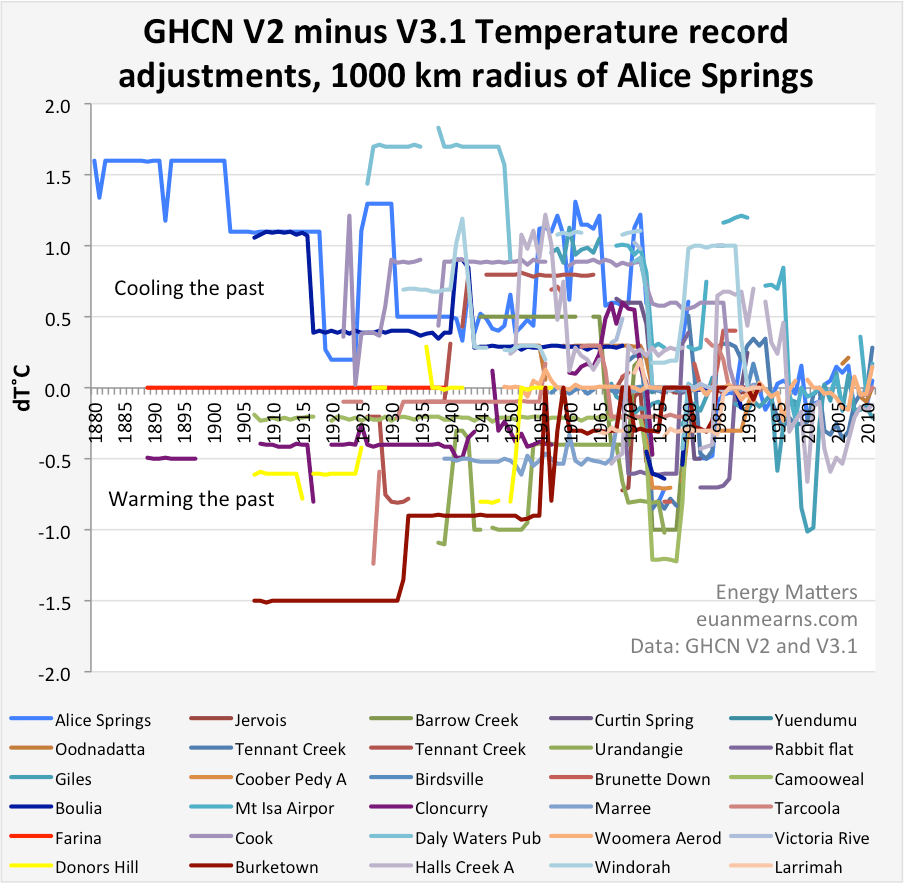
Figure 3 The chart summarises the adjustments made to the 30 station records showing V2 raw record minus V3.1 adjusted record. It shows clearly how adjustment is near ubiquitous although there are often segments of a record that are not adjusted. Note Farina (red) is the only station with no adjustment. Note also how the scale of adjustment tends to expand back in time.

Figure 4 Example of individual station record adjustment. The raw record for Barrow Creek was flat. Adjustments have cooled the past to create a warming trend. Note the style of flat line decimal fraction adjustments. Also note the significant adjustment to the mid 1970s data that tends to remove a real cooling event observed in several stations.
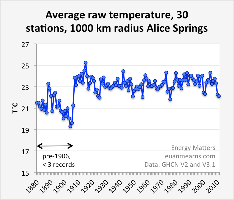
Figure 5 Somewhat surprisingly, since 1907 the raw temperature record for this large part of Australia is completely flat (Figure 6). There has been no warming. (note no area weighting). Pre 1907 there were only three operating stations and this imparts bias to the record. Mid 70s cooling is observable. There were no large volcanic eruptions at the time but VEI4 eruptions in 1973 (Tiatia), 1974 (Volcan de Fuego), 1975 (Tolbachik) and 1976 (Mount Agustine).
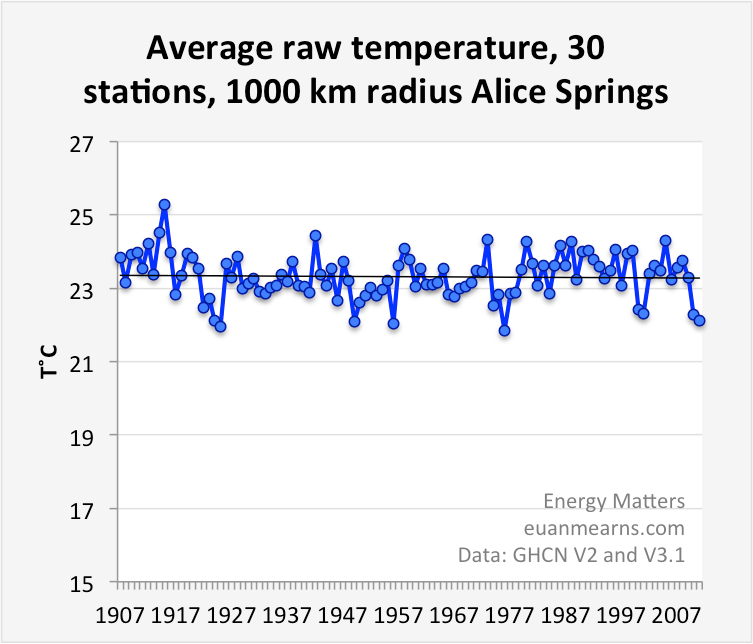
Figure 6 A regression through the post-1907 data is completely flat.
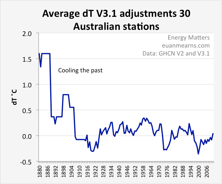
Figure 7 Averaging the dT records for 30 stations (Figure 3) shows that since 1906 no significant trend or bias is introduced. But the negative dip in the mid-1970s removes what is likely a real climatic signal. I’m unsure what impact the large pre-1906 bias may introduce but suspect that this may be removed by expanding the area that would increase the number of pre-1906 stations to a representative level.

Figure 8 Prior to 1906 there were only 1 to 3 operating stations. In 1907 that number increased to 7 and the temperature signal settled on a representative regional average. The number of stations then grew steadily to a maximum of 27 in 1972. Then in 1993, there was massive station closure, down to 6 is barely enough to provide representative regional cover.
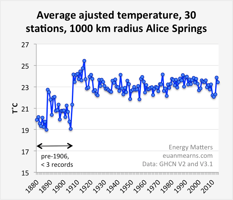
Figure 9 Following from Figure 7, it is difficult to spot the differences between the raw and the adjusted record. There is less variance in the homogenised data which I guess is what homogenisation does but I suspect that real climate signal has been smoothed out, in particular the possible mid-1970s cooling event.
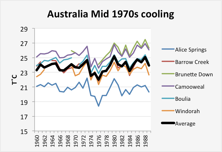
Figure 10 Six stations record a rather similar style of mid-1970s cooling that seems it could be a natural signal that homogenisation has removed (V2 unadjusted records).
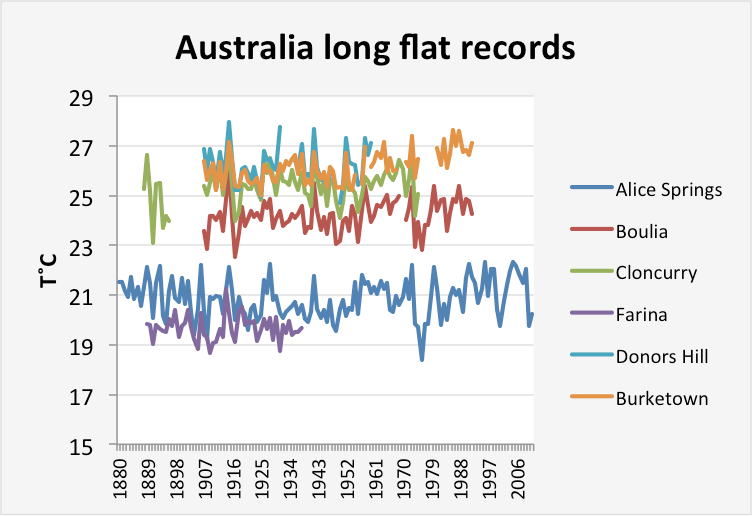
Figure 11 Six stations with old records do not show warming. Notably Farina was the only record to have no adjustments made. There is no evidence for warming or cooling anywhere and therefore no justification to add warming or cooling artificially using homogenisation (V2 unadjusted records).
Discussion
Homogenisation of climate records changes virtually everything and nothing at the same time. The objective of homogenisation is to remove non-climate artefacts. Wholesale re-writing of the temperature history everywhere is not consistent with the stated aims. Homogenisation appears to have added warming or cooling to records where neither existed. Homogenisation may also have removed real climate signal.
I find zero warming over such a large part of the Australian continent to be a surprise result that is consistent with Roger Andrew’s observation of no to little warming in the southern hemisphere, an observation that still requires more rigorous testing.
There is no evidence in this data set to support the more serious allegation that has been made for GHCN and NASA GISS adjusting records to manufacture global warming. Individually, the GHCN V3.1 records cannot be treated as climate records since each one contains fragments of code designed to create regional homogeneity.
It seemed prudent to have an anomaly chart, so here it is. Doesn’t change anything, the average temperature series are completely flat from 1880 to 2011.

Acknowledgements. I need to acknowledge the very substantial contribution made by my blogging partner, Roger Andrews, who many years ago compiled a large number of “raw records” that showed scant evidence for warming across the whole southern hemisphere. He sent me his spread sheet and Roger’s results are summarised in his recent post Homogenizing the World.
Biosketch. Euan Mearns is a geologist / geochemist. A former Managing Editor at The Oil Drum he now has his own blog Energy Matters.
JC notes: This post was submitted via email.As with all guest posts, keep your comments on topic and civil. In terms of moderation, this post will be treated as a technical thread.

But “the science is settled.” One of the more laughable comments in the CAGW debate. Where are these people getting their degrees, from a Cracker Jacks box?
Dave –
==> “But “the science is settled.” One of the more laughable comments in the CAGW debate.”
Please pardon my ignorance, but I don’t know which climate scientists you were quoting there. I know there are many – since “skeptics” so often point out how often the phrase has been uttered by climate scientists, but I was just hoping that you might list a few?
You are right Joshua. There are no ‘climate scientists’ who are claiming that Australia is warming.
“There is no evidence in this data set to support the more serious allegation that has been made for GHCN and NASA GISS adjusting records to manufacture global warming.”
Well, perhaps not, but then again if the pause goes on much longer they’re going to have to seriously consider it. Otherwise, things are beginning to look pretty grim for those insisting the debate is over.
There is no evidence
================
Are we sure that GHCN V2 is raw data? What happened to GHCN V1? Comparing adusted data to adjusted data isn’t going to prove anything.
My thought precisely.
“What happened to GHCN V1?”
It was actually issued on CD, and I’m sure there are copies still around.
GHCN V1, V2 and V3 unadjusted are just that, unadjusted (by GHCN). And you can check GHCN Daily against historic records. I’ve done that for my home town and old newspapers. Every one I checked matched. You could check too.
Nick Stokes | March 17, 2015 at 6:20 pm |
“What happened to GHCN V1?”
GHCN V1, V2 and V3 unadjusted are just that, unadjusted
Care to correct your assertion , Nick?
Steven says you are wrong, not to put to fine a point on it
Steven Mosher | March 17, 2015 at 1:26 pm | Reply
“basically GHCN-M v2 and V3 are going to have limited data.
If you move upstream to daily raw you get more data.”
Steven Mosher “Also don’t assume you have any reliable information to assess quality. Doubt every thing.”
Steven Mosher | March 17, 2015 at 2:03 pm | Reply
“Note that I have since discovered that the GHCN V2 records are not “raw” but have been processed a little. ”
“huh? this has been known for some time. discussed on CA and by RomanM and me. also see the work done on scribal records.”
Note GHCN incorporates and adds to USHCN records which are adjusted to ” get out of here” Eddie Murphy.
I would imagine that V1 GHCN is the finest set of adjusted raw data you can get Euan.
You can tell by the increasing cooling of climate backwards.
BoM Australia also make adjustments using a similar approach – on that has been much criticised by Jo Nova and Jennifer Marohasy among others. Although I cannot say for sure, I suspect that the BoM adjusted data is what goes into GHCN. BoM adjustments can change the sign as well as the magnitude of the trend
Melbourne heat — BoM makes mystery corrections, but misses new skyscrapers. Incompetence?
http://joannenova.com.au/2015/03/acorn-melbourne-bom-makes-wrong-corrections-misses-new-skyscrapers-incompetence/
==> “Well, perhaps not, but then again if the pause goes on much longer they’re going to have to seriously consider it.
Beautiful. Don’t let the lack of evidence to support the conspiracy theories get in the way. Just because no temperature adjustment conspiracies have taken place in the past doesn’t mean that anyone can prove they won’t happen in the future.
Ya’ just gotta lurve “skeptics.”
Thanks, Joshie, I don’t even mind that you completely misinterpreted my comment, something for which you seem to have an amazing aptitude. In an ideal world, we all have to be good at something.
“Beautiful. Don’t let the lack of evidence to support the conspiracy theories get in the way. ”
Sigh. Josh, if I say all politicians are liars and thieves, does this generalisation imply they are part of a conspiracy to defraud the public? Hardly. Self interest, sloth and ignorance are more than sufficient to explain it. I leave it to you to draw the parallel with climate science.
Nicely done.
By way of a little further background. This post is a bit rough around the edges in part because it is a huge amount of work to clean the V3 data where large amounts of records are deleted and many are “created”. I was also feeling my way trying to make sense of how to treat the results. I have since moved on to look at Southern Africa and I hope these results will also be posted here. Excluding urban records that show warming trends, southern Africa looks like central Australia.
One thing I want to try and nail is how the likes of BEST manage to create warming from temperature records that are flat. I ventured on to Real Climate a few weeks ago and was told repeatedly that what GHCN and GISS were doing must be correct since BEST shows the same trends.
I have completed analysis of S S America and Antarctica that have yet to be published. All this pretty well confirms Roger Andrews observation that there is little warming in the southern hemisphere which I find is a real puzzle.
Note that I have since discovered that the GHCN V2 records are not “raw” but have been processed a little. V3 then homogenises the V2 records, frequently with robotic, exact decimal fraction adjustments. I sense there is a risk that the public lose access to the raw data which I view as a serious problem that needs to be addressed by NOAA.
euan, ” I ventured on to Real Climate a few weeks ago and was told repeatedly that what GHCN and GISS were doing must be correct since BEST shows the same trends.”
I believe that is “globally” regionally different products have different issues in different regions.
https://lh5.googleusercontent.com/-Jxhu9n1YpxE/VQhdNEleH9I/AAAAAAAANMg/0QeckjKdy7g/w738-h476-no/northern%2Bterritory%2Btrends.png
http://www.euanmearns.com/wp-content/uploads/2015/03/centaustempspag.png
This is the temp spaghetti for my 30 stations that covers most of the Northern Territory. Sharp eyes will see the majority of records trending flat. What I hope to find out is how this gets turned into a warming trend. Have I done something wrong?
Your chart shows the mid-70s cooling.
http://www.euanmearns.com/wp-content/uploads/2015/03/ozdT.png
For good measure my anomaly chart plotted at same scale as yours. I have simply converted each record in my spaghetti stack to an anomaly and taken the arithmetic mean to produce this average dT stack. When you average lots of flat lines, you get a flat line.
“I believe that is “globally” regionally different products have different issues in different regions.”
yes, that is most likely going to be the case.
1. The different groups use different data.
2. the different groups use different methods.
All the methods aim at minimizing the error in their global overall prediction. Depending on how you grid ( or dont grid) whether you use a CAM method or RSM method, or Regression method you are going to get different etsimates for the local detail. Global methods dont aim at
get the local detail correct. They aim at minimizing the error of prediction.
every time you read the words “global average” remember that it’s a misnomer of sorts.
Steven Mosher, ““I believe that is “globally” regionally different products have different issues in different regions.”
yes, that is most likely going to be the case.”
Why weren’t you this agreeable when we were discussing the exact same issue in the southeast US or is this another dumb question?
Capt. There is no disagreement. The issue is that nothing follows from it. We have pointed out the disagreement before. Resolving it is
A. Unimportant to the global estimate
B. A topic of on going research.
Jumping to conclusions about the disagreement is what I object to. It’s poor skeptical thinking
“…every time you read the words “global average” remember that it’s a misnomer of sorts.”
Misnomer? Misnomer implies accidental misrepresentation of facts. It is a neutral term. A better way of putting it would be that when you see the term “Global Average Temperature” used by CAGW advocates, it is, and has been, a knowing misrepresentation, a/k/a a lie.
The producers of this supposed GAT have known since they started their marketing campaign in 1988 that what they are reporting was not global, was not an average, and was not about temperature. GAT is the constructed, adjusted mean of anomalies which pretend to global extent through interpolated and krigged data based on measurements from sparse sites over a portion of the Earth, leaving out vast swaths of land and ocean for which there are no actual measurements.
But that doesn’t make for such a nifty headline as “Warmest Year Ever!!! (by .04 degrees, to 38% confidence).
Garym
When I have expressed the opinion that the global average is not helpful as you miss out on the nuances and extremes I have got it in the neck.
. We have global averages for land temperatures, sea temperatures, sea levels etc. I am not sure any of them are helpful
Tonyb
Steven, “Jumping to conclusions about the disagreement is what I object to. It’s poor skeptical thinking”
Some aren’t jumping to the conclusions you think they are jumping to. Some of the regular skeptics are just concerned that their area temperature history is being revised a bit too often. NCDC’s adjustment routine might be perfectly correct, but when they keep constantly adjusting the past, perhaps it isn’t correct enough. If they picked a different baseline period, the past might stay where it was. Then there wouldn’t be as many questions. When they jump in front of the cameras to announce the warmest year EVAH after more adjustments, that just makes them look a bit stupid.
https://wattsupwiththat.files.wordpress.com/2014/09/comic_rollercoaster_610.jpg
You might even say cartoonish.
tonyb,
Your real sin against the Church of CAGW is looking at actual historical temperature data, rather than tea leaves, sorry, tree rings and ice cores.
You can only make so many ‘helpful’ assumptions when statistically massaging temp data. But with proxies, the possibilities are virtually endless.
Not to mention that your results don’t support the thermageddon dogma.
GaryM,
Was there a study: “rather than tea leaves”? :)
@ joshua
What arguments? I’m hoping he posts a sub-regional summary for Central Australia based on same stations I’ve used. Because then we will have a basis for debate. Where do the discrepancies lie? Is it in the raw input data? Or how it is processed?
Well that is a grey zone. In my first year as an undergraduate student I read Physics, Statistics, Geology and Geography. My final degree could have been in any one of those four subjects. It turned out to be geology.
Judging the merits of bloggers and blog commenters against their expertise is one thing. Judging the technical competence of those providing professional advice to governments and the UN that guides multi trillion $ investment decisions is another.
huh.
1. A global approach to predicting the temperature at unsampled locations
doesnt aim at getting local detail correct. It is NOT an average.
2. GISS use monthly data and they also use a RSM method. They
stitch stations together. Even the source data has stations
stitched together.
For Alice springs, as an example, looking at all the source data you
have multiple records, inconsistent location records.
Hmm. this record cools.
http://berkeleyearth.lbl.gov/stations/4735
this one warms a bit
http://berkeleyearth.lbl.gov/stations/152286
basically GHCN-M v2 and V3 are going to have limited data.
If you move upstream to daily raw you get more data
http://berkeleyearth.lbl.gov/station-list/station/152286
###########################################################
“One thing I want to try and nail is how the likes of BEST manage to create warming from temperature records that are flat. ”
we dont.
Within 600km or so you have 30 stations. The GHCN /GISS approach requires long records. But we dont use GHCN-M for the vast majority of our data. we go upstream to daily or hourly if need be. That give you more records, more data.
we cool this one
http://berkeleyearth.lbl.gov/stations/172903
cool this one
http://berkeleyearth.lbl.gov/stations/152352
raw data is warming here. there is a small change
http://berkeleyearth.lbl.gov/stations/152356
raw is warming here.. we dont do much
http://berkeleyearth.lbl.gov/stations/152269
a little bit further out.. raw is warming.. we cool it
http://berkeleyearth.lbl.gov/stations/152337
One of the drawbacks of the RSM approach is that you have to have or “make” long records. you make them by stitching series at different locations together.
With a standard statistical approach you dont need continuous records.
http://berkeleyearth.lbl.gov/stations/152248
Steve, are you able to run off a summary of Central Australia using same 30 stations I have used so we at least have a basis for comparison? The initial objective of my exercise was to compare V2 and V3 and to quantify the impact of V3 homogenisation. The fact that the temperature stack came out as a flat line was an “accidental” by product. But it surprised me a lot. Does CO2 not radiatively force temperatures over central Australia?
In southern Africa I have looked at 59 records. Selectively removing 10 warming urban records, the remaining 49 also give a flat line that I know is at odds with BEST S Africa chart. Judy will hopefully run my Africa post next week.
I am no expert on assembling and interpreting temperature records. In the past I simply accepted that the thermometer records told a story and the controversy lay in understanding the underlying causes of the warming. So looking into the raw data here has thrown me off balance.
I am in quite strong disagreement with several aspects of BEST approach and methodology.
1) We can start with this:
Global warming IS the sum of the parts. Confidence in what you are doing is substantially undermined if the local detail is not correct.
2) From my limited experience, station quality trumps station quantity any day. We can probably describe the world land surface temperature history with perhaps 1000 records.
3) Long continuous records ARE of greater value than short ones and discontinuous ones. That is not to say that short records have no value.
4) From the NASA GISS FAQ page:
This has a simple appeal. The less processing done the better. If records are to be corrected then it should be done based on historic events and not by bots. Temperature records within a congruous climate zone should be congruous and so comparing them to each other is a good way to select good records. Records that do not comply with the regional trend should simply be discarded – (see point 2). I am not in favour of automated corrections.
5) The BEST way of “homogenising” while it has a certain appeal seems also to be at risk of fulfilling prophecies. If you start in SE Australia you could easily develop a regional warming trend and normalise to that. Congruous records will evolve slowly across space and should be allowed to do so without correction.
6) From my limited experience of looking at a few thousand records I observe clear evidence for urban warming. This is a bit more complex than linking a station to the size of settlement, though that is a good starting point. I suspect land use change is a major driver of temperature change – though have yet to delve into the details. If an urban record shows warming it should NOT be used. Go off and find a nearby rural record that shows same and you will be on more solid ground.
I am blogging from Aberdeen Scotland, 7 hours ahead of California.
E
PS Krakatoa 1883 left no mark on Australian temperatures.
Euan,
As much as I’m in favour of people questioning science and looking at data for themselves, we now have at least 5 different groups who’ve produced global temperature records, all of which broadly agree. I’m, therefore, somewhat failing to understand the motivation behind what you’re doing. Part of it simply seems to be a “this could be done differently/better”, but part seems to be a suggestion that you think there might be some kind of problem with the global temperature record. If the latter, how likely is it that 5, or more, groups have produced broadly consistent global temperature records, and you’ve come along and discovered some major problem. Anything’s possible, I guess, but it seems rather unlikely. Of course, if your motivation is the former, then there probably are ways of doing things differently, but the people in these groups are not fools, and may well have been through exactly the process you’re following now. It might seem that I’m suggesting being cautious of hubris, but actually………okay, I am.
euanmearns
I want to extend my appreciation to you for taking on this task. You are asking questions that have been begging to be asked.
Euan.
You are being mislead by the term global average.
It is not the sum of the parts.
It is simply the prediction of temperature at unsampled locations. This is fundamental to spatial statistics.
Now some people try to do this prediction by summing the parts, but don’t be mislead.
Also don’t assume you have any reliable information to assess quality. Doubt every thing.
@ and then there’s physics
Believe me, I wish I’d never heard of homogenisation. The Paul Homewood / Christopher Booker reports have generated huge interest on the back of sensational claims that I set out to check. And I found the sensational part is largely unfounded – so I fall foul of the sceptic community that I am a peripheral part of. But I try to tell things as they are.
Really?
http://oi60.tinypic.com/2mgvy42.jpg
This from Roger Andrews. And from N hemisphere:
http://tinypic.com/view.php?pic=2hey3jm&s=8#.VQiL-ijjJcY
One possible explanation is that the GHCN V2 records are crap, in which case someone needs to go and crash heads together at GHCN. I have checked GHCN V2 records for Iceland against the IMO records and while there is unnecessary fiddling, the differences are not material.
http://www.euanmearns.com/wp-content/uploads/2015/03/IMO_ddT_7stations.png
“You are being mislead by the term global average.
It is not the sum of the parts.
It is simply the prediction of temperature at unsampled locations.”
Well that’s simply not true.
The reported “Global Average Temperature” reports do NOT just try to PREDICT past temperatures. They make their “predictions” (what a bastardized, obscurantist use of the word this is) of those past temps at “unsampled sites” for the purpose of combining them with their adjusted values at sampled sites, and release the final result as the “GAT”.
Even allowing for Mosher’s obscurantist use of the word predict, those predictions are a step in manufacturing the final product, not the end product itself.
“Also don’t assume you have any reliable information to assess quality.”
I would in fact advise the contrary – that no one has sufficient reliable information to assess quality of the reported temperature records on a global basis, including the creators of those reports.
Euan,
Yes, I know they have. Of course, that in itself is rather irritating given that most of what Christopher Booker says is complete and utter nonsense, and that this isn’t obvious is itself concerning. I reserve judgement on Paul Homewood, but the word “hubris” does spring to mind.
Also, why would you appear to refute my comment about global temperature records by showing a graph for the Southern Hemisphere only? Also, it would be nice to know more about the graph as it’s not at all clear what it is that you’re showing or where it comes from.
Garym
The historic temperature records are every bit as anecdotal as the anecdotal weather accounts that mosh is so scathing about.
Tonyb
@ ATTP
Well I posted N and S hemispheres, the N did not display, but the link is there. The methods etc are described here:
http://euanmearns.com/homogenizing-the-world/
If Roger’s analysis is correct then everyone should find this interesting.
@ Steve, so what is your background? I am a geologist / geochemist. I take the view that climatology is a very small component part of geology. Are you a statistician, physicist or what? Climate science does not in my opinion exist. It is an amalgamation of geology (oceanography, glaciology and climatology), history, physics and chemistry ± a few other discrete disciplines.
Some of this sounds a little too philosophical to me. Your final paragraph I agree with. But it shouldn’t be like that. With the billions spent, we should by now have a reference set of thermometer records from around the world that everyone can agree on.
And I don’t agree that it is necessary to predict temperatures where there is no data. Whilst I understand the logic in area weighting etc, perhaps a new approach is required. How many points on the Earth’s land surface are required to define if we have global warming or not?
there is an issue of fitness for purpose. There aren’t too many applications that you need a truly global average temperature:
1) simple 1D global energy balance models
2) media spin about ‘warmest year’ etc.
For many applications, regional values or a spotty global dataset are fine. Climate models can easily be compared with a spotty global dataset by masking the climate model output to match the data coverage.
At this point I don’t really see the point of cherry picking areas to examine adjustments. I tend to agree with ATTP in this regard. Best was set up to find out the validity of gov temp records and found little difference. If someone wants to test these adjusted temps I would like to see unadjusted raw data charts made. If TOD is a problem then just seprate the periods plotted. Otherwise I don’t see the usefulness of these exercises. I like to look at all the various measrement means and tend to favor satellite. Those are adjusted too but have more coverage.
http://www2.sunysuffolk.edu/mandias/global_warming/images/temperature_trends_1979.png
curryja | March 17, 2015 at 5:46 pm |
there is an issue of fitness for purpose. There aren’t too many applications that you need a truly global average temperature:
——————————————————————————
Using it to manufacture a consensus that dangerous global warming is happening from fossil fuel use seems to be the only application that really matters. But it’s a biggie.
Eaun –
Why is mosher’s background relevant? Shouldn’t his arguments stand on their own merits?
Be careful in how you answer that question – as you might run the risk of upsetting Judith and many other “skeptics” if you argue that we should judge someone’s arguments based on their area of expertise.*
*Except, in some rare and freakish event, they apply standards selectively so as to confirm biases.
:-)
Dr. Curry,
“For many applications, regional values or a spotty global dataset are fine.”
Imagine what could be done with weather/climate science if the focus were shifted from massive funding for PR for decarbonization, and instead spent those billions on relatively short term science to help countries anticipate and adapt to severe weather events. Rather than trying to read computer generated tea leaves to predict future temps by tenths of a degree, or searching through every weather event for a CAGW ‘signal.’
If these progressives genuinely cared about the people they claim to, their priorities would be completely different.
i>”For many applications, regional values or a spotty global dataset are fine. Climate models can easily be compared with a spotty global dataset by masking the climate model output to match the data coverage.”
No they can’t. Are GCM’s supposed to predict station moves etc?
A GCM will give you an average temperature from a 100km sq grid (approx). The point of homogenisation is to best estimate the temperature in the region surrounding a station, eliminating the effects of station moves and events etc that a GCM couldn’t be expected to match. That is the temperature that you could hope to compare with the GCM grid.
And then? You have a whole lot of pointwise comparisons. How can you summarise? Average. There isn’t anything much better.
averaging within a grid box on the scale of the GCM resolution is a much different endeavor than making up values for the entire Arctic Ocean, regions in Africa where there simply aren’t any observations, and vast areas of the oceans for which there were no observations prior to 1980 or whenever.
@ Juddy
The main application where global average temperatures are used is in developing energy policies in the UK, the USA, the EU and the UN. The stakes could quite simply not be higher.
actually, the simple fact of warming isn’t sufficient to motivate these policies, it is the alleged cause of the warming (which does not necessarily require global data set).
Judith
I am working on a concept for interpolated anecdotal historical data.its going to propel historical climatology to new levels as I can create precise anecdotal accounts of the climate for each hour of the 15 th century in any country in the world. Exciting times…I just need a very powerful computer, I hear the met office have got a brand new one..watch this space.
Tonyb
==> “:If these progressives genuinely cared about the people they claim to, their priorities would be completely different.”
GaryM makes an excellent point. Obviously, “these progressives” don’t care about the people they claim to be concerned about.
Think about the poor children in Africa.
euanmearns | March 17, 2015 at 3:43 pm |
“2) From my limited experience, station quality trumps station quantity any day. We can probably describe the world land surface temperature history with perhaps 1000 records.’
Either “We can describe ” a ” world land surface temperature history with perhaps 1000 records.’
Or We can describe “gadzillions” of world land surface temperature history with perhaps 1000 records.’ depending on which combinations <1000 of the 1000 you chose or were able to use.
is correct.
Nick Stokes | March 17, 2015 at 7:30 pm |
“. Are GCM’s supposed to predict station moves etc? ”
They are not supposed to, Nick.
They are supposed to predict the global temperature
A GCM will give you an average temperature from a 100km sq grid (approx). The point of homogenisation is to best estimate the temperature in the region surrounding a station, eliminating the effects of station moves and events etc that a GCM couldn’t be expected to match. That is the temperature that you could hope to compare with the GCM grid.
And then? You have a whole lot of pointwise comparisons. How can you summarise? Average. There isn’t anything much better.
Nick Stokes | March 17, 2015 at 7:30 pm |
i>”For many applications, regional values or a spotty global dataset are fine. Climate models can easily be compared with a spotty global dataset by masking the climate model output to match the data coverage.”
No they can’t. Are GCM’s supposed to predict station moves etc?
A GCM will give you an average temperature from a 100km sq grid (approx). The point of homogenisation is to best estimate the temperature in the region surrounding a station, eliminating the effects of station moves and events etc that a GCM couldn’t be expected to match. That is the temperature that you could hope to compare with the GCM grid.
And then? You have a whole lot of pointwise comparisons. How can you summarise? Average. There isn’t anything much better.
Berkeley Earth has a rising temperature in Australia.
http://berkeleyearth.lbl.gov/regions/australia
As does GISTEMP
http://data.giss.nasa.gov/cgi-bin/gistemp/nmaps.cgi?sat=4&sst=3&type=anoms&mean_gen=0112&year1=2001&year2=2010&base1=1901&base2=1910&radius=1200&pol=rob
These use independent methods and get the same result. It is about 1 C in a century. The western part seems to be warming faster.
Jim D,
And wouldn’t it be much better if the conversation was regarding actual measured temperatures and not “predicted” ones? This issues comes about not due to an “merchants of doubt” but instead from “creaters of doubt”. This is why it seems so little value is presented (maybe even negative value) by using the methods of choice. Instead of adding clarity to the conversation, predicting temperatures (especially via cooling the past) muddies it.
“Note that I have since discovered that the GHCN V2 records are not “raw” but have been processed a little. ”
huh?
this has been known for some time. discussed on CA and by RomanM and me.
also see the work done on scribal records.
I expect most readers, have seen Roy Spencer’s observations of corn belt temperature changes from the 2014 record to the 2015 record. The 2014 record shows a warming of 0.2 deg F per century while the 2015 record shows a warming of 0.6 deg F per century.
Spencer took the time to show the annualized temperature adjustments since about 1900.
dont average temperatures. there are only highly specialized cases where doing so is valid. never do it.
Agreed. This was the first of several regions I looked at and cleaning the V2 and V3 data for comparison did my head in. I got lazy and averaged the temperature stack and got a flat line. Looking at the spaghetti, you can see there is a kind of normal distribution of station discontinuity about the mean. This is one of those rare occasions where mean T is similar to mean dT.
I have recently published a study on this subject.
Adjustments Multiply Warming at US CRN1 Stations
A study of US CRN1 stations, top-rated for their siting quality, shows that GHCN adjusted data produces warming trends several times larger than unadjusted data.
The full text and supporting excel workbooks are available here:
https://rclutz.wordpress.com/
From the linked article
“I ran a final check by comparing the raw Alice record with the raw records from stations around it, which as noted earlier is a good way of confirming that a record isn’t seriously distorted. Unfortunately there are no records close to Alice that are long enough to tell us anything,”
wrong.
this is an example of the old school GISS/CRU thinking, only long records are important. wrong.
short records can and do give you information about the reliability of longer records. One method that uses short records was in fact invented by a skeptic. So within 600 KM of Alice Springs there are around 30 other stations.
@ euanmearns | March 17, 2015 at 1:19 pm |
Relative to your “mostly flat” measurements in your first figure… One could easily use “Mikey’s Trick” to weight by a factor of 100 or more those records having a positive slope, and voila – this data would produce the desired hockey stick.
There has been no recorded warming across a very large portion of the Australian continent. Let me repeat that: the warming is hiding somewhere on the Australian continent.
“Let me repeat that: the warming is hiding somewhere on the Australian continent.”
Specifically in the pouches of female kangaroos.
Euan,
Very impressive analysis, and lots of work.
It would seem, however, that the whole exercise is a waste of time.
The thing goes wrong from the beginning. When you accept the climate clique’s assumption, definitions and terminology, you’ve already lost.
“Homogenization” is based on deeply flawed assumptions.
“Homogenization in climate research means the removal of non-climatic changes. Next to changes in the climate itself, raw climate records also contain non-climatic jumps and changes for example due to relocations or changes in instrumentation. The most used principle to remove these inhomogeneities is the relative homogenization approach in which a candidate station is compared to a reference time series based on one or more neighboring stations. The candidate and reference station(s) experience about the same climate, non-climatic changes that happen only in one station can thus be identified and removed.”
The assumption that the comparison of neighboring stations identifies “non-climatic jumps” is completely unsupportable.
After years of weather observations in my own region (say 50 miles in diameter), if is clear that there are locations that experience drastically different temperatures from “neighboring” locations–due completely to “climatic jumps.”
Hills, valleys, winds, frontal patterns, cloud formation, and many other totally “climatic” reasons create large “discontinuous jumps” among “neighboring stations.”
Smearing a “standardized, homogenized” temperature across large regions, to make up for imagined “relocations or changes in instrumentation” is a spurious and unscientific practice.
If a station has experienced a “relocation” or “changes in instrumentation,” then there may be a reason to adjust that station’s readings. However, the adjustment should be based on solid, actual data.
For example: “We switched thermometers from the Acme Bulbmaster to the Maxi Thermo King. The Thermo King, when compared to the Bulbmaster, read 2/100ths of a degree cooler. Therefore, we plan to adjust the Thermo King readings 2/100ths of a degree higher than the actual readings.”
The “adjustments” cannot be non-specific, regional heat-smearing exercises. This erases the reality of Earth’s climate–that there are micro-climates a few hundred yards apart. This is real. This is the Earth. This is climate.
So–critiquing their fake “homogenization” techniques just plays into their hands. Once you start playing three-card-Monte with a con man, you’ve already lost the game. The only way to win is to avoid playing at all.
Play on your own terms.
Examine and analyze the actual recorded temperatures.
If the climate clique suggests “adjusting” the raw readings, demand clear and scientific justifications for each and every change.
Otherwise, great work!
Kent, If you read my lengthy comment to Mosh, you will see that I am largely in agreement with what you say. 1000 carefully selected surface stations could be “hand” curated, like they do in Iceland. In Iceland, GHCN have taken carefully curated records (already homogenised) and applied V2 and V3 adjustments, re-writing the climate history in the process.
This gives me an excuse to post this;
http://www.euanmearns.com/wp-content/uploads/2013/11/Tmax_spaghetti.png
This 23 UK records, Tmax, 5Y running means. This is UK Met office data. Shetland Islands are 1200 km N of Southampton. But they all go up and down together. But there are boundaries to these congruous zones. Nearby Faroe Islands are IMO different to Shetland but Faroe is similar to Iceland and Jan Mayen.
And today looking at Antarctica (which isn’t warming) 14 records from The Continent are totally different to the Antarctic Peninsula (S Georgia and South Sandwich Islands), which are in turn different to S America. And so some places you get large areas of congruous temperatures, others not.
The assumption is that there is a thing you can call the actual recorded temperature. There isn’t.
There are just records. Folks need to be more skeptical not less.
Scientists have to work with the data available, or gather more data. You examine the data carefully for quality, relavance, accuracy, etc.-it is what it is. Why not use the actual data from each station, and if that’s too many numbers to crunch, then do a series of runs on randomly selected subsets of stations. Homogenization, with it’s litany of assumptions, some probably valid but some very sketchy, seems like a short cut that doesn’t pass the smell test.
This is something I’ve never quite understood. Until the proper instrumentation is in place and since we have many “regions” with a long track record of observations then why are we using “projections/predictions” at all? If an uncovered region is left out of the equation which is used to generate global values then any infilling processes are subject to question and adding more inaccuracy.
In addition, areas with longer historic records can be compared against the current methodology which should then be a check and balance approach.
Finally, once an area is covered, it should not impact the others.
Simplistic thinking, but why wouldn’t this work?
The goal of creating a global “average” is to predict the values at unsampled locations. Leaving areas blank is no different than in filling with the mean of the whole.
Mosh
But why not just say ‘you don’t know?’. There is no shame in just using real word data just for the areas where they exist.
. My respect for the met office would increase if for example they would admit that vast proportions of the global sea surface temperatures were not actually sampled back to 1850 . Why not just supply the data that is reliable for the areas thoroughly sampled, in the case of SST. ‘s the main shipping lanes? ( sorry John Kennedy)
Tonyb
SM, Your comment is ‘correct’ in one sense, but incorrect in another. Because it ignores the error bar uncertainty that should go with ‘infilling’ say half the world’s surface (oceans not on well sampled trade routes).
Part of the CAGW meme is that the detected post ~1950 temperature signal is ‘robust’ and ‘unique’ (hockey stickish), when it isn’t on both counts. CET shows this for a land region using thermometers.
Maybe researching archived whaling ship log books could help provide missing ocean air temp data from unsampled regions. A random idea I have no clue how to actualize. Or even if such ancient mariners log books still exist in places like New England.
“There is no shame in just using real word data just for the areas where they exist.”
The areas where they exist is in a few thousand white boxes around the world. OK, SST is different, and the boxes nowadays may not be white. But the fact is that you only ever have point samples. If you want to attach any continuum meaning to that, you have to interpolate. And you should do it as well as you can.
Rud
What I find amusing is that mosh continually moans about my ‘anecdotal’ written records but he not only uses ‘anecdotal ‘ temperature figures but also uses many figures that don’t even exist.
Tonyb
“The goal of creating a global “average” is to predict the values at unsampled locations. ”
This is unmitigated garbage. (I tried a more temperate response elsewhere, but repetitive BS gets old.)
The “goal” of those promoting a false “Global Average Temperature” is global decarbonization.
What the hell would be the point of spending all that money for purposes of determining “the values at unsampled locations?” Who cares about values at unsampled locations?
I’ll tell you who cares, those who want to take control of the global energy economy. The point of “predicting” values at unsampled sites is to provide support for headlines like “2014 – Warmest Year Ever!!! (by .04 degrees to 38% certainty).
Mosher claims he does not support the stated goal of the consensus, that he is (variously) a lukewarmer, libertarian or conservative. But he spends an enormous amount of time defending the arguments they make to push their cause. And none arguing against it. At most he disagrees with them on tactics, and that has become increasingly rare.
When there is conflict between what someone says, and what they do, look to what they do to determine their true motives.
tony
‘But why not just say ‘you don’t know?’. There is no shame in just using real word data just for the areas where they exist.”
because you do know.
Further field with missing data is NO DIFFERENT than that same field feild with the missing data infilled with the mean of the whole.
the mistake is NOT infilling with the best approach.
its simple math
“SM, Your comment is ‘correct’ in one sense, but incorrect in another. Because it ignores the error bar uncertainty that should go with ‘infilling’ say half the world’s surface (oceans not on well sampled trade routes).”
1. its correct on all senses.
2. you have uncertainty in all cases.
you cannot avoid infilling
as for old records.. yes they validate the prediction
@ Mosh
If you want to record the temperature of the human body, how many points of measurement are required? Is a thermometer in the mouth enough” Or do you need the arm pit and a**e as well? A specific body with a specific temperature can be accurately monitored from a single point.
Euan
You are missing the point. Your questions show this.
Average temperature doesn’t exist.
You have data. Your job is to estimate what you have not measured. As a diagnostic one temperature from your butt will estimate whether you have a problem.
No Tony it’s not using what doesnt exist.
It’s using what does exist to predict what wasn’t measured
When you look at crop records you are using what does exist to estimate a temperature that was never recorded. The issue I have with your work is you have no repeatable method. That is what is anecdotal.
Steven,
Thank you. Follow up question though. It seems to me that one of two things can occur. Reasonably accurate representative infilling, or alternatively, error. This still brings me back to a question of value. Is the error rate on actual raw data no different that that of infilling?
Let’s do a simple example.
I measure your waist it’s 30 inches. Your weight is 170
Next year 31 inches and 180. Next year 32 inches and a missing weight. Then next year 33 inches and 200 pounds. The data is missing. What do you know and how can you use it to say something about the missing weight.
I don’t know is not an answer.
“I measure your waist it’s 30 inches. Your weight is 170
Next year 31 inches and 180. Next year 32 inches and a missing weight. Then next year 33 inches and 200 pounds. The data is missing. What do you know and how can you use it to say something about the missing weight.”
Actually, a better analogy that mimics the homogenizing of temperature data would be:
I measure your waist it’s 30 inches. Your weight is 170
Next year etc, etc, etc..Then the next year your closest neighbor’s waist is 37 and weight is 120. Then next year your weight is 210 and your neighbor’s waist is 37. The following year your across-the-street neighbor’s waist is 43.
Now answer this question: What is the weight of the guy who lives three streets over?
Provide all your homogenization algorithms and justifications in the space provided. For extra credit figure the average weight of the citizens of the town across the river, using your adjustments to your neighborhood’s waistlines.
Steven,
Using this example:”I measure your waist it’s 30 inches. Your weight is 170
Next year 31 inches and 180. Next year 32 inches and a missing weight. Then next year 33 inches and 200 pounds. The data is missing. What do you know and how can you use it to say something about the missing weight.
I don’t know is not an answer.”
What difference would it make if the actual weight was 230 vs 190 vs 140 (was really sick and had a surgically removed large belly tumor) (as an example)? Cannot this question be addressed “mathmatically” as a missing data point using an algorithm designed to understand that there are missing data points? How is the value of an predicted number higher than skipping a missed point in creating a “global” value.
If I recall correctly I believe you’d previously indicated some 30,000 sites are used. Considering the coverage we currently have we might need some 30,000 more (just tossing out a figure). I just don’t understand why a figure must be created for those 30,000 not yet installed sites unless there is a plan for exactly that number of sites (and the locations) to be installed at a later time.
And are those adjustments made once, then perpetuated, or readjusted each sample period or an alternative time frame?
Just trying to grasp the value, and it’s not sinking in.
Send in the arbitrary robots.
Hi Tony,
“But why not just say ‘you don’t know?’. There is no shame in just using real word data just for the areas where they exist.”
You never “don’t know”; there is always some limits on what the temperatures were. Without ever taking a single SST measurement we know from the physical properties of sea water that SSTs will fall between about -2C and 100C as outside these ranges you don’t have liquid water to measure the temperature of, it’s either ice or water vapour.
You can do much better than this using knowledge of the climatological average and variability. We can estimate this from historical ship data and buoy data, or we can estimate it from satellite data, or both. Any way you choose you can generally narrow that -2 to 100 range down to within several degrees.
Where you have actual measurements those limits are narrower, but measurements aren’t perfect so we need to account for that. We do this by estimating the likely spread that would arise from imperfections in the measurement process – measurement error.
Combining information about average conditions with actual measurements and statistical methods it is possible to estimate what temperatures are in areas where we don’t have measurements. Mosher says “predict” which is an apposite word because what you get out of the statistical machinery is (ideally) a likely range in which the true SST is predicted to fall at a particular place on the ocean surface. In other words, one could go out and make an observation at that location and verify if the prediction is accurate.
“My respect for the met office would increase if for example they would admit that vast proportions of the global sea surface temperatures were not actually sampled back to 1850 . Why not just supply the data that is reliable for the areas thoroughly sampled, in the case of SST. ‘s the main shipping lanes? ( sorry John Kennedy)”
No need to apologise. I know your views on this. I’d just like to note here that:
first, I don’t think (correct me, please, if I am wrong) you have ever really defined quantitatively or otherwise what you mean by “reliable” or “thoroughly sampled” which makes your specific request impossible to fulfil. Also, your idea of reliable and someone else’s might not be the same. It depends what you and they are doing with the data.
Second, that the Met Office’s HadSST3 data set provides gridded summaries of data only where data are available.
Third, we provide estimates of the uncertainties in those gridded records and document the procedures for estimating them so the users can judge the reliability for themselves according to their own criteria.
HadSST3, data, papers and plots can be found here:
http://www.metoffice.gov.uk/hadobs/hadsst3/
An extended paper on uncertainty in in situ SST measurements can be found here:
http://www.metoffice.gov.uk/hadobs/hadsst3/uncertainty.html
Best regards,
John Kennedy
John
Your comment about knowing the approximate temperature range is interesting. You may know the range but is that useful for the purposes it is being used for-to help instruct global policy?.
The Met Office themselves have recently taken to (unhelpfully) saying in their weather forecast that the approximate temperature range (through the country) will range from 3C to 14C (as an example)
Now, those temperatures are wildly different, whereas at the former a thick coat is necessary in the latter its shirt sleeve weather (particularly if you are from Newcastle) Its not useable information.
We surely need to know accurate temperatures SST’s and global temperatures before we can say anything is happening that is worryingly untoward, SST’s in particular being very thinly sampled until modern times.
I do not have the means to provide the information you ask for, but give me a few hundred thousand pounds in budget , a couple of researchers and access to your records and I am sure I could find out in a year or two.
All the best
tonyb
Hi Tony,
“Your comment about knowing the approximate temperature range is interesting. You may know the range but is that useful for the purposes it is being used for-to help instruct global policy?”
That’s not my area of expertise. I estimate the uncertainty. It’s up to the users of the data – whoever they might be – when provided with that information to decide if it is suitable for their particular purpose.
As you note:
“The Met Office themselves have recently taken to (unhelpfully) saying in their weather forecast that the approximate temperature range (through the country) will range from 3C to 14C (as an example) Now, those temperatures are wildly different, whereas at the former a thick coat is necessary in the latter its shirt sleeve weather (particularly if you are from Newcastle) Its not useable information.”
This is kind of the point I’m making. You have been provided with information and, based on your particular needs, you make a judgement about whether that information is useful to you. You’ve decided it’s unhelpful as a guide for choosing an outfit and the range is what allows you to do that. You have strictly speaking used the information so it is in that sense “usable”. For other purposes, it might actually be useful too. There is no one-size-fits-all definition of useful, or accurate.
“We surely need to know accurate temperatures SSTs and global temperatures before we can say anything is happening that is worryingly untoward, SSTs in particular being very thinly sampled until modern times.”
Again: what do you mean by “accurate”? What do you mean by “thinly”? These terms can only have a useful meaning if you quantify how accurate (0.01C, 0.1C, 1C, 10C?) or what thin means. Is it one observation in a 250,000 km2 area or one thousand or one million?
I’m not asking you to undertake a research project, I’m simply trying to get to the bottom of what precisely you mean when you say these things. I consider you and others like you to be users of the data sets I work on (in a somewhat informal manner), so I’d like to understand better what you want from them, or what you expect.
By the way, the ICOADS data set which is a generally amazing resource for marine climatology contains the records we use for our SST data sets. It’s available online to all at:
http://icoads.noaa.gov/
Best regards,
John
Steven Mosher | March 17, 2015 at 8:49 pm |
“No Tony it’s not using what doesn’t exist.
It’s using what does exist to predict what wasn’t measured”
The issue I have with your work is you have no repeatable method.
How many of your “sites” have survived 40 years without a change of thermometer, Heck, how many have survived 100 years.
Answer none.
Hence there is no repeatable method available for the goal of creating a global “average” by predicting the values at unsampled locations. By using a mixture of different sites, thermometers and changed thermometers you are effectively doing anecdotal corn crops mixed in with wheat and barley.
By all means justify your use with it’s all we have and we do it scientifically but don’t knock Tony B when you are doing the same thing only a little bit more high and fancy.
http://data.giss.nasa.gov/tmp/gistemp/NMAPS/tmp_GHCN_GISS_ERSST_1200km_Anom1212_1900_2014_1950_1980/nmaps.gif
You seem to have confirmed only what was already known that the is zero warming in the region for 100+ years.
It was an interesting map. Where did it come from and where did it go?
Cooler summer days have led to plenty of tomatoes at the Alice Springs community garden.
“I am currently picking these gorgeous tomatoes,” she said.
“We’ve been really lucky with the weather.
“When it gets too hot the flowers don’t actually produce any fruit.
“We have got more tomatoes than we can actually eat,” she said.
http://www.abc.net.au/news/2015-01-07/alice-springs-community-garden/6002820
Cooler weather delays Eliminate Dengue trial in Stratford, Freshwater
“Mosquitoes obviously appreciate the warmer weather but it’s actually easier for us to establish bacteria when there’s less mosquitoes around but as it turned out this year was a little cooler than expected and it took a little longer to get the target number of mosquitoes in these areas.”
http://www.abc.net.au/news/2014-11-07/cooler-weather-delays-eliminate-dengue-trial-in/5874172
Interactive: 100 years of temperatures in Australia (BoM)
http://www.abc.net.au/news/2014-07-09/100-years-of-temperatures/5582146
The biggest issue with the Australian temperature record is that it only starts in 1910. Plenty of quality stations with data prior to that date.
Malcolm
BOM tend to disregard earlier stations because of possible siting problems, methodology and possible lack of Stephenson screens.
However there Must be sufficient atations that meet an acceptable criteria but don’t know if anyone is seeking to extend prior to 1910
Tonyb
Tonyb, apparently the gentlemanin charge of setting up the telegraph system in the 1880’s that ran along the early railroads was interested in weather. So apparently there are a number of stations with well maintained Stevenson screens going back at least to the 1890’s. Been following Australia at KensKingdom, Jennifer Marohasy, and JoNova because of the Rutherglen controversy in the ebook.
Cannot speak to geographic coverage, only that there are some decent weather records to go along with historical info ‘Down Under’ that paint a different picture about past heat and drought than BOM has been promulgating.
“The biggest issue with the Australian temperature record is that it only starts in 1910. “
This is completely untrue. My home town has a record since 1856; there are many other long records. This is a typical mis-statement that comes from people for some reason focussing on the adjusted data, when they want the historic record. The BoM a few years ago produced a homogenised data set back to 1910. The unadjusted record is of long standing, and found in the GHCN unadjusted file. I’m sure BEST has it too.
Point taken tonyb and nick. By starting in only 1910 the general populace are easily spooked by statements like “hottest ever on record”. By ignoring high quality station data from prior to the official start date we miss some well documented extreme weather events from the latter part of the 19th century – events which, if included in our record, would make recent claims of the hottest summer or winter or October or Christmas Day kind of unjustifiable. Should have made the point as well as ristvan does. Cheers.
BOM would not release it’s data to anyone without a court order, GHCN would not get a look in Nick.
Bureau of Meteorology officials, meanwhile, told Senate estimates on Monday that Australia was on a clear warming path, with temperatures rising between 0.71 and 0.76 degrees since 1960, depending on the methods used.
http://www.smh.com.au/environment/climate-change/threat-of-air-pollution-to-worsen-along-with-global-warming-warns-climate-council-20141020-118u3k.html
This article has issues. It follows the Homewood pattern of muddling with unadjusted data from different places rather than using the maintained repository, GHCN V3 unadjusted. Instead, it uses V2 with all the issues of duplicate records etc. And so there are dumb comments like
“In Iceland, GHCN have taken carefully curated records (already homogenised) and applied V2 and V3 adjustments, re-writing the climate history in the process.”
GHCN don’t re-write climate history; they preserve it in the unadjusted file. If you want adjusted data to prepare a regional average, they have that too.
It has the elementary error of Goddard and co, where you take an average of stations in an area, without area weighting, and say there is no warming, or whatever. If you compare (over time), average of different subbsets of stations, you mostly get, not how the climate has changed, but how the composition of the sample has changed. Whether hot or cool places were reporting in those years. The anomaly calculation at the end repairs this to some extent, but then you have to have the anomaly base over fixed years, else the base itself may drift.
It’s true that Australia hasn’t warmed so much over 20Cen. You can look up the trends on this active map and compare. There is Australia since 1967 – GHCN unadjusted, stations with shading infill. The scale on the right is in C/cen.
http://www.moyhu.org.s3.amazonaws.com/GHCN/mearns/aus67b.png
:-)
When all the records are the same, i.e. flat, area weighting makes no difference. Not sure about your map scale though.
Well, they are not the same. Even if no trend, some places are hot, some not so much. And if you have more hot places reporting over time, your average will uptrend. And if there is a real uptrend, but the stations that report are increasingly from the cooler set, you may well get nothing.
Here is my recalculation of your 30-station average. It doesn’t look as flat as you suggest, although there is no very clear trend. To show why just averaging 30 stations is wrong (the black), I have shown in red what you get if you just average the long term means of the stations that report in each year. In so far as the black has a long term behaviour, it is mainly that of the red curve, which comes from station selection, not weather.
I’ve added an anomaly plot in green, with 24 added to put it on the same scale. It avoids most of the problems due to station variation, because all have zero mean anomaly.
I’ve left in the “Goddard spike” in 2015, to show further why it is a bad method. The spike comes because 2015 data is from summer months. Anomaly is affected because I used the annual average for anomaly.
http://www.moyhu.org.s3.amazonaws.com/GHCN/mearns/mn.png
Nick
Interesting that there is no trend in your graphic.
I think the trouble is that the manner in which global temperatures are calculated are of necessity complex and confusing. The trouble is that the people trying to explain them are equally confusing and just serve to muddy the waters.
I have said numerous times that although I doubt the value of global averages as they miss nuances and extremes, and I doubt the accuracy of the measure, I don’t think there is fraud at all. (pointlessness is another matter)
I have said to Mosh and took the trouble to say it personally to Dr Richard Betts during a meeting I had with him at the Met Office a couple of weeks ago, that to puncture the debate about hoaxes and fraud that they need to publish a one page rebuttal on the web
This would explain succinctly how and why there are apparent discrepancies in the data, in for example Iceland. This would enable people like me to link to it .
The data leaves much to be desired being mostly anecdotal and averaged and homogenised etc but scientific fraud is unlikely.
Mosh and Dr Betts have both said they might do something along the lines I suggest but in the absence of a clear and lucid and non snarky answer (not Prof Betts) should hardly be surprised if fraud claims continue to surface, as this is a by product of genuine people like Euan analysing the data, asking questions and getting no clear answer.
tonyb
Through email with IMO I have managed to resolve that the early data that GHCN has not archived on IMO site does exist, just that IMO have decided to not publish it. The IMO records are already “homogenised” and no further adjustments are required. And yet GHCN apply small adjustments in V2 and large very large targeted adjustments in V3 as shown in my charts. Can you not recognise that this is plain wrong.
GISS TEMP and NOAA are using the V3 adjusted data. This is what is currently driving trillion $ investment decisions.
So how does one access the V3 unadjusted “raw” data?
Says it all really. Not only is this clearly not true (in the sense that the surface temperatures record are only part of the information we have about this topic), it also means that I have to continue my search for someone dubious of the temperature records who doesn’t appear to be motivated by an apparent concern about the supposed impact it is having on spending decisions. It’s funny how in some cases, someone illustrating their policy preferences completely invalidates their science through indicating a lack of objectivity, and in other cases it’s a perfectly justifiable motivation.
Nick Stokes | March 18, 2015 at 12:36 am |
“Here is my recalculation of your 30-station average.
I’ve left in the “Goddard spike” in 2015, to show further why it is a bad method.”
The “Goddard ” spike or the “Stokes” spike?
Goddard did not invent a spike, but spikes have been used by AGW enthusiast’s such as yourself to promote the world’s hottest “ever whatever.
When the recalibrations are done the corrections are not mentioned or buried on page 34.
“The spike comes because 2015 data is from summer months. Anomaly is affected because I used the annual average for anomaly.”
So you could have done a proper graph but just wanted to be scary?
Further comment Euan is that BOM changed to the ACORN system in 2012 bumping up the Australian Maximum temp by 0.5 degrees C. giving the 2 hottest years by using a grossly different set of stations
And this is what V2 did to the original IMO records;
http://www.euanmearns.com/wp-content/uploads/2015/03/XL_screen_cap_icleand.png
“This is what GHCN V3 did to V2 in Iceland:”
This is endlessly frustrating. I tell you that GHCN V3 unadjusted preserves the Iceland record, and you come back with what looks like data from the adjusted file. The GHCN Reykjavik data is shown here. There is no unadjusted data missing from the 1960’s. The unadjusted data (table here) matches the IMO data perfectly (except that GHCN goes back further).
And this is V2 minus V3:
http://www.euanmearns.com/wp-content/uploads/2015/03/V2minusV3.png
So, the warming trend over “their period” has now been adjusted to warming in ˚C per century and all the numbers have changed. You could get a job at NOAA or NASA with credentials like that.
I have shown you this ~3˚C cooling in Central Australia mid 70s.
http://www.euanmearns.com/wp-content/uploads/2015/02/mid70scooling.png
And here’s rabbit Flat a short record recovering from that cooling event and you seem quite happy to extrapolate that into the future on a century scale.
http://www.euanmearns.com/wp-content/uploads/2015/03/station-4.gif
Nick I have been very patient here. But I am now leaving this discussion.
Euan,
Well, IMO, Nick is one of the most patient and informed people who engages in such discussions. This – in my view – is your loss, not his.
“Nick I have been very patient here. But I am now leaving this discussion.”
You do so without having calculated a single station trend yourself. Just arm-waving.
The neighboring unadjusted station trends do cast light on the Alice Springs adjustments. Almost all nearby show a much higher trend than AS.
The big past-cooling adjustments at AS were in 19092 and 1918. One was very likely the introduction of a Stevenson screen.
“So, the warming trend over “their period” has now been adjusted to warming in ˚C per century”
No, the units have not changed..
http://www.euanmearns.com/wp-content/uploads/2015/02/average_raw_1907.png
Well what you have looks identical to what I have – you seem to have some more recent data. You’re right, there is no very clear trend. Overall the data are totally flat. Your’s might even be trending down. You’ve picked up that mid-70’s dip with quite distinctive structure. I see the same thing in southern Africa.
I don’t really understand your long-term average argument. Smoothing has a role to play but in this particular case it has removed that interesting mid 70s dip.
The big question here is why has central Australia not warmed since most of us now seem to agree that it hasn’t. CO2 has risen over Australia the same as everywhere else and if it forces temperature as is claimed it should do so over central Australia too.
The only physics based explanation i can come up with would be to do with the thermal structure of the upper troposphere over Australia linked to the emission height of the main 15 µm emission band.
“The big question here is why has central Australia not warmed since most of us now seem to agree that it hasn’t”
No, we don’t. I’ve been showing how your simple averaging of stations is bad arithmetic for that purpose.
Here is a list of the individual stations with their trends over their periods. Pretty uppish.
Nick,
And these 29 stations are raw data? (point to point?)
Same TOD, same instrumentation?
And are they not “averaged” to generated the total delta?
The four longest sampled areas:
BOULIA 1888 1992 0.59 (wondering why ends in 1992)
ALICE SPRINGS 1879 2010 1.04
NORMANTON 1908 1992 0.57
BURKETOWN 1907 2009 1.57
And these anomalies:
TURKEY CREEK 1962 1992 7.41 (also ends 1992)
JERVOIS 1967 1992 -3.47
Thanks,
http://www.euanmearns.com/wp-content/uploads/2015/02/longflat.png
Yes, very uppish.
http://www.euanmearns.com/wp-content/uploads/2015/03/station.gif
Nick, I can only conclude that you have a serious issue in relation to the way you see data. A regression through Turkey Creek would come out fairly flat. It shows the mid-70s cooling. Classic flat central Australian record.
http://www.euanmearns.com/wp-content/uploads/2015/03/station-1.gif
http://www.euanmearns.com/wp-content/uploads/2015/03/station-2.gif
http://www.euanmearns.com/wp-content/uploads/2015/03/station-3.gif
Yuendumu simply shows recovery from the 1970s cold spell.
“Nick, I can only conclude that you have a serious issue in relation to the way you see data. A regression through Turkey Creek would come out fairly flat. It shows the mid-70s cooling. Classic flat central Australian record.”
Well, it’s not just me. Below (from here) is how NOAA sees it.
http://www.moyhu.org.s3.amazonaws.com/GHCN/mearns/turkeycreek.png
The fact that my arithmetic agrees with yours is a check that we have the same data. But it doesn’t mean your curve tells anything about climate trend. As my graph showed, it is telling you about the kind of stations (hot/warm) that reported over the years. The individual trends tell a different story.
I found an error in my code – it wasn’t properly eliminating years with very few months data. This added some noise to the trends, but didn’t change the general uppishness – in fact, makes it more uniform. Here are the revised results:
These are unadjusted GHCN monthly.
http://www.euanmearns.com/wp-content/uploads/2015/03/Turkey_creek.png
I think this shows same as NOAA apart from I start and stop the time series with the data. It shows about 1 ˚C warming across the time interval of the data. Your table says 7.41˚C.
This particular short series is biased by the mid 1970s cool period which occurs at the front end of the data series. 3˚C down is what I said on my post and that is what Turkey Creek shows.
Euan,
I have a comment in moderation. I found an error which led to inclusion of years with very few month data. That doesn’t change the general uppishness, but it added noise. The revised table is here.
ps the revision brings Turkey Creek back to 4.37 C/Cen.
:-) Well you may think you’ve been showing me but I’m afraid I just don’t see it. You produced a chart that was pretty well identical to mine – which is good, but somehow you seem to believe that it shows something other than a long-term flat trend. And I’m afraid I can’t make head nor tail of the table you posted. Folks can check for themselves. Click on a station and get a chart.
http://data.giss.nasa.gov/cgi-bin/gistemp/find_station.cgi?lat=-23.8&lon=133.88&dt=1&ds=1
Let me see if I understand this…
The hypothesis of CO2 induced climate change suggests that increasing CO2 levels will affect atmospheric temperatures. The available records vary in regional distribution, number, length, consistency, methodology, accuracy, precision and much else.
But they are what we have, and the hypothesis needs testing. Efforts are made to extract useful data from the mess. Various algorithms are created by various people using various assumptions. Each algorithm produces an index, each index is different. These are usually mislabeled something like “Global Average Temperature”. None of the indices is, in fact, global or an average or even a temperature that, say, a Maxwell, Carnot, or Boltzman would recognize.
The indices are all trivially correct, because they are defined quantities, or at least the products of defined procedures. There are no standards by which to judge them. The analytical terms accuracy and precision have no meaning in this context.
The indices are then plotted against time, to reveal trends. All such plots are different. Some of the algorithms adjust the trends as more data is added. This can, for instance, result in a different history, and variable present, which demonstrates the absurdity of calling the indices temperatures.
Complex mathematical models of the climate are constructed, incorporating some physical principles, parameterization and broad approximations. The models assume that the indices are actual temperatures. They support much “sturm und drang” when offered as proof of human induced global warming. Much ideological posturing ensues.
You only miss the last little part where the vaunted GCM models fail (pause, accelerating SLR, climate extinctions, more extreme weather,…) and the climatariat hilariously panics in multiple self contradictory directions. Settled, so ignore the 21st century. Caused by increasing/decreasing trade winds at same time in same place. Heat hiding where nobody can measure, but only during the pause. Decelerating SLR caused by water held by central Australia (not), Amazonia (not), Congo (not)… Essay Pseudo Precision. Models falsified by pauses of 15, no 17, no 20…years. Polar bears in dire straights, except they refuse to die and are thriving…
More fun all the time watching wheels fall off the CAGW bandwagon.
No warming in central Australia is another wheel that just fell off.
As you say, the hypothesis is that increased co2 causes warming, yet the data at the very best, can only show if Temps have changed – they do nothing to show cause. Warmest use model output to make egregiously unsubstantiated claims, and scurry about looking for excuses when the repeatedly adjusted/homogenized temp data suddenly flat line when compared to model predictions. It all seems perfectly sensible in this light to totally disassemble the current functioning energy sector and replace it with one that is at best unproven, and more likely, will not work to support our growing energy needs.
I have tried to follow most of the discussions on CE re. GAT (anomalies). I understand what Euan has done and it makes sense to me. I kind of understand homogenization and it doesn’t. I keep coming back to the same conclusion that there is a lot of mental masturbation going on.
The characterization of GAT change that makes the most sense to my meager brain is that given in the recent GWPF paper: http://www.thegwpf.org/content/uploads/2015/03/Shortguide.pdf
“What is important is that the change referred to is small and imperfectly measured.” QED
So, there’s no such thing as “the actual recorded temperature,” these are “just records”.
It seems crystal clear that there is no meaningful way of measuring the “global temperature.” And thus, comparing year to year, day to day, minute to minute, century to century “global temperatures” is an inane (if not insane) project.
But…we have to use the tools we have–temperature measuring devices that DO give us a temperature for a specific place, at a specific time, measuring on that specific instrument.
This is how the rational world has been doing science for a couple centuries. Acknowledge the weaknesses, and collect as clean data as is possible. This is the foundation of science. Data.
Not “homogenized, adjusted, parameterized, regionalized, scrubbed, pasteurized” data. But clean data.
We have clean temperature data for many, many sites, for long periods of time. It was carefully collected by careful science-minded people doing their best for a few centuries now.
Massaging, homogenizing, twisting, manipulating, tweaking, and torturing that data is not a useful approach.
If there is a need for data from a certain place–then, by gum, start collecting it! Don’t make it up! If you don’t like the measurements from a certain place at a certain time, then make a cogent argument for why that data should be rejected. But don’t just replace that data with “what it should be!”
Micro-climates: Here are readings from weather stations within a two mile radius of Brambleton, VA 10 minutes ago:
Note that among the 6 different stations, the range of temperature readings runs from 54 to 60 F.
Which one of these do you homogenize? What are the microclimatic conditions that might account for the range? Do you ignore microclimates? Why?
The range of readings in this tiny area–6F–exceeds the alarmists’ doomsday number–2C.
The point is that a “global temperature average” is impossible. And furthermore, that creating a fake, homogenized, algorithm prediction of such a number is even more meaningless.
We should not play the games of the climate clique. Deal with reality instead.
Reality is Bill Bye, Barack Obama and Bill Maher are ridiculing climate denialists all the time.
Oops…here are the measured temperatures mentioned above:
http://postimg.org/image/83urpfvuh/
‘Never try to cross a river that is, on average, four feet deep.’
says Nassim Taleb.
But… but… homogeneity is so smooth ‘n easy that robots
can do it. And it gets rid of those old awkward trends and
variabilities that were too hard to explain.
How deep is a river as it goes over the falls?
How do you adjust for the biggest distorter of all, namely cloud?
When sun rarely breaks through cloud, as in Eastern Oz in 1950 and most of Oz for much of the mid-1970s, you are bound to see some “cooling” of maxima and very odd minima. Would it not be more productive to look at what happened, rather than seek to turn things into barren numbers? A clouded “cooler” is not the same as a cloudless one. I am not surprised that 1915 maxima were so high in my region, considering the lack of rainfall. I am surprised how 1914 was so bloody hot (by mean max) with above normal cloud and rainfall spread over the year, except for a freakishly hot April. (Parts of Oz which were dry in 1914 really copped it.)
The wider you go, the sillier any average gets. If there happens to be a temp recorded somewhere in WA I really don’t see the point in merging that with a temp recorded on Cape Byron thousands of miles away because both places happen to be part of the same POLITICAL entity. Nor do I see how a temp station is okay as a long term indicator because it has a Stevenson screen and the right siting on its premises. With a huge modern city and expressway just beyond those premises, I’d say you’re better off using some horse sense rather than using the data to build another Babel of numbers to prove some point about climate.
I’m pretty comfy with the idea of some global warming, with a bit of an up after 1980. I don’t see why that’s strange for this little patch of the Quaternary, and I don’t see any reason to look back fondly on any conditions prior to 1980. Want to be in Africa in the 1970s? Texas in the 1950s? By a major waterway in China in the 1930s? Anywhere in Australia in 1902? India in the 1890s? Anywhere near the girth of the globe in the late 1870s?
Careful what you wish for. Or tax for.
As long as the debate is: -”is the temperature adjusted / manipulated – Warmist will march from victory to victory!
The HONEST AND APPROPRIATE QUESTION SHOULD BE: ”can the few thermometers from Australia investing the climatologist and IPCC, tell the temp for the WHOLE continent and thousand islands around + the surrounding waters?!?!?! (until then, the skeptics will remain as ”born losers.”..)
Here is a very well done youtube summary of Mann, models, temp manipulation, etc… Monkton and Lizdon, “We have to get rid of the Medieval Warm Period.” https://www.youtube.com/watch?v=Jcp40a6IYdY
Ron Graf | March 18, 2015 at 1:04 am said: ”Here is a very well done youtube summary of Mann, models, temp manipulation, etc… Monkton and Lizdon, “We have to get rid of the Medieval Warm Period”
Hi Ron
it would be like getting read of one flee from a dog; nothing changes; here is why this post will tell you: https://globalwarmingdenier.wordpress.com/2012/08/25/skeptics-stinky-skeletons-from-their-closet/
The Montford Dossier on Deming certainly deserves due diligence. For instance, it is claimed that “Lindzen of MIT has confirmed that the email was written by Jonathan Overpeck.” But note 12, which follows this claim, points to an ArXiV document authored by Lindzen. There is one mention to Overpeck in that document: a signature to an international conference invitation. The only mention of “getting rid” of MWP cites (Deming, 2005) as authority. Here is when the Auditor might revive yet another introduction to check-kiting.
See also: http://judithcurry.com/2012/01/05/error-cascade/#comment-156288
Hey Ron, can you tell us the name of the major climate scientists who said they had to get rid of the medieval warm period? Surely he accuser kept a copy of the alleged email.
…and Then There’s Physics | March 17, 2015 at 3:55 pm |
Euan,
As much as I’m in favour of people questioning science and looking at data for themselves, we now have at least 5 different groups who’ve produced global temperature records, all of which broadly agree. I’m, therefore, somewhat failing to understand the motivation behind what you’re doing
Answer paraphrasing “…and Then There’s Physics | March 17, 2015 at 4:53 pm |”
Yes, I know they agree. Of course, that in itself is rather irritating given that most of what ” and Then There’s Physics” says is complete and utter nonsense, and that this isn’t obvious is itself concerning.
To point out the * obvious we have a lot more than 5 groups who have produced global temperature records.
Michael Mann did one with upside down bristle cone tree rings from one tree.
Numerous proxy Global temperature records exist.
Gerghis threw out the ones which did not agree with her version of history and still could not get published.
ATTP could mention UAH and RSS which broadly disagree strongly with the 5 groups he mentions.
The 5 groups furthermore all share much of the same data and homogenised data and adjusted data.
That is why they are the same.
Just like Mann’s Hockey stick was backed up by 5 studies Nick, Mann et al, Mann, Briffa and Hansen, Mann and Hansen , Mann and Briffa, and Briffa and Hansen and they “all of which broadly agree”
ATTP doesn’t understand motivation? bollocks.
Mosh said;
We may begin to zero in on a philosophical divide that rings in many comments. It is NOT necessary to try and estimate a global average temperature in order to determine whether or not Earth is warming and at what approximate rate and where. I don’t see that it is possible to estimate temperatures spatially where data does not exist. You would have to take into account 1) latitude 2) altitude 3) dCloud over time 4) local climatic influences 5) congruous temperature zonation. Its impossible to do this meaningfully and it is not necessary to do it.
I looked into the Alice Springs adjustment when Paul Homewood did some blog posts about it 2012. The result was this graph,
https://ipccreport.files.wordpress.com/2015/03/alice.png
which shows the raw and adjusted temperature series from GHCN v3.1 as reported by them in January, March, May and June 2012. Amazingly, the results differ by more than 3 degrees.
This shows that their adjustment algorithm is unstable, producing meaningless virtually random results.
This was discussed by Paul Homewood three years ago, but nobody, least of all GHCN, took much notice.
Here is one of Paul Homewoods 2012 blog posts where he discusses this:
https://notalotofpeopleknowthat.wordpress.com/2012/06/24/temperatures-altered-yet-again-in-alice-springs/
I don’t know if anyone has ever asked the following question, and if asked, answered:
What does raw data shows? Warming, stasis or cooling?
Can anyone answer this please?
“What does raw data shows?”
Albert Ellul,
There is no “raw” data. Even Mosher says there isn’t. All of it has been “cooked.”
Andrew
I thought as much. I was born with a weather station on top of my head. My father was the keeper of the local village weather station, taking daily readings and observations which were then handed over every month to the Meteorological Office. By the age of 10 I had learned how to take the station readings which my father then recorded in his log. I still have my father’s hand written raw data somewhere in a drawer. Originally, the weather station was situated at the local primary school where my father was a teacher. Then he got permission to move the station to our home so that daily readings would be taken without having to commute to the school on weekends and holidays. The weather station was taken away when dad reached his pension age and transferred to the local police station, about half a kilometre away. From the daily rain records I could immediately deduce that whoever was responsible for the station did not keep the time of reading constant which should have been at 0800 hours, but readings were taken haphazardly. So I can safely assume that the other parameters, Tmax, Tmin, Dry, Wet etc were just as much respected as the rain gauge. This situation remained for some years, then the station was culled. After my dad passed away in 2011 at the age 91 years, I had an idea of handing over his weather records to the local Met Office, but then I got the jitters knowing full well that the people there are keen on reporting warm events at leisure while supressing news about cold anomalies.
This winter we had record cold here, even a bit of snow in a country where snow is unknown. But still they found December warmer than average even though everyone was saying that we had the coldest December and winter in memory and the Met Office officially declared 2014 as the third warmest year since records began. But the truth is that the last time that the mercury exceeded 40C was in 1998, it reached 43.4C in fact. Since then we have never had temperatures above 38C and last summer the highest recorded was 34.5C which must be the lowest annual maximum ever.
To Nick and to “and Then there was “Physics””
http://www.euanmearns.com/wp-content/uploads/2015/03/alice_dTspag.png
What part of this do you not understand? There is an incredibly high degree of station congruousness – spikes and troughs going up and down together. It suggests the data are incredibly good. And it shows the trend in Central Australia is dead flat. I’ve applied exact same methodology to areas that show warming and the trend goes up. Here it doesn’t go up.
What is it that you seem incapable of understanding about this?
“What part of this do you not understand?”
Your spaghetti plot shows a substantial rise from 1920 on. Before 1920 it shows a drop. But that is where the composition of the sample counts. The rise is based on many stations; the pre-1920 on just a few. And it is very likely that those dropped when a Stevenson screen was installed. Radiation levels are high in the outback.
Anyway if you want to be taken seriously with these claims, you need to quantify somehow. Calculating trends is conventional. Arm-waving is just that. And simple math fallacies with time series averages of sets of variable composition don’t help.
Nick, in what I have done I have tried to be objective. I used all the stations returned by the GISS platform and I used all the data to see what the data told me. I didn’t like the look of Woomera Aero that much but I left it in there. You on the other hand seem to have started out with the pre-conceived notion that the data should show a warming trend and seem prepared to do anything to the data to prove your case. This is not science and lies at the heart of the whole climate controversy.
I don’t know what you’ve done with 9 year smooth, but it has moved the data in time since the peaks and troughs are no longer aligned. That is trash I’m afraid.
Your pre-1920 argument may have some merit – it goes along the lines, the pre-1920 data don’t show what I want it to show so lets trash it. Here again your lack of objectivity fails you. If you want to trash the pre-1920 data because of lack of representation then you need to trash the post 1993 data for same reason – or is you scientific method to keep that data because it shows what you want it to show?
http://www.euanmearns.com/wp-content/uploads/2015/02/number_stations.png
http://www.euanmearns.com/wp-content/uploads/2015/03/dt_nick.png
Here’s what it looks like with pre-1920 and post-1993 data removed – hey lets keep throwing out data until we get the result we want :-)
Euan,
Sorry, anyone who claims objectivity while accusing others of lacking it, is not someone worth engaging with. In my world this is called “don’t be a [self-moderated]”. Admittedly I’ve been a bit snarky, but you’ve given me little reason not to be.
Nick knows what he’s talking about. Try thinking about what he’s actually saying. Talking with Steven Mosher, Zeke Hausfather and Victor Venema would also be of benefit. If you were genuinely interested in developing your understanding of this topic, you would do so. If you just have a goal of trying to convince yourself that there’s been no warming, that there’s a fundamental problem with the temperature data, that people have been biased in how they’ve applied adjustments, or that there’s too much uncertainty to spend these trillions that you seem to think we’re spending, then carry on as you are. Of course, you could still conclude that, but it would be much more convincing if you’d actually put some effort into talking with people who are regarded as having some understanding of this topic.
> Nick knows what he’s talking about. Try thinking about what he’s actually saying. Talking with Steven Mosher, Zeke Hausfather and Victor Venema would also be of benefit. If you were genuinely interested in developing your understanding of this topic, you would do so.
I don’t see why you’d doubt Euan’s interest, AT. Here’s is passion:
http://euanmearns.com/about-euan-mearns/
I don’t see Mosh, Zeke or Victor in that list.
Aberdeen… That rings a bell. I know a math guy over there.
http://www.euanmearns.com/wp-content/uploads/2015/03/dT_antpenin.png
Thought I’d post this in order to show what a warming set of records looks like.
And Then and Nick, the first thing you need to consider is that I undertook this pretty time consuming exercise at the behest of a “green” commenter on my own blog to test the bias introduced by V3 homogenisation. I found, as he had predicted, there was none. But in addition I found an absolutely shocking level of data manipulation, deletion and “creation”. This is probably the first point where our different world views will diverge. I think it’s shocking what is being done, you perhaps think it is OK.
As a side benefit to the exercise I discover that the temperature stack for Central Australia is pretty flat – big surprise for me. Now you guys seem to be having a hard time coming to terms with this. So much so you seem determined to give me tuition on how to process the data so that it shows what you want it to show. I’m afraid I’m not interested.
I might add that in publishing this type of data I am naturally nervous, but my own blog serves as a good testing ground. I am fully aware of limitations; not area weighting, discontinuous records, normalisation procedure etc. But when you have flat data, adjusting any of these is unlikely to make a lot of difference. Jo Nova is going to chase this down with BOM.
Normalisation was my greatest concern and I still need to run more tests on that. I suspect that normalising to a fixed date period may actually impart structure to data – I’m sure someone will already have looked at that.
You guys have been good sports. But I haven’t learned anything from you. For so long as the approach of climate science is to try and deform data to fit the theory this controversy and disagreement will continue.
I have the advantage of having looked at Africa, S America, Antarctica, E Siberia and in process of looking at Finnmark. There is an amazing story in the making – IMO.
@ Willard, I have the support of some very senior scientists from the top of the UK establishment to pursue this line of enquiry.
Any reason why you won’t tell us who? I can’t think of a good reason why you wouldn’t. There should be no reason why they wouldn’t be more than happy for us to know who they are.
Euan,
And if the latter is actually your view, then I have absolutely no interest in teaching you anything as your basic view is already so set that I’d be completely wasting my time.
To be less “good sports” like, I really do think you’re suffering from a major case of hubris. The people who work on this are not idiots and it’s much more likely that they’ve considered everything you’re considering, have very good reasons for whatever form of data analysis they’ve done, and have developed their techniques over many years of study and work. The idea that you’ve found some obvious flaw that they’ve somehow missed is vanishingly small. Remember (and maybe you don’t know this) but Berkeley Earth was set up to do exactly what you’re doing. Guess what they found? I’ll leave that as an exercise for you.
“I don’t know what you’ve done with 9 year smooth”
It’s just a centered 9 point triangular filter. But if you don’t like my smooth, you could do your own. Any reasonable filter will show a rising trend.
You haven’t come to terms with the fact that you are using averaging methods that are well known to be faulty. Anomalies help, but you need to get a common base period. People who prepare SAT indices go to a great deal of trouble over this. You won’t get the trend right otherwise.
Here is an average of those 30 stations done by fitting a linear model in the style of Tamino and RomanM (which I use in TempLS). It still lacks area weighting, but avoids the main problems. It’s not flat.
http://www.moyhu.org.s3.amazonaws.com/GHCN/mearns/roman.png
Euan
Both Nick and I have published code long ago that allows people to solve these issues in relatively standard ways.
Skeptic JeffID even published code.
> I have the support of some very senior scientists from the top of the UK establishment to pursue this line of enquiry.
Sure, and I have an army of ninjas to spot appeals to anonymous authorities, Euan.
To reinforce the point, here is your spaghetti plot, but with a 9-year triangular smooth to clear away the short term stuff. It’s hard to say that is level. Anomalies in deg C.
http://www.moyhu.org.s3.amazonaws.com/GHCN/mearns/spag.png
http://www.euanmearns.com/wp-content/uploads/2015/02/dT_alice6574.png
One thing that has been worrying me a little is my normalisation procedure. I did some quick checks before but not on the full data set. In central Oz there is no date band that passes through all records – not sure how folks manage that else where. Above chart uses the 1965 to 1974 mean instead of the mean for the whole series. Farina and Donors Hill don’t have data in that range, so I’ve used the station average in these two cases.
Doing this adds a little gradient to the anomaly stack. Not material to my argument but does open the door to debate which method is most correct. I need to run some more checks, but I suspect using a fixed time interval reference period exposes the data to structure from the continuity of the data series.
“One thing that has been worrying me a little is my normalisation procedure”
Here is a link to Tamino’s discussion of his “optimal” method. And here is RomanM, who greatly exaggerates the faults of current practice, but his method is sound.
But I think a quick and satisfactory way is to take a year where most stations have data – say 1985 – and use the linear regression fit value (for each station) at that point as its anomaly base.
Update to Adjustments Warming US CRN#1 Stations
In response to a comment, this post shows the effect of GHCN adjustments on each of the 23 stations. The average station was warmed by +0.58 C/Century, from +.18 to +.76, comparing adjusted to unadjusted records.
19 station records were warmed, 6 of them by more than +1 C/century. 4 stations were cooled, most of the total cooling coming at one station, Tallahassee.
So for this set of stations, the chance of adjustments producing warming is 19/23 or 83%.
Details here: https://rclutz.wordpress.com/2015/03/19/update-to-adjustments-warming-us-crn1-stations/
euan, I don’t think you are going to get anywhere with this particular approach. You will probably get further and have more fun aggravating some folks using the CRUTs3.22 temperature and precipitation data set. The mid 70s cooling correlates with higher than normal precipitation. Since rain can be pretty random and since the homogenize temperature products don’t consider changes in precipitation patterns, they likely overly weight dry regions.
https://lh3.googleusercontent.com/-6bFzqIgVJhI/VQravfpdJ4I/AAAAAAAANN8/QRKmgmLgPwA/w777-h505-no/aus%2Bnorthern%2Bterritory%2Bprecip%2Band%2Btemp.png
Tree ring proxy “reconstructions” would have the same issue. They would need to be compared to a combined temp/precip index instead of assuming just temperature correlations.
https://lh3.googleusercontent.com/-FNrYRVndF3c/VQrfy_vf77I/AAAAAAAANOQ/1L-ak_YY2BA/w748-h448-no/us%2Bga%2Bprecip%2Band%2Btemp.png
US Georgia has the same issues. So take a hint from Dr. Curry’s, “fit for purpose” comment and you can show how homogenized and adjusted temperature products are not fit for determining local climate and land use impacts. btw, water retention/water sheds are likely the main land use impact so you would need a combined temp/precip metric to start sorting that out. And since precipitation and convection are related you really need an absolute temperature not an anomaly. PDO/AMO/NMO are all precipitation changers so you might be able to aggravate a few other geniuses along the way.
Well I like the negative correlation with rainfall. Who’d have guessed that ;-)
Cru TS is specifically declared to be not suitable for climate studies.
“US Georgia has the same issues. So take a hint from Dr. Curry’s, “fit for purpose” comment and you can show how homogenized and adjusted temperature products are not fit for determining local climate and land use impacts.”
Wrong. A GLOBAL product may or may not suitable. As I tell all users
IF your concern is getting the local correct, then you will want to do specialized regressions that take notice of the local details.
For example. If you want to do Alpine areas it would be best to avoid
GISS, CRU, and BE. You’d want to use a very detailed DEM, more detailed
than we would in a global product.
The notion that a global product should be used for local issues OR evaluated by looking at local issues fundamentally misunderstands what the product is meant to do.
it is not meant to get the local correct.
a screw driver is not a good hammer.
And on the flip side, specifically tailored local maps are horrible starting points for a global record unless every local map is produced with the same methodology.
Steven Mosher, “Cru TS is specifically declared to be not suitable for climate studies.”
CRUTs3.22
“KEY STRENGTHS:
Compiles station data of multiple variables from numerous data sources into a consistent format
Uses the station data to compute variables such as potential evapotranspiration, diurnal temperature range, and number of frost and rain days
KEY LIMITATIONS:
Although many of the input data were homogenized, the data set is not strictly homogenous. Use trends with caution.
Substantially fewer stations used than GPCC”
If climate were only temperature you might be right, but it isn’t. As was mentioned before, a lot of the southeast shifted from cotton/tobacco to trees and orchards. That should change the hydrology cycle. Kazakhstan and Uzbekistan in the Aral sea region has some pretty intensive agriculture related land use changes.
Now if BEST had a reasonable local product, it might be a better option than CRUTs, but right now I don’t see it. Homogenizing areas with different types of land use change would tend to mask impacts I would think. That might take a total different kind of product, but temperature is only part of “climate studies”.
What is totally ignored throughout interminable justifications of data adjustments and “homogenizations” is the virtually total absence among index makers of any scientifically credible vetting of entire time-histories at various locations throughout the globe. The result is a hodge-podge of fictional time-series, none of which have the requisite coherence with the actual climate signal.
@ Nick
Well its a bit late in the day to be telling me this;-) I don’t recall anyone bringing this up in the thread until I did and showed that it made little difference. I’m afraid in the world I live in you make no sense to me at all.
I don’t mean to be disrespectful. But you continue to recommend statistical ways of torturing data to give the “right result”. So you must have infinite wisdom to know what the right result is. The fact that hundreds of folks like you have poured over the data and come up with the same result as you means nothing to me.
Demonstrate what exactly is wrong with my methodology. And remember that what ever corrective devices need to be applied need to be applied everywhere.
“Well its a bit late in the day to be telling me this;-) “
My first comment started “This article has issues”. And I think I covered them there.
“Demonstrate what exactly is wrong with my methodology. “
Well, you should make some effort to show that it is right. But the thing clearly wrong is that you have shown faulty averaging that purports to show no warming. And yet almost all the individual stations warm substantially, whether measured by trend or by smoothed plot.
People have thought a lot about how to average disparate data over space and time. You need to understand why they do that.
Can you link to your first comment so i can read it please. Or perhaps just paste the whole thing down here.
I’ve written a post here explaining what I think is wrong with this article. It includes links to the data I used, if anyone wants to do their own trends or smoothed plots.
euanmears:
Inasmuch as you rely exclusively upon LONG, NON-URBAN station records, use a correspondingly long period to establish a common datum-level for “anomalies,” and don’t venture beyond the region of nearly homogeneous temperature variations, there’s little wrong with your averaging methodology. It’s the trend-altering manufacturers of GLOBAL indices, with all their physically and statistically unjustifiable presumptions, who fail to pass the smell test, despite high-blown pretensions to “superior” knowledge and methodology.
A Judy Curry scoop :-) Here is what runs on Energy Matters tomorrow;
http://www.euanmearns.com/wp-content/uploads/2015/03/samerica_dT.png
This is for Patagonia. But the area immediately to the South is completely different.
http://www.euanmearns.com/wp-content/uploads/2015/03/dT_antpenin.png
I could add S Georgia and S Sandwich to this plot, it makes little difference. Do we really need advanced mathematical and statistical techniques to conclude these two sets of data are different? And is it interesting to ask why?
Nick, so its past midnight here in Aberdeen and I’m going to bed. Had a quick look at your post on your own blog where you say;
This is Figure 8 in the Post on Climate Etc and on my own blog. You really seem to have a distant relationship with facts. It strikes me you haven’t bothered to actually read the post.
“I have the support of some very senior scientists from the top of the UK establishment to pursue this line of enquiry.”
Euan, This is a very important area of enquiry and I’m glad that you have some significant support in the UK scientific establishment for it. The leanings of ATTP and NS are quite obvious from their own blogs. No smoke without fire I’m quite sure is applicable here, as has been uncovered by yourself, Paul Holmwood, Steve Goddard, Chefio, to name a few. Increasing examples of the same type of bizarre trends and manipulation can only help.
Yet, if you take the CO2 and temperature change since 1950, you still get an effective transient sensitivity near 2 C per doubling. The aerosols have not decreased in this time, and the sun hasn’t increased, so it is all GHGs as afar as the positive forcing goes.
JimD,
Maybe not, if you’re following this:http://judithcurry.com/2015/03/19/implications-of-lower-aerosol-forcing-for-climate-sensitivity
It was meant to be posted there. I will try again.
Just eyeballing the anomalies chart, there is a warming trend especially after 1970. The Australian BOM do say they do not consider records prior to 1910 to be reliable. Perhaps a decadal analysis would show the trend better.
Reblogged this on I Didn't Ask To Be a Blog.
Pingback: The Hunt for Global Warming: South America | Energy Matters
Nick, I’ve spent the morning working out the anomaly stack different ways using data from E Siberia as a test case. The E Siberia stack is here:
http://euanmearns.com/the-hunt-for-global-warming-south-america/#comment-8071
And comparisons with two different base periods here:
http://euanmearns.com/the-hunt-for-global-warming-south-america/#comment-8073
As someone kindly points out, math is not my strong point and so I cannot judge your “combined regression average” methodology. But I have read physics and statistics at university level. As pointed out to you at Climate Etc your starting point is your certain knowledge that the trend should be warming and to my mind you have simply applied a number of statistical techniques to produce the result you want. In particular I don’t like the 9 point triangular fit which appears to move data on the x-axis.
“As someone kindly points out, math is not my strong point and so I cannot judge your “combined regression average” methodology. ”
Then put down your keyboard.
Nicks methods are all documented.
your methods are not.
I have tested Nick’s methods, Roman’s methods, tamino’s method.
Those three are all consistent and robust. All three were developed by men whose life is math.
Don’t oversell the math involved.
Carrick,
who is over selling.
if you want to defend simple averaging of temperatures be my guest.
if you want to attack RomanM be my guest
you had an opportunity to attack Roman and JeffId you had an opportunity to attack Nick when he posted his code.
You had an opportunity and the skill to improve it.
you didnt.
Steven Mosher, the math isn’t that complicated. That’s the overselling.
So there’s no reason for Euan to defer to Nick Stokes and put down his keyboard: He’s perfectly capable of doing this correctly himself.
Noticing the fact Euan could have down it well, but failed, isn’t being defensive of Euan. Rather it’s one of the worst criticisms you could give him. It’s a poor effort, and I wished he’d quit wasting people’s time.
I’m not sure where this came from. I haven’t attacked Nick’s approach because I like what he’s done.
Euan,
Okay, I think I got caught out by HTML above. There were meant to be some attempts at deep, meaningful sighs after each of those quotes.
ATTP, seeing some of your aborted attempts at rudamentary thermodynamics, you should be showing more of a kindred understanding with this guy, rather than taking yet another cheap opportunity to assume the downturned nose posture.
Carrick,
In a sense I am. I’m trying to point out that when you don’t understand something, you talk to people and try to understand. You don’t just publish.
Given your fundamental prattishness, though, I can see why sympathise with Euan.
Just out of interest, why would someone as arrogant as you be referring to my downturned nose posture?
ATTP, the implications of my comment aren’t towards sympathetic to Euan and his travails. It is the opposite, I think.
I always find it amusing to see what you characterize as arrogant behavior. I could say a lot more about that lol.
Carrick,
I’m not really interested in these kind of pissing matches. If you think I’m arrogant, fine. I think it’s unfortunate that someone like you, who clearly isn’t an idiot, can’t be bothered to at least try to engage in pleasant discussion. My loss, your loss, who knows.
Interesting you would say that given how you treat people at your place of business, wouldn’t you say?
Tom,
No, not quite sure why you would say that. I presume you’re referring to our brief exchange on my blog. That was heavily influenced (on my side, at least) by our earlier interaction on Stoat – or had you not realised that?
I was simply pointing out that there are some people who are clearly not idiots and it is sometimes a pity that we can’t rein in the rhetoric slightly so as to allow for a more throughtful, informative and interesting exchanges. I’m not suggesting that I’m not guilty myself, though.
I’ll even extend this slightly. I think even the writer of this post (Euan) is well regarded in energy and policy circles. It’s unfortunate – in my view – that he’s chosen to write a post like this before actually delving into it in more detail and speaking to some who have actual experience with this topic. He even acknowledges that maths is not his strong point. I think it’s also unfortunate that he’s chosen to accuse some of those commenting here as lacking objectivity and having biases, without recognising that his motivation suggests a bias of his own. I don’t have a problem with people having a bias (everyone does), but accusing others of being biased while implying you are not, is sub-optimal.
euanmearns:
if math is not your strong point, I (kindly( suggest that you work on it until it is a strong point.
i often disagree with steven mosher, and i often find his posts inane, non responsive and disingenuous.
HOWEVeR… in this case he is absolutely correct:
1) he is open and generous with his own research and if you are interested, you can easily replicate his work and
2) if you dont see an overall trend on global temps since the end of what many call the little ice age, then youre pretty blind.
Now, what caused this increase in temps, whether, on balance it was good for the things living on earth or not, whether it will continue into the future or not are subjects for discussion and debate.
but that the overall trend for the last 170 years or so has been upwards, there is little debate.
The claim “that the overall trend for the last 170 years or so has been upwards, there is little debate” is only nominally true, because there are precious few with any realization that there’s no persistent set of UNIFORM measurements, particularly over the oceans, that spans the last 170 years. And that’s what required If we are to be at all scientifically serious in making claims about “global” climate change.
Alas, none of the indices that show such a significant secular trend are based upon measurements at locations that remain INVARIANT throughout that entire interval. They’re all stitched together from mere snippets of record at an ever-changing set of locations. And to make matters worse, in many regions of the globe, virtually all available records come from increasingly urban locations. The pretense of solid scientific evidence for any truly global secular trend is manifestly empty.
“nominally true”…i take as true.
BET, CET seems to indicate that my assertion is correct.
its a continuos record, centuries long that correlates really well with global temps.
please provide some evidence that temps haven’t risen over the last 170 years?
really.
@ David
Where have I said that I don’t see an upwards trend in global temperatures? This post is specifically on Central Australia, and I’m pretty sure if I went to SE Australia I would find warming.
I began this exercise as a test of V3 homogenisation, the flat T trend came out by coincidence. But I’ve since looked at southern Africa, Patagonia and Antarctica that are all pretty well flat (Antarctic peninsula is clearly warming). I’m afraid I find that intensely interesting.
I have openly declared that I am hunting for global warming where I least expect to find it. Here’s a puzzle for you. Does this chart show warming or not?
http://www.euanmearns.com/wp-content/uploads/2015/03/E_Sib_dT_meanbase.png
Mosh,
:-)
I think before you join in with the others judging my work by my qualifications (ad hominem attacks) you really ought to lay your own credentials on the table.
http://berkeleyearth.org/team/steven-mosher
Now I am not going to judge your apparent lack of appropriate academic qualifications on your ability to perform your role in Berkley Earth noting that you evidently have programming and business skills.
I have an upper second class honours degree in Geology, a PhD in isotope Geochemistry and as already mentioned I year of Physics and 1 year of Statistics at University. I also ran an isotope geochemistry analysis and consulting business. I know how to interpret data in the real world where commercial decisions may be made based on both the quality of data provided and the interpretations placed upon it.
Now I’m not claiming that what I’m doing here is necessarily correct. But I’m not sure that anyone has yet made a convincing argument why it is materially wrong. There is of course a conversation to be had around spatial representation and data discontinuities etc, but these should only have secondary effects. I’ve posted a chart below that shows anomalies calculated 2 ways.
A lot of people are interested to know how Berkley reached the result you did. I was rather hoping you may attempt to replicate the exercise I have done here using both your “raw” station records and the Berkley homogenised data that goes into your global product so that we can all see how you get there. While your web site is a great resource, I go to download station data and find lines of monthly anomalies that are not exactly the handiest format for anyone to handle.
Are the “raw” records and homogenised records available anywhere in an easily accessible format?
I will upload a copy of my spread sheet some time this weekend.
Euan,
Great response to Mosher. His condescension and arrogance put him clearly in the Michael Mann camp of “researchers.”
His qualifications and experience…:
Northwestern University: BA English Literature/Philosophy.
UCLA: Graduate studies in Literature
Northrop: Threat Analyst
Eidetics: Engineering
Creative Labs: Marketing
…are those of a marketer–a word spinner. His academic background is nearly the epitome of non-science, or even anti-science. About the best you can say of that is that at least he dropped out of Literature graduate school.
His Northrop “commercial” work appears to be government contracting. His “Engineering” stint was clearly not as a professional engineer, but apparently as a manager.
After that his work appears to be purely marketing–that is spinning and convincing others to buy something–putting bows on rocks and calling them “Pet Rocks” at $5 a pop.
It also appears that he is good at networking–which is pretty much marketing.
That’s the analysis of a professional headhunter, and is offered in support of your continued resistance to his ad hominem bullying. While his lack of professional/technical qualifications does not disqualify him from arguing with you, his deep background in Literature and Philosophy compared to your deep background in earth sciences and engineering make his attempts to denigrate your technical work a bit ludicrous.
Keep questioning, searching, experimenting. Don’t give in to the lukewarm bully-boys.
“His Northrop “commercial” work appears to be government contracting. His “Engineering” stint was clearly not as a professional engineer, but apparently as a manager.”
Lets see if I can help you guys unravel the mystery.
I entered Northwestern university as a Math and Physics major. in my 2nd year I switched to Philosophy and English and graduated top of my class with honors in both. I was accepted into UCLA on fellowship directly into the Phd program. My director was a former geology major and we shared a love of computers. At this time he and Vincent Dearing were two pioneers in applying computers in the humanities. For my dissertation I decided to write on Shannon information theory and Art.
This required me to audit statistics classes and programming classes.
The books that inspired me were
http://books.google.com/books/about/The_Measurement_of_Meaning.html?id=qk5qAAAAMAAJ
and JR Pierce
https://books.google.com/books?id=sEVCPgAACAAJ&dq=editions:e6cogiL5oCAC&hl=en&sa=X&ei=28cNVcDdE8XtoASb6IH4Cw&ved=0CCwQ6AEwAw
if you want to find out what I was working on I believe I’ve discussed it at Lucia’s long ago. Essentially it was applying Shannon’s concept of Entropy as a measure of stylistic variability.
Needless to say this was far too “mathy” for most folks in the department.
But it seemed to me that I could marry up the math side of my abilitiies with the interest in art.
At the same time I was also interested in the mind/body problem specifically I started to look at ways of using the computer to automatically generate text. This is known as NLG or natural language generation.
One summer my buddy asked me to be a summer intern at Northrop.
My first job was as an operations researcher in air combat modelling.
The training Northrop provided was astounding. The combat model I first worked on was a force level model which is basically just modelling air combat as a markov process.
From there I went on to man in the loop simulation. My responsibilities were creating models for Electrically Scanned Array radars, IR missiles,
and automated threat forces.
An automated threat is basically a piece of AI that operates a plane as a human would. That became my specialty and later I joined a small aerospace outfit to build up their simulation capability.
Like this
https://www.sbir.gov/sbirsearch/detail/153186
the work at eidetics in simulation and 3D graphics ( and a patent) got me a technical marketing job at Kubota. Their biggest question was how could an engineer do marketing. Hmm, well thats just the other half of the brain.
Anyway from there I focused entirely on marketing until I decided it was time to go back and do some technical stuff around audio and voice recognition, primarily for Mp3 players. had a hard time getting that accepted into the development but Got an unrelated patent there on intelligent shuffling of playlists.
After that I decided to get into mobile phones and switch back to pure marketing.. after a few years of that I decided to switch back again and started to learn R and write packages on temperature analysis. All of this of course requires either self study or online courses. Its not hard if you have the basic skills.
Today my 9-5 is operations research with a focus on
failure/warrently analysis, pricing, and most recently demand modelling using historical weather and short term weather forecasts.
So ya.. 9-5 I get paid to do modelling, math and statistics.
Its not that hard. neither is understanding the stats of historical weather.
heck, even a philosophy major can do it. BUT you have to sit down, read study take some course ask for help and do your homework.
Same as school except you dont have to work at the slow pace of dummies.
@ Mosh, thanks for that, you’ve done yourself a huge favour here. It’s a very strong CV. Now, since Berkley Earth claims to be open and transparent, all you need to do is to post an XL spread sheet with Berkley “raw data” annual averages for the 30 stations that NASA GISS selected for me together with your homogenised data so that everyone can compare your “raw data” with GHCN “raw data” and your homogenised data with your raw data so that we can all see what Berkley have done – please.
I’ll post my spread sheet sunday so everyone can check out what I’ve done. But it’s absurdly simple. Station anomalies based on the mean for that station (anomaly = value minus station mean). Average dT based on the arithmetic mean of the anomaly stack. A lot of people feel this is a good starting point for understanding temperature trends. Any further processing that results in significant departures really need to be debated )maybe I missed the debate :-(
“It’s a very strong CV. Now, since Berkley Earth claims to be open and transparent, all you need to do is to post an XL spread sheet with Berkley “raw data” annual averages for the 30 stations that NASA GISS selected for me together with your homogenised data so that everyone can compare your “raw data” with GHCN “raw data” and your homogenised data with your raw data so that we can all see what Berkley have done – please.
#################
our data is all available. It is open. It is transparent. If you want to down load it and have problems then write me an email. I track end user requests that way and report on it weekly.
, we dont provide data in excel. If I give you data in excel, then the next person will ask me to do their work for them.
There is also SVN access . When I started demanding code and data from people I made one thing clear. I would never ask them to do extra work. Just point me at the files and I will go get the data and do the work myself. Being Open doesnt mean you do work FOR PEOPLE. being Open means you give them the data so they can work for themselves and share back
###############################################
I’ll post my spread sheet sunday so everyone can check out what I’ve done. But it’s absurdly simple. Station anomalies based on the mean for that station (anomaly = value minus station mean). Average dT based on the arithmetic mean of the anomaly stack. A lot of people feel this is a good starting point for understanding temperature trends. Any further processing that results in significant departures really need to be debated )maybe I missed the debate :-(
Anomalies are calculated like this:
Take all your series. Find a period that they all have in common
like 1951-1980.
Then calculate the average jan, average feb, average march etc.
You then have a base period.
then calculate T-anomaly
“Station anomalies based on the mean for that station (anomaly = value minus station mean).”
is not well enough defined. If the time series have gaps or different start points and end points, then its wrong.
And finally, Nick’s table has Alice warming at +0.75˚C. I get about +0.2˚C using the annual GHCN V2 data.
http://www.euanmearns.com/wp-content/uploads/2015/03/AliceSprings.png
Sorry, some fine print I left out – I did not go back before 1900 in those calcs. As the BoM mentions, Steven screens were not common in Australia before the establishment of the Bureau in 1906-8. The GHCN V3 data I used is here (CSV).
http://www.euanmearns.com/wp-content/uploads/2015/03/dTOz_2ways.png
Got to admit that this looks so good so as to be suspicious. I double checked my spread sheet. It is a matter of coincidence that the 1965 to 1974 means are the same as the station means. This is of course also an artefact of the data being flat ;-)
Yes, I agree. In this case, letting the anomaly period vary doesn’t hurt much.
But the result is not at all flat. Trend since 1940 (to 2014), 1.50 °C/cen. Since 1960, 1.34. Since 1920, 1.26.
It is flat in the sense that it goes down then back up. It is actually an oscillation, like pretty much all climate data on all scales.
If you go back far enough with CET you can see the oscillations clearly with different levels of peaks and troughs over the centuries.
https://curryja.files.wordpress.com/2015/02/slide1.png
The period 1525 to 1540 looks similar to the decade concluding in 2000 There has been a general upwards trend since 1700 .
Perhaps we are on a downward slope again but it’s much too early to tell. 2014 was one of the warmest on record.
Tonyb
“It is flat in the sense that it goes down then back up.”
That’s an unusual “sense”. But it’s flaky before 1920. Very few stations, and before about 1905, no BoM and probably no Stevenson screens.
> If you go back far enough with CET you can see the oscillations clearly with different levels of peaks and troughs over the centuries.
If we accept not to use:
then Central England Temperature might need to be renamed the Lancashire, London and Bristol triangle
http://www.metoffice.gov.uk/hadobs/hadcet/
Even then I’m not even sure why we should extrapolate anything beyond the stations themselves.
thanks willard.
I have a post for Judith showing what happens when you dont extrapolate beyond “the stations” themselves.
basically if you vary gridding resolution from large to small at the limit you approach the simple average which is biased.
> what happens when you dont extrapolate beyond “the stations” themselves.
The concept of a station is perhaps too abstract.
Why not limit ourselves to the thermometers’ locations?
Willard
I Had the great pleasure of meeting the author of that data set you cite, David Parker, at the met office a year or so ago.
Extrapolate beyond the station themselves? Interested to read Mosh!s piece.
David Parker believes CET is a reasonable proxy for temperature trends far beyond our shores.
Tonyb
There is an easy way to check how global CET is. Compare it with a station on the other side of the world (maybe Alice Springs) for a contemporaneous period and see if they correlate on any time scales.
Jim
There are other smallish areas ( CET is a AREA AVERAGE not a station )
http://berkeleyearth.lbl.gov/regions/massachusetts
see the correlation
http://berkeleyearth.lbl.gov/regions/rhode-island
basically CET is not a station. its not a point location
its a small area.
when you get to periods over 10-20 years these areas have correlations
exceeding 90%.
Basically you can play a game. Give me the temperature in Massachusetts and I can predict ( with error) the temperature in other locations.
The existence of the correlation that tony argues for is EXACTLY the reason why we can interpolate beyond the station
Steven, yes, the Alice Springs area should be used for an equal comparison with CET. I don’t expect to see correlations between such areas until you start averaging over several decades in each case. A clue would be that we don’t see 1998 or El Nino years in any of these local time series, yet they stick out in all the global ones. It only emerges from a much larger area average, probably at least large continental scales.
> David Parker believes CET is a reasonable proxy for temperature trends far beyond our shores.
If that’s the case, I don’t think David Parker also believes your argument about “non-existent figures,” TonyB.
My argument targets the refusal to accept “non-existent figures” while believe CET’s scope beyond the Lancashire, London and Bristol triangle like you seem to do.
Next time you dine with him, ask him about “non-existent figures.”
Willard
You keep mentioning ‘non existent figures’
To what are you referring?
Tonyb
> To what are you referring?
Search for “figures” in that page, TonyB.
If you ever find the Round Tuit to answer my question about lobbying on the other thread, that would be great. For reference:
http://judithcurry.com/2015/03/18/on-the-social-contract-between-science-and-society/#comment-685378
Many thanks!
Willard
You used the phrase ‘non existent figures’ several times, as if it was I that said them. If so, I can’t trace where I did in the short sequence of exchanges we had on CET and therefore don’t understand the context or relevance.
As regards you referring to the exchange we had some days ago regarding Nic, you reference a comment about Ross which appears to be about lobbying..
My understanding of an activist is as per the two references I gave you, one being from Cambridge . I would see Hansen as an activist. I do not see Nic as one on my admittedly short acquaintance with him. I am not aware of him marching on climate rallies, or getting arrested or forcefully pushing a point of view.
Your understanding of an activist might well be different from mine
I do not understand either the relevance of introducing Ross nor your comment about non existent figures.
Perhaps you are playing Climate Ball? I am not and have never done . I have as much interest and knowledge of how to play climate ball as I do in American Football, which is zero.
If you are playing but the other is not, you are likely to read far more into their comments than was ever actually present.
tonyb
.
Hey, Tony–at least the American football apparatus is trying to make provision for those whose brains have been damaged by the game. I wonder when the masterminds behind Climateball will do the same.
Thomas
The frequent allusions to climate ball, its purpose and how and why it is played are completely beyond me. Willard seems to assume that I know how to play it and often treats my comments as being cunning ruses to advance my position.
He is no doubt a clever and charming person but he reads to much into my questions, which are just that, questions, as I find asking them is the best way to find out things.
Perhaps it would be useful to have a primer on the rules and the purpose of the game on an open thread someday? In the meantime its purpose and rules genuinely baffle me.
tonyb
TonyB, Ogden Nash is credited with both creating and destroying light verse in America. The same can be said of Willard and Climateball.
I believe asking what the rules are costs you two points, so you’re already in the hole.
> You used the phrase ‘non existent figures’ several times, as if it was I that said them. If so, I can’t trace where I did in the short sequence of exchanges we had on CET and therefore don’t understand the context or relevance.
Reading the first comment of this subthread may have sufficed, TonyB:
http://judithcurry.com/2015/03/17/temperature-adjustments-in-australia/#comment-685622
You can trace where you talk about non-existent figures if you search for “figures’ on this page.
Our mutual conceptions of activism is irrelevant, since what matters is the the one Nic implied when he dismissed Robert Way’s work.
You still fail to answer my question about lobbying.
Yet you editorialize about ClimateBall.
Willard
I have no idea what question about lobbying you want me to answer. It is not a subject I ever brought up.
As regards the ‘non existent figures’ comment I still can not see where any reference has been made to it.
Instead of linking to a comment and suggesting i examine it why don’t you merely cut and paste the relevant part that will enable me to directly understand what you are talking about?
tonyb
> I have no idea what question about lobbying you want me to answer. It is not a subject I ever brought up.
Yet I gave you a link to it, TonyB. Perhaps you need a quote? Here it is:
http://judithcurry.com/2015/03/18/on-the-social-contract-between-science-and-society/#comment-685378
***
> As regards the ‘non existent figures’ comment I still can not see where any reference has been made to it.
Yet I told you to look at the first comment in the very sub-thread you’re commenting right now. Perhaps you need a quote? Here it is:
http://judithcurry.com/2015/03/17/temperature-adjustments-in-australia/#comment-685622
Had you searched for “figures,” as I told twice already, you’d have seen the comment to which I am referring.
***
That you can’t understand “what I’m talking about” when this is the basis of this very sub-thread is a bit “amusing,” as you yourself put it regarding “many figures that don’t even exist,” since it means you replied to a comment you now claim not understanding.
The point behind that comment is that any kind of temperature series extrapolates from measurements locales to abstracta, i.e. things that don’t really exist. This includes your own pet project.
Surely you must have been joking. So were I. Sir Rud will do as he pleases, as always.
***
Since you do not understand “the relevance of introducing Ross:”
(1) It shows an instance of a derogatory usage of the word “activist;”
(2) Ross is the perfect examplar of an (in)activist, being the new scientific thoughts leader of the GWPF, signing all kinds of letters, and all.
Providing prototypes oftentimes beats citing random dictionaries. There’s an whole literature on the subject, if you’re interested beyond using it as a squirrel to artfully dodge the point regarding Nic’s suboptimal ClimateBall move.
***
I hope I am clearer this time. If not, feel free to ask more question.
Many thanks!
Willard
I know that lobbying in the states is big business, much less so over here.
I guess that there is lobbying involved in getting funding for many climate projects in as much that as well as the proposal there might be the need to schmooze those holding the purse strings.
I am sure the met office must have needed to lobby the govt, the treasury and those powerful organisations who might use their services in order to get approval for their 100 million pound super computer.
Does Judith have to do the same? I guess so. Does that mean she needs to register as a lobbyist? I have no idea of the legalities or scale of the projects when registering would be necessary.
As regards being artful, I am sorry but once again you are over intellectualising any comment I might have made. I have no brief for the GWPF . They do not speak on my behalf and I consider them unimportant. Ross has done a few interesting things but I do not habitually follow him or have an opinion on him.
My original point, from which we seem to have strayed, was that on my knowledge of Nic and meeting him briefly, he did not come over as an activist in the manner of which I understand the term. When he starts getting arrested for taking part in climate demonstrations or forcefully pushing his viewpoint over a protracted time scale, or you provide direct evidence that he is more active with his climate advocacy than I am aware of, then I will change my opinion.
When I get the time I will rerread the thread as I still do not see that I made any reference to Figures that don’t exist. Temperature reconstructions can give no more than an indication of the climate if that is your meaning. I have said numerous times that I follow Hubert lambs observation that ‘we can understand the tendency but not the precision,’ as regards trying to determine historic temperature trends.
Now, if you will excuse me I will stop tapping on my iPad so my wife can watch Poldark without that distraction. To me, it’s just as boring as Downton Abbey.
Tonyb
I remember watching Poldark in the 1970’s :) I also watch Downton Abbey
Judith
It’s the new Poldark with a smouldering, so I am told, hero. It’s set in Cornwall, the next county to me.
I vaguely knew the duchess of Caernarvon who is the real life owner of highclere castle aka Downton. Also intriguingly, I have the estate records from highclere for the 13th and 14 th century which tells us of the seasons weather and the crops.
Tonyb
Nick
Why isn’t it equally appropriate to identify the trend since 1890?. There are oscillations all over the place in climate science. Sea levels show oscillations. Arctic temperatures show oscillations. Going back thousands of years show temperature
oscillations.
Climate science is too much in its infancy for anyone to proclaim the last 50 or 70 years to be statistically significant about anything.
“Why isn’t it equally appropriate to identify the trend since 1890?”
Lack of data. This is supposed to be the trend of a region, based on 30 stations. But before 1906 there is only one (Alice).
1906 is a significant year – Act establishing BoM. Before that, there was no central authority. 1906-8 was a big period for rolling out Stevenson screens. The BoM itself considers pre-1910 data to be less reliable.
So, one station with patchy measurement. That’s why.
Pre 1906 there are in fact three stations with data, Alice, Cloncurry and Farina. Now I’m not going to argue that these 3 stations provide representative cover, but their average dT anomalies are in line with the rest of the data providing no reason to exclude them.
http://www.euanmearns.com/wp-content/uploads/2015/03/dT_OZ_again.png
Nick, we seem to be caught in some form of cognitive dissonance (I don’t mean that in any form insulting way, but quite simply we are both looking at the same picture and seeing totally different things). When I look at data tables I can imagine the trends in the data and when I look at a chart I see trends that I can recall and blend in my mind. Let’s imagine this is a chart of the Australian stock market. In your mind this chart is rising and you have made a fortune since 1880. In my mind it is totally flat and my pension is dust.
There is in my mind zero evidence of rising peaks and troughs which would define a rising trend. The warmest year is in fact 1915.
Totally lost in this discussion is the interesting “science”. Central Australian temperatures seem to oscillate by roughly ±1˚C. Now there is probably a climatological reason for that, which would be interesting to know about.
euan, “Totally lost in this discussion is the interesting “science”. Central Australian temperatures seem to oscillate by roughly ±1˚C. Now there is probably a climatological reason for that, which would be interesting to know about.”
http://climexp.knmi.nl/data/iersstv4_90-140E_-20-0N_n_5p19402013a.png
Australian climate is strongly influenced by ENSO and SAM
http://climexp.knmi.nl/data/iersstv4_90-140E_-20-0N_n_5p19402013a.png
Since the surface station data you have is limited to roughly 1906 to present, the temperature trend would be warming but it doesn’t include the likely tropical sst cooling from the 1860s.
sorry that second graph should have been this link.
http://www.bom.gov.au/climate/enso/history/ln-2010-12/SAM-what.shtml
euan, you are right of course. There will always be excuses for not recognizing the lack of warming and not accepting natural variability.
euan, this is a comparison of the southern portion of the indo/western Pacific warm pool area tropics with a mask of the Alice springs area, 25S-23S, 132E-134E. the HADLEY Cowtan and Way is kriged and the CRUTs3.22 is close to the raw area data (Mosher doesn’t like it but it is easier than sorting through all the individual stations).
https://lh3.googleusercontent.com/-4Q4afKzS5HU/VQ4CcgVwraI/AAAAAAAANQc/9wwUJyz5xGY/w787-h517-no/sst%2Band%2Balice%2Bsprings.png
When the authors say its not suitable for climate studies I would hesitate
to use it.
That you choose it when there are other options, speaks volumes
Steven Mosher, “When the authors say its not suitable for climate studies I would hesitate
to use it.
That you choose it when there are other options, speaks volumes”
The website for CRUTs3.22 explains its limitations and that it is a work in progress. Versions are documented in the X.xx. GHCN uses v(x) All of the products should have a similar disclaimer since that is what is being discussed, adjustments to products makes them works in progress
The main point of this post is that homogenization changes local temperature records and CRUTs3.22 while it uses some homogenized data doesn’t homogenize the data So comparing the un-homogenized CRUTs3.22 to other homogenized products is fairly useful since Climate Explorer allows simple masking of regions without the user having to learn some antiquated data processing method. They actually do a lot of the work for the users instead of dumping large files of data on people with with instructions to, “learn how to do your own work dummy.”
https://lh3.googleusercontent.com/-4Q4afKzS5HU/VQ4CcgVwraI/AAAAAAAANQc/9wwUJyz5xGY/w787-h517-no/sst%2Band%2Balice%2Bsprings.png
The reason I posted that chart is northern Australia is strongly influenced by ENSO and southern Australia by the Southern Annular Mode Alice Springs is in the middle of Australia and surrounded by various types of desert and precipitation caused by ENSO or SAM fluctuations would have a pretty large impact on desert temperatures. While I don’t have a good SAM data set, the southern tropical oceans appear to correlated extremely well with Alice Springs. Most of the HADCRUT Cowtan and Way version homogenization impacts are prior to 1930 and appear to be a bit at odds with SST. That could be something or nothing because most of the data sucks prior to 1930 in the north and 1955 in the south of Australia. It is just an observation. If my using CRUTs3.22 ends up finding some reason their product needs adjustments, then you will probably see a version 3.23, unlike some of the other products that just make changes without much fanfare.
That short of a base period is going to cause you problems.
My spread sheet for Alice Springs / Central Australia. I decided to simply publish it as is, warts and all. There is a tab for each station with the GHCN data. V3 first followed by V2. Then there are 5 coloured tabs:
All TV2 is a summary of the metANN temperatures for V2
All TV3.1 is a summary of the metANN temperatures for V3
all dT is TV2 minus TV3
anom is anomalies calculated based on average for station
anom 2 is anomalies calculated for the 1965 to 1974 base period
Central Australia Data
Pingback: Weekly Climate and Energy News Roundup #173 | Watts Up With That?
Concerning homogenization the first number I’d like to see is the SNR.
There was a lot of discussion around normalisation and regression of the Central Australia data. Yesterday Roger checked things out by using a longer 1963 to 1992 base period and using his first difference method.
/Users/euanmearns/Documents/Euan’s new folder/Energy Matters/Alice/5kjbdw.jpg.png
We can conclude that 1963 to 1992 base and first difference give same result and 1963 to 1992 fixed base period is perhaps the preferred way forward.
The following charts show regressions worked out 3 ways: 1) using station average as the base, 2) using 1965 to 1974 as the base 3) using 1963 to 1992 as the base. The “tables” below each chart shows the warming over the period. The first chart is 1880-2011, the second 1907 – 2011.
/Users/euanmearns/Documents/Euan’s new folder/Energy Matters/Alice/alice_1880_11.png
Station average base +0.2˚C
1965 to 1974 base +0.45˚C
1963 to 1992 base +0.2˚C
/Users/euanmearns/Documents/Euan’s new folder/Energy Matters/Alice/alice_1907_11.png
Station average base +0.45˚C
1965 to 1974 base +0.8˚C
1963 to 1992 base +0.7˚C
For 1880 to 2011 it makes no difference using station average or 1963 to 1992.
For 1907 to 2011 it makes a big difference which base method is used.
The biggest difference however comes from selection of when the regression is begun. The fact that there are only 3 stations prior to 1907 and the data may not be representative is a reasonable argument, that should not be ignored. On the other hand are there good reasons for not using 27 years of data? Are the three stations with early records – Alice Springs, Conclurry and Farina – somehow faulty or biased?
/Users/euanmearns/Documents/Euan’s new folder/Energy Matters/Alice/acf.png
Station average base +0.3˚C
1965 to 1974 base +0.3˚C
1963 to 1992 base +0.35˚C
I will admit that I may have been subject to confirmation bias. And in one of the comparisons I made between the 1965 to 74 base with the station average I made a mistake reading the gradient of the line – as noted above 65 to 74 does normally give a different result.
Confirmation bias comes from not seeing rising tops and bottoms that would in my opinion be characteristic / diagnostic of a rising trend. I still see this as a flat range bound data set. And I do not see good reason for excluding the pre 1907 data, although I can understand that others may want to do so. It is unfortunate that those 27 years of data make such a big difference.
I screwed up posting the charts :-( Maybe Judy can fix?
http://www.euanmearns.com/wp-content/uploads/2015/03/5kjbdw.jpg.png
http://www.euanmearns.com/wp-content/uploads/2015/03/alice_1880_11.png
http://www.euanmearns.com/wp-content/uploads/2015/03/alice_1907_11.png
http://www.euanmearns.com/wp-content/uploads/2015/03/acf.png
euanmears:
There indeed is no good reason to ignore the 27 early years of data provided by only three stations. A legitimate way to treat that situation is to establish a “base period” much-longer than the traditional 30yrs–one that overlaps all the records–and average the yearly deviations (“anomalies”) from such respective means of each of the available records. While the sampling uncertainty will certainly be higher during early years than later ones, you will obtain UNBIASED estimates of yearly deviations throughout the entire time-interval.
This is crucial, because nothing–aside from UHI– biases estimates of the linear “trend” more than the surreptitious influence of time-interval selection in time-series whose spectral structure defies all theoretical models and descriptions.
John S.
I tried to post on this thread before, and lost it all. Here is a shorter version. When I was doing research in agricultural economics a long time ago, I was frustrated by the rule the then Bureau of Agricultural Economics employed about trends. If anything significant happened to the measurement of a variable the BAE ended the trend line and started a new one. So there were gaps. I hated the gaps, but accept that was the correct thing to do. Why isn’t it routinely done in temperature measurement? If you shift the instrument, you should end that trend and start a new one.
Why isn’t that done with respect to temperature? I don’t know. I do know that these temperature measurements, originally made to enable people the record what had happened, s that they know when to plant next year, or where not to put a shed, or how big to make a fireplace, have become tools to talk about climate, a different thing altogether.